• Skip to primary navigation
  • Skip to main content
  • Skip to footer
Printing for Less

Printing for Less

At Printing for Less, we've offered high quality online printing services since 1996. Shop business cards, booklets, stickers, and more!

P F L.com
My LoginMy Login
800-930-2423
  • Printing
    • Postcards
    • Catalogs
    • Brochures
    • Folders
    • Letters
    • Newsletters
    • Envelopes
    • Greeting Cards
    • Print Templates
    • All Products
  • Direct Mail
    • Why Direct Mail Marketing?
    • Every Door Direct Mail® Postcards
    • Direct Mail Letters
    • Catalogs & Booklets
    • Marketing Gifts & Kits
    • Direct Mail Automation
  • Services
    • Mailing Services
    • Design Services
    • Custom Printing Services
    • Reseller Program
  • Industries
    • Advertising & Design
    • Enterprise
    • Food & Beverage
    • Healthcare Payers
    • Healthcare Providers
    • Nonprofit
    • Real Estate
    • Retail
    • Technology
    • University
  • Resources
    • Direct Mail Marketing
      Resource Center
    • Printing Resource Center
    • Blogs
    • Templates
    • Video Library
    • Have a Question?
  • Get Samples
  • Get a Quote

Graphic Design

4 Color Process Printing

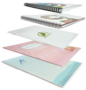
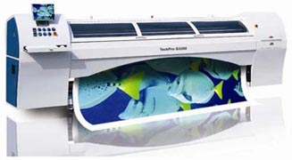
How 4 Color Process Printing (CMYK) Works


CMYK Process Printing Features

  • It uses the same 4 standardized base colors all the time (cyan, magenta, yellow and black)
  • Small dots of these colors are printed at different angles to create the printed image
  • The most widely used and cost effective color system in commercial printing
  • It’s significantly cheaper than toner based or digital printing for larger quantity runs
The use of color in print increases readership and information retention.
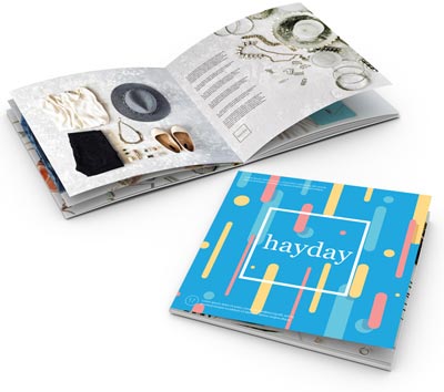
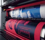
Studies in a major publication revealed that the use of color increased readership by 40% or more. A university study showed a 65% increase in the retention of material when full color was used instead of black and white. See more research about why color matters in marketing.
 
Also see Color in the Printing Process for more information on the use of four color process in commercial printing.

Get 20% Off

Subscribe to our weekly newsletter and get an instant 20% off your first print project.

Name(Required)
This field is for validation purposes and should be left unchanged.

RELATED MARKETING & DESIGN TIPS

Premium Paper

Premium paper is sometimes referred to as designer paper, fancy paper, or specialty paper. Regardless of what you call these quality papers, Printing for Less is ready to help you decide which paper best suits your personal printing project.

Read More >


Bottle Necker Design

Get custom Bottle Neckers, neck tags and bottle neck hangers, popular for wine bottle tags and marketing anything sold in bottles.

Read More >


European Sizes

Sending marketing across the pond? We offer European paper sizes in A4, A3, & printing options for your brand. Request samples or design help. Learn more.

Read More >


Graphic Design Layout Specifications for Printing

Graphic Design Layout Specifications for Printing

Bleed

Bleed is the amount of printed information which extends beyond the finished size of your piece.

  • Bleed allows us to print your piece slightly oversized and cut it down to its exact size. This gives a final seamless appearance of the image “bleeding” off the edges.
  • We recommend that you build your file with bleed dimensions of an extra 1/8 inch (.125″) on each side. This increases the total width and height of your document by 1/4 inch (.25″). For example, a 3.5 x 2″ business card is designed as a 3.75 x 2.25″ file.
  • We are happy to provide templates for your use that include bleed dimensions.
  • If you do not design your piece with bleeds, we are happy to add bleed free of charge!

graphic layout bleeds

Safe Design Zone

The safe design zone is the 1/8 inch (.125″) area surrounding the inside trim edge of your piece.

  • Keeping your critical content-text, images, graphics-within the safe design zone ensures that nothing will be positioned too close to the edge, where it could be impacted by trimming variances of up to 1/32 inch. In the 3.5 x 2″ business card example, all important content should be positioned within the interior 3.25 x 1.75″.
  • The safe design zone decreases to 1/16 inch (.0625″) for envelopes, and increases to 3/16 inch (.1875″) for catalogs with more than 36 pages.
  • Borders around the outside edge should be at least 1/8 inch (.125″) wide to avoid any visual variance after trimming.
Panel Dimensions

The best way to understand panel dimensions is to make a quick mock-up of your folded piece. The panel dimensions are listed from narrowest to widest. Once you have a folded mock-up, write the dimensions on the appropriate panels, both front and back. Then translate your page and panel information into your design layout.

  • Dimensions are provided at bleed size/at trim size
  • We are happy to provide templates for your use that include fold line indicators.
Tri Fold
8.5 x 11 3.6347 3.6667 3.6987
8.5 x 14 4.6347 4.6667 4.6987
11 x 17 5.6347 5.6667 5.6987
Closed Gate Fold
8.5 x 11 2.735 2.75 2.765 2.75
8.5 x 14 3.485 3.55 3.515 3.5
11 x 17 4.235 4.25 4.265 4.25
Z Fold
8.5 x 11 3.67 3.67 3.67
8.5 x 14 4.67 4.67 4.67
11 x 17 5.67 5.67 5.67
4-Panel Barrel Roll
8.5 x 11 2.69 2.73 2.77 2.81
8.5 x 14 3.44 3.48 3.52 3.56
11 x 17 4.19 4.23 4.27 4.31
4-Panel Fold / Double Parallel
8.5 x 11 2.75 2.75 2.75 2.75
8.5 x 14 3.50 3.50 3.50 3.50
11 x 17 4.25 4.25 4.25 4.25
Accordion Fold / M Fold
8.5 x 11 2.75 2.75 2.75 2.75
8.5 x 14 3.50 3.50 3.50 3.50
11 x 17 4.25 4.25 4.25 4.25
 
Size Specifications and Layout Information
Business Card Size Specifications
CD Cover Size Specifications
Newsletter Templates
Rounded Corner Business Card Templates
Brochure Templates for Design and Layout
Envelope Printing Information
Door Hanger Design and Layout Instructions
Presentation Folder Design and Layout Instructions
Presentation Folder and Pocket Folder Templates
Brochure Holder Layout Instructions
Rack Card Holder Layout Instructions
Calendar Printing Specifications
File Folder Design
US Mail Layout Guides for Commercial Printing
Hang Tag Templates with Design and Layout Instructions
Table Tent Templates and Design with Layout Instructions
InDesign Brochure Templates for Design and Layout
Post-it® Notes Templates with Design and Layout Instructions
Carbonless NCR Form Layout and Design Templates and Instructions
Folded Business Card Templates with Design and Layout Instructions
Coil Bound Booklet and Manual Templates with Design and Layout Instructions
Church Offering and Remittance Envelopes with Design and Layout Instructions
 
Graphic Design and Layout Template Files
 
Creative Resources for Designers

Visit our Graphic Design Center for tips and articles on design, digital photography, Adobe Acrobat, Adobe Illustrator Adobe InDesign, Adobe Photoshop, Microsoft Publisher, and QuarkXPress.

Other Resources:

visit creativepro

Creativepro.com is a comprehensive online resource for creative professionals working in graphic arts and printing on the Web. The site provides news, reviews, how-to features, and analysis from experts in the fields of publishing, digital imaging, and creative workflow. Creativepro.com also includes essential resources and services to help creative pros get the job done—from one-click stock photography and font searches to book and software purchases to on-line print ordering. Creativepro.com is also the publisher of InDesign Magazine, the only publication devoted entirely to Adobe InDesign.

Get 20% Off

Subscribe to our weekly newsletter and get an instant 20% off your first print project.

Name(Required)
This field is for validation purposes and should be left unchanged.

RELATED MARKETING & DESIGN TIPS

Folding Options for Menus

Menu folding options explained. The paper stock and weight you use on your printed menus has an impact on the folding options you have available

Read More >


How To Make A Super Brochure Or Mailing Piece

Super brochures or mailing pieces can be a great way to advertise your business, as long as you have the right design in place. Get tips from our experts!

Read More >


Foil Business Cards

Add sleek eye catching flair to your business card! Custom foil accenting elevates your business card design to a whole new level. Learn more.

Read More >


Digital Printing vs Offset Printing

Digital Printing vs Offset Printing Explained

What’s the REAL difference, and does it matter?

So, what’s the distinction between digital and offset printing? Printing is printing, right? Not exactly… Let’s take a look at these two printing methods, their differences, and where it makes sense to choose one or the other for your next print project.


What is Offset Printing?

Offset printing technology uses plates, usually made from aluminum, which are used to transfer an image onto a rubber “blanket”, and then rolling that image onto a sheet of paper. It’s called offset because the ink is not transferred directly onto the paper. Because offset presses run so efficiently once they are set up, offset printing is the best choice when larger quantities are needed, and provides accurate color reproduction, and crisp, clean professional looking printing.

What is Digital Printing?

Digital printing doesn’t use plates the way offset does, but instead uses options such as toner (like in laser printers) or larger printers that do use liquid ink. Digital printing shines when lower quantities are needed; think of a run of 20 greeting cards or 100 flyers. Another benefit of digital printing is it’s variable data capability. When each piece needs a unique code, name or address, digital is the only way to go. Offset printing cannot accommodate this need. Learn more about digital printing options and capabilities.

While offset printing is a fantastic way to produce great-looking print projects, many businesses or individuals do not need large runs of 500 or more, and the best solution is digital printing.

What are the Advantages of Digital Printing:

  • Setup costs are lower for short runs
  • Print only the amount you need, when you need it
  • Lower minimum quantities (as low as 1, 20 or 50 pieces)
  • Inexpensive black and white digital printing
  • Variable data capability (names, addresses, codes or numbering can be done easily)
  • Improved technology has made digital quality acceptable for more uses

What are the Advantages of Offset Printing:

  • Large quantities can be printed cost effectively
  • The more you print, the cheaper the price per piece
  • A large variety of paper types with custom finishes can be used
  • Special custom inks such as metallic and Pantone colors are available
  • Highest possible printing quality, with greater detail and color fidelity
Is Digital Printing the right fit for my next print project?

Offset and digital are both useful printing methods. Each have particular benefits depending on your project’s requirements. When you need larger runs of a project, into the hundreds or thousands, or are using a specific, brand-centric Pantone color, offset printing is the only way to go. You can also use a much wider variety of custom papers and specialty inks, such as metallic or fluorescent inks in the offset process.

If a small run of less than 100 or the need for individual addresses or information is required, digital is your solution. The best part is that as a business, your needs can be met with either of these choices, and the high-level of quality means you get a printed product that will make you look great!

Digital Press
Digital Press

Offset Press
Offset Press


To get started on your next digital printing project, talk to a helpful expert now a 800-930-6040.

Get 20% Off

Subscribe to our weekly newsletter and get an instant 20% off your first print project.

Name(Required)
This field is for validation purposes and should be left unchanged.

RELATED MARKETING & DESIGN TIPS

Digital Printing vs Offset Printing

What are digital printing and offset printing? Knowing the difference between digital and offset printing can save costs in the long run.

Read More >


Complete Guide to Creating Press Ready Print Files

We put together everything you need to know about creating a successful commercial print ready file. Learn about bleed, color, image formats, folds, & more.

Read More >


UV Coating: High Gloss Print Coating Explained

Learn more about the pros and cons of UV coating. UV coating or UV printing can enhance shine, and durability of printed materials when used effectively.

Read More >


Design Postcards in InDesign to Connect

Design Postcards in InDesign to Connect

Make sure your message is delivered by laying out and printing postcards correctly.

by: Cathy Palmer

Since the mid-1800s, postcards have been a comparatively inexpensive way to send a short message. But with so many modern options for flashy digital interactive messaging, how does the humble printed postcard survive? The reason is simple: You can’t avoid physical mail. Even if you just pick up the postcard on the way to the recycling bin, chances are you’ll see something on it.

As designers, our job is to use our skills to use that brief encounter to convey real information and, hopefully, prompt an action. By following a few design strategies and production criteria when creating postcard layouts, you can offer your clients an effective, lower-cost vehicle to get their messages across.

You can let your imagination run wild on the front of a postcard (as long as nothing can be mistaken for an address or indicia). However, the back side and the card’s overall dimensions must adhere to several layout rules and ink and paper choices if the cards are to be delivered as quickly as possible for the lowest possible cost. These strictures vary across the world; in this article, I’ll focus on United States postal regulations, but two tables do include information on postcard sizes and rates around the world.


How to Design the Best Backs

Whichever side holds the ship-to address is Design Postcards to Connect considered the mailing panel (more commonly, the “back”) and has the most restrictions for positioning of graphic elements. My recommendations in this article will, for the most part, result in a postcard back readable by the Post Office’s scanners. That lets you take advantage of lower automation or bulk rates.

The address must be parallel to the longest side, so that it’s readable when the postcard is horizontal. (Cards that are square, round, or die-cut shapes can ignore this regulation, since they’ll be hand-sorted by the Post Office.) The rest of the graphics on the mailing panel can be the same orientation as the address or rotated, as long as they don’t interfere with the postal scanning.

In any print project, there are three edges to be aware of: trim, bleed, and live. The trim area is the most obvious, being the finished size of the printed piece. The bleed area is larger and extends past the trim, allowing images to appear right up to the cut edge. The live area is the inner safety zone for important images and information, where there’s no risk that they’ll be shifted too close to the trim and risk being cut off.


Keep the Clear Zones Clear

There are no special printing considerations for setting up the trim, bleed, and live areas for postcards, but there are definitely mailing guidelines for where ink is permissible.

postcard clear zones

“Clear zones” are locations that are reserved for postal use, so don’t place text or graphics in those areas. Ink coverage less than 10% density is allowed, so very light screened-back photos and tint colors might be OK, but it’s safer to keep these areas entirely free of printing.

To qualify for the lower presorted standard and bulk rates, you must keep the postage, address, and barcode zones clear of any unrelated printing. (First- Class mail is less strict about the clear areas required but does cost more to send.)

The upper right corner—1.25″ down from the top and 1.25″ from the right edge—is a postage clear zone reserved for the indicia (mailing permit imprint), metered postage, or stamp.

The lower right corner—2.75″ up from the bottom edge and 2.75″ from the right edge—is the mailing address area where no other visuals except the shipto address may appear. Because the indicia must be positioned to the upper right of the delivery address, the top of the address must start lower than the 1.25″ postage clear zone from the top edge.

An area at least 0.625″ (5/8″) across the bottom (longest) edge of the mailing side should be kept unprinted for the sorting barcode. The Post Office will print a barcode here if the area is clear, or slap on a barcode label to cover the area if there is any printing. Either way, any artwork in that space will get covered up, or worse, make your postcard unmailable.


Mailing Rates Vs Delivery Times

If your client demands postcard rates, which are lower than First-Class mail, you must design within those parameters to avoid higher rates and surcharges. But do prepare your client with the information that when mailed First Class, postcards arrive at their destination more quickly and with fewer quantity restrictions.
International Postcard Rates  (As of 2/2010)
 
Postcard Rates Domestic To USA To Mexico & Canada To the rest of the world
U.S.A. 0.28 US$ — 0.79 US$ 0.98 US$
Canada 0.57 C$ 1.00 C$ — 1.70 C$
Great Britain
First Class 0,39 £
Second Class 0,30 £
0,62 £ — 0,56 £
Australia (a.k.a. small letter) 0.55 AUS$ 1.40 AUS$ — 1.40 AUS$

Make the Address Machine-Friendly

The mail-to address is critical to delivery. Follow the recommendations below so that automated postal equipment can read and understand the address text.

  • Face: Serif and script typefaces may be difficult for pre-sorting scanners to read, so the Post Office recommends sans serif.
  • Case: Uppercase letters are more evenly shaped and easier to scan, so use all-caps whenever possible.
  • Size: 10 to 12 point is optimal for the postal scanners to read, so make that cap-height your minimum.
  • Spacing: Overlapping characters caused by too much tight kerning/tracking can confuse the scanner, but extreme letterspacing can be a readability problem,
  • too. Keep the horizontal letterspacing so that each character stands alone without overlap.
  • Leading: If you don’t use all caps, overlapping characters can happen between lines of text as well, so leave enough vertical space clear between lines.
  • Underlines: Additional ink near the letters can confuse the character shapes, so no underlines.

The address locations are also important to scanners. Including a return address is a great opportunity for branding and providing contact info, but be careful with the positioning of the return address in relation to the mailing address. The relative position of To: and From: will determine which address the Post Office uses for delivery. Use the wrong return address position, and all of your postcards might mistakenly be sent to the sender!

Any text within 2.75″ of the bottom edge will be scanned as a potential mailing address, so keep your return address above this area. Also, be sure your message can’t be mistaken for an address—don’t include state or ZIP code in your text, or it might be misinterpreted.


Create Mailing Permit Indicias

An indicia is text that tells the Post Office the details of how the mail delivery is being paid for. (The U.S. Postal Service calls it a “Mailing Permit Imprint,” but for simplicity’s sake, let’s stick with “indicia.”) It should be in the same upper-right location where you’d put a postage stamp. Indicia text should be 10 to 12 points, all caps, and a sans-serif typeface. The indicia imprint can be four or five lines, as needed to fit in a compact area, and can be enclosed in a box or not (designer’s choice).

An indicia for outbound mail has several required text elements, in this order:

  1. The RATE MARKING, showing the mailing service used.
  2. The words “U.S. POSTAGE PAID”, usually with “PAID” on its own line.
  3. The CITY and STATE where the mailing permit’s held.
  4. The words “PERMIT NO.” and the mailing permit number.

Depending on the mail services you use, indicia Rate Markings can include any combination of First-Class, Standard, Bulk, Pre-Sorted, Non-Profit Organization, and/or Customized Market Mail. A mailing permit has registration costs and minimum quantities that may be too much expense for a small client or project, so many printers and mailing houses will let


Postcard Sizes

Cards that qualify for the postcard mailing rate start at 3.5″ x 5″ size (the smallest allowed size of any U.S. mail piece) and go up to a maximum of 4.25″ x 6″. The most common postcard trim size is 4″ x 6″.

Any piece larger than 4.25″ x 6″ up to 6.125″ x 11.5″ is charged the First-Class rate, even when it’s a flat, unenclosed card. Some standard trim sizes that mail as First-Class include Large 5″ x 7″, Deluxe 6″ x 8.5″, and Super Size 6″ x 9″ postcards.


International Postcard Sizes

Country Postal Service Web Site Smallest Width x Height Largest Width x Height Minimum Thickness Maximum Thickness Min-Max Weight Shapes
U.S.A. United States Postal Service www.usps.com/ 3.5″ x 5″ 4.25″ x 6″ 0.007″ 0.016″ — Customized MarketMail
Canada Canada Post · Postes Canada www.canadapost.ca/ 90mm x 140mm 120mm x 235mm 0.18mm 5mm 3g – 50g Dimensional AdMail AdCard
Great Britain Royal Mail www.royalmail.com/
portal/rm
90mm x 140mm 120mm x 235mm — 5mm up to 100g Non-rectangular postcards must be enclosed in envelope & mailed at letter rate.
Australia Australia Post www.auspost.com.au/ 88mm x 138 mm 130mm x 240mm — 5mm up to 250g Impact Mail


In addition to width and height, depth (thickness) also has minimum and maximum limits. A ¼” is the maximum thickness for a standard piece of mail, including postcards larger than 4.25″ x 6″. A card thicker than that is considered a flat or large envelope, with different postal rates. Standard mail has a 0.009″ minimum thickness if the piece is 4.25″ x 6″ or larger, but mailers sized smaller than that are allowed to be slightly thinner. Postcards within the 3.5″ x 5″ to 4.25″ x 6″ range can be as light as 0.007 inches thick, and up Design Postcards to Connect to 0.016″ thick. Less than that is just too thin and flimsy to go through the mailing equipment. See Table 2 for these numbers at a glance.

Proportion matters, too: The aspect ratio has to fall within a certain range to be mailable at regular postage rates. The aspect ratio (length divided by height) has to fall between 1.0-to-1.3 and 1.0-to-1.25 inclusive, or it’s considered non-standard. Anything non-standard must be processed manually, which costs more. Square or skinny shapes outside of this range won’t go through the automated postal equipment, so those get a manual-handling surcharge.

Postal Dimensional Standards Template
Figure 2: A free template from the Post Office helps check mail piece dimensions. To get an actual template, contact a Postal Business Service Center.

You can quickly evaluate your project against all of these size criteria by using a free template from the Post Office. The Dimensional Standards Template (Notice 3A) is an easy way to check for minimum size, proper height to length ratio, and thickness of your mail piece. Just align your design sample over this white plastic card and see if the corners fall within the recommended dimensions (Figure 2). There’s even a slot to test the maximum thickness of your design sample; if it fits through, it’s OK to mail. Pick up a template at your local Post Office.


Reply Mail

Subscription cards inside magazines are an example of Reply Mail—postcards meant to be sent back to the source. The Post Office has a few options for these kinds of postcards: Business Reply Mail (BRM) and Courtesy Reply Mail (CRM). If your postcard is sent BRM, the sender pays for return postage. If the postcard is sent CRM, senders have to add their own stamps. The Post Office delivers BRM and CRM postcards faster than standard mail, giving a possible business advantage of several days.

A third option, Meter Reply Mail, uses preprinted metered postage affixed to it that doesn’t get charged until it arrives at the originator. But since the MRM format has no special limitations to design around, I won’t cover it in this article.

There are so many restrictions on BRM and CRM card layouts that it’s best to use the official

Post Office digital templates (Figures 3 and 4). You can download Mac and Windows files in several trim sizes at http://pe.usps.com/mpdesign/mpdfr_addl_all.asp. These well-structured documents have an Instructions Layer, Working Layer, and Dimensions Layer. They’re available as Illustrator, Acrobat PDF, and Freehand files, but unfortunately not as InDesign files.

There are more detailed layout guidelines for BRM in Quick Service Guide 507 and for CRM in Quick Service Guide 507b. Check your postcard project against all of these criteria by using the free Automation Letters Template (Notice 67).

business reply guidelines
Figure 3: Layout guidelines for Business Reply Mail are in the Dimensions Layer of the template.
business reply dimensions
Figure 4: The Dimensions Layer of the CRM digital template shows the layout guidelines.
 

Shapes: Beyond the Standard Rectangle

So far I’ve covered rectangular postcards within a fairly narrow range of size and proportion. But you can send almost any flat shape through the mail. In 2005, the USPS started the Customized MarketMail (CMM) program, which allows for die-cut “shaped mail” to be sent through the postal system. The first oversized specialty die-cut postcard mailed was shaped like a box of Krispy Kreme doughnuts.

Don’t worry that odd postcard shapes will be tangled in the mail sorter. Because these pieces are sent express to each ZIP code distribution center and then hand-sorted by the final postal carrier, they don’t ever go through any automated machinery. Minimum dimensions of 3.5″ x 5″ and 0.007″ thick still apply, but the maximum size for CMM is 12″ x 15″ x 0.75″ with a top weight limit of 3.3 ounces. Uniform thickness is not required, and attachments up to ¼” thick are allowed. That means you can glue things onto your postcard, such as a product sample. The only shape limitations are the die-cutter tolerances at your print finisher.

CMM materials can be anything semi-rigid that fits within the dimensional criteria. That means materials that would otherwise be considered unmailable are now open for consideration: clear or semi-transparent; mirror-reflective; rough and heavily textured; furry; fluffy; and spongy surfaces are all fair game for CMM.

Having your odd postcard shapes gently handled by people during every step of the delivery process has its price, and some benefits. Between the express delivery and the prioritized hand sorting, CMM can actually be faster than First-Class mail. The postage itself is not bad, but the cost of organizing and drop- shipping each CMM ZIP-zone batch can add up. Note: Due to the additional expense of drop-shipping to each postal station, CMM is more cost-effective when targeting specific ZIP codes than when sending to scattered addresses across the country.

Because of the multi-stage delivery process, CMM won’t be returned to the sender, so you must include “Carrier-Leave If No Response” on CMM pieces in the location of the return address or under the return address, in a minimum 8 pt font size. Be sure to leave a 3.375″ x 2.5″ area to include the mailing address, optional return address, indicia, and “Carrier-Leave If No Response”.

custom shaped postcard sample
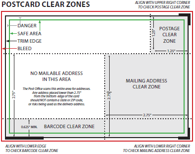
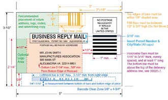
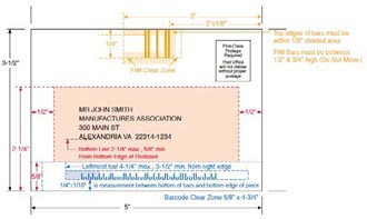
Not just any mail house can participate in this specialized delivery process. The postal service requires the sender to be registered with certain mailing capabilities confirmed. Check with your printer to see if they have the die-cutting and mailsorting capabilities required for CMM shipments. The special standards for designing Customized MarketMail are in Quick Service Guide 705a.

With a huge size, almost any shape, and minimal restrictions on materials, Customized MarketMail is the place where creative postcard inspiration can flourish. CMM will cost you extra, but the dramatic impact of sending attention-getting shapes in the mail may be worth the expense (Figure 5).


Printing Postcards

Postcard printing is fairly straightforward. You can output at your local press or find lots of affordable options from online printers.


Base Stock

If you want the Post Office to process your cards automatically, the stock must be between 0.007″ and 0.016″ thick, and bar-coded pieces more than 4-1/4″ high or 6″ long (either dimension) must be at least 0.009″ thick. Rigidity is also an issue; make sure the stock isn’t too flexible.

In general, avoid patterns, textures, and colors of more than 10% density from white. Within these guidelines, there may be plastics or other non-paper materials that qualify for postcard or letter rate. If you use a stiffer plastic or heavily laminated stock, the rigidity may bump it up to an “automated flat” rate. Check stock samples with the Mailpiece Design Analyst at the nearest Postal Business Service Center, because only they can make the final call.

As you discovered in the section “Shapes: Beyond the Standard Rectangle,” paying a little extra for a “flat” rate or manual handling opens up many more options for mailing postcards made of different materials.


Varnishes

Flood varnishes or coatings can add a nice look and feel to the finished card, but that’s not everything to consider. You may want to keep the postcard surface uncoated or matte so it’s easier to write on, especially if it’s a survey or appointment card. For a calendar or reference postcard that’s intended to be kept and handled repeatedly, adding a heavy laminate or UV coating will make the card more durable.


Inks

Don’t use metallic inks for addresses, because the reflection makes the text unscannable. Also be sure to keep the address color darker than the surrounding area, with a color contrast of at least 15% from the base it’s printed on. Black ink for addresses is the safest choice, and what the Post Office recommends.


Color Control

There are amazing deals online for printing large quantities of color postcards. Many times, these cards are batch-printed with other orders, so your postcard may be one small section of a ganged-up press sheet. You may not have the opportunity for exacting color adjustments and can reasonably expect to get “pleasing color” results only. If your project needs precise color execution, beware, but if pleasing color is acceptable, then by all means give these options a try.


Tempting Templates

With all of these production criteria to consider, optimal postcard design might be more complex than you originally thought. It’s tempting to use a template for guidance. Postcard templates are available from printers and the postal service, and as part of support files that ship with InDesign and Illustrator. But beware that each source has its own agenda. Printers are most concerned about where the ink hits the paper, the Postal Service is simply enforcing pre-sorting and automated mail processing, and the design programs encourage creativity without worrying about critical aspects for mailing (Figure 6).
InDesign postcard template
Figure 6: When you overlay the postal guidelines for positioning text and graphics, it’s clear that this InDesign postcard template is not a good layout example to follow.
Get commercial postcard printing templates and US Mail layout guides.

As I’ve mentioned in previous sections of this article, the Postal Service offers working template files for BRM and CRM, and plastic templates with measurements and guidelines. These are your best bet to ensure that your design qualifies for the lowest possible rates and the most delivery options.

Adobe’s InDesign and Illustrator postcard templates are problematic because they don’t follow the best practices described in this article. In fact, as Figure 6 shows, some of them wouldn’t even be mailable! However, they’re fine for visual inspiration before you get into production setup.

InDesign CS3 and CS4 templates are in Library > Application Support > Adobe Templates > InDesign in their respective version folders, with a postcard example in the Business Sets folder. You can also navigate to the InDesign examples by choosing File > New > Document from Template. In Illustrator CS3, check out Cool Extras > Templates to find folders with Basic and Inspiration examples, and in Illustrator CS4 look in the Cool Extras > en_US > Templates for a few options.

Performing Postcards

The point of any postcard is to deliver a message. Many marketing postcards are meant to be returned to the sender so the message impact can be measured. Whether they come back by mail or in person, you as the designer can improve the return rate. For example, use the Business Reply Mail (BRM) or Courtesy Reply Mail (CRM) layout formats. Those little black bars help with automated pre-sorting for return delivery that can dramatically reduce time in transit.
 
A strategy that encourages in-person returns is to design a postcard that takes on an additional role: an event invitation can also act as an entrance ticket, a sale announcement can do double duty as a coupon, even a simple schedule reminder can become an active appointment card. People lining up with postcards in hand is proof that the mailing was effective.
 
Some postcards are sent out, and meant to be saved. Beautifully designed postcards can earn a permanent spot on bulletin boards, scrapbooks, walls or refrigerator doors as art that constantly reminds people of their source and message with creative visuals they don’t mind displaying.
 

Better Postcards by Design

Based on its dimensions and setup, a mail piece can qualify as a postcard, letter, automated flat, Customized MarketMail or package. Add in lower rates for pre-sorting and bulk quantities, discounts for Non-Profit Organizations, and surcharges for manual handling, and there are lots of factors that determine the actual cost of mailing. Don’t worry, there’s a friendly neighborhood Mailpiece Design Analyst (MDA) to check your work and make sure it fits the criteria. Run a sample of your project past the MDA at any Postal Business Service Center for a free mailing evaluation, find the one nearest to you at https://tools.usps.com/go/POLocatorAction!input.action

As designers we can create postcards that people may glance at and toss out, or that catch their attention with immediate visual impact. Beyond the design of your message, there are plenty of ways to layout your postcard for optimal results. With a very straightforward printing process and a fraction of the cost of other delivery options, these little mailers can be valuable communicators.


Cathy Palmer is an award-winning graphic designer who has worked in both the creative and production sides of publishing. She currently provides digital media skills training and seminars on graphics applications, teaching designers how to build smarter pages and let their computers do most of the work so they can focus on the creative stuff.

From InDesign Magazine. Each issue gives you tips, techniques, and time-savers by an all-star cast of industry experts.

Also see Business Card Design Concepts in InDesign

Get 20% Off

Subscribe to our weekly newsletter and get an instant 20% off your first print project.

Name(Required)
This field is for validation purposes and should be left unchanged.

RELATED MARKETING & DESIGN TIPS

How to Choose the Best Paper for Your Printing Project

Paper choice is maybe the single most important decision you’ll make for your printing project. Get essential tips to help you choose the best paper.

Read More >


Brochure Marketing – A Vital Component for Your Business

Brochure marketing can be a vital piece of advertising for your business, so make sure you do it right. Get our tips on brochure layout, content and more.

Read More >


Text and Type for Printing

Tips and advice on how to work with text in your graphic arts files used for full color commercial printing

Read More >


Custom Die Cutting: Stand Out From the Crowd

Custom Die Cutting: Stand Out From the Crowd

We all need to stand out from the crowd occasionally, and this rings true when it comes to your printing and marketing materials. While the list of options, colors, papers and finishes is extensive, one unique custom feature that can set you apart is the use of a die cut. What exactly is a die cut, how are they created, and how do you use die cutting to really stand out with your printed piece?


The Die Cut – Your Cookie Cutter to Creativity

Watch Door Hangers Being Cut Video
A die cut is created by using a sharp steel blade formed into a specific shape, then used to cut through the paper. Think about how a steel cookie cutter would work; just substitute the dough with paper. The shapes for die cutting are nearly limitless—circles, squares, holes, curves, stair-stepped, rounded corners, sharp points, just to name a few. The die cut form, or “die”, is customized to your artwork, and it creates a very crisp, smooth edge that can include fine detail and a very distinctive look. Standard blades can only cut straight lines. Hear one of our print consultants explain the process.
examples of die-cut business cards
 

How is die cutting done?

Die cutting starts with a die consisting of a sharp thin metal blade formed into the shape that will be cut out of the paper or other substrate. The die is embedded into a block of wood that is securely held in a die cutting press. The paper is fed onto the die and they are both pressed under pressure against a metal plate or cylinder, cutting the shape into the paper. In most cases, tiny uncut ticks are left around the edge of the shape to hold the cut shape in the parent sheet until it can be stripped out later by hand. This is done to facilitate easier handling of the die cut sheets of paper during processing.

The products you can use die cuts on are wide ranging. Many people add eye-catching details to their business cards with die cutting, but you can also use the process on door hangers, brochures, postcards and presentation folders, to name a few.
 

Why you should use a Die Cut

die cutting sample
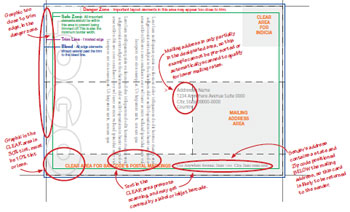
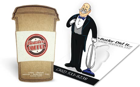
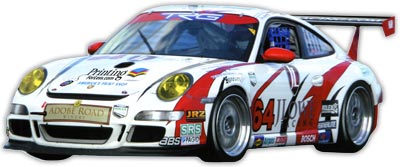
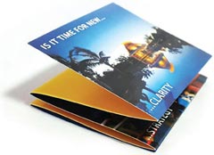
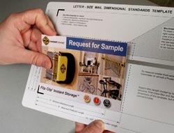
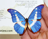
Done well, a die cut can direct the reader to the most recognizable aspects of your business or your offer. Your logo or product is the obvious place to start, but what else can you do to add a creative spark to your brand? As you look for ways to add a die cut to your piece, think about the purpose of it, and what kind of message you want to deliver. Are you looking for a classic shape, such as an effect of a family crest or scrollwork? Or perhaps something wild or unique, like the top of palm tree, a car, and the wings of a bird or even a butterfly, as seen here?
 
Your industry can provide additional creative direction. Construction companies, real estate agents or architects could use the outline of a roof or building, restaurants perhaps could use the corner of a napkin or even a fork or basil leaf; the possibilities are nearly limitless.
 
The real benefit of using a die cut is to get a potential customer to do a double-take, take a closer look, and check out what you have to offer. Sometimes it is that critical few seconds that can result in your business card, brochure or rack card being ignored or held onto and followed up on, just because of a unique finishing option—the multipurpose die cut.
 
Die Cut Business Card Samples
die cut business card       die cut business card sample     die cut business card example
die cut car shape
 
Die cut car promotional handout
Need creative or technical advice on using die cutting on your next project?
Give our helpful experts a call at 800-930-2423.
Check out our full line of custom printing effects and finishes.
 
Get Pricing for Custom Die Cutting

Get 20% Off

Subscribe to our weekly newsletter and get an instant 20% off your first print project.

Name(Required)
This field is for validation purposes and should be left unchanged.

RELATED MARKETING & DESIGN TIPS

How to Choose the Best Paper for Your Printing Project

Paper choice is maybe the single most important decision you’ll make for your printing project. Get essential tips to help you choose the best paper.

Read More >


Business Card Size Specifications

See standard business card dimensions, layout specifications, and guidelines for printing business cards and folded business cards for commercial printing.

Read More >


Custom Magnets

Get high quality full color custom magnets made in whatever size, shape or color you need to market your business.

Read More >


Which Paper to Use

How to Choose Paper for your Printing Marketing Materials

The Best Business Card Paper, Brochure Paper and More

Choosing the best paper for your print marketing project can influence the impression your final product leaves on a potential client or customer. From final presentation to cost, paper stock is the core of your printed piece. Here are some tips for picking the right paper for different types of printed materials.


Choosing Business Card Paper

Business cards should catch the eye, be memorable, and then get out of the way. When your prospect goes to find your card later, it should still look as good as the day you shared it with them. There are many paper stocks to choose from for business cards, and you can even get cards printed on plastic or other non-paper substrates.

Here are some tips for choosing the best paper for a business card:

business card example

  • Uncoated Stock: Pick an uncoated stock or a dull/matte stock if you want people to be able to write on your card. Uncoated stock is the best option when you want people to be able to write directly on the piece without smudges, but if you have important photos or graphics on your card they will look much more vibrant on the dull/matte stock than on the uncoated stock.
  • Metallics: Using metallic foils or metallic ink? Metallic inks should only be printed on gloss stocks, as the ink will not look metallic at all on uncoated or only slightly on dull/matte stocks.
  • Unique Coatings: Want something that feels interesting to the touch? Use a Soft Touch® coating that makes the card feel like velvet. Request a sample; you have to touch it to get the effect.
  • Protective Coatings: Worried about your cards getting scratched up in pockets and purses? Get UV coating to add greater protection for your card while adding a dramatic pop of color.

Paper Recommendations:

  • 120# (14 pt) Dull/Matte Cover when you want a final piece that has crisp text and images, while maintaining the ability to write on.
  • 100# (14 pt) Uncoated Cover is great for business cards that you’ll be writing on and for certain demographics (attorneys, financial, other professional).
  • 120# (14 pt) Gloss Cover works best if you’re using metallic inks or if you want the professional look and feel of a glossy paper.
  • 160# (18 pt) Gloss Cover is super stiff and thicker than most business cards. Get’s noticed, but you can’t keep as many in your wallet.
  • Magnet Stock keeps your message in front of your clients all year long. Our magnetic stock enables high quality printing with excellent color reproduction and will stick to most metal surfaces. Great for business cards from service industries that could be saved and referenced on the fridge.
business card thickness comparison


Choosing Brochure Paper

Brochures, sell sheets, maps, menus and flyers can all benefit from using the right paper for the job.

Here are some tips for choosing the best paper for a brochure:

brochure on cover stock

  • Plastic paper like SmartFlex® can create water and tear-proof products like maps or menus.
  • Heavier paper is more rigid, helping items stand up when folded. If you are folding your brochure, the maximum recommended thickness for 2 or more folds is 100# cover.
  • If the printed piece is going in the mail, it must be the correct thickness to meet postage regulations. The number of folds affects the final thickness. Call us for advice as the 2,000 page postal regulations manual changes often!
  • Thicker paper can make metallic foils and embossing look better, but as you go above 80# cover the amount of detail that is able to be shown in your embossed element will decrease.
  • If you’re printing a lot of materials, thinner paper is usually cheaper and could potentially have a lower mailing cost.

Paper Recommendations:

  • 70# Uncoated Text is great if you want to be able to write on the brochure, and want to add more than two folds. Text stock is lightweight, this paper is similar to the paper you’d find in a book.
  • 80# Gloss Text is your choice for brochures that need the professional look of a glossy finish, need more than 2 folds, and that should be lightweight but still strong enough to hold their shape. This is an economical and very common choice for brochures.
  • 100# Gloss Text is a great choice for brochures that you want to feel more substantial and that will hold up better to repeated use. This is a very popular stock for brochures.
  • 80# Gloss Cover produces a thicker brochure; it’s a light weight card stock that can be folded, but might not lay perfectly flat when closed.
  • 80# Dull/Matte Cover. This matte coated stock makes images look good without excessive shine, and can be written on with certain pens.
  • Brochures can be protected with additional coatings, such as optional UV coating that provides additional protection and makes colors really shine.
brochure on cover stock


Postcards

Postcards – especially those sent in the mail – have only a moment to get and keep someone’s attention, but they do get handled, held, and read.

Here are some tips for choosing the best paper for a postcard:

postcard with die cutting

  • Postcards that will be mailed have to meet US Postal Service regulations for size and thickness. In general, your postcards need to be printed on 100# cover or higher to mail. Check out our postcard mailing templates for sizes and layout tips.
  • Thicker and larger postcards stand out, but anything larger than 6″ x 11″ will be require a much higher “Flats Rate” postage.
  • Use a UV coating on the non-address side to make your card pop with high-gloss elements while protecting the card from handling and the weather.
  • People touch a postcard so use Soft Touch® coating on the non-address side to give it a soft, velvety feel (you have to request a sample – words don’t do Soft Touch® justice).

Paper Recommendations:

  • 100# Uncoated Cover. This bright white smooth #1 grade cover stock is a substantial paper, and the minimum thickness for a postcard going in the mail. You can easily write on this stock and is a great option for appointment or reminder cards.
  • 120# Dull/Matte Cover. Our dull/matte cover is a substantial paper with a smooth, non-shiny coating. It is a heavy 14 pt stock well suited for detailed, crisp printing without sacrificing the ability to write on the paper. You can also get UV coating on the front of a dull/matte card to add pop to the side that isn’t needed for writing. This is a popular choice for postcards.
  • 120# Gloss Cover. This is one of our most popular papers, its glossy coating makes photographs and other images look beautiful. UV coating, often called liquid lamination, is a great addition to the 120# Gloss Cover for added pop and shine. Not recommended if you want to be able to write on the postcard.
  • 200# Gloss Cover. At 24 pt, this is our thickest and sturdiest card stock. It has a glossy, smooth finish that prints well. It works really well for die cuts and foil stamping. If you’re adding foil stamping or die-cuts to your postcard, you can’t beat 200# cover stock.
  • Use an optional UV coating to protect your postcard from scratches and scuffs while making the colors pop.
  • Soft Touch® coating adds a velvety feel to the card that makes it stand out and grab attention, but save some money by only adding it on the non-address side.
postcard paper example


Catalogs / Calendars

In print terminology, a catalog is anything that is saddle-stitched like a magazine, but unlike a magazine a catalog can have a range of paper types for the cover and interior pages.

Here are some tips for choosing the best paper for a catalog:
    • Catalogs are printed in 4 page increments, as each sheet is folded in half into 4 pages (front and back).
    • Catalogs are frequently printed with a thick cover stock and thinner text stock for the interior to minimize cost. It is important to match the cover stock and interior text stock so there’s consistent color and image quality. For example, if you use 80# gloss cover stock for the cover and 70# uncoated text stock for the interior pages, and you have a consistent brand color on every page, it will look noticeably different on the cover than on the interior pages.

catalog papers and bindings

  • Catalogs can be saddle-stitched like a magazine, coil bound, Wire-O bound, or glued (perfect bound) like a soft cover book.
  • Consider a high-gloss, coated paper for catalogs where art and images are important, and use an uncoated paper you can write on for product lists where readers may want to circle something or take notes.
  • If your catalog will be mailed, be conscious of the total weight. You may need to use lighter papers to minimize the overall mailing cost.

Paper Recommendations:

  • 80# Gloss Text. Standard glossy paper stock, about as thick as a quality magazine page. The shiny finish provides an excellent opaque base for four color process printing. This can be either perfect bound or saddle-stitched. Text stock, like this, is usually used for interior pages only unless weight is a factor in mailing cost.
  • 80# Dull/Matte Text. This stock is finely coated with a non-gloss finish. It provides an excellent opaque base for easy to read, crisp typography.
  • 100# Gloss Text. Similar to the 80# gloss text, but 25% thicker and heavier for a more substantial feel and extra durability. This paper is thick enough to be bound any way you’d like. It’s sometimes used for a self-cover when cost or mailing weight are factors.
  • 80# Gloss Cover. As a “cover” stock, this paper is stiff, about like a postcard or baseball card. This stock has a glossy finish, making photographs and other images look beautiful. Glossy cover stock is hard to write on, however. Cover stock, like this, is usually used for the cover of a catalog, or for catalogs with only a few pages.
  • 80# Dull/Matte Cover. This cover stock is well suited for detailed, crisp printing without a shiny finish. Colors pop with dull/matte stock and it is thick enough to be bound however you’d like.
  • Cover and interior papers can be coated with an optional UV coating to provide protection and a high-gloss look that makes colors even more vibrant.
catalog paper example


Greeting Cards / Note Cards / Event Notices

A great way to make a personal connection with your customers and prospects. We have a great selection of papers for greeting cards, note cards, announcements and custom stationery.

Here are some tips for choosing the best paper for a greeting card:

thank you greeting card

  • Use uncoated stock where people will be writing on the card, such as an RSVP response card, or for certain artistic effects.
  • Gloss coated paper will resist writing and leave smudges, but this issue can be minimized by choosing a dull/matte coated stock if your images require the superior print quality of a coated paper stock.
  • Our standard card stocks, 120# (14 pt) are optimal for embossing, foil stamping, and die-cutting, all popular options for event cards such as wedding invitations.
  • Use textured papers such as linen, ribbed, or parchment to give a sense of luxury or class. They can be custom ordered.

Paper Recommendations:

  • 120# Gloss Cover. This is one of our most popular papers. It is a heavy 14 pt stock with a glossy, coated finish. It makes photographs and other images look beautiful. UV coating, often called liquid lamination, is a great addition to the 120# Gloss Cover for added pop and shine on the outside of the card. Not recommended for cards that need to be written on.
  • 120# Dull/Matte Cover. Our dull/matte cover is a substantial paper with a smooth, non-shiny coating. It is a heavy 14 pt stock well suited for detailed, crisp printing without sacrificing the ability to easily write on the paper. You can also get UV coating on the front of a dull/matte card to add pop to the side that isn’t needed for writing. This is an excellent choice for greeting cards and note cards.
  • 100# Uncoated Cover. This bright white smooth #1 grade cover stock is 14 pt in thickness and matches the 70# text-weight stock we use for letterhead and envelopes. You can easily write on this stock and is a great option for appointment or reminder cards or when a “natural” feel is desired.
  • Protect your cards with an optional UV coating that provides protection from the elements and makes colors more vibrant.


Coating Options

coating on postcard

UV Coating, often called liquid lamination, is a highly protective, ultra-shiny gloss coating that we apply over regular coating and then cure on a special machine using ultraviolet light. The solvent-free UV coating provides an extremely hard finish that’s chemical and abrasion resistant. It makes color and details really pop! On deep colors, it results in a stunning, almost wet appearance. Perfect when you want a durable, environmentally-friendly piece with a richer, high-end look and feel. 

NOTE: UV Coating cannot be used on the addressed side of mailed pieces.
 
 
Need help deciding which paper to use for your project?
Call us now at 800-930-2423 

Get 20% Off

Subscribe to our weekly newsletter and get an instant 20% off your first print project.

Name(Required)
This field is for validation purposes and should be left unchanged.

RELATED MARKETING & DESIGN TIPS

Gate Fold Brochure Design Review

How to use four color printing, unique folds and custom paper to reel in guests at a Montana guest lodge.

Read More >


Saddle Stitch Binding

What you need to know to get saddle stitching binding done on your printed catalogs and booklets

Read More >


Wind Up Your Business with Coil Binding

Get a variety of coil binding sizes, colors, covers and special printing effects to enhance your documents

Read More >


  • « Go to Previous Page
  • Page 1
  • Page 2
  • Page 3
  • Page 4
  • Interim pages omitted …
  • Page 8
  • Go to Next Page »

Footer

Printing for Less

info@printingforless.com
100 P F L Way, Livingston, MT 59047

800-930-2423

  • Home
  • Products
  • Services
  • Industries
  • Get Samples
  • Direct Mail Marketing Resource Center
  • Printing Resource Center
  • Blogs
  • Templates
  • Terms & Conditions
  • Contact
  • About Printing for Less
  • About P F L
  • Our Team
  • Careers
  • Login

Copyright © 1998-2025 PrintingforLess.com. All Rights Reserved.

logo
  • 800-930-2423
  • Products
  • Direct Mail Marketing
  • Services
  • Industries
  • Direct Mail Marketing Resources
  • Printing & Mailing Resources
  • Get a Quote
  • Contact Us
  • My Login