• Skip to primary navigation
  • Skip to main content
  • Skip to footer
Printing for Less

Printing for Less

At Printing for Less, we've offered high quality online printing services since 1996. Shop business cards, booklets, stickers, and more!

P F L.com
My LoginMy Login
800-930-2423
  • Printing
    • Postcards
    • Catalogs
    • Brochures
    • Folders
    • Letters
    • Newsletters
    • Envelopes
    • Greeting Cards
    • Print Templates
    • All Products
  • Direct Mail
    • Why Direct Mail Marketing?
    • Every Door Direct Mail® Postcards
    • Direct Mail Letters
    • Catalogs & Booklets
    • Marketing Gifts & Kits
    • Direct Mail Automation
  • Services
    • Mailing Services
    • Design Services
    • Custom Printing Services
    • Reseller Program
  • Industries
    • Advertising & Design
    • Enterprise
    • Food & Beverage
    • Healthcare Payers
    • Healthcare Providers
    • Nonprofit
    • Real Estate
    • Retail
    • Technology
    • University
  • Resources
    • Direct Mail Marketing
      Resource Center
    • Printing Resource Center
    • Blogs
    • Templates
    • Video Library
  • Get a Quote

Design & File Preparation

Edit PDFs in Adobe Illustrator

Edit PDFs in Adobe Illustrator

For years, editing PDFs was discouraged. There were too many things that could go wrong. Ideally, edits are made in the original application to avoid any compatibility issues and the potential nightmare of keeping track of changes between formats.


But improvements to the PDF format (thanks to Adobe Acrobat’s ever-increasing functionality) in recent years has meant much more flexibility in editing workflow.

So which Adobe programs can you use to edit a PDF? Because other Adobe Creative Cloud programs like Adobe Illustrator can also save as the PDF file format, it’s understandable that you’d assume that “any CC program goes” when it comes to editing PDFs.

But while Adobe Illustrator is the gold standard of vector graphics programs, and while it can handle both graphics and type, it’s not a dedicated PDF editing application.

Yes, if you have a native Illustrator file and you’ve simply generated a PDF from that source file and checked “Preserve Illustrator Editing Capabilities” when saving it, you’re pretty much safe making additional edits in Illustrator.

Much of the time, though, Acrobat is the way to go.

Making PDF Edits in Adobe Acrobat

If you’re going to edit a PDF in Adobe Acrobat, launch Adobe Acrobat Pro and then open the file you need to edit.

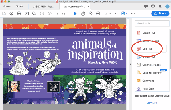
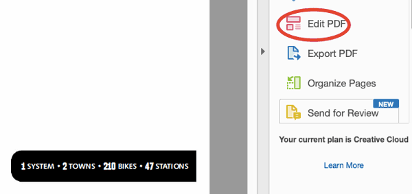
Once the PDF document you’d like to edit is open, you can either click “Edit PDF” in the right hand pane:

Editing a PDF in Adobe Acrobat

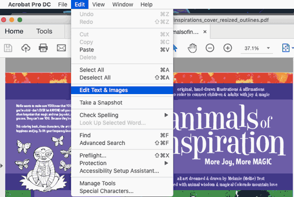
…or use the Edit menu to choose “Edit Text and Images” from the dropdown:

editing text in a PDF in Adobe Acrobat

Now, you’ll see that bounding boxes have appeared around any sections of editable text.

bounding boxes in Adobe Acrobat

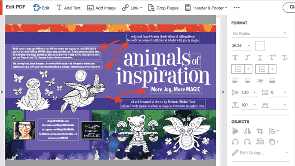
Once you select (click on or within) a bounding box, you’ll notice that the greyed-out text options are suddenly populated and active.

edit text options in Adobe Acrobat

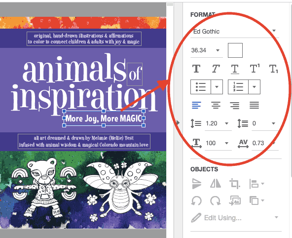
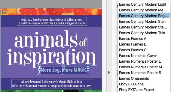
You can highlight the text you want to change and use the font dropdown to choose a new font.

adding a new font in Adobe Acrobat

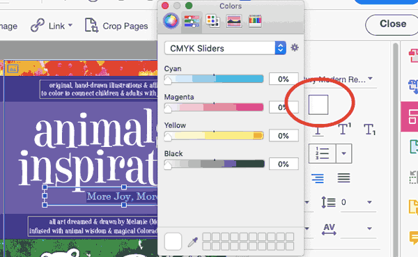
You can change the font size, the paragraph alignment, and the leading and line spacing. You can also change the color of the type by clicking the square next to the type size (which is in this case white because the text is white) and then moving the color sliders to get the new color you’ve chosen.

CMYK sliders in Adobe Acrobat

Adobe Acrobat Pro is a robust PDF editor and has numerous editing capabilities. That said, Acrobat hits a wall when it comes to editing vector and raster graphics. Acrobat alone isn’t the best choice if you want to edit images.

When your document images include vector artwork, Adobe Illustrator will be your best friend. You’re probably going to feel like you’re taking the long way around, but trust us. We’re going to give you the safest way to make spot changes and keep your document’s integrity intact.

How to Edit a PDF in Illustrator

What Adobe Acrobat can’t handle is complex graphic edits. The good news for us all is that, assuming you’re using the Adobe Creative Cloud, you’ll be able to make edits pretty seamlessly across the Adobe Cloud applications. Over the years, Acrobat has learned how to talk to Illustrator and Photoshop, and even when edits can’t be made directly in Adobe Acrobat Pro, the appropriate applications can be launched (and edits made) without ever closing your PDF file.

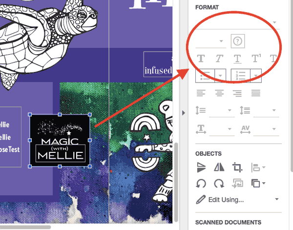
To get an idea of how seamless this process can be, first launch Adobe Acrobat Pro and then open a PDF that’s stored on your computer. Here, we’re opening a PDF cover spread for a coloring book. Once your document is open in Acrobat, click “Edit PDF” in the right hand panel.

edit a pdf

Now that the edit functions have been activated, click around your document to select items that you might want to edit. As you do this, start to compare the available editing options. Notice that with some elements, the editing features in the right hand editing panel remain greyed out and inactive.

greyed out editing tools in Adobe Acrobat

This is a case where, for vector graphics, Illustrator can come to your rescue.

To edit any vector graphics in your PDF with the Illustrator program, first make sure a relevant graphic has been selected (click on the graphic to select it). Then, right-click on the graphic, or control-click on a Mac, go down to “Edit Using” and choose “Adobe Illustrator” from the flyout.

edit a PDF in Adobe Illustrator command

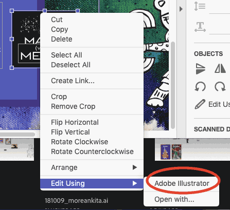
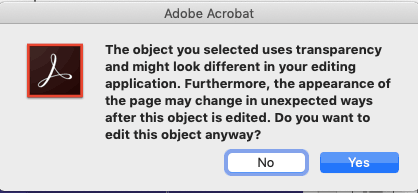
Note: you may see a warning dialog box. If you accept the risks, then go ahead and proceed. Please click “Yes.”

v

If Illustrator isn’t already open on your computer, it will now automatically begin to launch, and a document containing the graphic you’ve chosen to edit will open within the Illustrator interface. What has happened is that you’ve now extracted editable content from Adobe Acrobat.

You’ll probably notice that the artboard looks huge — it’s taken on the dimensions of your Adobe Acrobat file, and your editable artwork has also carried over its same positioning within the larger artboard space.

large artboard in Adobe Illustrator

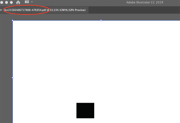
The size of this artboard is extremely important. Keeping these artboard dimensions will ensure that any edits you make in Illustrator will seamlessly be written back into your Acrobat file.

Don’t change the bounding box, either, if you want your positioning to stay intact within the original PDF. (Yes, there’s a lot going on here, but as long as you take the proper steps, your artwork and files — and all your hard work — will be safe.)

You also may notice that when Acrobat launched Illustrator, it created a new file with a crazy name made up of random letters and numbers. The file that has been generated and appears in Illustrator is is called a “touch up file,” and only exists in your computer’s memory. This means it’s not saved locally at the moment (but can be, of course, with the File –> Save As command).

weird name generated by Adobe Illustrator

From within Illustrator, go ahead and make your changes to this touch up file.

We’re going to change the color of this logo background box.

changing color in Adobe Illustrator

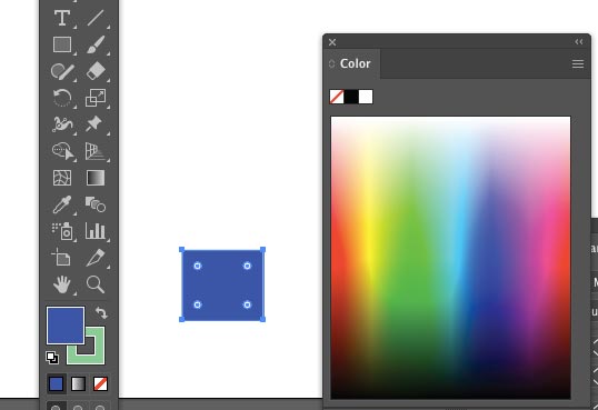
You may notice some odd behavior when you’re making your changes. Because we’re communicating back and forth between two programs, that’s totally normal — it just takes some getting used to.

When you’re done with your vector edits and ready to head back to Acrobat, you’ll go to File –> Save. Remember, you’re in the touch-up file, so you’re saving these changes right back into Acrobat, NOT onto your hard drive.

saving changes in Adobe Illustrator

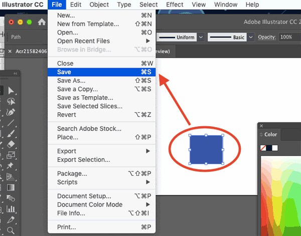
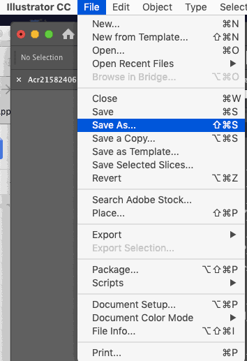
Do note that if you think you might need your changes on their own for use in the future, you can also choose File –> Save As and create a standalone vector file, saved on your hard drive.

illustrator save as screenshot

For our current purposes, though, simply saving will immediately export your changes back into your Acrobat document without requiring any additional steps.

Here’s a summary of the steps if you need to harness Illustrator’s vector editing power:

  • Open your PDF file in Adobe Acrobat.
  • Choose “Edit PDF” from the right hand panel.
  • Select the vector artwork you’d like to change.
  • Right- (or control-) click and edit using Adobe Illustrator.
  • Make your changes to the graphic without changing anything else about the touch up document as launched.
  • Save your changes.
  • Confirm your changes in your open Acrobat document.

How to Edit PDF Text in Illustrator

If you’re going to edit text in a PDF, it’s usually best to stick with Adobe Acrobat. As we mentioned earlier, Adobe Illustrator is more dedicated to graphics (specifically, vector artwork).

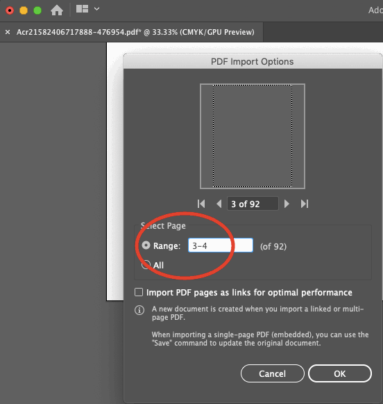
That said, if you’re going to open your PDF file in Illustrator to edit the text, you can go to File –> Open and select your PDF file. Then, if it’s a multi page PDF, you can choose the page range you’d like to open.

page range details in Adobe Illustrator

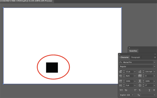
Once the pages are open, you can click on the text. On this particular document, you’ll see that the text isn’t editable, because it was converted to outlines in Illustrator before the PDF file was generated.

editing outline text in Adobe Illustrator

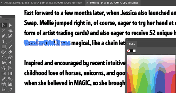
If this is the case and you still want to edit the text, you’ll need to have the original font on your computer and retype it.

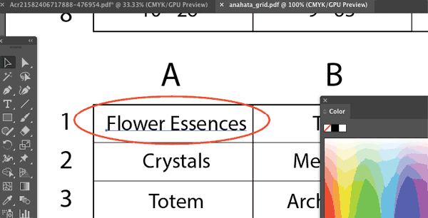
If your text is editable, though, you’ll see a line or a text box appear when the text is selected, instead of individual letter shapes.

edit text in adobe illustrator

In that case, make the text changes you need and then re-save the PDF file. Make sure it’s saving as a PDF and not an .AI file when you do this.

If you need help with getting your project ready for print, PrintingForLess can help! Learn more and place your order with Printing for Less here.

Need creative or technical advice on working with your PDF?
Call our helpful experts now at 800-930-6040


Subscribe to our weekly newsletter and get an instant 20% off your first print project.

Name(Required)
This field is for validation purposes and should be left unchanged.

RELATED MARKETING & DESIGN TIPS

Spot UV Printing

Get exceptional Spot UV printing for your marketing materials. Numerous Spot UV coating options can enhance your printed piece and really get you noticed.

Read More >


Printing Terms & Glossary

A glossary of terms used in the graphic design and commercial printing industry from Printing for Less. Learn the definitions of important printing terms! of collate printing, ream, and more.

Read More >


File Formats

Wondering what files are best for commercial printing? At Printing for Less, we accept almost every file format. See all accepted file formats here.

Read More >


Image Resolution for Printing

Image Resolution for Printing

When talking about image printing, resolution is one of the most important factors to keep in mind. Resolution is the measurement of how many dots/pixels fit into once inch, which is already referred to as DPI (dots per inch). High quality image prints rely on the provided images having high resolution and enough DPI to provide clarity.

The higher resolution, the sharper the image will be. At Printing for Less, we recommend a resolution of 300 DPI (dots per inch) for crisp, clear results. Lower resolution images appear fuzzy, jagged and blurry.

The following image is available with a 300 DPI resolution, and therefore will translate well into print. A zoom of the same image, also at 300 DPI, will print with equal quality.


good image resolution
 
Resolution = 300 DPI
Will print well
Zoom of 300 DPI image
Will print well
 
bad image resolution
 
Resolution = 72 DPI
Will not print well
Zoom of 72 DPI image
Will not print well

The low resolution of 72 DPI for this image and zoomed image means they will not print well. 

Take the below font resolution as another example. The version on the left has a resolution of 400 DPI, and it comes out nice and crisp.
The version on the right, which only has a resolution of 72 DPI, is fuzzy and appears blurred.


400 dpi text resolution for printing
 

Image resolution rules:

  1. Images should be at least 300 DPI (dots per inch) at the final size in the layout. 
  2. Images which include text should be 400 DPI at the final size in the layout.
  3. Resolution and image size are inversely proportional to each other. Enlarge an image, the resolution decreases; reduce an image, the resolution increases. Example: a 2 x 2″ image at 300 DPI (acceptable) enlarged to 4 x 4″ has a new resolution of 150 DPI (unacceptable).
  4. Low resolution images print fuzzy, jagged and blurry.
  5. The settings used during the original “capture” of an image (ie: scanning, digital camera, etc) determine its base resolution. Resolution can only be improved by decreasing the image size, or by recapturing the image at a higher quality setting.
  6. Recommended minimum resolution for printing is 300 DPI; computer monitors generally have a display setting of 72 DPI or 96 DPI. If we indicate that some of your images have low resolution, they may not look bad on your monitor but will likely print blurry or jagged.

Things to avoid:

  1. Web images are predominately low resolution (72-96 DPI) GIF or JPEG files. This resolution is good for quick transmission over the internet, but is not acceptable for use in printing. Do not save images or graphics from a website to use in your print project!
  2. Upsampling is when a low resolution image is saved to a higher resolution with no changes in dimensions. Upsampling adds more pixels/dots per inch (DPI), but creates blurry images, ugly blocks of color, and high contrast in images. The only way resolution can be improved is by decreasing the image size, or by recapturing the image at a higher quality setting.

How to get images with good resolution from your digital camera:

    • If you have not yet taken the digital image, adjust your camera to the highest quality setting.
      • Taking the photo on the highest setting will maximize both the quality of the image, as well as the range of sizes at which you will be able to use it in printing projects. If possible, save your image as a lossless TIF or EPS file before doing any editing to best preserve color and sharpness.
    • Determine the resolution and maximum usable dimensions for any images you want to use in your project. Images should have resolution of 300 DPI at their final size in the file; 400 DPI if the image includes text. Resolution and image size are inversely proportional to each other. In other words, enlarging an image will decrease the resolution and shrinking an image will increase the resolution.
2 x 2″ image @ 300 DPI = GOOD  …enlarged to 4 x 4″ = 150 DPI = BAD
 
      To determine resolution from pixel dimensions, divide pixel width and height by 300 to determine the maximum size at which you will be able to use the image, while maintaining a quality resolution of 300 DPI. Divide by 400 for images that include text.
Example:
    • Start with 1200 pixels x 1600 pixels as the dimensions for an image with no text.
    • Divide 1200 ÷ 300 = 4, and 1600 ÷ 300 = 5.33. If this image had text, you would divide by 400 instead of 300.
    • So, the maximum usable dimensions for the image are 4 x 5.33″. It will print crisp and clear at this size or smaller.

Things to know about image color 

Cameras primarily use the RGB color space. To print on a four-color printing press, all RGB images need to be converted to CMYK.

When we receive RGB images, we do a standard-value conversion to CMYK, which may not be perfectly to your liking. You have more control if you do the color conversion yourself- see our RGB – CMYK information page for important instructions on getting the results you want.

Most home and office users use flatbed scanners. No weight should ever be set on top of a flatbed scanner, as it will warp the glass bed and cause undesired color shadows. Artists, photographers and other users who need critical color accuracy and quality control often are best served with a professional drum scan.
 

How to scan your image for printing

Before you scan, you need to know what size your image will be in your design layout. If in doubt, overestimate the size you will need.

      • If the original image is larger than the size it will be in your file, simply scan at 300 DPI. Scan at 400 DPI if image includes text.
      • If the original image is smaller than the size it will be in your file, you need to adjust your scanner settings. You will not get acceptable results if you scan the photo at 300 DPI and then enlarge it in your layout program.

To calculate the necessary scanning resolution, you’ll need to do a little math to match the new resolution with the size of the enlarged image:

      • Increase the scanning resolution (300 DPI if image doesn’t have text; 400 DPI if it includes text) by the same percentage you will be enlarging the original image.
      • If you need to enlarge anything more than 300%, it is best to contact your local service provider for a professional scan.

Example:

    1. Start with a 2 x 3″ image with no text that will display at 5 x 7.5″ in the layout.
    2. This is an 2.5x enlargement, or 250% of the original image (5 / 2 = 2.5).
    3. Multiply the magnification factor (in this case, 2.5) by the desired DPI of the final image (in this case, 300 DPI) to get the DPI at which you will need to scan the original image (750 DPI) (2.5 x 300 = 750). This will allow you to print the 5 x 7.5″ image without loss of crispness or quality.

Save your scanned images as lossless TIF or EPS files to best preserve color and sharpness.

File formats like GIF or JPEG are best for web usage, as they compress color and pixel resolution to enhance transmission speed. If you’re going to be printing your image, you need to save it in the lossless format to keep the high resolution that will result in quality prints.

Most scanners save images in the RGB color space. To print on a four-color printing press, all RGB images need to be converted to CMYK.

When we receive RGB images, we do a standard-value conversion to CMYK, which may not be perfectly to your liking. You have more control if you do the color conversion yourself-see our RGB – CMYK information page for important instructions on getting the results you want.

Using stock photography in printing

If you’re going to be creating printing products using stock photography, there are a few things to keep in mind.  

  1. Image size in your design layout 
  2. Royalty specifications
  3. Color values of the image 
  • Before purchasing a stock image for printing, make sure you know what size the image will be in your design layout so you can purchase appropriately. If in doubt, overestimate the size you will need. 
  • Read all the “fine print” prior to purchase as it will determine price, color, file size, copyrights, resolution and quality. Images should have a resolution of 300 DPI (400 DPI if the image includes text) at their final layout size.
  • Royalty-free: Purchased images can be used as many times as you want and for almost any purpose. Royalty-free images cost less than rights-protected images, however you have no control over who else uses that image.
  • Rights-protected: Images are purchased for a specific use. Cost varies depending on how image will be used (circulation size, production medium, etc.) and cannot be used in any way other without permission. A certain level of exclusivity is usually guaranteed.
  • Get the image in CMYK if possible. To print on a four-color printing press, all RGB images need to be converted to CMYK.
  • When we receive RGB images, we do a standard-value conversion to CMYK, which may not be perfectly to your liking. You have more control if you do the color conversion yourself-see our RGB – CMYK information page for important instructions on getting the results you want.

What are lossless image file formats?

Photographic and scanned images can be saved in different file formats. We recommend saving in a “lossless file format,” one that does not lose color quality, contrast or file size.

  • GOOD: TIF or EPS files are examples of lossless file formats. They are designed to maintain identical color and image data throughout multiple uses.
  • BAD: JPEG/JPG or GIF files are examples of lossy file formats. They are designed for easy file transmission and Internet use, not for printing. When a lossy file format is saved over and over again, the process exaggerates blurry, jagged edges and creates extra pixel garbage that you do not want printed.
    • If you start with a JPEG or GIF file that needs to be edited, save it as an EPS or TIF file before you make any edits. Then edit the EPS or TIF file to maintain image quality.
high and low resolution text
GOOD: Resaved TIF & EPS files maintain original quality
BAD: Resaved JPEG & GIF files create blurry, jagged, ugly images
 

Recap: Image resolution + standard DPI = High quality image printing 

Don’t let yourself be disappointed by low quality printed images. Remember these key pieces of information to get the best printed images, every time: 

  • Standard image resolution needs to be 300 DPI for images, and 400 DPI for images containing text 
  • Save images in lossless file formats (TIF or EPS), not as low resolution GIF or JPEG files 
  • Make sure your image uses CMYK color, not RBG 

Subscribe to our weekly newsletter and get an instant 20% off your first print project.

Name(Required)
This field is for validation purposes and should be left unchanged.

RELATED MARKETING & DESIGN TIPS

What is EDDM

One of the best tools for reaching customers in a geographical area is Every Door Direct Mail, a cost-effective way to market locally.

Read More >


Marketing & Design Tips

Need print marketing tips or advice? We have a variety of print marketing articles with everything you need for a successful marketing campaign. Learn more.

Read More >


InTime: Play that Funky Master Page

When editor in chief Terri Stone called to ask me about the topic of this installment of InTime, I had been blasting out funk.

Read More >


Order quality image prints today

Graphic Design Layout Specifications for Printing

Graphic Design Layout Specifications for Printing

Bleed

Bleed is the amount of printed information which extends beyond the finished size of your piece.

  • Bleed allows us to print your piece slightly oversized and cut it down to its exact size. This gives a final seamless appearance of the image “bleeding” off the edges.
  • We recommend that you build your file with bleed dimensions of an extra 1/8 inch (.125″) on each side. This increases the total width and height of your document by 1/4 inch (.25″). For example, a 3.5 x 2″ business card is designed as a 3.75 x 2.25″ file.
  • We are happy to provide templates for your use that include bleed dimensions.
  • If you do not design your piece with bleeds, we are happy to add bleed free of charge!

graphic layout bleeds

Safe Design Zone

The safe design zone is the 1/8 inch (.125″) area surrounding the inside trim edge of your piece.

  • Keeping your critical content-text, images, graphics-within the safe design zone ensures that nothing will be positioned too close to the edge, where it could be impacted by trimming variances of up to 1/32 inch. In the 3.5 x 2″ business card example, all important content should be positioned within the interior 3.25 x 1.75″.
  • The safe design zone decreases to 1/16 inch (.0625″) for envelopes, and increases to 3/16 inch (.1875″) for catalogs with more than 36 pages.
  • Borders around the outside edge should be at least 1/8 inch (.125″) wide to avoid any visual variance after trimming.
Panel Dimensions

The best way to understand panel dimensions is to make a quick mock-up of your folded piece. The panel dimensions are listed from narrowest to widest. Once you have a folded mock-up, write the dimensions on the appropriate panels, both front and back. Then translate your page and panel information into your design layout.

  • Dimensions are provided at bleed size/at trim size
  • We are happy to provide templates for your use that include fold line indicators.
Tri Fold
8.5 x 11 3.6347 3.6667 3.6987
8.5 x 14 4.6347 4.6667 4.6987
11 x 17 5.6347 5.6667 5.6987
Closed Gate Fold
8.5 x 11 2.735 2.75 2.765 2.75
8.5 x 14 3.485 3.55 3.515 3.5
11 x 17 4.235 4.25 4.265 4.25
Z Fold
8.5 x 11 3.67 3.67 3.67
8.5 x 14 4.67 4.67 4.67
11 x 17 5.67 5.67 5.67
4-Panel Barrel Roll
8.5 x 11 2.69 2.73 2.77 2.81
8.5 x 14 3.44 3.48 3.52 3.56
11 x 17 4.19 4.23 4.27 4.31
4-Panel Fold / Double Parallel
8.5 x 11 2.75 2.75 2.75 2.75
8.5 x 14 3.50 3.50 3.50 3.50
11 x 17 4.25 4.25 4.25 4.25
Accordion Fold / M Fold
8.5 x 11 2.75 2.75 2.75 2.75
8.5 x 14 3.50 3.50 3.50 3.50
11 x 17 4.25 4.25 4.25 4.25
 
Size Specifications and Layout Information
Business Card Size Specifications
CD Cover Size Specifications
Newsletter Templates
Rounded Corner Business Card Templates
Brochure Templates for Design and Layout
Envelope Printing Information
Door Hanger Design and Layout Instructions
Presentation Folder Design and Layout Instructions
Presentation Folder and Pocket Folder Templates
Brochure Holder Layout Instructions
Rack Card Holder Layout Instructions
Calendar Printing Specifications
File Folder Design
US Mail Layout Guides for Commercial Printing
Hang Tag Templates with Design and Layout Instructions
Table Tent Templates and Design with Layout Instructions
InDesign Brochure Templates for Design and Layout
Post-it® Notes Templates with Design and Layout Instructions
Carbonless NCR Form Layout and Design Templates and Instructions
Folded Business Card Templates with Design and Layout Instructions
Coil Bound Booklet and Manual Templates with Design and Layout Instructions
Church Offering and Remittance Envelopes with Design and Layout Instructions
 
Graphic Design and Layout Template Files
 
Creative Resources for Designers

Visit our Graphic Design Center for tips and articles on design, digital photography, Adobe Acrobat, Adobe Illustrator Adobe InDesign, Adobe Photoshop, Microsoft Publisher, and QuarkXPress.

Other Resources:

visit creativepro

Creativepro.com is a comprehensive online resource for creative professionals working in graphic arts and printing on the Web. The site provides news, reviews, how-to features, and analysis from experts in the fields of publishing, digital imaging, and creative workflow. Creativepro.com also includes essential resources and services to help creative pros get the job done—from one-click stock photography and font searches to book and software purchases to on-line print ordering. Creativepro.com is also the publisher of InDesign Magazine, the only publication devoted entirely to Adobe InDesign.

Subscribe to our weekly newsletter and get an instant 20% off your first print project.

Name(Required)
This field is for validation purposes and should be left unchanged.

RELATED MARKETING & DESIGN TIPS

Brochure Design Analysis

This brochure needs to appeal to fly fishers who may have an open day or two during their visit.

Read More >


Plastic Business Card Printing

Get high quality plastic business cards printed with numerous custom options, fast turnaround, free templates, live expert help and award winning service

Read More >


Repurposing Your Website for Print Marketing

Make your website content work for you and Learn how to effective repurpose your existing website content into you print marketing strategy. Learn more.

Read More >


Design Postcards in InDesign to Connect

Design Postcards in InDesign to Connect

Make sure your message is delivered by laying out and printing postcards correctly.

by: Cathy Palmer

Since the mid-1800s, postcards have been a comparatively inexpensive way to send a short message. But with so many modern options for flashy digital interactive messaging, how does the humble printed postcard survive? The reason is simple: You can’t avoid physical mail. Even if you just pick up the postcard on the way to the recycling bin, chances are you’ll see something on it.

As designers, our job is to use our skills to use that brief encounter to convey real information and, hopefully, prompt an action. By following a few design strategies and production criteria when creating postcard layouts, you can offer your clients an effective, lower-cost vehicle to get their messages across.

You can let your imagination run wild on the front of a postcard (as long as nothing can be mistaken for an address or indicia). However, the back side and the card’s overall dimensions must adhere to several layout rules and ink and paper choices if the cards are to be delivered as quickly as possible for the lowest possible cost. These strictures vary across the world; in this article, I’ll focus on United States postal regulations, but two tables do include information on postcard sizes and rates around the world.


How to Design the Best Backs

Whichever side holds the ship-to address is Design Postcards to Connect considered the mailing panel (more commonly, the “back”) and has the most restrictions for positioning of graphic elements. My recommendations in this article will, for the most part, result in a postcard back readable by the Post Office’s scanners. That lets you take advantage of lower automation or bulk rates.

The address must be parallel to the longest side, so that it’s readable when the postcard is horizontal. (Cards that are square, round, or die-cut shapes can ignore this regulation, since they’ll be hand-sorted by the Post Office.) The rest of the graphics on the mailing panel can be the same orientation as the address or rotated, as long as they don’t interfere with the postal scanning.

In any print project, there are three edges to be aware of: trim, bleed, and live. The trim area is the most obvious, being the finished size of the printed piece. The bleed area is larger and extends past the trim, allowing images to appear right up to the cut edge. The live area is the inner safety zone for important images and information, where there’s no risk that they’ll be shifted too close to the trim and risk being cut off.


Keep the Clear Zones Clear

There are no special printing considerations for setting up the trim, bleed, and live areas for postcards, but there are definitely mailing guidelines for where ink is permissible.

postcard clear zones

“Clear zones” are locations that are reserved for postal use, so don’t place text or graphics in those areas. Ink coverage less than 10% density is allowed, so very light screened-back photos and tint colors might be OK, but it’s safer to keep these areas entirely free of printing.

To qualify for the lower presorted standard and bulk rates, you must keep the postage, address, and barcode zones clear of any unrelated printing. (First- Class mail is less strict about the clear areas required but does cost more to send.)

The upper right corner—1.25″ down from the top and 1.25″ from the right edge—is a postage clear zone reserved for the indicia (mailing permit imprint), metered postage, or stamp.

The lower right corner—2.75″ up from the bottom edge and 2.75″ from the right edge—is the mailing address area where no other visuals except the shipto address may appear. Because the indicia must be positioned to the upper right of the delivery address, the top of the address must start lower than the 1.25″ postage clear zone from the top edge.

An area at least 0.625″ (5/8″) across the bottom (longest) edge of the mailing side should be kept unprinted for the sorting barcode. The Post Office will print a barcode here if the area is clear, or slap on a barcode label to cover the area if there is any printing. Either way, any artwork in that space will get covered up, or worse, make your postcard unmailable.


Mailing Rates Vs Delivery Times

If your client demands postcard rates, which are lower than First-Class mail, you must design within those parameters to avoid higher rates and surcharges. But do prepare your client with the information that when mailed First Class, postcards arrive at their destination more quickly and with fewer quantity restrictions.
International Postcard Rates  (As of 2/2010)
 
Postcard Rates Domestic To USA To Mexico & Canada To the rest of the world
U.S.A. 0.28 US$ — 0.79 US$ 0.98 US$
Canada 0.57 C$ 1.00 C$ — 1.70 C$
Great Britain
First Class 0,39 £
Second Class 0,30 £
0,62 £ — 0,56 £
Australia (a.k.a. small letter) 0.55 AUS$ 1.40 AUS$ — 1.40 AUS$

Make the Address Machine-Friendly

The mail-to address is critical to delivery. Follow the recommendations below so that automated postal equipment can read and understand the address text.

  • Face: Serif and script typefaces may be difficult for pre-sorting scanners to read, so the Post Office recommends sans serif.
  • Case: Uppercase letters are more evenly shaped and easier to scan, so use all-caps whenever possible.
  • Size: 10 to 12 point is optimal for the postal scanners to read, so make that cap-height your minimum.
  • Spacing: Overlapping characters caused by too much tight kerning/tracking can confuse the scanner, but extreme letterspacing can be a readability problem,
  • too. Keep the horizontal letterspacing so that each character stands alone without overlap.
  • Leading: If you don’t use all caps, overlapping characters can happen between lines of text as well, so leave enough vertical space clear between lines.
  • Underlines: Additional ink near the letters can confuse the character shapes, so no underlines.

The address locations are also important to scanners. Including a return address is a great opportunity for branding and providing contact info, but be careful with the positioning of the return address in relation to the mailing address. The relative position of To: and From: will determine which address the Post Office uses for delivery. Use the wrong return address position, and all of your postcards might mistakenly be sent to the sender!

Any text within 2.75″ of the bottom edge will be scanned as a potential mailing address, so keep your return address above this area. Also, be sure your message can’t be mistaken for an address—don’t include state or ZIP code in your text, or it might be misinterpreted.


Create Mailing Permit Indicias

An indicia is text that tells the Post Office the details of how the mail delivery is being paid for. (The U.S. Postal Service calls it a “Mailing Permit Imprint,” but for simplicity’s sake, let’s stick with “indicia.”) It should be in the same upper-right location where you’d put a postage stamp. Indicia text should be 10 to 12 points, all caps, and a sans-serif typeface. The indicia imprint can be four or five lines, as needed to fit in a compact area, and can be enclosed in a box or not (designer’s choice).

An indicia for outbound mail has several required text elements, in this order:

  1. The RATE MARKING, showing the mailing service used.
  2. The words “U.S. POSTAGE PAID”, usually with “PAID” on its own line.
  3. The CITY and STATE where the mailing permit’s held.
  4. The words “PERMIT NO.” and the mailing permit number.

Depending on the mail services you use, indicia Rate Markings can include any combination of First-Class, Standard, Bulk, Pre-Sorted, Non-Profit Organization, and/or Customized Market Mail. A mailing permit has registration costs and minimum quantities that may be too much expense for a small client or project, so many printers and mailing houses will let


Postcard Sizes

Cards that qualify for the postcard mailing rate start at 3.5″ x 5″ size (the smallest allowed size of any U.S. mail piece) and go up to a maximum of 4.25″ x 6″. The most common postcard trim size is 4″ x 6″.

Any piece larger than 4.25″ x 6″ up to 6.125″ x 11.5″ is charged the First-Class rate, even when it’s a flat, unenclosed card. Some standard trim sizes that mail as First-Class include Large 5″ x 7″, Deluxe 6″ x 8.5″, and Super Size 6″ x 9″ postcards.


International Postcard Sizes

Country Postal Service Web Site Smallest Width x Height Largest Width x Height Minimum Thickness Maximum Thickness Min-Max Weight Shapes
U.S.A. United States Postal Service www.usps.com/ 3.5″ x 5″ 4.25″ x 6″ 0.007″ 0.016″ — Customized MarketMail
Canada Canada Post · Postes Canada www.canadapost.ca/ 90mm x 140mm 120mm x 235mm 0.18mm 5mm 3g – 50g Dimensional AdMail AdCard
Great Britain Royal Mail www.royalmail.com/
portal/rm
90mm x 140mm 120mm x 235mm — 5mm up to 100g Non-rectangular postcards must be enclosed in envelope & mailed at letter rate.
Australia Australia Post www.auspost.com.au/ 88mm x 138 mm 130mm x 240mm — 5mm up to 250g Impact Mail


In addition to width and height, depth (thickness) also has minimum and maximum limits. A ¼” is the maximum thickness for a standard piece of mail, including postcards larger than 4.25″ x 6″. A card thicker than that is considered a flat or large envelope, with different postal rates. Standard mail has a 0.009″ minimum thickness if the piece is 4.25″ x 6″ or larger, but mailers sized smaller than that are allowed to be slightly thinner. Postcards within the 3.5″ x 5″ to 4.25″ x 6″ range can be as light as 0.007 inches thick, and up Design Postcards to Connect to 0.016″ thick. Less than that is just too thin and flimsy to go through the mailing equipment. See Table 2 for these numbers at a glance.

Proportion matters, too: The aspect ratio has to fall within a certain range to be mailable at regular postage rates. The aspect ratio (length divided by height) has to fall between 1.0-to-1.3 and 1.0-to-1.25 inclusive, or it’s considered non-standard. Anything non-standard must be processed manually, which costs more. Square or skinny shapes outside of this range won’t go through the automated postal equipment, so those get a manual-handling surcharge.

Postal Dimensional Standards Template
Figure 2: A free template from the Post Office helps check mail piece dimensions. To get an actual template, contact a Postal Business Service Center.

You can quickly evaluate your project against all of these size criteria by using a free template from the Post Office. The Dimensional Standards Template (Notice 3A) is an easy way to check for minimum size, proper height to length ratio, and thickness of your mail piece. Just align your design sample over this white plastic card and see if the corners fall within the recommended dimensions (Figure 2). There’s even a slot to test the maximum thickness of your design sample; if it fits through, it’s OK to mail. Pick up a template at your local Post Office.


Reply Mail

Subscription cards inside magazines are an example of Reply Mail—postcards meant to be sent back to the source. The Post Office has a few options for these kinds of postcards: Business Reply Mail (BRM) and Courtesy Reply Mail (CRM). If your postcard is sent BRM, the sender pays for return postage. If the postcard is sent CRM, senders have to add their own stamps. The Post Office delivers BRM and CRM postcards faster than standard mail, giving a possible business advantage of several days.

A third option, Meter Reply Mail, uses preprinted metered postage affixed to it that doesn’t get charged until it arrives at the originator. But since the MRM format has no special limitations to design around, I won’t cover it in this article.

There are so many restrictions on BRM and CRM card layouts that it’s best to use the official

Post Office digital templates (Figures 3 and 4). You can download Mac and Windows files in several trim sizes at http://pe.usps.com/mpdesign/mpdfr_addl_all.asp. These well-structured documents have an Instructions Layer, Working Layer, and Dimensions Layer. They’re available as Illustrator, Acrobat PDF, and Freehand files, but unfortunately not as InDesign files.

There are more detailed layout guidelines for BRM in Quick Service Guide 507 and for CRM in Quick Service Guide 507b. Check your postcard project against all of these criteria by using the free Automation Letters Template (Notice 67).

business reply guidelines
Figure 3: Layout guidelines for Business Reply Mail are in the Dimensions Layer of the template.
business reply dimensions
Figure 4: The Dimensions Layer of the CRM digital template shows the layout guidelines.
 

Shapes: Beyond the Standard Rectangle

So far I’ve covered rectangular postcards within a fairly narrow range of size and proportion. But you can send almost any flat shape through the mail. In 2005, the USPS started the Customized MarketMail (CMM) program, which allows for die-cut “shaped mail” to be sent through the postal system. The first oversized specialty die-cut postcard mailed was shaped like a box of Krispy Kreme doughnuts.

Don’t worry that odd postcard shapes will be tangled in the mail sorter. Because these pieces are sent express to each ZIP code distribution center and then hand-sorted by the final postal carrier, they don’t ever go through any automated machinery. Minimum dimensions of 3.5″ x 5″ and 0.007″ thick still apply, but the maximum size for CMM is 12″ x 15″ x 0.75″ with a top weight limit of 3.3 ounces. Uniform thickness is not required, and attachments up to ¼” thick are allowed. That means you can glue things onto your postcard, such as a product sample. The only shape limitations are the die-cutter tolerances at your print finisher.

CMM materials can be anything semi-rigid that fits within the dimensional criteria. That means materials that would otherwise be considered unmailable are now open for consideration: clear or semi-transparent; mirror-reflective; rough and heavily textured; furry; fluffy; and spongy surfaces are all fair game for CMM.

Having your odd postcard shapes gently handled by people during every step of the delivery process has its price, and some benefits. Between the express delivery and the prioritized hand sorting, CMM can actually be faster than First-Class mail. The postage itself is not bad, but the cost of organizing and drop- shipping each CMM ZIP-zone batch can add up. Note: Due to the additional expense of drop-shipping to each postal station, CMM is more cost-effective when targeting specific ZIP codes than when sending to scattered addresses across the country.

Because of the multi-stage delivery process, CMM won’t be returned to the sender, so you must include “Carrier-Leave If No Response” on CMM pieces in the location of the return address or under the return address, in a minimum 8 pt font size. Be sure to leave a 3.375″ x 2.5″ area to include the mailing address, optional return address, indicia, and “Carrier-Leave If No Response”.

custom shaped postcard sample
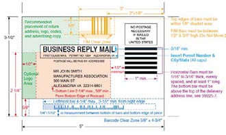
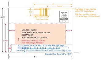
Not just any mail house can participate in this specialized delivery process. The postal service requires the sender to be registered with certain mailing capabilities confirmed. Check with your printer to see if they have the die-cutting and mailsorting capabilities required for CMM shipments. The special standards for designing Customized MarketMail are in Quick Service Guide 705a.

With a huge size, almost any shape, and minimal restrictions on materials, Customized MarketMail is the place where creative postcard inspiration can flourish. CMM will cost you extra, but the dramatic impact of sending attention-getting shapes in the mail may be worth the expense (Figure 5).


Printing Postcards

Postcard printing is fairly straightforward. You can output at your local press or find lots of affordable options from online printers.


Base Stock

If you want the Post Office to process your cards automatically, the stock must be between 0.007″ and 0.016″ thick, and bar-coded pieces more than 4-1/4″ high or 6″ long (either dimension) must be at least 0.009″ thick. Rigidity is also an issue; make sure the stock isn’t too flexible.

In general, avoid patterns, textures, and colors of more than 10% density from white. Within these guidelines, there may be plastics or other non-paper materials that qualify for postcard or letter rate. If you use a stiffer plastic or heavily laminated stock, the rigidity may bump it up to an “automated flat” rate. Check stock samples with the Mailpiece Design Analyst at the nearest Postal Business Service Center, because only they can make the final call.

As you discovered in the section “Shapes: Beyond the Standard Rectangle,” paying a little extra for a “flat” rate or manual handling opens up many more options for mailing postcards made of different materials.


Varnishes

Flood varnishes or coatings can add a nice look and feel to the finished card, but that’s not everything to consider. You may want to keep the postcard surface uncoated or matte so it’s easier to write on, especially if it’s a survey or appointment card. For a calendar or reference postcard that’s intended to be kept and handled repeatedly, adding a heavy laminate or UV coating will make the card more durable.


Inks

Don’t use metallic inks for addresses, because the reflection makes the text unscannable. Also be sure to keep the address color darker than the surrounding area, with a color contrast of at least 15% from the base it’s printed on. Black ink for addresses is the safest choice, and what the Post Office recommends.


Color Control

There are amazing deals online for printing large quantities of color postcards. Many times, these cards are batch-printed with other orders, so your postcard may be one small section of a ganged-up press sheet. You may not have the opportunity for exacting color adjustments and can reasonably expect to get “pleasing color” results only. If your project needs precise color execution, beware, but if pleasing color is acceptable, then by all means give these options a try.


Tempting Templates

With all of these production criteria to consider, optimal postcard design might be more complex than you originally thought. It’s tempting to use a template for guidance. Postcard templates are available from printers and the postal service, and as part of support files that ship with InDesign and Illustrator. But beware that each source has its own agenda. Printers are most concerned about where the ink hits the paper, the Postal Service is simply enforcing pre-sorting and automated mail processing, and the design programs encourage creativity without worrying about critical aspects for mailing (Figure 6).
InDesign postcard template
Figure 6: When you overlay the postal guidelines for positioning text and graphics, it’s clear that this InDesign postcard template is not a good layout example to follow.
Get commercial postcard printing templates and US Mail layout guides.

As I’ve mentioned in previous sections of this article, the Postal Service offers working template files for BRM and CRM, and plastic templates with measurements and guidelines. These are your best bet to ensure that your design qualifies for the lowest possible rates and the most delivery options.

Adobe’s InDesign and Illustrator postcard templates are problematic because they don’t follow the best practices described in this article. In fact, as Figure 6 shows, some of them wouldn’t even be mailable! However, they’re fine for visual inspiration before you get into production setup.

InDesign CS3 and CS4 templates are in Library > Application Support > Adobe Templates > InDesign in their respective version folders, with a postcard example in the Business Sets folder. You can also navigate to the InDesign examples by choosing File > New > Document from Template. In Illustrator CS3, check out Cool Extras > Templates to find folders with Basic and Inspiration examples, and in Illustrator CS4 look in the Cool Extras > en_US > Templates for a few options.

Performing Postcards

The point of any postcard is to deliver a message. Many marketing postcards are meant to be returned to the sender so the message impact can be measured. Whether they come back by mail or in person, you as the designer can improve the return rate. For example, use the Business Reply Mail (BRM) or Courtesy Reply Mail (CRM) layout formats. Those little black bars help with automated pre-sorting for return delivery that can dramatically reduce time in transit.
 
A strategy that encourages in-person returns is to design a postcard that takes on an additional role: an event invitation can also act as an entrance ticket, a sale announcement can do double duty as a coupon, even a simple schedule reminder can become an active appointment card. People lining up with postcards in hand is proof that the mailing was effective.
 
Some postcards are sent out, and meant to be saved. Beautifully designed postcards can earn a permanent spot on bulletin boards, scrapbooks, walls or refrigerator doors as art that constantly reminds people of their source and message with creative visuals they don’t mind displaying.
 

Better Postcards by Design

Based on its dimensions and setup, a mail piece can qualify as a postcard, letter, automated flat, Customized MarketMail or package. Add in lower rates for pre-sorting and bulk quantities, discounts for Non-Profit Organizations, and surcharges for manual handling, and there are lots of factors that determine the actual cost of mailing. Don’t worry, there’s a friendly neighborhood Mailpiece Design Analyst (MDA) to check your work and make sure it fits the criteria. Run a sample of your project past the MDA at any Postal Business Service Center for a free mailing evaluation, find the one nearest to you at https://tools.usps.com/go/POLocatorAction!input.action

As designers we can create postcards that people may glance at and toss out, or that catch their attention with immediate visual impact. Beyond the design of your message, there are plenty of ways to layout your postcard for optimal results. With a very straightforward printing process and a fraction of the cost of other delivery options, these little mailers can be valuable communicators.


Cathy Palmer is an award-winning graphic designer who has worked in both the creative and production sides of publishing. She currently provides digital media skills training and seminars on graphics applications, teaching designers how to build smarter pages and let their computers do most of the work so they can focus on the creative stuff.

From InDesign Magazine. Each issue gives you tips, techniques, and time-savers by an all-star cast of industry experts.

Also see Business Card Design Concepts in InDesign

Subscribe to our weekly newsletter and get an instant 20% off your first print project.

Name(Required)
This field is for validation purposes and should be left unchanged.

RELATED MARKETING & DESIGN TIPS

Fair and Square Binding

Get Square Back Binding on your catalogs and booklets for added usability and class

Read More >


Envelope Printing and Design

Get envelopes printed online with sustainable printing options and visual flair to boost your response rates. Learn more on how to create effective designs.

Read More >


Shipping and Delivery

Everything you need to know about getting your order shipped to you when you need it, including making shipment changes and tracking your order

Read More >


Color Printing Design Tips

Color Printing Design Tips

Getting Started with your Graphic Design

Designing your own printed piece can seem like a challenge. These handy hints will help you with the process. Here are the first steps.


Color Printing Design Guide
  1. Decide the purpose of your piece. Ask yourself the following questions:
    • Who will be reading it?
    • What is the main point you want them to remember?
    • What do you want them to do when they read the material (What is the “call-to-action”)?
    • How will you be distributing the piece (does it need to have a mailing panel)?
    • What is your budget?
  2. Decide on a format and size for your design.
  3. Sketch a mock-up of the piece before you start your digital design and layout.
  4. Understand your choices about color, type, resolution and layout.
  5. Get on the computer and have fun!

Design with Color

The best designs are simple. Clean lines, organized structure and minimal clutter will ensure that people read and remember your piece. Use a limited set of colors throughout your layout to keep the design consistent. Choose a color for each area of interest including:
  • Titles — Headlines, Subtitles
  • Body Copy — Captions
  • Graphics — Borders, Lines, Clip Art

Monitor-to-Print Comparison

Image Resolution

Resolution is the measurement of the number of pixels of color information in an inch.
image resolution for printing
Low Resolution (72 dpi)
 
Good Resolution (300 dpi)
Low resolution images look choppy and lack detail. Super-high resolution (over 400 dpi) will produce large file sizes and longer upload times, with no improvement in visual quality.
 

The Rules of Resolution

  • Images should be 300 dpi (dots per inch) at the final size in the layout.
  • The settings used during the original “capture” of an image (ie: scanning, digital camera, etc) determine its base resolution. Resolution can only be improved by decreasing the image size, or by recapturing the image at a higher quality setting.
  • Images which include text should be 400 dpi at the final size in the layout.
  • Resolution and image size are inversely proportional to each other. Enlarge an image, the resolution decreases; reduce an image, the resolution increases. Example: a 2″ x 2″ image at 300 dpi (acceptable) enlarged to 4″ x 4″ has a new resolution of 150 dpi (unacceptable).
  • Low resolution images print fuzzy, jagged and blurry.
  • Recommended minimum resolution for printing is 300 dpi; computer monitors generally have a display setting of 72 or 96 dpi. If we indicate that some of your images have low resolution, they may look fine on your computer monitor but will likely appear blurry or pixelated in print.

Things to Avoid

  • Web images are predominately low resolution (72-96 dpi) GIF or JPEG files. This resolution is good for quick transmission over the internet, but is not acceptable for use in printing. Do not save images or graphics from a website to use in your print project!
  • Upsampling is when a low resolution image is saved to a higher resolution with no changes in dimensions. Upsampling adds more pixels/dots per inch (dpi), but creates blurry images, ugly blocks of color, and high contrast in images. The only way resolution can be improved is by decreasing the image size, or by recapturing the image at a higher quality setting.

Spot Color or 4-Color?

Spot colors (also called PMS colors) use ink that is custom mixed. Generally, spot color is used with 1- or 2-color printing. Inks like fluorescent orange, metallic gold or Pantone colors are examples of spot color. For more color choices at a lower cost, use CMYK color in your design. Full-color photos are always printed in CMYK.
 

Black and Rich Black

rich black formula
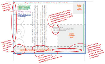
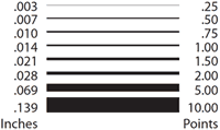
Black colors in print are not all the same. On computer monitors, all blacks will generally appear consistent. But on press, different ink combinations can create a wide range of blacks. When black is the text color, use flat black (CMYK 0-0-0-100) for the best results. If you have a solid black area larger than two square inches, we recommend using a “rich black” for a darker, more uniform color. The rich black color build we recommend is 50-35-15-100.
 

Background Color

Make sure your design has enough contrast between the type color and the background color. The examples below show how font and background colors can cause readability issues.
background color example
 

Number of Fonts

Minimize the number of font styles for your entire design (preferably 3 or less). Keep it simple! Read more about designing with text.
 

Type Size and Color

Type smaller than 10 point can be difficult to read. Type smaller than 14 point should be made with 3 or fewer of the CMYK colors to avoid mis-registration.
 
font size chart
 
line width chart

Line Width

“Hairlines” or very thin lines will not print well. Set line thickness to at least .25 points or .003 inches in width. A one or two-point line looks great around photographs.
 

Bleeds

“Bleed” refers to images or graphics that go to the edges of the paper on the final printed piece (also called “full bleed”). printing bleed diagram
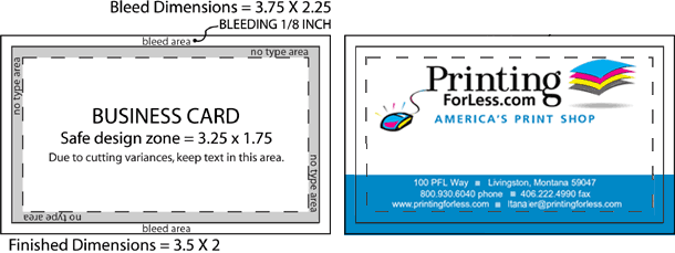
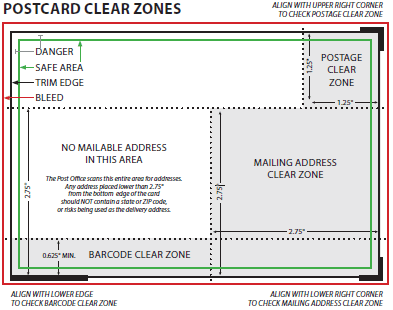
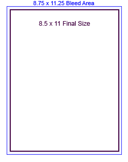
When designing for bleed, you should make your document .25″ larger on both your horizontal and vertical dimensions. For instance, if the final size of your piece is 8.5″ x 11″ then make your document 8.75″ x 11.25″. Add guides to your layout that are .125″ from the edge all the way around. Now create your design with the idea that the layout will be cut off where those guides are – because that is exactly what will happen. Make sure that any photographs or backgrounds that you want to bleed go clear out to the perimeter of the document, past the guidelines. After your piece is printed, we will trim off that extra .125″ all the way around, leaving you with color all the way to the edges!
 

CMYK: The Formula for Success

Full-color printing, also called “4-color process,” uses Cyan (C), Magenta (M), Yellow (Y), and Black (K) inks in different percentage combinations to create the colors we see in print. By specifying your design elements using a CMYK formula, you can be confident that you will get the colors you want. Create your design in CMYK color instead of RGB whenever possible.
 
The swatches below are CMYK color builds, shown with their “recipes,” or C-M-Y-K percentages. If your graphic arts printing file specifies any of these color combinations, the colors in your final piece will turn out very close to what you see here. Your printer and monitor may preview different results, but this is what you can expect.
 
Request a Design Guide below.
Need help preparing your graphic arts printing file?
Call our helpful print experts now at 800-930-6040.
Get Free Print & Paper Samples

Subscribe to our weekly newsletter and get an instant 20% off your first print project.

Name(Required)
This field is for validation purposes and should be left unchanged.

RELATED MARKETING & DESIGN TIPS

Edit PDFs in Adobe Illustrator

Improvements to the PDF format (thanks to Adobe Acrobat’s ever-increasing functionality) in recent years has meant much more flexibility in editing workflow.

Read More >


Color Printing Design Tips

Designing your own printed piece can seem like a challenge. These handy hints will help you with the process. Here are the first steps.

Read More >


Begin with Finishing

Step by step tutorial on folding and finishing layouts in Adobe Indesign.

Read More >


Color in Process Printing

Color in Process Printing


About RGB-CMYK

  • Scanners, digital cameras and computer monitors use red, green and blue (RGB) light to display color.
  • Commercial printing presses print with cyan, magenta, yellow and black (CMYK) ink, called process printing, instead of RGB light, and therefore produce a different range of color.
    See 4 color process printing explained for more info.
  • To print on a four-color press, all RGB files must be converted into CMYK color.


RGB colors with lights

                                 CMYK colors with ink

RGB lights combine to make white         CMYK inks combine to create black
 
  • Certain RGB colors that you can see on your monitor (in particular, bright blue, green and red) cannot be replicated with standard CMYK inks. These unachievable RGB colors are said to be “out of the CMYK color gamut.” When selecting colors for your print project, use CMYK color builds to avoid potential RGB conversion issues.
  • You are more likely to notice color shifts with solid bright backgrounds.
  RGB colors on a monitor                             CMYK colors on a press


RGB Colors              CMYK colors
(what you see on screen)      (printed with ink)
 
 
RGB in photos       RGB on a press
 
Color photographs do not suffer much from the
RGB-CMYK conversion.
 
Video about RGB and CMYK color

Learn about RGB and CMYK color Video


RGB – CMYK Conversion

All RGB files must be translated into CMYK. This conversion can be easily done in most image editing or graphic arts programs.
  • Our print consultants can convert your RGB files to standard value CMYK colors for print. If you have specific color concerns, you can also speak with one of our professional designers for more control over the final print.
  • You will have more control over the appearance of your printed piece if you do the color conversion yourself. We want you to be happy, so please take the time to prepare your file properly. Give us a call at 800-930-2423 for assistance.
FAQs
 
How well will my job match what I see on my monitor?
 
Will the colors match a sample I print out on my own printer, or a previously printed sample?
 
What is the difference between the RGB and CMYK color space and why does it matter?
 

How well will my printing match what I see on my monitor?

Most people are surprised at how well their print job matches what they see. But because of wide differences in monitor calibration and the different technologies used, some printed colors may not exactly match the colors on your specific monitor. Please see our RGB – CMYK Information page for important instructions on getting the results you want. Our Design Hints page has additional information and illustrations.
 

Will the colors match a sample I print out on my own printer, or a previously printed sample?

At Printing for Less we calibrate our equipment to a very rigorous industry standard for ink density and color. Due to variation in conditions and equipment, we do not recommend using home or office printers to predict how images or color will render when printed at our facility.
If you require precise color match, please contact us to arrange for a digital color proof. We will produce and send you a hard proof on equipment calibrated to our standard. When you approve and return the proof, we will strive to match the color of the proof when printing your final piece.
There can be additional charges for precise color match services. Also, if you request color correction or other changes after you see your proof, there could be charges for color correction time and a new proof.
Bottom line: the final product we produce for you is unlikely to match the output from your inkjet – it will look more professional!
 

What is the difference between the RGB and CMYK color space and why does it matter?

RGB refers to the primary colors of light, Red, Green and Blue, that are used in monitors, television screens, digital cameras and scanners. CMYK refers to the primary colors of pigment: Cyan, Magenta, Yellow, and Black. These are the inks used on the press in “4-color process printing”, commonly referred to as “full color printing” or “four color printing”.
The combination of RGB light creates white, while the combination of CMYK inks creates black. Therefore, it is physically impossible for the printing press to exactly reproduce colors as we see them on our monitors.
Many programs have the capability to convert the layout/images from the RGB color space to the CMYK color space. We request that you convert your colors from RGB to CMYK if your tools allow you to. By doing it yourself, you have maximum control over the results. You may notice a shift in color when converting from RGB to CMYK. If you do not like the appearance in CMYK, we recommend that you make adjustments while working in CMYK (usually lightening). Generally, you should specify CMYK color builds that look a little lighter than you want, since the dots of ink “fatten up” on press, giving you more pigment on paper than you see on your monitor. Be especially careful to keep backgrounds light if there is black or dark colored text over it, so that the text remains readable.

See our RGB and CMYK Information page for more details.

Subscribe to our weekly newsletter and get an instant 20% off your first print project.

Name(Required)
This field is for validation purposes and should be left unchanged.

RELATED MARKETING & DESIGN TIPS

What is EDDM

One of the best tools for reaching customers in a geographical area is Every Door Direct Mail, a cost-effective way to market locally.

Read More >


Printing Pricing Information

Get printing prices instantly for full color printing of all your marketing materials at discount prices. Personal support, high quality, fast turnaround.

Read More >


Magnetic Business Card Printing

Get high quality magnetic business cards printed with numerous custom options, fast turnaround, live expert help and award winning service

Read More >


  • « Go to Previous Page
  • Page 1
  • Page 2
  • Page 3
  • Page 4
  • Interim pages omitted …
  • Page 7
  • Go to Next Page »

Footer

Printing for Less

info@printingforless.com
100 P F L Way, Livingston, MT 59047

800-930-2423

  • Home
  • Products
  • Services
  • Industries
  • Get Samples
  • Direct Mail Marketing Resource Center
  • Printing Resource Center
  • Blogs
  • Templates
  • Terms & Conditions
  • Contact
  • About Printing for Less
  • About P F L
  • Our Team
  • Careers
  • Login

Copyright © 1998-2025 PrintingforLess.com. All Rights Reserved.

logo
  • 800-930-2423
  • Products
  • Direct Mail Marketing
  • Services
  • Industries
  • Direct Mail Marketing Resources
  • Printing & Mailing Resources
  • Get a Quote
  • Contact Us
  • My Login
Catalog Printing

Subscribe to our weekly newsletter and get an instant 20% off your first print project.

Name(Required)
This field is for validation purposes and should be left unchanged.

*Some exclusions apply. See details