• Skip to primary navigation
  • Skip to main content
  • Skip to footer
Printing for Less

Printing for Less

At Printing for Less, we've offered high quality online printing services since 1996. Shop business cards, booklets, stickers, and more!

P F L.com
My LoginMy Login
800-930-2423
  • Printing
    • Postcards
    • Catalogs
    • Brochures
    • Folders
    • Letters
    • Newsletters
    • Envelopes
    • Greeting Cards
    • Print Templates
    • All Products
  • Direct Mail
    • Why Direct Mail Marketing?
    • Every Door Direct Mail® Postcards
    • Direct Mail Letters
    • Catalogs & Booklets
    • Marketing Gifts & Kits
    • Direct Mail Automation
  • Services
    • Mailing Services
    • Design Services
    • Custom Printing Services
    • Reseller Program
  • Industries
    • Advertising & Design
    • Enterprise
    • Food & Beverage
    • Healthcare Payers
    • Healthcare Providers
    • Nonprofit
    • Real Estate
    • Retail
    • Technology
    • University
  • Resources
    • Direct Mail Marketing
      Resource Center
    • Printing Resource Center
    • Blogs
    • Templates
    • Video Library
  • Get a Quote

Design & File Preparation

Graphic Design

< All Resources

Graphic Design Resources

Custom Printing Options
  • Getting Started
  • Graphic Design
  • Mailing
  • Marketing
  • Ordering Process
  • Printing Options

MOST RECENT


How to Set Up and Submit Canva Print Files

Get perfect prints every time with our new Canva print-ready guide! This helpful resource shows brands and designers how to prepare their Canva designs for smooth printing. Grab the guide and make your next print project a success.

Read More >


Postcard Design in InDesign for Postcard Marketing Success

Tips on easily using InDesign to design postcards from conception to printing, including sizes, back design, images, ink, templates, paper, indicias and mail layout guidelines.

Read More >


File Formats

Wondering what files are best for commercial printing? At Printing for Less, we accept almost every file format. See all accepted file formats here.

Read More >


Build a Calendar in InDesign

Learn step by step how to easily build a calendar in InDesign using a script and free templates.

Read More >


How to Edit PDFs in Adobe Illustrator

Learn how to edit PDFs in Adobe Acrobat and Adobe Illustrator like a professional in this step-by-step guide. Start modifying PDF documents with ease!

Read More >


Edit PDFs in Adobe Illustrator

Improvements to the PDF format (thanks to Adobe Acrobat’s ever-increasing functionality) in recent years has meant much more flexibility in editing workflow.

Read More >


4 Color Process Printing

Explanation and description of how four color process printing works and how a color separation is made.

Read More >


Graphic Design Layout Specifications for Printing

Make sure your printed products fit into their dimensions with this guide on graphic design layout specifications for various printing projects.

Read More >


Digital Printing vs Offset Printing

What are digital printing and offset printing? Knowing the difference between digital and offset printing can save costs in the long run.

Read More >


Design Postcards in InDesign to Connect

Make sure your message is delivered by laying out and printing postcards correctly.

Read More >


Custom Die Cutting: Stand Out From the Crowd

We all need to stand out from the crowd occasionally, and this rings true when it comes to your printing and marketing materials.

Read More >


Which Paper to Use

Learn how to choose paper for your business cards, booklets, brochures, greeting cards, and other print marketing materials. See paper options and get design tips here.

Read More >


Choosing the Best PDF Preset in InDesign

Choose the best Adobe InDesign PDF presets for printing. This guide covers ‘high quality print’, PDF/X-1a, PDF/X-4 presets, and custom Adobe PDF presets.

Read More >


CD Cover Size Specifications

See standard CD cover dimensions, layout specifications, guidelines, and design tips for printing CD covers and CD inserts. Guaranteed quality & delivery.

Read More >


What is Embossing or Debossing?

What is embossing and debossing? It’s smooshing paper, but it’s really cool. Find out more about how to effectively use this advanced printing technique.

Read More >


Business Forms and Invoice Form Samples

Read More >


Business Card Size Specifications

See standard business card dimensions, layout specifications, and guidelines for printing business cards and folded business cards for commercial printing.

Read More >


Knowledge Center: Graphic Design

Get graphic design tips, how-to’s, and articles to help you create, print, and grab attention with your designs. Learn more in our knowledge center.

Read More >


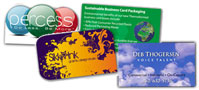
Business Card Examples, Printing Samples and Design Ideas

See how professional printing and design can up the impact of your business card with these business card examples, printing samples, and design ideas.

Read More >


About RGB and CMYK

How to convert RGB to CMYK in Adobe Photoshop, Illustrator, and more graphic design programs for commercial printing. Hint: We convert RBG to CMYK for free!

Read More >


Build a Calendar in InDesign

One of the best and easiest ways to make a calendar is to use a template designed by someone else. Search for the word “calendar” in the InDesign section at the Adobe exchange and you’ll find a number of free…

Read More >


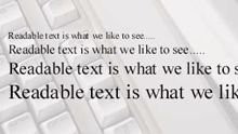
Text and Type for Printing

Tips and advice on how to work with text in your graphic arts files used for full color commercial printing

Read More >


Letterhead Design and Printing

Read More >


Envelope Printing and Design

Get envelopes printed online with sustainable printing options and visual flair to boost your response rates. Learn more on how to create effective designs.

Read More >


Saving PDF Files in Photoshop and Illustrator

Learn how to save PDF files in Adobe Photoshop and Adobe Illustrator by exporting your work as a PDF file, as well as the benefits of saving files as PDFs.

Read More >


The Psychology of Color in Marketing

Create more effective marketing materials and a stronger brand by understanding the influence and psychology of color

Read More >


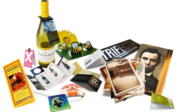
Innovative Print Marketing Design Ideas

Examples of innovative ideas to enhance your print marketing with numerous custom printing options

Read More >


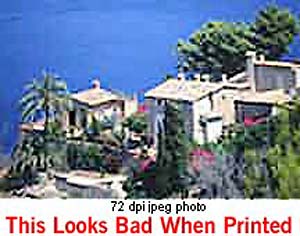
Preparing Photos for Print Projects

You’ll learn how to use resolution and sharpening to improve digital photos so that they look crisp and sharp in your printed projects

Read More >


Postcard Design Tips

Postcard design tips for effective printing and marketing of full color postcards.

Read More >


Color Management 101 – Monitor Calibration

We demystify certain elements of color management and suggest helpful tools for monitor calibration and profiling for better printing accuracy

Read More >


Clear Business Cards

Get clear plastic business cards printed with numerous custom options, fast turnaround, free templates, live expert help and award winning service

Read More >


Church Donation, Remittance and Offering Envelopes

Full color custom printed full flap remittance envelopes and church offering, collection and donation envelopes for churches, non-profits, and schools

Read More >


Design Tips for Commercial Printing

If you are scanning the iages yourself from photographs it is better to save them in either tif, or eps format.

Read More >


Horizontal Small Catalog Design

Need help designing a small horizontal catalog (8.5 x 5.5)? This guide walks you through our process of creating a unique design and execution! Learn more.

Read More >


5 Steps to Producing a Great Catalog

5 step catalog marketing strategy that will help you produce a successful catalog to bridge online and offline sales channels.

Read More >


Creating a Successful Catalog Design

A catalog’s design is essential to its success. Master your catalog design and learn to make a captivating catalog with our expert tips. Start designing!

Read More >


Business Cards with Pantone Inks and Spot UV

Get Pantone spot color and spot UV printing on your business cards to stand out from your competitors

Read More >


Brochure Design Analysis

This brochure needs to appeal to fly fishers who may have an open day or two during their visit.

Read More >


Gate Fold Brochure Design Review

How to use four color printing, unique folds and custom paper to reel in guests at a Montana guest lodge.

Read More >


Large 3 Panel Brochure Design Review

Presentation of your product is important with any brochure, but when your product is food, extra special care must be taken to entice the customer rather than repel.

Read More >


Half Fold 11×17 Brochure Design Review

Need to target a specific group or audience for you next brochure? Informative brochures are a fantastic way to educate your customers about a specific function or product.

Read More >


Box Toppers Printing

Box toppers are a great way to share coupons, information, and new menu items with your customers. Print custom box toppers with Printing for Less.

Read More >


Bottle Necker Design

Get custom Bottle Neckers, neck tags and bottle neck hangers, popular for wine bottle tags and marketing anything sold in bottles.

Read More >


Coating for Printing

Descriptions of uses of uv coating and varnish coatings used on printed materials for protection or to achieve visual effects.

Read More >


Graphic Design Help
Marketing & Design Tips

Guides
Jumping into the world of printing? We’ve put together these handy resources to help you get your footing.

Explore >

Advertising & Design
Templates

Templates
Pre-made templates are a great way to springboard your creativity and make sure everything is laid out exactly the way you need it. Utilize one of our printing templates and speed up the printing process even more.

Explore >

Printing for Less services the technology industry.
Blog Articles

Blog Articles
We’ve compiled a list of our best blog posts to help you dive into custom printing

Explore >

Design Tips for Commercial Printing

Design Tips for Commercial Printing

Get Many More Print and Design Tips in our Help Center

What Types of Images Will Work Ok?

If you are scanning the iages yourself from photographs it is better to save them in either tif, or eps format. These image formats will preserve the color and sharpness of your pictures the best.


File formats like gif or jpg compress the pictures color and pixel resolution and this can cause color shifts and blurriness. Since jpg and gif are the most predominant image formats on the weit follows that it’s not a good idea to simply lift an image from someone’s website and use it in your layout.low resolution image


You should scan your images using a resolution of 300dpi at the final dimensions you intend to use them so that your colors will look smooth, and hard objects will look sharp. In other words don’t scan at 300dpi and then enlarge the picture by 200% in your layout program! This is another reason why you should not use images that are lifted from websites; they are probably only 72dpi in resolution and will look very blurry if printed on a printing press. See our Resolution page for more information on resolution.


If you are using pictures from your digital camera they will work just fine if they are jpgs; the quality of jpg images from digital cameras seems to be much better than jpgs that are used on the web. You must do the math to make sure that it is high enough in pixel resolution though. For instance, if your camera puts out a typical image of 1280 x 960 pixels at 72dpi you get about 17″ x 13″ of photograph (at 72dpi); this is the same amount of detail as an image which is 4″ x 3″ at 300dpi so it’s safe to reduce or enlarge that image in Publisher up to about 4″ x 3″ in dimension.

Do I need to send you my fonts?

If you use only the fonts that came with MS Publisher then no. We have them here too.


But if you use any other fonts from other sources then we most likely do need you to gather up copies of them and archive them together using a program like Winzip and send them to us with your layout file.


If you don’t know how to do this then just carefully go through your document and make a list of the fonts used. Send that list to us in an email along with your order reference number so that we can see if we have your typefaces.

Will my printed piece look exactly like it does on my computer monitor?

There are some small differences. Scanners and digital cameras create images using combinations of just three colors: Red, Green and Blue (called “RGB”). These are the colors that computers use to display images on your screen. But printing presses print full color pictures using a different set of colors: Cyan (blue), Magenta (red), Yellow and Black (called “CMYK”). So at some stage your RGB file must be translated to CMYK in order to print it on a printing press. This is easily done using an image editing program like PhotoShop or Corel PhotoPaint.
 
Caution: It’s Best If You do the RGB-to-CMYK Conversion of Your Images!
 
You will have more control over the appearance of your printed piece if you convert all of the images from RGB to CMYK before sending them to us. When we receive RGB images, we do a standard-value conversion to CMYK, which may not be perfectly to your liking. We want you to be happy, so please, take the time to prepare your file properly. We cannot be responsible for sub-par results if you furnish low-res images or RGB images.
 
Be aware that it is possible to make colors in RGB that you can’t make with CMYK. They are said to be “out of the CMYK color gamut”. What happens is that the translator just gets as close as possible to the appearance of the original and that’s as good as it can be. It’s something that everyone in the industry puts up with. So it’s best to select any colors you use for fonts or other design elements in your layout using CMYK definitions instead of RGB. Please see our RGB – CMYK Information page for important instructions on getting the results you want.
rgb colors
RGB colors
(what you see on screen)
cmyk colors
CMYK colors
(printing inks will do this)
rgb colors
RGB colors
(what you see on screen)
cmyk colors
CMYK colors
(printing inks will do this)
You most likely won’t notice this kind of color shift in a color photograph.
It is more likely to happen if you pick a very rich, vibrant color for a background or some other element of your layout. It probably won’t look bad, it just won’t look exactly the same. But it may not be noticeable at all either. In any event it will look spectacular compared to a piece printed on an inkjet printer.


Color photos don’t suffer much from CMYK translation
rgb image
RGB picture
(what you see on screen)
cmyk image
CMYK picture
(printing inks will do this)
 

Can I use colored text?

mis-registered text


             Small text magnified
 
Small text magnified

It’s best not to colorize small text. What happens is that all printing presses have a little bit of variance in the consistency of the position of the different color plates. This is called misregistration. The cyan, magenta, yellow and black portions of the text characters don’t line up exactly. So the result is little colored halos around the characters. It’s ok to use colored text on large, headline type, or smaller sizes down to about 12 point size, but much smaller than that will be too noticeable and you won’t like it. The same thing holds true for white (knock-out) text on a dark or colored background. You can do it but don’t use point sizes smaller than about 12 point. Otherwise the words may be hard to read and it will look unprofessional.

Can I put text over an image?

Be careful about using photographs for backgrounds. If you put text (any color) on top it can be very hard to read. So the secret is to lighten the photograph a lot–more than you may think is necessary. Use a photo editing program like Photoshop, Paint Shop Pro or Adobe Elements.

text over dark backgound text over light background


What are bleeds, and do I need them?

bleeds
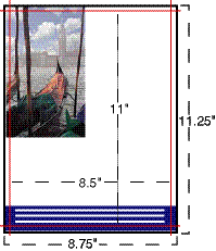
Bleed is the term for printing that goes right to the edge of the paper. The way to do this is to make your document .125″ too big in both dimensions. For instance, if the final size is 8.5″ x 11″ then make your document 8.75″ x 11.25″. Draw guides on the layout that are .125″ from the edge all the way around. Now create your design with the idea that the layout will be cut off where those guides are….because that is precisely what is going to happen. Make sure that any photographs or backgrounds that you want to bleed go clear out to the perimeter of the document, past the guidelines. Then after we have printed your piece we will trim off that extra .125″ all the way around and voila! You have color all the way to the edges of your piece. It looks professional….

Not Sure We Can Print From Your File?

If you are not sure that your file will work, you can send it to us and we will examine it
to see if there are any major flaws that would prevent us from printing your job.

Recommended Graphic Arts and Printing Books and Software
Have questions about your print project?
Give our helpful experts a call at 800-930-6040 or Request a Quote.


Subscribe to our weekly newsletter and get an instant 20% off your first print project.

Name(Required)
This field is for validation purposes and should be left unchanged.

RELATED MARKETING & DESIGN TIPS

Packaging: Box Dimension Guidelines

How to determine and specify the length, width and height for a folding box for product packaging design.

Read More >


Leveraging Direct Mail Throughout the Customer Lifecycle

Direct mail can serve as a powerful tool across every stage of the customer lifecycle. With our exclusive guide, you’ll access 13 turnkey strategies that seamlessly integrate direct mail with your digital campaigns, helping you drive more revenue and enhance…

Read More >


Direct Mail 2025 – Emerging Trends and Strategies

As 2025 unfurls, direct mail marketing is set for an exciting and dynamic transformation fueled by technology and shifting consumer preferences. Read all about it to get a head start in the new year.

Read More >


5 Steps to Producing a Great Catalog

5 Steps to Producing a Great Catalog

Montgomery Ward Catalog cover

Catalogs have come a long way from the first version distributed by Montgomery Ward in 1872. Today, they come in all sizes and are part of an omni-channel marketing strategy that provides customers with a seamless brand experience through all available purchasing channels.


catalog marketing stats 1
 
Catalogs are a cost-effective way to get a great deal of information in front of your customers in an eye-catching, physical format. They have staying power in the hands and homes of customers who read and refer to them for ordering and browsing. Options range from brochures, to saddle stitched, coil bound, and square back bindings.
 
catalog marketing stats 2
 
Here are five key steps to producing a catalog that will increase sales.
 

1. Determine Your Audience

Understanding your audience is the first step to creating a successful catalog. Customer data and insights should precede your decisions such as to whom you will send, what you will feature, and what you will say. Give customers a product that makes their life easier and more informed, and they will use it.

2. Select Products or Services

Once you determine your target market, examine your selling strategy with a fine-toothed comb. Take a critical look at big sellers, so-so sellers and the duds. Review other marketing-channel sales to determine what items will resonate best with a wide variety of customers. Advancements in digital printing allow for variable data that give you the ability to personalize catalogs for specific customers or prospects.

3. Create Your Layout

We have all gone into stores and noticed items strategically placed to maximize exposure. Think about presenting your catalog in the same way. Merchandising is important to ensure not all products are weighted equally. Customers want to know what’s new and exciting, so guide them.

4. Craft a Support Strategy

Your catalog should not be a stand-alone initiative. Instead, think of the catalog as one tool in a multi-channel approach. Use catalogs to drive to your website or social media pages. You can also utilize direct mail and postcards to follow up with information about upcoming sales, events, or services. Omni-channel marketing gives customers a seamless brand experience through all available purchasing channels.

5. Analyze and Assess

Analyzing the performance of your catalog is an important part of refining and perfecting your strategy. You can gain insights that not only help you with your sales strategy, but also your product or service offerings. Look at what sold well and what didn’t to understand page conversion. If you had any specific offers or calls to action, make sure you have a way to quantify those results as well. Tune and tweak until you have dialed in a winning strategy.

catalog marketing stats 3
 
Some nice catalog designs from our customers:
 
catalog design sample catalog cover example catalog sample example catalog
 
View more catalog designs showing different catalog design and marketing ideas.

Subscribe to our weekly newsletter and get an instant 20% off your first print project.

Name(Required)
This field is for validation purposes and should be left unchanged.

RELATED MARKETING & DESIGN TIPS

Using Die Cutting on Brochures

Get unique die cut brochures printed that will cut through the clutter in the mailbox and get your message noticed.

Read More >


Digital Printing vs Offset Printing

What are digital printing and offset printing? Knowing the difference between digital and offset printing can save costs in the long run.

Read More >


Shipping and Delivery

Everything you need to know about getting your order shipped to you when you need it, including making shipment changes and tracking your order

Read More >


Creating a Successful Catalog Design

Creating a Successful Catalog Design

catalog design examplesCatalogs are a ubiquitous part of many companies’ marketing initiatives, and are one of the most powerful marketing vehicles for getting the word out about products and services. Think about it: we receive catalogs in the mail and pick them up on the way out of stores. They even come in the packages we receive, allowing us to peruse and shop after the initial sale. And many times, catalogs continue to stick around, found on our counters with dog-eared pages and favorite products circled or marked.

But not every catalog we receive sticks around for long. Some get a hasty glance, while others are not even cracked open before going directly into the recycling bin. Just because you put everything and the kitchen sink in your catalog doesn’t mean every potential customer who gets it will spend precious time poring over it, especially if it is boring or lacks direction.


Catalog Design Matters

Eye-catching design, smart layouts, appealing images and organization are cornerstones to good catalog design. Add in the fact that different industries usually require different approaches: a big box sporting goods store’s catalog will look very different from a custom watch-maker’s. Consider this before diving in, as one size does not fit all in the world of catalog design.

So, where do you start? Let’s look at a few key ways to get a jump start on your catalog design with best practices.

Design for Your Audience

A catalog’s performance is tied to how well it sells. Tailor your catalog design to appeal to your target customer. If your target is a young audience it will be drastically different than a catalog for older folks. If you target multiple audiences you may consider doing multiple designs to match the style and desires of your audience.

Size and Format

Give your products the space that they need. When designing your catalog, make sure it is large enough to showcase your all of your products and draws attention to your most important products or services. Consider the page count, format and how it will make your customers feel. For example, if you are in a niche industry like custom watch-making or fine photography, you may want an austere layout with fewer items per page, highlighting the quality and uniqueness of the work.

Additionally, this kind of audience would probably also benefit from a higher quality paper stock, more careful consideration of image quality and color trueness. You will want your customers to linger over the pages, taking in the details and the “story” of your work. A good place to get expert advice is from your favorite printer. At PrintingForLess, we provide printed samples, technical help and guidance on how to get the best printed piece.

Use High Quality Images

Images of your products and services are the centerpiece of your catalog. Consider making images of high value products and services larger than those of products of lesser value. Great photos will make your products more appealing and increase sales. Make sure all your images are taken with good lighting and are of an adequate resolution for printing. We recommend 300 dpi or above for all images. More information on image resolution can be found here.

It Ain’t Over Yet…Analyze the Results of Your Catalog Design

Take the time to scrutinize and evaluate how your catalog performed for you. Consider the answers to the following questions:

  • What sold like crazy? Where was it in the catalog?
  • Were there any “duds” and where were they located in the catalog?
  • Did the overall look and feel of the catalog help or hinder your sales?
  • How quickly did you start seeing sales after your catalog release?
  • Also, be sure to ask your sales people how the catalog is doing, or for feedback from customers.

As you can see, a catalog is a process that takes time, commitment, patience and testing. And while all of this may seem daunting, once you get your system wired, you can use it over and over again. The right catalog formula will help drive sales and keep your customers coming back for more!

Some catalog designs from our customers:
catalog cover sample catalog cover example catalog sample example catalog


See more catalog designs showing different catalog design and marketing ideas.

Subscribe to our weekly newsletter and get an instant 20% off your first print project.

Name(Required)
This field is for validation purposes and should be left unchanged.

RELATED MARKETING & DESIGN TIPS

The Scenery From Here

Read More >


Door Hanger Marketing and Door Hanger Design

Printed samples of door hangers showing different designs and uses for targeted local door to door personalized marketing.

Read More >


Printing With Metallic Ink

When you venture beyond the familiar territory of cyan, magenta, yellow, and black, a wide world of color possibilities opens up for you.

Read More >


The Art of Business Card Marketing

The Art of Business Card Marketing

What’s Not in Your Wallet?

Your business card may be the most important advertising tool you have. Those little pieces pack a powerful punch simply because they’re inexpensive and easy to get in front of people.

Yet most people make the mistake of thinking printed business cards are just a vehicle for exchanging contact information. In our digital age, we have the Internet, PDAs and smart phones for that. To get real value from a business card, consider its true potential.

That commonplace card can be a key asset in your everyday marketing madness. Your business card is the one thing you should never leave home without. Ever meet a prospective customer unexpectedly while walking the dog? Or maybe you happened to spot a neglected roof in a friend’s neighborhood that was just ripe for your services? While sometimes you get a chance to introduce yourself and what you do, quite often all you have is that piece of paper to leave behind. So make it intriguing. Follow these tips to use that valuable advertising real estate wisely.


Five Steps for Business Card Marketing Success

1. Explain what you have to offer

Besides telling people who you are and where to contact you, make sure your business card tells people what you do. Hopefully your company name or your title says something about what you offer. If they don’t, add a few words to explain what you do. Either way, express what you do that makes you stand out. Let the world know about your “secret sauce” with a specific tag line or header. What perks and special services do you provide?
printed business cards

  • “Fresh ingredients, free delivery”
  • “Evening and weekend appointments available”
  • “Certified technicians that come to you”
  • “Best of [Your Town] Award Winner”
  • “Perfect events for every occasion”

2. Include a call to action or food for thought

Make space on your business cards to give prospects an enticing reason to call or visit, such as:

  • “Free consultation with this card – $50.00 value!”
  • “Visit YourSite.com for current specials”
  • “Exclusive titles available only at this location”
  • “Learn to speed read now and gain 87 hours this year”

If this approach doesn’t fit your company or position or you think it sounds too promotional, you could include a revealing or humorous quote or statistic. Use something that piques interest about you and your offering, reflects your sensibilities and tells the recipient you care about your work.

  • “Life’s too short to be miserable in your job”
  • “The details are not the details. They make the design.” – Charles Eames
  • “Cheese – milk’s leap toward immortality.” — Clifton Fadiman
  • “40% of men have noticeable hair loss by age 35”

3. Look professional and up to date

Treat yourself and your company with respect and get professional quality business cards. Sure, you could try to print them on your laser jet or go to a quick printer and pinch a few pennies. You’ll get what you pay for. And worse, your customers will question whether they can trust you with their business if it seems like you can’t afford to print nice full color business cards.

Pay attention to details. Flimsy paper, off-the-shelf designs and typos leave a bad taste. A business logo and email address are important for credibility, so invest in basic branding to show you’re the real deal. Use color and images for impact and basic design principles to make your business card pleasing and easy to read. Hire a designer for help, use customizable templates or see our Business Card Design Do’s and Don’ts for tips. Keep them in a case or in a protected pocket where they won’t get bent, marked up or scuffed.

Be proactive and keep your information up to date. Get your new business cards printing right away if any of your contact information or title has changed. Too busy, you say? You won’t be for long if you appear behind and disorganized when scratching out your email address…

4. Distribute strategically and considerately

Think of your business cards as tiny billboards with the potential to attract just the right people at just the right time.

  • Don’t be afraid to post them on public bulletin boards, stick them in doors or leave them in bowls for free drawings where your target audience might see them. Ask affiliated businesses to allow you to display your cards, such as paint stores if you’re a painting contractor. Keep them at your fingertips at parties, on airplanes and at the gym. Magnetic business cards can be used on metallic surfaces.
  • Capitalize on natural opportunities to hand them out when you’re talking about your business or someone asks how to contact you.
  • Don’t thrust them upon people uninvited or hand out more than one unless they offer to hand them out for you.

5. Maximize content and usability

You’re not limited to the front of your business cards, unless you want to use business magnets. Why not use the back for other info that you want to make available, such as office hours, client list or a small map to your store. Another option is to use a folded business card as a mini brochure.

Keep in mind that people often write on business cards, so leaving some white space on the back is generally a good idea.

Business cards aren’t going out of circulation anytime soon. Take full advantage of these bantam business boosters by investing a little time and energy into making them work for you.

Subscribe to our weekly newsletter and get an instant 20% off your first print project.

Name(Required)
This field is for validation purposes and should be left unchanged.

RELATED MARKETING & DESIGN TIPS

Thick Business Cards

Get extra thick 24pt business cards that get you noticed. Guaranteed high quality full color printing with round corners, die cutting and embossing options

Read More >


Specialty Printing Options

Trust the experts at Printing for Less with your specialty print. We offer a wide array of specialty printing options & services. Learn more.

Read More >


Real Estate Marketing Tips

Tips and resources on how to use print marketing and direct mail to expand your real estate business and make more sales

Read More >


Business Card Design Do’s and Don’ts

Business Card Design Do’s and Don’ts

The humble business card can boast some powerful results in marketing your business, if you create it with care. Since your card will linger long after your meeting’s over, think of your business cards as your unsung sales force; they need to reflect your company and your product the way you would. The key is to create a business card design that’s appealing, targeted and informative.


Make the Right Impression

The first decision a prospect makes is about you. Does your business card look and feel professional and convey the right image? Your visual identity on paper depends on several fundamental graphic design concepts and printing choices:

Color and Images

  • Do use color for interest and emphasis. It can be in your logo or other images, in text or in background elements. Stay with a maximum of 3-4 colors. Pull colors from your logo for other background elements and type colors.
  • Do match color tones. If you have bright colors in your image or logo, use black or other bright colors that work with it. If your colors are muted, earthy or pastel, stick to that scheme with the other colors.
  • Do include a photo if it’s a great picture of you and it’s appropriate. Photos are most useful in service type businesses where an ongoing relationship is a critical factor.
  • Don’t use clip art for your logo or other elements. You’re brand is your identity and these days you can easily find affordable images or get help with a custom logo online. Remember you want your business card to stand out in a memorable and positive way.
  • Don’t veer from other branded materials. Keep your business card design consistent with the general color and design scheme on your website, in your store, and other marketing materials.

Type

  • Do pay attention to alignment. Left align for easiest reading. Too much centered text can look cluttered and is hard to read.
  • Do limit your business card to one or two font types.
  • Don’t use decorative or unusual fonts for your name and contact info, unless it’s right for your business image. Use easy-to-read but not too generic fonts (such as Courier).
  • Don’t mix it up with different font sizes or text that is too small to read and print clearly.
  • Don’t use light colors that are difficult to read or have an excessively dark image in the background that obscures your text.

Composition and Format

  • Do keep it clean and simple. Avoid visual overload or clutter. Consider using the back of the card or create a folded business card if you need more space for additional info (multiple locations, map, appointment info, etc)
  • Do match the “tone” of the card to your market space. A more traditional professional services or real estate business card, for example, might stay more conservative in layout and colors, while a colorful or splashy card could fit the bill for a toy store or trendy restaurant.
  • Do strive for contrast and balance. Dark against light, opposite colors and large elements juxtaposed with smaller ones create contrast which attracts attention. Keeping the weight of elements relatively distributed on the card creates balance and pleases the eye, as do elements of similar tone or size. [example]
  • Do use bleeds to extend colored backgrounds or images to look like they’re “bleeding” off the edge of the card for a professional look.
  • Don’t cut it too close around the margins. Keep your logo and text away from the edges of the card. Be careful with borders or thin lines around the sides, since slight variances in cutting could make the lines look crooked or uneven.
  • Don’t use a non-standard size or shape. Unless you have a special need for it, stick to the usual 3.5 x 2 inch size to fit in most wallets, card holders and business card scanners. Rounded corners or other cut outs (called die-cuts) on the standard size, however, can add a distinctive touch.
See our Business Card Specifications page for more information on setting up your card with bleeds and safe margins. And see some business card design ideas and examples on our samples page.
 

Texture

  • Don’t use cheap, thin paper. The recipient will wonder about the quality of your product or service. Compare papers when shopping for business card printing services. You’ll want 12-14pt thickness for maximum impact and durability.
  • Do match the coating to your purposes. Go with gloss to make photos look beautiful. Select a dull or matte finish for smooth, non-shiny business card printing that’s easy to write on. Uncoated paper has a more textured feel that can look more formal and match stationery such as letterhead and envelopes. Request samples of our papers to see and feel the differences.
  • Do opt for custom finishing options such as embossing, foil stamping or raised lettering that can give your business card that extra oomph. They cost less than you might think and add a touch of class.

The Fine Print

Now that you’ve got a solid design for printable cards, it’s time to pay attention to the details of the information you’re providing. The next decision a prospect will make is whether to contact you based on how clear and easy you make it on your business card.

Include and align relevant contact info including an email address and website url. Double check the numbers and spelling of all text before you send it off to your business card printer and again when you review your proof. Typos and wrong numbers are easy to miss and can land your business card and your chances for a sale in the trash.

Follow these tips and your own good judgment to create business cards that sell. You’ll find that good things do come in small packages indeed.

Breaking the Rules for Business Cards

You’ve probably seen hundreds of business cards in your lifetime, each remarkably similar and non-descript. Conventional wisdom tells us that all business cards should follow a simple, conventional formula: name, company, title, contact information, and perhaps a colorful logo. Business cards ‘should’ be uniform in size and shape, printed in black ink on 3.5 by 2 card stock that fits neatly into standard size business card holders.

However, do you remember the last time someone handed you a business card that made you stop and actually pay attention? Was there anything distinctive about it? Do you recall the information it contained? Most importantly, did it compel you to act? How can your card end up on the top of someone’s mind instead of at the bottom of a stack or, worse yet, in the trash?


It’s Time to Break the Rules!

Your business isn’t standardized. It’s the culmination of your entire life’s work, the fruit of your hard labor, the payoff to your dedication. There’s a piece of you in everything you do. It is unique and offers something different than your competitors. Your business card may be your first point of reference for potential customers.

Why, then, would you even think about representing yourself or your business with the same business cards in the same size, shape and color that everyone else uses?

Before designing your new business card, consider what you really want your card to say about you and your business. Shift the focus from what a business card conventionally is-a contact card-to what it should be: a business card that actually generates business!

With this in mind, let’s take a look at the key components of a standard business card:

  • Company name/logo
  • Your name, in large font
  • Your title, in smaller font
  • Contact information: Address, phone, fax, email, social media accounts.
  • 3 ½” x 2″ size
  • 100 lb card stock
  • White background, black ink, maybe a splash of color
  • Blank on reverse

Standard business cards tell people how to contact you, they don’t relay why a potential customer should. Who says your business card has to fit into a desktop Rolodex? Where is it written that all business cards must be printed on heavy, white card stock? Why can’t you include more on the card than just your company’s tag line?

You can!

To be effective and generate sales from new prospects, your business card needs to be a reflection of you and your business. It can be any size, shape, color, and font you want. Consider alternative materials like plastic, magnets and even metal. You are unique. Your business is different from any competitor.

Example 1

oversize business card

When Dave Allen launched his own insurance company after 20 years working for someone else, he needed to completely rebuild his book of business, thanks to a non-compete agreement.

Insurance is a fairly undifferentiated industry. It’s the same basic products and services sold by hundreds of thousands of people nationwide, making it tough to stand out. Having a business card designed according to ‘the rules’ would not make it any easier.

His solution? Break the rules! Abandoning standard practice for size and texture, he created a larger card than usual–more than twice the size of an average card at 3 ½” x 5″. The card stock he used had a silky quality to it, much more intriguing to the touch than standard semi-gloss.

In addition to Dave’s basic information, he also included a powerful call to action, reminding potential clients exactly why they need to do business with him. The type face is even bolder than his company name. Securing new business is more important than simply promoting the name of the business.

When Dave gives prospects this card, they aren’t sure what to do with it. It doesn’t fit in a Rolodex. It sticks out of card stacks. More often than not, according to Dave, it will sit on the prospect’s desk until they call him for a quote, which is exactly what he wants them to do! Through the use of this highly effective business card, Dave makes more now than he ever did in his previous position.

Example 2

To achieve lofty goals you have to think outside the box. Literally. You can’t succeed in business by limiting yourself to standard, ordinary practices. Innovators reap the greatest rewards.

Jonathan Drake knows that all too well. His company launches new products with people’s hopes, dreams and fortunes in the balance. As an innovative entrepreneur, he deals with other innovative entrepreneurs for a living. They’ve already seen or thought it all–it’s not easy to sell them.

Jonathan knows his clients must perceive his company as fresh and modern, on the cutting edge, two steps ahead of the curve. When you are pitching the next best thing, your clients have to think you’re better than the next best thing. When Jonathan came to Printing for Less, we realized the challenge of making those qualities shine through what is an otherwise mundane piece of marketing collateral.

custom size business card 
custom size business card back

Once again, he broke every rule. The cards Jonathan hands out to potential clients resemble a tri-fold brochure more than a traditional business card. Other striking features include:

  • Heavy glossy card stock
  • Die cut unique shape featuring his picture in profile
  • Call to action, challenging prospects to ask themselves if they’re ready for his services
  • List of criteria that make a prospect ready
  • Guarantee of results
  • State of the art email domain system in which clients can email him with their name @his domain
  • QR code sending you to a page with more traditional contact information

His business card is a testimony to what Jonathan does, stronger than any former client could provide. When prospects receive his card, they immediately know what this man does and how he can help them. They know he can generate the six- and seven-figure results he says he can because he has the forethought to produce a card this innovative.

Forge Your Own Path

Again, businesses are not standardized. What worked for Dave and Jonathan might not be what’s best for you and your company. Use the ideas presented her as inspiration, a springboard for your own innovation. When considering what your business card should look like, ask yourself these questions:

  • What am I really selling to my customers?
  • How do I want prospects to perceive me and my business?
  • How can I show, rather than tell, my customers what I do?
  • What can I do to provoke action?
  • What will turn this into a lead-generating system?
  • How do I make my business stand out from all the noise?

For example, have fun with the job title on your card so it more accurately and poignantly explains what you do. A non standard title can both imprint your work on the customer while also serving as a conversation starter. Everyone knows what a CEO is, but what about a CSO (chief satisfaction officer), or a CCO (chief convergence officer) or a CQO (chief quality officer). The possibilities are endless. Take every opportunity to define your role and expand your business horizons.

Conclusion

The business card may be the first impression you make on potential new customers. It is the ignition switch to fire up company growth. You can’t afford to do what everyone else is doing-nor should you want to! You are different, your company is different. Your business card should reflect that-and actually generate new business!

Optimize your strategy by starting with your silent salesman. Make him pitch your services loudly–long after you’re out of the contact’s line of sight. Make the contact remember your name, your brand, your promise. Make the sale.

Order high-quality, low cost business cards

Subscribe to our weekly newsletter and get an instant 20% off your first print project.

Name(Required)
This field is for validation purposes and should be left unchanged.

RELATED MARKETING & DESIGN TIPS

Die Cut Business Cards

Skip the boring and make it extraordinary! Die cut business cards are an effective way to break out of the standard business card box to create a unique impression.

Read More >


Color Management 101 – Monitor Calibration

We demystify certain elements of color management and suggest helpful tools for monitor calibration and profiling for better printing accuracy

Read More >


UV Coating: High Gloss Print Coating Explained

Learn more about the pros and cons of UV coating. UV coating or UV printing can enhance shine, and durability of printed materials when used effectively.

Read More >


  • « Go to Previous Page
  • Page 1
  • Interim pages omitted …
  • Page 4
  • Page 5
  • Page 6
  • Page 7
  • Go to Next Page »

Footer

Printing for Less

info@printingforless.com
100 P F L Way, Livingston, MT 59047

800-930-2423

  • Home
  • Products
  • Services
  • Industries
  • Get Samples
  • Direct Mail Marketing Resource Center
  • Printing Resource Center
  • Blogs
  • Templates
  • Terms & Conditions
  • Contact
  • About Printing for Less
  • About P F L
  • Our Team
  • Careers
  • Login

Copyright © 1998-2025 PrintingforLess.com. All Rights Reserved.

logo
  • 800-930-2423
  • Products
  • Direct Mail Marketing
  • Services
  • Industries
  • Direct Mail Marketing Resources
  • Printing & Mailing Resources
  • Get a Quote
  • Contact Us
  • My Login
Catalog Printing

Subscribe to our weekly newsletter and get an instant 20% off your first print project.

Name(Required)
This field is for validation purposes and should be left unchanged.

*Some exclusions apply. See details