• Skip to primary navigation
  • Skip to main content
  • Skip to footer
Printing for Less

Printing for Less

At Printing for Less, we've offered high quality online printing services since 1996. Shop business cards, booklets, stickers, and more!

My LoginMy Login
800-930-2423
  • Printing
    • Postcards
    • Business Cards
    • Catalogs
    • Brochures
    • Folders
    • Letters
    • Newsletters
    • Envelopes
    • Greeting Cards
    • Print Templates
    • All Products
  • Direct Mail
    • Why Direct Mail Marketing?
    • Every Door Direct Mail® Postcards
    • Direct Mail Letters
    • Catalogs & Booklets
    • Marketing Gifts & Kits
    • Direct Mail Automation
  • Services
    • Mailing Services
    • Pro Services
    • Design Services
    • Custom Printing Services
    • Reseller Program
  • Industries
    • Advertising & Design
    • Food & Beverage
    • Healthcare Payers
    • Healthcare Providers
    • Nonprofit
    • Real Estate
    • Retail
    • Technology
    • University
  • Resources
    • Direct Mail Marketing
      Resource Center
    • Printing Resource Center
    • Blogs
    • Templates
    • Video Library
    • Have a Question?
  • Request Samples
  • Get a Quote

Printing Resources & Help Guides

Which Paper to Use

How to Choose Paper for your Printing Marketing Materials

The Best Business Card Paper, Brochure Paper and More

Choosing the best paper for your print marketing project can influence the impression your final product leaves on a potential client or customer. From final presentation to cost, paper stock is the core of your printed piece. Here are some tips for picking the right paper for different types of printed materials.


Choosing Business Card Paper

Business cards should catch the eye, be memorable, and then get out of the way. When your prospect goes to find your card later, it should still look as good as the day you shared it with them. There are many paper stocks to choose from for business cards, and you can even get cards printed on plastic or other non-paper substrates.
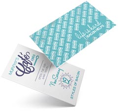
Here are some tips for choosing the best paper for a business card:

business card example

  • Uncoated Stock: Pick an uncoated stock or a dull/matte stock if you want people to be able to write on your card. Uncoated stock is the best option when you want people to be able to write directly on the piece without smudges, but if you have important photos or graphics on your card they will look much more vibrant on the dull/matte stock than on the uncoated stock.
  • Metallics: Using metallic foils or metallic ink? Metallic inks should only be printed on gloss stocks, as the ink will not look metallic at all on uncoated or only slightly on dull/matte stocks.
  • Unique Coatings: Want something that feels interesting to the touch? Use a Soft Touch® coating that makes the card feel like velvet. Request a sample; you have to touch it to get the effect.
  • Protective Coatings: Worried about your cards getting scratched up in pockets and purses? Get UV coating to add greater protection for your card while adding a dramatic pop of color.

Paper Recommendations:

  • 120# (14 pt) Dull/Matte Cover when you want a final piece that has crisp text and images, while maintaining the ability to write on.
  • 100# (14 pt) Uncoated Cover is great for business cards that you’ll be writing on and for certain demographics (attorneys, financial, other professional).
  • 120# (14 pt) Gloss Cover works best if you’re using metallic inks or if you want the professional look and feel of a glossy paper.
  • 160# (18 pt) Gloss Cover is super stiff and thicker than most business cards. Get’s noticed, but you can’t keep as many in your wallet.
  • Magnet Stock keeps your message in front of your clients all year long. Our magnetic stock enables high quality printing with excellent color reproduction and will stick to most metal surfaces. Great for business cards from service industries that could be saved and referenced on the fridge.
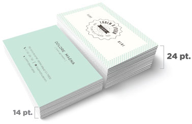
business card thickness comparison


Choosing Brochure Paper

Brochures, sell sheets, maps, menus and flyers can all benefit from using the right paper for the job.
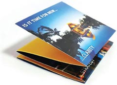
Here are some tips for choosing the best paper for a brochure:

brochure on cover stock

  • Plastic paper like SmartFlex® can create water and tear-proof products like maps or menus.
  • Heavier paper is more rigid, helping items stand up when folded. If you are folding your brochure, the maximum recommended thickness for 2 or more folds is 100# cover.
  • If the printed piece is going in the mail, it must be the correct thickness to meet postage regulations. The number of folds affects the final thickness. Call us for advice as the 2,000 page postal regulations manual changes often!
  • Thicker paper can make metallic foils and embossing look better, but as you go above 80# cover the amount of detail that is able to be shown in your embossed element will decrease.
  • If you’re printing a lot of materials, thinner paper is usually cheaper and could potentially have a lower mailing cost.

Paper Recommendations:

  • 70# Uncoated Text is great if you want to be able to write on the brochure, and want to add more than two folds. Text stock is lightweight, this paper is similar to the paper you’d find in a book.
  • 80# Gloss Text is your choice for brochures that need the professional look of a glossy finish, need more than 2 folds, and that should be lightweight but still strong enough to hold their shape. This is an economical and very common choice for brochures.
  • 100# Gloss Text is a great choice for brochures that you want to feel more substantial and that will hold up better to repeated use. This is a very popular stock for brochures.
  • 80# Gloss Cover produces a thicker brochure; it’s a light weight card stock that can be folded, but might not lay perfectly flat when closed.
  • 80# Dull/Matte Cover. This matte coated stock makes images look good without excessive shine, and can be written on with certain pens.
  • Brochures can be protected with additional coatings, such as optional UV coating that provides additional protection and makes colors really shine.
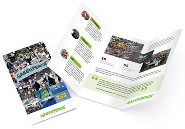
brochure on cover stock


Postcards

Postcards – especially those sent in the mail – have only a moment to get and keep someone’s attention, but they do get handled, held, and read.
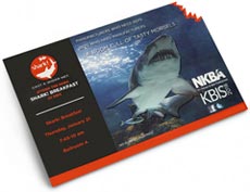
Here are some tips for choosing the best paper for a postcard:

postcard with die cutting

  • Postcards that will be mailed have to meet US Postal Service regulations for size and thickness. In general, your postcards need to be printed on 100# cover or higher to mail. Check out our postcard mailing templates for sizes and layout tips.
  • Thicker and larger postcards stand out, but anything larger than 6″ x 11″ will be require a much higher “Flats Rate” postage.
  • Use a UV coating on the non-address side to make your card pop with high-gloss elements while protecting the card from handling and the weather.
  • People touch a postcard so use Soft Touch® coating on the non-address side to give it a soft, velvety feel (you have to request a sample – words don’t do Soft Touch® justice).

Paper Recommendations:

  • 100# Uncoated Cover. This bright white smooth #1 grade cover stock is a substantial paper, and the minimum thickness for a postcard going in the mail. You can easily write on this stock and is a great option for appointment or reminder cards.
  • 120# Dull/Matte Cover. Our dull/matte cover is a substantial paper with a smooth, non-shiny coating. It is a heavy 14 pt stock well suited for detailed, crisp printing without sacrificing the ability to write on the paper. You can also get UV coating on the front of a dull/matte card to add pop to the side that isn’t needed for writing. This is a popular choice for postcards.
  • 120# Gloss Cover. This is one of our most popular papers, its glossy coating makes photographs and other images look beautiful. UV coating, often called liquid lamination, is a great addition to the 120# Gloss Cover for added pop and shine. Not recommended if you want to be able to write on the postcard.
  • 200# Gloss Cover. At 24 pt, this is our thickest and sturdiest card stock. It has a glossy, smooth finish that prints well. It works really well for die cuts and foil stamping. If you’re adding foil stamping or die-cuts to your postcard, you can’t beat 200# cover stock.
  • Use an optional UV coating to protect your postcard from scratches and scuffs while making the colors pop.
  • Soft Touch® coating adds a velvety feel to the card that makes it stand out and grab attention, but save some money by only adding it on the non-address side.
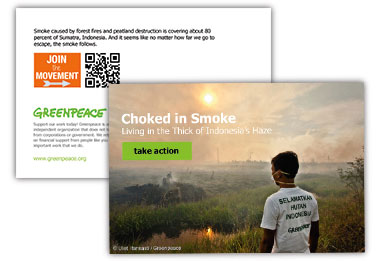
postcard paper example


Catalogs / Calendars

In print terminology, a catalog is anything that is saddle-stitched like a magazine, but unlike a magazine a catalog can have a range of paper types for the cover and interior pages.

Here are some tips for choosing the best paper for a catalog:
    • Catalogs are printed in 4 page increments, as each sheet is folded in half into 4 pages (front and back).
    • Catalogs are frequently printed with a thick cover stock and thinner text stock for the interior to minimize cost. It is important to match the cover stock and interior text stock so there’s consistent color and image quality. For example, if you use 80# gloss cover stock for the cover and 70# uncoated text stock for the interior pages, and you have a consistent brand color on every page, it will look noticeably different on the cover than on the interior pages.
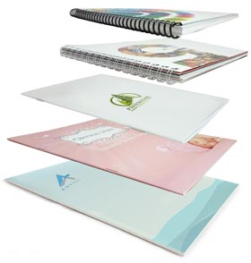
catalog papers and bindings

  • Catalogs can be saddle-stitched like a magazine, coil bound, Wire-O bound, or glued (perfect bound) like a soft cover book.
  • Consider a high-gloss, coated paper for catalogs where art and images are important, and use an uncoated paper you can write on for product lists where readers may want to circle something or take notes.
  • If your catalog will be mailed, be conscious of the total weight. You may need to use lighter papers to minimize the overall mailing cost.

Paper Recommendations:

  • 80# Gloss Text. Standard glossy paper stock, about as thick as a quality magazine page. The shiny finish provides an excellent opaque base for four color process printing. This can be either perfect bound or saddle-stitched. Text stock, like this, is usually used for interior pages only unless weight is a factor in mailing cost.
  • 80# Dull/Matte Text. This stock is finely coated with a non-gloss finish. It provides an excellent opaque base for easy to read, crisp typography.
  • 100# Gloss Text. Similar to the 80# gloss text, but 25% thicker and heavier for a more substantial feel and extra durability. This paper is thick enough to be bound any way you’d like. It’s sometimes used for a self-cover when cost or mailing weight are factors.
  • 80# Gloss Cover. As a “cover” stock, this paper is stiff, about like a postcard or baseball card. This stock has a glossy finish, making photographs and other images look beautiful. Glossy cover stock is hard to write on, however. Cover stock, like this, is usually used for the cover of a catalog, or for catalogs with only a few pages.
  • 80# Dull/Matte Cover. This cover stock is well suited for detailed, crisp printing without a shiny finish. Colors pop with dull/matte stock and it is thick enough to be bound however you’d like.
  • Cover and interior papers can be coated with an optional UV coating to provide protection and a high-gloss look that makes colors even more vibrant.
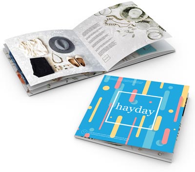
catalog paper example


Greeting Cards / Note Cards / Event Notices

A great way to make a personal connection with your customers and prospects. We have a great selection of papers for greeting cards, note cards, announcements and custom stationery.

Here are some tips for choosing the best paper for a greeting card:

thank you greeting card

  • Use uncoated stock where people will be writing on the card, such as an RSVP response card, or for certain artistic effects.
  • Gloss coated paper will resist writing and leave smudges, but this issue can be minimized by choosing a dull/matte coated stock if your images require the superior print quality of a coated paper stock.
  • Our standard card stocks, 120# (14 pt) are optimal for embossing, foil stamping, and die-cutting, all popular options for event cards such as wedding invitations.
  • Use textured papers such as linen, ribbed, or parchment to give a sense of luxury or class. They can be custom ordered.

Paper Recommendations:

  • 120# Gloss Cover. This is one of our most popular papers. It is a heavy 14 pt stock with a glossy, coated finish. It makes photographs and other images look beautiful. UV coating, often called liquid lamination, is a great addition to the 120# Gloss Cover for added pop and shine on the outside of the card. Not recommended for cards that need to be written on.
  • 120# Dull/Matte Cover. Our dull/matte cover is a substantial paper with a smooth, non-shiny coating. It is a heavy 14 pt stock well suited for detailed, crisp printing without sacrificing the ability to easily write on the paper. You can also get UV coating on the front of a dull/matte card to add pop to the side that isn’t needed for writing. This is an excellent choice for greeting cards and note cards.
  • 100# Uncoated Cover. This bright white smooth #1 grade cover stock is 14 pt in thickness and matches the 70# text-weight stock we use for letterhead and envelopes. You can easily write on this stock and is a great option for appointment or reminder cards or when a “natural” feel is desired.
  • Protect your cards with an optional UV coating that provides protection from the elements and makes colors more vibrant.


Coating Options
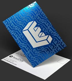
coating on postcard

UV Coating, often called liquid lamination, is a highly protective, ultra-shiny gloss coating that we apply over regular coating and then cure on a special machine using ultraviolet light. The solvent-free UV coating provides an extremely hard finish that’s chemical and abrasion resistant. It makes color and details really pop! On deep colors, it results in a stunning, almost wet appearance. Perfect when you want a durable, environmentally-friendly piece with a richer, high-end look and feel. 

NOTE: UV Coating cannot be used on the addressed side of mailed pieces.
 
 
Need help deciding which paper to use for your project?
Call us now at 800-930-2423 
This field is for validation purposes and should be left unchanged.

Get 20% Off*

Your First Print Order

Name(Required)

*By subscribing, you agree to receive weekly emails from Printing for Less. Some exclusions apply. See details.

RELATED MARKETING & DESIGN TIPS

The Scenery From Here

Read More >


Custom Notepads Printing Services

Custom full color personalized notepad and memo pad printing in a variety of sizes and options. Award winning live expert assistance

Read More >


Green Printing Recycled Paper

Eco-friendly choices for sustainable printing on recycled paper. Discover sustainable printing options for your projects with Printing for Less! Learn more.

Read More >


What is Embossing or Debossing?

What is Embossing or Debossing?

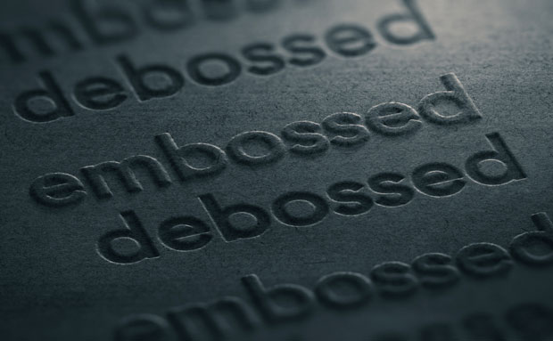
examples of embossing and debossing

Have you ever run your hand over a topographical globe, the kind that has bumps and recesses to depict the world’s peaks and valleys? You almost can’t help but touch them; the raised relief is as appealing to your eye as it is to your fingertips.


Embossing has a similar effect. Embossing (and its opposite, debossing) are two techniques used to either impress or depress an image into paper. These popular print effects are ideal for giving your print piece a fresh, contemporary look — and when combined with other effects, like foil stamping, embossed designs can transform a great piece to a luxury one.

Which should you choose for your project? It all comes down to your preference. Let’s look closer at both the embossing and debossing process.

What is Embossing?

To emboss, a commercial printing company uses two main things: a die, which is a personalized metal plate that’s cut into the image you want to emboss, and stock (paper). The die presses into the stock like a stamp and slightly raise images off the paper of your print piece. The die can be single-level or multi-level, where a single-level raises your image to one consistent height or depth, and a multi-level creates a more complex emboss or deboss.

The result is a three-dimensional effect that emphasizes a particular area of your design. People often emboss a company logo, a custom illustration, initials, or a pattern for a luxurious effect.

When most people think of embossing, they think of raised effects on paper like business cards, greeting cards, and invitations. But embossing can be done on other materials like metal, acrylic, leather, wood, and cloth. In this piece, however, we’ll focus on embossing paper, combining embossing with other effects, and prepping your design for the best outcome.

The Embossing Process

The first part of the commercial embossing process is the creation of the die, which is made up of two metal plates (front and back, also called the counterdie) that will sandwich the paper. The printer creates the die by either hand-tooling, routering, or photo-etching the image that will be embossed onto the two metal plates.

Next, the printer places the stock between the front and back of the die. If you’re having an image embossed, the female die will go on top of the stock and male die will go on the bottom as the counterdie. When debossing, the male die goes on top and the female die will serve as the counter.

Then, using both heat and pressure, the die presses into the paper and create a relief of the image. This process is called a blind emboss because the embossed image isn’t colored with any kind of ink or foil — it’s simply raised or depressed off the paper.

However, if you want to combine special print effects or add color to your die, you can! A registered emboss or a combination emboss combines an emboss with ink or foil to alter the appearance of your embossed image. Adding shimmery foil to an embossed logo or name is a common practice to create a striking or luxurious custom effect.


combination emboss

What is Debossing?

Think of debossing as the opposite of embossing. Debossing is when an image (logo, text, etc.) is imprinted into your print piece, creating a depressed effect. Just like embossing, you can choose to leave the debossed area untouched or fill it in with ink or foil stamping.

Unlike embossing, debossing doesn’t interfere with the back of your print piece, giving you both sides to work with. It can be used on its own, or in conjunction with embossing.

Considerations for Embossing and Debossing

Not all images emboss well — and you’ll save money and time in the long run by spending a little more of both upfront to get your project right. Here are the top things to consider before you emboss an element of your printed design.

  • Start with vector art. Ask your designer to submit the final design as a vector art file, rather than a raster file. Vector art is made up of mathematical rules that enable it to be resized up or down without compromising quality, and so these files will translate the smoothest into an embossing die.
  • Choose the ideal section of your design to emboss. Text, logos, a single image, initials, and a small pattern or embellishment work best with embossing. Although there are no hard-and-fast rules, an emboss or deboss looks best when it’s used as an accent rather than as a whole piece. An exception might be a recurring pattern on the cover of a small printed piece like an invitation or a business card, where embossing a repetitive element on the entire side of a piece adds a touch of class.
  • Use simple artwork. Because embossing and debossing adds literal dimensionality to a 2D image, embossing actually looks best when it’s done on simple artwork. Artwork that’s shaded, colored, or otherwise designed to look 3D might appear distorted when embossed — so keep it simple.
  • If you’re doing a multi-level emboss, your deepest areas should be the largest parts of the design. If you go too deep with your emboss on a very small section of your design, the paper is more likely to tear. Save your deep embossing for larger sections of your artwork.
  • Use a heavier paper stock, if possible. The most effective embossed pieces use a detailed die and heavier paper stock to highlight the depth and detail of the embossed graphics or images.
  • Consider the back of your print piece, as embossing will affect the design of this area. This doesn’t make embossing a limitation, but an opportunity to add some really cool visuals to your piece.

Embossing or debossing create the kind of printed pieces that stand out where others fall flat. They’re the business cards a person can’t quit running a finger over, or the wedding invitations that embody a day of elegance. While the cost runs a bit different than your standard print job, it’s worth it when your print pieces do what they were meant to—make memorable impressions that get you noticed.

Talk to a printing professional today about using embossing or debossing for your next project, call us at 800-930-2423!


This field is for validation purposes and should be left unchanged.

Get 20% Off*

Your First Print Order

Name(Required)

*By subscribing, you agree to receive weekly emails from Printing for Less. Some exclusions apply. See details.

RELATED MARKETING & DESIGN TIPS

Direct Mail Service Options

Direct mail services have so many options that it can get confusing. We put everything you need to know about direct mail marketing in one place! Learn more.

Read More >


Using Embossing on Brochures

Get custom embossing on your brochures to turn them from ordinary to exceptional and significantly increase their impact and success

Read More >


5 Steps to Producing a Great Catalog

5 step catalog marketing strategy that will help you produce a successful catalog to bridge online and offline sales channels.

Read More >


Complete Guide to Creating Press Ready Print Files

The Complete Guide to Creating Press Ready Print Files

Even the best designers break out in a cold sweat when it comes time to send a project to a printer. There are a ton of moving parts, checklists and details to keep in mind when it comes to getting your project ready for commercial printing. This guide will cover the technical do’s and dont’s, give you tips and best practices and walk you through how to take a project from your computer to the printing press.


How to Plan For Perfect Color Printing

One of the most common issues with professional printing is sending your printer graphics files that is in the wrong color space. Here’s what you need to remember about color before you send your file to your printer.

CMYK not RGB

Your computer uses a color space called RGB to produce the colors you see on your screen. A printing press uses a color space called CMYK to produce similar colors using just four colors of ink: cyan, magenta, yellow and black, also know as 4 color process. When you send your files to a commercial printer, they must be in the CYMK color space.

This is so important that we have a whole page dedicated to RGB vs CMYK color space if you want to learn more.

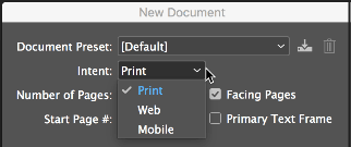
Here’s how you change your color space in InDesign: When you create a new document, the color space changes based on your intent.

InDesign document settings

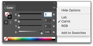
You can also change the color space in the Color Panel.

InDesign color panel CMYK seting

Spot Colors

Most of the colors produced in color printing are created by blending just 4 colors of ink: cyan, magenta, yellow and black. But sometimes you need a very specific color. Despite all of the advanced techniques and technology at a professional printer, matching the exact color from printer to printer and even from one order to the next can be a challenge. Consistent color-matching is what separates good printers from great ones.


When you need a very exact color, such as Coca-Cola’s trademarked red or John Deere’s famous green, you’ll need to use a spot color. A spot color is not created by mixing other types of ink, but rather it is made to order for the project at hand. This also means the printer must make an additional plate for the spot color, which usually makes using a spot color more expensive.


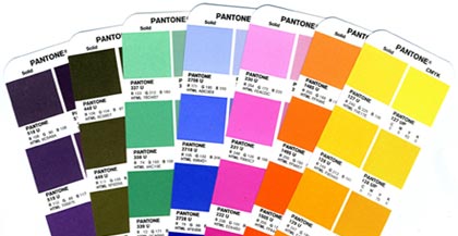
If you have to use a spot color, you’re likely using a color from the Pantone Matching System. It is a commonly used system of spot colors that helps press operators achieve the exact same shade, every time. Find a Pantone Color here.

Pantone color book example
 

Speciality inks like metallics, neons and unique colors will also have to be run as spot colors.

Spot colors can be expensive for short run orders, but become more economical if you’re doing larger quantities using offset printing.

Viewing spot colors that are blended with other colors, or are somewhat transparent, can be a problem in your page layout program. Make use of Overprint Preview when you’re working with spot colors.

Planning Image Quality for Professional Printing

Low quality and low resolution images produce terrible, ugly, hideous printing but many people don’t understand the relationship between quality and resolution. You must plan for your final output at the beginning of your design, otherwise you’ll be left with an unusable final product.

Print will always look better with higher resolution images. Let’s get clear on what we mean by resolution.

Image resolution is how much data is in a digital image, it is directly related to how many pixels are in the image. When you print an image, you must transfer that data into dots per inch (DPI) which determines the image quality of a printed piece. Usually, 300 DPI is what you’ll need. Most images on your computer are not at 300 DPI, but 72 DPI. This is because 72 DPI looks good on most computers and the files are much easier for the computer to store and display. Be sure to check your images for print quality and insure that they are 300 DPI or higher.

How to Resample Images for Printing

Resizing images can lead to problems when they are printed because the resolution can be unintentionally changed.

When you resample an image, you are changing the amount of data in the image. Downsampling removes data and upsampling adds data. When you make an image smaller than its original size, you are downsampling it, when you make it larger you are upsampling.

You should always avoid upsampling your images. Adding data to an image will usually result in a very poor printed image.

How to Resample Images in InDesign

Sometimes you may want to resample an image to change the size that it will print. If you are downsampling, for example, resampling can make the image take up less space. In InDesign, make sure the Resample Image option is checked when you change the size of an image. It is checked by default. When Resample is checked, you change the data in the image when you up or downsample the image.

  • Changing pixel dimensions changes the physical size but not the resolution.
  • Changing resolution affects the pixel density but not the physical size.
  • Changing the physical size changes the pixel density but not resolution.

Note, you can change the resampling method from the default bicubic automatic to other options to change the sharpness or smoothness of the resampled image. Bicubic produces the best results in most cases.

image compression in InDesign
Changing an Image Without Resampling

When you uncheck the Resample Image box, the amount of data in the image is unchanged even when you change the size of the image. This has the effect of changing the pixels per inch (PPI) of your image. For commercial printing, you want a rather high PPI value.

  • For printing purposes you want 300 PPI or greater.
Which Image Formats Are Best For Printing?

When sending press ready design files to a printer you should send your images in the highest quality (not fastest) image format possible. Different image formats compress image data differently. PNG and TIFF images work the best for most print projects. JPG images work Ok at 100% quality, but every time the JPG is saved it is recompressed, so the quality can drop quickly if it is saved often at less than maximum quality.

When Are Vector Images Important for Printing?

Most images are created using a bitmap, or series of dots, and are called raster images. Vector images are not made of dots, but a shape plotted by points along a mathematically generated path. Vector images can change to any size without losing quality. Popular vector image formats are AI, SVG and EPS formats. When you are printing commercially, vector images are very important.

  • Your text should always be in a vector format.
  • Line drawings, such as plans or blueprints, should always be in vector format.
  • Logos work best in a vector format.

Really, anything that isn’t a photograph will work better as a vector.

Tips for Designing Great Images for Print

When possible, do the following:

  • Do not upsample your images.
  • Make sure your images are at least 300 PPI (or 300-600 DPI).
  • Use vector formats for text, line art and logos.

Use image formats with less compression like PNG, TIFF and maximum quality JPG.

What Are Bleeds? Why are Bleeds Important?

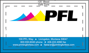
A bleed is printed content that extends beyond the trimmed edge of your final printed piece. Bleeds are important because they allow your artwork to be cut without artifacts. If there is no bleed you may have a small white space around the cut edge. The bleed should be 0.25″ larger than the trim size (0.125″ on all sides). Learn more about bleed. You should design your project within the trim size and add bleed settings in InDesign.

setting bleeds in InDesign

How do You Design for Folds?

If you are printing brochures, catalogs, folded cards, or boxes you’ll need to plan for folds.

  • Use guides and the ruler to measure exactly where the fold will happen. Plan your artwork and design accordingly.
  • Consider the thickness of your paper and the types of coatings and effects on your finished product, you may need to adjust where folds happen to accommodate paper thickness.
  • Balance form and function with your folds, think about how someone will unfold and refold the piece: what do they see first, last and how does it go back together? Learn more about folds.

How to Design Your Project for Binding

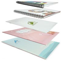
binding formats

Binding is what holds books, magazines, catalogs or pamphlets together. There are many different types of binding, such as coil, wire-o, perfect binding and saddle stitching. When you’re creating a bound piece like a catalog, it is very important to understand pagination. Pagination is how the pages will be ordered in your document so they’ll be printed correctly.

Pagination can be very confusing because the way a document is printed is not exactly the way you look at it in your page layout program. InDesign allows you to switch to a printer spread view or a reader spread view. When you change your document to printer spread view the pages go crazy, and things appear out of order. This is the format that the printing press needs your document to be in so it prints the pages out and folds and binds them properly, a process know as imposition.

You might think that by changing your document to printer spread view that you’re doing the printer a favor. But you aren’t! Keep your document in a reader spread view at all times, modern prepress systems convert your documents correctly so there’s no need for a confusing printer spread.

  • Remember to include blank pages so you have the right number of pages for your piece.
  • Work with your printer when you’re printing books and catalogs to get the pagination correct.
  • Each binding format has a minimum and maximum number of pages and a specific multiple of pages.
  • Your printer should provide you with a template that works for your binding method.
  • Always ask for a proof, especially with this type of printing project.

Planning for Custom EffectsEmbossing and Debossing

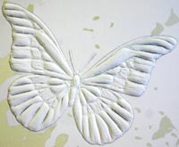
embossing example

Embossed graphics, text and artwork are pressed upward, giving a 3D texture to a printed piece. Debossing is the opposite, where text or artwork is pushed down into the paper creating an indentation. Both of these custom effects can be created in single-level, multi-level or they can be sculpted. When you get a sculpted emboss/deboss, an artist actually sculpts your artwork out of clay and that is used to make a mold for the project. Sculpted embossing/debossing is more expensive, but can achieve a much higher level of detail.

If you’re using standard (single-level or multi-level) embossing/debossing, be aware that super fine details may not be visible. The thickness (weight) of the paper has an impact too. The thicker the paper, the less fine detail you can achieve.

  • The thinnest detail should be twice the thickness of the paper.

Work with your printer to pick the right type of paper and embossing/debossing style to make your project look perfect. Learn more about embossing here.

Die Cutting
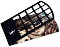
die cutting example

Die cutting slices your paper up so you have a knocked-out design. Think of it as using a cookie-cutter on your paper to make your text, artwork and designs get cut out of the paper. A die cut uses a metal die that looks a lot like a cookie cutter. This is shaped by hand and because of the limitations of bending metal, standard die cuts must keep at least 1/8th of inch of space between designs. Sharp points may not work well and very small text can lose quality.

If you need finer die cutting that is less than 1/8th” you should consider laser die cutting.

Foil Stamping
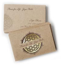
foil stamping example

Foil stamping is a very popular way to make text, artwork and logos pop. It is often used to make a seal or award burst off the paper with a golden sheen, but in the hands of a great designer, foil stamping can create true works of art.

There are two types of foil, metallic and matte. Metallic foil can achieve much more detail than matte foil because the surface is literally harder — it has metal flakes in it, giving it more strength. Even so, both types of foil can begin to bleed together and details are lost if you are doing very fine detail or tiny text.


When sending in artwork for foil stamping, try to use vector artwork, not bitmap files. For example, use an Adobe Illustrator EPS or AI file vs a JPG image. Using bitmap artwork can have a negative impact on foil stamping, making it look blocky and lower quality.

Planning for Trimming, Cutting and Shaping Your Printed Piece

Your printed piece is going to be cut and trimmed. Your printing company should help you plan your printing properly, so there isn’t much you need to do to prepare, but here are the industry terms so you can speak fluent printerese.

How to Plan Your Bleed

A bleed is needed when printing extends to the edge of the paper, so when the piece is trimmed or cut to the final size, the artwork goes all they way to the edge. A full bleed describes a print project that has artwork that touches every edge. When in doubt, include bleed in your document.

  • Create a bleed that is 0.125″ on all sides.
  • If you’re making multi-page InDesign documents add the bleed in document settings.
press ready bleed layout
How to Plan Margins or Safe Zones

A margin is the space between the print and the edge of the page, sometimes called the Safe Zone. The margin should be a minimum of 1/16 or .0625″, preferably 0.125″. You just want to make sure your critical artwork or text has a bit of room so it isn’t in danger of being chopped off in the cutting process.

Margins become complicated when you print a bound piece like a catalog or booklet. The size of the margin changes on each page because of the wrap of the sheets of paper around the spine. Check with our printer to make sure you get the correct specs for this before laying it out.

Choosing Paper & Ink

You’ll need to work with your printer to choose the best substrate (paper) for your project. Paper comes in a variety of weights, finishes and coatings.

The paper type and weight can sometimes affect how you prepare your press ready files, especially related to folding and binding, so confirm your paper choice with your printer to make sure any considerations are accommodated.

Paper options can be daunting: here’s what you need to know to get started.

Choose Paper with the Right Weight

A paper’s weight is, more or less, a measure of its thickness. A higher weight will be sturdier, thicker and firmer. Higher weight papers are great for business cards, bottle-neckers, cards, tags and catalog covers. Lighter weight papers are ideal for brochures, envelopes, stationery and interior pages of catalogs. Higher weight paper is usually more expensive.

There are also premium papers that are made with a high quality texture. They feel great to the touch and are used for some stationery, formal invitations, artwork and important legal documents. Choosing a paper weight means thinking about how your piece will be used. Will it be held? Will it be abused in a wallet or purse? Will it be bound into a thick, hundred page catalog? Is it going to be folded?

Choose the Paper Type

Papers also come coated or uncoated. Coated papers have a gloss or matte finish that resists smudges and stains and displays the ink brighter and crisper. This also makes writing on the paper difficult. It’s best used for brochures, some business cards and marketing pieces that need to look higher end and aren’t being used for writing.

Uncoated papers lack this solid surface and are more porous. They are easy to write on, but can get smudged and stained more easily and the ink looks duller. There are also synthetic papers that are totally water and chemical resistant and spill proof. They are perfect for menus, industrial stickers or anything that needs to withstand the elements or outdoor use.

Additional Paper Coatings

There are also specialty coatings that can be added after a piece is printed. These help protect the entire piece or are used to create eye-catching effects.

UV coating, Spot UV coating and varnish provide a high-gloss or matte look and offer protection and improved visual appeal.

Exporting Your Work for the Printer

Packaging InDesign Files for a Professional Printer

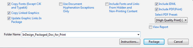
If you’d prefer to supply the actual InDesign document to your printer – make sure you package the InDesign file. Zip the entire file and provide that to your printer. Your printer will need all of your images and fonts, so you’ll need to include the entire package not just the Indd file. When packaging, check the boxes shown below.

InDesign Package For Print
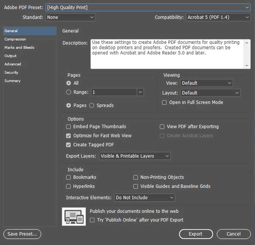
Exporting a PDF from InDesign

When exporting a PDF from InDesign:

  • Include all pages
  • Export the document in pages not spreads
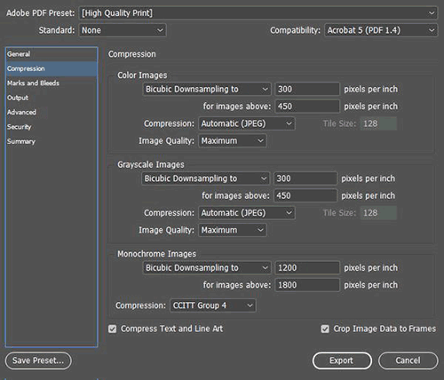
  • Either choose “no compression” or choose Bicubic Downsampling on Color and Greyscale images to 300 pixels per inch for images above 450. For Monochrome images set bicubic downsampling to 1200 pixels per inch for images above 1800.
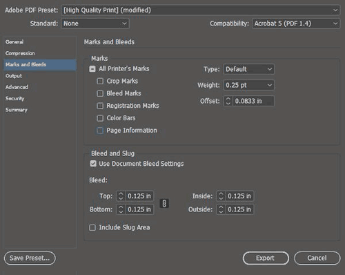
  • For marks and bleeds – don’t include any marks, but make sure you check “use document bleed settings” if you included the bleed in your settings. If not, you can specify the .125″ bleed here.
exporting a PDF from InDesign
Exporting a PDF for a Professional Printer

Exporting your press ready file for the printing company is very easy in all modern page layout and design programs. Usually you’d export everything into a PDF but sometimes you may export the entire project including images, fonts and other elements. Here are some tips to keep in mind, many that have already been mentioned:

  • Make sure your images are the right DPI (300 or higher) for printing.
  • Use vector for text, drawings and logos when possible.
  • Don’t export a PDF with security settings and password protection unless your printer is prepared for and can work with that security.
  • When in doubt, always choose the highest quality file possible.
  • If your project file is too big for email, consider using Dropbox or Google Drive to host the file or see if your printer has a solution for handling large files.

Following these tips will save you time and trouble and make your printer happy, insuring the best possible outcome for your project.

Have questions or need help generating your print ready files?
Call us now at 800-930-6040
 
 
This field is for validation purposes and should be left unchanged.

Get 20% Off*

Your First Print Order

Name(Required)

*By subscribing, you agree to receive weekly emails from Printing for Less. Some exclusions apply. See details.

RELATED MARKETING & DESIGN TIPS

Direct Mail Marketing – An Idea Book for E-Commerce and Retail

This e-book explores three core ways marketers can integrate direct mail into their digital strategy: the Power of Engagement, the Power of Personalization, and the Power of Action.

Read More >


Choosing A Printing Company: A Partnership For Your Success

What to look for when choosing a printing company for your business marketing materials, espcially an online one.

Read More >


Letterhead Design and Printing

Read More >


Knowledge Center: Graphic Design

Graphic Design Tips and Articles


Printing Design Guide with CMYK Color Chart
Tips, advice and information to help you pepare a graphic arts design file for commercial printing.


Preparing Photos for Commercial Printing
In this guide, you’ll learn what resolution is, how much you need when printing, and how to change it without lowering image quality. You’ll also learn how to edit digital photo files so that they look crisp and sharp in your printed projects.


Filling Text with Images and Creating Dutones with Photoshop
In this guide, you’ll learn to transform one photograph into a wide variety of duotones and step by step instructions for making images filledtext.


Design How-To: Working with Photos
So your staff meeting is coming up and your boss tells the administrative assistant to take some photos for the corporate newsletter. When he returns, he hands you generic snapshots taken from across the room. Here’s how to salvage the job with cropping and layout.


Successful Branding with Brochures
A good brochure is a balancing act of effective communication and appropriate design. To deliver, you need a shrewd understanding of your client and the target audience. Here are the three steps that will get you there, plus examples of five brochures that do the job right.


Design How-to: A Better Newsletter
Before & After magazine is renowned for its practical yet beautiful advice on laying out pages. This excerpt from the book “Before & After Page Design” is no exception. Here’s all you need to know — from the basics to the refined detail — to design successful newsletters.


The Art of Business: Design on a Shoestring
The mark of a good designer is not what can be done with a large budget, but what can be done with a small one. Here are tricks for closing the deal, managing your low-budget client, and creating a winning design.


Creative Fuel: Pentagram’s Kit Hinrichs Talks about Good Design
Is judging a design contest always a subjective experience? Is it possible to truly evaluate “good design”? Kit Hinrichs, a partner in the Pentagram design firm, says yes, if you understand the criteria.


Design How-To: Make Type and Photos Play Nice
When text and images are battling for the same space, you don’t have to give up one or the other. Here are practical techniques for bringing the two together.


Design How-To: Solve Color Dilemmas
No matter what you’re creating — a print piece, a Web site, an illustration — the element with the greatest effect on your audience is color. How do you choose the right one, or even more daunting, the best mix?


Design How-to: Endless Pattern Possibilities
Just one simple step-and-repeat technique is all you need to create striking background patterns perfect for the covers of books, annual reports, brochures — you name it.


Design How-To: Repurposing Art for a Digital Portfolio
Instead of lugging around a big black case, creating a compact digital portfolio that you can post on the Web or send via e-mail makes sense. But how to translate your traditional-media work to a digital format? And how should you prepare your existing digital files so they appear in the best light? Here’s what to do.

Design How-To: Make Eye-catching Small Calendars
What’s fun is that with modern desktop printers that render tiny type clearly, a calendar of your own is easier than ever to make and use.


Posters That Stop Them On the Street
The best posters engage, inform, and motivate people. Here’s how to create them, no matter what the subject matter or where they’ll be posted.


Make Your Next Catalog a Work of Art
An effective catalog goes far beyond pictures and text slapped on a page. Creating one that generates sales takes strategic thinking and great design. Follow these 9 tips to make your catalogs stand out.


Giving Design Meaning
Design goes far beyond making something “pretty” on the outside. The best design takes into account customer needs and delivers meaningful experiences. This excerpt identifies seven design principles to follow and five process stages to go through to reach the end goal: design that matters.


Fly the Creative Skies
Fasten your seatbelts low and tight across your laps, ladies and gentleman, because we’ve got a quietly powerful creativity boost for you. This article, which combines full-page photos with insights from a fellow creative pro, will give you wings.


Sometimes a Logo Is Just a Logo
Quark’s new logo is strikingly similar to several others. Is it theft? A global conspiracy? Or a failure to follow basic design principles? Gene Gable gives you the dirt, including ways you can sidestep the same type of predicament.


Creative Fuel: Appreciate the View
Fire hydrants, taxicabs, a national book expo, and Central Park give Molly Joss a new outlook. What would open your eyes?


Creative Fuel: The Book Geek in Me
MMMmmmm, design books. The carefully chosen color palettes, the inspiring imagery, the sensual feel of the heavy paper stock. Molly Joss waxes rhapsodic and invites you to share your bibliocentric desires.


Creative Fuel: Tips for Stimulating Creativity
A nasty virus came with a silver lining — it gave Molly Joss the down time she needed to discover her inner Jackson Pollack and to create a plan for conjuring creativity anytime.


Creative Fuel for the Holidays: It’s in the Cards
The holiday season is a fine time to show your artistic side to clients and friends. But when the weight of expectation becomes too heavy, how do you light the creative spark? Molly W. Joss takes you through her annual internal debate.


This field is for validation purposes and should be left unchanged.

Get 20% Off*

Your First Print Order

Name(Required)

*By subscribing, you agree to receive weekly emails from Printing for Less. Some exclusions apply. See details.

RELATED MARKETING & DESIGN TIPS

Direct Mail Marketing: An Idea Book for Nonprofit Organizations

Here are some actionable strategies that can help your organization leverage the power of direct mail effectively. This ebook offers provides ways to create effective connections that inspire generosity and strengthen your mission.

Read More >


Paper Folding

Proper paper folds in print marketing can drive an effective piece. Learn more about paper folding patterns and options at Printing for Less.

Read More >


Custom Size Catalog Printing

Get catalogs printed in custom sizes and shapes to make them more functional and memorable

Read More >


The Basics of Professional Printing

The Basics of Professional Printing

Print isn’t going anywhere.

Think about it: at the end of an exceptionally long day of work, do you feel compelled to get on your computer and read articles online or cozy up on your couch with a book? Have you ever felt sick from staring down at your tablet too long, or squinting into your phone?


Screen time drains our mental resources faster than looking at printed content, and screen content can actually make it harder to consume information in an “intuitive and satisfying way”, according to the Scientific American.

It doesn’t matter if you’re a marketer hoping to stand out from your competition or a business owner looking to reach new customers on a different channel: printed content will always appeal deeply to people from every walk of life.

Here’s a primer on what to expect from (and how to get the most out of) the professional printing process.

The Wide World of Printers

There are a lot of printing options and they can seem overwhelming at first. Some printers, like the old dot matrix, had a short time in the spotlight before being replaced by more attractive options. Meanwhile newer inventions, like 3D printers, may be a bit too expensive for mass use just yet — cool as they are to read about.

We’ve boiled the list down to four main types of printing. Here’s a bit on how each of these methods works, along with which projects they’re best suited for.

Desktop Printing

What is it?

Chances are you’ve used a desktop printer before. Desktop printers include simple consumer grade printers all the way up to larger, feature-loaded office printers that can crank out thousands of copies at breakneck speed. Desktop printers come in three variations: inkjet printers, laser printers, and photo printers.

How does it work?

Desktop printers are usually small to medium-sized devices that connect to a wireless network or through a cable to receive print jobs from local computers. Most home printers are inkjet printers, which create images on paper by squirting tiny drops of ink onto paper.

What’s it best for?

Desktop printers are best for simple, one-off projects that can be completed quickly. However, if you need professional quality, a huge volume of content, or custom work, desktop printing isn’t going to cut it. Also, desktop printing can get very expensive — especially if your printer uses one cartridge for all colors, meaning the whole cartridge has to be replaced when one of the colors runs out.

Commercial Digital Printing

What is it?

Digital printing is like desktop printing on steroids. You can produce just about anything with a modern digital printer, from simple postcard-sized flyers to complex three-dimensional promotional pieces.

How does it work?

Digital printers create printed images using a very similar process to that of a desktop printer. The printed image starts as a digital file, and then the printer deposits toner onto the surface of the paper.

What’s it best for?

If you need variable data printing or a rush job, digital is the way to go. It’s both fast and cost-effective, since there isn’t much equipment to set up to prepare for a print job. Each piece of a digitally printed run can be different. If you’re printing luxury or high-quality materials, however, digital printing simply won’t look as refined as traditional ink-based printers.

Offset Lithography

What is it?

An offset lithography machine is what most people imagine when they think about an industrial printing press. It came about in the 1950s and endures today as the most widely-used industrial print process.

How does it work?

In this process, printed images are transferred, or “offset,” from a metal printing plate to a rubber blanket and then rolled onto the printing surface like a stamp. The printing surface is usually, but not always, paper.

What’s it best for?

Offset lithography can produce enormous volumes of materials that have exceptional quality. It takes longer to set up than digital printing, however, and the process can be very expensive if you’re doing a short print run. This style is best suited for ongoing, large-scale projects that require the best quality.


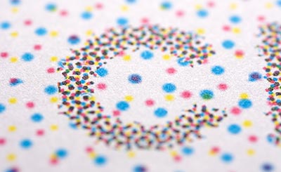
offset lithography dot pattern
Dot pattern used in offset lithography to reproduce colors.


Engraving

What is it?

Engraving is one of the oldest printmaking processes still in use. You may have seen engraving used on wedding invitations or other formal print materials.

How does it work?

Engraving uses finely-carved plates of steel or copper to print an image into paper or another substrate using extreme pressure. This creates a “bruise” on the back side of the printed sheet, serving as a symbol of how genuine the engraving was.

What’s it best for?

This type of printing is much slower than other processes and is relatively uncommon. It’s best reserved for top-end quality artwork, or for fine typography.

Beyond these four examples, there are plenty of other types of printing processes, including gravure, flexography, thermography, and screen printing.

Professional Printing and Paper

If your print job was a rock concert, your paper would be the lead guitarist. Sure, you could put any old musician up there — but if you want to go down in history, you need your leading player to be a standout.

Don’t skimp on the paper. Here are the main choices you’ll have to make when working with a professional printer:

Paper Weight

The weight of the paper measures how thick it is. A high number for weight means you’re looking at thicker paper, and thick paper reacts to ink differently than paper with a lower number for weight.

Thicker, higher weight paper is often called cover stock and can get be as thick as cardboard. Thinner paper, sometimes called text stock, is more like the paper you find in a novel — and can even run as thin as the paper in a phonebook.

Coated or Uncoated Paper

Paper can be coated or uncoated. Coated paper tends to make colors more vibrant and produces a sharper look. It’s also glossy and spill-resistant, which makes it a great choice for printed materials that’ll be exposed to the elements — self-mailers, door hangers, and postcards, for example.

Uncoated paper has a matte finish and can be written on. It’s great for business cards, trade show handouts, or other materials that you may want to make notes on. During printing, the ink or toner seeps into uncoated paper, which gives its colors a warm and soft feel.

Color Options: CMYK, RGB, and Pantone

Though CMYK or RGB may sound like the latest acronyms in text-speak, they’re actually two ways of describing color in professional printing.

CMYK stands for cyan, magenta, yellow, and key (or black). These four colors make up most print colors, and they’re the main color cartridges you’d buy for a home desktop printer.

Sometimes called a four-color process, CMYK describes the range of colors you can get from combining just these four colors. Though the range you can get from CMYK is pretty impressive, you can mix in Pantone colors to get a five- or even six-color process. CMYK is the gold standard for printing colors and it by far the most common color process.

RGB color is what you see when you look at your computer screen. It’s an additive color model that uses red, green, and blue light to make any combination of colors. While you may create a design in RGB, when it comes time to print that design, you’ll need to convert it to CMYK.

Certain RGB colors cannot be replicated with CMYK inks, which is why people often use the four color printing process (CMYK) to avoid RGB conversion issues. If you have a special color in your logo, you may need to use the Pantone Matching System to meet your specific color requirements.

What’s the Pantone Matching System®?

Pantone® is a patented, standardized color matching system. Instead of combining variations of CMYK to make a color, the Pantone system features unique colors on their own.

Because the colors are standardized, different manufacturers in different locations can make sure two colors match perfectly by referencing a Pantone number. The result for your brand is ultimate consistency no matter where you print.

What’s the Difference Between CMYK and Pantone?

With offset printing, you usually need four color plates – one for each color in the CMYK model. With a Pantone system, you may only need one or two plates, which saves you some money.

On the other hand, there are some colors that don’t have Pantone hues to match and may require a combination of CMYK. While the Pantone solid palette consists of an impressive 1,114 colors, CMYK can make almost any color you can imagine.

Because printing offers so many options, it’s a good idea to connect with a company that understands the full suite of possibilities. When you discuss printing, be clear about three things:

  1. Your business’ core value
  2. What you want to convey
  3. How you want to reach people

If you discuss these concepts clearly with any printing company, they will be able to give you a detailed explanation of your options and potential costs.

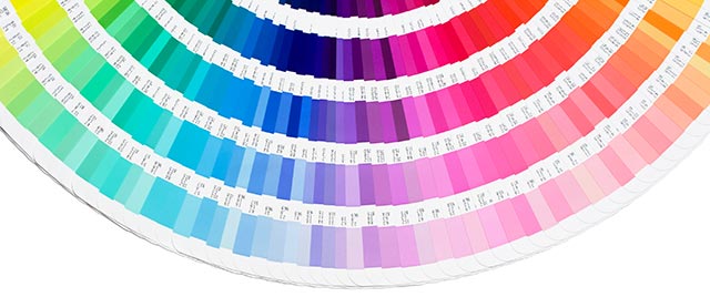
pantone color swatches
Pantone Matching System color swatch book


Customizing and Personalizing Your Printed Materials

No matter what kind of company yours is, printing is one of the most effective methods to display your brand personality and creativity. One way to do that is by printing materials with personalized, variable data.

What’s variable data? Imagine feeding a lead list with names, contact information, and job titles into a printing process so the materials you print have personal names and info on it. You’ve probably seen these pieces in your own mailbox. The personal touch catches your eye and sticks in your memory.

There are other options to make your printed pieces stand out, including:

  • Die-cutting, to get a unique shape
  • Large format text
  • Hot foil stamping
  • Embossing
  • Specialty inks (glow in the dark, anyone?)
  • Specialty papers
  • Custom folds
  • Custom binding

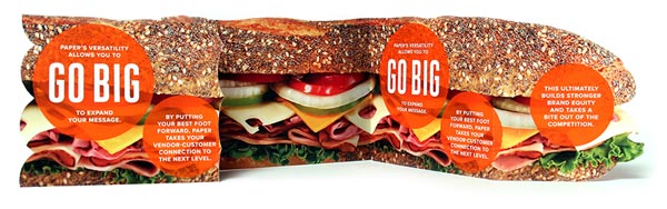
large folding postcard mailer

A combination of several custom print effects can have powerful results, such as a fold out map with personalized directions from your prospect’s home to your store.

Mailing and Distributing Printed Materials

Your print design isn’t worth much if you don’t get it out to customers! The next step is understanding how a printing company can help you actually get the message out.

A commercial printer usually offers various distribution options, including:

  • Targeted direct mail
  • EDDM, or Every Door Direct Mail
  • List management

Think of content distribution like the old “tree falling in the forest” metaphor (if no one’s around, does it make a sound?) In other words, you want to produce beautiful, attention-grabbing content that’s printed cleanly and customized for your prospect — but if you do all of that work and the content never reaches your audience, does it make an impact?

Of course not. That’s why it’s essential that you partner with a printer who can help you deliver your materials to the right people at the right time.

Why Printing Is Important a Marketing Strategy

personalized professional postcard

Consider some of the main approaches that marketing consultants are pitching to clients these days:

  • Social media
    The reach is potentially spectacular, but over-saturation is causing organic reach to decline, meaning you’ll have to pay to get people to see your posts. Connection to a company is often weak, and while people may remember the idea of a campaign, they’re not necessarily going to remember the company or what they sell.
  • Email marketing
    You might get a message directly into someone’s inbox. Then again, your emails might get lost or sent to a spam folder. Even when email marketing is done right, average open rates are usually only 20% and average click-through rates are 2 — 3%.
  • Advertisements
    It can be expensive to buy digital ads, and traditional advertising like commercials and radio don’t offer the same targeting capabilities of other channels.

Printing is a fantastic complement to these digital channels. It gives you flexibility, it’s cost effective, and the end product is a real, tangible thing that people can hold in their hands and remember — even pass on to other potential customers.

Printing has staying power you just won’t find in digital message. Fortunately, you don’t have to choose between the two, and they’re best used in tandem to create clever and effective marketing campaigns.

For more information on print effects, direct mail marketing, and graphic design, check out our Knowledge Center .

Printing for Less has been an industry leader and provider of high-quality, unique printing services since 1996. Though we are a large company with customers across the globe, we treat our customers with the attention and care you’d expect from a luxury printing boutique. From business cards and banners to letterhead, flyers, and beyond — Printing for Less knows printing like no other.

Let’s talk about your project! Our print consultants are available 8am-5pm MT Monday through Friday at 800-930-7978.

This field is for validation purposes and should be left unchanged.

Get 20% Off*

Your First Print Order

Name(Required)

*By subscribing, you agree to receive weekly emails from Printing for Less. Some exclusions apply. See details.

RELATED MARKETING & DESIGN TIPS

Successful Direct Mail Campaigns

How to create a successful direct mail campaign from start to finish with tips for creative content and cleaning your mailing list

Read More >


Custom Size Catalog Printing

Get catalogs printed in custom sizes and shapes to make them more functional and memorable

Read More >


Design Postcards in InDesign to Connect

Make sure your message is delivered by laying out and printing postcards correctly.

Read More >


Fair and Square Binding

Fair and Square Binding

Why Square Back Binding?

If your business has stayed away from professional looking binding because of the cost, square back binding is your answer. Square back binding is an affordable solution in-between saddle stitching and perfect binding, offering the security of a saddle-stitched spine with the improved appearance of a perfect bound square spine. Add a level of sophistication and polish to your projects without the significant price tag of perfect binding. One of the biggest advantages to choosing square back binding is the ability to produce short run quantities.

square back binding samples


What is Square Back Binding?

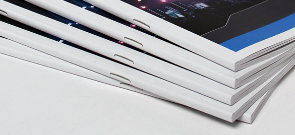
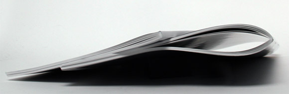
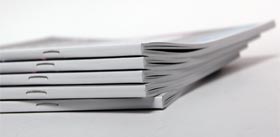
The only aesthetic difference between square back binding and perfect binding is the two small staples. The finished squared-look is created after applying pressure to the spine. Square bindings lay flat, making it easier to stack, handle, and pack than saddle stitching. The pages are always secure, and you can print directly on the squared surface spine.

square back vs saddle stitching
Square Back Binding vs Saddle Stitching


Who Can Use Square Back Binding?

Square back binding is the perfect solution for authors who specialize in children’s books, coloring books, or coffee table books. It also gives short run magazines, annual reports and any catalog or booklet a level of professionalism your customers and clients will notice and appreciate.square back binding

Square Back Binding Specifications

  • Ideal for quantities of 1-500
  • Can be printed on any paper weight
  • Minimum page count: 28
  • Maximum page count: 120 (70# & 80# text only)
  • This is a digital* only printing process
*Digital printing has a lower lead-time than offset printing.
If the files are ready, we can hit print and start right away.
 
Call us now at 800-930-6040 to learn more about how square back binding can give your next project a professional look, at a reasonable price.
 
This field is for validation purposes and should be left unchanged.

Get 20% Off*

Your First Print Order

Name(Required)

*By subscribing, you agree to receive weekly emails from Printing for Less. Some exclusions apply. See details.

RELATED MARKETING & DESIGN TIPS

Digital Printing vs Offset Printing

What are digital printing and offset printing? Knowing the difference between digital and offset printing can save costs in the long run.

Read More >


Plastic Self-Mailing Snap-out Postcards

Get printed custom plastic postcards that can be customized for many different purposes, from snap-off membership and loyalty cards to special discount cards and more

Read More >


Bottle Necker Design

Get custom Bottle Neckers, neck tags and bottle neck hangers, popular for wine bottle tags and marketing anything sold in bottles.

Read More >


  • « Go to Previous Page
  • Page 1
  • Page 2
  • Page 3
  • Page 4
  • Go to Next Page »

Footer

Printing for Less

info@printingforless.com
100 P F L Way, Livingston, MT 59047

800-930-2423

  • Home
  • Products
  • Services
  • Industries
  • Get Printing Samples
  • Direct Mail Marketing Resource Center
  • Printing Resource Center
  • Blogs
  • Templates
  • Terms & Conditions
  • Contact
  • About Printing for Less
  • Careers
  • Login

Copyright © 1998-2026 PrintingforLess.com. All Rights Reserved.

logo
  • 800-930-2423
  • Products
  • Direct Mail Marketing
  • Services
  • Industries
  • Direct Mail Marketing Resources
  • Printing & Mailing Resources
  • Get a Quote
  • Contact Us
  • My Login
Direct Mail Delivery
This field is for validation purposes and should be left unchanged.

Get 20% Off*

Your First Print Order

Name(Required)

*By subscribing, you agree to receive weekly emails from Printing for Less. Some exclusions apply. See details.