• Skip to primary navigation
  • Skip to main content
  • Skip to footer
Printing for Less

Printing for Less

At Printing for Less, we've offered high quality online printing services since 1996. Shop business cards, booklets, stickers, and more!

My LoginMy Login
800-930-2423
  • Printing
    • Postcards
    • Business Cards
    • Catalogs
    • Brochures
    • Folders
    • Letters
    • Newsletters
    • Envelopes
    • Greeting Cards
    • Print Templates
    • All Products
  • Direct Mail
    • Why Direct Mail Marketing?
    • Every Door Direct Mail® Postcards
    • Direct Mail Letters
    • Catalogs & Booklets
    • Marketing Gifts & Kits
    • Direct Mail Automation
  • Services
    • Mailing Services
    • Pro Services
    • Design Services
    • Custom Printing Services
    • Reseller Program
  • Industries
    • Advertising & Design
    • Food & Beverage
    • Healthcare Payers
    • Healthcare Providers
    • Nonprofit
    • Real Estate
    • Retail
    • Technology
    • University
  • Resources
    • Direct Mail Marketing
      Resource Center
    • Printing Resource Center
    • Blogs
    • Templates
    • Video Library
    • Have a Question?
  • Request Samples
  • Get a Quote

Printing Resources & Help Guides

Going to Press Efficiently

Going to Press Efficiently

These best InDesign preflight practices will save you time and money.

by: Pariah S. Burke

InDesign has many uses, some of them surprising. For many, InDesign long ago replaced PowerPoint as a slide show creator—just export pages cum slide deck to PDF, and use Acrobat’s or Adobe Reader’s built-in presentation features to display it to an audience. Many print-turned-Web-designers are using InDesign to wireframe, or sketch, Web sites. Features that allow embedding of multimedia, such as QuickTime movies and sounds, and interactive elements, like buttons with rollovers and actions, have positioned InDesign as the tool of choice for developing rich user experience PDFs. Thanks to innovations in CS4, InDesign is even catching up to its main competitor as the non-Flash-savvy-user’s Flash content creation tool.


All of these uses, whether expected or not, are a testament to the versatility and ease of use of InDesign. They also attest to the expansion of even traditional print design workflows toward electronic publishing. Still, despite the Web, PDF, and Flash, the main purpose for which the majority of us employ InDesign is to create materials destined to become ink on paper.
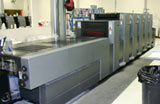
offset printing pressIt’s startling, though, how little information there is on the subject of going to press these days. I don’t mean how to use InDesign’s Print dialog or why you should use CMYK instead of RGB color swatches. I’m referring to best practices for going to press. My friend Sandee Cohen recently mentioned that she’d met a woman who, within the last five years, had graduated college with a graphic design degree—which included at least one full year learning in InDesign—but without any instructor ever having defined the word “prepress” or having explained how layouts get from InDesign to ink on substrate!

Some people don’t even know why they should avoid the default and undeletable Registration color swatch; someone once said, “Don’t use it,” so they don’t use it, without knowing why.

In this edition of InTime, I’ll try to fill a few of those gaps. Hopefully even seasoned pressmen with ink embedded beneath their fingernails will find something herein to take away. And, I hope they’ll write in and share some of their wisdom and time tested prepress truisms and techniques with me, so I can pass along that information in a future InTime.


Consult the Wizard of Press

I’m often asked for my recommendation on the very best resource to give a designer the information she needs to send InDesign documents to press efficiently, with the best quality, highest color fidelity, fewest errors, and the least expense. Have you wondered the same thing? If so, you might be surprised by my answer because it isn’t this magazine, a book, Web site, or industry guru. Nor is the best resource Adobe itself.

The single most important resource you can consult regarding your InDesign (or any) for-print project is the printer who will output it for you. Your printer knows all, your printer sees all, your printer prints all. He can tell you more about your specific document, how to format this and configure that, than any of the gurus in this magazine. Why? Because we’re not RIPping and printing your job. We can give you general advice, specific techniques we’ve learned over the years, even best practices that will serve you in many, perhaps even most, situations, but not one of us can tell you precisely what will happen to your specific document when it goes to a particular print shop’s prepress and then press stages. The only one who can is the person who takes work like yours and processes it day in and day out on those very prepress and press systems.
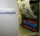
offset printing pressSo what should you ask your printer? Everything. Pardon the banality of this, but it needs to be said: The only dumb question is the one unasked. No matter how much or how little experience you have in print design and working with print providers, every printer worth hiring will be happy to educate you about his shop’s unique processes, tell you what to do in InDesign (and other applications), to ensure that your job prints to the highest quality possible, on time, with the least amount of stress for you and the printer’s personnel. If there’s something you don’t know about the printing process, how to prepare your files for press, how the printer wants them delivered, ask.

Then, after you deliver your project, go visit the printer if possible. Watch the job RIPping and printing. Do press checks—examining printed examples of your job as they roll off the press to ensure output as expected. Ask more questions.


Decide Before You Design

Before you can choose File > New Document you must make crucial decisions about the content and output of your printed design. The below, used as a checklist, can help you ask yourself and your print provider the right questions, make the right decisions, and begin your project already halfway to producing a top quality InDesign document efficiently before you’ve even launched InDesign.

  • What kind of paper are you printing on? Or are you printing on plastic, fabric, or another substrate? Each of these require special printing processes.
  • What is the color of the substrate (see “White isn’t Always White” below)?
  • How heavy is the substrate?
  • Is it coated or uncoated?
  • What type(s) of ink will be used—process CMYK, premixed spot colors, Hexachrome, screenprint ink (typically for fabrics and other non-paper substrates), or another media?
  • Will the final piece be flat paper, multi-dimensional (like a box printed flat and then folded), or non-flat (such as directly labeling a bottle or can)?
  • If printed flat, will the final piece require folding or perforating?
  • Do any colors touch the side of the page? If so, you’ll have to set up a bleed.
  • Will the final printed shape be a rectangle or will it require cutting dies?
  • If the document will be bound, how will it be bound—perfect bound like a book, saddle stitched or -stapled like many magazines, wire- or GBC-bound to lay flat when opened, or another type of binding?
  • Because of the binding method, what are the required inside and outside margins?
  • If the artwork will run ink-to-edge (bleed), what size bleed guide do you need—how far out from the page edge will you need to extend your artwork?
  • What is the required live area inset? (That is, how close to the edge of the page is it okay to print text or important details?)
  • Will you need a slug area, and, if so, what will be its dimensions?
  • What is the ideal image resolution?
  • Does the printer have a PDF Print Engine (such as APPE) which can handle native transparency, or will you need to supply a flattened PDF version?
 

Files to Get

Before you begin each project, ask your printer for the files listed below. The printer will have at least some of them ready, though you may not need the rest, depending upon your output options and file delivery methods.

  • The ICC/ICM color profile for the output device and selected substrate. This is updated frequently, so get a fresh copy for every job, for every different medium you’re printing on.
  • While few printers want PostScript files anymore (it was an old 90s thing), if they do, ask for the output device’s PPD (PostScript Printer Definition file).
  • If you’ll be sending a PDF instead, ask for a custom PDF preset. If your printer doesn’t have one, he or she should be able to tell you what settings to use in the Export to Adobe PDF dialog box. Alternately, they might tell you to use PDF/X1-a, X3, or X4, which are standard presets that ship with InDesign.
  • A trap preset file. It’s pretty rare that the printer would have one of these for you, as they will likely prefer to handle trapping themselves, usually in- RIP. But it never hurts to ask.
 

There is No Generic Color Profile

If I had a dollar for every time I’m asked for the best color profile for “general use” I’d probably own Adobe Systems by now (and I’d have built in an option to hide that darn Registration color swatch). There is no best, ideal, default, or generic general use setting when it comes to sending documents to press. There are guidelines, though. For example, most printers in North America are used to receiving documents and images saved with the U.S. Web Coated (SWOP) v1 CMYK color profile (part of the North America General Purpose 2 preset in Creative Suite). That’s actually strange, because most printing is done on sheetfed presses, not web presses. If you’re printing to sheetfed, consider using the Coated GRACoL 2006 profile, which ships with CS4, as it will likely give you better results.

But these kinds of guidelines are if you don’t know have an accurate picture of how a document will be printed (which actual printing press, which inks, which paper, and so on). If you can find those things out, you could use a color profile generated specifically for that particular output device. The point of color management is that there are no typical settings. Every device renders color differently, and the entire purpose of color managing a file is to target your document’s colors to a specific device’s unique color rendering characteristics.

Where do you get the color profile for your output device? Your printer. A good printer profiles his output devices, generating custom ICC profiles. They should gladly send them to you free, and then, with a properly calibrated monitor, you can be confident that what you see on screen is pretty darn close what you’ll see in print.
 

ink paper differences

White Isn’t Always White

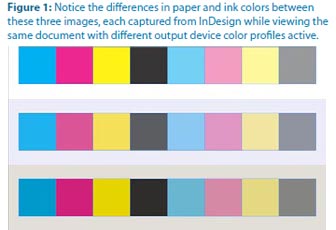
To paraphrase Bruce Willis in the Last Boy Scout, we all know that water’s wet, the sky’s blue, and paper is white, right? Well, no, not always. Frozen water isn’t wet, the sky changes color, and so does paper. Some white paper is whiter or brighter than others. Thus, not only will the unprinted “white” of your jobs differ from one stock to the next, so will the colors of your inks because the color of the paper will mix with them, tinting them (Figure 1). For that reason, you should proof your work from time to time onscreen using a color profile targeted not only to a particular output device but also to the specific substrate you’ve chosen. Once you have it (from your printer again), here’s how to use it.

  1. With InDesign closed, install the ICC/ICM file into the following path:
    Windows: \Windows\system32\spool\drivers\color
    Mac: /Library/ColorSync/Profiles
  2. Open your document in InDesign.
  3. From the View menu, choose Proof Setup > Custom.
  4. Select the newly installed profile from the Device to Simulate dropdown menu and check Simulate Paper Color, which will also automatically check Simulate Black Ink. Click OK and, if your monitor is properly calibrated (with a device such as the Datacolor Spyder or an Xrite Eye-One), you’ll see onscreen colors very close to what you’ll get off the printing press.

Changing the options in the Customize Proof Condition dialog automatically turns on color proofing. To turn it off, just toggle the View > Proof Colors command.


Use Best of Breed Printers

Like designers, printers tend to specialize in certain areas. A printer who cranks out the most beautiful magazines, catalogs, and brochures may not be equipped to do the best job on your promotional posters, business cards, or signage. Some may not print jobs outside their specialties at all, others will offer “full service printing” to augment their primary projects income or as a convenience to clients who need something outside the norm once in a while. Many of both types will vend out the job to other printers. This is particularly true of the highly specialized business card printing business. Few print shops actually do business cards; most vend them out to a handful of boutique business card printers. And, sometimes, you can get better quality and price by cutting out the middle man.

Unless you’re always producing the same types of printed projects, establish a stable of print vendors and vend to them only the jobs at which they excel in producing. That said, cultivate relationships with your printers. Gifts help. Bruce Fraser, the late co-author of Real World Photoshop, recommended offering a “pint of Haagen-Dazs sorbet or, for really big favors, Laphroiag.”


Cash Off the Top

Did you know that you can often pay 10-15% less for your print job? If the job is for you—your identity package or marketing material, say—you must pay full price. However, if you’re bringing a client job to press, you are acting as a print broker, not as a print client.
 
Many print shops will therefore charge you 10-15% less for the job. Why? So that you can make some money on the print job without having to raise the price. If your client calls the print shop directly, she’ll be quoted the full retail price, which is what you charge back to her, keeping the 10-15% difference for yourself. The print broker discount is a way to help you recuperate the costs of working with the printer on your client’s behalf and spending time checking proofs and transporting files and the printed job. Just let your print provider know at the time of order that you’re brokering the job for your client, and then ask for the discount.
 
Full disclosure: InDesign Magazine’s parent company, PrintingForLess.com, offers a print broker program called Printing for Less Pro. Learn More.
 

Why You Shouldn’t Use Registration Color

As we all know, the InDesign Swatches panel includes four undeletable swatches. Their names are bracketed and three of them have an obvious purpose—None is no color; Black is black; Paper is effectively no color, allowing the color of the paper or substrate to shine through or knockout ink. The fourth undeletable swatch is Registration, and, surprisingly, not many people know what it’s for, just that they should never use it for any object to appear on the printed page unless instructed by their printer.

Simply put, the Registration color is a magic swatch that will print on every ink plate. If you’re working strictly in CMYK, any object set in 100% Registration will print out at 100% of cyan, magenta, yellow, and black. If that’s cool to you, think again. The result is usually not a nice rich black but rather the color of old mud. Worse, ink is tacky and that much of it aggregating in too large of a place will make your printer very unhappy. If you’re working in CYMK and two spot colors, your Registration-colored object will print out in six colors. (That’s even uglier.)

So what is the point of the Registration swatch? To create such things as registration marks, those little cross hairs that enable press workers to identify when one or more colors don’t match up, indicating that something is misaligned on the printing press. The color is also used for other information or structures that need to print on all plates—usually in the slug area—such as the client name, job number, and other specific information. The easiest way to include that information on the film is to set it in the slug area, in the Registration color swatch.


PDF or INDD?

Most prepress pros are firmly in favor of sending only PDFs to the printer. Many printers are firmly in favor of you sending them the native InDesign document (packaged to include images and fonts). So which is correct? Send the PDF first. After all, the most common prepress problems, such as font embedding issues, alteration of trap and overprint settings, can be fixed directly in the PDF. That’s a whole lot better than the printer opening your file and possibly introducing accidental major changes like text reflow. But be prepared to package and send the InDesign file if the print shop insists on it.
 

spot colors in InDesign

Multiple Instances of Spot Colors

Working in a layout application like InDesign you often combine image assets from various sources, even different decades, into a single document. Well, if you haven’t noticed, ink libraries differ from application to application, one time period to another. An EPS image exported 10 years ago from QuarkXPress may contain a PANTONE color with a slightly different name than the same color added into the Photoshop PSD file last week. Placing both images into InDesign will bring in that same color as two separate color swatches— and it will output them as two separate color plates, doubling the cost and work involved in printing that one color.

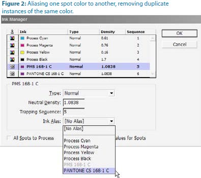
How do you resolve such a situation? You can’t delete one swatch and replace it with the other, not if the spot color is part of a linked image. Should you pull the EPS into Illustrator or PSD into Photoshop and fix the mismatched ink there? Sure, you could, if you’re comfortable with those applications, but it’s not the most efficient way to fix the problem—particularly if you have multiple assets using the same conflicting spot colors. Instead, configure InDesign to overcome the problem internally, at print or export time.

  1. From the Swatches panel flyout menu, choose Ink Manager (Figure 2).
  2. In the Ink Manager dialog highlight the first duplicate ink, preferably the one with the older, more obscure, or otherwise undesirable name.
  3. From the Ink Alias dropdown menu select the other instance of the spot color, the one with the name you do want to keep. Click OK.

The first ink is now aliased or mapped to the second. All instances of either spot color will now output on the same plate, as the same ink.


Time and Money

Going to press efficiently—which includes preparing to design the right way—will save you time and expense. Maybe we should call this column InTime and InExpense? I’ll bring you more tips and techniques for going to press efficiently in future installments of InTime. In the meantime, open the April/May 2009 issue of this magazine for some great related advice from Steve Werner in “Will it Print? 10 Tips for Creating an InDesign File that Prints Perfectly.”


Pariah S. Burke is the author of Mastering InDesign CS3 for Print Design and Production (Sybex, 2007), and other books; a freelance graphic designer; and the publisher of the Web sites GurusUnleashed.com, WorkflowFreelance.com, and CreativesAre.com. Pariah lives in Portland, OR, where he writes (a lot) and creates (many) publications and projects for Empowering, Informing, and Connecting Creative Professionals.

More on InDesign Magazine. Each issue gives you tips, techniques, and time-savers by an all-star cast of industry experts.


This field is for validation purposes and should be left unchanged.

Get 20% Off*

Your First Print Order

Name(Required)

*By subscribing, you agree to receive weekly emails from Printing for Less. Some exclusions apply. See details.

RELATED MARKETING & DESIGN TIPS

Saddle Stitch Binding

What you need to know to get saddle stitching binding done on your printed catalogs and booklets

Read More >


E-Book: 2025 Direct Mail Product Guide

The first edition of this e-book is packed with actionable insights, including design tips, mailing class details, and best practices to ensure your campaigns stand out.

Read More >


USPS Mail Layout Templates

Get USPS-compliant templates for printing EDDM postcards, brochures, newsletters, and more to ensure your mail fits USPS regulations. Print & mail EDDM!

Read More >


The Scenery From Here

The Scenery From Here

Why we’re one of the best printing companies in the world to work for.


The PrintingForLess Headquarters
PrintingForLess headquarters PrintingForLess building
Our 46,000 sq. ft. environmentally friendly facility in Livingston, MT. Energy efficient and human friendly!
 

Learn more about our eco-friendly green printing practices and more details
on our state of the art printing plant. Now 100% wind-powered.


Paradise Valley near Livingston Montana

Livingston Montana and Paradise Valley Views


Bozeman MT

Nearby Bozeman

Drop by or call to let us know you’re coming!
800-930-6040  or  406-222-2689
100 Printing for Less Way
Livingston, MT 59047
 
 
This field is for validation purposes and should be left unchanged.

Get 20% Off*

Your First Print Order

Name(Required)

*By subscribing, you agree to receive weekly emails from Printing for Less. Some exclusions apply. See details.

RELATED MARKETING & DESIGN TIPS

File Upload

Read More >


Complete Guide to Creating Press Ready Print Files

We put together everything you need to know about creating a successful commercial print ready file. Learn about bleed, color, image formats, folds, & more.

Read More >


What is EDDM

One of the best tools for reaching customers in a geographical area is Every Door Direct Mail, a cost-effective way to market locally.

Read More >


Repurposing Your Website for Print Marketing

Repurposing Your Website for Print Marketing

Boost small business marketing by repurposing your existing website

As a small business owner, you wear more hats than most people will ever know. Whether it’s acting as accountant to balance the books, rolling up your sleeves in the kitchen, or burning the midnight oil to launch a website, you’d do anything for your business.

Which means that like most small business owners, you’ve got to save time and resources where you can. One of the greatest small business marketing secrets is understanding how to repurpose content. Here are some tips for turning your existing website into direct mail pieces, emails, and other marketing assets.


How to get the most return from one piece of content

Whenever you create a piece of content for your business, you’ll do yourself a huge favor by taking a more holistic approach from the get-go. Consider how a webpage, blog post, or tradeshow flyer can be repurposed to fit multiple channels. Let’s take a look at how to create each of these assets from your current website.

Repurpose website material for direct mail

If you’ve got a website, you’re already sitting on a lot of good information that’s waiting to be repurposed. One of the easiest ways to do this is to turn that content into direct mail pieces that you can use to target specific customers. This is a great way to take an inbound channel (your website) and turn it into an outbound channel (direct mail) so you are spreading your marketing message.

You can take topics from different web pages and make them the focus of direct mail pieces like brochures, flyers, postcards, and more. Best of all, you can use those mailers to point people back to your website and drive them to buy. For example, let’s say you own a small auto shop. One of your biggest money makers is tires and you have an entire web page devoted to them. You can promote your business by taking the details from that webpage, adding it to a postcard and highlighting your top selling tires.

With direct mail, you can also target certain areas in your community by using the US Postal Service’s Every Door Direct Mail® (EDDM®) option. Now you can send your direct mail piece showcasing your tires to everyone within a few miles, or if you’re promoting special tractor or farming tire, why not focus only on rural residents? It is easy to do with targeted EDDM®.

Pro tip: include a limited time offer on the mailer to build a sense of urgency in your audience.

Turn a webpage into a blog post

When you write a webpage, you’ve got blog content sitting directly in front of you. If you’re trying to expand your blog content, simply take the main points of your webpage and re-use them as a blog post. Don’t copy and paste, however. Creating exact duplicates of a webpage will set off an alarm in search engines like Google, flagging your site as low quality and bumping you down when someone searches for a topic in your blog.

Check out how this webpage on brochures was repurposed to make this blog post on creating great brochures. Notice how the content is similar but not identical. The blog post adds a bit more value, takes a more colloquial tone, and engages the audience.

Turn a blog post into multiple social media posts

No matter whether you’re a small business or a large enterprise, social media is critical in today’s business world. This may seem like another area you simply don’t have the time or resources for, but if you’re crafting reusable content, it’s much easier than you think. For each blog post you create, you should be able to create four or five different social posts from it.

Good ideas for social posts are short, concise blurbs that identify a problem your customers face; captivating photos of your products, customers, or staff; and quotes from the blog post that are attention-grabbing. Typically you link the social post back to your blog or other webpage on your site that is relevant.

Remember, the key to a successful social campaign is to be social. Engage. Talk, become part of a community. If you think you simply don’t have the time to manage multiple social profiles, check out some of the free tools for ongoing social content management.

We’re big fans of Hootsuite at PrintingForLess, and using these kinds of tools can help you broadcast your message far and wide with a minimum amount of effort. They work by letting you schedule blog posts weeks in advance and give you access to data showing you how people are engaging with your social posts. This is just the start, there is a whole industry out there to help small businesses manage their social presence.

Turn a blog or webpage into an email

You can also take that same webpage or blog and turn it into an email for your current customers. Think of this email as a teaser to what you’ve already written, you want to keep it short and sweet. And make sure your email isn’t a dead end! Use a strong call to action to point the reader to the next destination once they’re finished reading. What do you want them to do next? Visit your website? Go to your blog? Be sure to tell them exactly what to do and make the language strong and urgent.

An old marketing adage says that a prospect has to be exposed to your brand seven times before they remember you. The longer you can keep customers bouncing around your blog, website, or social profile, the better. This is how they begin to build a relationship with your brand.

Keep your marketing brand-centric

Be sure that as you expand your content across multiple channels you stay consistent. You don’t want your company voice and messaging to change drastically. What if you spend money on a high-profile billboard ad that is really funny, but all of your email newsletters are dry and stuffy? You are going to create confusion with customers. The public should be able to recognize your company from one piece to another whether you’re talking to them online, in an email, or through direct mail.

Don’t make your marketing strategy about pushing a sale

When you sit down to write content, ask yourself, “What value can I bring to my customers? What can I solve for them?” Answer those questions in your content and you’ll build trust with readers. You never want to come across as simply pushing a product.

When you are repurposing portions of your website you can easily fall into this trap. Your website is mostly about you, your company, and what you can do. The reality is that effective marketing is about the customer, their needs, and real solutions. If repurposed content feels self-serving, your customers know.

There are a lot ways for you to repurpose content on your website, from growing blog efforts to engaging in social media. One of the best ways is to give direct mail a try. It can help you stand out, target local audiences, and be remembered. And it is affordable.

If you’re interested in using direct mail to turn digital assets into tangible assets, check out Printing for Less’s direct mail services.


This field is for validation purposes and should be left unchanged.

Get 20% Off*

Your First Print Order

Name(Required)

*By subscribing, you agree to receive weekly emails from Printing for Less. Some exclusions apply. See details.

RELATED MARKETING & DESIGN TIPS

Newsletter Design Idea Example

Creating a newsletter and keeping people informed is important, especially when it comes to non-profit organizations.

Read More >


Using Die Cutting on Brochures

Get unique die cut brochures printed that will cut through the clutter in the mailbox and get your message noticed.

Read More >


Printing Metallic Ink on Business Cards

Add a little flash to your business card with metallic ink! Printing for Less offers metallic printing for your business card to get you noticed! Learn more.

Read More >


Begin with Finishing

Begin with Finishing

Folding is hardly the most glamorous part of a print project. But when it comes to getting what you envisioned on time and on budget, it’s one of the most important.
 
By Trish Witkowski and Peter Truskier

Folds are everywhere: brochures, direct mail, fold-out covers, folded inserts bound into books. Although it can be simple and standard or fun and creative, even the most basic of folds can require careful thought and planning. There s a technical side to folding that s rarely talked about, yet understanding how to design folded materials is a critical career skill. Once you re in the know, you’ll feel more confident about the files you send to the printer, be happier with your finished projects, and save money in the process.

This article covers the basics to consider before you fold and takes you step-by-step through creating a common (yet often bungled) folded document. We’ll also supply scripts that free you from some of the tedious manual work.


Think Before You Fold

Before we talk tech, let’s back up a bit. When you begin to work on something like a brochure, you probably start with a sketch, then come up with a cool layout, get the client’s OK, and finally choose a printer and send off the file. Basically, you do the fun stuff first and worry about the details later.

The drawback to that workflow is that folding, even though it happens after your project comes off the press, has to be planned for if you don’t want to send your costs sky-high.

Not all folds are created equal. Some require special folding equipment, skilled bindery professionals, slower run speeds, longer make-readies, and hand work (translation: $$$).

If you have an unlimited budget, you have nothing to worry about, but otherwise, you need to be sure your fold not only can be produced but can be produced at a cost you can afford to pay. Talk to your printer early and often in the concept stages, or you may get burned.

The other reason that finishing (anything that happens to the sheet of paper after printing) is so important is because of its place in the process. A mistake caught at the finishing stage is the most expensive mistake you can make. At that point, the job has been through prepress, proofing, and the pressroom. For each step in the workflow, the cost of the error gets exponentially higher. A mistake caught in the bindery almost always means a reprint, or an undesirable work-around.

With that in mind, here are some things to think about before you start a project that involves folding.

Do you know your audience?
You wouldn’t choose a delicate paper for a piece intended for children, or a complex fold for an elderly audience. Sometimes the folding style or materials that would look best (and maybe even win design awards) are inappropriate for the end user. Think about who will receive the piece, have a paper dummy made up, and test it.

origami

Do you know your budget?
Before you show that creative fold to your client, run it by your printer first. No client appreciates being sold something they can’t afford, and the budget- conscious compromise will never be as good as the original in their eyes. Be upfront with your printer about your budgetary constraints; they may even be able to help you get what you want. For example, reducing the finished size of the piece slightly may fit more of them on the press sheet, or may allow you to drop your press sheet size. There may be a comparable paper that is less expensive, or a trimming trick that could make a nice effect without adding much cost to the job.

Do you know your content? This is really important. The way your content should be organized has everything to do with how the sheet is folded. Content placement isn’t always an intuitive decision; the reader may not open or read the document in the order you intended.

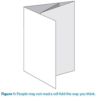
For example, often when working on a roll fold (Figure 1), designers usually put the most important information on the two roll-in panels. The perception is that people will open the piece and read the first roll-in panel, then open it a little further to read the second roll-in panel, and lastly open it out flat to view the inside spread. The reality is that when most people open a roll fold, they flatten it almost immediately. They might eventually turn it over and read the material on the roll-in panels, but the critical real estate for the roll fold is the inside spread. If you have text flowing from one panel to another, be sure the reader knows where to go next or, no matter how nice it looks, your design fails. The easiest way to find out how the reader will respond is to make a folding dummy of your layout and pass it around, watching how people open it.

roll fold
 

Do you know your method of distribution?
Will it be a self-mailer? If so, there are postal regulations and wafer seal or glue requirements. Talk to the post office, which has staff dedicated to qualifying mail. If your piece will be mailed in an envelope, auto-insertion can be a problem for some folding styles, particularly the accordion fold, so ask your printer about that. Do you know the size of the envelope, and how small your piece needs to be to fit in the envelope? If other pieces will go in the envelope with the brochure, you may need to make the main piece a little smaller than the recommended enclosure size since the added bulk will take up space.

Folding Guidelines

You can boil down folding guidelines into four areas: compensation, edges (trims, margins, pages), and setting fold marks.

Compensation.
Folding is dimensional, and because of this, if panel 1 is to fold into panel 2 and lie flat, panel 1 must be slightly smaller. That’s called compensation. If you don’t compensate, the folded piece will telescope, or have a roundish profile because the panels are too long and push against each other. No bindery will let telescoping happen. Rather, they’ll adjust the fold placement so that the brochure will lie flat, but margins and color breaks may shift noticeably. Not good!

To truly understand compensation, let’s make a four-panel roll fold dummy. Start with a standard sheet of paper and divide it into four equal panels. Fold the farthest right panel in, fold it in again, and close the cover. It will telescope because the farthest right panel must fold into the next panel, which folds into another. So the farthest right panel gets twice the compensation of the panel to its left, and the last two panels, since they’re not folding into anything, don’t require any compensation.
Now flip the dummy over and you’ll notice that the narrowest panel now falls on the left—everything reverses for side two of the brochure.

There’s a simple rule for calculating the panel differences: Shorten the fold-in panel by 3/32″ to 1/8″. If the fold-in panel is broadside (two-sheet thickness) or in heavy cover stock, increase the compensation to 1/8″ to 3/16″.
The step-by-step how-to on page 13 gives you valuable techniques and tools for creating the digital document that includes these calculations.

Trims, margins, pages, etc.
We’ve seen many ways of building a digital file for folding. Some float the brochure on a larger page with crop marks, some create separate documents for side one and side two, some build the file in viewing spreads. We recommend creating a single two-page document. Build the document size to the final trim size of the piece. Trim size (also called flat size) is the size of the final brochure—including folding compensation—when laid out flat. Pull the bleed past the edge as you would with any other print project.

There are no rules regarding what margins should be. The key is not to question the margin amount, but rather the width and placement of the text frame when a panel is compensated. It can add up to a noticeable difference when not adjusted correctly.

Setting fold marks.
Placing one of InDesign’s guides is not enough to show the printer where to fold the sheet. You need to create fold marks. Once you’ve set fold guides, draw a short, vertical dotted or dashed line directly above the first guide, making sure it’s in the slug area and not crossing onto the document edge. Then, follow the guide straight down and make another vertical line just below the guide, off onto the slug area. Zoom out, group both lines, copy and paste, and place them on the next guide. Continue this until all folding guides have fold marks above and below. Want to save time? Run a fold mark script instead. (See the “Scripts” sidebar on page 17 for details, including directions for getting the scripts.)

When you’ve finished, print the document with bleeds and crop marks, trim it, fold it down and make sure you didn’t miscalculate or misplace any of the folds. If everything looks good, you’re ready to start designing.

fold types for commercial printing
Fold by Fold, Step by Step

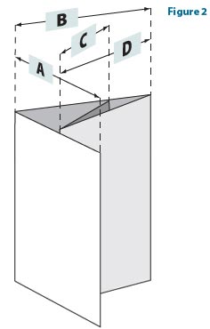
Enough theory—let’s build it. By the end of this how- to, you’ll have an InDesign document for a four-panel, eight-page, roll folded piece with a finished folded size of 5″ X 8″ (Figure 2).

fold types
1 Plan it out

Once you know the desired width for each of the panels, make a simple sketch you can refer to while building your document. In Figure 3, both sides of the piece are shown with Panel A (the front cover) on the right of the outside page and on the left of the inside page.

Using the standard compensation values, the panel widths should be as follows:

D. 4-13/16″
C. 4-29/32″
B. 5″
A. 5″
fold compensation
Folding Lingo

Flat size vs. finished size
The flat size is the exact dimension of the piece when laid flat. This measurement should include all folding compensations, but should never include bleed allowances because bleed is pulled past the edge of the page in the digital document. Digital document page dimensions and flat size should always be the same measurement. Finished size is the exact dimension of the piece when completely folded.

Folding Lingo


Mechanical fold vs. hand fold
A mechanical fold is any fold that can be done by machine. Hand folds must be done completely or partially by hand. Often, printers take folds as far as they can go by machine, then bindery workers do the last fold or two by hand. Some folding styles that are considered hand folds can be done by machine at specialty binderies. Hand folding is very expensive and requires a die-score and more time built into the finishing schedule.

Panels vs. pages
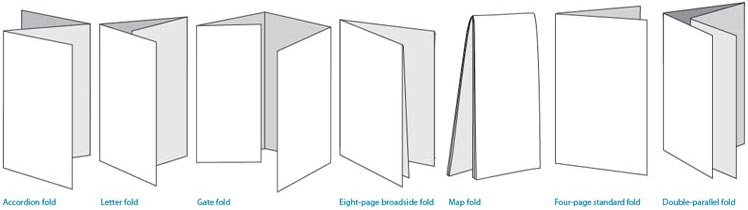
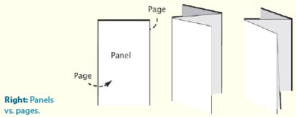
Panels are two-sided sections of the final folded piece. A page is one side of a panel. The Accordion fold below is three panels; each of the panels is two-sided, and each side is a page. So, the three-panel Accordion has six pages. If you take that fold and make it a Broadside Accordion—a broadside fold doubles its area by folding in half on itself before any characteristic folding style is created—the fold changes to six panels and the page count rises to twelve. Left: Flat vs. finished size. Right: Panels vs. pages.

fold panels
 

To avoid dealing with fractions or lots of decimal places in InDesign, and also to minimize InDesign rounding errors, use points to define your document and create the guides that will denote the panel boundaries. Since there are 72 points per inch, multiply each of the four panel widths in inches by 72. Also multiply the finished 8″ height of the piece by 72. These are the values marked on Figure 3.

fold panel values
2 Create the document

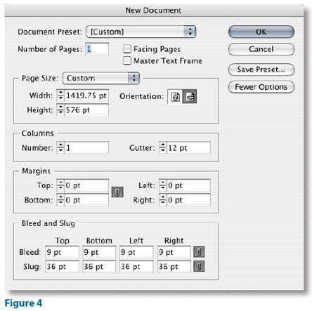
Add the widths of the four panels (346.5 + 353.75 + 360 + 360) to calculate the desired width of the document: 1419.75 points. Its height will be 576 points.

Enter the values in the New Document dialog box (Figure 4). If you use our utility scripts (see the “Scripts” sidebar on page 17), you only need to create a one-page document; you’ll use the mirroring script to automatically create the second page after you’ve made the guides on the first page.

indesign document
 

In the New Document dialog box, specify the amount of bleed you want, and add a slug area to contain the fold marks. (Our fold mark utility script will expand the slug as necessary to hold the folding marks, so you can omit this now if you plan to use the supplied script.)

 
3 Create a new layer

It’s a good idea to place marks and guides on their own layer beneath all other layers in the stacking order. Now’s the time to create and select this layer. (After you’ve created all the guides and marks, you may want to lock this layer to prevent accidentally moving anything.)

 
4 Create the first guide

Drag a vertical ruler guide from the left ruler of the document window. Release the mouse when the guide is in the vicinity of the desired position (346.5 points).

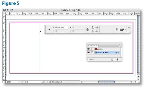
To precisely position the first guide after dragging it on to the page, make sure it’s selected (it will be just after you’ve created it) and enter its desired position in the numeric field in the Control panel/palette (Figure 5).

indesign guides
5 Create the second guide

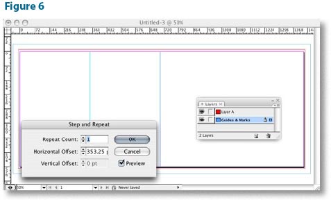
You can also use the Edit > Step and Repeat menu option to duplicate a guide at a precise horizontal or vertical offset. To create the second guide, select the first one by clicking on it with the Selection Tool, and choose Step and Repeat… from the Edit menu. In the Step and Repeat dialog box, enter “1” for the Repeat Count, and enter the width of panel C (353.25 points) in the Horizontal Offset field. We also like to turn on the Preview checkbox (Figure 6).

secind guide
6 Create the final guide

Select the second guide, and Step and Repeat it by the width of panel B (360 points) to create the final guide on page 1.

 
7 Check your work

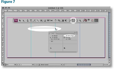
Before moving on to page 2, double-check that all the guides are in the correct position. Make sure Snap To Guides is turned on (under the View > Grids & Guides menu), and use the Measure Tool and Info Panel to measure the distance between each pair of guides (or page edges) and compare to your sketch for accuracy (Figure 7).

check guides
8 Make page two

Your document needs a second page, and its guide positions need to be horizontally mirrored relative to page 1—that is, panel A (one of the 360 point panels) is on the left of page 2, and panel D (the narrowest) is on the right.

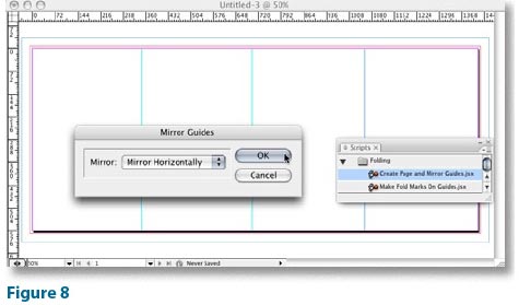
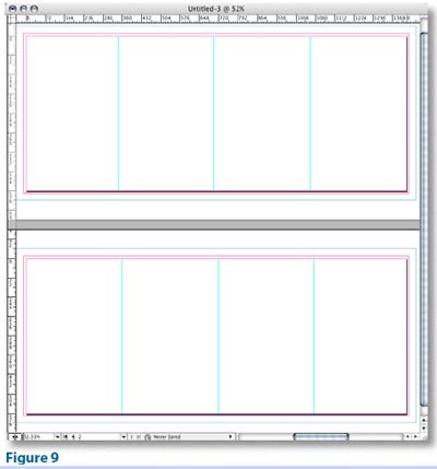
You could manually create a second page, and follow the previous steps to create the guides. However, it’s a lot easier to use our script attached to this article (Create Page and Mirror Guides.jsx). This script will create a new page, and create a new set of guides on it, mirroring the position of all the guides on page 1. When you run the script (by double-clicking it in the Scripts Panel), it will display a dialog box with a popup menu in which you select the direction(s) in which you want to mirror the guides (Horizontally, Vertically, or Both). In this case, we want to mirror horizontally (Figure 8). The result will look like Figure 9.

indesign pages
check pages
9 Create fold marks

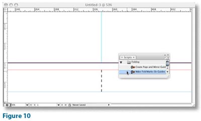
The final step in building your document is to create fold marks in the slug area. You could create these manually, but once again, InDesign scripting comes to the rescue, eliminating the need for tedious, error-prone work. Our script Make Fold Marks on Guides.jsx will first expand the slug area (if necessary to accommodate the marks it’s going to create), and then create fold marks in the slug area for all guides on visible layers in your document (Figure 10).

fold marks
10 Time for text and images

With your document set up this way, you’re well-prepared. Time to place text and images!

 
Finshing at the Beginning

A successful folded project and a smooth workflow process take thought, planning, and some technical know-how. But with a little practice, you’ll feel confident about what you’re doing. If you remember only one thing from this article, make it this: Think finishing at the beginning. Resist the temptation to design in a vacuum and get your printer’s opinion early. Then have fun creating your masterpiece.


Trish Witkowski is president of Finishing Experts Group, Inc., and is the creator of the award-winning FOLDRite brochure folding system.
 
Peter Truskier is partner at Premedia Systems, a publishing workflow consulting company in the San Francisco Bay area.
 
Resources
If you don’t have the time or the desire to come up with a folding plan on your own, there’s plenty of help.
 
Templates
Search the Web for InDesign templates and you’ll get a lot of hits like these:
  • www.stocklayouts.com
  • www.ideabook.com/indesign_templates.html
  • Also, some printers offer a wide variety of folded product templates.
  • Don’t forget the templates that ship with InDesign. Access them by going to Help > Welcome Screen…, and click on Create New…From Template.
  • For custom digital folding templates in a snap, check. out the new FOLDRite Template Master plug-in for InDesign (available November 2007). Visit www.foldfactory.com for more information and to view a demo. If you visit the site and pre-register, you’ll be eligible for a special promotional price and other offers.
Books
  • FOLD: The Professional’s Guide to Folding, by Trish Witkowski
  • Forms, Folds, and Sizes: All the Details Graphic Designers. Need to Know but Can Never Find, by Poppy Evans
  • The Packaging and Design Templates Sourcebook, by Luke Herriott
More InDesign Articles and Tutorials. Tips, techniques, and how tos by an all-star cast of industry experts.

This field is for validation purposes and should be left unchanged.

Get 20% Off*

Your First Print Order

Name(Required)

*By subscribing, you agree to receive weekly emails from Printing for Less. Some exclusions apply. See details.

RELATED MARKETING & DESIGN TIPS

Plastic Business Card Printing

Get high quality plastic business cards printed with numerous custom options, fast turnaround, free templates, live expert help and award winning service

Read More >


Get Our 2025 Holiday Cheer Lookbook

Whether you celebrate Hanukkah, Christmas, Kwanzaa, or something entirely your own (Festivus, anybody?), “Printing for Less’s 2025 Holiday Cheer Lookbook” has all the inspiration you’ll need to make your gifting season sparkle.

Read More >


Fair and Square Binding

Get Square Back Binding on your catalogs and booklets for added usability and class

Read More >


Professional Printing Tips and Resources

Professional Printing Tips and Resources

Business printing is a lot like preparing for an important presentation. You want to show that you put enough thought and care into how you present yourself and your company. Here are some tips and resources for professional printing to help instill confidence in your clients and business prospects.


Bare Bones for Business Printing

Looking “professional” in print takes more than just a decent design and well-written copy. If you want professional-quality marketing materials, there is no substitute for true 4-color process printing. Offset commercial business printing gives you the best quality and value for the buck.

But don’t be fooled into thinking any local or online printer will produce the type of quality that says “credibility.” More is involved in professional business printing than simply putting ink on paper.

Your printer should work with you and review your files to ensure your design will look as good as you expect, when you expect it. Choices such as paper stock, fonts and mailing guidelines can be critical in printing an effective marketing piece.

  • Thick, 12 or 14pt card stock for your business cards and 80# or higher text for brochures and catalogs give a substantial feel, with either a glossy or matte finish.
  • The right layout, fold and size can save you a bundle when preparing direct mail pieces. Talk to the pros on how to save on both printing and postage on your business printing and mailing.
  • Request samples of papers and printing. Ask about getting a hard proof or press proof if the color has to be right or you are printing a large order. Check the finish, texture and color to ensure it portrays the professional look and feel your business deserves.

A printer that stands behinds it’s work also guarantees it. Check your printer’s guarantee policy to understand how they deal with errors or returns. Find out more about how to choose the right business printing service.

Unique Business Printing Needs

  • If you’re a graphic designer, marketing agency or other print broker or reseller, professional printing is paramount to your business. Consider using a trade printer that offers high quality printing, trained experts and wholesale pricing.
  • For organizations with multiple offices, distributors or franchises, or for anyone looking for fast and easy business printing for your employees or associates, a web-to-print professional printing solution may be the best way to obtain quality printing that’s hassle-free.
  • For startups, professional printing can make the difference in showing you’re serious about your new business. Ask about special offers for establishing your business identity, such as business card and stationery packages.


This field is for validation purposes and should be left unchanged.

Get 20% Off*

Your First Print Order

Name(Required)

*By subscribing, you agree to receive weekly emails from Printing for Less. Some exclusions apply. See details.

RELATED MARKETING & DESIGN TIPS

Complete Guide to Creating Press Ready Print Files

We put together everything you need to know about creating a successful commercial print ready file. Learn about bleed, color, image formats, folds, & more.

Read More >


5 Steps to Producing a Great Catalog

5 step catalog marketing strategy that will help you produce a successful catalog to bridge online and offline sales channels.

Read More >


Saddle Stitch Binding

What you need to know to get saddle stitching binding done on your printed catalogs and booklets

Read More >


Choosing a Printing Service for Your Project

Choosing a Printing Service for Your Project

As one of our oldest industries, there are scores of “printing” choices, but what are the differences in printing services and methods, and which is right for your project? There are three key factors that will help you determine what type of printing service is right for you and your budget: Quantity, quality and production speed. Here’s a rundown on the types of printing services and their relative pros and cons.


Standard Business Printing Services and Methods

Desktop Printing

Desktop printingNeed to run only a couple dozen copies of a flyer, a few manuals or one-at-a-time invoices? A desktop printer fits the bill. Whether laser or inkjet (using toner as opposed to ink), printers you have in your home or office produce instant copies with acceptable quality when using good paper. Once your quantity requirements increase, however, your actual ink and paper cost can get expensive as a do-it-yourselfer. To minimize your per-piece cost, or if you want higher quality, special printing effects or promotional printing on substrates other than paper, you’ll need to find a printing service for your project.
Digital Printing

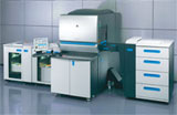
Digital Printing PressA digital file is sent from a computer directly to a toner-based digital press or copier. Because there are minimal set up costs, digital printing services are most cost effective for low run printing, such as 100 flyers or postcards, a few posters, or for creating complex document compilations such as training manuals. Short turnaround times are another reason to use digital printing when speed is critical. Digital printing quality doesn’t quite offer that “professional” look you get with traditional commercial offset lithography printing, but as equipment improves, it’s getting closer.


Special, high-end digital printers are used for large format printing, such as for large posters and vinyl banners.

Offset Lithography

Offset Printing PressIt is the most widely used printing service. Offset printing is where ink is transferred, or offset, from metal plates to a rubber cylinder or “blanket”, then onto the paper. This printing method accommodates the vast majority of commercial printing needs. Print projects such as a glossy brochures, postcards, business cards, stationery and catalogs are common offset projects. The advantages are rich, accurate higher-quality color and details and lower unit cost for volume quantities (250-500 pieces or more). Offset printing can take a little longer than digital printing due to the time needed for creating plates and for the ink to dry before cutting and finishing. Offset is generally not offered in smaller quantities, due to the initial set up costs involved.

Learn more about offset printing, the type of printing we use for most products at PrintingForLess.com

Offset presses are either “sheet-fed” with individual sheets or paper or “web-fed” with rolls of paper. Sheet-fed presses are generally used for short to medium runs of standard business marketing printing, while web presses are most cost-effectivene for high-run commercial printing, usually of magazines, catalogs and books (around 20,000 quantity or more) and for newspaper printing.


Printing Services Compared

Standard Printing Type Quantity – lowest unit cost Quality Production Speed
Desktop printing Less than 50 pieces Good Immediate
Digital printing 50-250 pieces Good 1-4 days*
Offset lithography 250 or more pieces Excellent 2-6 days*


Take some time and ask yourself: What matters most to you on your print project? The size of your marketing campaign, your company’s image and quality needs, any looming deadlines and your target recipients’ expectations are important considerations to weigh when you are looking for the best printing service match for your project.

Other Printing Services

Gravure Printing

Rotogravure presses are the fastest and widest presses in operation and are mostly used for huge industrial runs of magazines and direct mail catalogs.

Engraving, Thermography, Flexography and Screen Printing

Engraving is used on fine stationery, while thermography is a lower-end process that creates an engraved or raised printing effect. Flexography is generally used on packaging, such as food labels and can be used for printing on non-paper mediums such as plastic, metallic films and cellophane. Screen printing services are used for T-shirts and billboards.

Also see Choosing A Printing Company: A Partnership For Your Success


This field is for validation purposes and should be left unchanged.

Get 20% Off*

Your First Print Order

Name(Required)

*By subscribing, you agree to receive weekly emails from Printing for Less. Some exclusions apply. See details.

RELATED MARKETING & DESIGN TIPS

How to Design Print Materials for Foil Stamping Effects

We share the top best practices for designing for foil stamped or metallic printing effects to insure that you get the best printed piece possible

Read More >


Point of Purchase Displays

These patented easy to erect custom point of purchase displays can complement your literature graphics and communicate your brand messaging better

Read More >


Graphic Design

So you have the coolest design idea for print, but do you have the right colors for print or coating or fold? Our graphic design resource center has it all.

Read More >


  • « Go to Previous Page
  • Page 1
  • Page 2
  • Page 3
  • Page 4
  • Go to Next Page »

Footer

Printing for Less

info@printingforless.com
100 P F L Way, Livingston, MT 59047

800-930-2423

  • Home
  • Products
  • Services
  • Industries
  • Get Printing Samples
  • Direct Mail Marketing Resource Center
  • Printing Resource Center
  • Blogs
  • Templates
  • Terms & Conditions
  • Contact
  • About Printing for Less
  • Careers
  • Login

Copyright © 1998-2026 PrintingforLess.com. All Rights Reserved.

logo
  • 800-930-2423
  • Products
  • Direct Mail Marketing
  • Services
  • Industries
  • Direct Mail Marketing Resources
  • Printing & Mailing Resources
  • Get a Quote
  • Contact Us
  • My Login
Direct Mail Delivery
This field is for validation purposes and should be left unchanged.

Get 20% Off*

Your First Print Order

Name(Required)

*By subscribing, you agree to receive weekly emails from Printing for Less. Some exclusions apply. See details.