• Skip to primary navigation
  • Skip to main content
  • Skip to footer
Printing for Less

Printing for Less

At Printing for Less, we've offered high quality online printing services since 1996. Shop business cards, booklets, stickers, and more!

P F L.com
My LoginMy Login
800-930-2423
  • Printing
    • Postcards
    • Catalogs
    • Brochures
    • Folders
    • Letters
    • Newsletters
    • Envelopes
    • Greeting Cards
    • Print Templates
    • All Products
  • Direct Mail
    • Why Direct Mail Marketing?
    • Every Door Direct Mail® Postcards
    • Direct Mail Letters
    • Catalogs & Booklets
    • Marketing Gifts & Kits
    • Direct Mail Automation
  • Services
    • Mailing Services
    • Design Services
    • Custom Printing Services
    • Reseller Program
  • Industries
    • Advertising & Design
    • Enterprise
    • Food & Beverage
    • Healthcare Payers
    • Healthcare Providers
    • Nonprofit
    • Real Estate
    • Retail
    • Technology
    • University
  • Resources
    • Direct Mail Marketing
      Resource Center
    • Printing Resource Center
    • Blogs
    • Templates
    • Video Library
    • Have a Question?
  • Get Samples
  • Get a Quote

Graphic Design

Choosing the Best PDF Preset in InDesign

Choosing the Best PDF Preset in InDesign

InDesign provides PDF presets so that you have fewer choices to make (and fewer details to actively remember). Presets group multiple panels of choices into the most common combinations for various workflows, such as commercial printing, desktop printing, and digital publishing.

But can you really trust a preset to take care of the piece you worked so long and hard to create? At the same time, how in the world would you expect to remember all of the available print options every single time you need a PDF?

Don’t worry about the learning curve; InDesign’s PDF presets aren’t standalone. If you’ve used other Adobe Creative Cloud applications to generate PDFs, you’ll likely notice something familiar about InDesign’s available preset options. You’ll find the presets in similar places when creating PDFs from both Illustrator and Photoshop.

You can quickly access InDesign’s PDF presets right from a flyout in the File menu. Go to File –> Adobe PDF Presets, and you’ll see all of your options right there.


InDesign pdf presets dialog


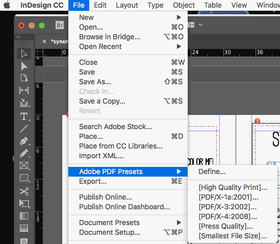
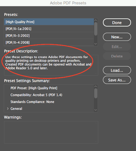
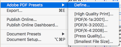
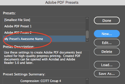
If you ever need a quick reminder of what a particular preset does from within your InDesign document, you can choose File –> Adobe PDF Presets –> Define, and as you choose each preset, you’ll see a straightforward “Preset Description” right there in the dialog box.


pdf quality settings


Let’s go ahead and look at the best applications for each.


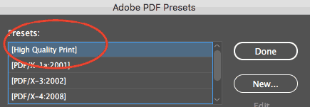
“High Quality Print” PDF Preset

According to InDesign, this preset will produce PDF files suitable for “high-quality printing on desktop printers and proofers.” What settings are most suitable for this particular application? Both color and grayscale images above 300 ppi will be downsampled to 300. Colors are left alone, so RGB and CMYK images will each remain in their native color spaces.

All transparency settings will also be left alone. Note that Acrobat and Acrobat Reader 5 are the minimum versions required for compatibility with these preset settings (which shouldn’t be a problem these days).


pdf presets high quality


What is PDF/X?

PDF/X standards are the best choice when your printer hasn’t provided you with specs. They’re a safe bet if you want to be sure your printer will be able to open your file, while also minimizing any printing errors. Adobe developed this set of ISO standards for print workflows by addressing input from other industry professionals and vendors. Because these standards are geared toward producing more universal print-ready PDFs, printers will often take the easiest route and encourage clients to choose the PDF/X presets.


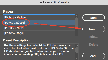
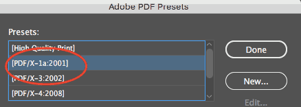
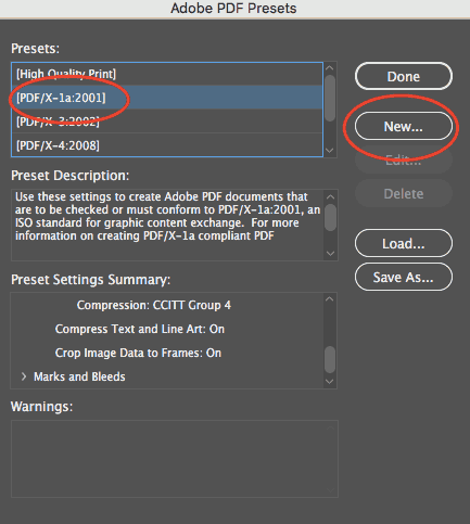
“PDF/X-1a:2001” PDF Preset

PDF/X-1a:2001 takes away compatibility with Acrobat 5 and downgrades it to Acrobat 4. All of your colors (whether RGB or CMYK) will automatically be converted to CMYK, although any spot colors you’ve set will stay intact.

You’ll also need to be proactive about transparency flattening, and may want to specify your own settings for transparency treatment.

To do this, you can go to File –> Adobe PDF Presets –> Define as shown above, then choose “PDF/X-1a:2001” and click the “New” button.


pdf presets pdf x-1a:2001


Then, select “Advanced” from the left menu and use the “Transparency Flattener” down to make your choice.


pdf presets transparency flattener


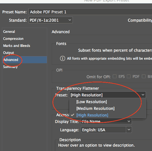
The “High Resolution Transparency Flattener” preset will best maintain the quality of your text and vectors, if that’s what you want. All images above 300 ppi resolution will be downsampled to 300 ppi if you have they’re higher.


adobe pdf presets settings


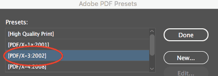
“PDF/X-3:2002” PDF Preset

Again, with this preset, your transparency will be flattened. If you want to choose your transparency settings proactively, you can follow the same instructions as above. PDF/X3:2002 is like the previous PDF/X setting, except it allows embedded RGB profiles to remain (no automatic conversion to CMYK).

It’s a helpful setting if your printer is planning on optimizing the color based on the printing environment. European printers tend to make more use of this format than American printers.


pdf presets pdf x-3:2002


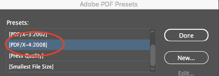
“PDF/X-4:2008” PDF Preset

With this PDF/X present, since compatibility is set to the more recent Acrobat 7, you’ll be able to keep any transparency in your document intact.

This is the biggest advantage of the PDF/X-4:2008 formatting. You’ll also be able to maintain the quality of any high resolution images. Color-wise, you’re allowed to use RGB, CMYK, and greyscale. Your spot colors will stay intact, and you can even continue to use LAB or ICC profiles.

pdf presets pdf x-4:2008


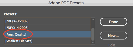
“Press Quality” PDF Preset:

This is another bundle of settings that’s often commonplace when working with high-quality commercial printers. This preset will allow you to keep all transparency live in the document (no flattening required). Adobe Acrobat works well with live transparency, and also creates satisfying separations, so a printer who works out of Acrobat will be happy with any file output this way. It will be compatible as far back as Adobe Acrobat 5. Any RGB values will be converted to CMYK, and all images will be downsampled to 300 pp in cases where the actual resolution is higher.


adobe pdf presets press quality


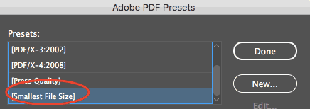
“Smallest File Size” PDF Preset:

“Smallest File Size” is most important where size matters, and size matters most on the web. In order for your document to be accessible to as much of your audience as possible, you’ll want to choose this preset for anything you’re planning to send via email or display on a screen.

Anything that’s both color and high resolution will automatically be downsampled to 100 ppi. Grayscale images can stay as high as 150 ppi. You’ll be able to play well with anything as far back as Acrobat 6, and you can keep your transparency and any layers intact.


pdf presets smallest file size


Custom InDesign Presets

The above settings will satisfy your print-worthy document needs almost all of the time, especially when you’re part of a professional environment using a typical print workflow. If, however, you have special considerations (or just want to get fancy), there’s more than one way to customize presets for your needs in InDesign.

We don’t need to cover every possible preset customization, but here are a couple of suggestions for more common needs:

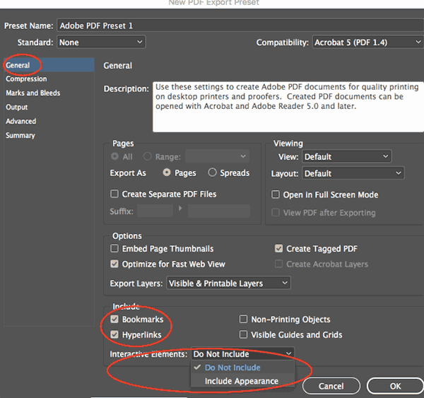
  • If you need to make your InDesign files interactive once saved as PDFs, you can go to File –> Adobe PDF Presets –> Define, then choose your preset setting and hit “New.”
define adobe pdf presets
pdf presets new preset
 
  • Then, choose “General” from the left side menu and pick your desired Hyperlinks and Interactive Elements from the bottom of the dialog:
pdf presets new export preset
 
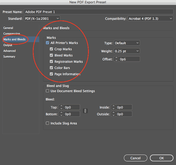
  • If your printer is asking you for crop marks, bleed marks, or other printer’s marks, you can go to File –> Adobe PDF Presets –> Define, then again choose your preset setting and hit “New.”
pdf presets pdf x-1a:2001 new preset
 
  • Then, in the dialog box, choose “Marks and Bleeds” from the left side menu and check the box for “All Printer’s Marks” in the top section.
adobe pdf presets all printers marks


Saving Your PDF Preset

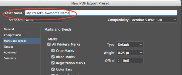
Once you’ve added your additional customizations to any of the PDF Presets in InDesign, you’ll want to name your preset in the top field of the dialog box.

pdf presets save preset
 

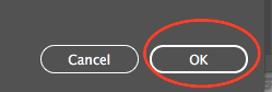
Then, click the “OK” button at the bottom right of the dialog box.


pdf presets ok
 

Your preset will have automatically been added to the Adobe PDF Presets dialog.


pdf presets list of presets

Congratulations, and happy customizing!


Need creative or technical advice on working with your PDF?
Call our helpful experts now at 800-930-6040

Get 20% Off

Subscribe to our weekly newsletter and get an instant 20% off your first print project.

Name(Required)
This field is for validation purposes and should be left unchanged.

RELATED MARKETING & DESIGN TIPS

The Art of Business Card Marketing

Your business card is one of the best advertising tools you have – Five Steps for Business Card Marketing Success.

Read More >


How to Set Up and Submit Canva Print Files

Get perfect prints every time with our new Canva print-ready guide! This helpful resource shows brands and designers how to prepare their Canva designs for smooth printing. Grab the guide and make your next print project a success.

Read More >


Color Printing Design Tips

Designing your own printed piece can seem like a challenge. These handy hints will help you with the process. Here are the first steps.

Read More >


CD Cover Size Specifications

CD Cover Size Specifications

How to Create your Own Custom CD Covers

CD Cover designs

Need custom CD covers for your corporate presentation or sales tools? Follow these simple CD cover size specifications to create the graphics for an eye-catching and informative CD jacket. And check out other products such as Presentation Folders and Brochures to help market your business.

It’s easy to produce a professional looking CD cover printed inside and out using whatever software tools you have on your computer. You can start from scratch in any layout program including Microsoft Word, Publisher or PowerPoint as well as traditional graphic arts programs such as Adobe Photoshop and Illustrator. Just use the simple diagram below to size your file and create any needed bleeds.


CD Cover Size Specifications for Printing

The finished dimensions for the outside of printed CD covers are 4.724 inches square. Many printed designs include bleed. The “bleed area” is an extra 1/8″ of space for design elements or backgrounds to extend beyond the finished size of your piece. A CD cover with bleeds is printed slightly oversized (4.974 inches square) and then cut down to size, giving the appearance that the printing “bleeds” off the edge of the cover rather than having a white border.

The finished dimensions for the inlay card are not square to accommodate the folded part needed to make the spines on each end. The inlay card creates the cover for the back and both spines, while the CD Cover inserts into the lid of the CD case.


CD Cover and Inlay Card

CD Cover Size Specs
CD Inlay Card Size Specs


Printed CD Cover Design Tips

When creating your CD cover design file, use these tips:
  • Make the document page size equal to the cover size plus the bleed area or 4.974″ x 4.974″ to be trimmed down to the finished size after printing. If you aren’t planning to include bleeds, the bleed area isn’t necessary so set the document size to the finished size of 4.724″ square.
  • Play it safe near the borders. Because cutting may vary ever so slightly, it’s a good idea to keep all of your valuable text and logo information within the design safe zone. This zone is the 1/8 inch around the margin of your cover or inlay card.
 
Need help with your CD cover or other printing project?
Give us a call now at 800-930-2423!
Get Instant Pricing on CD Cover Printing

Get 20% Off

Subscribe to our weekly newsletter and get an instant 20% off your first print project.

Name(Required)
This field is for validation purposes and should be left unchanged.

RELATED MARKETING & DESIGN TIPS

How to Create a Small Business Marketing Plan

Need help creating a small business marketing plan? We created a detailed step by step guide to get your marketing out into the world. Learn more!

Read More >


Printing Adhesives

Print adhesives are used when two print pieces need to be attached or when a single piece is connected to itself.

Read More >


Printing Product Descriptions

Printing for Less offers a variety of print marketing materials. Learn more about what products we offer and see helpful product descriptions.

Read More >


What is Embossing or Debossing?

What is Embossing or Debossing?

examples of embossing and debossing

Have you ever run your hand over a topographical globe, the kind that has bumps and recesses to depict the world’s peaks and valleys? You almost can’t help but touch them; the raised relief is as appealing to your eye as it is to your fingertips.


Embossing has a similar effect. Embossing (and its opposite, debossing) are two techniques used to either impress or depress an image into paper. These popular print effects are ideal for giving your print piece a fresh, contemporary look — and when combined with other effects, like foil stamping, embossed designs can transform a great piece to a luxury one.

Which should you choose for your project? It all comes down to your preference. Let’s look closer at both the embossing and debossing process.

What is Embossing?

To emboss, a commercial printing company uses two main things: a die, which is a personalized metal plate that’s cut into the image you want to emboss, and stock (paper). The die presses into the stock like a stamp and slightly raise images off the paper of your print piece. The die can be single-level or multi-level, where a single-level raises your image to one consistent height or depth, and a multi-level creates a more complex emboss or deboss.

The result is a three-dimensional effect that emphasizes a particular area of your design. People often emboss a company logo, a custom illustration, initials, or a pattern for a luxurious effect.

When most people think of embossing, they think of raised effects on paper like business cards, greeting cards, and invitations. But embossing can be done on other materials like metal, acrylic, leather, wood, and cloth. In this piece, however, we’ll focus on embossing paper, combining embossing with other effects, and prepping your design for the best outcome.

The Embossing Process

The first part of the commercial embossing process is the creation of the die, which is made up of two metal plates (front and back, also called the counterdie) that will sandwich the paper. The printer creates the die by either hand-tooling, routering, or photo-etching the image that will be embossed onto the two metal plates.

Next, the printer places the stock between the front and back of the die. If you’re having an image embossed, the female die will go on top of the stock and male die will go on the bottom as the counterdie. When debossing, the male die goes on top and the female die will serve as the counter.

Then, using both heat and pressure, the die presses into the paper and create a relief of the image. This process is called a blind emboss because the embossed image isn’t colored with any kind of ink or foil — it’s simply raised or depressed off the paper.

However, if you want to combine special print effects or add color to your die, you can! A registered emboss or a combination emboss combines an emboss with ink or foil to alter the appearance of your embossed image. Adding shimmery foil to an embossed logo or name is a common practice to create a striking or luxurious custom effect.


combination emboss

What is Debossing?

Think of debossing as the opposite of embossing. Debossing is when an image (logo, text, etc.) is imprinted into your print piece, creating a depressed effect. Just like embossing, you can choose to leave the debossed area untouched or fill it in with ink or foil stamping.

Unlike embossing, debossing doesn’t interfere with the back of your print piece, giving you both sides to work with. It can be used on its own, or in conjunction with embossing.

Considerations for Embossing and Debossing

Not all images emboss well — and you’ll save money and time in the long run by spending a little more of both upfront to get your project right. Here are the top things to consider before you emboss an element of your printed design.

  • Start with vector art. Ask your designer to submit the final design as a vector art file, rather than a raster file. Vector art is made up of mathematical rules that enable it to be resized up or down without compromising quality, and so these files will translate the smoothest into an embossing die.
  • Choose the ideal section of your design to emboss. Text, logos, a single image, initials, and a small pattern or embellishment work best with embossing. Although there are no hard-and-fast rules, an emboss or deboss looks best when it’s used as an accent rather than as a whole piece. An exception might be a recurring pattern on the cover of a small printed piece like an invitation or a business card, where embossing a repetitive element on the entire side of a piece adds a touch of class.
  • Use simple artwork. Because embossing and debossing adds literal dimensionality to a 2D image, embossing actually looks best when it’s done on simple artwork. Artwork that’s shaded, colored, or otherwise designed to look 3D might appear distorted when embossed — so keep it simple.
  • If you’re doing a multi-level emboss, your deepest areas should be the largest parts of the design. If you go too deep with your emboss on a very small section of your design, the paper is more likely to tear. Save your deep embossing for larger sections of your artwork.
  • Use a heavier paper stock, if possible. The most effective embossed pieces use a detailed die and heavier paper stock to highlight the depth and detail of the embossed graphics or images.
  • Consider the back of your print piece, as embossing will affect the design of this area. This doesn’t make embossing a limitation, but an opportunity to add some really cool visuals to your piece.

Embossing or debossing create the kind of printed pieces that stand out where others fall flat. They’re the business cards a person can’t quit running a finger over, or the wedding invitations that embody a day of elegance. While the cost runs a bit different than your standard print job, it’s worth it when your print pieces do what they were meant to—make memorable impressions that get you noticed.

Talk to a printing professional today about using embossing or debossing for your next project, call us at 800-930-2423!


Get 20% Off

Subscribe to our weekly newsletter and get an instant 20% off your first print project.

Name(Required)
This field is for validation purposes and should be left unchanged.

RELATED MARKETING & DESIGN TIPS

Plastic Self-Mailing Snap-out Postcards

Get printed custom plastic postcards that can be customized for many different purposes, from snap-off membership and loyalty cards to special discount cards and more

Read More >


Pantone Colors in Printing

Color creates the first impression of any print. Even the lack of color can be a bold statement. Because of that, you should put thought into how you want colors to impact your brand through print.

Read More >


Full Color Brochure Printing

Read More >


Business Forms and Invoice Form Samples

Business Forms and Invoice Form Samples

These printed examples from different industries show a variety of ideas for designing your own invoice, receipt or business form. A carbonless 2 part form is the most commonly used, but a 3 part form is also popular. 4 part, 5 part and 6 parts are also available for those needing more copies of a business invoice.

A common invoice printing format is black ink with one PMS color for a company logo or title that adds some color and highlighting for not much additional cost. But use 4 color process for a form that will really stand out and reinforce your brand to those using your forms, as well as improved usability with color coded sections or elements.


8.5 x 11 Full Color Forms

These good looking 4 color forms all use color printing to achieve a more visually interesting and functional design, significantly enhancing the user experience and making a more professional impression that can help increase sales and customer retention.

2 part full color NCR form 3 part full color NCR form 2 part color NCR form  3 part color NCR form full color work order form full color sales form full color purchase order full color invoice form construction work invoice form 2 part service order 3 part 4 color purchase order 3 part 4 color business form


One or Two Color Forms

These forms all use 1 color black printing or a PMS ink as a primary or second color. Screened areas and images can make a 1 or 2 color form look better and easier to use.

2 part application form project form 2 part PMS color form black ink form with images 2 part order form auto detail form order form invoice form repair order form PMS color invoice form order acknowledgement form 2 part form


Half Size Forms

These compact, roughly 5.5 x 8.5 forms are half the size of a standard form and are useful when less information is needed. They are less expensive to produce so are great for a tight budget.
half size business form half size form 5 x 8 business form business form half sheet 2 color form


Non-Standard Size Custom Business Form Samples

These forms are slightly smaller or larger than the standard 8.5 x 11. The two inside examples are narrower and the outside wider than normal. Custom invoices or forms can be made in many sizes and formats to meet your specific business needs.
custom size form custom invoice form custom size invoice form custom dental work form


11 x 8.5 Horizontal Format Form Examples

The landscape format is a great option for forms that have longer input fields needing longer descriptions. One popular use for business forms is the dental form shown on the right. The forms in the top row are all 4 color forms and show how much nicer they look than just black ink.
4 color horizontal invoice form 4 color horizontal form horizontal dental work form bid sheet form work order form horizontal receipt form
 

8.5 x 14 Legal Size Forms

These larger size forms are used when more information needs to be collected and stored. The extra colors help a lot with better usability when more elements are required.

3 part legal size form custom legal size form legal size invoice form

Need help with a form printing project?
Talk to one of our experts at 800-930-2423.
 
Free business form, invoice form and receipt templates
Lots of downloadable business forms from Office Depot
 
Form Pricing and Ordering

Get 20% Off

Subscribe to our weekly newsletter and get an instant 20% off your first print project.

Name(Required)
This field is for validation purposes and should be left unchanged.

RELATED MARKETING & DESIGN TIPS

Our Partners

Add value to your customers by partnering with the leader in online commercial printing.

Read More >


Paper Belly Bands

A wide variety of paper belly band printing options to enhance the packaging of your product or printed material

Read More >


Roll Labels

Roll Labels and stickers printed to your specifications. Durable, high-quality full color label printing with many standard and custom options available. Use your design or have us design them for you. Printed right and delivered on time, guaranteed

Read More >


Business Card Size Specifications

Business Card Size Specifications

Printing for Less also offers business card printing and design services. We’ll take care of the details and design so you don’t have to!

Once you know the standard dimensions to use, it’s easy to produce a professional-looking business card using whatever software tools you have on your computer. You can start from scratch in any layout program, including Microsoft Word, Publisher or PowerPoint as well as traditional graphics programs such as Adobe Photoshop and Illustrator. You can also get a fast start by using customizable templates provided by services such as Canva or you can download business card templates from our expert designers.


Business Card Size and Setup

The standard dimensions of a printed business card are 3.5 x 2 inches. That’s the finished card size.

Many printed designs include bleed. The “bleed area” is an extra 1/8 inch of space for design elements or backgrounds that extend beyond the finished edges of your card. A business card design with bleed is printed slightly oversized and then cut down to size, giving the appearance that the printing “bleeds” off the edge of the card, rather than having white borders.

When creating your business card design file, use these sizing tips:

Template for standard 3.5” x 2" business card

  • Make the document page size equal to the card size plus the bleed area, or 3.75″ wide x 2.25″ high, to be trimmed down to the finished size after printing. If you aren’t planning to include bleeds, the bleed area isn’t necessary, so set the document size to the finished size, 3.5 x 2 inches.
  • If you’re designing a vertical card with the long size up, simply switch the page width and height so you won’t have to rotate the card to see the design the way you intend it.
  • In the metric system, the standard business card size is 8.9 x 5.1 cm (centimeters) or 88.9 x 50.8 mm (millimeters).

Play it Safe Near the Borders

Because cutting may vary ever so slightly, it’s a good idea to keep all of your valuable text and logo information within the design safe zone. This zone is the 1/8 inch around the margin of your card. Make sure your text is within the 3.25 x 1.75 inch area of your card. You wouldn’t want to have the last digit of your phone number trimmed off!

Designing with borders can be tricky. Thin borders outside the safe zone that are less than 1/8th inch thick may not trim evenly. To avoid an “off-center” look, keep border lines or other thin lines away from the edge of your business card, within the safe zone.

Two-Sided Business Card Sizes and Custom Business Cards

Using double-sided business cards is a good idea when you need more space to work with or want to provide a special offer or extra info about your company or product. Create a separate page in your file for the back side, keeping each page with the size specifications above. There are many options available for commercial printing of custom business cards including round corners and custom printing effects. Our team of print experts can help you with some of the technical aspects of using these effects. Send us your file and we can give you advice on how you can enhance and improve the design to stand out from the crowd.

Request a Quote to get a price on custom options.

Sample Custom Business Card Designs

Round corner business card.
Round Corners

Plastic business card with round corners.
Plastic Cards

Foil business card.
Foil Cards


Embossed business card example.
Embossing

Die cut business card.
Die Cutting

Popup die cut business card example.
Die Cut Popup


Folded Business Card Sizes

folded business card exampleAnother popular option is a custom folded business card or tent card. At twice the printable area of a standard business card, they can be used as handy mini brochure or greeting card. For folded business cards, set your file size to 3.75 x 4.25 with bleed, or finished size of 3.5 x 4 without bleed. Create two pages in your file, the first for the outside (front and back) of the card, the second for the inside. For both vertical and horizontal cards with long, short and offset fold layout specifications, see our Folded Business Card Templates with Design and Layout Instructions for examples and downloadable free templates.

Need advice or help with your business card design or layout?

Give our helpful printing experts a call at 800-930-2423, or

Get Business Card Pricing

Get 20% Off

Subscribe to our weekly newsletter and get an instant 20% off your first print project.

Name(Required)
This field is for validation purposes and should be left unchanged.

RELATED MARKETING & DESIGN TIPS

Graphic Design Layout Specifications for Printing

Make sure your printed products fit into their dimensions with this guide on graphic design layout specifications for various printing projects.

Read More >


Corporate Printing Solutions

Find a fast, cost-effective solution for your corporate printing needs by partnering with Printing for Less. Plus, save time and money with web to print!

Read More >


Recycle and Reuse: Repurposing Your Printed Material for Use on the Web

Repurposing content effectively can maximize your ROI. Explore new avenues by repurposing your print marketing to your digital strategies like a pro.

Read More >


Knowledge Center: Graphic Design

Graphic Design Tips and Articles


Printing Design Guide with CMYK Color Chart
Tips, advice and information to help you pepare a graphic arts design file for commercial printing.


Preparing Photos for Commercial Printing
In this guide, you’ll learn what resolution is, how much you need when printing, and how to change it without lowering image quality. You’ll also learn how to edit digital photo files so that they look crisp and sharp in your printed projects.


Filling Text with Images and Creating Dutones with Photoshop
In this guide, you’ll learn to transform one photograph into a wide variety of duotones and step by step instructions for making images filledtext.


Design How-To: Working with Photos
So your staff meeting is coming up and your boss tells the administrative assistant to take some photos for the corporate newsletter. When he returns, he hands you generic snapshots taken from across the room. Here’s how to salvage the job with cropping and layout.


Successful Branding with Brochures
A good brochure is a balancing act of effective communication and appropriate design. To deliver, you need a shrewd understanding of your client and the target audience. Here are the three steps that will get you there, plus examples of five brochures that do the job right.


Design How-to: A Better Newsletter
Before & After magazine is renowned for its practical yet beautiful advice on laying out pages. This excerpt from the book “Before & After Page Design” is no exception. Here’s all you need to know — from the basics to the refined detail — to design successful newsletters.


The Art of Business: Design on a Shoestring
The mark of a good designer is not what can be done with a large budget, but what can be done with a small one. Here are tricks for closing the deal, managing your low-budget client, and creating a winning design.


Creative Fuel: Pentagram’s Kit Hinrichs Talks about Good Design
Is judging a design contest always a subjective experience? Is it possible to truly evaluate “good design”? Kit Hinrichs, a partner in the Pentagram design firm, says yes, if you understand the criteria.


Design How-To: Make Type and Photos Play Nice
When text and images are battling for the same space, you don’t have to give up one or the other. Here are practical techniques for bringing the two together.


Design How-To: Solve Color Dilemmas
No matter what you’re creating — a print piece, a Web site, an illustration — the element with the greatest effect on your audience is color. How do you choose the right one, or even more daunting, the best mix?


Design How-to: Endless Pattern Possibilities
Just one simple step-and-repeat technique is all you need to create striking background patterns perfect for the covers of books, annual reports, brochures — you name it.


Design How-To: Repurposing Art for a Digital Portfolio
Instead of lugging around a big black case, creating a compact digital portfolio that you can post on the Web or send via e-mail makes sense. But how to translate your traditional-media work to a digital format? And how should you prepare your existing digital files so they appear in the best light? Here’s what to do.

Design How-To: Make Eye-catching Small Calendars
What’s fun is that with modern desktop printers that render tiny type clearly, a calendar of your own is easier than ever to make and use.


Posters That Stop Them On the Street
The best posters engage, inform, and motivate people. Here’s how to create them, no matter what the subject matter or where they’ll be posted.


Make Your Next Catalog a Work of Art
An effective catalog goes far beyond pictures and text slapped on a page. Creating one that generates sales takes strategic thinking and great design. Follow these 9 tips to make your catalogs stand out.


Giving Design Meaning
Design goes far beyond making something “pretty” on the outside. The best design takes into account customer needs and delivers meaningful experiences. This excerpt identifies seven design principles to follow and five process stages to go through to reach the end goal: design that matters.


Fly the Creative Skies
Fasten your seatbelts low and tight across your laps, ladies and gentleman, because we’ve got a quietly powerful creativity boost for you. This article, which combines full-page photos with insights from a fellow creative pro, will give you wings.


Sometimes a Logo Is Just a Logo
Quark’s new logo is strikingly similar to several others. Is it theft? A global conspiracy? Or a failure to follow basic design principles? Gene Gable gives you the dirt, including ways you can sidestep the same type of predicament.


Creative Fuel: Appreciate the View
Fire hydrants, taxicabs, a national book expo, and Central Park give Molly Joss a new outlook. What would open your eyes?


Creative Fuel: The Book Geek in Me
MMMmmmm, design books. The carefully chosen color palettes, the inspiring imagery, the sensual feel of the heavy paper stock. Molly Joss waxes rhapsodic and invites you to share your bibliocentric desires.


Creative Fuel: Tips for Stimulating Creativity
A nasty virus came with a silver lining — it gave Molly Joss the down time she needed to discover her inner Jackson Pollack and to create a plan for conjuring creativity anytime.


Creative Fuel for the Holidays: It’s in the Cards
The holiday season is a fine time to show your artistic side to clients and friends. But when the weight of expectation becomes too heavy, how do you light the creative spark? Molly W. Joss takes you through her annual internal debate.


Get 20% Off

Subscribe to our weekly newsletter and get an instant 20% off your first print project.

Name(Required)
This field is for validation purposes and should be left unchanged.

RELATED MARKETING & DESIGN TIPS

What is EDDM® and is it Right for Your Business?

One of the best tools for reaching customers in a geographical area is provided by the post office. It is called Every Door Direct Mail® (EDDM®) and it’s a cost-effective way to market locally.

Read More >


Marketing & Design Tips

Need print marketing tips or advice? We have a variety of print marketing articles with everything you need for a successful marketing campaign. Learn more.

Read More >


Direct Mail Service Options

Direct mail services have so many options that it can get confusing. We put everything you need to know about direct mail marketing in one place! Learn more.

Read More >


  • « Go to Previous Page
  • Page 1
  • Page 2
  • Page 3
  • Page 4
  • Page 5
  • Interim pages omitted …
  • Page 8
  • Go to Next Page »

Footer

Printing for Less

info@printingforless.com
100 P F L Way, Livingston, MT 59047

800-930-2423

  • Home
  • Products
  • Services
  • Industries
  • Get Samples
  • Direct Mail Marketing Resource Center
  • Printing Resource Center
  • Blogs
  • Templates
  • Terms & Conditions
  • Contact
  • About Printing for Less
  • About P F L
  • Our Team
  • Careers
  • Login

Copyright © 1998-2025 PrintingforLess.com. All Rights Reserved.

logo
  • 800-930-2423
  • Products
  • Direct Mail Marketing
  • Services
  • Industries
  • Direct Mail Marketing Resources
  • Printing & Mailing Resources
  • Get a Quote
  • Contact Us
  • My Login