• Skip to primary navigation
  • Skip to main content
  • Skip to footer
Printing for Less

Printing for Less

At Printing for Less, we've offered high quality online printing services since 1996. Shop business cards, booklets, stickers, and more!

P F L.com
My LoginMy Login
800-930-2423
  • Printing
    • Postcards
    • Catalogs
    • Brochures
    • Folders
    • Letters
    • Newsletters
    • Envelopes
    • Greeting Cards
    • Print Templates
    • All Products
  • Direct Mail
    • Why Direct Mail Marketing?
    • Every Door Direct Mail® Postcards
    • Direct Mail Letters
    • Catalogs & Booklets
    • Marketing Gifts & Kits
    • Direct Mail Automation
  • Services
    • Mailing Services
    • Design Services
    • Custom Printing Services
    • Reseller Program
  • Industries
    • Advertising & Design
    • Enterprise
    • Food & Beverage
    • Healthcare Payers
    • Healthcare Providers
    • Nonprofit
    • Real Estate
    • Retail
    • Technology
    • University
  • Resources
    • Direct Mail Marketing
      Resource Center
    • Printing Resource Center
    • Blogs
    • Templates
    • Video Library
    • Have a Question?
  • Get Samples
  • Get a Quote

Graphic Design

Saving PDF Files in Photoshop and Illustrator

Saving PDF Files in Photoshop and Illustrator

PDF stands for Portable Document Format, and it’s used for both print and digital applications. The main advantage of the PDF format is that accessibility doesn’t rely on fancy software; anyone can download a free PDF reader (we most often recommend Adobe Acrobat). PDF is a fixed format, meaning it will render the same on all platforms, browsers, and devices.

If you’re proficient in graphic design, you can create and save PDFs from a variety of industry image editing programs, such as Adobe Illustrator and Photoshop.


Why Save My Illustrator File as a PDF?

Even if you package an Illustrator file with all related fonts and links, the recipient of your file will need to have Illustrator in order to open it. Saving your Illustrator document as an Adobe PDF can quickly get rid of any headaches related to software requirements and compatibility.

If saved properly, your PDF will look just like your Illustrator file and can even be used to print your final project. The only software your recipient will need to view it is the free Adobe Acrobat Reader.

The biggest benefit of using Illustrator (and Illustrator instead of Photoshop) to create print-ready PDFs is that Illustrator can keep all of the vector content as editable vector content without having to stick to the native Illustrator format.

How Do I Save My Illustrator File as a PDF?

Go to the File menu and select “Save As.”

illustrator save as dialog

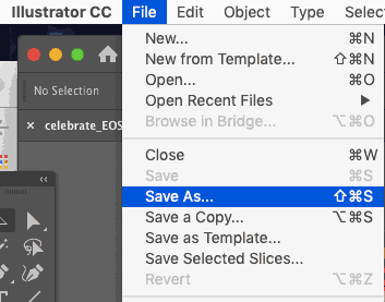
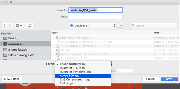
Select “Adobe PDF pdf” from the “Format” dropdown. Change the filename if you’d like, and then click the “Save” button.

illustrator pdf save as dropdown

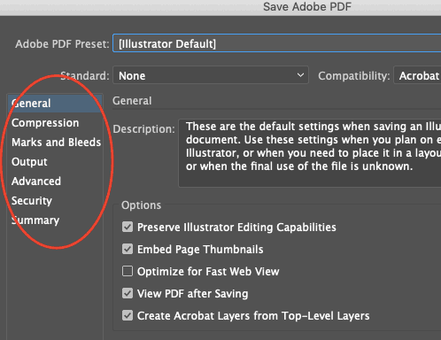
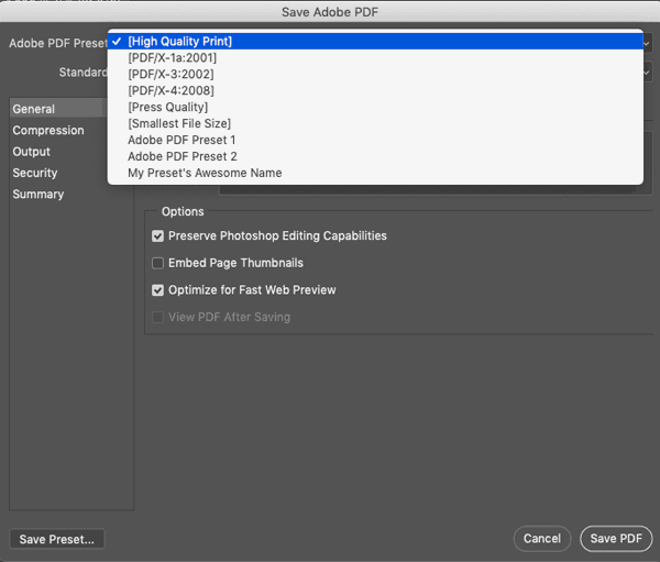
You’ll see a new dialog box populated with Illustrator’s Save As PDF presets, and providing additional PDF options.

save adobe pdf options

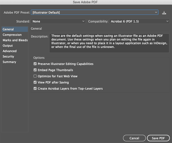
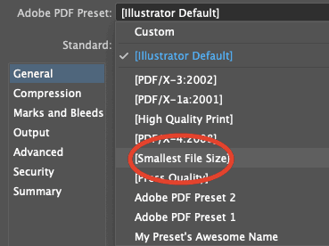
Depending on what your PDF’s purpose is, you can use the Adobe Illustrator PDF Presets to shortcut choosing your settings.

illustrator default preset

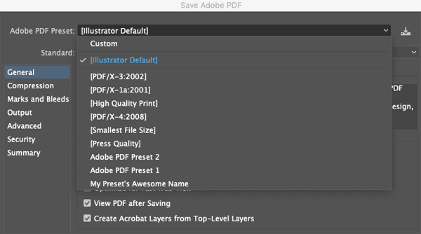
If you’re going to be using your PDF online, for example, the “Smallest File Size” option is usually a good start.

illustrator smallest file size

Within Illustrator’s “Save Adobe PDF” dialog box, choosing any category from the left hand menu will allow you to customize your settings further.

illustrator preset default\
 

How to Create a Vector File from a PDF

Wondering how, if you can save make a PDF out of a vector file, you can reverse the process and create a vector file from a PDF? To be honest, it’s a bit of a trick question.

No PDF can “become” a vector file; the only way to make a vector file out of a PDF is if it was created in a vector program to begin with, and saved that way. You cannot convert raster files to vectors. Too much information has been lost when something has been rasterized. Below, we’ll explain this in more depth.

How Do I Know if a PDF Is Raster or Vector?

In order to tell whether a PDF you want to open (and most likely edit) is a raster or vector file, You’ll need Adobe Acrobat Pro to execute a couple of different tests:

Open your PDF in Acrobat, and click on the page. If the page turns blue, you’ve got a raster file. After opening your PDF, click on the magnifying glass tool and/or adjust the Zoom percentage. If, the more you continue to zoom in, the more you see jagged lines and fuzzy imagery instead of smooth, clean strokes and shapes, you’ve got a raster PDF.

Can I Save a Vector-Based PDF in Photoshop?

Unfortunately, you can’t save a vector-based PDF in Photoshop, since it’s primarily a raster program.

Yes, Photoshop can handle vector graphics created within the program. And yes, Photoshop allows you to edit vector content if it’s created within and saved as Photoshop document (PSD) files.

But as soon as you export to another format (like PDF), Photoshop embeds the vector data in a raster file. It cannot create a pure, scalable vector format. Your vector layers and raster layers stay separate only as long as you keep the Photoshop document format. Which is why you can’t make just any PDF into a vector file; it has to be in vector format already.

Photoshop’s vector drawing tools are decent, but your ability to manipulate the vectors once created is hardly robust. You’ll also always need to use Photoshop to edit a Photoshop-exported PDF.

So Why Would I Use Photoshop for PDFs?

In general, it doesn’t make much sense to save a Photoshop document (PSD) as a Photoshop PDF. You’ll end up losing data and flexibility.

There is one big exception, however. If your Photoshop document has vector layers (shapes or type) and will be used as part of another layout which is destined for printing, then you should save it from Photoshop as a PDF document.

For example, let’s say your Photoshop document is going to be placed within Adobe InDesign document. Save your Photoshop doc as a PDF with “Preserve Photoshop Editing Capabilities” checked. Then, place that PDF into InDesign instead of placing the PSD.

This is because InDesign flattens and rasterizes a PSD when you place it in an INDD document. Meaning that when your document prints, InDesign will rasterize the PSD and therefore limit the resolution of all vector artwork, including type. Rasterized type, especially, is much more difficult to read than type with the vector information preserved.

A placed Photoshop PDF, on the other hand, will keep the crisp vector information (such as type) all the way to press.

Is There Another Use for Photoshop PDFs?

Photoshop has a cool feature that allows you to create a PDF presentation. Since Photoshop’s image capabilities and layout flexibility far surpass that of other presentation software (such as Microsoft Powerpoint), this feature allows you to create presentation files with more visual impact.


And, of course, since you’re saving a PDF file, it will be easily accessible even by those without access to Adobe Photoshop.


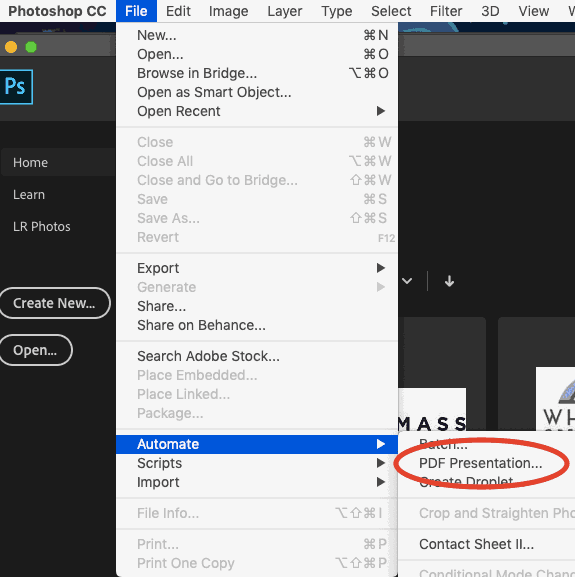
First, have your images created and saved as separate files. Then, choose File ? Automate ? PDF presentation.

automate pdf presentation

Click the “Browse” button to locate your files and add them to the list.

pdf presentation browse

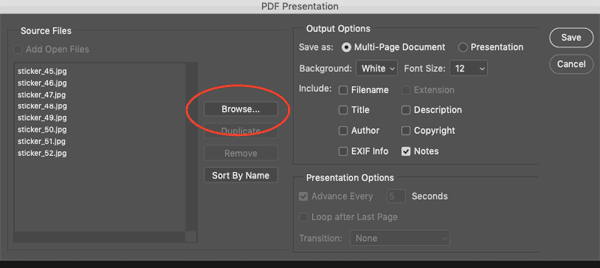
Choose the “Presentation” radio button and then select your Presentation Options (which will no longer be greyed out) at the bottom.

presentation options

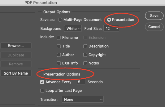
After choosing the location for saving and naming your presentation file, you’ll then get a PDF settings dialog. Choose a preset or add your own customizations, and off you go! Do double check that the file extension in the filename you’ve chosen is “PDF.”

save adobe pdf high quality print

How to Save a Photoshop File as a Regular PDF

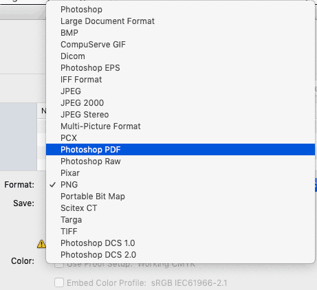
Choose File ? Save As.

save as regular pdf

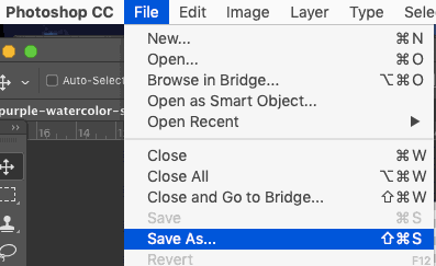
Then, from the Format dropdown, choose “Photoshop PDF.”

save as photoshop pdf

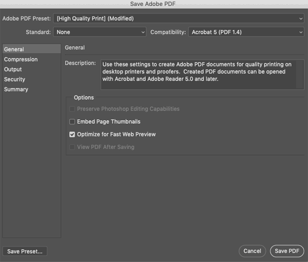
Keep “Layers” checked, change the filename if you need to, and click “Save.” Then you’ll see a new dialog box with PDF Presets. You can use the “Adobe PDF Preset” dropdown to choose one.

save adobe pdf layers high quality print

If you have a print provider with specific settings they require, then you’ll customize the PDF settings here before saving.


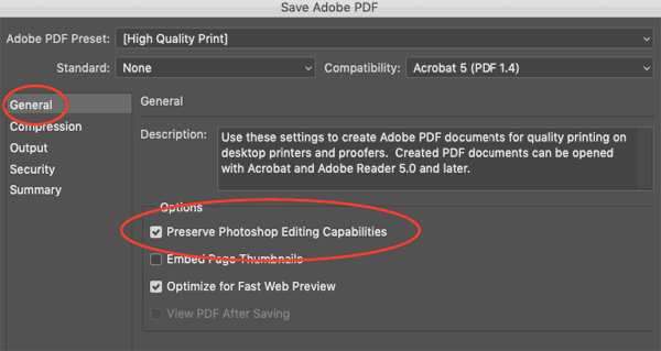
In the dialog box and under the “General” tab, check Preserve Photoshop Editing Capabilities.

preserve photoshop editing capabilities

Go to the “Compression” tab, and select “Do Not Downsample.”

do not downsample setting

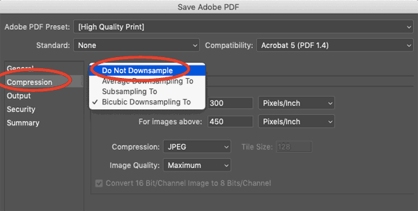
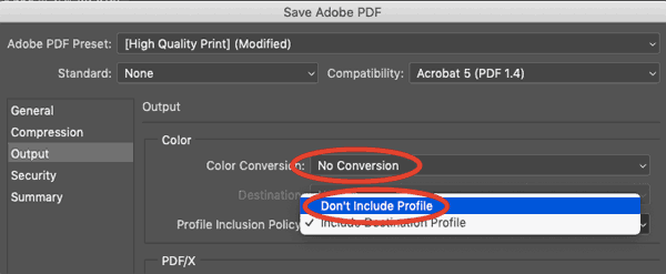
Select “None” under “Compression” (which will be a new dropdown that appears once you’ve selected “Do Not Downsample”). Select the Output tab and choose “No Conversion” under Color Conversion, and “Don’t Include Profile” under Profile Inclusion Policy.

no conversion

Make sure there are NO checkboxes selected under the “Security” tab.

pdf security dialog

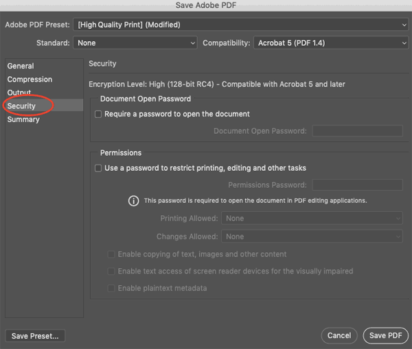
Then, name your file, choose the location where you want to save it, and click the “Save” button.

Printing for Less can help you get in touch with a print design professional, or – if that describes yourself – we can take your creative vision and make it live in stunning, world-class print. Speak with one of our consultants, available 8am-5pm MT Monday through Friday at 800-930-6040.


Need creative or technical advice on working with your PDF?
Call our helpful experts now at 800-930-6040


Get 20% Off

Subscribe to our weekly newsletter and get an instant 20% off your first print project.

Name(Required)
This field is for validation purposes and should be left unchanged.

RELATED MARKETING & DESIGN TIPS

Choosing a Printing Service for Your Project

Printing services types explained. Help with choosing the right printing service for your commercial printing needs

Read More >


Personalized Coasters

Get custom personalized coasters for a practical way to share your branding or event. Lots of custom options, quick turnaround and great pricing

Read More >


Printing With Metallic Ink

When you venture beyond the familiar territory of cyan, magenta, yellow, and black, a wide world of color possibilities opens up for you.

Read More >


The Psychology of Color in Marketing

The Psychology of Color in Marketing

Color has a deep impact on how people react to products and marketing materials. Understanding the influence of color can help you create more effective marketing materials and a stronger brand.


Does Everyone React the Same to Color?

color wheel
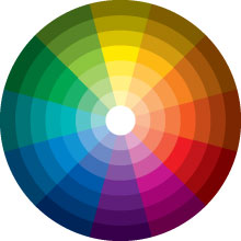
We’ve been taught to believe that everyone responds positively to green, yellow is the happiest color, and that no one likes brown. Instead, studies about color find that reactions to color are deeply personal and are created by each person’s life experiences. We assign meaning to everything in life—even color. One person might find orange to be the happiest of colors because of an orange chair she used to cuddle with her grandmother in. Another person might react negatively to orange because he broke his arm when he fell off his orange bike as a kid. There is no way to know how every individual is going to respond to a color.

When Are Responses to Color Predictable?

Despite that, some scientists think our brains are hardwired to respond in certain ways to specific colors. Blue signifies a clear sky and good weather. Supposedly, this is why so many people respond positively to blue. Brown and muddy greens and yellows signify illness, which may suggest why they are not popular colors. And we have definitely been conditioned by marketing and our society to associate some colors with certain concepts (green with environment, white with clean design, and red for warnings).

Rely on Target Audiences When Choosing Color

While not everyone reacts the same way to colors, studies do show there are clear gender preferences when it comes to response to colors. In general, men don’t like purple but women definitely do. Men tend to prefer bolder, more saturated colors and those that are darker while women lean towards softer versions and gently tinted colors.

Color preferences also differ around the world due to cultural beliefs. In the U.S. red is a color that is often associated with warning, while in Japan it signifies good luck. In the U.S., white usually implies purity or clean lines, but in China it is associated with death. These preferences are important to keep in mind when you are thinking about your target audience.

Does Color Impact Consumer Decisions?

Even though everyone responds differently to colors, we do know that color is incredibly important and influences how people make decisions. In fact, up to 90% of snap judgments about products are made based on their color and 84% of consumers say that color is the main reason they buy a product. Ads that are in color are read 42% more often than those in black and white. There’s no question that the colors you choose for branding and printed marketing materials impact consumers’ decisions.

How Does Color Play into Branding?

Choosing a color scheme for your brand is one of the most important decisions you make. When choosing colors, think about the traits you want your brand to be associated with and stand for. Think carefully about your brand’s personality.

It’s important to choose a color that stands for your brand. People are more likely to respond positively to a product when the color makes sense to them and is appropriate for the product (this is why there are no purple Caterpillar bulldozers). Your brain decides for you what brands you like. If it’s easy to remember, easy to understand, and doesn’t make your brain work too hard, you’ll probably like it.

When coloring your brand, you also want to be sure to choose a color scheme that stands out from that of your competitors. You want to be memorable and different so consumers remember your brand and your product. Use color recognition to help drive brand recognition, the way that Coca-Cola® and John Deere® use red and green as an integral part of their identities.

Use Color to Direct Your Customers

When creating marketing materials, think about what you want people to do and use color to guide them in that direction. Some of the most effective marketing materials use softer color combined with a bold, loud color. A page that is white and blue with a red button for signing up for a newsletter or requesting a quote can be very effective.

People remember things that are printed in bold, bright colors. Their attention is drawn to that area on the page and they notice what you tell them in bright colors. Think of color on the page as creating a set of signs for your customers. You want them to follow where the signs are leading, so the signs must stand out and be very clear. Motorists won’t pay attention to a brown stop sign. Readers need to be told with words and colors what you want them to do, think, or remember.

If you want customers to click on things or take actions on web pages, incorporate buttons that are bright and stand out from all the other colors on the page, so they can’t help but notice them and are tempted to click. If you want a call to action to get a response, make it a different color than everything else around it.

How to Choose Color

Customers respond positively to pages that have colors with similar hues, so choosing a color family can be important. The general theme of your pages should be done with analogous colors, with your most important information or calls to action in contrasting colors. When you look at a color wheel, the colors that are next to each other are analogous and combine harmoniously. If you draw a triangle from that area, you’ll find the two colors that are triadic, or contrasting colors to your harmonious family. These are colors that will really stand out and create a bold statement on the page, yet won’t appear to clash or seem discordant. This color wheel can help you put together some great color combinations.

Print Marketing and Color

Pantone color book
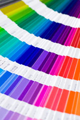
Once you’ve decided how you want to use the psychology of color in your marketing, you will want to find the best way to keep accurate colors throughout your marketing materials. Keeping your colors accurate, consistent, and vibrant are critical to getting the most out of your printed pieces.

When you’re ready for top-quality printed materials, find a printer that invests heavily in producing accurate color that creates effective marketing materials. There are a lot of choices you’ve got to make when you choose to print in color. First, you have to choose between CMYK and Pantone colors (or a combination of the two). CMYK uses a mixture of four basic colors (cyan, magenta, yellow and black), providing a huge range of color variations.

Pantone color printing has numbers assigned to the specific colors identified within this system. This allows you to select a numbered pantone color for your brand logo for example, and take it anywhere, to any printer, and have it look the same. The drawback is that you can only use the specific Pantone colors, which could be slightly different than the color you want or have been using. One caveat, Pantone colors can’t be accurately produced on digital presses. Many companies use a combination of CMYK and Pantone. These can be combined, for example using a Pantone color for a logo and CMYK for the other colors in the graphics.

If you’re interested in best-in-class color printing, keep Printing for Less in mind. We put your needs first, our customer advocates help you choose the best method to keep your brand colors vibrant, accurate and in budget. We have over 20 years of experience and we’ll make sure your color-sensitive printing gets done correctly. Give us a call for a print marketing consultation today: 800-930-6040.


Get 20% Off

Subscribe to our weekly newsletter and get an instant 20% off your first print project.

Name(Required)
This field is for validation purposes and should be left unchanged.

RELATED MARKETING & DESIGN TIPS

Using Die Cutting on Postcards

Get unique die cut postcards that will cut through the clutter in the mailbox and get your message noticed.

Read More >


The Advantages of Self-Mailers in Direct Mail Campaigns

Learn about self-mailers as an effective but often overlooked element of a successful multi-channel marketing campaign.

Read More >


Paper Belly Bands

A wide variety of paper belly band printing options to enhance the packaging of your product or printed material

Read More >


Innovative Print Marketing Design Ideas

Innovative Print Marketing Design Ideas

Could your marketing use a jump start? Maybe you’re at a loss on what to do to make your next marketing piece memorable? It happens to the best of us.
 
This article is chock-full of great ideas for direct mail pieces, brochures, business cards and more for any budget. This is just a small taste of our capabilities. When it comes to dreaming up projects, your only limit is your imagination.
Download a PDF of this pagepdf
 

Mini-Table Tent with Wire-O® Binding

This great little piece is worth keeping. Consider making the piece a calendar, or a series of inspirational quotes that anyone would want to keep on their desk. You can apply this format to virtually any information or imaging that is appropriate to your product or service. For example, if you are a dog groomer, you may want to have a several cute dog images, with an explanation of the service offered on each flap.
 
mini table tent
 

Brochure with Graduating Pages

Graduating pages are an economical way to add interest to any piece. Staggered reveal pages spark curiosity and draw the reader in. This piece incorporates rich black and gray hues combined with a High Gloss Spot Coating that lends to the brochure’s sophistication. We can help you get this sleek, sophisticated look at a very reasonable cost.
 
graduating page brochure
 

Window Die Cut with a Single Fold

This creative idea can be used in both small and large pieces and incorporate a standard or custom die cut. The peek-a-boo effect is visually engaging and increases the piece’s impact. This technique has many possibilities. Call one of our print experts for specifications and details.
 
window die cut
 

Clear Plastic Business Cards

The unique, see-through element gives clear plastic business cards a modern touch. Clear cards can incorporate a number of design elements and finishes. They are perfect for businesses and individuals looking for that competitive edge. A conversation starter, these cards are not going in the trash any time soon.
 
clear business card
 

Pop-Up Business Card or Postcard

Give your marketing efforts a boost with 3-D effects on their materials. Pop-up pieces become points of conversation in their own right. You can pop-up a person, as seen here, so that they become a self-standing card, or you can pop up any object. For example, a real estate agent may want the “FOR SALE” sign to pop-up in the yard on a postcard. Apply this creative technique to your own business model.
 
popup business card
 

Modified Gate Fold with a Die Cut

One of the best ways to make a piece stand out is to experiment with folding patterns and possibilities. The golf ball die cut, combined with the gate fold makes this piece appealing. People are likely to share this with others based on its strong design elements.
 
modifed gate fold
 

Iron Cross Mailer

Iron cross mailers not only provide ample printing real estate, they also present the opportunity to tell a story in a clever and innovative way. The finished size of this cross fold is 4.25″ x 6.25″ and the flat size is 13″ x 18.5″. It’s compact when closed, and perfect for mailing. The real beauty of an cross fold lies in its unfolding. By using creative cross over imagery and copy on each panel, the cross fold becomes an interactive, tactile experience. Coupons, magnets, and inserts can easily be glued or placed inside the piece as well.
 
cross fold mailer
 

“Wallet” Mailer with Inserts

This die-cut wallet with soft touch coating is a show stopper. The flat size is 4.2″ x 10.5″ and the finished size is 4.25″ x 5.125″, ideal for a mailing. There are a few things that really make this piece stand out. The first is the soft touch coating. Its velvety and smooth texture elicits an immediate response; it feels rich and elegant. Once opened the inserts and the fine attention to detail take over. The $500 bill was used for the offer, and the business card contains important information about how to contact the company. It feels great, it’s clever and makes a lasting impression.
 
wallet mailer
 

Die Cut Coffee Cup

Skip the boring and make it extraordinary! Die cut business cards are an effective way to create an unique impression. This to go coffee cup is a perfect fit for a coffee shop or cafe. It can also double as a frequent drink card that people are sure to hang on to.
 
die cut coffee cup


Download a PDF of this pagepdf
 
 
Get Free Print &
Paper Samples


Get 20% Off

Subscribe to our weekly newsletter and get an instant 20% off your first print project.

Name(Required)
This field is for validation purposes and should be left unchanged.

RELATED MARKETING & DESIGN TIPS

Using Die Cutting on Brochures

Get unique die cut brochures printed that will cut through the clutter in the mailbox and get your message noticed.

Read More >


Creative Services Brief

Read More >


Printing Metallic Ink on Business Cards

Add a little flash to your business card with metallic ink! Printing for Less offers metallic printing for your business card to get you noticed! Learn more.

Read More >


Preparing Photos for Print Projects

Preparing Photos for Print Projects

This whitepaper is one in a series of helpful how-to’s from PrintingForLess.com, America’s Print Shop®. In this guide, you’ll learn what resolution is, how much you need when printing, and how to change it without lowering image quality. You’ll also learn how to edit digital photo files so that they look crisp and sharp in your printed projects.


Understanding Resolution

Image resolution can be a tough concept to wrap your brain around. When referring to an image, resolution is the number of pixels displayed per unit of printed length. It’s a measurement used in printing and it’s stated in dots per inch (dpi). This makes sense because printers print dots, and that’s what a printed image is composed of. When referencing an image onscreen—on a computer monitor, TV, or projector—resolution is stated in pixels per inch (ppi). This too makes sense because digital images are displayed in tiny individual blocks of color called pixels. How Resolution and Pixels Work Together The resolution measurement dictates how closely an image’s pixels are packed together. Increasing an image’s resolution means the pixels will be packed together more tightly, resulting in a smaller physical size, but generating a smoother, higher quality print. Lowering an image’s resolution means loosening the pixels, resulting in a larger physical image size, but generating a blocky, lower quality print.resizing an image


Think of the resolution measurement as density. For example, the tighter a substance is packed, the denser it is and the less surface area it takes up (like brown sugar). The more loosely a substance is packed, the more surface area it consumes and it becomes less dense.


The confusing part is that when it comes to imagery, printers are the only devices that can do anything with the resolution measurement. Because our eyes can process only so much information, a 72ppi image onscreen looks identical to a 600 ppi image onscreen. However, a printer isn’t hampered by the human eyeball and can take advantage of resolutions much higher than 72.


How Much Do You Need?

The resolution necessary for a good print depends on the printing device itself. For instance, consumer inkjets do a nice job at 225 to 250 dpi. For a black and white laser printer, you need between 150 to 200 dpi. For business cards, brochures, and other PrintingForLess.com products, you’ll do best with 300 dpi or higher. Let’s put theory into action on a photo from a high-end digital camera. I opened Figure 1 in Adobe Photoshop, then chose Image > Image Size (Command+Option+I/ Alt+Option+I).


This photo (courtesy of iStockphoto.com/Lisa Gagne) is measured at 72 ppi. But that doesn’t mean it’s a low-quality image. It’s 14.1 megabyte, and its pixel dimensions are 2716 x 1810. That means you have a lot of pixels to work with. In fact, if you tried to print this image at its current resolution, you’d need a piece of paper more than 37 inches wide by 25 inches tall.sizing an image


At the bottom of Photoshop’s Image Size dialog, uncheck the Resample Image option. This locks the pixel data, thereby locking image quality. Watch what happens in Figure 2 (next page) when you enter 300 into the resolution box. The physical size of the image changed! It decreased to roughly 9 x 6 inches—much more manageable!


However, look at the pixel dimensions toward the top of the dialog. They didn’t change, and that is the power of the Resample Image option. I just successfully changed the resolution without altering image quality. The number of pixels is exactly the same as it was before, but now the pixels will be packed more tightly together when the image reaches a printer.


Upsample with Caution

If you leave Photoshop’s Resample Image box checked and increase the resolution of an image, you’ll be adding information (pixel data) to the image that wasn’t originally there. That’s called upsampling. It’s usually an extremely bad idea, but there may come a time when you have no choice; for example, maybe the only available image is a small, low-resolution one from the Web, and you have to print it.


resampling an image


Here’s how to add enough pixels for printing: Open the Image Size dialog in Photoshop and leave the Resample Image box checked. Choose Bicubic Smoother from the pop-up menu to its right and change the document dimension pop-up menus to Percent. Enter 110% in the width box and press OK (Figure 3).


Repeat this process as many times as necessary to enlarge the image. Resist the urge to increase the size more than 10% at a time. Adding data 10% at a time doesn’t cause a huge amount of quality loss. If you must upsample low-resolution images frequently, you may want to buy a plug-in, such as Genuine Fractals by onOne Software, Blow Up by Alien Skin, or PhotoZoom Pro by BenVista. They manage to increase pixel data without totally destroying the image.

 
Pre-Sharpening

Sometimes you want to print an image with enough resolution, but the photo is a little blurry. You can’t take something that’s completely out of focus and make it a masterpiece of clarity, but you can significantly improve an average photo.

Optimize Image Contrast

When you see a sharp edge in an image, it’s because the difference between dark and light—that is, contrast—is higher along that edge than in other areas. When you apply a sharpening filter in a program such as Photoshop, you boost contrast only along edges, creating the illusion of heightened sharpness. But it isn’t just edge contrast that affects whether you perceive an image to be sharp. Every adjustment that affects overall contrast contributes to what looks like sharpness. You can apply contrast to the entire image, to specific tonal ranges within the image, and to specific areas.

Shape the Tonal Range to Enhance Details

Sharpening will be more effective if you first enhance the definition of image details by adjusting the photo’s tonal range.


Set a proper black point and white point. Setting the darkest and lightest tones in the image is the first stage in affecting how much an image pops (Figure 1). In Photoshop CS3 and CS4 (Figure 2), you do this by dragging the black and white triangle sliders in the Levels or Curves dialog box or panel (in Photoshop CS2 or earlier, the sliders are in Levels only). In Adobe Lightroom and Adobe Camera Raw, the black point is controlled by the Blacks slider and the white point is controlled by the Exposure slider. In all cases, you can Option-drag (Mac) or Alt-drag (Windows) a slider to preview which tones are clipped.

setting black and white point
adjusting levels in Photoshop

Shape the tone curve for details. The next level of contrast adjustment involves shaping a tone curve, which lets you boost or cut contrast in specific ranges of tones. If you want to make certain image details more distinct and you can isolate that part of the image by tone, steepening that part of the tone curve will help differentiate image details in those areas (Figure 3).tone curve adjusting


In Photoshop CS4, create a new Curves adjustment layer by clicking the Curves button in the Adjustments panel. In Photoshop CS3 and earlier, click the Create New Adjustment Layer button at the bottom of the Layers panel and choose Curves. To increase contrast within a specific range of tones, click two points on the curve where that tonal range begins and ends, and drag the points to steepen the curve there.


In Camera Raw, click the Tone Curve tab to view the Parametric curve. In Lightroom, use the Tone Curve panel in the Develop module. In both programs, drag horizontal sliders that control four segments of the tonal range (Figure 4). In Camera Raw, you can edit the curve as in Photoshop by clicking the Point tab.

Enhance Local Contrast

Sharpness is ultimately about contrast. More specifically, sharpness is ultimately about local contrast. Unlike a tone curve, which lets you adjust contrast among different ranges of tones within an image, a local contrast adjustment affects areas of tones within an image. When you boost local contrast, you boost the difference between all adjacent dark and light areas in the image (Figure 5).


adjusting contrast
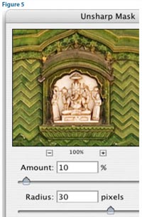
of sharpening, the way you control local contrast in Photoshop is by applying the Unsharp Mask or Smart Sharpen filters.


The basic technique is simple: Set a high Radius value and a low Amount value compared to those you would use for sharpening edges.


These values provide a subtle contrast boost in areas extending some distance from the edges of image content, instead of at edges as in normal sharpening. (In normal sharpening, the Amount is closer to 100% and the Radius is closer to one pixel.) The Radius value controls how far from an edge the contrast boost is applied. Local contrast changes are most effective in the midtones. You may want to keep local contrast adjustments from affecting highlight detail. If you’re using Smart Sharpen in Photoshop, click the Advanced button, click the Highlights tab, and increase the Fade amount. If you use Unsharp Mask, after applying the filter, double-click the layer thumbnail in the Layers panel, and in the Layer Style dialog box, drag the white Underlying Layer slider to the left to hide the effect of the layer from the highlights (Figure 6). Option-drag (Mac) or Alt-drag (Windows) one half of the white slider to split it, feathering the transition.


layer style effects
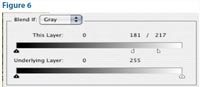
In Camera Raw and Lightroom, controlling local contrast is easy—just increase the Clarity value. Applying Clarity is like applying the high-Radius/low-Amount technique above but includes automatic protection of image quality so that there’s much less need to manually protect highlights.


By now, the details in your image should appear much clearer, even before you’ve applied any traditional sharpening settings.
Photoshop sharpening

And Finally, Ready for Advanced Sharpening

If you’ve performed the previous steps correctly, you should have images that respond easily to the sharpening features in Photoshop, Camera Raw, Lightroom, and other image editors. In Figure 7 is the final image after sharpening was applied, compared to the same amount of sharpening applied to the image in the beginning where no contrast optimization was applied. You can see that manipulating contrast contributed as much to better definition of image details as sharpening did.


Advanced Sharpening Workflow

If you’re ready for some heavy lifting in Photoshop, read Out of Gamut: Thoughts on a Sharpening Workflow by Bruce Fraser on CreativePro.com.


This whitepaper is based on materials written by Lesa Snider and Conrad Chavez for CreativePro.com.
 
 
Also see the Filling Text with Images and Creating Dutones whitepaper.
 

Get 20% Off

Subscribe to our weekly newsletter and get an instant 20% off your first print project.

Name(Required)
This field is for validation purposes and should be left unchanged.

RELATED MARKETING & DESIGN TIPS

Plastic Business Card Printing

Get high quality plastic business cards printed with numerous custom options, fast turnaround, free templates, live expert help and award winning service

Read More >


Foil Stamped Brochures

Custom foil stamping on your brochure is an excellent way to stand out from the crowd. Printing for Less offers gold & more custom foil colors. Learn more.

Read More >


Using Embossing on Brochures

Get custom embossing on your brochures to turn them from ordinary to exceptional and significantly increase their impact and success

Read More >


Postcard Design Tips

Postcard Design Tips

Postcard Marketing
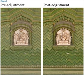
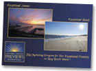
Good postcards are colorful, catchy and short on words. They’re also one of the most effective ways to reach your target audience and get a response.


Postcard Perfect

Since postcards serve a lot of purposes, the best design is one that achieves the outcomes you want for the piece. Whether you seeking new leads or customers, announcing a new product, service or event, or following up with an appointment or survey card, your marketing goal should always drive your postcard design. The job of a business postcard is to impel taking action. Follow these Do’s and Don’ts to help ensure your message gets attention and results.


First and foremost, does your postcard printing convey the right visual and tactile impression? How you come across on paper depends on key fundamental graphic design concepts and printing choices:

Images and Color

Postcard Image sample

  • Do use color for interest and emphasis. It can be in your logo or other images, in text or in background elements. You’ll find many stock image sites on the web if you need some artwork to spruce up your design.
  • Keep your postcard design consistent with the general color and design scheme on your website, in your store, and other marketing materials.
  • Do include photos if they’re appropriate for your message. Postcards that are personalized are especially useful for service businesses where an ongoing relationship is a critical factor and for displaying your products.
  • Avoid most clip art for your logo or other elements. Your brand is your identity and these days you can easily find affordable images or get help with a custom logo online.

Text and Font Types

Postcard Type sample

  • Do keep it bright and brief! Too much text can get cluttered on smaller postcards. Your card should the teaser that motivates the recipient to contact you for more detail, don’t try to squeeze it all in. Resist using large blocks of copy. Highlight words and phrases like “Free” or “40% Off” to get your reader’s attention and encourage them to read further.
  • Do limit your postcard to one or two font types.
  • Don’t use light colors that are difficult to read or have an excessively dark image in the background that obscures your text.

Postcard Composition and Format

Postcard Design sample

  • Do keep it clean and simple. Avoid visual overload. Consider using a larger postcard size if you need more space for additional info. See common postcard size options.
  • Do match the “tone” of the card to your market space. For example, if you’re targeting business executives for B-to-B marketing or luxury good buyers, consider using a more conservative approach in language, color and layout than you might for general consumers.
  • Do strive for contrast and balance. Dark against light, opposite colors and large elements juxtaposed with smaller ones create contrast which attracts attention. Keeping the weight of elements relatively distributed on the card creates balance and pleases the eye, as do elements of similar tone or size. (sample image)
  • Think outside the box. Non-standard elements such as round corners or special cut-out shapes (called die cuts) spark interest and can give a distinctive touch. Learn more about our Custom Printing Options.
  • Consider putting eye-catching content on the back of the card and more text on the front. Most postcards actually get delivered with the back side up in mailboxes, so make the back interesting to grab attention quickly. Put the concept to the test and create two different versions, measure which one gets better results.
  • Do use bleeds to extend colored backgrounds or images to look like they’re “bleeding” off the edge of the postcard for a professional look. Be careful not to cut it too close around the edges of the card, or use borders that could look uneven with slight variances in cutting.

See our Layout Specifications for more info on setting up your card with bleeds and safe margins.

Layout for Mailing Postcards

mailing services

  • Do keep clear space on your postcard mailing piece that’s free of any design elements to allow for barcoding, addressing and permit imprinting per US Postal Service regulations. This ensures both that the mail piece is eligible for your preferred mail service class and that any content in your piece isn’t covered up in the addressing and mailing process. See our U.S. Mail Layout Guides for postcards.

Paper and Texture

  • Opt for a high-quality, thick cover stock for maximum impact and durability, generally 12-14pt thickness (100# to 120# cover). Compare papers when shopping for postcard printing services.
  • Do match the coating to your purposes. Go with gloss to make photos look beautiful. Select a dull or matte finish for smooth, non-shiny postcards that are easy to write on. Uncoated paper has a slightly textured feel that can look more formal and match stationery such as letterhead and envelopes.

Request samples of our papers to see and feel the differences.

The Finishing Touch

Review the details before you finalize your design. Include relevant contact info including an email address and website url. Double check the numbers and spelling of all text before you send it off to your postcard printer and again when you review your proof. Typos and wrong numbers are easy to miss.


Follow these tips to create postcards that pack a powerful punch to help grow your business.

Need help with your project? Give us a call at 800-930-6040 to talk to one of our experts.


Get 20% Off

Subscribe to our weekly newsletter and get an instant 20% off your first print project.

Name(Required)
This field is for validation purposes and should be left unchanged.

RELATED MARKETING & DESIGN TIPS

Perfect Binding

Get Perfect Binding done on your high page count catalogs and booklets for added durability and class

Read More >


Direct Mail Marketing: An Idea Book for Realtors

Boost Your Real Estate Sales! Download our Direct Mail Marketing Idea Book to learn innovative strategies that really work. Discover how direct mail’s 90% open rate can transform your business. Get it FREE today!

Read More >


What is Embossing or Debossing?

What is embossing and debossing? It’s smooshing paper, but it’s really cool. Find out more about how to effectively use this advanced printing technique.

Read More >


Color Management 101 – Monitor Calibration

Color Management 101 – Monitor Calibration


How Red Is Red?

Your computer, and the Creative Suite applications, can’t provide the most accurate color without knowing which colors your monitor is displaying. That is, when you specify an object as 100% red (often called “255 red”), exactly what shade of red do you see on your monitor? Every monitor displays it a little differently. Defining that shade of red and all other colors your monitor displays is called characterizing or building a profile. You can also calibrate a monitor, which is forces a monitor to behave consistently over time with respect to its color of white, brightness, and tonality.

The tool for both of these tasks is a color measurement device called a colorimeter. I’ll discuss three mid-range entry-level devices later in the section “Colorimeters in Action.”


Why Can’t All Monitors Display the Same Colors?

There are several technological reasons for the wide variation in monitor colors. Makers of displays don’t always stick to standards, such as sRGB. Some affordable wide-gamut displays easily exceed the gamut of sRGB, while most laptop displays have smaller gamuts than sRGB.

There are also two categories of monitors, each of which handles color differently: CRTs and LCDs. CRTs aren’t manufactured anymore, but they’re still on many desks. If you have one, it’s probably time to replace it.

Within the LCD market, there are two backlighting technologies that affect how colors display: CCFL and LED.

What’s a Backlight?

A backlight is the light source for any LCD, and it’s essentially what you’re changing the intensity of when you adjust the brightness control. The brightness of the display affects how bright black and white are. The difference between black and white luminance is called dynamic range, or contrast ratio.
 
The point of any kind of calibration and profiling system is to approximate the dynamic range of print. There’s no point in looking vastly better than a proof or press sheet. When your monitor’s brightness is set too high, its contrast ratio is much greater than print. That makes layouts onscreen look much better (have more “pop”) than prints and proofs.
 
When your monitor’s brightness is set too low, shadow detail won’t be visible onscreen but will be on prints and proofs. And there’s a point at which it’s really too low, and then the color science of all of this color management stuff doesn’t work correctly. So it’s necessary to get the backlight intensity in the ballpark of reasonable.
 
CCFL has been around for a while, so the colors it emits are fairly consistent among manufacturers. This is not the case with the newcomer, LED backlighting. It promises greater stability and more sensitive environmental qualities (no mercury). However, LED backlighting is so new that some measurement devices can’t correctly calibrate LED-backlit displays.
 
For a few monitor recommendations, see “My Favorite Monitors” below.
 
My Favorite Monitors
High-end professional displays do cost more than the displays you’ll find on the remainder shelves of your local electronics store. However, the prices have dropped in recent years, and the quality really is much higher. If a more accurate monitor means your jobs are more accurate when printed, you may find the price worth paying.
 
When you’re looking for a complete end-to-end color management solution, something you know works, is worth the money, and is a prerequisite for serious softproofing and color-critical use, a closed-loop solution is the best way to go. Prices for high-end professional displays have dropped recently, and the quality really is much higher. I like the NEC SpectraView and Eizo ColorEdge monitors, which come with their own color-management software for calibrating and profiling the display. I’m particularly fond of NEC’s recent offerings driven by the SpectraView II Color Calibration Solution, which includes colorimeter and software thoroughly tested to work very well with their displays. It’s hard to beat the price/performance of the $560 Multisync P221W entry-level professional 22″ wide-gamut display. And their high-end 2690 and 3090 series SpectraView II displays, which also closely approach the Adobe RGB (1998) color gamut, yet remain within the grasp of mortals to purchase, are personal favorites.
 
Designers often wonder why a monitor can’t calibrate itself and provide its own custom profile. As it turns out, there is something that could help, called EDID, or Extended Display Identification Data. It’s a standardized method for displays to announce their capabilities—such as their resolutions, and specific measured colors of their red, green, and blue primaries. If the color information in a display’s EDID correlates reasonably well to actual display behavior (that is, if the monitor is telling the truth), we might not even need to calibrate and profile them. For example, the Mac OS automatically asks for EDID from any display when you plug it in and builds a display profile from that information on the fly. For example, the profile built by the Mac OS from EDID for my 23″ Apple Cinema Display performed comparably to the profiles produced by third-party colorimeters I tried out (see “Colorimeters in Action” below).
 
For various practical manufacturing reasons, the EDID won’t exactly correlate to your specific display, but if manufacturers could put a little more effort into this, it would likely make this process good enough for most designers.
 
Unfortunately, there are two problems with EDID: First, there’s no way to know if a monitor’s EDID information is correct. And second, Windows users must track down software to build an ICC profile based on EDID information, as it’s not created automatically by the operating system.
 

Colorimeters in Action

Colorimeters, those measurement devices that define what colors your monitor displays, range in price from low to high. They’re bundled with software that talks to the colorimeter and your display to calibrate and then build the ICC profile. This is why you’ll find the same colorimeter at different prices—the price depends on the features in the software. I’ll focus here on entrylevel packages that are low to mid-range in cost.

I tried out four products using a sample image that contained high key, low key, neutrals, saturated colors with fine detail, and multiple skin tones. I tested each product on two monitors: a 23″ Apple Cinema Display and a fourth-generation MacBook Pro 15″ LED laptop. On the CCFL-based Cinema Display, all of the colorimeters produced fairly similar and acceptable results. There were no immediately obvious visual differences in profile quality.

But when testing with the MacBook Pro laptop, which uses LED backlighting, I found noticeable visual discrepancies among all of the products. It may be that none of these colorimeters work well with LED displays. They may require an entirely different category of instrumentation: a spectroradiometer, such as the Eye One Pro or the device used in ColorMunki Design and ColorMunki Photo.

The $129 Huey Pro from Pantone is so inexpensive that I was suspicious of its sensor accuracy. However, while its resulting tone reproduction curve may not be 100% correct, it isn’t objectionable visually.

The Huey Pro’s ambient light compensation didn’t work as I expected. I tested it with extremely low ambient light and with rather high ambient light, but there was no difference in the two calibrations and profile Huey created in those two different situations.

The $176 X-Rite i1Display LT is on the opposite end of the options spectrum. It includes the Eye One Display 2 colorimeter, which has been around for some time and is a pretty decent colorimeter for the price. Its default behavior doesn’t help set the brightness correctly, or flag the user of unacceptably low brightness. Its advanced mode is more accommodating but assumes you know what settings to choose. The “Perform ambient light check” does check ambient light but doesn’t use that information to suggest a more appropriate brightness setting. And Leopard lovers beware: X-Rite’s web site states that its software is not officially tested or supported on Mac OS X 10.5 (Leopard).

Pantone’s $149 Colormunki Create includes a sensor based on the Eye One Display 2. It’s a piece of cake to use because there are no options: not for color temperature, tone response, or brightness. The lack of assistance in setting brightness is an unfortunate miss. You may find Colormunki Create useful if you like its features that create, manage, search, and share color palettes.

As I mentioned earlier, we could use help getting the display brightness setting established at something other than improper, and ideally at something reasonable. Only one product I tested does this somewhat well: Datacolor’s $249 Spyder3Elite. This includes a new 7-sensor colorimeter, the Spyder3, which the company says performs correctly with a wider range of display technologies. It makes a reasonable estimation of ambient brightness and corresponding suggestion for display white luminance (brightness setting).

With a particularly bright Apple Cinema Display, the Spyder3Elite software proceeded with calibration and at the end determined my display was too bright. It was the only software I tested to do so. But instead of suggesting the obvious—reducing the brightness of the display to achieve the recommended white luminance—the Spyder3Elite software suggested I increase the brightness of the room I was in.

The software is very thorough, involving quite a bit of interaction on the part of the user. Even the default path presents too much information, tries to educate the user too much, and yet doesn’t perform ambient light compensation by default to make better recommendations off the bat. I’d like a shorter path. Those caveats aside, the Spyder3Elite comes closest to the feature and performance characteristics I expect in a professional tool.

Although I didn’t test the $169 Spyder3Pro package, which also Left: The Huey Pro includes the same Spyder3 colorimeter and has the same features as I tested in the Spyder3Elite, I’d expect similar results. I recommend Spyder3Elite if you need its additional features, including support for calibrating and profiling projectors, and for arbitrary white point, which comes in handy if you want to match white points among multiple displays.


Why Don’t They Just Call It White?

One of the biggest problems with color management in general, and monitor calibration in particular, is its obscure terminology: D50, D65, 5000K, gamma 2.2, gamma 1.8, 6500K, blah, blah, blah. Why in the world are we still using words developed by color scientists? One important part of making your monitor more accurate is defining what it should display for the color white. I wish color-management hardware and software developers would give us a slider with which to choose the color of white. Designers understand that there are cool whites and warm whites, and that the objective is to choose a white that roughly corresponds to paper white.

But since that simple slider doesn’t exist, here’s a little cheat sheet: D65 or 6500K are cool white. As that number goes down toward D50 or 5000K, we experience warm white.

The best white on which to standardize depends on your environment and the papers you use. If you work in a low ambient brightness on magazine-type printing, 5000K is grand. If you tend to be in a brighter environment, and/or you work with higher quality, brighter white paper stocks, 6500K may be more to your liking.


Liking?! This Is About Liking Something?!

Yes, absolutely. Color management is as much art as science and therefore doesn’t always offer a technical answer. And when you’re more at home in an art class than a science lab, that may actually be comforting.


Chris Murphy is the founder of Color Remedies, a color management training and consulting firm. He is a co-author of Real World Color Management, 2nd Edition.

More on InDesign Magazine. Each issue gives you tips, techniques, and time-savers by an all-star cast of industry experts.

Get 20% Off

Subscribe to our weekly newsletter and get an instant 20% off your first print project.

Name(Required)
This field is for validation purposes and should be left unchanged.

RELATED MARKETING & DESIGN TIPS

Thick Business Cards

Get extra thick 24pt business cards that get you noticed. Guaranteed high quality full color printing with round corners, die cutting and embossing options

Read More >


Using Die Cutting on Brochures

Get unique die cut brochures printed that will cut through the clutter in the mailbox and get your message noticed.

Read More >


Liquid Laminate

Liquid laminate is a great way to add durability & visual impact to paper & digital prints. We created a guide on how to effectively use liquid laminate.

Read More >


  • « Go to Previous Page
  • Page 1
  • Interim pages omitted …
  • Page 3
  • Page 4
  • Page 5
  • Page 6
  • Page 7
  • Page 8
  • Go to Next Page »

Footer

Printing for Less

info@printingforless.com
100 P F L Way, Livingston, MT 59047

800-930-2423

  • Home
  • Products
  • Services
  • Industries
  • Get Samples
  • Direct Mail Marketing Resource Center
  • Printing Resource Center
  • Blogs
  • Templates
  • Terms & Conditions
  • Contact
  • About Printing for Less
  • About P F L
  • Our Team
  • Careers
  • Login

Copyright © 1998-2025 PrintingforLess.com. All Rights Reserved.

logo
  • 800-930-2423
  • Products
  • Direct Mail Marketing
  • Services
  • Industries
  • Direct Mail Marketing Resources
  • Printing & Mailing Resources
  • Get a Quote
  • Contact Us
  • My Login