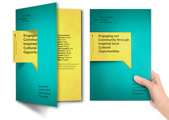
Custom Bookmark Printing Samples
These samples of full color bookmarks or bookmarkers show a variety of design ideas and examples of ways to market your business using bookmark printing. Samples of inspirational, promotional and photo bookmarks used for book and author advertising and giveaways for artists and products are shown in three different sizes. Personalized bookmarks are a great inexpensive and impactful way to advertise and keep your product or business in front of potential customers. The standard bookmark dimensions are 2″ x 6″, 2″ x 7″, and 2″ x 8 “.
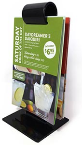
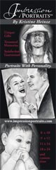
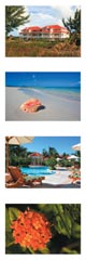
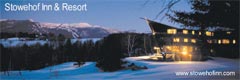
Vertical 2 x 6 Bookmark Designs
One of the two most common standard bookmark sizes, the economical choice with one or two sided printing.


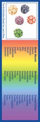
2 Sided Bookmarkers
Many people print on both sides to convey more information. One color backs are a little cheaper but less effective.


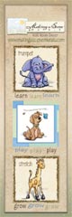
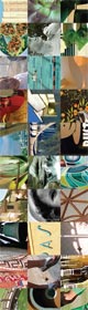
Horizontal Printed Bookmarks
Horizontal designs are another popular option for a different visual presentation of your information.


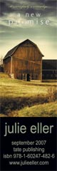
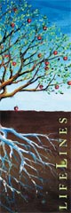
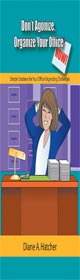
2 x 7 Bookmark Printing Designs
Our second most common bookmark size. Slightly longer to hold more information and photos for more visual impact.


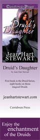
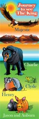
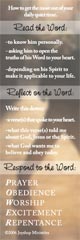
2 x 8 Bookmark Printing Examples
Another popular bookmark size. An inch longer to display even more information and really catch people’s attention by sticking out of paperback size books.


Get Bookmark Templates for Design and Layout, with Instructions
Everything you need to layout and design a bookmark for commercial printing in your favorite graphic arts design program.
Need help with your next project? Give our print experts a call at 800-930-6040.
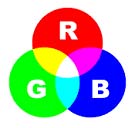
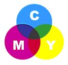
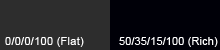 Black colors in print are not all the same. On computer monitors, all blacks will generally appear consistent. But on press, different ink combinations can create a wide range of blacks. When black is the text color, use flat black (CMYK 0-0-0-100) for the best results. If you have a solid black area larger than two square inches, we recommend using a “rich black” for a darker, more uniform color. The rich black color build we recommend is 50-35-15-100.
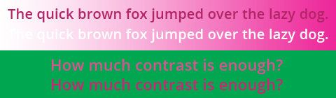
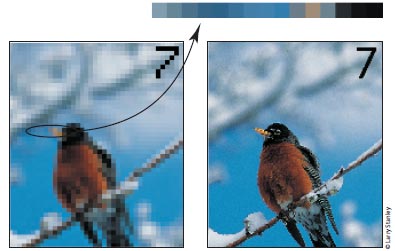
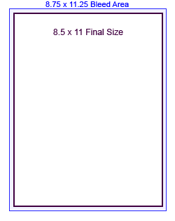 When designing for bleed, you should make your document .25″ larger on both your horizontal and vertical dimensions. For instance, if the final size of your piece is 8.5″ x 11″ then make your document 8.75″ x 11.25″. Add guides to your layout that are .125″ from the edge all the way around. Now create your design with the idea that the layout will be cut off where those guides are – because that is exactly what will happen. Make sure that any photographs or backgrounds that you want to bleed go clear out to the perimeter of the document, past the guidelines. After your piece is printed, we will trim off that extra .125″ all the way around, leaving you with color all the way to the edges!