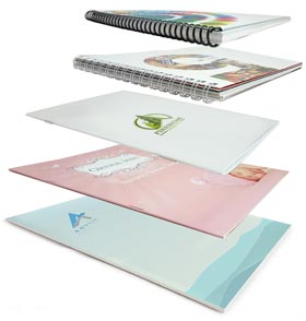
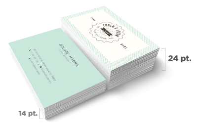
• Skip to primary navigation
  • Skip to main content
  • Skip to footer
Printing for Less

Printing for Less

At Printing for Less, we've offered high quality online printing services since 1996. Shop business cards, booklets, stickers, and more!

P F L.com
My LoginMy Login
800-930-2423
  • Printing
    • Postcards
    • Catalogs
    • Brochures
    • Folders
    • Letters
    • Newsletters
    • Envelopes
    • Greeting Cards
    • Print Templates
    • All Products
  • Direct Mail
    • Why Direct Mail Marketing?
    • Every Door Direct Mail® Postcards
    • Direct Mail Letters
    • Catalogs & Booklets
    • Marketing Gifts & Kits
    • Direct Mail Automation
  • Services
    • Mailing Services
    • Design Services
    • Custom Printing Services
    • Reseller Program
  • Industries
    • Advertising & Design
    • Enterprise
    • Food & Beverage
    • Healthcare Payers
    • Healthcare Providers
    • Nonprofit
    • Real Estate
    • Retail
    • Technology
    • University
  • Resources
    • Direct Mail Marketing
      Resource Center
    • Printing Resource Center
    • Blogs
    • Templates
    • Video Library
    • Have a Question?
  • Get Samples
  • Get a Quote

Printing Options

European Sizes

< All Products

European Sizes

Need an A3 or A4 size product?
European Standard Sizes are Available for these Products.

Get Samples

Postcard
Custom flyer printing services.

Flyers/Brochures/Leaflets


Pricing and Ordering

Booklet Standard Sizes

Booklets & Catalogues


Pricing and Ordering

Custom Postcards

Postcards & Club Cards


Pricing and Ordering

Foil Business Cards

Business Cards


Pricing and Ordering

Letterhead

Letterhead & Envelopes


Pricing and Ordering

Letter Envelopes

#10 Envelopes


Pricing and Ordering

Shop by Industry

Shop printed porducts for advertising & design industries.

Advertising & Design

Reseller printing services symbolized by a house with a circular arrow around it.

Reseller Program

Real estate printing services provided by Printing for Less.

Real Estate

Shop printed products for the medical industry.

Medical Services

An icon of a burger and shake representing food and beverage printing services.

Food & Beverage

Non-profit printing services symbolized by hands forming a net.

Non-Profit

Printing for Less provides printing services for colleges and universities.

University

Printing for Less provides printing services for the tech industry.

Technology

Enterprise business printing services.

Enterprise

Icon to shop all commerical printing services.

SHOP ALL >

We’re Committed to the Success of Your Project From Ideation to Implementation

From visualizing the first ideas of your project, all the way to the delivery, we’re committed to the success of your project. That’s why we’re trusted by some of the biggest brands you know (and independent ones you should!)

Customers

Personalized Service, Every Step of the Way

At Printing for Less, we believe in the power of human connection—and we want every connection to count. That’s why we have real people ready to assist you with any questions you have to get your project started. 

Get a Quote

Personalized Online Printing Help from Printing for Less.

Catalog Binding Options

Catalog Binding Options


catalog binding optionsNeed a durable way to present a professional image to clients and prospects? Looking to hand out branded reports, catalogs or booklets at your next company presentation? If so, one of the binding options discussed below could be the right product packaging solution for you.


Binding is more than just a fastener that holds a catalog together. The right binding can create an image, improve durability, or make a catalog easier to read.


At Printing for Less, we offer several catalog binding options.


Saddle Stitch

 is the most common catalog binding method. Folded catalog pages, or “signatures” are placed, or “saddled” on equipment and then stapled together along the center fold. More on saddle stitching.

saddle stitch binding

  • Saddle stitching is appropriate for catalogs that are 4 to 64 pages.
  • Saddle stitched catalogs or booklets should be designed to account for “creep.” As catalog pages are stacked and folded, the outer pages protrude farther than the inner ones. Be sure your design allows room to trim the catalog edges so they’re flush and uniform.

Perfect binding

 is the same binding used for magazines and paperback books. With perfect binding, pages are securely attached to one another with a strong adhesive, creating a professional-looking, squared-off spine. Perfect binding, also known as edge binding, is best suited to catalogs that are more than 40 pages long. More on perfect binding.

square back binding


Square Back binding

 offers an affordable compromise between the economical and secure saddle stitch and the professional-looking perfect binding. With square back binding, the pages are secured with two staples along the center fold. Then we apply pressure to the spine to create a squared-off look. Square back binding is suitable for digital printing projects of 28-120 pages. More on square back binding.


Spiral or coil binding

 is traditionally used on school notebooks and manuals, with strips of metal or plastic coiled through holes on one side of the paper. We offer coils in black or colored plastics to give projects a professional and custom look. Coil binding is suitable for projects from 4.25 x 4.25 inches to 12 x 14 inches. More on coil binding.


Wire-O Binding®

 lays flat when opened, and it’s a durable and user-friendly way to bind booklets and manuals that will be used again and again. C-shaped wires are threaded into holes along one edge of the pages, creating an attractive binding that stands up to repeated use. More on Wire-O binding.

  • Wire-O binding comes in a variety of colors and can secure up to 350 pages.
  • Wire-O bound pages line up perfectly when opened. This makes them ideal for overlays, two-page maps, or any project where exact alignment is important.

Choosing and Using Custom Binding Options

With so many options, it’s clear that custom binding isn’t just for product catalogs. Here are some things to consider when deciding which binding option works best for your project:

  • The number of pages. Some binding options, like saddle stitch, work only for shorter catalogs, while perfect binding can create a catalog that feels more like a book.
  • The way the catalog will be used. Retail catalogs and or owner’s manuals work well with saddle stitching, perfect binding and square back binding. Spiral and wire-o binding can be good choices for presentation documents, handbooks, calendars, journals, training manuals and cookbooks.
  • Will it be mailed. Catalogs with perfect or square back bindings are easier to handle and stack than saddle stitched catalogs, making them good choices for mailing.
Saddle vs Square Back Binding
Saddle Stitch vs Square Back Binding

Catalogs can accommodate magazine-type layouts that show your products in action alongside in-depth articles about the way they’re made, your company story, or the way your business is helping the environment. Perfect binding and square back binding make catalogs feel more like magazines — meant to be saved and re-read.

Annual catalogs are like reference manuals that customers can consult again and again. Use perfect binding for the maximum page count, or use spiral or Wire-O binding for durability and easy reference.

Binding does far more than hold a catalog’s pages together. It improves usability and sets the tone for the entire catalog. Printing for Less’s wide variety of binding options ensures that you’ll always find the perfect binding solution for all your catalog, manual and booklet projects.

Shop Catalogs


Get 20% Off

Subscribe to our weekly newsletter and get an instant 20% off your first print project.

Name(Required)
This field is for validation purposes and should be left unchanged.

RELATED MARKETING & DESIGN TIPS

Custom Magnets

Get high quality full color custom magnets made in whatever size, shape or color you need to market your business.

Read More >


Digital Printing vs Offset Printing

What are digital printing and offset printing? Knowing the difference between digital and offset printing can save costs in the long run.

Read More >


How Custom Printing can Turbo-charge your Business

Using custom printing to turbo-charge your business marketing and stand out from your competitors

Read More >


How to Choose the Best Paper Stock for Printing

How to Choose the Best Paper Stock for Printing

Paper choice is maybe the single most important decision you’ll make when it comes to creating a great printed piece. It can have as much impact on the final product as ink and the design. It affects how, when, and where the printed piece can be used. It can also have a significant effect on price at higher quantities.


Essential Paper Knowledge for Ordering Print

The primary features that you need to know about when ordering standard printing papers are weight, finish and shininess.
 
In most cases, weight corresponds to thickness and stiffness. The higher the weight the thicker and stiffer the paper. Text stocks are regular paper and cover stocks are like thin cardboard. 
 
Papers are either coated or uncoated. Uncoated paper is non-reflective like printer paper. Coated papers have dull/matte or gloss finishes. Dull/matte stocks are smoother and more refined than uncoated, but not shiny like gloss papers. The coated papers produce sharper and more vibrant printing. 
 
If your print job is pretty standard and has no special effects or options, our standard house paper stocks will more than meet your needs. We use high quality papers and simply don’t carry low quality paper stocks so you don’t have to worry about getting burned with cheap paper.
 
However, if you want to stand out, just use something different, have special requirements or will be mailing your piece, please read on and learn the fundamentals of choosing the right paper stock, and let us work with you find the best paper for your project.
 

Usage: Picking the Right Paper

Don’t just think about how you want the piece to look, also think about what you’re going to use the final piece for, who’s going to be handling it, if it will be mailed (because the weight of the paper can affect your postage costs), and if the paper will be exposed to water, chemicals or extreme temperatures.


Choosing the Right Paper Material

plastic paper example
Paper isn’t just made from wood. There are papers made from cloth, synthetic fibers and even plastics. These papers serve specialized purposes.
 
If you’re worried about your impact on the environment, there are speciality green papers that are made from more environmentally friendly materials, are sourced from sustainable forests, and biodegrade faster. Though most of our standard papers are sustainably sourced, other options are available.


Picking the Right Paper for the Job

Most of the print jobs we see are part of a marketing campaign, no matter if that’s a business card, a giant poster, a brochure or a postcard mailing campaign. Here are some things to consider when you’re choosing the paper you’ll need:
Are you going to use a detailed die-cut? If you’re going with a detailed cut, usually a thicker paper will show finer details better. Thinner papers tend to lose the details or have frayed edges where they’re cut. A premium paper would be benficial too.
Is the piece going to be mailed? If you’re going to mail the piece, keep the weight down because you’ll pay more per each piece if certain weight limits are exceeded.
Where will you store it until you use it? If you think the paper might be exposed to extreme temperatures, rain or dampness then you should use a paper that is resistant to these things.
Will you want to write on the paper? Nothing beats uncoated paper when it comes to writing, so in most cases, don’t use a coated, glossy, or heavily textured paper.
Will the paper be out in the elements? If the paper might get wet, pick a type with built-in water resistance or apply a supplemental coating.
Do you need the paper perforated? Thin, stiff paper works best for perforation.
diecut brochure


Picking an Affordable Paper

Paper can have an impact on the price of any printed piece. A more expensive paper can add quite a bit to the total cost of a printing project, especially if you are printing large quantities. Ultimately you will need to choose a paper that works for your budget.
 
Our advice: pick a paper for function first – it won’t matter that your piece looks great if it doesn’t perform, hold up, or hits you with hidden mailing or shipping costs because it’s too heavy.
 
The standard papers available on our ordering pages are high quality and good value papers that print well for the majority of projects.
 
You can also dig deeper into this topic and see how paper choice affects specific printed products. Learn more from Which Paper Should I Use?.


Paper Stock: Coated vs Uncoated

Paper stock is either coated or uncoated. There are a variety of coating finishes, and specialized uncoated papers, but all paper falls into one of these two categories.
coated uncoated paper comparison


Uncoated Paper

Uncoated paper has a non-glare surface and is absorbent. It has nothing covering the natural fibers and easily soaks up ink. Uncoated paper can be textured, for example, a linen finish, but it can also be very smooth, like printer or copy paper. Uncoated paper is the easiest to write on. Uncoated paper is generally used for things like:
  • stationery and standard envelopes
  • inexpensive flyers
  • newsletters
  • a final product you can write on

Coated Paper

Coated paper has been covered with a hardened clay material so that it will better display text and images with sharper detail and denser color. The coating can be a non-shiny matte, dull, gloss and cast coated (a mirror-finish high gloss), spanning the range from non to super glossy. Paper can be coated on one or both sides. Paper coated on one side is often used for low-cost postcards. Coated paper is more difficult to write on, especially with pencils or ballpoint pens. booklet printing example
Coated paper is great for:
  • brochures
  • catalogs
  • postcards
  • packaging
  • a product that you won’t be writing on

Specialty Paper Coatings

There are also specialty coatings that can be added after a piece is printed. These can help protect the entire piece or can be used to create eye-catching effects. Click on the links to learn more details about these options.Spot UV cards
 
UV coating and Soft-Touch coating can dramatically change the look and tactile feel of a printed piece.
 
Varnish can be used to protect a piece or be used to highlight specific details.


Paper Thickness & Weight

You have to think about the thickness and weight of paper at the same time. Both measure how thick, sturdy and rugged the paper is. A higher weight, thicker paper will stand up to a beating better than a lower weight or thinner paper.


Cover and Text Stock

When you’re talking about weight and thickness of paper, you can understand the difference with the terms cover and text stock. Cover stock is thicker paper that is often used as covers for books. We aren’t talking hardcover books – but more like paperback or softcover books, greeting cards, and the like. Text stock is the paper you’re used to seeing in desktop printers. Thinner, looser and more flexible, it is used as the paper inside a book.
 
Cover stock and text stock really have nothing to do with books although they use those terms. Cover stock is great for postcards, bookmarks, hang-tags, and anything that needs stiff, heavy paper. Text stock can be made into brochures, flyers, mailers and notepads.


What is Paper Thickness?

Paper thickness is usually mentioned when talking about cover stock, and it’s simply a measurement of how many hundredths of an inch thick a single sheet of the paper is. The thickness of a paper is expressed by points, where a point is equal to one thousandth or .001 inches. Paper that is 10pt is 0.01 inches thick, 20pt is 0.02 inches thick, etc.
 
Business cards are great examples of different paper thicknesses. Most business cards are printed on 12 or 14pt cover stock, while extra thick cards are printed on 18pt or 24pt (or thicker) stock.
 
Other products usually printed on thick papers include hang tags, door hangers, bookmarks, packaging, and table tents.
paper thickness comparison

What is Paper Weight?

Paper weight is harder to define. Depending on what country you’re in, the weight of paper can be specified differently. The measurement comes from how much a ream of paper of a particular size weighs.
 
Paper is weighed in stacks of 500 sheets, and the resulting weight in pounds is the weight designation for that paper. If 500 sheets of text weight paper weighs 60 pounds, the paper is called “60# text.” If the sheets are cover stock that weighs 120 pounds, the paper is called “120# cover.”
 
In most cases, the greater the weight the thicker the paper. Could you have a thin paper that is also higher weight? Sure, it would be very dense. But the inverse, a thick paper that isn’t a higher weight, is uncommon. Here are some examples:
  • 60# text: copy or printer paper, like the paper used for legal documents
  • 80# text: heavier paper used for flyers, posters, or brochures
  • 120# cover: basically thin cardboard, great for postcards, business cards, and note cards

Choosing the Right Thickness & Weight

Paper weight and thickness have a huge impact on your final piece and it can be confusing. You should talk to a printing professional before you choose a critical stock, but here are some things to keep in mind when you’re picking paper thickness and weight.
  • Thicker paper produces better results for die-cutting, embossing and foil stamping.
  • Paper that’s being mailed as a self-mailer may have to be a certain thickness to pass US postal regulations (the final thickness has to be at least 7 or 9 point, depending on the size).
  • You pay to mail paper by weight so keep paper that will be mailed the right weight for the size of the mailing piece.
  • Thinner paper is usually cheaper and uses less material, making it more environmentally friendly.
  • If you’re printing a catalog or magazine-style piece, make sure the cover and interior paper stocks are the right thickness for your project, as there can be binding issues with some combinations and configurations.
  • Thicker paper is more rugged and can typically hold up to a beating better than thinner paper.
  • SmartFlex is a plastic paper that looks, feels, and acts just like paper but is water resistant and tear resistant.

Paper Brightness & Opacity

The quality and specifications of your paper can have a dramatic effect on the perception of the images and text printed on the paper.


Paper Brightness

Paper brightness is measured using a special blue light on a scale of 1 to 100, with 100 being the brightest. The brightness of the paper affects contrast and impacts how readable print appears – the brighter the paper the more readable it will be. Brighter papers also display ink colors more accurately, vibrantly and purely, as the less bright papers are yellower, muddying the colors somewhat. This makes brighter papers better suited for the best quality printing used in high-end advertising or fine art reproduction.
 
Paper that is brighter makes colors pop and just looks better. A darker paper could be used to make a certain type of image have a darker, more muted tone but in general, brighter paper works best for colorful designs.


Opacity

Opacity is a measure of transparency or how much print shows through from one side of the paper to the other. Paper that shows nothing from the other side is 100% opaque (greeting cards, postcards). Paper that shows everything is 0% opaque (tracing paper). Opacity is particularly important if you are printing on both sides of the paper, as it can be unsightly, distracting and hard to read if content from the other side is visible.
 

UV Coating

UV coating uses ultraviolet light to quickly dry the coating, hardening it to a brilliant shine. UV coating blows all other coatings away when it comes to gloss, but is so hard it may crack when folded. UV coating is not a good idea for a piece that will be folded, scored, foil stamped or embossed.
 
It can be applied in small areas, termed spot UV, creating brilliant highlights on your piece. The high gloss has the effect of making colors appear even more vibrant and kinetic. If you want very high-gloss pieces with colors that explode off the page, UV coating is for you. Learn even more.


Soft-Touch Coating

This specialty coating changes the tactile feel of a piece. It creates a velvety coating that offers some protection while creating a soft feel to the paper. It is great on business cards or other pieces that will be held. In addition to making the paper feel soft, it also softens colors, creating a warm look to printed images. If you’re interested in this, order a sample from us because you have to feel soft-touch coating to really understand what it can do. Learn even more.


Varnish

Varnish is a clear ink that can be applied over the whole printed piece or in selected areas to add an artistic effect. When it is applied in a small area, it is called spot varnish. The varnish creates a glossy, satin or matte area on the printed piece, useful for highlighting a logo, part of an image, or a call to action.


Premium Papers

When you hear the term premium paper know that it really just refers to paper stocks that have the best attributes of thickness, texture, opacity, brightness and coating. Premium papers offer nicer textures, better coatings, higher brightness and greater attention to detail. They make just about everything look better – from color reproduction to properly setting embossing stamps and taking metallic foil or metallic inks. We offer a wide variety of premium papers that are on par with really expensive designer papers. Premium papers cost more, so they may not be right for every project.
There’s a ton of info on premium paper stocks here.


Paper FAQs

How does Matte compare to Uncoated stock?

A matte coating is still a coating on your paper. It may look matte, but it will resist smudges; and printing, especially images, will look sharper and more vibrant. Matte coated paper is usually ok to write on, but lacks the tactile feel of uncoated paper. Uncoated stock is naked paper – it’s perfect for writing.


Why should I use a flood color instead of printing on colored paper?

Printing on colored stocks changes the color of your images in ways that can be unpredictable and can change their look, usually by muddying or darkening them. Flooding a color creates a perfectly applied, predictable background for your design in the exact shade that you want. Your piece looks better because you are able to print full color images on the white paper, and simulate the colored paper by flooding the rest of the page. Plus, there are only a very few shades of coated stock available, so flood coloring is your only option in most cases.


What’s the difference between recycled vs sustainable paper stock?

eco friendly paper

Recycled paper is made from post-consumer waste and goes through a process to be turned back into paper or from pre-consumer waste like sawdust from lumber and furniture manufacturing. Either way it must be purified before it can be made into paper. Sustainable paper comes from carefully controlled forests that are replanted and renewed. Honestly, recycled paper could be considered a bigger burden on the environment because the process uses some pretty harsh chemicals. Before sustainable paper was your business card, it was cleaning the air.


What kinds of recycled paper do we have?

All of our house coated and uncoated papers have at least 10% recycled content. Most of that is pre-consumer content. We can order custom stocks with varying amounts of post-consumer recycled content up to and including 100% post-consumer recycled. Learn more about printing on recycled paper.


Why are custom stocks more expensive than house stocks?

We keep a lot of house stock… well, in house. We can offer a better deal on that stock because we buy huge amounts of it at a better price. But let’s be clear: we buy lots of really great paper. Our house stock is better than many standard or custom ordered stocks.


I need to know more about weight versus thickness / pound versus point size.

Thickness indicates how thick the paper is and is usually referred to in point sizes or thousandths of an inch. The smaller the point, the thinner the paper. Some synthetic papers like our SmartFlex material, are sold in a ‘mil’ designation, also equal to one thousandth – these are all interchanged measurements.
 
Weight is how much the paper weighs, usually measured in pounds. In some cases, paper can be thin and heavy, or thick and light – but usually thicker paper weighs more.


What is the lightest stock you carry?

60# uncoated text is the lightest and thinnest we carry in an uncoated sheet, and 80# gloss text is the lightest coated sheet. Both are approximately 3.5 points thick.


What’s a good paper stock to write on?

Any uncoated stock is best for writing. It’s naked paper, and it lets you write with ink or pencil without a problem. It also soaks up water and other liquids so it’s not a great choice if you’re printing underwater post-it notes. If you have to have a coated stock for better print quality, matte stocks can sometimes be used with certain types of pens. You’ll want to do testing to make sure you use a combination that works for you.


What kinds of paper are the most durable?

Generally speaking, the thicker the paper the more durable it is, but this can change quickly depending on how it is coated. Thick, heavy uncoated paper will turn into sludge if you drop it in water. Thin paper covered in a UV coating will brush the water right off. If you want the most durable paper of all, use the plastic-based SmartFlex. It feels like paper, acts like paper, and prints like paper but it is water resistant and tear-proof.


Get 20% Off

Subscribe to our weekly newsletter and get an instant 20% off your first print project.

Name(Required)
This field is for validation purposes and should be left unchanged.

RELATED MARKETING & DESIGN TIPS

Repurposing Your Website for Print Marketing

Make your website content work for you and Learn how to effective repurpose your existing website content into you print marketing strategy. Learn more.

Read More >


Plastic Self-Mailing Snap-out Postcards

Get printed custom plastic postcards that can be customized for many different purposes, from snap-off membership and loyalty cards to special discount cards and more

Read More >


Brochure Design Analysis

This brochure needs to appeal to fly fishers who may have an open day or two during their visit.

Read More >


Image Resolution for Printing

Image Resolution for Printing

When talking about image printing, resolution is one of the most important factors to keep in mind. Resolution is the measurement of how many dots/pixels fit into once inch, which is already referred to as DPI (dots per inch). High quality image prints rely on the provided images having high resolution and enough DPI to provide clarity.

The higher resolution, the sharper the image will be. At Printing for Less, we recommend a resolution of 300 DPI (dots per inch) for crisp, clear results. Lower resolution images appear fuzzy, jagged and blurry.

The following image is available with a 300 DPI resolution, and therefore will translate well into print. A zoom of the same image, also at 300 DPI, will print with equal quality.


good image resolution
 
Resolution = 300 DPI
Will print well
Zoom of 300 DPI image
Will print well
 
bad image resolution
 
Resolution = 72 DPI
Will not print well
Zoom of 72 DPI image
Will not print well

The low resolution of 72 DPI for this image and zoomed image means they will not print well. 

Take the below font resolution as another example. The version on the left has a resolution of 400 DPI, and it comes out nice and crisp.
The version on the right, which only has a resolution of 72 DPI, is fuzzy and appears blurred.


400 dpi text resolution for printing
 

Image resolution rules:

  1. Images should be at least 300 DPI (dots per inch) at the final size in the layout. 
  2. Images which include text should be 400 DPI at the final size in the layout.
  3. Resolution and image size are inversely proportional to each other. Enlarge an image, the resolution decreases; reduce an image, the resolution increases. Example: a 2 x 2″ image at 300 DPI (acceptable) enlarged to 4 x 4″ has a new resolution of 150 DPI (unacceptable).
  4. Low resolution images print fuzzy, jagged and blurry.
  5. The settings used during the original “capture” of an image (ie: scanning, digital camera, etc) determine its base resolution. Resolution can only be improved by decreasing the image size, or by recapturing the image at a higher quality setting.
  6. Recommended minimum resolution for printing is 300 DPI; computer monitors generally have a display setting of 72 DPI or 96 DPI. If we indicate that some of your images have low resolution, they may not look bad on your monitor but will likely print blurry or jagged.

Things to avoid:

  1. Web images are predominately low resolution (72-96 DPI) GIF or JPEG files. This resolution is good for quick transmission over the internet, but is not acceptable for use in printing. Do not save images or graphics from a website to use in your print project!
  2. Upsampling is when a low resolution image is saved to a higher resolution with no changes in dimensions. Upsampling adds more pixels/dots per inch (DPI), but creates blurry images, ugly blocks of color, and high contrast in images. The only way resolution can be improved is by decreasing the image size, or by recapturing the image at a higher quality setting.

How to get images with good resolution from your digital camera:

    • If you have not yet taken the digital image, adjust your camera to the highest quality setting.
      • Taking the photo on the highest setting will maximize both the quality of the image, as well as the range of sizes at which you will be able to use it in printing projects. If possible, save your image as a lossless TIF or EPS file before doing any editing to best preserve color and sharpness.
    • Determine the resolution and maximum usable dimensions for any images you want to use in your project. Images should have resolution of 300 DPI at their final size in the file; 400 DPI if the image includes text. Resolution and image size are inversely proportional to each other. In other words, enlarging an image will decrease the resolution and shrinking an image will increase the resolution.
2 x 2″ image @ 300 DPI = GOOD  …enlarged to 4 x 4″ = 150 DPI = BAD
 
      To determine resolution from pixel dimensions, divide pixel width and height by 300 to determine the maximum size at which you will be able to use the image, while maintaining a quality resolution of 300 DPI. Divide by 400 for images that include text.
Example:
    • Start with 1200 pixels x 1600 pixels as the dimensions for an image with no text.
    • Divide 1200 ÷ 300 = 4, and 1600 ÷ 300 = 5.33. If this image had text, you would divide by 400 instead of 300.
    • So, the maximum usable dimensions for the image are 4 x 5.33″. It will print crisp and clear at this size or smaller.

Things to know about image color 

Cameras primarily use the RGB color space. To print on a four-color printing press, all RGB images need to be converted to CMYK.

When we receive RGB images, we do a standard-value conversion to CMYK, which may not be perfectly to your liking. You have more control if you do the color conversion yourself- see our RGB – CMYK information page for important instructions on getting the results you want.

Most home and office users use flatbed scanners. No weight should ever be set on top of a flatbed scanner, as it will warp the glass bed and cause undesired color shadows. Artists, photographers and other users who need critical color accuracy and quality control often are best served with a professional drum scan.
 

How to scan your image for printing

Before you scan, you need to know what size your image will be in your design layout. If in doubt, overestimate the size you will need.

      • If the original image is larger than the size it will be in your file, simply scan at 300 DPI. Scan at 400 DPI if image includes text.
      • If the original image is smaller than the size it will be in your file, you need to adjust your scanner settings. You will not get acceptable results if you scan the photo at 300 DPI and then enlarge it in your layout program.

To calculate the necessary scanning resolution, you’ll need to do a little math to match the new resolution with the size of the enlarged image:

      • Increase the scanning resolution (300 DPI if image doesn’t have text; 400 DPI if it includes text) by the same percentage you will be enlarging the original image.
      • If you need to enlarge anything more than 300%, it is best to contact your local service provider for a professional scan.

Example:

    1. Start with a 2 x 3″ image with no text that will display at 5 x 7.5″ in the layout.
    2. This is an 2.5x enlargement, or 250% of the original image (5 / 2 = 2.5).
    3. Multiply the magnification factor (in this case, 2.5) by the desired DPI of the final image (in this case, 300 DPI) to get the DPI at which you will need to scan the original image (750 DPI) (2.5 x 300 = 750). This will allow you to print the 5 x 7.5″ image without loss of crispness or quality.

Save your scanned images as lossless TIF or EPS files to best preserve color and sharpness.

File formats like GIF or JPEG are best for web usage, as they compress color and pixel resolution to enhance transmission speed. If you’re going to be printing your image, you need to save it in the lossless format to keep the high resolution that will result in quality prints.

Most scanners save images in the RGB color space. To print on a four-color printing press, all RGB images need to be converted to CMYK.

When we receive RGB images, we do a standard-value conversion to CMYK, which may not be perfectly to your liking. You have more control if you do the color conversion yourself-see our RGB – CMYK information page for important instructions on getting the results you want.

Using stock photography in printing

If you’re going to be creating printing products using stock photography, there are a few things to keep in mind.  

  1. Image size in your design layout 
  2. Royalty specifications
  3. Color values of the image 
  • Before purchasing a stock image for printing, make sure you know what size the image will be in your design layout so you can purchase appropriately. If in doubt, overestimate the size you will need. 
  • Read all the “fine print” prior to purchase as it will determine price, color, file size, copyrights, resolution and quality. Images should have a resolution of 300 DPI (400 DPI if the image includes text) at their final layout size.
  • Royalty-free: Purchased images can be used as many times as you want and for almost any purpose. Royalty-free images cost less than rights-protected images, however you have no control over who else uses that image.
  • Rights-protected: Images are purchased for a specific use. Cost varies depending on how image will be used (circulation size, production medium, etc.) and cannot be used in any way other without permission. A certain level of exclusivity is usually guaranteed.
  • Get the image in CMYK if possible. To print on a four-color printing press, all RGB images need to be converted to CMYK.
  • When we receive RGB images, we do a standard-value conversion to CMYK, which may not be perfectly to your liking. You have more control if you do the color conversion yourself-see our RGB – CMYK information page for important instructions on getting the results you want.

What are lossless image file formats?

Photographic and scanned images can be saved in different file formats. We recommend saving in a “lossless file format,” one that does not lose color quality, contrast or file size.

  • GOOD: TIF or EPS files are examples of lossless file formats. They are designed to maintain identical color and image data throughout multiple uses.
  • BAD: JPEG/JPG or GIF files are examples of lossy file formats. They are designed for easy file transmission and Internet use, not for printing. When a lossy file format is saved over and over again, the process exaggerates blurry, jagged edges and creates extra pixel garbage that you do not want printed.
    • If you start with a JPEG or GIF file that needs to be edited, save it as an EPS or TIF file before you make any edits. Then edit the EPS or TIF file to maintain image quality.
high and low resolution text
GOOD: Resaved TIF & EPS files maintain original quality
BAD: Resaved JPEG & GIF files create blurry, jagged, ugly images
 

Recap: Image resolution + standard DPI = High quality image printing 

Don’t let yourself be disappointed by low quality printed images. Remember these key pieces of information to get the best printed images, every time: 

  • Standard image resolution needs to be 300 DPI for images, and 400 DPI for images containing text 
  • Save images in lossless file formats (TIF or EPS), not as low resolution GIF or JPEG files 
  • Make sure your image uses CMYK color, not RBG 

Get 20% Off

Subscribe to our weekly newsletter and get an instant 20% off your first print project.

Name(Required)
This field is for validation purposes and should be left unchanged.

RELATED MARKETING & DESIGN TIPS

How to Choose the Best Paper for Your Printing Project

Paper choice is maybe the single most important decision you’ll make for your printing project. Get essential tips to help you choose the best paper.

Read More >


USPS Mail Layout Templates

Get USPS-compliant templates for printing EDDM postcards, brochures, newsletters, and more to ensure your mail fits USPS regulations. Print & mail EDDM!

Read More >


Sequential Numbering Printing

Get sequential numbering printing on carbonless NCR forms, tickets, purchase orders and other items with numerous options

Read More >


Order quality image prints today

4 Color Process Printing

How 4 Color Process Printing (CMYK) Works


CMYK Process Printing Features

  • It uses the same 4 standardized base colors all the time (cyan, magenta, yellow and black)
  • Small dots of these colors are printed at different angles to create the printed image
  • The most widely used and cost effective color system in commercial printing
  • It’s significantly cheaper than toner based or digital printing for larger quantity runs
The use of color in print increases readership and information retention.
Studies in a major publication revealed that the use of color increased readership by 40% or more. A university study showed a 65% increase in the retention of material when full color was used instead of black and white. See more research about why color matters in marketing.
 
Also see Color in the Printing Process for more information on the use of four color process in commercial printing.

Get 20% Off

Subscribe to our weekly newsletter and get an instant 20% off your first print project.

Name(Required)
This field is for validation purposes and should be left unchanged.

RELATED MARKETING & DESIGN TIPS

Gift Card Printing

Gift card printing made easy for businesses big and small. Order plastic or custom gift cards and boost your brand! Get more with Printing for Less.

Read More >


Wire-O® Binding

Get the many advantages of Wire-O Binding for bound booklets, manuals, workbooks and other documents that need to lay flat. Assorted colors are available

Read More >


Custom Notepads Printing Services

Custom full color personalized notepad and memo pad printing in a variety of sizes and options. Award winning live expert assistance

Read More >


Custom Printing of Diplomas, Awards, and Certificates

Custom Printing of Diplomas, Awards, and Certificates

No matter the occasion, awards mean more when they are polished and attractive. If you obtained a professional certification that took you years to achieve, chances are, you wouldn’t be too excited about framing a generic, pre-formatted form your boss found on the internet and printed off.

You might even feel a little insulted.

To give your awards and certificates the appropriate degree of flair and craftmanship you need the help of the custom print professionals. Custom printing effects like embossing and foil stamping help any print stand apart from the crowd. When you need to notice someone for achievement, make the award noticeable as well.


A Story of Elegant Certificates on a Budget

Printing for Less customer Dave Molmen needed custom Leadership Achievement Diplomas for several students. He came to Printing for Less with a great design, pictured below.

diploma example

The entire piece honors the accomplishment of the recipient with a sculptured embossed seal. See how the blue, gold, and red foil stamping accentuates the design?

These awards are 12.5″ by 15.25″ on #80 cover stock (similar weight to a standard business card) which contributes to its impact. What’s more, Dave didn’t have to go in and hand-write every recipient’s name. Using variable data printing, Printing for Less printed each graduate’s name on their diploma in stylized text that matched the theme. Dave’s final take: “I was thrilled with the quality of the printing. It’s a work of art. Beautifully done, with great attention to detail!”


How to Create Award-Winning Award Certificates

Of course, having a great design from the start made Printing for Less’s job a lot easier. Here are 4 tips for streamlining the certificate-creation process.


#1: Emboss the right way.

Embossing (and its opposite, debossing) is one of the easiest ways to give a printed piece a touch of class. It’s best used sparingly, however. Think of it as an accent wall. It draws the readers’ attention, but also leaves space to see the other beautiful design elements. Logos, header text, names, and patterns or embellishments are all great candidates for an emboss or deboss.

embossed seal

Here’s how it works. Two dies, which are big pieces of metal, sandwich your certificate. These dies are custom-made to imprint a specific design onto your paper. For an emboss, the male die (the one with a relief of your design sticking up) goes under your paper, and the female goes on top of it. For a deboss, the dies are reversed – pressing your image down into the paper instead of raising it up. If you emboss elements that won’t change, you can use these dies for later print pieces as well.


#2: Use a metallic foil stamp.

We’re huge fans of metallic foil stamping for certificates and awards. Why? Nothing says sophistication quite like it. To get that Midas touch, first identify which part of your design (could be text, an image, or a shape) should get the special treatment. Your printer will use a heated die to create a stamp of this element directly onto your paper or stock.

foil stamping example

A note about metallic foil stamping (also called hot foil stamping): the foil is tough! It has a more pronounced sheen than a metallic ink, so it’ll glimmer from far away. This is what makes metallic foil stamping ideal for certificates and awards, which will should live up high within frames or display cases.

Another important point about metallic foil stamping is that you’re not limited to the shades of precious metals like silver and gold. Designing for a company? Render their logo in classy metallics. Creating diplomas for a high school? Use school colors! We even have holographic foils.


#3: Try a metallic ink.

If you’re not sold on the foil stamp, a metallic ink can have a similar effect. It won’t have as strong of a luster, but it’ll definitely appear more luxurious than standard CMYK colors. Metallic ink actually has bits of metal within it that give it shine: aluminum, copper, bronze, or zinc. It’s very similar to metallic paint on a car.

One of the benefits of opting for metallic ink instead of the foil stamp is budget limitations. Metallic inks are cheaper and a bit easier to design for than foil stamping, so if cost is a concern, you may want to give this custom print effect a try.


#4: Don’t skimp on paper.

The way an award feels is every bit as important as how it looks. This is why premium paper is usually the go-to choice for certificates. Premium paper may cost a little more than standard paper, but it’s worth it. For starters, your design will look better on higher-quality paper, because premium paper contributes to print performance. Premium paper will also make it so your ink won’t show through on the other side.

gold foil diploma

Not to mention, the wrong stock – too thin, too glossy, the wrong color – may make your award difficult to read when it’s on the wall, or make it susceptible to rips and perforations. Important certificates should last a long time, and paper quality is integral to this.

Printing for Less can help you get a custom printed certificate, award, or diploma that reflects well upon your business or organization. Our friendly print experts know their stuff and are ready to assist you. Call 800-930-2423 to share your ideas or get a quote for your project.

Need creative or technical advice on your certificate project?
Call our helpful experts now at 800-930-2423

Get 20% Off

Subscribe to our weekly newsletter and get an instant 20% off your first print project.

Name(Required)
This field is for validation purposes and should be left unchanged.

RELATED MARKETING & DESIGN TIPS

Printing Paper Type Descriptions

Descriptions of types of papers used in commercial full color printing including gloss, uncoated, matte and dull text and cover weight stock and paper

Read More >


Choosing the Best PDF Preset in InDesign

Choose the best Adobe InDesign PDF presets for printing. This guide covers ‘high quality print’, PDF/X-1a, PDF/X-4 presets, and custom Adobe PDF presets.

Read More >


Business Card Examples, Printing Samples and Design Ideas

See how professional printing and design can up the impact of your business card with these business card examples, printing samples, and design ideas.

Read More >


  • Page 1
  • Page 2
  • Page 3
  • Interim pages omitted …
  • Page 12
  • Go to Next Page »

Footer

Printing for Less

info@printingforless.com
100 P F L Way, Livingston, MT 59047

800-930-2423

  • Home
  • Products
  • Services
  • Industries
  • Get Samples
  • Direct Mail Marketing Resource Center
  • Printing Resource Center
  • Blogs
  • Templates
  • Terms & Conditions
  • Contact
  • About Printing for Less
  • About P F L
  • Our Team
  • Careers
  • Login

Copyright © 1998-2025 PrintingforLess.com. All Rights Reserved.

logo
  • 800-930-2423
  • Products
  • Direct Mail Marketing
  • Services
  • Industries
  • Direct Mail Marketing Resources
  • Printing & Mailing Resources
  • Get a Quote
  • Contact Us
  • My Login