• Skip to primary navigation
  • Skip to main content
  • Skip to footer
Printing for Less

Printing for Less

At Printing for Less, we've offered high quality online printing services since 1996. Shop business cards, booklets, stickers, and more!

P F L.com
My LoginMy Login
800-930-2423
  • Printing
    • Postcards
    • Catalogs
    • Brochures
    • Folders
    • Letters
    • Newsletters
    • Envelopes
    • Greeting Cards
    • Print Templates
    • All Products
  • Direct Mail
    • Why Direct Mail Marketing?
    • Every Door Direct Mail® Postcards
    • Direct Mail Letters
    • Catalogs & Booklets
    • Marketing Gifts & Kits
    • Direct Mail Automation
  • Services
    • Mailing Services
    • Design Services
    • Custom Printing Services
    • Reseller Program
  • Industries
    • Advertising & Design
    • Enterprise
    • Food & Beverage
    • Healthcare Payers
    • Healthcare Providers
    • Nonprofit
    • Real Estate
    • Retail
    • Technology
    • University
  • Resources
    • Direct Mail Marketing
      Resource Center
    • Printing Resource Center
    • Blogs
    • Templates
    • Video Library
  • Get a Quote

Design & File Preparation

Newsletter Design Idea Example

Newsletter Design Idea Example

The Art of a Newsletter

Creating a newsletter and keeping people informed is important, especially when it comes to non-profit organizations. A newsletter can provide helpful information, announce upcoming events and activities and provide a recap of what was accomplished since the prior newsletter. Distributing your newsletter by direct mail is a great way to get your message out, remind people about your company with something tangible, and keep them informed every step of the way.


Target

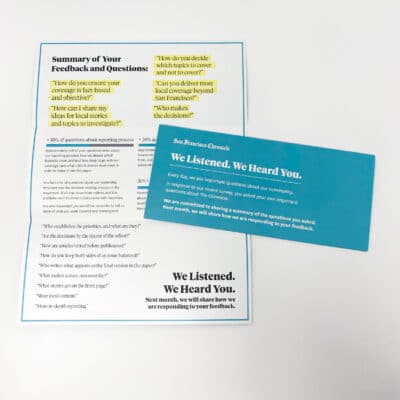
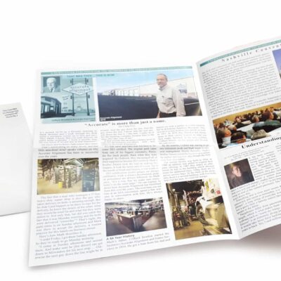
FACT or Fine Arts for Children & Teens, is a non-profit program that emphasizes bringing arts-learning opportunities to under served children in the northern area of New Mexico. Nearly 80% of the students they serve are considered at-risk, and many come from some of northern New Mexico’s lowest-income and highest-crime neighborhoods. By working with students and teachers, FACT encourages art education that is rigorous, fun and positively influences student success.

FACT’s newsletter is designed for a wide array of people from students and parents to board members and people wanting to donate to a useful cause.

Appeal

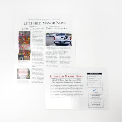
  • Layout – The newsletter design is carefully laid out with each section highlighted in a different color. This breaks the content into easy to read sections and allows your eyes to focus on one piece at a time.
  • Informative – This newsletter example is targeted to a specific audience looking for updates on the program, upcoming events and classes and highlights from the past few months.
  • Paper – The designer chose 80# dull matte text to show the images off beautifully without being too glossy. This durable, heavy-weight paper was a great choice as it can be easily folded and mailed.

Attention Directors

  • Format – This fine example of an 11×17 quarter fold newsletter format provides the designer the ability to fill this newsletter with a wealth of information and pictures and still have room for a mailing area, turning it into an cost effective self mailer.
  • Color – By using numerous playful colors throughout the newsletter, it catches the attention and draws the reader in, ensuring this piece will be read cover to cover.

Motivators

Keeping people up to date – This sample of a successful newsletter is full of information, from upcoming activities/classes, to transition in the staff, and the organization seeking sponsorships. You can get a sense of what they accomplished in the past 6 months by reading their program highlight section and get a view of what events are coming up in the months ahead.

Summary

Newsletters are one of the most popular printed pieces and are extremely valuable when keeping people informed is a top priority. FACT did a fantastic job with the newsletter layout and provided essential and interesting information for their students, parents, staff and sponsors. Create your newsletter today by clicking here for a newsletter template.

Subscribe to our weekly newsletter and get an instant 20% off your first print project.

Name(Required)
This field is for validation purposes and should be left unchanged.

RELATED MARKETING & DESIGN TIPS

Wire-O® Binding

Get the many advantages of Wire-O Binding for bound booklets, manuals, workbooks and other documents that need to lay flat. Assorted colors are available

Read More >


Creating a Successful Catalog Design

A catalog’s design is essential to its success. Master your catalog design and learn to make a captivating catalog with our expert tips. Start designing!

Read More >


5 Steps to Producing a Great Catalog

5 step catalog marketing strategy that will help you produce a successful catalog to bridge online and offline sales channels.

Read More >


Door Hanger Marketing and Door Hanger Design

Door Hanger Marketing and Door Hanger Design

Hang Your Marketing Message on Your Prospect’s Door

Picture this. Your prospect arrives home and gets out of the car. She checks the mail and absentmindedly rifles through a stack of uninviting junk mail. Then she goes to the front door, and slowly starts to turn the handle. But wait…something stops her in her tracks. Hanging on the door is the full color, professional-quality, eye-catching door hanger your company has strategically placed on the knob.

Sounds like a marketer’s dream, right? Door hangers are full of untapped marketing potential. They are the perfect vehicle for marketing your business locally and are one of the most inexpensive ways to get the word out a large group of potential customers. Full color, professionally-printed door hangers are easy to distribute and are effective because they are the first advertisement a consumer sees when he or she arrives home.

Pack a Serious Promotional Punch with Door Hanger Marketing

Door hangers can be used in a variety of ways to market your business. Whether you are seeking new customers or trying to generate repeat business, doorknob hangers will give you some serious bang for your marketing buck. Here are a few ideas for how you can make door hangers work for you:

  • Announce a new business
  • Introduce an established business to potential customers that have recently moved into the area
  • Promote a sale
  • Distribute coupons
  • Promote an event – grand opening, giveaway, in-store promotion
  • Educate potential customers about products or services
  • Inform conference attendees about the next day’s schedule by hanging a door hanger on their hotel doors
  • Introduce a new product or service
  • Highlight a political candidate

Ready, Aim, Fire: Hitting the Mark with Full Color Door Hangers

We all know that even the best marketing campaigns are wasted without a relevant target. Ideally, your target should consist of people or businesses ready to buy your product or service at the moment they receive your door hanger. Door hangers are very effective at this because they allow you to target specific areas and demographics to help in increase your ROI.

For example, if you sell fencing, you can deliver your door hangers just to the homes without an existing fence. Or if you sell renters insurance, you can target your door hangers to specific apartment complexes. Or, if you perform snow removal, you can focus on neighboring homes that do not currently use your services – and look like they could use it!

Door Hanger Distribution – Divide and Conquer

How a business distributes their door hangers depends on the resources you have available. There are several options to getting it done:

  1. Utilize your company staff to distribute your door hangers to your target audience.
  2. Enlist friends and family to help you out and reduce your distribution costs. Try turning it into a competition to see who can distribute the most door hangers in the time allotted. It will be fun and more effective than doing it yourself!
  3. If you just can’t find the time to do it yourself, outsourcing your door hanger distribution is also a viable option for many businesses.

Consider this: An able bodied person should be able to distribute between 600 and 800 door hangers a day depending upon neighborhood concentration. Better get moving!

Door Hanger Design: Getting People to Respond

The more eye-catching and visually appealing your door hanger is, the greater the chances someone will read it, remember its message, and purchase your service or product. Consider an attention-grabbing headline and image on the front of your door hanger or design it in an unusual shape or color to stand out from the pack. Or try transforming your door hanger into a flyer, business card and coupon all in one by using perforation marks to allow future clients to neatly tear off important information. The most important thing to do when designing your door hanger is to make it easy to respond to your offer and have a clear ‘call to action.’

As you can see the, the benefits to adding door hangers to your marketing plan are numerous. Not only are doorknob hangers perfect for reaching a specific target audience, they also allow you to hit your prospect at exactly the right time and are hard to ignore. Plus, your door hanger is likely to be carried into your prospects’ home for a second look later on.

PrintingForLess.com offers affordable, full color door hangers in a variety of different formats and sizes. Choose from one or two-sided, in two popular sizes; the standard 4.25 x 11 or 3.5 x 8.5. We offer these on your choice of our three cover stocks or the more economical 100# gloss text.

Door Hanger Samples


Subscribe to our weekly newsletter and get an instant 20% off your first print project.

Name(Required)
This field is for validation purposes and should be left unchanged.

RELATED MARKETING & DESIGN TIPS

Clear Business Cards

Get clear plastic business cards printed with numerous custom options, fast turnaround, free templates, live expert help and award winning service

Read More >


Our Partners

Add value to your customers by partnering with the leader in online commercial printing.

Read More >


E-Book: 2025 Direct Mail Product Guide

The first edition of this e-book is packed with actionable insights, including design tips, mailing class details, and best practices to ensure your campaigns stand out.

Read More >


Text and Type for Printing

Best Quality Text for Printing

Raster vs. Vector Text

  • Raster graphics are bitmap images made up of individual pixels/dots, laid out in a grid. Raster images have a fixed resolution (dots per inch) and lose quality when enlarged. Not recommended for text, as edges will likely appear jagged.
  • Vector graphics are graphics created with mathematical lines and curves. Vector graphics are resolution independent and scalable. Recommended for text, as edges will be clear and crisp.
raster vs vector text quality
BAD                                                     GOOD
Raster type will print blurry & fuzzy   Vector type will print clear & crisp

How to get vector text:

Colored Text

There are two things to be aware of when working with colored text:
  1. Due to their physical limitations, all printing presses may experience slight variations in the positioning of the cyan, magenta, yellow and black plates. Any deviance among the four plates is called misregisration.
    • The printed result of misregistration is colored “halos” around your smaller, finer elements such as text or thin lines.
    • We recommend that colored text is used only at sizes larger than 12 point. This also applies when you are using white knock-out text.
  2. Light colors built of only one or two colors may appear to have rough edges when printed. Adding a color or two to the color build, or using a darker mix of colors, will help to smooth the edges and improve text legibility and appearance.
    • Colored text should be at least 12 point.
colored type printing problems
BAD                                                             BAD                                                       BAD
Colored type smaller than 12            Knock-out type smaller than 12            Light text built of only one or two
point is subject to misregistration   point is subject to misregistration colors    can appear jagged when printed


Black & Rich Black
Printed blacks are not all the same.
  • Computers display color with RGB light, while presses print with CMYK ink.
    On computer monitors, all blacks will generally appear consistent. But on press, different ink combinations can create a wide range of blacks: warm black, cold black, green black, etc. It is important to know the CMYK builds of any blacks used in your project so that you can achieve the results you want.
cmyk black builds
Black border looks consistent on screen
 
When printed, inconsistent black builds will be obvious
Some Guidelines:
  • When black is the text color, we recommend using 100% black (0 C / 0 M / 0 Y / 100 K) for crispest results.
  • If you have a solid black area larger than two square inches, we recommend using a “rich black” to achieve a thicker, darker and more uniform color. We recommend a rich black color build of 50 C / 35 M / 15 Y / 100 K.
  • When you have two abutting backgrounds, adjoining color builds should match to avoid color inconsistencies.
  • If your piece has a black or dark color background, we highly recommend that you add a coating to your piece. Dark backgrounds are more likely to show fingerprints, scuffing and smudges, which the applied coating can help minimize.

Laying Type Over Images
Be careful when using images and graphics for backgrounds. Text of any color can become very hard to read when placed over a busy image.
  • The secret is to lighten the image a lot – more than you may think is necessary.
text over image example
   It can be difficult to read text over an image
 
Dramatically lighten the image for easy reading

Sending Fonts
We need the same fonts that you use in your file to be able to successfully reproduce your order on press. It is not necessary to send us standard fonts, but we do need any special fonts that you have used or purchased. This usage is allowed by copyright law.
To upload your font:
  1. Go to the Start menu on your computer
  2. Go to Search/For Files or Folders
  3. Type in the name of your font and search your computer for the file
  4. Once the file pops up, copy the file by right clicking on the icon, scrolling down and clicking “copy”
    • Type 1 fonts contain two parts with the extensions .PFM and .PFB. Both are needed in order for the font to be functional.
    • True type fonts only require one file that uses the extension .TTF.
  5. Paste the font file(s) onto your desktop; do this by right clicking, scrolling down and clicking “paste”
  6. Go to our file upload page
  7. Click “Browse”, go to your desktop, click on the font file you pasted and then click “Upload”
    • Mac users must compress font files prior to upload to avoid corruption.


Subscribe to our weekly newsletter and get an instant 20% off your first print project.

Name(Required)
This field is for validation purposes and should be left unchanged.

RELATED MARKETING & DESIGN TIPS

Bumper Stickers Printing

Bumper stickers are not just for bumpers anymore! Printing for Less offers custom bumper sticker printing available on all-weather vinyl & more!

Read More >


Business Card Size Specifications

See standard business card dimensions, layout specifications, and guidelines for printing business cards and folded business cards for commercial printing.

Read More >


Direct Mail 2025 – Emerging Trends and Strategies

As 2025 unfurls, direct mail marketing is set for an exciting and dynamic transformation fueled by technology and shifting consumer preferences. Read all about it to get a head start in the new year.

Read More >


Saving PDF Files in Photoshop and Illustrator

Saving PDF Files in Photoshop and Illustrator

PDF stands for Portable Document Format, and it’s used for both print and digital applications. The main advantage of the PDF format is that accessibility doesn’t rely on fancy software; anyone can download a free PDF reader (we most often recommend Adobe Acrobat). PDF is a fixed format, meaning it will render the same on all platforms, browsers, and devices.

If you’re proficient in graphic design, you can create and save PDFs from a variety of industry image editing programs, such as Adobe Illustrator and Photoshop.


Why Save My Illustrator File as a PDF?

Even if you package an Illustrator file with all related fonts and links, the recipient of your file will need to have Illustrator in order to open it. Saving your Illustrator document as an Adobe PDF can quickly get rid of any headaches related to software requirements and compatibility.

If saved properly, your PDF will look just like your Illustrator file and can even be used to print your final project. The only software your recipient will need to view it is the free Adobe Acrobat Reader.

The biggest benefit of using Illustrator (and Illustrator instead of Photoshop) to create print-ready PDFs is that Illustrator can keep all of the vector content as editable vector content without having to stick to the native Illustrator format.

How Do I Save My Illustrator File as a PDF?

Go to the File menu and select “Save As.”

illustrator save as dialog

Select “Adobe PDF pdf” from the “Format” dropdown. Change the filename if you’d like, and then click the “Save” button.

illustrator pdf save as dropdown

You’ll see a new dialog box populated with Illustrator’s Save As PDF presets, and providing additional PDF options.

save adobe pdf options

Depending on what your PDF’s purpose is, you can use the Adobe Illustrator PDF Presets to shortcut choosing your settings.

illustrator default preset

If you’re going to be using your PDF online, for example, the “Smallest File Size” option is usually a good start.

illustrator smallest file size

Within Illustrator’s “Save Adobe PDF” dialog box, choosing any category from the left hand menu will allow you to customize your settings further.

illustrator preset default\
 

How to Create a Vector File from a PDF

Wondering how, if you can save make a PDF out of a vector file, you can reverse the process and create a vector file from a PDF? To be honest, it’s a bit of a trick question.

No PDF can “become” a vector file; the only way to make a vector file out of a PDF is if it was created in a vector program to begin with, and saved that way. You cannot convert raster files to vectors. Too much information has been lost when something has been rasterized. Below, we’ll explain this in more depth.

How Do I Know if a PDF Is Raster or Vector?

In order to tell whether a PDF you want to open (and most likely edit) is a raster or vector file, You’ll need Adobe Acrobat Pro to execute a couple of different tests:

Open your PDF in Acrobat, and click on the page. If the page turns blue, you’ve got a raster file. After opening your PDF, click on the magnifying glass tool and/or adjust the Zoom percentage. If, the more you continue to zoom in, the more you see jagged lines and fuzzy imagery instead of smooth, clean strokes and shapes, you’ve got a raster PDF.

Can I Save a Vector-Based PDF in Photoshop?

Unfortunately, you can’t save a vector-based PDF in Photoshop, since it’s primarily a raster program.

Yes, Photoshop can handle vector graphics created within the program. And yes, Photoshop allows you to edit vector content if it’s created within and saved as Photoshop document (PSD) files.

But as soon as you export to another format (like PDF), Photoshop embeds the vector data in a raster file. It cannot create a pure, scalable vector format. Your vector layers and raster layers stay separate only as long as you keep the Photoshop document format. Which is why you can’t make just any PDF into a vector file; it has to be in vector format already.

Photoshop’s vector drawing tools are decent, but your ability to manipulate the vectors once created is hardly robust. You’ll also always need to use Photoshop to edit a Photoshop-exported PDF.

So Why Would I Use Photoshop for PDFs?

In general, it doesn’t make much sense to save a Photoshop document (PSD) as a Photoshop PDF. You’ll end up losing data and flexibility.

There is one big exception, however. If your Photoshop document has vector layers (shapes or type) and will be used as part of another layout which is destined for printing, then you should save it from Photoshop as a PDF document.

For example, let’s say your Photoshop document is going to be placed within Adobe InDesign document. Save your Photoshop doc as a PDF with “Preserve Photoshop Editing Capabilities” checked. Then, place that PDF into InDesign instead of placing the PSD.

This is because InDesign flattens and rasterizes a PSD when you place it in an INDD document. Meaning that when your document prints, InDesign will rasterize the PSD and therefore limit the resolution of all vector artwork, including type. Rasterized type, especially, is much more difficult to read than type with the vector information preserved.

A placed Photoshop PDF, on the other hand, will keep the crisp vector information (such as type) all the way to press.

Is There Another Use for Photoshop PDFs?

Photoshop has a cool feature that allows you to create a PDF presentation. Since Photoshop’s image capabilities and layout flexibility far surpass that of other presentation software (such as Microsoft Powerpoint), this feature allows you to create presentation files with more visual impact.


And, of course, since you’re saving a PDF file, it will be easily accessible even by those without access to Adobe Photoshop.


First, have your images created and saved as separate files. Then, choose File ? Automate ? PDF presentation.

automate pdf presentation

Click the “Browse” button to locate your files and add them to the list.

pdf presentation browse

Choose the “Presentation” radio button and then select your Presentation Options (which will no longer be greyed out) at the bottom.

presentation options

After choosing the location for saving and naming your presentation file, you’ll then get a PDF settings dialog. Choose a preset or add your own customizations, and off you go! Do double check that the file extension in the filename you’ve chosen is “PDF.”

save adobe pdf high quality print

How to Save a Photoshop File as a Regular PDF

Choose File ? Save As.

save as regular pdf

Then, from the Format dropdown, choose “Photoshop PDF.”

save as photoshop pdf

Keep “Layers” checked, change the filename if you need to, and click “Save.” Then you’ll see a new dialog box with PDF Presets. You can use the “Adobe PDF Preset” dropdown to choose one.

save adobe pdf layers high quality print

If you have a print provider with specific settings they require, then you’ll customize the PDF settings here before saving.


In the dialog box and under the “General” tab, check Preserve Photoshop Editing Capabilities.

preserve photoshop editing capabilities

Go to the “Compression” tab, and select “Do Not Downsample.”

do not downsample setting

Select “None” under “Compression” (which will be a new dropdown that appears once you’ve selected “Do Not Downsample”). Select the Output tab and choose “No Conversion” under Color Conversion, and “Don’t Include Profile” under Profile Inclusion Policy.

no conversion

Make sure there are NO checkboxes selected under the “Security” tab.

pdf security dialog

Then, name your file, choose the location where you want to save it, and click the “Save” button.

Printing for Less can help you get in touch with a print design professional, or – if that describes yourself – we can take your creative vision and make it live in stunning, world-class print. Speak with one of our consultants, available 8am-5pm MT Monday through Friday at 800-930-6040.


Need creative or technical advice on working with your PDF?
Call our helpful experts now at 800-930-6040


Subscribe to our weekly newsletter and get an instant 20% off your first print project.

Name(Required)
This field is for validation purposes and should be left unchanged.

RELATED MARKETING & DESIGN TIPS

Complete Guide to Creating Press Ready Print Files

We put together everything you need to know about creating a successful commercial print ready file. Learn about bleed, color, image formats, folds, & more.

Read More >


Die Cut Business Cards

Skip the boring and make it extraordinary! Die cut business cards are an effective way to break out of the standard business card box to create a unique impression.

Read More >


How-To Make Environmentally-Friendly Printing Decisions

Printing can be an eco-friendly venture, but you have to make the right decisions. Get advice from a leading sustainable printing service on how to do it!

Read More >


Somewhere Over the CMYK Rainbow

Somewhere Over the CMYK Rainbow

Using PMS Pantone colors, metallic inks, varnishes and custom paper with your InDesign projects

by: Claudia McCue

For print projects that really pop, there’s nothing like unusual inks or atypical papers. But before you jump into that 27-color job printed on foil gum wrappers, read this article to find out what to do—and what not to.

When you venture beyond the familiar territory of cyan, magenta, yellow, and black, a wide world of color possibilities opens up for you. Whether you’re striving for vibrance not attainable in process colors, or you need to match a specific corporate color, spot colors greatly extend the rainbow of print.

However, it’s not all rosy in the world of spot colors. You’ll find that some spot color inks require special handling because of the unique nature of their pigments, and that you may have to compromise a bit of brilliance in the name of longevity.

And even plain old process colors can come to life when printed on specialty substrates, such as foil-coated stock. But there are things to watch out for here, too, such as which types of ink print well on your chosen stock. In this article, I’ll explore the possibilities of these interesting inks and substrates, as well as issues to consider before you jump into something really adventurous.


See Spot

Pantone color book
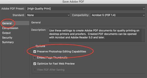
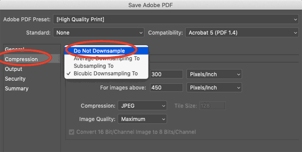
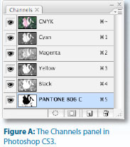
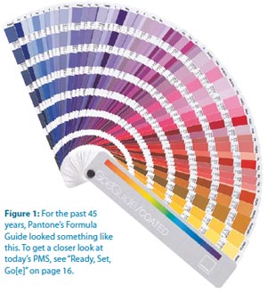
You probably know there are serious limitations on the gamut of colors that can be printed with combinations of cyan, magenta, yellow and black. But let’s pause for a moment of amazement at the range of colors that can be printed with CMYK. Think of all the color photographs that are successfully printed every day without the help of any special guest-starring inks.

Ah, but that’s just not enough for us, is it? We always want something more. In fact, CMYK can’t accomplish some fairly common colors, such as navy blue and bright orange (see “I’ve Got the Blues” below).

Those are almost primal colors—think of myriad high school football jerseys. Even for such basic colors, process (CMYK) inks can only produce a purplish blue instead of navy, and a brownish orange in lieu of festive Pantone 021 Orange. That’s where spot colors come in. Open up your Pantone Formula Guide and play along (Figure 1).

The Pantone Corporation doesn’t manufacture or sell printing ink; instead, Pantone functions as a “color authority,” providing its famous color guides. Those color guides serve as more than just a color picker for designers: there’s a reason your fanbook is called the Formula Guide. Note the little recipe under each swatch—it’s a mixing instruction for creating the ink color seen in the swatch by combining specified amounts of the “basic colors” (the swatches at the front of your fanbook), along with opaque or transparent white. (The fluorescent and metallic inks in the Pantone books are supplied as ready-mixed inks.)

Besides enabling the printing of colors outside the range of CMYK, there are other advantages to using

  • Color consistency from page to page
  • Avoidance of registration issues with small text or
  • Smooth coverage of large areas

Although it may be the most familiar resource in the United States, the Pantone Formula Guide is not the only color library available. The Toyo library is used primarily in Japan (and to some extent in Europe) to specify spot color inks. Dainippon Ink Corporation’s DIC Color Guide originated in Japan but pops up worldwide. The ANPA (American Newspaper Publishers Association) library is for newspaper use, and HKS is a German-based color resource used predominantly in Europe. While this article refers generically to “spot colors,” keep in mind that it’s important to select spot colors from the library that’s appropriate for your job’s printing environment.

I’ve Got The Blues
One of the most commonly used spot colors is Reflex Blue. Ironically, that good old navy blue is also one of the most problematic inks. Because of the resins and solvents used to bind the reflex blue pigment, it’s slower-drying than other inks, unless chemicals are added to speed the drying process. This may delay your job by a day or so. The pigment itself is a bit coarse, which can interfere with adhesion to paper—although it’s difficult to remove the blue stain if you get it on your hands! Consequently, Reflex Blue is prone to scuffing.
 
As ink formulations have improved over the years, it’s become easier to compensate for the behavior of this popular color, and now there are “fake Reflex” inks that aren’t as finicky as the real thing, but still give you that desirable navy blue. If you have your heart set on Reflex Blue, talk to your printer about it so that you (and the printer) can prepare for any special handling it may incur.
 

Bump, Kiss, Touch…

Creating a spot color vector logo isn’t hard: Just pick the proper Pantone colors from the spot color libraries in Illustrator or InDesign. But extending the range of printable colors in images (for special cases such as art prints) requires that you create spot color image components in Photoshop.

There are lots of colorful (pun intended) terms in printing, and printers refer to these extra color plates variously as bump plates, kiss plates, or touch plates. There’s quite a bit of craftsmanship and artistic imagination to creating a successful bump plate by hand; for a how-to, see “Creating a Bump Plate.” Photoshop plug-ins such as Aurelon’s CoCo Multichannel can also make the process more manageable. In (Figure 2), I’ve started with a four-color image and enhanced the hot pink color of the rose by adding a Pantone 806C plate. This is more than a pink plate: PMS 806 is a fluorescent color that gives the rose a vibrancy that’s simply impossible with any combination of process colors.

An alternative approach is to use fluorescent ink in place of one of the process inks; this is especially effective on uncoated stock, which absorbs ink more readily, thus dulling the rendition of bright colors. (Another option is for the printer to create a custom ink composed of process ink and 25% to 50% fluorescent ink, and use that instead of the regular process color. This increases vibrancy without necessitating an additional plate.)
spot color channel in InDesign

Specialty inks such as fluorescent colors greatly expand your creative possibilities, but (like all fun things in life) they come with their own set of problems. To maintain the vibrant purity of fluorescent inks, many printers prefer to lay down these inks first to avoid contamination from traces of other inks carrying through on the press sheet. But in the case of the rose, the fluorescent ink needs to be applied last, on top of the CMYK image, so it can enhance the rose. Even though this may result in some contamination, it won’t prevent the fluorescent ink from enlivening the piece. It’s mostly when fluorescents print on clean paper stock (rather than on top of other colors) that any contamination can be obvious.

Keep in mind that you have no control over the print order of inks on your job: that’s a determination best made by job planners and pressman. But if you want to embark on such a printing escapade, solicit input from knowledgeable print professionals in the early planning stages of the job. Since it’s challenging to proof such images with some proofing systems, you may have to rely on the instincts of craftspeople who can help you determine the appropriate approach and manage your expectations.


Creating a Bump Plate

In Photoshop, open a CMYK image and look at the Channels panel (Figure A). Because it looks so much like the Layers panel, the Channels panel can be a bit confusing. But if you’ve ever printed separated lasers, it’s easy to relate the four color channels to the four process inks and the plates that print those inks. The CMYK channel is called the composite channel, and it represents the sum of all the inks.
 
Beyond the basic color channels lies the realm of Alpha channels, used to store masks for future use. When you have an active selection and choose Select > Save Selection, that’s where the selection is stored. Alpha channels don’t print; they just act as storage.
 
But there’s another kind of channel: Spot Channels, which represent spot inks. To incorporate a spot color in an image, you must use a spot channel to store information for that ink. If you don’t have a dedicated plug-in like Aurelon’s CoCo Multichannel to help you, you’ll have to build spot channels manually.
 
Usually, a spot color is meant to accentuate (or replace) an existing color in the image. In the case of the rose image, the central pink rose will be enhanced by adding a hit of Pantone 806 (a fluorescent pink). To create the Pantone 806 spot channel:InDesign Channels Panel
  1. From the Channels palette menu, choose New Spot Color. In the dialog that appears, resist the urge to name the color—let Photoshop do it for you when you select the correct printing ink. Click the small color block under Ink Characteristics to launch the color picker.
  2. In the Select Spot Color dialog, click the Color Libraries button and shop for the correct color library (usually Pantone Solid Coated). To pick a color by its number, click anywhere in the list of available colors and type the Pantone number; for example, 806. Photoshop creates a new, blank spot channel and names it according to the selected spot color.
  3. Since the rose is currently predominantly magenta, the magenta channel provides a head start for the spot channel. Select the contents of the magenta channel, copy it, and paste it into the new spot channel.
  4. Here’s where the artistry comes in. It’s necessary to eliminate all parts of the spot channel that won’t be printed in the spot color. Using white, paint out everything but the pink rose. To finish up, select the pink rose in the magenta channel and lighten it to allow the spot plate to dominate in that area.

Special Handling for Images with Spot Color Channels

InDesign CS, CS2, and CS3 let you place native .psd files containing spot channels, so you don’t need any no special approach for them. However, I’ve encountered a few workflows in which the file must be saved as a special type of EPS called DCS (Desktop Color Separations). Ask your printer if this is necessary when submitting application files (rather than sending print-ready PDFs). If so, follow their instructions for saving the file—or let them make the appropriate conversion.
 
If you submit print-ready PDFs, either follow the printer’s specifications or export a PDF/X-1a file. The default PDF/X-1a settings will handle your fancy spot color image correctly, although the resulting PDF may initially view incorrectly in Acrobat. Turn on Overprint Preview (Advanced > Print Production > Overprint Preview) to ensure that the display is correct.

If you’re using fluorescents in a more conventional way—for artwork and text rather than images—there are some issues to consider. It’s sometimes necessary to print two passes (a “double hit”) of a fluorescent ink to attain adequate strength and coverage. Additionally, fluorescent inks are sometimes prone to chalking—the pigment separates from the surface and flakes off. So if your piece will be handled extensively (and isn’t that what you want?), consider adding a varnish to protect the surface from scuffing. Ironically, while a coat of varnish protects the surface, it also dulls the vibrancy of the fluorescent ink. An additional caveat: fluorescent pigments tend to fade, especially when exposed to sunlight; consequently, these inks are best suited to projects with a short shelf life, such as promotional pieces. Finally, as you might expect, fluorescent inks are more expensive than process inks.


Heavy Metal

Metallic inks can add to the luster of high-end jobs. While these inks don’t have quite the shine or reflectivity of actual metal, they provide effects you can’t accomplish with process or other spot inks. Because they consist of metal flakes in a clear base, metallic inks are opaque. And because these inks tend to spread a bit, traps are usually reduced. (Happily, that’s the printer’s concern, not yours.) If any ink will overprint the metallic ink, the press run is often set up so the metallic ink prints on the first unit and the overprinting ink on the last unit, allowing the metallic ink to dry slightly before the final ink is laid down. You’ll have the best results on coated stock, since the ink sinks into uncoated stock, losing most of its metallic appearance. Double hits of a metallic ink don’t substantially enhance the shine, regardless of the underlying stock, but a second hit may be necessary for adequate coverage.

Since they’re composed of metal flakes, metallics are somewhat prone to chalking and flaking. While that can dull the metallic sheen a tiny bit, it’s preferable to the scuffing common with unprotected metallic inks. Metallics come in shades of gold, bronze, silver, and copper—even greens, blues, and purples.

But keep in mind that these inks don’t give quite the true metal appearance attainable with foil stamping or printing on metallic stock.

Not-So-Heavy Metal

Traditionally, if you wanted to print multiple metallic inks, you’d have to empty your wallet: The inks are expensive, and they require special preparation to ensure proper trapping, printing order, and general handling. But there’s a new way to generate multiple metallic colors affordably, and to create stunning image effects by combining metallic inks with process colors: MetalFX, developed by MetalFX Technology.
 
A highly refined, special silver or gold ink is the key: The shape of the metallic particles generates a smooth, reflective surface that doesn’t flake, and its formulation accepts overprinted inks easily, unlike traditional metallic inks. To mimic a solid metallic ink color, the metallic ink is printed first, followed by process combination generated by the MetalFX software. The process color even acts as a sealer.
 
While this means you can have the visual effect of an enormous range of solid metallic inks with only five colors (the special MetalFX ink plus CMYK), that’s not the cool part. MetalFX software lets you create a CMYK image with a specially generated metallic fifth plate that truly transforms the image. The result is an image that looks three-dimensional—the metallic component “lifts” detail, in contrast to the appearance of CMYK falling on just paper. With only slight changes in angle of view, the effect is almost holographic.
 
On the MetalFX Web site, you can request a sample and find a printer certified by MetalFX to offer this service.
 

Custom Colors

If you want that perfect taupe, and it’s not available in your spot-color fanbook, your printer can custom mix an ink for the job. As you may imagine, this is expensive and carries its own set of complications. It will be difficult (or impossible) to create color-accurate proofs, and you won’t know how the solid ink will look on the final stock unless you have the printer provide a draw-down sample (the actual ink applied to stock) or you pay for a press proof. You’ll also incur the cost of mixing and testing the ink, as well as making enough of it to ensure there’s an adequate amount for the press run.

TIP…   When you’re saving Illustrator artwork containing spot colors, the native .ai format is fine. If you’re saving a Photoshop file with spot colors, either a native .psd or a DCS-flavored EPS file will behave correctly in InDesign. Consult your printer before submitting your job to ensure you’ve saved such files correctly for the printer’s particular workflow.

Of course, since you’ll be working with a color not to create an opaque white shape that will be printed in any Pantone or Toyo fanbook, you’ll have to create a custom swatch to represent it. That’s easy: Just create a new spot color swatch, name it something meaningful, and approximate the appearance of the custom ink. It doesn’t matter what color mode you use—you’re just going for appearance. What’s important is to designate the swatch as a spot color and to make sure that, as with any spot color, your naming convention is consistent across Illustrator, InDesign, and Photoshop. And, of course, communicate with your printer to ensure that you’re building your files correctly.

Alternative Substrates

When you use non-traditional substrates, such as clear plastic or foil-coated metallic stock, or highly textured paper, your files may require special preparation to print correctly. For example, if you don’t want the underlying stock showing through artwork, you need to create an opaque white shape that will be printed first. To do this, you’ll have to create a custom spot color that represents the white ink—the [Paper] in InDesign won’t do the trick, nor will the “White” swatch in Illustrator, despite the name. Both of these swatches actually translate to “no ink prints here,” which is not what you want. I suggest you create a swatch called Opaque White, again keeping the naming consistent in Photoshop, Illustrator, and InDesign. It’s hard to see white unless it’s in front of another color in either program. And even if it is at the top of the pile, there’s a chance that you might inadvertently choose White or {Paper} when you’re in a hurry. To be sure you’re choosing the custom Opaque White, make the swatch’s appearance something other than white— temporarily use something bright and obvious like a loud orange or nuclear green. Yes, it will make your printouts look weird during the formative stages, but it will help avoid errors. Then, once everything’s in place, change the swatch options to be, well, white. Or just leave it nuclear green and make sure the printer know that it represents the opaque white ink.

It may be difficult to anticipate the appearance of the printed piece unless your printer uses a proofing system such as DuPont Waterproof. DuPont Waterproof can also proof opaque white.

If you skip the opaque white plate, printing directly on foil-coated stock can result in opulent effects approaching iridescence, even with four-color process (Figure 4). Consult your printer early in the game to determine what special handling may be required. They may suggest coating the piece to minimize scuffing, and you may need to allow extra time in the printing schedule for drying and special handling.

As you design for printing on foil-coated stock, consider the visual effect of all that reflected light: Small elements, such as fine type, may be overwhelmed by a foil background. Small reverse or white opaque type is particularly hard to read. To compensate, use a slightly larger or bolder font than might be appropriate on white stock.

Printing on clear plastic gives an interesting dimensionality to a printed piece, especially if the clear page acts as an overlay for another page, as in the Showtime project in Figure 5. In this example, the plastic sheet is an illustration on its own, but when you look at the plastic sheet, the following page shows through it. No special file preparation is required for this effect, although the clear sheets are printed as a separate job and bound in with the correct pagination. This entails extra effort at the printer to plan the job and set up the binding procedures.

If you want the transparent effect around a subject printed on clear plastic, but don’t want other art showing through the interior of the subject, you’ll need to create an opaque white knockout to be printed behind the subject in much the same way you’d create art for a spot varnish. You can either create a spot plate in Photoshop (see the “Bump, Kiss, Touch…” section above) or separate art in Illustrator or InDesign that you’ll have to carefully align with the image. If the white plate is part of a Photoshop file, just place the native .psd in InDesign or Illustrator. If you’ve created the art for the white plate as a separate file, place it above the image in stacking order or layering, and—most importantly—set it to overprint. In both InDesign and Illustrator, the overprint option is in the Attributes panel (Window > Attributes).

To correctly preview the effect, activate Overprint Preview (available under the View menu in Illustrator and InDesign). And, as I continually harp, consult with your printer. Ask if the white undercoat will require curing or extra drying for the remaining inks to adhere, so you can figure that into your deadline.

Varnishes

A flood varnish covers an entire printed page for protection or sheen, but you can highlight areas of a printed piece with a spot varnish that adds shine and depth to only certain elements on a page. You can combine matte and gloss varnishes to accentuate the boundaries between different areas on the page. There even are more possibilities: tinted varnishes provide Figure 5: Incorporating transparent stock can add dimensionality to a piece. Keep in mind that this complicates binding, since it can’t be done in-line. The different stocks are run at separate print jobs, then combined in the binding process. Consequently, you should avoid effects that require extremely tight registration of the clear page and the separate page behind it. But isn’t this cool? novel accents. And since tinted spot varnishes are printed like any other ink, you can use them to print subtle images or other graphic elements.

If your piece will be imprinted with mailing information (whether by inline inkjet or label), avoid varnish in the area of imprint or labeling so it doesn’t interfere with adhesion.

While the word “varnish” commonly refers to all coatings (sort of like using “Kleenex” to refer to facial tissue, regardless of actual brand), there are some important distinctions:

  1. Varnishes are also applied on-press, but they’re heavier-bodied and can be applied (like inks) to only certain areas (spot varnish). A plate must be created to apply a spot varnish, so artwork is necessary.
  2. UV coatings are cured by exposure to ultraviolet light to quickly dry and harden the coating on press. UV coatings can be applied as a flood (covering the entire printed sheet) or as a spot coating. UV coatings can also be applied by silkscreen after the printed sheets are off the press.

Trapping Specialty Inks

Good news—you don’t have to worry about trapping! While InDesign is capable of sophisticated trapping, your trap parameters are exercised only if separations are generated directly out of InDesign, and that’s rare. (There’s a roundabout way to make traps tangible by Distilling, but trust me—it’s neither necessary nor worthwhile.)

It’s been a very long time since printers expected to receive pre-trapped files because modern RIPs perform in-RIP trapping with far more speed and sophistication than we mere mortals can accomplish. And it’s best for the printer to tackle trapping to ensure that it’s done appropriately for their printing conditions. So, despite my cautions about minimizing trap to compensate for the natural spread of metallic inks, for instance, you don’t have to bother your pretty head about it. It’s still good to be mindful of trapping issues so you have reasonable expectations of the outcome, and so you can communicate with printers, but it’s truly not a designer’s responsibility. You have enough to worry about.


Ready, Set, Go[e]

Now that you’ve memorized the 1,114 swatches in the Pantone Formula Guide, guess what? Pantone has a new approach to specifying spot colors.
 
The new Goe system contains more colors—2,058. Arranged chromatically rather than in the slightly haphazard order of traditional fanbooks, the Goe swatchbooks are much easier to navigate. And since the number of base colors used to mix the inks has been reduced from 14 (plus White and Transparent White) to 10 (plus Clear), things may get easier for ink technicians. (There’s no truth to the rumor that the name Goe is from the ancient Sumerian for “we need to sell more swatchbooks.”)
 
The $129 GoeGuide is available in the familiar fanbook configuration. The complete Goe System consists of the following:
  • A GoeGuide coated fanbook
  • A 3-ring binder of GoeSticks coated, adhesive-backed Goe specification chips with palette cards
  • myPANTONE color selection and palette creation software
pantone book
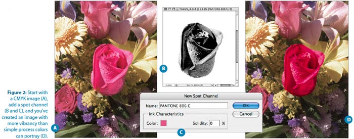
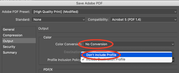
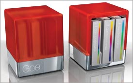
All of this is housed in a spiffy GoeCube storage and comes with access to the myPANTONE Web community for viewing and posting color palettes.
 
For those of you who don’t have Goe, don’t worry: You can still specify spot inks with the old numbers. The GoeCube doesn’t render your current fanbook obsolete (unless it’s eight years old like mine, thus rendering itself obsolete because its faded colors are no longer accurate). However, it will be some time before Goe swatches are available directly as part of Creative Suite applications. This is a new release, and there’s no word on when we can expect to pick Goe swatches from within InDesign or Illustrator. But if you adopt the Goe system, you can easily create your own custom swatches as described in the Custom Colors section of the main article.

Claudia McCue a prepress pro with more than 20 years of hands on experience. She is owner of Practicalia, an independent training provider specializing in Adobe and Quark products, retouching and color correction, and resolving general issues relating to prepress and printing. She frequently presents on these topics at industry conferences.

From InDesign Magazine. Each issue gives you tips, techniques, and time-savers by an all-star cast of industry experts.

Also see our Custom Printing Effects page for descriptions and visual samples of custom finishing options such as pantone colors, metallic inks, die cutting, embossing and foil stamping.

Subscribe to our weekly newsletter and get an instant 20% off your first print project.

Name(Required)
This field is for validation purposes and should be left unchanged.

RELATED MARKETING & DESIGN TIPS

E-Book: 2025 Direct Mail Product Guide

The first edition of this e-book is packed with actionable insights, including design tips, mailing class details, and best practices to ensure your campaigns stand out.

Read More >


Mailing

Direct mail marketing is still a powerful marketing tool! Get Direct mail marketing tips and resources and take full advantage of your campaign. Learn more.

Read More >


Printing Paper Type Descriptions

Descriptions of types of papers used in commercial full color printing including gloss, uncoated, matte and dull text and cover weight stock and paper

Read More >


InTime: Play that Funky Master Page

InTime: Play that Funky Master Page

Get your groove on with the hidden efficiency of working with InDesign master pages.
by: Pariah S. Burke
 
When editor in chief Terri Stone called to ask me about the topic of this installment of InTime, I had been blasting out funk. (You might not peg long-haired, leather-wearing me for someone who gets down to the likes of James Brown and George Clinton, but I do.)
 
While I was stomping around, jumping back and kissing myself, I considered the influence of 1970s and ’80s funk on modern rock, pop, hip-hop, and even country music. From the Gap Band to Stevie Ray Vaughn, funk grooves have helped shape most of the other music I enjoy. The Blues begat soul and Motown, which in turn spawned funk; funk led to disco and punk, which catapulted us into early hip hop and the optimistic sugar pop of the 1980s and beyond. Even in hard rock, it isn’t uncommon to hear a riff inspired by or even borrowed from Rick James or Parliament Funkadelic. Techno and trance speed up or slow down, respectively, variations of many beats originally committed to vinyl by Stevie Wonder or the Dazz Band. Your iPod is almost certainly filled with bits of funk and funk influence.
 
“So, Pariah, what’s the topic of the next installment of InTime?” Terri repeated, breaking through my internal musings.
 
I grinned like an atomic dog and said, “Master pages—a multi-parter.”
 
“Why master pages?”
 
“Master pages are the foundation and influence for many layouts, yet InDesign’s master pages contain many undiscovered gems of efficiency our readers should know about.”
 
“All right,”Terri replied. “Play that funky master page, white boy.”

Can’t Touch This

Let’s start simply with an introductory groove. Nothing too hard core, just enough to start your feet tapping. Let’s lay down some overrides. Everyone knows how important master pages are in expediting the creation of multi-page documents with common elements, such as page numbers, headers, footers, and backgrounds. Putting common elements on a master page lets you alter those elements on all document pages with one change to the master. But what about those occasions when a document page requires something a little different, when a master page item needs to be altered in one instance only? That’s where it’s useful to override or detach the item from the master page.

If you’re a QuarkXPress super freak newly boogying to the InDesign beat, you’ll notice that you can’t just click to select master page items on document pages. Unlike XPress, InDesign locks master page items to prevent accidental repositioning and alteration. In other words: Ow! Can’t touch this! The difference in the way the two apps handle master page items can be frustrating at first, but rest assured, you can override those untouchable master page items.

To override (access) one master item at a time, CMD+SHIFT-click/CTRL+SHIFT-click on the master page item. It will unlock, override, and become a document page item. You’re then free to change it however you like. Overriding doesn’t completely disassociate the object from its master item original; rather, the object will continue to update with the master item except for your overrides. For instance, if you override a picture frame and apply a stroke to it on the document page, and then later go back and add a fill to the master page version, the fill will also apply to the document page item, but the stroke will remain on the document page item.

It might help to think of master items in InDesign the same way you think of text to which you’ve applied a paragraph style. If you’ve defined a paragraph style as Times New Roman and then manually make one word in a paragraph italic (creating a paragraph style override), it becomes Times New Roman italic. If you later change the paragraph style font family to Myriad Pro, the overridden attribute remains—the italic word stays italic but adopts the new font family attribute to become Myriad Pro italic.

There are some exceptions. For example, overriding a text frame breaks the content link—if you then type in the text frame on the master page, it won’t appear on the document page. And if you move the object on the document page, rotating it on the master page doesn’t affect what’s on the document page.

To override all master page items for the current page or spread, slide on up to the Pages panel flyout menu and select Override All Master Page Items (Figure 1). Now you’ve overridden and made accessible all objects applied by the master page. You can also CMD+SHIFT+drag over an area to override all the objects that the marquee rectangle touches.

 
layout menu


To completely sever the connection between an overridden master item and its original on the master page, you must detach it. First, override the item as normal, and then, with the object(s) still selected, choose Detach Selection from Master from the Pages panel flyout menu. Once detached, the object will no longer inherit attributes from, nor change with, the original master page item.

You can also change your mind, dropping the overridden versions in favor of the original master page items. CMD+Z/CTRL+Z, of course, undoes override and detach operations, but only immediately after doing them. If you decide to remove overrides later, you can manually delete the overridden objects and reapply the master, which is the way most people do it, or you can opt to take the more efficient route.

On the Pages panel flyout menu is a dynamic menu command. If you select one or more objects that were once master page items, you’ll see the command to Remove Selected Overrides. Executing that command returns the selected objects to their untouchable, pre-override states, without affecting any other objects on the page—overridden master page items or objects created directly on the page.

If you want to restore all overridden master page items to their original, pre-override states, deselect all objects and return to the Pages panel flyout menu. The Remove Selected Overrides command will have transformed into the Remove All Local Overrides command.

Note that reapplying the master to that document page will result in two copies of the same objects—the overridden versions as well those still locked objects inherited from the master page.

Funk Bombing Document Pages

You can apply a master page (or re-apply it) to a page by dragging the master page icons from the top of the Pages panel, dropping them onto document page icons in the lower portion. But, for the love of soul, don’t do it for more than a page or two!

If you need to apply or re-apply a master page to more than a couple of pages, use the little known— but very funkalicious—Apply Master dialog (Figure 2). On the Pages panel flyout menu, choose the Apply Master to Pages command to open the Apply Master dialog. With only two fields it’s deceptively simple, but, like the best of funk music, simple lasts. From the dropdown Apply Master field, pick which master page to apply, and in the To Pages textbox, enter the page number(s) to which to apply or re�apply the chosen master. In this field you can enter a single page number, a range of pages separated by a hyphen (e.g., “2-50”), comma-delimited non�sequential page numbers (e.g., “2,4,6,8,10”), and even combinations of sequential and non-sequential pages (e.g., “2, 4, 5, 8-22, 24, 28-50”). This is a funk of a lot faster—and much less strain on your bop gun wrist—than dragging that master page icon numerous times.

 
apply master page
 

Feel square and not so fresh using a dialog? Not a problem. You can apply or re-apply a master to multiple pages entirely from within the Pages panel. Select the needed pages. For a sequential range of pages, click on the first and then SHIFT-click on the last. To select multiple non-sequential pages, CMD-click/CTRL-click on the page icons. Once selected, OPT-click/ALT-click on the master page’s icon to apply it to all selected document pages.

It’s Super Good

Track 1 of “Play that Funky Master Page” is now concluded. In the next InDesign Magazine, I’ll spin up a whole new groove for you to get up, get down, and get funky with yo’ bad self. By the time I’ve finished discussing the tricks of working efficiently with master pages, you’ll be able to stand up and howl, I’ve got soul, and I’m super bad!

 
Pariah S. Burke is a design and publishing workflow expert bringing creative efficiency into studios, agencies, and publications around the world as principal of workflow:Creative. He is the author of Mastering InDesign CS3 for Print Design and Production (Sybex, 2007); the former technical lead for InDesign, InCopy, Illustrator, and Acrobat to Adobe’s technical support team; a freelance graphic designer; and the publisher of the Web sites Quark VS InDesign. com and Designorati. When not traveling, Pariah lives in Portland, Oregon, where he writes (a lot) and creates (many) publications and and projects to empower creative professionals.
Pariah S Burke

More on InDesign Magazine. Each issue gives you tips, techniques, and time-savers by an all-star cast of industry experts.

Subscribe to our weekly newsletter and get an instant 20% off your first print project.

Name(Required)
This field is for validation purposes and should be left unchanged.

RELATED MARKETING & DESIGN TIPS

Packaging: Box Dimension Guidelines

How to determine and specify the length, width and height for a folding box for product packaging design.

Read More >


What is Embossing or Debossing?

What is embossing and debossing? It’s smooshing paper, but it’s really cool. Find out more about how to effectively use this advanced printing technique.

Read More >


Brochure Printing with Custom Inks

Get metallic, pantone and custom ink printing on your brochures so you can stand out with improved visibility and enhance your conversion rates

Read More >


  • « Go to Previous Page
  • Page 1
  • Page 2
  • Page 3
  • Page 4
  • Page 5
  • Page 6
  • Page 7
  • Go to Next Page »

Footer

Printing for Less

info@printingforless.com
100 P F L Way, Livingston, MT 59047

800-930-2423

  • Home
  • Products
  • Services
  • Industries
  • Get Samples
  • Direct Mail Marketing Resource Center
  • Printing Resource Center
  • Blogs
  • Templates
  • Terms & Conditions
  • Contact
  • About Printing for Less
  • About P F L
  • Our Team
  • Careers
  • Login

Copyright © 1998-2025 PrintingforLess.com. All Rights Reserved.

logo
  • 800-930-2423
  • Products
  • Direct Mail Marketing
  • Services
  • Industries
  • Direct Mail Marketing Resources
  • Printing & Mailing Resources
  • Get a Quote
  • Contact Us
  • My Login
Catalog Printing

Subscribe to our weekly newsletter and get an instant 20% off your first print project.

Name(Required)
This field is for validation purposes and should be left unchanged.

*Some exclusions apply. See details