• Skip to primary navigation
  • Skip to main content
  • Skip to footer
Printing for Less

Printing for Less

At Printing for Less, we've offered high quality online printing services since 1996. Shop business cards, booklets, stickers, and more!

My LoginMy Login
800-930-2423
  • Printing
    • Postcards
    • Business Cards
    • Catalogs
    • Brochures
    • Folders
    • Letters
    • Newsletters
    • Envelopes
    • Greeting Cards
    • Print Templates
    • All Products
  • Direct Mail
    • Why Direct Mail Marketing?
    • Every Door Direct Mail® Postcards
    • Direct Mail Letters
    • Catalogs & Booklets
    • Marketing Gifts & Kits
    • Direct Mail Automation
  • Services
    • Mailing Services
    • Pro Services
    • Design Services
    • Custom Printing Services
    • Reseller Program
  • Industries
    • Advertising & Design
    • Food & Beverage
    • Healthcare Payers
    • Healthcare Providers
    • Nonprofit
    • Real Estate
    • Retail
    • Technology
    • University
  • Resources
    • Direct Mail Marketing
      Resource Center
    • Printing Resource Center
    • Blogs
    • Templates
    • Video Library
    • Have a Question?
  • Get Samples
  • Get a Quote

Graphic Design

Business Cards with Pantone Inks and Spot UV

Business Cards with Pantone Inks and Spot UV

spot uv business cardPantone inks ensure that business cards perfectly reflect your brand. Spot UV gives cards dazzling effects that you can’t get with ordinary printing processes.

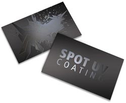
Spot UV isn’t really “ink” at all. It’s a special glossy varnish that’s applied to business cards and instantly cured with ultraviolet light. The result is a shimmering glow that will make people wonder where you got such cool cards.

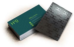
Pantone inks are based on the Pantone color system (also known as the Pantone Matching System or PMS), which provides color consistency across everything your company does through multiple vendors. When you choose spot Pantone inks, you guarantee that the blue on your business card is the same as the blue on your signs and product packaging, making your brand recognizable by its color alone.


Design Tips for Business Cards with Pantone and Spot UV

Pantone and spot UV add inviting accents to four color printing projects. For the best look:

business card using spot uv
  • Use matte paper to emphasize the shine of spot UV. For maximum shimmer, we recommend “silk spot UV” — coating the paper with a soft touch coating before adding UV coating.
  • Keep your business cards uncluttered and make it easy for people to read your contact information. Use at least 8pt type and pick a typeface that’s professional, clear and readable. Save the swirly scripts and comic sans for another use.
  • Refer to your company’s style guidelines when using Pantone inks to ensure you specify the right colors for your brand.

Using Pantone and Spot UV Business Cards

These days, almost everyone can instantly enter contact information in their phones. But business cards still serve an important function. They give people a physical reminder that they met you. When you hand someone a business card, you keep the focus on your conversation, not on technology. And business cards keep working for you, even when there’s no internet.

Keep a stack of business cards with you everywhere you go. Be sure they include your most important contact information:

  • Put your name, company name, and job title in a prominent spot
  • Include your direct phone number and email address
  • Also add your company’s website address
  • Optional information includes your street address, social networking URLs and a QR code that connects to your company website. Include these items only if they seem useful and important to the people you meet.

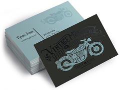
Your overall business card design should be consistent with your brand and the way you want people to view your company. Spot Pantone colors make it easy to maintain brand consistency, but business cards can also suggest your brand in more subtle ways. Thicker paper says “quality,” while die cuts can make you seem creative and fun.

spot uv backSpot UV gives business cards a truly striking look. Use a spot UV finish on the back of the card to transform it into a conversation-worthy piece. Or put spot UV over your company name or logo. Use spot UV to simulate water and other shiny surfaces, or to show that your tech company really is cutting-edge.

Having trouble picking colors? Every year, Pantone names a color of the year and suggests other shades that pair well with it. Use spot Pantone color in this year’s hue to create a business card that’s perfectly on trend.

Spot UV gives business cards an arresting effect, while spot Pantone inks create colorful perfection. Either will give you the kind of business cards that you can’t wait to share.

Have questions about using Pantone or Spot UV?
Give our helpful experts a call at 800-930-2423 or Get Pricing
This field is for validation purposes and should be left unchanged.

Get 20% Off

Subscribe to our weekly newsletter and get an instant 20% off your first print project.

Name(Required)
RELATED MARKETING & DESIGN TIPS

The Advantages of Self-Mailers in Direct Mail Campaigns

Learn about self-mailers as an effective but often overlooked element of a successful multi-channel marketing campaign.

Read More >


Using Die Cutting on Postcards

Get unique die cut postcards that will cut through the clutter in the mailbox and get your message noticed.

Read More >


Horizontal Small Catalog Design

Need help designing a small horizontal catalog (8.5 x 5.5)? This guide walks you through our process of creating a unique design and execution! Learn more.

Read More >


Brochure Design Analysis

Brochure Design Analysis

DePuy Spring Creek, LLC Brochure

Next time you’re staying in a hotel, stop by the brochure rack in the lobby. Among the brochures for tours, cool attractions, natural wonders, amusement parks, local restaurants, and historical sites, you might find a slightly out-of-place brochure; one that speaks of elegance, high class, and exclusivity. In the brochure rack you’ll be hard pressed to find a brochure as well designed and beautifully produced as this one.


Target

DePuy Spring Creek is one of the finest wild trout streams anywhere in the lower 48 states. Located 6 miles outside of Livingston, Montana, the original gateway to Yellowstone National Park, millions of park visitors stay in hotels within close driving distance to the spring each year. DePuy Spring Creek, LLC, offers reserved fly fishing spots on this world-class trout fishery.
 
This brochure needs to appeal to fly fishers who may have an open day or two during their visit. These potential customers typically have some disposable income and occasionally enjoy dining at a fine restaurant.


Appeal

To appeal to the target audience of this brochure, the whole piece has to say, “Epic Fly Fishing!”

  • Professional photography – The best way to appeal to this audience is to put a big, giant trout right on the front cover. Actually, the photographer did one better and shot an image of a big, giant trout just coming out of the water with a fly in its lip.
  • Appealing “inside” information – Not everyone would find a license plate splattered with bugs exciting. But to the right person, this means big fish. The bug smeared license plate photo on the inside of the tri-fold tells a fly fisherman that the driver just went through a caddis fly hatch – a favorite food of trout. This photo cleverly sends a “coded” message to the right audience.
  • Font and Leading – A serif font was used with slightly expanded spacing between letters to give a clean, easy-to-read feel. Sarif fonts are good to use on brochures built around a nature theme. The font style has a more classic, old world finish and fits right in on this piece.
  • Paper – An 80# gloss text was used to provide the right finish to the piece.

Attention Directors

Nature is heavily represented in this brochure, and there are many design elements that were integrated to help accentuate those natural elements and leave the reader with warm feelings.

  • Hue – This brochure is filled with pictures of wood, wooded mountains, lush stream banks, rocky-bottomed crystal clear streams, and colorful rainbow trout. To give a more consistent look to the images, and to add effects like warmth, the hues of the greens and browns were slightly changed. Magenta was added to the green hue, or the color’s position in the natural spectrum, to give the greens a natural consistency like a forest of evergreens. A slight amount of yellow was added to the browns for warmth
  • Format – Since this piece was designed for display racks in hotels, chambers of commerce, rest stops, visitor centers, and the like, this brochure had to be an 8 ½ x 11 tri-fold to fit in display racks.

Motivators

  • Contact info – You don’t want your contact info placed too inconspicuously on your brochure, but you also don’t want to detract from the piece. The designers here did a good job subtly placing a contact number on the inside of the tri-fold, and wisely using the center of the back fold to place the company’s full contact information.
  • Price – Placing pricing information on a brochure is not always a simple or easy decision. There are times when you don’t want to place price on a brochure. It may be a good idea to leave price off if:
    • The pricing is complex
    • The pricing list is too long and takes up too much space
    • You don’t want your price list falling into the hands of a competitor
    • You might want a customer to speak with a sales rep first
    • Your prices change often
    • It seems tacky to put price on your brochure

Due to the target market and nature of the product, it was necessary to put pricing on this brochure. Here it was placed very appropriately on the back panel.

The different panels showing the nice design layout.

Click images for a larger view
brochure design panels
Inisde with Right Panel Folded Over
Notice the nice crossover design when viewing the first step in unfolding
 
brochure design insides
Inside Panels
Nice cross panel presentation with
large good looking and engaging photos
 
brochure design back
Back Panel
Clean and effective

Summary

Excellent professional photography, a clean crisp feel, and a very warm, natural appeal make this elegant brochure really stand out. Look for it next time your travels take you near Yellowstone National Park.


See more Featured Brochure Designs
 
Need help or advice on a brochure design?
Give our helpful experts a call at 800-930-2423.
This field is for validation purposes and should be left unchanged.

Get 20% Off

Subscribe to our weekly newsletter and get an instant 20% off your first print project.

Name(Required)
RELATED MARKETING & DESIGN TIPS

Half Fold 11×17 Brochure Design Review

Need to target a specific group or audience for you next brochure? Informative brochures are a fantastic way to educate your customers about a specific function or product.

Read More >


Coating for Printing

Descriptions of uses of uv coating and varnish coatings used on printed materials for protection or to achieve visual effects.

Read More >


Custom Size Catalog Printing

Get catalogs printed in custom sizes and shapes to make them more functional and memorable

Read More >


Gate Fold Brochure Design Review

Gate Fold Brochure Design Review

Capturing Emotion through Printing

How to use four color printing, unique folds and custom paper to reel in guests at a Montana guest lodge

Customers, getting customers, grabbing their attention–It is safe to say that business owners know with certainty one thing: clients and customers can be finicky, temperamental and easily distracted. How do you grab the attention of a potential customer, hold on to it, and make an impression? One way is through your marketing materials, specifically a brochure. Many businesses count brochures as a key piece in their marketing arsenal, along with their business cards, direct mail pieces like postcards, and of course their websites.

One company that uses brochures to successfully convey the warmth and hospitality of their fly fishing lodge is Yellowstone Valley Lodge, out of Livingston, Montana.


The Brochure

Their brochure, a custom size 9 x 16″ closed gate fold, uses a folded, closed vertical orientation to achieve two things: ease of placement in standard sized brochure racks and a closed gatefold to maximize real estate of the printed piece. At first glance, the size is similiar to most “rack cards” or other tri-fold brochures, but once an interested customer grabs one, they begin to unfold not once, but two more times, revealing pertinent text and compelling photographs.


The Design Elements

This piece also uses an often overlooked component of winning printed pieces – the custom paper stock. Printed on a 65# Neenah Sundance Cover Felt, the look and feel of the paper works well with the subject matter—a Montana lodge providing down-home hospitality in a setting with stunning scenery, great fishing and fantastic food and amenities. This “feel” is enhanced by the softer, textured paper stock, which is reminiscent of a well-worn fishing vest. Also, this stock is made with a minimum of 30% post consumer fiber, adding to the environmentally friendly aspect.

Printing for Less’s customer, Yellowstone Valley Lodge, used a printed background that resembles lightly-worn leather, adding to the richness of the piece, and ultimately, the experience of a stay at the lodge.


The Impact

All of the components of the brochure set the stage for a potential guest at the lodge to start seeing themselves in the photographs, whether casting a fly to rising trout, wildlife viewing in Yellowstone National Park or enjoying the great food and landscapes. This is something that a website cannot do, and coupled with the portability of the piece, makes it a perfect reminder for a potential guest to start booking a trip!


Get Your Own Winning Brochure

Let’s take a look at some of the features this brochure uses to really stand out from the crowd:

  • Custom paper stock adds “feel” and richness
  • Visually-appealing photographs that capture the essence of the experience
  • Text is laid out in an easy-to-read format, telling the “story” of their lodge
  • Back panel is set up as a mailer, giving it dual-use, whether in a rack as a takeaway or sent to a specific mailing list
  • Unique fold that makes it user-friendly, easy to mail with a tab, but also maximizes space and enhances information presentation


Interested in Creating Your Own Winning Brochure?

Adding a brochure to your business’s marketing toolbox is a great way to pull in more customers, and if you are ready to get started, give Printing for Less a call today at 800-930-2423 and speak with one of our Technical Service Representatives and get all of your questions answered, or email us at info@printingforless.com. We can help you with paper selection, fold layout, design and mailing services.


The different panels of the gatefold brochure

closed gate fold
Front and back covers
 
gate fold unfolded
Panel spread after opening the brochure
 
gatefold brochure inside panels
Full inside spread
 
See more Featured Brochure Printing Designs
If you have questions about gate folds, or need help with your brochure, call our design experts at 800-930-2423 or email us at info@printingforless.com.
This field is for validation purposes and should be left unchanged.

Get 20% Off

Subscribe to our weekly newsletter and get an instant 20% off your first print project.

Name(Required)
RELATED MARKETING & DESIGN TIPS

Direct Mail Marketing: An Idea Book for Healthcare Providers

At every stage of the patient journey, direct mail plays a crucial role. Healthcare providers must focus on efficiency and targeted messaging to get the most out of their direct mail campaigns.

Read More >


Catalog and Booklet Printing Specifications and Formats

Understanding printing specifications and formats for catalogs and booklets is key for making the most of your printed marketing efforts. Learn more!

Read More >


2 Color Printing – Two Colors are Better than One

2 Color printing advantages and disadvantages for commercially printed marketing materials, with printed examples.

Read More >


Large 3 Panel Brochure Design Review

Large 3 Panel Brochure Design Review

Can a Brochure Make You Feel Hungry?

Chef de Paris’ brochure stirs the appetite!

Presentation of your product is important with any brochure, but when your product is food, extra special care must be taken to entice the customer rather than repel.

Just like a chef at a fine restaurant knows, the presentation of the food can influence a customer’s perception of taste. Whether your company is a restaurant or a manufacturer of high-quality food products, the images of your cuisine and their surroundings can drive customers to you – or drive them away.


Target

The frozen appetizers, vegetable side dishes and desserts produced by Chef de Paris in Merrick, New York, are created for discerning restaurants that maintain the highest culinary standards. Certainly their brochures need to maintain the same standards as their food products.
 

Appeal

Chef de Paris’ products are a critical component to a restaurant’s menu. They can make-or-break a restaurant customer’s dining experience. The brochure must give the restaurant owners confidence in Chef de Paris’ high standards.

  • 120# dull cover stock – The thickness of this paper portrays quality and class. Combined with the smooth dull matte finish the brochure shows off crisp printing without sacrificing the ability to easily write on it and circle the items you want to order.
  • Paris – Just by saying the word conjures up ideas of the Eiffel Tower, sophistication, cafes and exquisite food. As the reader looks at each picture in this brochure they can trust that the food will be mouth-watering.

Attention Directors

The designers used several techniques to display the food in this brochure.

  • Format and Fold – The tri-fold used in this 11 x 25 brochure makes a big impression. Using the large 3-panel brochure format, the designer arranged multiple pictures that are evenly spaced throughout the piece without over crowding the brochure. The three panel brochure makes a cost effective small catalog.
  • Images of food – Close up images of the food in the brochure allow the reader to focus on each picture one at a time. By having the close-ups the reader is able to see the perfection and artistry these chefs pride themselves in.
  • Colors – Using browns and whites for the background accentuates the vibrant colors of the images making really pop and stand out in the brochure. Your eyes are drawn to the appetizing food as you pick and choose the ones you want to order. The design and colors used in the background of the brochure really highlight the food and makes it the all-star of the brochure.
  • Manufacturing – Having a great design is just one step in the process of getting a high-quality, printed brochure. Make sure your printer puts as much time, effort and attention to detail with their printing craft as you do with your design. Also request brochure samples from your printer specific to your topic – food in this case. Can your printer make your food brochure even better than you imagined? Don’t settle for less.

Motivators

Contact information – After opening this tri-fold brochure the first thought for most is how can I get more information? With that in mind, the designer strategically placed the contact information on the inside panel. They also used the back panel underneath the packing information to display their contact information again.

Summary

Displaying photos of delectable treats and appetizers requires a keen eye for details along with the ability to achieve a high perception of quality and class. Chef de Paris accomplished both in their brochure by their paper selection and using close up images of the food allowing the reader to focus on what they would like to order.

The different panels of the 3 panel brochure are used effectively.

three panel brochure unfolded
2 Panel spread after opening the brochure
 
3 panel brochure back
Back cover showing product information
 
3 panel brochure inside spread
Full inside spread
 
See more Featured Brochure Printing Designs
 
Need help or advice on a brochure design?
Give our helpful experts a call at 800-930-2423.
This field is for validation purposes and should be left unchanged.

Get 20% Off

Subscribe to our weekly newsletter and get an instant 20% off your first print project.

Name(Required)
RELATED MARKETING & DESIGN TIPS

Half Fold 11×17 Brochure Design Review

Need to target a specific group or audience for you next brochure? Informative brochures are a fantastic way to educate your customers about a specific function or product.

Read More >


Sustainable by Choice, Eco-Friendly by Design

Printing for Less is passionate about going green. Learn more about how we provide printing services that are sustainable by choice, eco-friendly by design.

Read More >


Leveraging Direct Mail Throughout the Customer Lifecycle

Direct mail can serve as a powerful tool across every stage of the customer lifecycle. With our exclusive guide, you’ll access 13 turnkey strategies that seamlessly integrate direct mail with your digital campaigns, helping you drive more revenue and enhance…

Read More >


Half Fold 11×17 Brochure Design Review

Half Fold 11×17 Brochure Design Review

Is It a Big Brochure or a Small Catalog?

Island Grove Ag Products Brochure

Need to target a specific group or audience for you next brochure? Informative brochures are a fantastic way to educate your customers about a specific function or product. By laying out the appropriate information, your customers will feel empowered to make the right choice. Island Grove Ag Products took full advantage of advertising their blueberries by providing an informative brochure to their audience. The large 11×17 half fold format serves as a small catalog of their products. By allowing their customers to read and compare the different varieties of blueberries, they can make an educated decision when choosing which berry will work best for them.


Target

Island Grove Ag Products is a blueberry farms in north central Florida who partnered with the University of Florida breeding program to grow their farm. Once they joined with the University of Florida, Island Grove Ag Products was able to expand production with experimental and new released varieties that could be tested under realistic growing conditions. The farm quickly grew and currently has 310 acres of producing fields and a nursery for native plants.
 

Appeal

Island Grove’s customers are put at ease with this brochure once they open it and see the mission statement and the message of “let us help you succeed”. Both these statements reassure the customer that Island Grove wants them to succeed in growing blueberries and will help them out every step of the way.
  • Product Image – Close up images of blueberries throughout the brochure allows you to see the quality of the berries in great detail.
  • Informative – This brochure is targeted to a specific audience looking for information on blueberries. The detailed “chill hour map” of Florida helps the reader determine which blueberries will work best for their location and growing conditions. Island Grove extended the shelf life of this brochure by providing general information that will not change in the future.
  • Paper – The designer chose 80# Gloss Cover to show the color-rich images off beautifully. This durable, heavy-weight paper was a great choice for this brochure since many will hold on to it as a reference guide.

Attention Directors

The designers used several techniques to display the food in this brochure.
  • Format – The 11×17″ half fold brochure allows the designer to provide the history of Island Grove and list all the blueberry varieties on the other side of the brochure without overcrowding the brochure details or layout. The chart is valuable for the reader to compare quality and “chill hours”.
  • Color – The use of vibrant colors on the front cover of the brochure draws the reader in, ensuring this piece will be read and reviewed.

Motivators

The contact information is displayed twice in this brochure. The website is placed inside the brochure at the bottom of the variety of blueberries inviting the potential customer to visit the site to get more information, such as price. The back page of the brochure was put to good use with more images of berries, contact information and a map making it easy for anyone to contact or visit them.
 

Summary

The colors on the cover are extremely eye-catching and entice the reader to open this half-fold brochure. With information inside to help educate the reader, they are sure to hold on to this piece as a reference guide when choosing the type of blueberries to plant now and in the future.
 

The different panels of the 11 x 17 brochure are used effectively.


  Outside panels       
Inside panels
 
See more Featured Brochure Printing Designs
 
Need help or advice on a brochure design?
Give our helpful experts a call at 800-930-2423.
This field is for validation purposes and should be left unchanged.

Get 20% Off

Subscribe to our weekly newsletter and get an instant 20% off your first print project.

Name(Required)
RELATED MARKETING & DESIGN TIPS

The Psychology of Color in Marketing

Create more effective marketing materials and a stronger brand by understanding the influence and psychology of color

Read More >


Magnetic Business Card Printing

Get high quality magnetic business cards printed with numerous custom options, fast turnaround, live expert help and award winning service

Read More >


Bumper Stickers Printing

Bumper stickers are not just for bumpers anymore! Printing for Less offers custom bumper sticker printing available on all-weather vinyl & more!

Read More >


Box Toppers Printing

Box Toppers Printing

Don’t send out those pizza boxes and to-go containers without including an attached flyer that will bring your customers back for more. “Box Toppers” provide valuable and affordable real estate to share coupons, information, and new menu items with your customers. Our box toppers come in an array of sizes and finishing options to meet your needs.


We can include peel and stick adhesive for the back for convenience or, if you have a glue tool on site, place your order without the peel and stick option. Either way, Printing for Less will provide the best in quality with vibrant print colors and durable paper stocks, which includes optional high gloss UV Coating. Choose from standard 8.5 x 11 and 5.5 x 8.5 sizes, or we can print pizza box toppers to meet your custom sizing requirements, simply call 800-930-6040 to speak with one of our pre-press experts or request a quote online.

If you have a delivery service, consider using a full menu or tri-fold brochure as your topper. This will provide customers with contact and hours information while letting them see your entire menu. Coupons that encourage sampling popular items on your menu can help generate return business. Pizza box ads get right into the hands of your customers and expose them to your menu offerings long after the initial sale.

Printing for Less runs state of the art Heidelberg Presses that are capable of accommodating extra-large runs. If lower quantities are needed, we can print as few as 250 box toppers on our offset presses or as few as 50 on our high-end digital equipment.

Think outside of the “box topper” with mini menus, brochures, and coupon books that complement the look and design of your pizza box advertising. Incorporate special effects, or foil stamping to increase your reach. Box toppers can help build brand recognition and keep you top of mind with your customers. Printing for Less customer advocates are just a phone call away to answer any file questions and can assist you with any technical or design questions you might have.

Call 800-930-6040 now to talk to our print experts or Get a Price Quote.
This field is for validation purposes and should be left unchanged.

Get 20% Off

Subscribe to our weekly newsletter and get an instant 20% off your first print project.

Name(Required)
RELATED MARKETING & DESIGN TIPS

Tip-On Printing Services

Affordable tip-on services to enhance your marketing effectiveness with tip-on cards.

Read More >


Foil Business Cards

Add sleek eye catching flair to your business card! Custom foil accenting elevates your business card design to a whole new level. Learn more.

Read More >


The Power of Direct Mail

This e-book explores three core ways marketers can integrate direct mail into their digital strategy: the Power of Engagement, the Power of Personalization, and the Power of Action.

Read More >


  • « Go to Previous Page
  • Page 1
  • Interim pages omitted …
  • Page 5
  • Page 6
  • Page 7
  • Page 8
  • Go to Next Page »

Footer

Printing for Less

info@printingforless.com
100 P F L Way, Livingston, MT 59047

800-930-2423

  • Home
  • Products
  • Services
  • Industries
  • Get Printing Samples
  • Direct Mail Marketing Resource Center
  • Printing Resource Center
  • Blogs
  • Templates
  • Terms & Conditions
  • Contact
  • About Printing for Less
  • Careers
  • Login

Copyright © 1998-2026 PrintingforLess.com. All Rights Reserved.

logo
  • 800-930-2423
  • Products
  • Direct Mail Marketing
  • Services
  • Industries
  • Direct Mail Marketing Resources
  • Printing & Mailing Resources
  • Get a Quote
  • Contact Us
  • My Login
Postcard Printing & Mailing
This field is for validation purposes and should be left unchanged.

Get 20% Off

Subscribe to our weekly newsletter and get an instant 20% off your first print project.

Name(Required)

*Some exclusions apply. See details