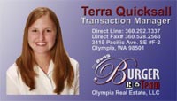
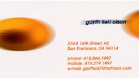
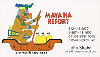
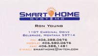
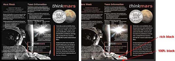
Business Card Examples, Printing Samples and Design Ideas
1 Sided Business Cards Samples
These design examples show how well designed business cards with professional quality printing can have more impact and be remembered more than a plain card, enhancing the success of your branding, marketing and sales efforts.


Double Sided Business Card Samples
These design ideas show how doubling the real estate and presentation space with a two sided business card gives you a lot more opportunity for making the case for your business services or product.


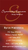
Vertical Business Card Examples
Full color vertical business card designs allow for different design presentations and can be more unique and interesting.


Folded Business Cards Examples
Get four times the space to share your business information and marketing message. These can be used like a mini-brochure or catalog, getting a lot more information into the hands of your prospective clients and contacts.

For quality business card templates use Freepik.com


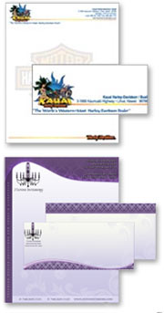
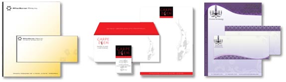
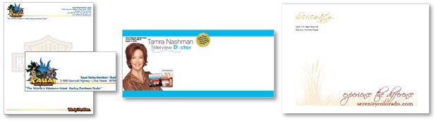
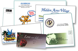 Don’t let your important correspondence and marketing efforts go straight from the mailbox to the trash bin with plain, dull, off-the-shelf envelopes. Give your printed envelopes some visual flair to boost your mailing response rates and make it more likely that your critical communications get read promptly.