• Skip to primary navigation
  • Skip to main content
  • Skip to footer
Printing for Less

Printing for Less

At Printing for Less, we've offered high quality online printing services since 1996. Shop business cards, booklets, stickers, and more!

My LoginMy Login
800-930-2423
  • Printing
    • Postcards
    • Business Cards
    • Catalogs
    • Brochures
    • Folders
    • Letters
    • Newsletters
    • Envelopes
    • Greeting Cards
    • Print Templates
    • All Products
  • Direct Mail
    • Why Direct Mail Marketing?
    • Every Door Direct Mail® Postcards
    • Direct Mail Letters
    • Catalogs & Booklets
    • Marketing Gifts & Kits
    • Direct Mail Automation
  • Services
    • Mailing Services
    • Pro Services
    • Design Services
    • Custom Printing Services
    • Reseller Program
  • Industries
    • Advertising & Design
    • Food & Beverage
    • Healthcare Payers
    • Healthcare Providers
    • Nonprofit
    • Real Estate
    • Retail
    • Technology
    • University
  • Resources
    • Direct Mail Marketing
      Resource Center
    • Printing Resource Center
    • Blogs
    • Templates
    • Video Library
    • Have a Question?
  • Request Samples
  • Get a Quote

Blog

20 Best Free Fonts for Business Cards in 2026

What are the best business card fonts?

Sadly there is no single answer, but we can look at fonts that make a business card do its job: make you memorable.

There are hundreds of websites that are loaded with free business card fonts, so even though you have more choices than ever before, you can be overwhelmed. We see a lot of business cards at Printing for Less – and some certainly leave a bigger impact on us than others. We’ll dig into what makes the best fonts for business cards.

What’s Important About Fonts for Business Cards?

Business cards are small, so we tend to think of them as somewhat innocuous. But this couldn’t be further from the truth. Getting your foot in a customer’s door requires A LOT of leg-work and after all of that, no one wants to blow it with a run-of-the-mill business card. You want to make a statement. But all you have is a measly 14 square (front and back) inches to do so.

You should choose a bold font that fills the space of a business card. Of course, in the hands of a master designer, even a small typeface, script font can work for the rest of us, go big with your business card font or go home.

Here are some examples of fonts we love.

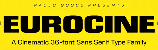
Eurocine

eurocine business card font

Brilliantly dramatic with just a hint of suspense, Eurocine was inspired by Italian movie posters of the 1970’s. Walking the line between glamorous and edgy, it grabs the viewer by the lapels and demands a second look. It’s bold lines can fill the space on a business card very well for a dramatic, in-your-face look that is still classy.

Milkshake

Milkshake font face

Thick, round, and wholesome, Milkshake’s classic feel invokes gleaming chrome and Sunday afternoons. Vanilla (but never boring), these lines can stand alone or blend well with others. This is a great font for resumes, CVs, and titles and headers in your designs.

Sofia Pro

Sofia Pro font face

Lovely, harmonious, and just a little bit spunky. A fantastic multi-use font, Sofia Pro brings a touch of playfulness while retaining its sense of poise. This business card font looks great scaled up to dominate a design or as a the small print. With so many options for line weight, you could do an entire project just using Sofia Pro.

Quicksand

Quicksand font face

Childhood cartoons were practically PSAs for these jungle hazards. Instead, this Quicksand sucks you in with tidy concise lines reminiscent of a raked desktop Zen garden. Find your business card bliss with this elegant font.

Geometria

Geometria font face

As elegant as a modern sky-rise in downtown Tokyo, Geometria embodies a gorgeous minimalism without sacrificing form. With this business card font, your business has no where to go but up!

Acherus Grotesque

Acherus Grotesque font

Sounds like a Bond villain, but looks like it belongs on Broadway? Don’t let the name fool you, this font is beautiful in its simplicity. Never harsh, Acherus Grotesque is nonetheless sharp and will nicely round out your look.

Neuton

Neuton font face

Reminiscent of periodic tables and grade-school alchemy (J+C = 4ever !) Neuton has a playfulness that other serif fonts can lack. And with TWO different italic forms, which is unusual for any business card font. We find this is a very popular font with younger professionals.

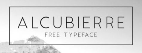
Alcubierre

Alcubierre font

Clean, sweeping lines make Alcubierre a breath of fresh air. And an open spread and smooth form elevates and gives it a distinctly Continental atmosphere.

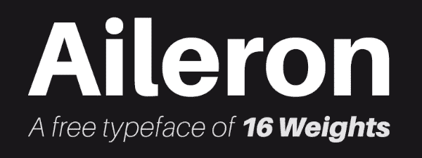
Aileron

Aileron font face

Aileron is a comfortable font that sits well on the page. Round and softly curving, but with a self-possession that asserts an easy maturity. It comes in a wide selection of weights, so it can be used in almost any situation. We trust Aileron and so will your customers.

Ubuntu

Ubuntu system font face

Now you can take the look of your favorite operating system with you anywhere. Not surprisingly, we see this font used by technology companies, coders and developers. The font is surprisingly versatile but we recommend pairing it with other fonts for balance and symmetry.

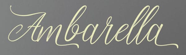
Ambarella

Ambarella font face

Now your business cards can have the look of hand lettered calligraphy. Ambarella has an old world charm with a new world sensibility. And we think that it would look positively bewitching foiled on a matte card stock!

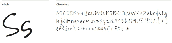
Shadows Into Light

Shadows into Light font face

Shadows Into Light is a delicate yet practical handwritten style font. Like a beloved kindergarten teacher, it is playful, up-beat, and if given the opportunity, would probably lead the sing-along with a ukulele. If you’re compelled to use Comic Sans (you madman), consider this business card font instead.

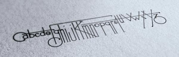
Futuracha

Futuracha font face

Futuracha is far too much fun not to include here! Looking like a print sample from a Martian edition of The Great Gatsby, the design was actually based upon the lengthy antennae of cockroaches. How can something so gross create something to beautiful? It’s a design mystery. Give Futuracha a try and turn any logo into a stunning visual with only the click of a button. This font looks fantastic when it is embossed with a metallic foil.

Cheque

Cheque font

This fun font started as a student project but quickly took off. Its antique vibe appeals to the Jules Verne fan and speakeasy moll alike.

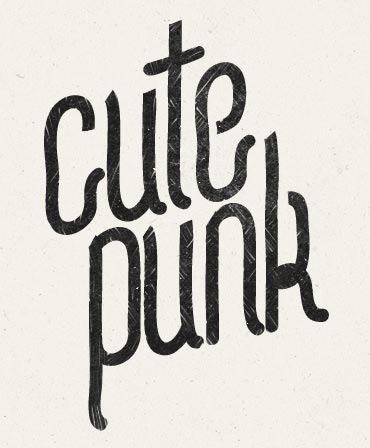
Cute Punk

Cute Punk font face

A little bit naughty, a touch playful, and very very cute! This font is for the person that doesn’t take themselves too seriously. This font looks great when it is used in square designs. If you’re doing a square business card, consider this font.

Find some retro funk with these next two 80’s throwbacks

Lot

Lot font

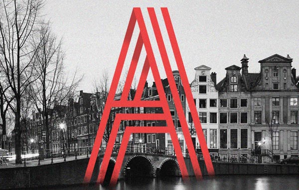
It’s Game On with this Tetris-esque blocky font. What’s not to love? The ‘C’s even look like PacMan®!

Paralines

Paralines font

With this font, you don’t have to put on the red light. Like a neon sign for your business cards, these letters practically yell ‘Come and Get It!’

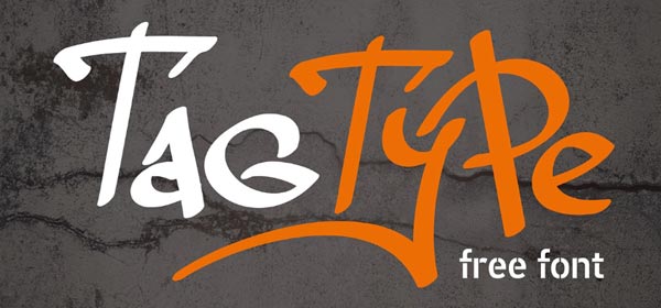
Tag Type

Tag Type font

Be outstanding in your field. Capture the rebellious spirit of plein air artistry with this free font.

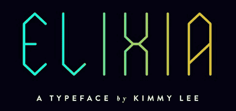
Elixia

Elixia font face

Words almost fail the simple beauty of this font. Graceful like crystal field theory yet angled like an empress cut diamond, Elixia speaks for itself. And it can go for days.

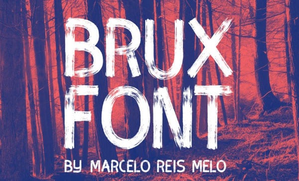
Kust or Brux Font

Kust font
Brux font face

Technically, these are two separate business card fonts but they are way too cool to pass up, so today you’re getting a freebie.

Both Kust (from the Latvian word ‘to melt’. I mean, how rad is that?!) and Brux Font are brush style fonts, but have their own unique markers that just rock my world.

Kust, with its fat Japanese calligraphic notes and Eastern European feel, blurs the line between avant garde impressionism and the rustic aesthetic.

Brux Font on the other hand, is pure business card font. It is an Icelandic birch forest, it is Ansel Adams’ ‘Monolith’, it is Tom Sayer whitewashing a fence. It is poetry.

Either way, you’re good.

So, there you have it! Personally, I can’t pick just one. But I do need a refill. Perhaps a Toasted Marshmallow Sweet Potato Chai latte? (I hear it’s ‘Yam’my!) so here concludes your 20(ish) Free and Effective Fonts to Use on Your Business Cards.

Need help with your print? Talk to a live print expert today: 800-930-7978.

Learn More About Business Card Sizing

5 Steps to Designing a Unique Promotional Calendar

At Printing for Less, we print and ship tons of custom calendars for our customers, and we’ve noticed that themed calendars make the biggest impact as a marketing asset. Picking themes and  images for each month of the year can be a challenge, and it is a common question our designers try to answer. Here are tips from those print design pros to help you generate unique calendar themes in a few simple steps.

Step 1: Plan Your Monthly Calendar Themes

There is a holiday for every type of company. Whether you run a restaurant, a dental office, or are a C.P.A, there is a calendar theme relevant to you. First, decide what your goals are. Do you want to reach new customers? Do you want to cement your relationship with existing customers? To increase foot traffic or raise awareness about a new program?

Do you want to sell more cupcakes, raise cavity awareness, or start tax return season early? What do you hope to achieve?


Promotional Calendar

And finally, how do you want this to take effect over the next month, six months, or the next year? If you have multiple goals that need to be achieved during certain months, you can gear your promotional themes for each month of the year.

Step 2: Choose Holidays to Highlight in Your Calendar Theme

Your calendar theme and your goals should be reflected in your holiday or observance selection. For example, if your goal is to increase foot traffic during certain times of the year, choosing to celebrate certain weeks (such as Small Business Saturday) with reward programs or promotional events can generate interest. You can print a discount code right on the calendar, and honor it only during that week or on that day.

Keep in mind that the holiday that you choose doesn’t always have to be directly related to your cause. For example, National Pizza week is January 7-13, even if you aren’t a pizza restaurant, you could offer a coupon to your customers for a free pie from a nearby pizza joint. This generates positive credibility in your community by showing your support other local businesses. You can piggyback on a larger ‘corporate holiday’ too -maybe offer a discount on products related to the corporate holiday.

example of corporate holiday marketing
National Nutella Day is real, and the sort of corporate holiday we need more of.

With that in mind, try to stay constructive. Not every holiday has to be upbeat (looking at you National Return of Daylight Savings day) but you can make it positive for your image and your customers.

With so many to choose from, it can be difficult to limit yourself to just a few calendar ideas for each month. But remember that you want to keep these events memorable and special to your clients. Ultimately, keep your final count to about one or two events (day or week-long observance) per month.

Step 3: Coordinate Your Calendar Theme with Your Business Cycles

Every business has their busy seasons and their slow seasons, and having an idea of your company’s highs and lows will go a long way to maximizing those promotional events. Guaranteed, you will always find at least one time of the year that is known around the office as ‘Hell Week’. And if there is one time of the year that you do not need to increase foot traffic, that is it.

Do you traditionally see a business slump in May? Add some May calendar ideas to your list, like Small Business Week (the first week of May). Call these out on your calendar, or promote your business directly on the calendar pages for these slower months.

If all else fails and you aren’t sure when to schedule your promotions, you can always check out an article like this one on Inc.com. While not specific to a single field, Dan Breeden’s article on the peak times and important sales dates for different industries is a great starting point.

Step 4: Combine Your Themed Calendar with Other Marketing Ideas

Rewards programs, promotional items, giveaways, etc. always make the customer feel valued, appreciated, and above all, special. Studies have shown that relevant and quality branded swag creates an 85% name recall in customers.

Does that mean that you have to drop a lot of money into your promotional items? Not at all. The best items are effective because they are memorable. So make themed swag a part of your promotional program.

For example, January is Slow Cooking Month, Soup Month, and Sunday Supper Month. When sending your promotional calendar to clients,  you could include a set of complementary laminate recipe cards. This free gift is inexpensive but a nice way to encourage name recognition every time a client makes dinner.

Step 5: Choose Your Type of Calendar

promotional calendar example

With so many options, it can be difficult to decide what kind of promotional calendar you want for your clients. But that is where Printing for Less can help. With our talented staff of Customer Advocates, we are ready and willing to help you design the perfect promotional calendar to suit your needs. We can offer a variety of calendar sizes, paper options, as well as inks, foil stamping, embossing, and die cuts.

Need help with your printing? Talk to a live print expert today at 800-930-7978.

5 Easy Ways to Hang Posters Without Damaging Your Walls

Search for the ‘Best way to hang posters’ and Google will bring back an almost limitless supply of How To’s. How to hang posters, how to put posters on walls, how to pick the best tape for posters, etc. But while it is handy to know the difference between ‘double-sided’ and ‘magic’ tape, or pick up yet another miraculous dorm-room use for toothpaste, you may not want to look as though you actually live in a dorm.

So, here are our recommendations on ‘How To’ elevate your look and showcase those posters in offices, living rooms, and, yes, even dormitories.

How To Pick Your Materials

Beyond your usual pencil and tape measure, there are a number of tools that you can use to efficiently and evenly hang your poster. And for some, you don’t even need a hammer!

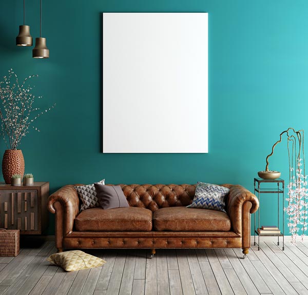
hanging a wall poster

Depending on whether you want a more informal look or a classic presentation, you have plenty of options to choose from when hanging posters. Renting has become so common that there are tons of choices for hanging materials that don’t require putting a hole in your wall.

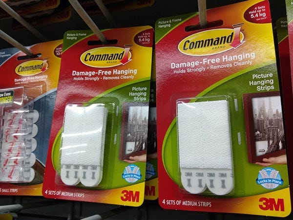
poster mounting strips

Sticky-backed Velcro® strips, hooks, and even plastic eye-holes are inexpensive and handy alternatives. Just keep those specified weight limits in mind.

Light-weight pieces, like an unadorned poster, can be mounted simply with decorative tacks, poster putty, or flat adhesives like double-sided tape. However, an adhesive that is attached directly to your poster can sometimes cause creasing or wrinkling. It also limits your ability to make adjustments without damaging your piece, and can potentially leave marks on your walls. You can read our suggestions below, but if you are stuck on double-sided tape, always test your adhesive in an inconspicuous area before you use it!

Middle-weight pieces, such as posters with a binder frame or other light frame, can usually be supported with a commercial hanging strip. These strips can be found at most stores and are available in a variety of sizes, styles, and weight-capacities. If you’re unsure as to what type you need, choose a slightly higher capacity for extra stability.

Heavy-weight pieces, such as fully framed posters, may need to be supported with nails or screws.

To avoid unnecessary damage to your wall, be sure to place your nail or screw into a wall stud, or use a sheet rock anchor to provide necessary support.

Start With a Clean Canvas

Before hanging your poster, quickly inspect the wall for unsightly scuffs, dirt, or residues that can inhibit your adhesive materials. Painted or wall-papered surfaces are easily cleaned by gently wiping them down with a soft damp sponge.

poster mounting wall prep

Most sticky residues (maybe left over from the last attempt at poster hanging?) may be removed with a little rubbing alcohol. This evaporates quickly and cleanly, but again always test it on a small, inconspicuous spot first. Ensuring that your wall is clean and ‘poster-ready’ will remove any distracting blemishes and make your job easier.

The (Other) Golden Rule

Choosing the right spot for your poster is more of a science than an art. To maximize the visual experience and the comfort of their audience, art galleries are often arranged with the centre of an individual piece at eye level.

For an average American this will be anywhere from 57-63 inches from the floor. This means that in order to put your poster at eye-level, you will have do a little math. But don’t worry! It’s easy.

  • First measure the length (including any frame) of your poster from top to bottom: that is your total length.
  • Then, divide your total length in half: that is your mid-point.
  • Pick a number from 57 to 63: that is your average height.
  • Subtract your mid-point from the average height that you chose. This new number will tell you where on the wall the bottom edge of your poster will be.
  • Finally, measure up from the floor and mark that point gently on the wall with your pencil. Do this two more times, on either side of your first mark.
  • When you are ready to hang your poster, line the bottom edge of it with those three marks. Erase any visible pencil marks and step back to admire your nice and even poster that is at the perfect height.

This technique will work for most individual posters. But don’t limit yourself. A wide-open wall space can seem daunting, but this is your place to play.

Depending upon the size or shape of your posters, you can showcase a single piece or a group to change the feel of your space.

When grouping your pieces, place the largest posters first to avoid over crowding. Larger posters may be placed further apart than smaller ones, but a good rule of thumb is to not space them more than 6 inches apart.

Keep in mind any furniture that will be nearby and allow about 12 – 24 inches between your furniture and the posters.

How to Frame Your Posters

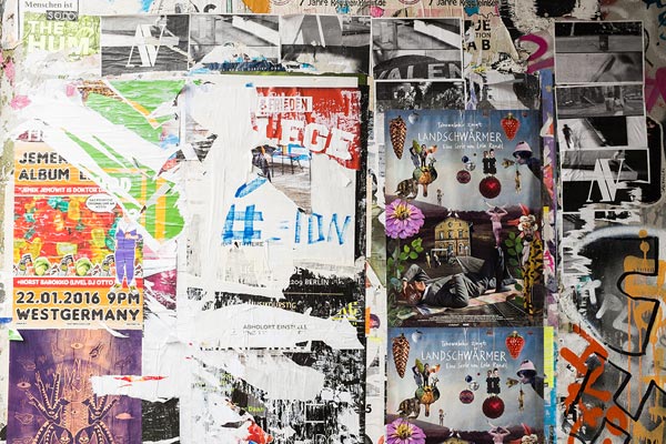
Love that vintage-inspired poster wall? Opt for double-sided tape and layer your posters to maximize the impact. This technique presents each unique aspect of your posters. You can even distress or tear posters to create peek-a-boo panels of eye-catching interest points. Keep it simple to avoid overwhelming your audience and losing the organic effect.

mounted poster

Sometimes the long, clean lines of a pristine poster just beg to be shown off. Avoid the ‘dormitory’ look with a smooth matte and a carefully arranged layout. The extra step of backing your pieces with poster board will make your posters more durable, less prone to curling, and make placement a breeze. To give your posters that extra POP!!, try utilizing an extra thick mounting adhesive to the wall. The floating effect of just a half-inch will have you walking on air.

Do you want a Pinterest worthy space but have just too many posters to choose from? Try mounting decorative bases or painted canvases to your walls and swap out your posters to fit your mood. Or hang your posters on gallery-style wires with clips or a magnetic two-piece binder. Makes it classy, but without the commitment.

Nothing elevates a poster like a well-chosen frame. Encase that ragged poster in a floating glass frame for an instant collector’s piece. Display your black and whites in something vibrant for an instantly modern look, or your monochromes in something understated and allow them to shine. A frame immediately creates a sense of permanency and importance, converting even the most casual poster into something special.

From advert to political statement, the poster is being re-imagined. Give those posters gathering dust a second life with one of our tips and tricks and upgrade your look.

wall of posters

Need help with your poster printing? Talk to a live print expert today: 800-930-7978.


8 Back of Business Card Design Ideas to Enhance Your Marketing

All hail the humble business card! While its primary purpose is to let people know how they can get in touch with you, this small piece of paper says a lot about who you are and what you have to offer. It pays to get creative with it, which is why savvy professionals know to the up the ante, especially when it comes to their business card back design.

Before we get to the backs of business cards, let’s talk basics. A business card, though tiny in scope and appearance, is actually a pretty key part of your individual or company marketing plan.

And people are paying attention. Seventy-two percent of them consider there to be a connection between the quality of your card and the quality of the product or service you have to offer. And 39% will choose not to do business with a company whose business cards look cheap.

The business card front and back each has their own distinct purpose. The front is where you want to convey your name, title, and contact information, and the back is where you have space to go a little more in-depth. Here are eight tips to making the back of your business card stand out.

1. Opt for simplicity

The trick to effective back of business card designs: simplicity. Remember, your business card is a snippet of information about you—it doesn’t have to tell your whole story; just inspire people to learn more. This can be a hard task to master when you’re staring at the blank side of your card and trying to figure out what to put there.

You want your business card to look pleasant to the eye, which means achieving a balance between design and emptiness. Thinking of your business card like any other piece of marketing copy shows why simplicity is so important.

Effective marketing involves getting your point across as succinctly as possible and avoiding unnecessary fluff that takes away from your main message. Apply the same principle to the backside of business cards and you understand why “less is more” continues to be reigning principle.

silver foil business card design

2. Blank doesn’t have to equal white

A caveat of the simplicity rule is that blank doesn’t have to mean blank. An original design or photograph is an excellent way to creatively utilize space on the back of your business card without overloading it. This is especially true if you’re an illustrator, designer, photographer, or another professional in a creative field.

Quality comes first when it comes to your image. Aim for 300 dpi or higher so that the design doesn’t appear grainy once it’s printed out. And if it’s in your skill set, use your back of business card design to showcase your skills, highlighting work you’re proud of or creating something new. It’s a great place to show off what you can do.

3. Share an evergreen tip

In the same vein as using back of business card designs as a place to display original imagery, you can also use it to share your expertise by including a useful tip. People will be more likely to hold on to your card if it shares information they might need.

For example, if you’re a plumber you can share a quick tip on how to fix a running toilet. Or if you own a bakery you can include a small chart detailing how much cake you need to feed a crowd. When prospects hold on to the card for the tip it offers, they’ll also hold on to your contact information.

4. Turn your card into a coupon

Another great way to get people to hold on to your business card design is to make it do double duty as a coupon. Use the space on the back side to share a deal that’s only for cardholders, such as 10% off their bill when they display the card at the time of service.

Even if they’re not in need of your business now, they’ll hang on to the card in case they are later. This is an ideal way to stand out if you’re in sales or another field where your card is less about creative design and more about securing leads.

5. Direct to your social accounts

If your brand uses social media as part of their marketing strategy, the back of your business card is an excellent place to direct people to your channels. The front of your card can get easily bogged down if you’re trying to share too much, so using the back specifically for your social media account information is useful. Because it’s simple and straightforward text, you’ll get your point across quickly without upsetting the balance of the space.

call to action business card design

6. Be smart with your color choice

Colors have subtle subconscious meanings, and you can take advantage of this when you design the back of your card. Bright colors like yellow and orange connote energy and optimism, while cooler colors like blue and violet are indicative of dependability and stability. And there are other ways that colors play into perception as well — think green for things related to the environment and black for luxury products.

Use the power of color to your benefit by opting for a solid stain on the back of your card that connects color with what you’re trying to convey. In addition to giving off subconscious cues, it will help you stand out from the stack of basic white business cards on a prospect’s desk.

bright colorful business card

7. Direct to video

You can’t exactly put a video on the back of business card design (yet), but you can absolutely use it as a place to direct to one. Give a quick run-down of what the video will entail (i.e. “5 cyber security tips all businesses should know” or “How to get stains out of grout”) and then include a QR code that people can scan on their phones to get to the video itself. Business card backs are a great place to do this, and it’s a helpful way of furthering a prospect’s journey down the sales funnel by bringing them to your site.

8. Map it out

If you want to go visual but aren’t quite sure how, consider putting in a map that either directs to your office or outlines your service area. Maps are streamlined, practical, and nice to look at, and they’re also an efficient use of space. You can work with a designer to create a unique map design, or you can just put together something simple from the web. Whichever way you go, it’s a good visual reminder of where you’re at.

Get a custom business card that shows off just how much you have to offer. And if you need some help, let us know! We can help you design a business card today or have you speak to a print consultant to come up with your ideal design.

Ready to rock? Order your business cards here.  

Need more help with your print? Talk to a live print expert today: 800-930-7978.

Create Custom Business Cards

9 Creative Ways Photographers Can Market Their Talents with Postcards

It’s not easy breaking into professional photography. In addition to having the skills, the equipment, and the freedom to explore a career outside the traditional 9-5 framework, you also need to have a keen sense of how to market yourself and stand out from the competition. On the bright side, your work speaks for you. If creating beautiful photography, your marketing materials will be inherently impressive. That’s where postcards come in.

beautiful postcard design

Photography postcards for marketing are one of the most effective ways of showing off what you can do in a concise, creative format. Because of their size, postcards give your prospects a (literal) big picture look at what you can do, with plenty of room left over for branding and contact information. Here are nine innovative ways you can take your marketing to the next level with postcards.

1. Mix black and white with color

Make your message jump off the page by overlaying a black and white image with colorful text and/or a colorful logo. Postcards, like photography, are visual mediums—use the eye that got you into the business in the first place to play around with color on your card, thinking specifically in terms of how you can highlight the most important information on it while also highlighting your image in a strong manner. The juxtaposition of grayscale with something bright will immediately catch the eye of the postcard recipient, and will also provide a necessary balance to space.

2. Embrace the season

Seasonally-focus your postcards to make the biggest impact during specific times of the year. Photography is inherently connected with the calendar—think graduation photos in the spring, wedding photos in the summer, holiday photos in late fall and early winter.

You can easily take advantage of these natural associations by incorporating seasonal aspects into your marketing postcards. Add a spattering of snowflakes and a touch of gold glitter to your postcards around the holidays, for example, or embrace blush pinks and white for wedding season. These seasonally-inspired details further your message in a subtle and effective way.

3. Make it pop

die cut postcard

Postcards lend themselves very well to three-dimensional marketing. Turn your postcard into a pop-up, or use special folds to display more images and show off your range of work.

Dimensional mail gives you more bang for your buck, with the best direct mail response rates for prospect mailing lists. While your upfront cost is a little bit higher, so is your potential for a high ROI. Think of ways to give your postcard heft and separate it in appearance from the pieces of flat mail your prospects are picking up at their mailboxes (our print consultants can help you brainstorm dimensional mailer ideas).

4. Create a digital version of your postcard

Do double duty with your postcard by creating a digital mock-up of your print product and displaying it on your website and social media pages. This creates continuity between your print and digital marketing efforts and also gets you more use out of a creative design. You’ve already put in the work, so you may as well exhibit your postcard in as many places as possible.

5. Include a QR code to your online portfolio

A postcard shows a snippet of what you can do, while your portfolio tells the whole story. In inspiring prospects to learn more about your work, you want to make sure that they have a clear and well-defined path to more information.

A great way to do that: include a QR code on your postcard that leads directly to your portfolio. Your card recipients will be able to scan the code on their phone and be taken right where you want them to go. You can also direct a QR code somewhere else, such as to a page where someone might be able to sign up for a session, or a video of your skills in action.

6. Turn your postcard into a promo

Everyone loves a good deal. Include a promo on your postcard, such as “Present this card for 10% of your first shoot” or “Mention this card when you schedule your session and receive five free prints.” Not only will you increase your chances of snagging business from a client who may otherwise have wavered, but offering a promotion also affords you a great way to track and measure how successful your postcard marketing efforts are.

7. Go big

Standard postcards range from 4.25” x 5.5” to 6” x 11”. The bigger you go, the more likely you are to attract attention in a pile of mail. Larger postcards are ideal for highlighting impressive image details, such as the perfect way you’ve captured the light in someone’s eyes. It’s one of the most simple ways to separate yourself from the competition, giving you an immediate boost in both the scope and the appearance of your card.

8. Use templates to customize your cards for individual services

two nice postcard designs

Using the exact same photography postcard template you can easily swap out key details to target your postcard for its ideal recipient. That way, you’re not dropping off graduation-focused postcards at a bridal convention or newborn-focused postcards at corporate functions. You want your postcards to speak directly to their targeted prospects and their needs, so use templates for simple customization of both image and text.

9. Have a clear call to action

Create a sense of urgency with your call to action. Simple text like “Hurry—spots are booking up fast!” or “Book in the next few weeks to make sure you have your photos in time for the holidays” will incite action among your recipients, especially those who need a little more fire under them to take that next step. Whether you go general or specific with your call to action will depend on whether your postcards are intended to be used year-round or if you’re using them for something more timely, like the holiday season.

Design your photography postcard today! Our experts are ready to help, so get in touch to speak to a print consultant and get a custom photography postcard.
Need help with your postcard printing? Talk to a live print expert today: 800-930-7978.

15 Creative Business Card Design Ideas to Make Your Brand Stand Out

Your business card says a lot more about your brand than just its name. With the right card, you have an opportunity to build brand awareness, show off your creativity, and create a lasting impression with prospects – and that’s even before you give them your pitch.

From modern business cards with streamlined designs to a QR code business card with a twist, look at your card as a chance to make a big splash in a small way.

Need a boost of creative inspiration? Here are 15 sleek business card designs that promise to make an impact.

1. Think outside the rectangle

curved business card

There are no hard and fast rules about the shape of your business card, and modern printing techniques mean it’s easier than ever before to go the untraditional route with your card’s design. Embrace a unique shape as an effective way to turn a simple business card into visual content for your brand.

2. Turn up the “wow” factor with foil

flower for life business card


Foil adds a touch of the unexpected to even the most basic of contemporary business cards. It’s available in a variety of stocks and finishes, so you can easily work it into your existing color scheme.

Use it to add metallic detailing or high-tech effects for an eye-catching, futuristic look. For ultimate effectiveness, be sure there’s a high contrast between your card’s background color and the foil stamping color or effect that you choose.

3. Make it multi-dimensional

folded business card

A successful modern business card is one that sticks in your prospects’ mind, and the best way to do that is to show them something they haven’t seen before. Multidimensional business cards – also called tactile business cards – make a strong impression in the simplest of ways, and they also give you more space to get information across.

4. Keep it clear

Mineral Water Clear Card

Transparent business cards are gaining popularity due to their unique design and inherent visual allure. Instead of paper, clear business cards are made of durable plastic, meaning they last longer and are less susceptible to damage. They’re also easily combinable with other printing methods for a truly original finished product.

5. Retro rewind

SPOT UV Vintage motorcycle business card

While it may seem a little counterintuitive to incorporate vintage aspects into your modern card, when you use contemporary printing methods with retro designs you end up with fun and futuristic looks that serve as standalone statements. Etching, foil, and tactile detailing all work great with retro fonts and images since they’re understated enough to let your vintage aesthetic shine while also lending a touch of boldness to your finished card.

6. Go for the gold

gold foil business card

Gold is a subset of foil design, but worthy of a callout in its own right. A touch of gold – in the font, around the border, as part of your logo, etc. – instantly adds a luxurious element to even the most basic of business cards. Juxtapose it with color for a whimsical look or against black for a futuristic feel. You’ll instantly convey an association of top quality for both your card and your brand.  

7. Minimize your message

minimal design business card

Let an eye-catching design stand on its own by editing down your wording and displaying only the bare minimum someone needs to learn more about you. In addition to the inherent intrigue of a minimalized message, it shows your prospective clients that you know how to keep things simple and effective.

8. Think two-sided

two sided business card

Instead of viewing the two sides of your business card as standalone spaces, carry through your design for a cohesive message. You’ll encourage recipients to turn the card over, and create a balance that’s inherently pleasing to look at.

9. Highlight something unique

unique highlight business card

The best modern business card designs say not just who you are but what you have to offer. Sometimes that message can be subtle, but other times it doesn’t hurt to just get right to the point. Think of something that separates you from the competition and use your card as a way to spread the word.

10. Make a connection they can’t forget

one of a kind business card

Create one-of-a-kind business cards with a design that instantly says what your specialty is. By playing around with your card’s shape or image you can come up with a finished product with a message that’s as obvious from across the room as it is from an up-close examination.

11. Add a touch of tech with a QR code

qr code business card

A QR code provides prospects with a direct path to your website – all they have to do is scan it on their phones. Have your QR code go to your portfolio, a landing page where potential clients can sign up for a demo, a video of you showing your skills in action, or anywhere else that helps you build brand authority and generate more leads.

12. Give your card a bigger purpose

coaster business card

Encourage people to keep your card on hand by giving it a purpose that goes beyond brand awareness and contact info. With the right shape and material, your card can do double duty, just like these cards that also serve as drink coasters.

13. Embrace eco-friendly design

eco friendly business card

Save money and the planet by using recycled paper and vegetable-based inks for your modern business cards. Showing that you care about the environment is a great way to build a positive rapport with prospects and spread a quick message about your brand’s values.

14. Splash on the watercolors

watercolor business card

A little bit of color can go a long way. Watercolor designs bring in a pop of something different, and let you play around with various shades without overwhelming the space. If you’re feeling extra creative, order plain white cards and add individual watercolor designs to them yourself.

15. Make it stick

magnetic business card

Stay top of mind – and on the front of the fridge – by opting for a magnetic business card. You’ll have a little bit less space to work with since you can only print on one side, but you’ll still have a range of options to work with in term of shape and color.

Design your business card today! Get in touch to speak to a print consultant and get a custom business card that you can’t wait to show off. Ready to place your order? Head to the Printing for Less order form and tell us what you need.
Need help with your print? Talk to a live print expert today: 800-930-7978.

  • « Go to Previous Page
  • Page 1
  • Interim pages omitted …
  • Page 22
  • Page 23
  • Page 24
  • Page 25
  • Page 26
  • Interim pages omitted …
  • Page 48
  • Go to Next Page »

Footer

Printing for Less

info@printingforless.com
100 P F L Way, Livingston, MT 59047

800-930-2423

  • Home
  • Products
  • Services
  • Industries
  • Get Printing Samples
  • Direct Mail Marketing Resource Center
  • Printing Resource Center
  • Blogs
  • Templates
  • Terms & Conditions
  • Contact
  • About Printing for Less
  • Careers
  • Login

Copyright © 1998-2026 PrintingforLess.com. All Rights Reserved.

logo
  • 800-930-2423
  • Products
  • Direct Mail Marketing
  • Services
  • Industries
  • Direct Mail Marketing Resources
  • Printing & Mailing Resources
  • Get a Quote
  • Contact Us
  • My Login
Direct Mail Delivery
This field is for validation purposes and should be left unchanged.

Get 20% Off*

Your First Print Order

Name(Required)

*By subscribing, you agree to receive weekly emails from Printing for Less. Some exclusions apply. See details.