Somewhere Over the CMYK Rainbow
Using PMS Pantone colors, metallic inks, varnishes and custom paper with your InDesign projects
For print projects that really pop, there’s nothing like unusual inks or atypical papers. But before you jump into that 27-color job printed on foil gum wrappers, read this article to find out what to do—and what not to.
When you venture beyond the familiar territory of cyan, magenta, yellow, and black, a wide world of color possibilities opens up for you. Whether you’re striving for vibrance not attainable in process colors, or you need to match a specific corporate color, spot colors greatly extend the rainbow of print.
However, it’s not all rosy in the world of spot colors. You’ll find that some spot color inks require special handling because of the unique nature of their pigments, and that you may have to compromise a bit of brilliance in the name of longevity.
And even plain old process colors can come to life when printed on specialty substrates, such as foil-coated stock. But there are things to watch out for here, too, such as which types of ink print well on your chosen stock. In this article, I’ll explore the possibilities of these interesting inks and substrates, as well as issues to consider before you jump into something really adventurous.
See Spot
 You probably know there are serious limitations on the gamut of colors that can be printed with combinations of cyan, magenta, yellow and black. But let’s pause for a moment of amazement at the range of colors that can be printed with CMYK. Think of all the color photographs that are successfully printed every day without the help of any special guest-starring inks.
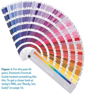
Ah, but that’s just not enough for us, is it? We always want something more. In fact, CMYK can’t accomplish some fairly common colors, such as navy blue and bright orange (see “I’ve Got the Blues” below).
Those are almost primal colors—think of myriad high school football jerseys. Even for such basic colors, process (CMYK) inks can only produce a purplish blue instead of navy, and a brownish orange in lieu of festive Pantone 021 Orange. That’s where spot colors come in. Open up your Pantone Formula Guide and play along (Figure 1).
The Pantone Corporation doesn’t manufacture or sell printing ink; instead, Pantone functions as a “color authority,” providing its famous color guides. Those color guides serve as more than just a color picker for designers: there’s a reason your fanbook is called the Formula Guide. Note the little recipe under each swatch—it’s a mixing instruction for creating the ink color seen in the swatch by combining specified amounts of the “basic colors” (the swatches at the front of your fanbook), along with opaque or transparent white. (The fluorescent and metallic inks in the Pantone books are supplied as ready-mixed inks.)
Besides enabling the printing of colors outside the range of CMYK, there are other advantages to using
- Color consistency from page to page
- Avoidance of registration issues with small text or
- Smooth coverage of large areas
Although it may be the most familiar resource in the United States, the Pantone Formula Guide is not the only color library available. The Toyo library is used primarily in Japan (and to some extent in Europe) to specify spot color inks. Dainippon Ink Corporation’s DIC Color Guide originated in Japan but pops up worldwide. The ANPA (American Newspaper Publishers Association) library is for newspaper use, and HKS is a German-based color resource used predominantly in Europe. While this article refers generically to “spot colors,” keep in mind that it’s important to select spot colors from the library that’s appropriate for your job’s printing environment.
Bump, Kiss, Touch…
Creating a spot color vector logo isn’t hard: Just pick the proper Pantone colors from the spot color libraries in Illustrator or InDesign. But extending the range of printable colors in images (for special cases such as art prints) requires that you create spot color image components in Photoshop.
There are lots of colorful (pun intended) terms in printing, and printers refer to these extra color plates variously as bump plates, kiss plates, or touch plates. There’s quite a bit of craftsmanship and artistic imagination to creating a successful bump plate by hand; for a how-to, see “Creating a Bump Plate.” Photoshop plug-ins such as Aurelon’s CoCo Multichannel can also make the process more manageable. In (Figure 2), I’ve started with a four-color image and enhanced the hot pink color of the rose by adding a Pantone 806C plate. This is more than a pink plate: PMS 806 is a fluorescent color that gives the rose a vibrancy that’s simply impossible with any combination of process colors.
An alternative approach is to use fluorescent ink in place of one of the process inks; this is especially effective on uncoated stock, which absorbs ink more readily, thus dulling the rendition of bright colors. (Another option is for the printer to create a custom ink composed of process ink and 25% to 50% fluorescent ink, and use that instead of the regular process color. This increases vibrancy without necessitating an additional plate.)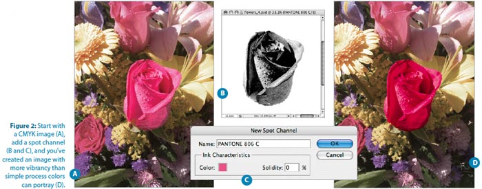
Specialty inks such as fluorescent colors greatly expand your creative possibilities, but (like all fun things in life) they come with their own set of problems. To maintain the vibrant purity of fluorescent inks, many printers prefer to lay down these inks first to avoid contamination from traces of other inks carrying through on the press sheet. But in the case of the rose, the fluorescent ink needs to be applied last, on top of the CMYK image, so it can enhance the rose. Even though this may result in some contamination, it won’t prevent the fluorescent ink from enlivening the piece. It’s mostly when fluorescents print on clean paper stock (rather than on top of other colors) that any contamination can be obvious.
Keep in mind that you have no control over the print order of inks on your job: that’s a determination best made by job planners and pressman. But if you want to embark on such a printing escapade, solicit input from knowledgeable print professionals in the early planning stages of the job. Since it’s challenging to proof such images with some proofing systems, you may have to rely on the instincts of craftspeople who can help you determine the appropriate approach and manage your expectations.
Creating a Bump Plate
In Photoshop, open a CMYK image and look at the Channels panel (Figure A). Because it looks so much like the Layers panel, the Channels panel can be a bit confusing. But if you’ve ever printed separated lasers, it’s easy to relate the four color channels to the four process inks and the plates that print those inks. The CMYK channel is called the composite channel, and it represents the sum of all the inks.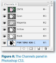
- From the Channels palette menu, choose New Spot Color. In the dialog that appears, resist the urge to name the color—let Photoshop do it for you when you select the correct printing ink. Click the small color block under Ink Characteristics to launch the color picker.
- In the Select Spot Color dialog, click the Color Libraries button and shop for the correct color library (usually Pantone Solid Coated). To pick a color by its number, click anywhere in the list of available colors and type the Pantone number; for example, 806. Photoshop creates a new, blank spot channel and names it according to the selected spot color.
- Since the rose is currently predominantly magenta, the magenta channel provides a head start for the spot channel. Select the contents of the magenta channel, copy it, and paste it into the new spot channel.
- Here’s where the artistry comes in. It’s necessary to eliminate all parts of the spot channel that won’t be printed in the spot color. Using white, paint out everything but the pink rose. To finish up, select the pink rose in the magenta channel and lighten it to allow the spot plate to dominate in that area.
Special Handling for Images with Spot Color Channels
InDesign CS, CS2, and CS3 let you place native .psd files containing spot channels, so you don’t need any no special approach for them. However, I’ve encountered a few workflows in which the file must be saved as a special type of EPS called DCS (Desktop Color Separations). Ask your printer if this is necessary when submitting application files (rather than sending print-ready PDFs). If so, follow their instructions for saving the file—or let them make the appropriate conversion.If you’re using fluorescents in a more conventional way—for artwork and text rather than images—there are some issues to consider. It’s sometimes necessary to print two passes (a “double hit”) of a fluorescent ink to attain adequate strength and coverage. Additionally, fluorescent inks are sometimes prone to chalking—the pigment separates from the surface and flakes off. So if your piece will be handled extensively (and isn’t that what you want?), consider adding a varnish to protect the surface from scuffing. Ironically, while a coat of varnish protects the surface, it also dulls the vibrancy of the fluorescent ink. An additional caveat: fluorescent pigments tend to fade, especially when exposed to sunlight; consequently, these inks are best suited to projects with a short shelf life, such as promotional pieces. Finally, as you might expect, fluorescent inks are more expensive than process inks.
Heavy Metal
Metallic inks can add to the luster of high-end jobs. While these inks don’t have quite the shine or reflectivity of actual metal, they provide effects you can’t accomplish with process or other spot inks. Because they consist of metal flakes in a clear base, metallic inks are opaque. And because these inks tend to spread a bit, traps are usually reduced. (Happily, that’s the printer’s concern, not yours.) If any ink will overprint the metallic ink, the press run is often set up so the metallic ink prints on the first unit and the overprinting ink on the last unit, allowing the metallic ink to dry slightly before the final ink is laid down. You’ll have the best results on coated stock, since the ink sinks into uncoated stock, losing most of its metallic appearance. Double hits of a metallic ink don’t substantially enhance the shine, regardless of the underlying stock, but a second hit may be necessary for adequate coverage.
Since they’re composed of metal flakes, metallics are somewhat prone to chalking and flaking. While that can dull the metallic sheen a tiny bit, it’s preferable to the scuffing common with unprotected metallic inks. Metallics come in shades of gold, bronze, silver, and copper—even greens, blues, and purples.
But keep in mind that these inks don’t give quite the true metal appearance attainable with foil stamping or printing on metallic stock.
Not-So-Heavy Metal
Traditionally, if you wanted to print multiple metallic inks, you’d have to empty your wallet: The inks are expensive, and they require special preparation to ensure proper trapping, printing order, and general handling. But there’s a new way to generate multiple metallic colors affordably, and to create stunning image effects by combining metallic inks with process colors: MetalFX, developed by MetalFX Technology.Custom Colors
If you want that perfect taupe, and it’s not available in your spot-color fanbook, your printer can custom mix an ink for the job. As you may imagine, this is expensive and carries its own set of complications. It will be difficult (or impossible) to create color-accurate proofs, and you won’t know how the solid ink will look on the final stock unless you have the printer provide a draw-down sample (the actual ink applied to stock) or you pay for a press proof. You’ll also incur the cost of mixing and testing the ink, as well as making enough of it to ensure there’s an adequate amount for the press run.
Of course, since you’ll be working with a color not to create an opaque white shape that will be printed in any Pantone or Toyo fanbook, you’ll have to create a custom swatch to represent it. That’s easy: Just create a new spot color swatch, name it something meaningful, and approximate the appearance of the custom ink. It doesn’t matter what color mode you use—you’re just going for appearance. What’s important is to designate the swatch as a spot color and to make sure that, as with any spot color, your naming convention is consistent across Illustrator, InDesign, and Photoshop. And, of course, communicate with your printer to ensure that you’re building your files correctly.
Alternative Substrates
When you use non-traditional substrates, such as clear plastic or foil-coated metallic stock, or highly textured paper, your files may require special preparation to print correctly. For example, if you don’t want the underlying stock showing through artwork, you need to create an opaque white shape that will be printed first. To do this, you’ll have to create a custom spot color that represents the white ink—the [Paper] in InDesign won’t do the trick, nor will the “White” swatch in Illustrator, despite the name. Both of these swatches actually translate to “no ink prints here,” which is not what you want. I suggest you create a swatch called Opaque White, again keeping the naming consistent in Photoshop, Illustrator, and InDesign. It’s hard to see white unless it’s in front of another color in either program. And even if it is at the top of the pile, there’s a chance that you might inadvertently choose White or {Paper} when you’re in a hurry. To be sure you’re choosing the custom Opaque White, make the swatch’s appearance something other than white— temporarily use something bright and obvious like a loud orange or nuclear green. Yes, it will make your printouts look weird during the formative stages, but it will help avoid errors. Then, once everything’s in place, change the swatch options to be, well, white. Or just leave it nuclear green and make sure the printer know that it represents the opaque white ink.
It may be difficult to anticipate the appearance of the printed piece unless your printer uses a proofing system such as DuPont Waterproof. DuPont Waterproof can also proof opaque white.
If you skip the opaque white plate, printing directly on foil-coated stock can result in opulent effects approaching iridescence, even with four-color process (Figure 4). Consult your printer early in the game to determine what special handling may be required. They may suggest coating the piece to minimize scuffing, and you may need to allow extra time in the printing schedule for drying and special handling.
As you design for printing on foil-coated stock, consider the visual effect of all that reflected light: Small elements, such as fine type, may be overwhelmed by a foil background. Small reverse or white opaque type is particularly hard to read. To compensate, use a slightly larger or bolder font than might be appropriate on white stock.
Printing on clear plastic gives an interesting dimensionality to a printed piece, especially if the clear page acts as an overlay for another page, as in the Showtime project in Figure 5. In this example, the plastic sheet is an illustration on its own, but when you look at the plastic sheet, the following page shows through it. No special file preparation is required for this effect, although the clear sheets are printed as a separate job and bound in with the correct pagination. This entails extra effort at the printer to plan the job and set up the binding procedures.
If you want the transparent effect around a subject printed on clear plastic, but don’t want other art showing through the interior of the subject, you’ll need to create an opaque white knockout to be printed behind the subject in much the same way you’d create art for a spot varnish. You can either create a spot plate in Photoshop (see the “Bump, Kiss, Touch…” section above) or separate art in Illustrator or InDesign that you’ll have to carefully align with the image. If the white plate is part of a Photoshop file, just place the native .psd in InDesign or Illustrator. If you’ve created the art for the white plate as a separate file, place it above the image in stacking order or layering, and—most importantly—set it to overprint. In both InDesign and Illustrator, the overprint option is in the Attributes panel (Window > Attributes).
To correctly preview the effect, activate Overprint Preview (available under the View menu in Illustrator and InDesign). And, as I continually harp, consult with your printer. Ask if the white undercoat will require curing or extra drying for the remaining inks to adhere, so you can figure that into your deadline.
Varnishes
A flood varnish covers an entire printed page for protection or sheen, but you can highlight areas of a printed piece with a spot varnish that adds shine and depth to only certain elements on a page. You can combine matte and gloss varnishes to accentuate the boundaries between different areas on the page. There even are more possibilities: tinted varnishes provide Figure 5: Incorporating transparent stock can add dimensionality to a piece. Keep in mind that this complicates binding, since it can’t be done in-line. The different stocks are run at separate print jobs, then combined in the binding process. Consequently, you should avoid effects that require extremely tight registration of the clear page and the separate page behind it. But isn’t this cool? novel accents. And since tinted spot varnishes are printed like any other ink, you can use them to print subtle images or other graphic elements.
If your piece will be imprinted with mailing information (whether by inline inkjet or label), avoid varnish in the area of imprint or labeling so it doesn’t interfere with adhesion.
While the word “varnish” commonly refers to all coatings (sort of like using “Kleenex” to refer to facial tissue, regardless of actual brand), there are some important distinctions:
- Varnishes are also applied on-press, but they’re heavier-bodied and can be applied (like inks) to only certain areas (spot varnish). A plate must be created to apply a spot varnish, so artwork is necessary.
- UV coatings are cured by exposure to ultraviolet light to quickly dry and harden the coating on press. UV coatings can be applied as a flood (covering the entire printed sheet) or as a spot coating. UV coatings can also be applied by silkscreen after the printed sheets are off the press.
Trapping Specialty Inks
Good news—you don’t have to worry about trapping! While InDesign is capable of sophisticated trapping, your trap parameters are exercised only if separations are generated directly out of InDesign, and that’s rare. (There’s a roundabout way to make traps tangible by Distilling, but trust me—it’s neither necessary nor worthwhile.)
It’s been a very long time since printers expected to receive pre-trapped files because modern RIPs perform in-RIP trapping with far more speed and sophistication than we mere mortals can accomplish. And it’s best for the printer to tackle trapping to ensure that it’s done appropriately for their printing conditions. So, despite my cautions about minimizing trap to compensate for the natural spread of metallic inks, for instance, you don’t have to bother your pretty head about it. It’s still good to be mindful of trapping issues so you have reasonable expectations of the outcome, and so you can communicate with printers, but it’s truly not a designer’s responsibility. You have enough to worry about.
Ready, Set, Go[e]
Now that you’ve memorized the 1,114 swatches in the Pantone Formula Guide, guess what? Pantone has a new approach to specifying spot colors.- A GoeGuide coated fanbook
- A 3-ring binder of GoeSticks coated, adhesive-backed Goe specification chips with palette cards
- myPANTONE color selection and palette creation software
 All of this is housed in a spiffy GoeCube storage and comes with access to the myPANTONE Web community for viewing and posting color palettes.
Claudia McCue a prepress pro with more than 20 years of hands on experience. She is owner of Practicalia, an independent training provider specializing in Adobe and Quark products, retouching and color correction, and resolving general issues relating to prepress and printing. She frequently presents on these topics at industry conferences.
From InDesign Magazine. Each issue gives you tips, techniques, and time-savers by an all-star cast of industry experts.