• Skip to primary navigation
  • Skip to main content
  • Skip to footer
Printing for Less

Printing for Less

At Printing for Less, we've offered high quality online printing services since 1996. Shop business cards, booklets, stickers, and more!

P F L.com
My LoginMy Login
800-930-2423
  • Printing
    • Postcards
    • Catalogs
    • Brochures
    • Folders
    • Letters
    • Newsletters
    • Envelopes
    • Greeting Cards
    • Print Templates
    • All Products
  • Direct Mail
    • Why Direct Mail Marketing?
    • Every Door Direct Mail® Postcards
    • Direct Mail Letters
    • Catalogs & Booklets
    • Marketing Gifts & Kits
    • Direct Mail Automation
  • Services
    • Mailing Services
    • Design Services
    • Custom Printing Services
    • Reseller Program
  • Industries
    • Advertising & Design
    • Enterprise
    • Food & Beverage
    • Healthcare Payers
    • Healthcare Providers
    • Nonprofit
    • Real Estate
    • Retail
    • Technology
    • University
  • Resources
    • Direct Mail Marketing
      Resource Center
    • Printing Resource Center
    • Blogs
    • Templates
    • Video Library
  • Get a Quote

Blog

10 Brochure Ideas You Haven’t Thought of Yet

There are few print marketing materials more versatile and informative than brochures. A brochure is, at its most simple, a folded, single-page printout that includes text and images about a brand’s products and/or services. And if that sounds boring, just stick with us for a second—we promise there is a ton of room for creativity within that folded-up page.

To understand how you can get creative with brochures, you have to understand the purpose of a brochure beyond just its general definition. So what is a brochure used for? Anything you can think of. Brochures are used in marketing and advertising, but they’re also used in restaurants, retail shops, and doctor’s offices. You’ll find politicians distributing brochures, as well as PR firms, banks, schools, salespeople, and so on. Basically, if an individual or a company has something to tell you about, chances are they’re going to do it in a brochure.

The reason that brochures are such a ubiquitous print marketing tool comes down to their adaptability. Well beyond the general guidelines that answer the question “what is a brochure?” is the ability for brands to get as imaginative as they want with what their finished products look like. Not convinced? Here are 10 alternative brochure ideas to kickstart your next print marketing project.

1. Use a brochure as an invitation

holiday brochure mailer

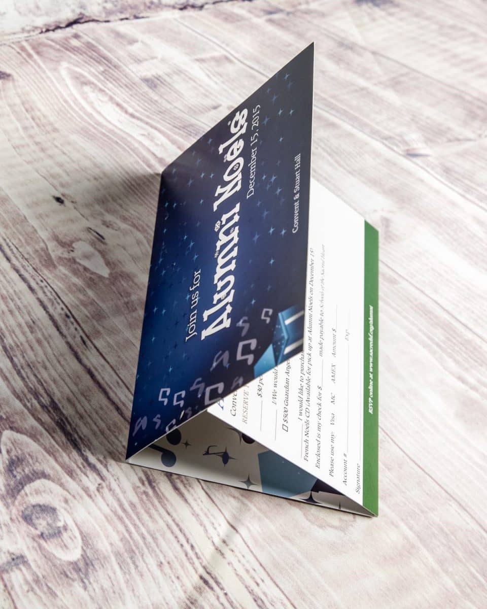
Next time you send out an invitation to a client- or lead-focused event, use it as an opportunity to share more than just the date, time, and place of your get together. By turning your invitation into a brochure, you give yourself significantly more room to go into information about who you are and what you do—which can be a real advantage if your event itself is marketing-driven.

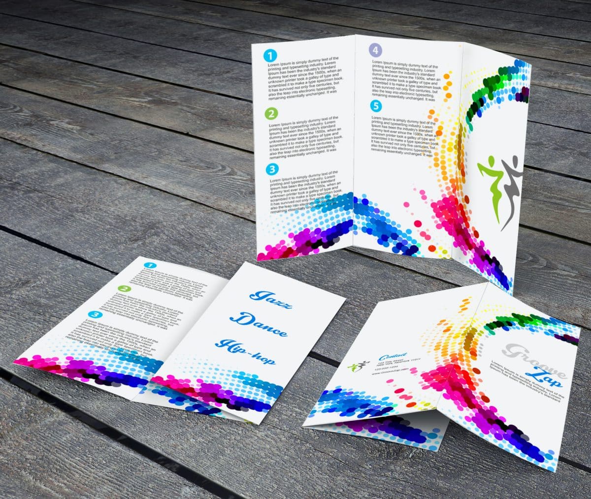
2. Think beyond standard folding options

cross fold mailer

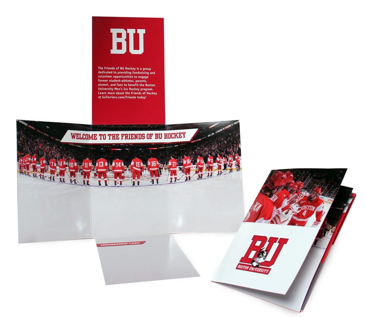
There’s no one way to fold a piece of paper. Help your brochure stand out by getting creative with your folds, opting for something non-traditional rather than just a standard panel arrangement. Doing this sends a subtle message about your brand that it’s forward thinking and into out-of-the-box ideas. In the example above, the unique fold is accentuated by images that work both as standalones when the brochure is opened and together when it’s closed.

3. Play around with shape

irregularly shaped brochure

Have some fun with the overall shape of your brochure. Because while a brochure is essentially just a piece of paper, there’s no rule that that piece of paper has to be a rectangle. The shape you choose for your brochure is up to you. Go with a star and fold each point inwards to create panels. Go with a circle or a hexagon or a pirate ship—whatever makes sense for your brand. The shape just has to be foldable (and not necessarily even into symmetrical parts).

4. Size it small with a snake fold

snake fold brochure

Big things really can come in small packages. Snake folds are an original method of brochure folding that balk standard patterns to create something unexpected, and lend themselves very well to tiny brochures that pack a major punch. Who knew you could get so many panels out of one standard size sheet of paper?

5. Include an infographic

Cornerstone mini iPad

Infographics convey a ton of information in a quick, easily digestible format. And while you may be used to seeing infographics online, a brochure is a great way to bring them into print. The key to a good infographic is that it has to capture attention and it has to provide information in a non-distracting way. Be conscious of how you use color and text in your infographic so that you don’t overload the page—there should still be enough white space on there to carry the eye from point to point.

6. Tell a fortune

Everstring fortune teller

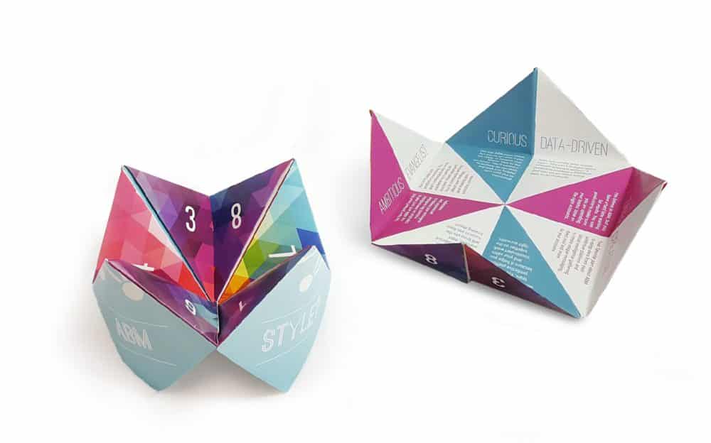
Even if you’re not in the business of fortune telling you can still design a creative brochure that mimics a paper fortune teller. Use each panel to highlight a different product or service that your company offers, or designate each panel in another way that you see fit. The benefit to this layout is that you can fit a ton of information in a relatively small brochure. And because the final product is three-dimensional, you’re sure to make a strong impression.

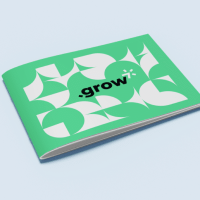
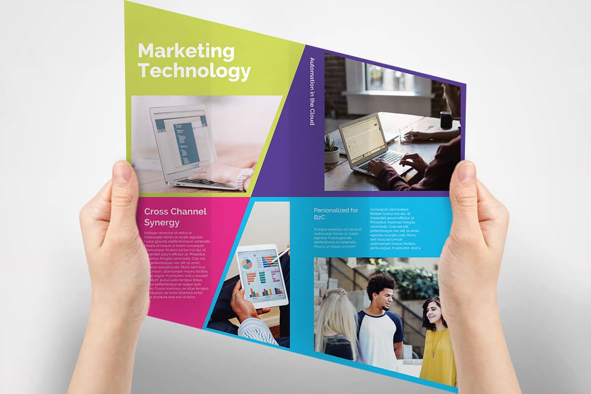
7. Make your imagery the star

sandwich brochure

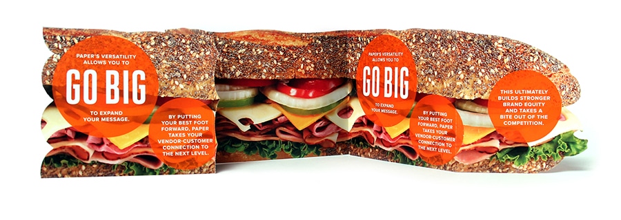
Brochures are used to share information, but to get someone to open it up in the first place you

have to grab their eye. Images are a great way to do this, especially when you incorporate the imagery into your overall brochure design instead of just using them to occasionally break up some text. In this example, the image dictates the entire shape of the brochure, and in doing so, immediately tells a story about this brand and what they do.

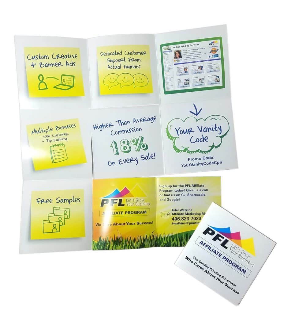
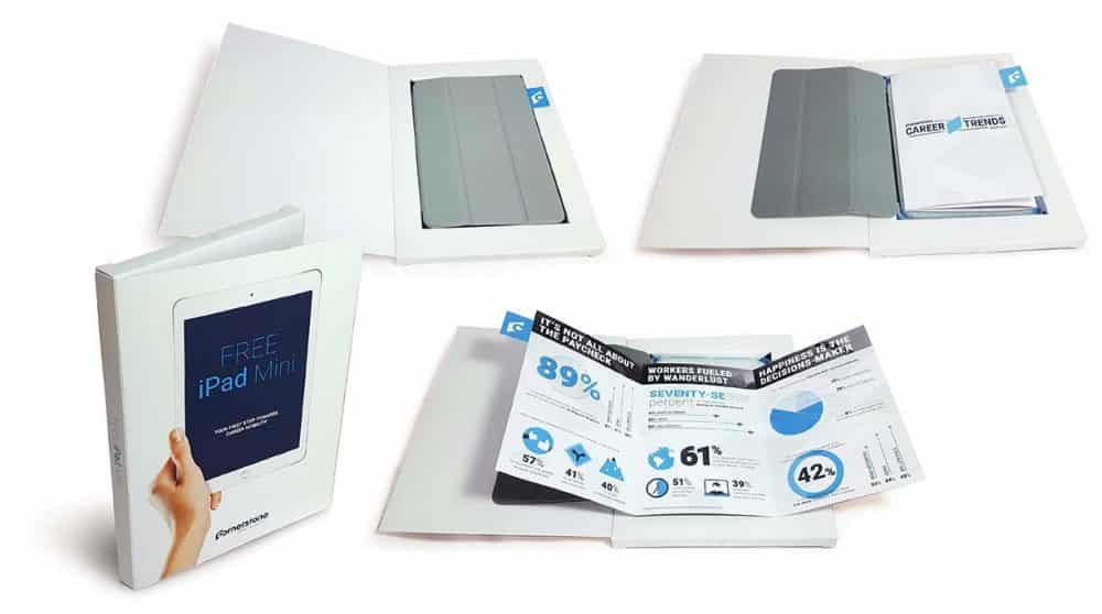
8. Supplement your brochure with a gift

Lorem Welcome Kit

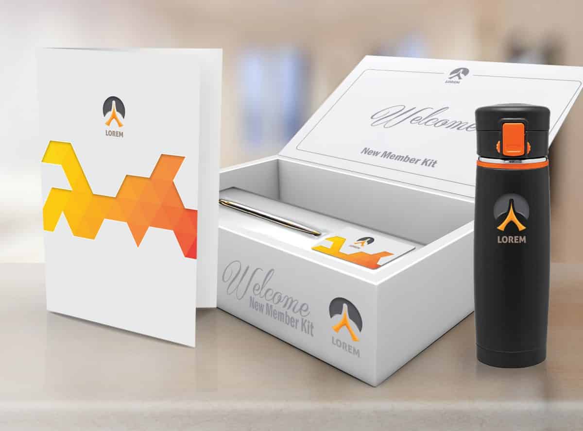
You already know why a client or a potential lead should pay attention to your brochure, but like all of us, they’re likely inundated with marketing materials every day. If you really want to stand out, it helps to sweeten the pot with a gift. By creating an integrated marketing bundle that includes a brochure and some sort of useful gift, you make it more likely that your recipient will notice your brochure among the others they’ve received, and will also give them more incentive to read what you have to say.

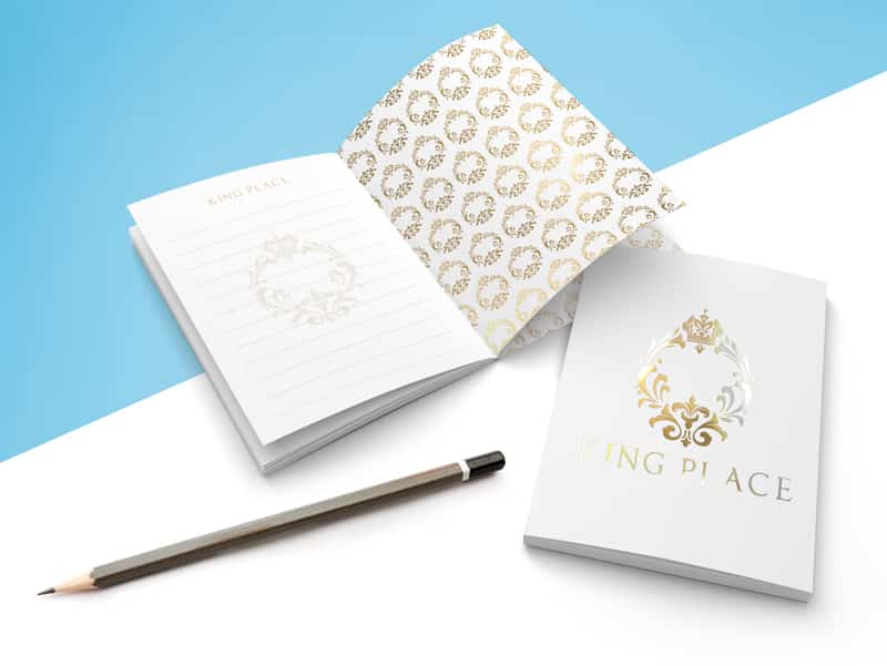
9. Embrace embossing

Military Brochure embossed

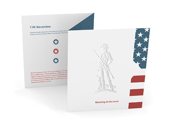
Adding embossed imagery or text to your print marketing materials adds a touch of something unexpected. It can be particularly effective on brochures like the ones in the image above, which are otherwise understated in their visual effect. Embossing adds depth and texture to a page, both of which can turn an unassuming brochure into something worth taking a second look at.

10. Pop it out

museum brochure pop out

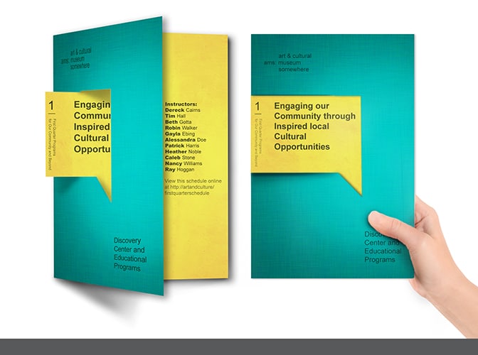
Speaking of unique design elements, consider including a pop out, which combines text from multiple panels of your brochure to highlight the message that you want to share. The brochure in the image above uses a pop out to make a strong point about what the objective of the ad is. And because it’s so clearly denoted, the organization doesn’t need to use a lot of other text to get that point across.

See? Brochures don’t have to be boring! Talk to a Printing for Less print expert to learn more about how you can create brochure that makes a big splash. Call us at 800-930-6040 to get started with brochures today.

Get A Brochure Printing Quote

The Ultimate Guide to Every Door Direct Mail Marketing

ultimate guide to eddm

How to Craft a Successful Direct Mail Campaign

Almost everyone in the entire world has been on the receiving end of an Every Door Direct Mail® (EDDM®) campaign. Even if you have recently changed your address, there will always be that business postcard promptly waiting inside your mailbox, usually marked “Postal Customer”. That is why EDDM campaigns are so effective. In a progressively more digital world physical pieces of mail still make it to your mailbox and in front of your very eyes, shutting down the outdated “print is dead” philosophy and giving direct mail marketers an edge they can’t get online. 

With EDDM®, you can cast a net into a concentrated area to maximize your direct reach. A well executed EDDM® campaign is the perfect way to get your message into the hands of every person in a specific geographic region — all without the cost of purchasing mailing lists and permits. Remember all those glossy flyers from your county’s representatives? EDDM® is made for the campaign trail. Pinpoint who your demographic is and only send mailers on your route matched with your ideal consumer. You can tailor your marketing material to better fit your postal route. EDDM® is ideal for political organizations, businesses and individuals looking to gain the attention of basically anyone (think “Local Postal Customer”). 

Every Door Direct Mail Marketing Reigns Over Digital Avenues 

What’s so efficient about EDDM® is the streamlined organization and transportation. There are reduced sorting and transportation costs associated with EDDM®, which translates to a reduction in cost incurred by the USPS carrier, which is then passed on to you. Some of the best-suited candidates for EDDM® are political groups looking to drive awareness of candidates/issues, and businesses looking to reach out to targeted customers in a specific geographical area. The number one value in an EDDM® campaign is the Reach. Direct mail marketers like political candidates want your votes, which means they have to reach out to you first. first.

With a never-ending election cycle, it’s time to get a jump on the campaigning and get your direct mail marketing started! 

Cast The Direct Mail Marketing Net 

There once was a push to make everything digital, but in recent years there’s been a resurgence of interest in direct mail. Digital marketers have realized that their online campaigns can only reach so far before they’re automatically filtered into the junk folder, removed by ad blockers, or skipped over on social feeds. By striking a balance between digital calls to action to sign up for email newsletters and Direct Mail Campaigns, marketing professionals are shifting to a mix of online and offline channels to maximize their marketing effectiveness. They realize that the expansive digital ecosystem produces an overwhelming amount of information that can be easily replaced, updated, and ignored by potential customers. It takes a whole lot of effort, but people do have the option to hit that “ Unsubscribe” link in the fine print. So, you may have reached your customer only for them to part ways with the message almost instantaneously. By including print, marketers can incite a 1:1 dialogue with their prospects, which creates lasting, engaged customer relationships. That is the long way to saying “print isn’t dead,” despite many arguments. 

According to a ProPrint survey, 79% of consumers act on a brand’s direct mail piece immediately, while 56% found printed material to be the most trustworthy out of all media channels.

Four advantages to direct mail marketing (EDDM®) campaigns:

  1. Reach. The ability to select specific zip codes and carrier routes allows you to target geographically, ensuring your message reaches consumers in areas most relevant to your business. You can search for your consumer market by narrowing down your audience by income, age and location. Additional demographic filters exist if you have a slightly more targeted methodology, such as home ownership, gender and household or family size. You can also use the EDDM® Mapping Tool from USPS to search for your ideal route. Ideally your reach targets only customers in your ideal market, which will lead a promising amount of conversions to your business.When going through the route reach process, USPS will ask your Route Type. You are then able to select one or more types between: residences by city, neighborhood, rural or highway and PO Box. The next prompt will ask for your Address Type (labeled Residential or Residence) which are divided into three selections which you are allowed to pick one: Business & Residential, Only Residential, or a targeted age group anything from legal age to senior citizen. Besides the design process (which hopefully you already have done) searching for your route will be the only tedious hurdle in beginning your campaign. Remember the route can make or break the campaign’s success. Make the most of your marketing dollars and take the time to find the best route for your direct mail campaign.
  2. Flexibility. This measures the size flexibility of your message. What kind of impact do you want your message to leave? The variety of postcard sizes available provides flexibility with your messaging. The smaller formats allow for punchy and compelling copy while larger formats offer room to tell the full story of your product or service. At Printing for Less, we offer many USPS templates in all different sizes for postcard printing. Not sure what your message is going to be? Try out a mockup template before you decide to complete your order.
  3. Value. Without an EDDM® campaign, large mailing requires a postage permit as expensive as $400 per permit. With an EDDM® campaign provided by Printing for Less, we waive that fee. USPS provides a simplified address system so that you never have to pay the price of mailing list. With no mailing permits or lists to buy and with postage at only 15.7 cents the program is highly economical. We even offer reduced postage rates for non-profit organizations.
  4. Effective. Print complements repetitive digital cycles and actually strengthens the overall effectiveness of a digital campaign. Providing something you can handle and read, grabs the consumer before they decide their next interaction with your business. By adding a high-impact, personalized tactile touch, you create true multi-channel campaigns, which increases exposure, response, and prospect engagement. Print is a low cost addition to your EDDM® campaign that could be the tipping point to beginning a lasting consumer to business relationship.

Choosing the Right Printing Partner for Your Direct Mail Marketing

press-check

Your printing partner can make all the difference in how effective your direct mail marketing is. The less time you devote to coordinating the details of an EDDM® campaign, the more time you have to focus on growing your business. Printing for Less offers all of following tools you will need for a successful campaign. Selecting a printer that has the capabilities to execute all aspects of an EDDM® campaign is important, so when searching for a direct mail marketing partner look for one that provides: 

  1. Printing capabilities. Look for a print shop with both digital and offset printing options. Digital allows for smaller quantities and variable data while offset provides larger runs with custom finishes. If you want to see your design before its sent out? Before you start down the printing pipeline, get a price quote or customized samples of your campaign before beginning your Direct Mail Campaign. When you offer both options your message is saturated in both digital and print mediums. Cover all the bases by using a printing partner that can facilitate range of print options. With all of our design options and printing capabilities, we can ensure your print job reaches your market successfully and efficiently.
  2. Route selection. What is so efficient about having an Every Door Direct Mail campaign is that we partner with USPS so that they handle delivery along the carrier route. You can deliver in suburban areas with high concentration of family housing, or maybe your target market is in an urban area filled with young professionals. Direct mail marketing only works well is your business is centered around attracting the right audience in your area. Choose a print facility that offers a route selection tool as part of the ordering process. Check out the USPS EDDM® User Guide for more information on registration. This saves you the hassle of manually searching for and choosing specific neighborhoods to target. Now you can close in on households that would find your business practice or special offer appealing which most likely means a higher response rate. Printing for Less has made Every Door Direct Mail Campaigns simplified to offer tailored services for small businesses to political campaigns.
  3. Delivery service. Most print facilities offer transportation to the nearest USPS, but you should always ask to double-check so you don’t get stuck transporting the bulk mailing to the post office yourself. Upon arrival to the USPS, your direct mail campaign prints will be sent out to every home or business address on your carrier route. You can find your desired carrier route online by using the USPS EDDM® mapping tool to tailor your circulation.
  4. Regulatory expertise. EDDM® has very specific bundling and mailing requirements, so confirm that your printer has a mailing services department that is well-versed in the rules and regulations of EDDM®. Many printing services offer specifics on mailers that only include certain print sizes and bulk orders. For example: if you’re a brewery that recently unveiled a new beer on tap, you can send out a bulk of 5,000 mailers or fewer to a specific zip code near your business to draw attention to your beer release event. This type of campaign is called an EDDM® Retail Account, something for small brick and mortar shops, restaurants, or professional services. If you’re a larger organization, like a nationally recognized department store or grocer, you’re going to need the Business Mail Entry Unit (BMEU) which entitles you to 5,000+ mailers per zip code and will also require an additional postage permit. Create an account if you haven’t already with USPS and this will enable you to sign up for the right account fit for your business needs.

Sending Your Direct Mail Marketing Order

After you’ve made the final decisions on your route map, schedule all your orders to be dropped off at the post office that is designated to your account. Choose a drop off date for your mailers then a payment prompt will highlight options to pay online or pay at the post office. We mentioned that finding an EDDM® mailer that will do all of the legwork, like picking up, dropping off, and sending mailers is ideal to ensure that your time is used wisely.

However, if you should choose to coordinate your own transport for the mailers, make sure that you have filled out the correct forms, bundle your postcards, and deliver them to the post office with in an orderly stacks of 50-100 cards. Your order should be labeled with the correct USPS forms and contain a postcard count. You can ship or drop off your orders at the post office that is designated to your account, whether it’s BMEU or an EDDM® Retail Account. BMEU policyholders have to drop off their order at the post office that holds their permit. Retail Accounts must drop off their mailers with the post office that is matched with your route. 

Make the Most of Direct Mail 

direct mail postcards

Once you understand the logistics and targeting associated with direct mail marketing, the final component to a positive ROI is the actual composition of the piece. The design process can be a ship on rocky waters, so it’s best to keep in mind a few best practices to make this project quick and on its way to doorsteps.

  1. Design. Use strong creative direction by using simple color palettes paired with a few eye-catching tones like metallic or chrome. Use design features that, to the touch, feel memorable like raised cardstock or glossy finishes. While a full-color piece will cost a bit more, the impact can greatly outweigh the cost variance. Things like high-resolution images, bold colors, and clean typography create a high-impact piece that will stand out in the mail. Remember, if it looks bare and scrappy then your mailer might be destined for the discard pile.
  2. Copy. Even with the larger size postcard, every word counts. Think about concise, catchy, and compelling copy. Use bold active language that draws readers in to whatever it is your selling or offering. Activate their minds to make a decisive action. Provide enough information to educate, in a way that keeps your prospect engaged and leaves them with something memorable. Make it active or give your reader a task like applying a coupon code or signing up for promotional discounts. Or if you’re online, drive them to your website by providing a welcome discount code.
  3. Tracking Measurement. Being able to measure your EDDM® campaign by tracking gross response rate is the best and most accurate way to prove your campaign’s success. Do you want them to call your business? Come to your store on a specific date for a sale? Or would you rather them find you online? Making the best call to action related to your business is key to getting successful response rates.

Tracking Your Direct Mail Marketing Campaign

  • Phone Number. If you choose to add a phone number with tracking capabilities, your marketing team will be able to track recorded inbound calls to your tracking number. Tracking numbers help with measuring which offer generates the most response, how many responses a certain mailer receives, what time of day you receive the most calls, and how your team handles incoming calls.
  • Website URL: Adding something like a website URL is a reliable way to track visitors to your website, who may want to book a professional service or make a reservation. If you’re a restaurant or offer salon and spa services, this is the best call to action! Drawing your consumer into your mailer will lead them to your website. Offering a coupon discount code for salon service will incentivize your customer and lead them to your website to schedule an appointment. If you’re a new restaurant in the neighborhood, your mailer could offer a discount on your first meal if you present the mailer or book a reservation. Mailers that offer a lead to goods and services are always successful.
  • QR Code: The ever more popular route of CTAs is the quick response (QR) code that is friendly to scanners on most smartphones. You can label smart codes like these onto your mailer to connect someone’s mobile device to your business. QR codes often contain data that, once scanned are linked to the device, are tracked and lead to a website or an application that contains the mailer offer. In conclusion, QR Codes are a quicker way to drive your consumers to your website with little effort and increase total conversion rate.

Being able to prove and improve your marketing spend is a critical component. Special offers, QR codes, and dedicated URLs are all viable ways to track the campaign and reinforce a multi-channel strategy with the ability to track whether or not consumers are converting. Depending on which strategy you decide to use, be sure that your message is clear and direct, so customers know exactly what to do and where to find you.

Measuring Direct Mail Marketing Performance

In preparation for your next campaign, the best route of action is to measure your previous EDDM® campaign performance. By using many tracking tactics like Google Analytics, you can track your response rate from your campaign from any of the methods that we mentioned above. According the Direct Marketing Association in targeted direct mail households, the response rate is 9% and 5% prospective rate, which are both higher than email, paid search, online display and social media combined.

Responses / Pieces Sent = Response Rate

To ensure the most accurate collection of your EDDM® response rate, take quality assurance in training your sales team to acquire and code leads accordingly as they are logged in an analysis tracking program. This should be practices every time a new tracking method is introduced or changed to an EDDM® campaign.

Next Steps: Direct Mail Marketing Best Practices

Now what? You’ve mailed out your campaign and are collecting your results and watching the growth. As you observe your successes and reevaluate missed opportunities, take into account which tracking methods have been installed. As a best practice for your next campaign, make sure you’re recording all new avenues of tracking methods. Be sure you’re saving your results from past EDDM® campaigns. In the future you will observe and compare each campaign’s key performance indicators (KPIs) to see if your returns are improving and if it’s worth your marketing investment. One of the key components of compiling the best results is to consult your past campaign components before beginning the next campaign. Examine your mailer and see if there are any errors or misinformation or take a user experience survey. Arguably the best way to troubleshoot and measure your direct marketing campaign is by segmenting your audience. It all goes back to choosing your direct mail route: try segmenting your route to better fit your business or product.

Now that we have laid all of our reasoning out in the open, does your business need a direct mail marketing campaign? Check out why an EDDM® campaign is the perfect mailing option for your business. Just remember, each step of the process is just as important as the other steps. Your mailing route is just as important as the design.  Designing a perfect mailer that doesn’t reach your targeted market could be a shot in the foot for your business. Or, a mailer with a poor message that does get into the hands of consumers might not make the mark you want. Take extra care in choosing your route and design to ensure your message gets into the hands of your potential consumers. Every Door Direct Mail® is a highly effective approach to drive actionable results. Out of all other marketing mediums, including: paid search, social media, online display, and email, direct mail has continued to reign supreme as the most successful tactic. And now that we’re in a new election cycle, it clearly shines as a cost-effective, powerful channel to engage your constituents. Contact us today to get your EDDM® campaign started!

Need help with your print? Talk to a live print expert today: 800-930-7978.

Request A Custom Direct Mail Quote 

Stunningly Inventive Brochure Ideas to Consider for Your Business

If you’re hoping to produce brochures that don’t look like they were born from generic brochure templates, you’re in the right place. If you want to maximize the format and stand out to your audience, we’ve got some tips.

What Is a Brochure?

A brochure is a small print piece, frequently folded. Most companies intend to distribute their brochures for free, usually to advertise products or services and inform a specific group or audience.

In this digital age, interactive brochures have become popular in the online space; however, the most commonly referenced “brochure” consists of ink printed on some sort of paper stock, and occasionally bearing special treatments like embossing or foil. While some business owners try to get inventive with brochure alternatives, a well-designed brochure can be stunning on its own.

To decide on the most effective brochure design, and to make sure it will reach potential customers, first ask yourself, how am I going to use this brochure?

  •      Will you need to mail it?
  •      Will you display it in a rack next to competitors’ marketing material?
  •      Will you be handing out printed products in person at a conference or trade show?
  •      What featured product is being sold?
  •      What services are being offered?
  •      Is the target audience receptive to print media?
  •      Will existing brand guidelines determine the design? Have decisions on the color palette, typography, and imagery already been made?
  •      What are the budget limitations?
  •      What is the ideal timeframe for design, printing, and distribution?

Once you’ve answered these questions, you’ll have the perfect foundation on which to build something truly stunning and inventive.

Pacing Your Visual “Pow”

One way to make your brochure stunning is by paying attention to the pacing of your visuals and information. Try to gradually introduce your audience to your services and products.

Maybe you want to pose a question to pique their interest, and then lead them through a sequence of printed panels before you give them the answer. Command their attention with the very first panel — through color, line, and copy. Then, fill your interior panels with the majority of the information that you might appear on a text-based pamphlet or leaflet — but with style.

Be sure to lead them gradually towards a call to action and give them your contact information as you close. They’ll put it down with your memorable message still in mind.

king place notebook

Using Minimal Text Inventively

With only seconds to grab and hold attention, you’ll want to keep your initial copy concise. Distill your message to the minimum possible number of words so that they stand out, giving you an opportunity to be inventive with your design and color usage.

We’re not recommending you dumb down your content or graphics — we’re reminding you that the more creative and inventive you are, the more your audience will remember your business. And sometimes, the best injection of creativity comes from self-imposed limitations. How can you more clearly and effectively communicate your message with less?

White space is an important element to give your audience room to breathe. How little text can you use, and still convey your message? How much white space can you include, and still get your point across? Devices like subheadings and pull quotes can also preserve white space and also draw attention to your chosen words.

[ standard tri fold brochure ]

Get Inventive with Color

Color is a key design element, whether you’re getting inventive with lots or less color. You can use color to communicate emotion, mood, and even quality. Here are some approaches you can take to make your color choices memorable:

  •       Guess which colors your audience will expect, and then choose a completely different color scheme.
  •       Try to communicate a lively mood with minimal color.
  •       Use color to break up different sections of information within your brochure’s content.
  •       Use color only for callouts.
  •       Make your brochure into a colorful map, literally.
  •       Allow your colors to move along geometric shapes and lines.

Fun with Folds

Part of the tactile nature of a brochure is the way it folds. Folding is dimensional. And it allows you to deliver your message with greater impact and interest. It helps organize information by literally letting it unfold in a logical order. A well designed fold can help pace a story, direct the reader’s attention to key points, and even introduce an element of surprise.

Choose a fold that suits your message. How will a particular folding style help you tell your story? To test the effectiveness of your design, print it out or mock it up and give it to several people, and see how they respond to the brochure.

3D fold brochure

Some possible brochure fold solutions:

  •      Half-fold: Also known as a bi-fold brochure, a half fold described a single piece of paper literally folded in half, which looks like a booklet. It’s a basic brochure design that accommodates large amounts of information.
  •      Tri-fold: Instead of a single fold booklet, the tri-fold separates your piece of paper into three panels. This fold can be exciting in terms of design, but also means less content per panel — and you’ll need to make sure your audience can follow the flow!
  •      Gate fold: To make gate fold, two smaller half-panels are created by folding the outside edges of the main panel inward. The two smaller panels end up looking like a gate. This fold tends to work for higher end pieces due to the complexity and expense.
  •      Cross fold: A cross fold requires multiple folds in order to change a larger scale, often poster-like design into a portable format. This fold is most common for maps and tourism handouts.
  •      Z-Fold: Also known as a concertina fold, a zig-zag fold, or an accordion fold, a Z fold has three panels like the tri-fold but gets folded like an accordion. It’s more of an interactive format, and tends to be remembered because of the unusual ways information can be presented.
  •      Die-cut fold: A die-cut fold is similar to the Z-fold, but the top of the paper gets cut in a diagonal incline. This means the panels will be different sizes, and some of the interior content will be visible even in its folded state.

If you’d like to play around with different folding templates, you can contact our print staff or use the template generator at FoldFactory.com.

Stunning, Creative Framing of Stock Imagery

Unless you have a professional photographer on staff and available on demand, you’ll most likely find yourself downloading both vector and photographic stock. Maybe you’re lucky enough to have a budget big enough to commission original artwork, but frankly, we doubt it.

At this point, we’ve all seen enough stock images and generic graphics to forget them as soon as we’ve seen them. So the best way to be budget-conscious and stay top of mind is to use those common images in a new way.

You aren’t required to include people in your brochure artwork, even though viewers tend to respond to pictures of people (especially when they’re in action); you can use vector silhouettes and crop them creatively. You can combine multiple types of stock imagery to design an innovative and truly impactful visual. You can merge abstract shapes with more recognizable forms. There aren’t any limits, even when your budget is small!

The “Wow” Factor: Special Effects

Although special effects may seem like the obvious and easy way out (and they do tend to require some extra budget room), they’ll definitely help you make an impact. Special printing finishes such as die cutting, embossing, foil stamping, and spot varnishing will instantly impart class to your brochure.

Because many of these finishes are tactile (and therefore addictive to the senses), your audience may also find themselves keeping your brochure around long after your event or promotion has ended.

How might you use some of these specialty finishes?

  • Die cutting can create slits to hold additional inserts (such as business cards) or even custom paper shapes.
  • Embossing (with or without ink) produces a raised image in the paper, heightening dimension and visual interest.
  • Gloss or matte varnishes can cover your entire sheet or just parts of your brochure. They can protect your brochure from scratches simple add dimension and interactivity.
  • Spot UV blind prints in varnish without ink. Your printer will let you know the best way to set up your brochure files for such an effect.


Die cutting can help a brochure get noticed

No matter which way you choose to make an impact, we always recommend consulting your printer for the best advice to merge about cost and practicality. To find out how to make an impact with your new brochure, speak to one of our print consultants today.

Guide to Using Color and Ink in Commercial Printing

Color in Printing

We want to give you a better understanding of how color works in a professional print environment so you’ll consistently achieve accurate, high quality work. There is a lot to learn about color space, color theory, and how different printing techniques can change how to use color in your print projects.

What Is RGB Color?

RGB (red, green, and blue) is a model based on light energy. It’s what’s called an “additive model,” meaning adding the highest strength of all the colors of light together will give you white. If your laptop or device were suddenly shut off, your screen would immediately become black because no light would be passing through it. Speaking of computers, RGB is the color space most commonly used to display colors on a computer monitor. That means it is the color space you likely used to build your designs.

How is CMYK different from RGB?

rgb cmyk comparison

CMYK is a subtractive, pigment-based model. Instead of starting with black, we start with white (like white paper) and the color subtracts from the amount of white you start off seeing.  In CMYK printing, there are four color different plates, each printing a different color of ink: cyan, magenta, yellow, and black. These colors mix together to remove color from white light, producing the image you see.

While the first three letters, C, M, and Y refer to the first letter of the ink/plate they represent, the letter K refers to the black plate and represents the first letter of the word “key.”  Black establishes a frame of reference by “keying” all of the colors so that your eyes can interpret a color image.

So how do the cyan, magenta, yellow, and black inks produce such a wide range of colors using just four inks? The colors are printed in varying percentages using something called a halftone dot. If you look at any printed piece with a magnifying glass, you’ll be able to see the halftone dots that make up the artwork.

Further Reading: RGB vs. CMYK, and Converting Your Colors

The number of colors of light you can see far surpass the number of unique colors you can get by adding four different pigment inks together. That means that the “gamut,” or range, of colors in the RGB (light-based, additive) spectrum far exceeds the gamut of the CMYK color space. In fact, some colors in the RGB model will never be achieved with CMYK printing colors alone.

A gamut describes the number of colors and tonal range that a specific device or environment can show you. Then certain colors cannot be produced on/by a device, those colors are said to be “out of gamut.”

Further Reading: Designing for Commercial Printing

Spot colors

There are times when we really need to see a specific color in print, even when it can’t be achieved by combining cyan, magenta, yellow, and black inks. Some brand standards, for example, specify very exact colors for their business identities and collateral. Maybe you want to increase the perceived value of your printed piece. Maybe you’ve designed a high-profile brochure or annual report that needs a little something “extra” – like a spot metallic ink – to give it a luxurious feel.

If you try to print them in CMYK, a lot of vibrant colors like bright orange and neon green come out looking kind of funny (and definitely not what you intended). Navy blue comes out looking more purple and grey. Silver looks sort of grey, and gold really just looks brown.

These specific colors can be printed even if they’re out of gamut, but they must be printed with solid or “spot” colors instead of with process inks. With spot colors, the inks are usually printed in solid, single-color blocks instead of in layers using the traditional CMYK mosaic-like dot pattern. On occasion, they also get overlaid translucently on top of a CMYK base in order to extend the available range of CMYK pigment mixes.

Pantone vs CMYK image

The Pantone color library is the industry standard library of spot colors. Their reputation grew based on the variety of multi-pigment specialty inks they offer and the legendary color-consistency of their inks. Before going crazy on adding spot colors to your pieces, though, keep in mind that these colors will significantly increase the cost of any print job since the press must be completely cleaned both before and after printing with these inks to avoid any color contamination and guarantee color accuracy. The prices of spot color inks can also vary based on which specific pigments and colorants go into a certain color (metallic inks tend to be on the higher end of the cost spectrum).

Further Reading: Pantone, RGB, and CMYK

Note: While spot colors can be fun to play with in your image editing and desktop publishing software, if you know that you’re never going to print actual spot colors, keep you color values as CMYK. You’ll have a more accurate visual preview on the monitor, and avoid additional delays with getting your project printed.

Color management

You want your printed piece to look as much as possible like the colors that you see on your computer monitor, right? That’s never really possible, to be honest. Why? Because digital screens can show you colors that you can’t actually print, and some colors that you can print can’t be displayed on a computer monitor.

We may not be able to achieve perfection, but we can make colors more consistent. That’s color management. Good color management gets you consistent and accurate results when you’re presenting, printing, or otherwise sharing your images.

Color workflow

The accurate reproduction of full color images and artwork requires following a careful and proven workflow. A color workflow maintains the best translation of colors from device to device or environment to environment throughout the production process, each with its own color processing standards and capabilities.

For example, you’d perhaps first have a digital camera. Then, you’d have a monitor (or multiple monitor) display. Then, you’d have the environment of your image editing software (such as Adobe Photoshop, Illustrator, InDesign, or Acrobat), including any specific adjustments you choose to make. You’d need to consider your paper, your printer, and the pigments available for your use. Each of these environments must be carefully managed for consistent and predictable artwork results.

Further Reading: Fix Color Issues with the Ink Manager

Why, for example, might the images on your screen differ from your final printed piece?

  • Your human eye can see more colors than any combination of inks can create in print.
  • Monitors typically use RGB color (additive model — adding to make white), but offset printing uses CMYK pigments (subtractive color — subtracting from the existing white).
  • Printed images have less visual range, saturation, and contrast than digital images, so in print, colors will usually appear darker and less vibrant. Paper texture and brightness will also have an effect on any image, and digital displays are unable to accurately mimic those effects.
  • The layering and overlapping of inks results in subtle color shifts and blends that can’t be exist in the discrete pixels of a digital image on screen.

Effective color management — including color calibration — ensures that you’ll be able to predict and work around any inconsistencies.

Color calibration

Color calibration guarantees adherence to a known set of color standards. Color standards provide a common base language or code for all devices to reference, such as the proper distribution of tones from black to white. Referring to the same code allows the translation of color representation between devices to occur seamlessly. If one of the devices in your own workflow is unable to reproduce certain colors, you’ll want to know when to make adjustments and when to accept the available output.

As the first step in your color workflow, you’ll want to calibrate your computer monitors. Your monitors are the windows through which you’ll make your biggest image editing decisions. Without an accurately color calibrated monitor, you can’t be sure that any decisions you make will produce a reliable outcome. Emitted light produces an image on a screen, whereas reflected light produces a visible image in print, so you’re going to need to bridge that gap without losing visual accuracy.

What happens if you don’t calibrate your monitor color? You lose accuracy. If your monitor isn’t showing you accurate images, then ay edits you make are just guesses. Do you really want to spend hours and hours editing your artwork, only to find out you made the wrong (or even just ineffective) tweaks? Or have your prints come out looking awful because you couldn’t really see what you were doing?

When you’re ready to calibrate, here are some basic steps that a monitor calibration tool might lead you through:

  1. Choose which monitor (if you have more than one) that you’re going to calibrate first.
  2. Adjust your white point to be slightly cool (6,500 degrees Kelvin – closer to blue), which produces a more natural-looking image on your screen compared to warmer tones. (Note: You don’t want your monitor to be overly blue, either, which is common error – your monitor shouldn’t be so blue that you feel the need to add yellow to your images to “correct” them.)
  3. Adjust your luminance value to 120 candelas per square meter. (Note: You don’t want your monitor to be too bright either, which is another common error.)
  4. Some calibration software may then begin generating and then measuring a variety of color and tonal values on the monitor. The software will then make adjustments to your monitor in order to produce the most accurate colors possible within the limitations of your hardware.
  5. You’ll then have the option to save this monitor “profile” and set it as your default.
  6. Check the “before” and “after” comparison to confirm you’re satisfied with your new settings.
  7. Proceed confidently with your images!
monitor color calibration

You can also buy an assortment of color calibration tools that help you calibrate display monitors. Be sure and get a calibration tool rated for print color management.

Choosing a color space for working with your images

When you’re opening a new document in your image editing or desktop publishing software, you’ll most often stick to the RGB color mode. That’s because you’ll usually be working with images in their most glorious and full color range, which only exists in the RGB color space (especially when the image was captured with a digital — meaning RGB — device in the first place).

You’d even use the RGB color mode if you wanted to work with an image in grayscale, adding adjustment layers to remove the appearance of color. You should definitely keep your image in RGB as long as you’re actively working on it, and your master file should always be RGB.

Some benefits of staying in RGB, even if you’re eventually going to print, are:

  • The flexibility of using the same artwork file for producing print pieces as well as vivid, web-based graphics
  • Keeping the image data for the larger RGB color gamut intact
  • Access to the benefits of all the filters and adjustment layers in Adobe Photoshop (many Photoshop operations, like Filters, work in RGB but not CMYK)
  • Avoiding the regrets of losing huge amounts of image data by converting to CMYK too soon
  • Saving space on your hard drive (RGB images are 25% smaller than CMYK because they only have three color channels instead of four)
  • Saving the time it would take to individually convert RGB images to CMYK

Within the RGB color space, there are three main options you’ll want to consider, each with a different available range of colors:

  • The sRGB color space
  • The Adobe RGB color space
  • The ProPhoto RGB color space

(Ultimately, though, the impact each of these color spaces will have on the available color range isn’t going to have a critical impact due to the capabilities of today’s printers and monitors.)

sRGB

sRGB has the smallest color range (gamut) and is the most appropriate for images that will be displayed on a screen. It’s less than ideal for anything that will be printed because it’ll prevent the use of some colors that your printer actually could make. Many people put down the sRGB space. However, it is, in fact, the color space of the digital world, the color space of most modern monitors, and it’s even the color space of most commercial photo lab printers.

Adobe RGB

Adobe RGB tends to be the safest and most flexible option. It’s got a large color gamut, and there aren’t too many additional things to worry about. Adobe RGB is the most commonly used RGB profile in print; in fact, it’s even recommended to export files for prepress in Adobe RGB instead of in CMYK, since Adobe RGB completely encompasses both the sRGB and CMYK color spaces. This means Adobe RGB can keep the integrity of all the color possibilities that both of these spaces can produce.

ProPhoto RGB

ProPhoto RGB has the largest available color range, which even includes colors that aren’t part of the visible spectrum. You should only consider this color space if you’re working in the 16 bit per channel mode. The main benefit of the ProPhoto color space is that it keeps the data that applies to the colors your monitor can display, the colors your printer can produce, as well as all the colors that printers and monitors in the future will recognize.

If you’re using ProPhoto RGB, we recommend you maintain that color space throughout the image editing process, and then convert your image to sRGB when you’re saving it for the web or sending it to another party. If you’re both editing and printing your own images, you’ll have the most flexibility if you leave your images in ProPhoto RGB.

Assign Profile versus Convert to Profile

A color profile defines a particular device’s range of color reproduction as well as how that device stores the color information to begin with. If an image that you open doesn’t have an “embedded” color profile, this means that even though specific RGB values exist in your image, your image editing software doesn’t know what those values mean. It’s trying to interpret the information in the image but can’t figure out the appropriate translation.

If an image doesn’t have an existing profile, you will need to assign one so that the color data gets interpreted accurately. Assigning a profile means consciously choosing the way an image’s color values will be interpreted and matched with specific RGB values and visual display. You can do this pretty easily in most design software, such as Photoshop, with the Assign Profile option. When you assign a color profile, you’re intending to change the image’s appearance.

You can also convert color to specific color profile. This method assumes that an image already has an assigned color profile. This function will take note of the image’s current appearance and then convert the color information while keeping things looking the same (or as closely as possible, anyway). With Convert to Profile, you’re intending to maintain the status quo, color-wise.

If you still need to convert from RGB to CMYK

These days, it’s recommended to keep your artwork in RGB, even when you’re going to be sending it to print.

The old “RGB versus CMYK” color wars don’t matter much anymore. RGB content can now be seamlessly processed by most modern print workflows and gets converted on the fly to CMYK for any offset printing applications. Digital output devices like professional digital printers may even give you better color if you don’t convert to CMYK.

Sometimes, though, you won’t be given a choice.

Your printer may be gun shy. He or she may have been doing things a more traditional (“old school”) way for so long that they don’t realize the flexibility and ease that modern technology can create. What were once commonplace mistakes (like leaving artwork in RGB) no longer cause problems – and sometimes even work to our advantage.

A lot of old school print shops still recommend converting images to CMYK. In Adobe Photoshop, you could go to Image >Mode > CMYK color, which will convert the image to CMYK. But not only will you immediately lose irrecoverable image data, Photoshop will make this conversion based on your current color settings for the CMYK color space and is rarely, if ever, correct.

If your printer still insists on CMYK deliverables, first ask for a custom CMYK output profile. Not necessarily a profile created for your print job alone, but a print profile that they’ve found works well based on their specific ink and press configurations.

Even with a custom profile, be extremely careful when navigating this territory. Making a color mode conversion is a one-way street. Besides using your “Undo” command immediately after making the switch, you won’t be able to retrieve any vividness or color data that gets lost.

You don’t want to throw away any color information away prematurely, so one option is to keep your working files in RGB but export to a CMYK PDF. You can use a preset or printer profile that makes the conversion for you, creating a new CMYK file but leaving your native RGB file alone.

Further Reading: Choose the Best PDF Preset for Printing

To continue designing and editing with all of the features and possibilities while keeping an eventual CMYK output in mind, you can choose View > Proof Colors in Adobe Photoshop, Illustrator, or InDesign. This way, you can see how your colors will look after conversion to CMYK, but all of your image data will remain intact in your original source files.

The main benefit of using “Proof Colors” is that you’ll avoid the point of no return. Your colors won’t get converted to CMYK until you actually export to a Print Ready PDF. Once you’ve exported to a Print Ready PDF and opened the file in Adobe Acrobat, you can confirm the CMYK conversion by going to Tools > Print Production > Output Preview. There, you’ll be able to see the CMYK separation plates, even though you began with an RGB image.

How are you going to print?

Today, traditional and modern printing methods coexist. You’ve got nearly unlimited options for producing your perfect printed piece. Here’s a summary of the most commonly used print processes.

  • Sheet-fed offset printing. Capable of printing very crisp, detailed, high-quality pieces. Can handle heavy paper stock. Allows for true spot colors. A perfect method for producing prints of fine art or brochures, or manuals. Uses process color and spot colors.
  • Web offset printing. The best for high volume print runs, especially those which may require inline finishing such as folding or gluing.
  • Letterpress. An elegant and historic method of printing most often used on heavy, textured paper stock to create memorable pieces with character.
  • Digital printing. An efficient method for high-quality print runs of less than 5,000 which also allows for variable data and personalized mailings. Today, digital presses are incredible advanced and are nearly indistinguishable from offset printing, but very few digital presses support true spot colors. Some inline finishing options may be available depending on the specific printer. Because they’re not just working from four plates, digital presses support the wider and more vibrant color gamut of RGB images – finally ending the RGB vs CMYK debate.
  • Silkscreen. The printing method most often used for apparel, products, and a variety of irregular surfaces. A screen gets burned for each ink color in place of traditional metal plates.

Of all the common printing techniques summarized above, your biggest decision will most likely come when evaluating offset versus digital. Each year, the quality of digital printing increases. In fact, the print quality of digital can often matches that of offset (often at a lower cost). Here’s a closer look at your choices:

Offset printing

Offset printing (lithography), as previously mentioned, is most commonly associated with high-volume commercial print jobs. (Visualize large rolls of newspaper running through a very large and loud press.) This traditional method of printing has been around for over one hundred years.

For offset printing, your artwork’s colors will be separated and the separations will get burned onto four plates – one each for cyan, magenta, yellow, and black. Pantone spot colors may be substituted for any four of the colors, and additional plates may be burned if special spot colors have been requested in addition to the traditional four.

The imprinted plates transfer the artwork onto rubber rolls, which get spread with the associated inks. The inked image then gets transferred (“offset”) from the plate onto a rubber blanket. Your chosen paper stock is then fed through the rubber rolls and gradually layered with the ink on each plate to complete the printing of your final artwork as designed.  

How Process Inks Are Made for Offset Printing

If you choose to go with offset printing, you might want more insight into just how these workhorse inks get made, right? The perfect printing ink would achieve high marks in number of areas (including set speed, gloss, running ability, and rub resistance), so the ink-making process is just as in-depth as you’d expect.

Printing inks are made of up two primary ingredients: pigment (the color) and a vehicle which carries the color. The pigment usually starts in powder form, and the vehicle tends to be a kind of varnish-like substance that’s sticky like honey. The vehicle components (whether thick or thin) are weighed into a pot and then added to a mixer.

mixing a Pantone color ink

The mixing process heats them together and the heat makes for a thinner consistency, which allows for the pigment to be easily incorporated in the varnish until it’s no longer a powder, but a thin liquid that can easily run through a printing press.

Next, in case any pigment particles are still stuck together, the lumps of pigment get broken apart in two different machines: a bead mill filled with tiny steel balls which roughly break the pigment particles off of the clumps, and a three roller mill which has three steel rollers moving in opposite directions. The steel rollers smears the pigment particles apart instead of knocking them about like the bead mill, and results in a glossy, smooth ink with a high color intensity.

Once a batch of ink gets to this stage, several quality control tests occur. A grind test takes place to make sure that every particle of pigment has been reduced to its smallest possible size so that it’ll print smoothly and consistently. Then, the ink is run through a “bleach test” where it’s mixed with opaque white to see how far it’s been developed. If everything looks good, the ink is moved to another mixer where waxes and dryers are added to impart necessary qualities to the ink. A final quality check on ink tack ensures that the ink is just sticky enough to adhere, but not so sticky that it gums things up.

Once that ink meets quality standards, it gets packaged via another three roller mill to remove any air bubbles and add more gloss and polish.

Offset Press Setup

  • The first step before beginning any new process print job is cleaning the press. Everything used in the last job, from printing plates to cylinders to fountains and rollers, must be uninstalled and cleaned. Starting with a clean, fresh press isn’t just about preventing ink contamination; it’s also important to make sure that any dirt or leftover residue doesn’t disrupt the registration or alignment for the new job.
  • The second step is creating color separations. Your composite artwork needs to be separated into four different artwork files (one each for cyan, magenta, yellow, and black), which are called color separations. Each separated file will get laser-engraved onto its very own thin metal own printing plate.
  • The third step is laser-engraving the metal printing plates. Each coated thermal plate gets inserted into an imagesetter, where lasers output each plate’s image by heating areas of the plate to different degrees (the temperature varies depending on how much color ink each area should collect). The plate moves out of the laser compartment and through a cleaning solution to wash away the heated parts of the coating. The plate now contains a negative image of what will appear when  printed.
  • The fourth step is installing the four newly burned plates into the printing press. The plates are flexible enough to get clamped around plate cylinders inside the press, which will rotate while water and ink get added to the surface.
  • The fifth step is calibrating the press. The press operator will perfect the color output by using calibration software. Output color density can be changed using levels and curves, as well as other tools. The calibration software also calculates ink absorption by taking into account the thickness of the chosen paper and any coatings being used. The operator starts the press at a slow speed to check the first prints for alignment and color. Any final adjustments get made so the press can ramp up to full production speed.

Use offset printing if:

  • You need to print large quantities. Offset printing can be much more cost effective in bulk because you pay a lump sum for paper and press time (in addition to set up) instead of an unwavering, flat rate per piece. With offset, the more pieces you print, the less you’ve had to invest in each one.
  • You have very specific paper stock or ink color requirements. Digital printing tends to be more restricted in these areas.
  • You need consistent, reliable, perfect image quality. With offset printing, you won’t have to worry about streaks or spots or stains. Your details will be impeccably crisp and defined.
  • Your color really matters. Offset printing is known for the best color balance and accuracy, especially since custom color inks can be precisely mixed for your job.
  • You’re working with unique materials. Offset printing gives you more flexibility in terms of the weight and finish of your stock, as well as allowing custom-sized material.
  • You’re not in a rush. You’ll need to allow a bit of time for your plates to be created and the press to be set up for your very own print run.
  • You trust your editing and proofing teams completely. Once an offset print run begins, any errors (like typos) are a big deal to fix. You’ll have to start the plate and setup process all over again, and anything you’ve already printed (along with the initial setup) will be a loss.

Digital printing

Digital printers look a lot like giant versions of the printer you have in your house. They print sheets one at a time, dispensing ink on demand instead of needing to burn individual color plates. There’s a lot less mystery in the digital process, since most of us have already been using digital printers of some sort for years.

A digital press is high-end color output device, toner-based, and can print 100 pages per minute. Many digital presses can print up to 300 line screen, which is a high quality print. Some digital presses can support special-mix spot colors, but you won’t generally have access to as many Pantone colors as offset printing can accommodate. Even without exact matching, though, the colorants in digital presses can quite closely approximate special spot colors because they have access to a much wider color gamut.

Besides digital presses, inkjet devices are also powerful modern digital printing machines, and their capabilities continue to increase. We aren’t talking about the inkjet printers you have at home, these industrial presses come in large format and grand formats, both of which mean new possibilities in terms of printing surfaces and sizes. Flatbed inkjets can print on metal, glass, or plastic; product decals and window clings which used to require silkscreening can now be printed with inkjets. Inkjet UV inks even permit the printing of outdoor signage!

The wide color gamut of digital printing colorants becomes an even bigger advantage when using inkjet printers. The colorant range allows the mixes of colors beyond the offset standards of cyan, magenta, yellow, and black. Unique colorants can be added to inkjets to extend the range of printable colors past traditional CMYK blends.

Because of this wide color gamut, RGB files become printable. RGB images are capable of  producing a wider range of colors than CMYK images. And the wide gamut of digital toners and inks surpasses the available range that offset printing inks can render; even CMYK digital toners also have a wider gamut than the four process inks. Spot colors can be closely approximated via built-in recipe books which generate the best options for producing a near-match.

Use digital printing if:

  • You need something printed, fast. Since digital printing doesn’t bother with the extensive setup required by offset printing, rush jobs are no problem.
  • You need to see a final printed piece before committing to the job. It’s easy to crank out a single copy from a digital file, but it would be awfully expensive to set up an entire offset press for just a single printed sample.
  • You’re printing a relatively small run. With digital printing, each printed sheet costs you the same amount of cash, so you won’t have to invest in plate and press setup when you’re just making just a few copies.
  • You’re using standard materials and paper stock. Digital printing just doesn’t have the flexibility of offset printing.
  • You need something personalized. Because of the “digital” nature of digital printing, you can easily import spreadsheets of values that need to be printed uniquely. This is called variable data printing. Offset printing, on the other hand, doesn’t accommodate such customization; every piece must be the same.
  • You want to print multiple versions of the same piece. Because there’s no extensive setup process, you can print as many variations as you like for the same cost per piece.
  • You don’t need everything to be perfectly crisp. And by perfect we mean, beyond the powers of a regular human eyeball. When printed on the best digital presses, you likely can’t tell the difference from an offset press without a microscope.
  • You’re not too concerned about exact color. While offset printing gives you the control of perfect color matching, digital printing just does the best it can to match whatever colors you chose. Digital printing can blend inks, but those blends will never be as perfect nor as reliable as a custom Pantone mix.

Have you enjoyed this journey through color and print, but need some more guidance? Talk to a print expert today by calling 800-­930-7978.

Get A Printing Quote

Jump Start Your Direct Mail Marketing Response Rate with These Quick Tips

Have you ever designed what you thought was a stellar piece of direct mail marketing only to find the response rate to be less than optimal? Direct mail serves a lot of purposes, but ultimately, the goal is a simple one: to get a response. And if you’re not getting a big one, it’s time to rethink your strategy.

Compared to other types of marketing efforts, the direct mail response rate is already one of the best out there. On average, you can expect a reasonable 5.1% of your house list and 2.9% of your prospect list to respond – a significant jump from the 2% response rate you’d get from all your digital efforts (email marketing, paid search, social media, etc.) combined (DMA).

The good news is that if you didn’t get a great response rate, it has less to do with your marketing method itself than the way that you framed it. Direct mail provides businesses with a ton of opportunity to connect and grow, you may just have to tweak how you get there. Here are some tips for getting more out of your direct mail and increasing that all important response rate.  

Have a clear and distinct call to action

The call to action (CTA) is one of the most important features of your direct mail. A CTA is a directive of sorts that inspires immediate action on the part of the mail recipient. And it’s often promotional, i.e. “Schedule before January 1 and receive 10% off your next appointment!” or “First 100 people to sign up get a free gift.”

Your exact CTA will depend on what the product or service it is that you’re selling, as well as who your audience is. But regardless of the exact terms, it should have a few key distinct features:

  • It should stand out on the page. Whether you’ve sent a postcard or a multi-page brochure, your CTA needs to be clear and obvious to the recipient. Play around with placement, font size, color, and more to ensure that your CTA pops off the page.
  • It should be actionable. A good CTA encourages the recipient to act fast. Direct mail is highly effective, but it’s also time-sensitive – if your lead isn’t inspired to act now, they may not act at all.
  • It shouldn’t be too general. You’ve got to give something to get something. If your CTA is broad and doesn’t offer anything to the recipient – for example, “Call now to learn more!” – they’re not going to have any incentive to follow through. Making your CTA promotional is a way to offer the recipient value in return for their response.

A piece of direct mail can be informative and well-designed, but if it’s lacking a strong CTA you’re missing out on a major component of high response rates. More than anything else, you should be optimizing your CTA if you want to increase the amount of responses that you receive.

Make it personal

Your recipients are more apt to connect with a piece of mail that is personalized to them and their needs. Seventy-seven percent of individuals who responded to a USPS survey said that personalization in the direct mail they receive is very important to them (PRIMIR). In another survey, 29.2% of respondents said that they’re much more likely to open and read personalized direct mail, and 55% said they’re a little bit more likely (InfoTrends).

You’re not going to get a high direct mail response rate if you don’t get people to look at your mailer in the first place. Include the recipient’s name in the headline and tailor an offer to what you perceive as their specific needs. You can even personalize the images, choosing visuals that are most likely to appeal to the unique demographics your recipient falls under. By making a bigger impression you up your chances of engaging with the recipient and getting a response.

Incorporate digital components

Direct mail and digital mail aren’t completely antithetical. In fact, you can increase your direct mail response rate by including digital directives through a personalized URL (PURL) or a QR code – both of which drive the recipient directly to your website with minimal effort on their part.

We live in a digital world, and it’s not just millennials who are loathe to pick up the phone. Ninety percent of customers visit a company’s website before calling or emailing them (Huffington Post). A recipient visiting your site is both a response in itself and a precursor to further engagement. And using PURLs and QR codes to get them there – instead of just offering a broad direction such as “visit us at xyz.com” – allows you to track who follows through and monitor their behavior once they get there.

When including digital aspects in your direct mail, be sure to specifically note where they lead. Context matters, and a recipient might not want to follow through on a PURL or QR code if they don’t know where it’s going to take them. A good way to increase the efficacy of these digital components is to tie them in to your CTA. “Follow the link to claim your $10 off” is almost always going to more effective than simply “Follow the link.”

QR code for digital payment

Focus on existing customers

Obviously you want to use your direct mail campaign to drive new business to your company, but if you’re neglecting your existing customer base you’re doing yourself a major disservice. You have about a 60% to 70% chance of selling to an existing customer, and just a 5% to 20% chance of selling to a new prospect (Invesp). So if you’re dealing with a low response rate, it might be who you’re marketing to – not how – that is to blame.

One of the major benefits of focusing your direct mail on your current client base is that you already know what they’re interested in. Use that information to help further your personalization efforts, offering information and promotions that will appeal to them. Don’t neglect un-converted leads entirely (this isn’t an all or nothing approach), but do tap into your existing base of customers for insight on how you can better connect.

Your direct mail can – and should – do more for you. Talk to a print expert today to learn more about how to increase your direct mail response rate and start turning a bigger ROI on your mail campaigns. And if you’re just getting started, call us at 800-930-7978 to get started with direct mail printing.

Check Out Your Color Files with Separation Preview

Color is a big topic. And there’s a difference between on-screen color and in-print color, which is most important to remember (and troubleshoot) if you’re going to print.

As graphic designers working between multiple platforms and applications, we can sometimes forget which mode we’re working in, or which colors have been applied where. The outcome? We can get results we’re not expecting when we send our files to the printer.

We don’t want that to happen to you. And one way to prevent any unexpected color results is to preview the print output before we send our files out the door (or email box). It’s wise to check the settings for the actual inks and make sure they’re going to interact in a predictable and satisfying way, for both you and your client.

The Separations Preview tool provides you with a visual display of how the various color inks in your document will interact with each other on the printed page. You’ll only need this panel if you’re going to be doing any commercial printing; if you’re sticking to your home printer (laserjet, inkjet, and the like), you won’t need to bother with separations. The Color Separations Preview will help you prep your files when you’re sending your job to a professional print house.

Since both Adobe Illustrator CC and Adobe InDesign CC are popular print layout powerhouses, we’ll focus on the Separations Preview in these applications. This way, you’ll be prepared for how the various process colors will interact with each other when you commercially reproduce an Adobe document.

Launch Separations Preview in Illustrator

Here’s how to launch Separations Preview in Illustrator. Go to Window → Separations Preview to launch the Separations Preview Panel.

illustrator separations preview

If the panel seems to be empty, check to make sure your document is in CMYK color mode. While you don’t have to work in CMYK just because you’re printing a document commercially (especially when using spot colors, which exist independently of the CMYK plates), you won’t be able to use the Separations Preview unless you are.

You can check your color mode by going to File → Document Color Mode. Make sure there’s a check next to “CMYK Color.” If “RGB Color” is checked instead, then change it to CMYK.

document color mode

Be aware that the saturation of the colors on your screen will become more muted if you make the change to CMYK, since RGB is considered a more “lively” color space than the printed page allows. In fact, if you have a document that only uses spot colors and no process color plates, some designers believe they can see the spot colors better if they leave the document in RGB. It’s your choice; just be aware of the pros and cons of each!

What you should see, once your document is in CMYK color mode, is a list of the four process color inks (cyan, magenta, yellow, and black) along with any spot colors which exist in your swatches panel. Spot colors are premixed inks which don’t  separate into the process components.

illustrator separation colors

To activate the actual separations preview, you’ll need to check the box next to “Overprint Preview.” Overprinting relates to how the inks interact; because they’re translucent, when each ink is printed on top of the others, you’ll a deeper visual range.

After that, you can decide whether you still want to see all the spot colors that have been defined, or only the spot colors actively in use. If the latter, check the “Show Used Spot Colors Only” box at the bottom of the Separations Preview Panel.

overprint preview

Note that nothing that you change in the panel will affect the actual print job; turning any of these checkboxes on or off simply allows you to see what will visually happen as the various colors interact.

In order to preview any one ink by itself, use the keyboard shortcut Alt + click (PC) or Option + click (Mac) while clicking the eye on the left side of the color indicator. You’ll then see a preview of all of the places in your document where that ink will be printed (where that color plate will be used). Here, we’re previewing the black plate only:

separation preview black

To restore the visibility of all the inks, simply Alt-  or Option-click again next to any ink swatch.

You can also toggle inks one by one to see different combinations of interaction. In this image, for example, the interaction of just the cyan and yellow inks are being previewed.

separations preview cyan yellow

Using the Color Separations Preview in Adobe InDesign

Now that we’ve covered separation previews in Adobe Illustrator, do you want to know how to preview color separations in InDesign, too? We’re not covering how to actually print color separations in InDesign, but the Separations Preview panel will give you good information so that you can make sure your separations are set up correctly before actually going to print.  

Assuming you’ve already got an InDesign document open, you’re ready to make sure the right inks will end up in the right places when you print your InDesign file commercially. To launch the Color Separations Preview, go to Window → Output → Separations Preview.

output separations preview


When you first launch the Separations Preview panel, you won’t see much, but if you click the “View” panel menu, you’ll get to choose your display options.

separations preview off

When you choose “Separations” from the dropdown, InDesign will activate “High Quality” display for the entire document (which you could also manually activate by going to View → Display Performance → High Quality Display).

display performance high quality

It will also show you a list of all the inks (not color swatches, but the actual inks) used in your file.

Would you like to see how much of each ink is being used in various places throughout your document? Simply move your cursor around your document, and notice that the percentages change in real-time to the right of each ink/plate in the Separations Preview panel.

separations preview percentages

You get to see exactly how much ink is set to be applied at any and every point in the document.

With this level of feedback from InDesign, you’re really able to make sure your files are set up perfectly before sending them along to the printer. The visual nature of this kind of troubleshooting makes it easy to catch color assignment errors, and your printer will be grateful! Your clients will be grateful, too, when perfectly printed pieces arrive on their doorsteps.

Now, let’s actually look at color separations. We’ll be able to see exactly which colors are applied to exactly which objects on your page, and in which densities.

Click on any color (magenta, in this example) to see what exists on that particular color plate — literally, what that color plate will look like

separations preview magenta

By turning on and off the various colors (by clicking on the eyeballs on the left), we get what’s called a “color build” — we can see various plates combined, and add more plates gradually to build up the cumulative ink density.

At first glance, this may not seem particularly useful, but a cyan-magenta-yellow color build can help you identify text, for example, that should be black but isn’t. If you have cyan, magenta, and yellow all turned on (but black turned off) in the Separations Preview panel and then go through your document page by page, you’ll immediately see items that should be black but aren’t.

If you have the black plate turned off but still see “black” text, that’s your a red flag! To remedy any non-black text or objects that should be black (and not a combination of the other process colors), first, select them. Then, open the Swatches palette, and click the black process swatch to assign that text or those objects to that plate.

Learn More About RGB and CMYK Color Printing

  • « Go to Previous Page
  • Page 1
  • Interim pages omitted …
  • Page 16
  • Page 17
  • Page 18
  • Page 19
  • Page 20
  • Interim pages omitted …
  • Page 43
  • Go to Next Page »

Footer

Printing for Less

info@printingforless.com
100 P F L Way, Livingston, MT 59047

800-930-2423

  • Home
  • Products
  • Services
  • Industries
  • Get Samples
  • Direct Mail Marketing Resource Center
  • Printing Resource Center
  • Blogs
  • Templates
  • Terms & Conditions
  • Contact
  • About Printing for Less
  • About P F L
  • Our Team
  • Careers
  • Login

Copyright © 1998-2025 PrintingforLess.com. All Rights Reserved.

logo
  • 800-930-2423
  • Products
  • Direct Mail Marketing
  • Services
  • Industries
  • Direct Mail Marketing Resources
  • Printing & Mailing Resources
  • Get a Quote
  • Contact Us
  • My Login
Catalog Printing

Subscribe to our weekly newsletter and get an instant 20% off your first print project.

Name(Required)
This field is for validation purposes and should be left unchanged.

*Some exclusions apply. See details