• Skip to primary navigation
  • Skip to main content
  • Skip to footer
Printing for Less

Printing for Less

At Printing for Less, we've offered high quality online printing services since 1996. Shop business cards, booklets, stickers, and more!

My LoginMy Login
800-930-2423
  • Printing
    • Postcards
    • Business Cards
    • Catalogs
    • Brochures
    • Folders
    • Letters
    • Newsletters
    • Envelopes
    • Greeting Cards
    • Print Templates
    • All Products
  • Direct Mail
    • Why Direct Mail Marketing?
    • Every Door Direct Mail® Postcards
    • Direct Mail Letters
    • Catalogs & Booklets
    • Marketing Gifts & Kits
    • Direct Mail Automation
  • Services
    • Mailing Services
    • Pro Services
    • Design Services
    • Custom Printing Services
    • Reseller Program
  • Industries
    • Advertising & Design
    • Food & Beverage
    • Healthcare Payers
    • Healthcare Providers
    • Nonprofit
    • Real Estate
    • Retail
    • Technology
    • University
  • Resources
    • Direct Mail Marketing
      Resource Center
    • Printing Resource Center
    • Blogs
    • Templates
    • Video Library
    • Have a Question?
  • Get Samples
  • Get a Quote

Getting Started

Leveraging Direct Mail Throughout the Customer Lifecycle

Printing for Less’s Essential Guide To: Leveraging Direct Mail Throughout the Customer Lifecycle

With modern direct mail, you can make every connection during the customer journey count. That is “More Than Mail.”

Leveraging Direct Mail Throughout the Customer Lifecycle

“More Than Mail” is a bold challenge to the status quo of direct mail marketing. For too many, direct mail is synonymous with outdated, one-way communication that comes with complicated processes, a high cost, and an environmental toll. But, in reality, direct mail is a versatile, engaging, and dynamic force in modern marketing.

Direct mail can serve as a powerful tool across every stage of the customer lifecycle, and it all begins by identifying opportunities for improvement in customer experience areas and gaps that need to be filled.

Embrace the power of direct mail and unlock its potential to enhance every step of your customer’s journey.

In the realm of modern marketing, direct mail is a versatile medium that has the potential to elevate your brand, captivate your audience, and drive tangible results.

If you’re looking to create memorable moments that extend far beyond the mailbox—“More Than Mail”—Printing for Less’s marketing solutions offer a comprehensive approach to achieving your marketing goals throughout the customer journey.

Fill out the form on this page to download your copy of our e-book today.

Download the E-Book

How to Set Up and Submit Canva Print Files

How to Set Up Canva Files for Print, Export and Use Printing for Less Templates in Canva

Canva is a popular tool used by everyone from designers to marketers, and we’ve created a guide to help you seamlessly submit your design files. This comprehensive resource ensures that your creations transition smoothly from screen to print, maintaining the integrity of your vision every step of the way. Whether you’re fine-tuning a business card or crafting a full-scale marketing campaign, our guide is here to make your process as straightforward as possible. Start exploring today and elevate your Canva projects to professional-quality prints!


How to set up files to start designing in Canva:

After logging in to Canva, select ‘Create a design’ and choose the ‘Custom’ option.

Before entering your desired dimensions, ensure the measurement is set to inches. Add an additional 0.25 inches to both the width and height of your document. This extra 0.25 inches accounts for bleed, which will be trimmed off during printing, ensuring no white space remains around the edges of your printed piece.

For example, if you need a 5” x 7” postcard, enter 5.25” x 7.25” as the dimensions to include bleed.

*Please ensure that critical elements within your artwork, such as text or QR codes, do not extend to the edge of your artboard. We require a .125 bleed on all sides for trimming purposes. Additionally, we recommend maintaining a .125 ‘safe zone’ inward from each trim edge.

When you’ve finished designing, please follow these steps to export print-ready files:

When you’re in the download area change the settings to:

  • File type: PDF Print
  • Check: “Crop marks and bleed”
  • Select Pages: Select “All pages” (unless there are additional pages that you do not intend to be printed).
  • Color: Select “RGB (best for digital use)” unless you have Canva Pro, then select CMYK
    • If you do not have Canva Pro, Printing for Less can convert the color space from RGB to CMYK for you. Please note that some colors may shift slightly during this conversion.

Finally, select to download your file, and now you’re ready to upload your file to your Printing for Less portal.

Tips for creating in Canva:

Use images that are 300 DPI or higher for optimal image quality.

Please be aware that when using images of text, low-resolution images can significantly impact legibility and may result in blurriness.


Using Printing for Less Templates for Document Design

Printing for Less offers templates for documents of any size to help you create print-ready files with precision. These templates clearly indicate two important areas:

  • Bleed Area (blue): This is the portion that gets trimmed off during printing.
  • Safe Zone (pink): Keep all critical elements (like text and logos) within this area to prevent accidental trimming.

Templates are especially helpful in ensuring your design doesn’t extend past the trim edge or sit too close to it. Some templates also include a designated mailing address area, which must remain completely clear of any artwork and must be 100% white to comply with USPS regulations.

Mailing Template

Using Templates in Canva

To ensure the template functions correctly, your design file must be set to the proper size, including a bleed (an extra 0.25″ added to both the width and height). If the file is at the correct size the template will work how it should.

If you’re working in Canva and need a template, request a transparent PNG template. If we know you’re using Canva, we’ll typically send a PNG version by default. If not, please let us know you need one.

To use the template in Canva:

  1. Go to the Uploads tab and click Upload Files.
  2. Locate and upload the template file.
  3. Once uploaded, drag the template onto your design.

Upload Files

File Upload

4. Resize it to match your document using the corner handles only to maintain proportions. The blue bleed edge should align exactly with the document’s outer edge.

Drop File Over Art

Drop File Over Art

Resize Template

Resize Template

Important: The template must be removed before final submission. It’s for your reference only; we apply mailing and folding templates on our end, optimized for our production system.

Common Issues

Bleed and Safe Zone Violations:
In the example below, text appears within both the blue (bleed) and pink (safe zone) areas. Text in the blue area will be cut off, and text in the pink area is at risk. Be sure to move any critical content out of these zones.

Bleed and Safe Zone Violations

Bleed-Safezone Violation

Incorrect Document Size:
Another common issue is a mismatch between your file size and the template. For example, applying a 5″x7″ template to a 6″x9″ document won’t work. If your template doesn’t fit your design:

  • If you need a different size template, contact us and we’ll provide the correct one.
  • Double-check the dimensions of your file.
  • If your file is the wrong size, resize it to match the template.

File Too Large for Template

File Too Large for Template

UV Coating: High Gloss Print Coating Explained

UV Coating: High Gloss Print Coating Explained

Your printed marketing materials may be your best opportunity to get your customer’s attention in today’s increasingly competitive arena. Why not make them really shine, and catch their attention? You may want to check out the advantages and benefits of UV coating.


What is UV or Ultra Violet Coating?

UV coating machine

UV coating, or ultraviolet coating, is a very glossy, shiny liquid coating applied to a printed paper surface and cured on a printing press or special machine using ultraviolet light. The coating hardens, or cures when it is exposed to the ultra violet radiation.

 
UV coating makes your printed piece eye catching, and is perfect for products such as postcards, hand-out sheets, presentation folders, business cards and catalogs, or any product that can benefit from a rich, glossy and dramatic look. Our high-gloss flood UV coating can even be applied to synthetic paper like SmartFlex®!
 
What are the Benefits of UV Coatings?
 
Ultraviolet coating has several advantages over other coating methods. They include:
 
Very high shine finish
  • When UV is used on deep, rich colors, like blues and rich blacks, the result is an almost wet appearance. This can be highly effective with image-rich projects, like product catalogs or photography brochures. The stunning shine it creates is why it is so popular for certain designs and products.

Good abrasion resistance

  • If your printed piece is going to be handed out or travel through the mail, the combination of a visually appealing piece and durability makes UV coating a great effect for postcards, brochures or business cards. The UV coating allows the mailed piece to resist smudging and marking and allows it to maintain a professional, high quality appearance due to an extremely hard finish, one known for being both chemical and abrasion resistant

High clarity

  • UV coatings make details pop and stand out and are perfect for photographic images and company logos. Check out our free sample pack to see for yourself the impact this coating makes to photos.

Environmentally friendly

  • UV coatings are free of solvents and do not emit volatile organic compounds, or VOCs when cured.
  • Paper with UV coatings can be recycled with all of your other paper.

Instantaneous drying time with UV light exposure

  • By drying so quickly, the use of UV coating helps reduce production time, enabling earlier shipping and delivery times.

Cons: When is UV Coating Not the Best Option?

While UV coating works great for a wide variety of printed pieces, there are several instances where UV coating is not a good fit.
  • When using Metallic Inks
  • On text weight paper under 100#
  • When the piece has Foil Stamping
  • Anything that needs to be written on
  • The addressed portion of a mailing piece

More Ways to Make You Shine

Coatings allow you to really make your printed piece stand out. Depending on what kind of result you want to achieve, coatings work to enhance the desired outcome. Use UV coating to make those rich, full color photos stand out, allow your strong graphical elements to pop, and really showcase your products.
 
Spot UV coating is another great way to add dimension, it is utilized by only applying UV coating to certain locations on your piece. This effect highlights certain spots and draws the eye so you can direct the reader’s attention.
 
Soft Touch® coating is a great option when you want to add a velvety, matte look and feel to your piece. Its tactile appeal makes it a perfect option for postcards, brochures, business cards and hangs tags. Words cannot describe how luxurious this coating feels. Use the button below to request samples to see and feel the difference between all of our coating options.
Video showing how UV Coating works. Printed sheets going through our UV coating machine.
UV Coating Video
Have questions about using UV Coating on your printing?
 
Call 800-930-2423 now to talk to a print expert.
This field is for validation purposes and should be left unchanged.

Get 20% Off

Subscribe to our weekly newsletter and get an instant 20% off your first print project.

Name(Required)
RELATED MARKETING & DESIGN TIPS

5 Steps to Producing a Great Catalog

5 step catalog marketing strategy that will help you produce a successful catalog to bridge online and offline sales channels.

Read More >


Direct Mail Marketing: An Idea Book for Healthcare Providers

At every stage of the patient journey, direct mail plays a crucial role. Healthcare providers must focus on efficiency and targeted messaging to get the most out of their direct mail campaigns.

Read More >


Professional Printing Tips and Resources

All types of promotional marketing materials printed in full color with quaranteed qualtity and on-time delvery. Live expert help

Read More >


Complete Guide to Creating Press Ready Print Files

The Complete Guide to Creating Press Ready Print Files

Even the best designers break out in a cold sweat when it comes time to send a project to a printer. There are a ton of moving parts, checklists and details to keep in mind when it comes to getting your project ready for commercial printing. This guide will cover the technical do’s and dont’s, give you tips and best practices and walk you through how to take a project from your computer to the printing press.


How to Plan For Perfect Color Printing

One of the most common issues with professional printing is sending your printer graphics files that is in the wrong color space. Here’s what you need to remember about color before you send your file to your printer.

CMYK not RGB

Your computer uses a color space called RGB to produce the colors you see on your screen. A printing press uses a color space called CMYK to produce similar colors using just four colors of ink: cyan, magenta, yellow and black, also know as 4 color process. When you send your files to a commercial printer, they must be in the CYMK color space.

This is so important that we have a whole page dedicated to RGB vs CMYK color space if you want to learn more.

Here’s how you change your color space in InDesign: When you create a new document, the color space changes based on your intent.

InDesign document settings

You can also change the color space in the Color Panel.

InDesign color panel CMYK seting

Spot Colors

Most of the colors produced in color printing are created by blending just 4 colors of ink: cyan, magenta, yellow and black. But sometimes you need a very specific color. Despite all of the advanced techniques and technology at a professional printer, matching the exact color from printer to printer and even from one order to the next can be a challenge. Consistent color-matching is what separates good printers from great ones.


When you need a very exact color, such as Coca-Cola’s trademarked red or John Deere’s famous green, you’ll need to use a spot color. A spot color is not created by mixing other types of ink, but rather it is made to order for the project at hand. This also means the printer must make an additional plate for the spot color, which usually makes using a spot color more expensive.


If you have to use a spot color, you’re likely using a color from the Pantone Matching System. It is a commonly used system of spot colors that helps press operators achieve the exact same shade, every time. Find a Pantone Color here.

Pantone color book example
 

Speciality inks like metallics, neons and unique colors will also have to be run as spot colors.

Spot colors can be expensive for short run orders, but become more economical if you’re doing larger quantities using offset printing.

Viewing spot colors that are blended with other colors, or are somewhat transparent, can be a problem in your page layout program. Make use of Overprint Preview when you’re working with spot colors.

Planning Image Quality for Professional Printing

Low quality and low resolution images produce terrible, ugly, hideous printing but many people don’t understand the relationship between quality and resolution. You must plan for your final output at the beginning of your design, otherwise you’ll be left with an unusable final product.

Print will always look better with higher resolution images. Let’s get clear on what we mean by resolution.

Image resolution is how much data is in a digital image, it is directly related to how many pixels are in the image. When you print an image, you must transfer that data into dots per inch (DPI) which determines the image quality of a printed piece. Usually, 300 DPI is what you’ll need. Most images on your computer are not at 300 DPI, but 72 DPI. This is because 72 DPI looks good on most computers and the files are much easier for the computer to store and display. Be sure to check your images for print quality and insure that they are 300 DPI or higher.

How to Resample Images for Printing

Resizing images can lead to problems when they are printed because the resolution can be unintentionally changed.

When you resample an image, you are changing the amount of data in the image. Downsampling removes data and upsampling adds data. When you make an image smaller than its original size, you are downsampling it, when you make it larger you are upsampling.

You should always avoid upsampling your images. Adding data to an image will usually result in a very poor printed image.

How to Resample Images in InDesign

Sometimes you may want to resample an image to change the size that it will print. If you are downsampling, for example, resampling can make the image take up less space. In InDesign, make sure the Resample Image option is checked when you change the size of an image. It is checked by default. When Resample is checked, you change the data in the image when you up or downsample the image.

  • Changing pixel dimensions changes the physical size but not the resolution.
  • Changing resolution affects the pixel density but not the physical size.
  • Changing the physical size changes the pixel density but not resolution.

Note, you can change the resampling method from the default bicubic automatic to other options to change the sharpness or smoothness of the resampled image. Bicubic produces the best results in most cases.

image compression in InDesign
Changing an Image Without Resampling

When you uncheck the Resample Image box, the amount of data in the image is unchanged even when you change the size of the image. This has the effect of changing the pixels per inch (PPI) of your image. For commercial printing, you want a rather high PPI value.

  • For printing purposes you want 300 PPI or greater.
Which Image Formats Are Best For Printing?

When sending press ready design files to a printer you should send your images in the highest quality (not fastest) image format possible. Different image formats compress image data differently. PNG and TIFF images work the best for most print projects. JPG images work Ok at 100% quality, but every time the JPG is saved it is recompressed, so the quality can drop quickly if it is saved often at less than maximum quality.

When Are Vector Images Important for Printing?

Most images are created using a bitmap, or series of dots, and are called raster images. Vector images are not made of dots, but a shape plotted by points along a mathematically generated path. Vector images can change to any size without losing quality. Popular vector image formats are AI, SVG and EPS formats. When you are printing commercially, vector images are very important.

  • Your text should always be in a vector format.
  • Line drawings, such as plans or blueprints, should always be in vector format.
  • Logos work best in a vector format.

Really, anything that isn’t a photograph will work better as a vector.

Tips for Designing Great Images for Print

When possible, do the following:

  • Do not upsample your images.
  • Make sure your images are at least 300 PPI (or 300-600 DPI).
  • Use vector formats for text, line art and logos.

Use image formats with less compression like PNG, TIFF and maximum quality JPG.

What Are Bleeds? Why are Bleeds Important?

A bleed is printed content that extends beyond the trimmed edge of your final printed piece. Bleeds are important because they allow your artwork to be cut without artifacts. If there is no bleed you may have a small white space around the cut edge. The bleed should be 0.25″ larger than the trim size (0.125″ on all sides). Learn more about bleed. You should design your project within the trim size and add bleed settings in InDesign.

setting bleeds in InDesign

How do You Design for Folds?

If you are printing brochures, catalogs, folded cards, or boxes you’ll need to plan for folds.

  • Use guides and the ruler to measure exactly where the fold will happen. Plan your artwork and design accordingly.
  • Consider the thickness of your paper and the types of coatings and effects on your finished product, you may need to adjust where folds happen to accommodate paper thickness.
  • Balance form and function with your folds, think about how someone will unfold and refold the piece: what do they see first, last and how does it go back together? Learn more about folds.

How to Design Your Project for Binding

binding formats

Binding is what holds books, magazines, catalogs or pamphlets together. There are many different types of binding, such as coil, wire-o, perfect binding and saddle stitching. When you’re creating a bound piece like a catalog, it is very important to understand pagination. Pagination is how the pages will be ordered in your document so they’ll be printed correctly.

Pagination can be very confusing because the way a document is printed is not exactly the way you look at it in your page layout program. InDesign allows you to switch to a printer spread view or a reader spread view. When you change your document to printer spread view the pages go crazy, and things appear out of order. This is the format that the printing press needs your document to be in so it prints the pages out and folds and binds them properly, a process know as imposition.

You might think that by changing your document to printer spread view that you’re doing the printer a favor. But you aren’t! Keep your document in a reader spread view at all times, modern prepress systems convert your documents correctly so there’s no need for a confusing printer spread.

  • Remember to include blank pages so you have the right number of pages for your piece.
  • Work with your printer when you’re printing books and catalogs to get the pagination correct.
  • Each binding format has a minimum and maximum number of pages and a specific multiple of pages.
  • Your printer should provide you with a template that works for your binding method.
  • Always ask for a proof, especially with this type of printing project.

Planning for Custom EffectsEmbossing and Debossing

embossing example

Embossed graphics, text and artwork are pressed upward, giving a 3D texture to a printed piece. Debossing is the opposite, where text or artwork is pushed down into the paper creating an indentation. Both of these custom effects can be created in single-level, multi-level or they can be sculpted. When you get a sculpted emboss/deboss, an artist actually sculpts your artwork out of clay and that is used to make a mold for the project. Sculpted embossing/debossing is more expensive, but can achieve a much higher level of detail.

If you’re using standard (single-level or multi-level) embossing/debossing, be aware that super fine details may not be visible. The thickness (weight) of the paper has an impact too. The thicker the paper, the less fine detail you can achieve.

  • The thinnest detail should be twice the thickness of the paper.

Work with your printer to pick the right type of paper and embossing/debossing style to make your project look perfect. Learn more about embossing here.

Die Cutting
die cutting example

Die cutting slices your paper up so you have a knocked-out design. Think of it as using a cookie-cutter on your paper to make your text, artwork and designs get cut out of the paper. A die cut uses a metal die that looks a lot like a cookie cutter. This is shaped by hand and because of the limitations of bending metal, standard die cuts must keep at least 1/8th of inch of space between designs. Sharp points may not work well and very small text can lose quality.

If you need finer die cutting that is less than 1/8th” you should consider laser die cutting.

Foil Stamping
foil stamping example

Foil stamping is a very popular way to make text, artwork and logos pop. It is often used to make a seal or award burst off the paper with a golden sheen, but in the hands of a great designer, foil stamping can create true works of art.

There are two types of foil, metallic and matte. Metallic foil can achieve much more detail than matte foil because the surface is literally harder — it has metal flakes in it, giving it more strength. Even so, both types of foil can begin to bleed together and details are lost if you are doing very fine detail or tiny text.


When sending in artwork for foil stamping, try to use vector artwork, not bitmap files. For example, use an Adobe Illustrator EPS or AI file vs a JPG image. Using bitmap artwork can have a negative impact on foil stamping, making it look blocky and lower quality.

Planning for Trimming, Cutting and Shaping Your Printed Piece

Your printed piece is going to be cut and trimmed. Your printing company should help you plan your printing properly, so there isn’t much you need to do to prepare, but here are the industry terms so you can speak fluent printerese.

How to Plan Your Bleed

A bleed is needed when printing extends to the edge of the paper, so when the piece is trimmed or cut to the final size, the artwork goes all they way to the edge. A full bleed describes a print project that has artwork that touches every edge. When in doubt, include bleed in your document.

  • Create a bleed that is 0.125″ on all sides.
  • If you’re making multi-page InDesign documents add the bleed in document settings.
press ready bleed layout
How to Plan Margins or Safe Zones

A margin is the space between the print and the edge of the page, sometimes called the Safe Zone. The margin should be a minimum of 1/16 or .0625″, preferably 0.125″. You just want to make sure your critical artwork or text has a bit of room so it isn’t in danger of being chopped off in the cutting process.

Margins become complicated when you print a bound piece like a catalog or booklet. The size of the margin changes on each page because of the wrap of the sheets of paper around the spine. Check with our printer to make sure you get the correct specs for this before laying it out.

Choosing Paper & Ink

You’ll need to work with your printer to choose the best substrate (paper) for your project. Paper comes in a variety of weights, finishes and coatings.

The paper type and weight can sometimes affect how you prepare your press ready files, especially related to folding and binding, so confirm your paper choice with your printer to make sure any considerations are accommodated.

Paper options can be daunting: here’s what you need to know to get started.

Choose Paper with the Right Weight

A paper’s weight is, more or less, a measure of its thickness. A higher weight will be sturdier, thicker and firmer. Higher weight papers are great for business cards, bottle-neckers, cards, tags and catalog covers. Lighter weight papers are ideal for brochures, envelopes, stationery and interior pages of catalogs. Higher weight paper is usually more expensive.

There are also premium papers that are made with a high quality texture. They feel great to the touch and are used for some stationery, formal invitations, artwork and important legal documents. Choosing a paper weight means thinking about how your piece will be used. Will it be held? Will it be abused in a wallet or purse? Will it be bound into a thick, hundred page catalog? Is it going to be folded?

Choose the Paper Type

Papers also come coated or uncoated. Coated papers have a gloss or matte finish that resists smudges and stains and displays the ink brighter and crisper. This also makes writing on the paper difficult. It’s best used for brochures, some business cards and marketing pieces that need to look higher end and aren’t being used for writing.

Uncoated papers lack this solid surface and are more porous. They are easy to write on, but can get smudged and stained more easily and the ink looks duller. There are also synthetic papers that are totally water and chemical resistant and spill proof. They are perfect for menus, industrial stickers or anything that needs to withstand the elements or outdoor use.

Additional Paper Coatings

There are also specialty coatings that can be added after a piece is printed. These help protect the entire piece or are used to create eye-catching effects.

UV coating, Spot UV coating and varnish provide a high-gloss or matte look and offer protection and improved visual appeal.

Exporting Your Work for the Printer

Packaging InDesign Files for a Professional Printer

If you’d prefer to supply the actual InDesign document to your printer – make sure you package the InDesign file. Zip the entire file and provide that to your printer. Your printer will need all of your images and fonts, so you’ll need to include the entire package not just the Indd file. When packaging, check the boxes shown below.

InDesign Package For Print
Exporting a PDF from InDesign

When exporting a PDF from InDesign:

  • Include all pages
  • Export the document in pages not spreads
  • Either choose “no compression” or choose Bicubic Downsampling on Color and Greyscale images to 300 pixels per inch for images above 450. For Monochrome images set bicubic downsampling to 1200 pixels per inch for images above 1800.
  • For marks and bleeds – don’t include any marks, but make sure you check “use document bleed settings” if you included the bleed in your settings. If not, you can specify the .125″ bleed here.
exporting a PDF from InDesign
Exporting a PDF for a Professional Printer

Exporting your press ready file for the printing company is very easy in all modern page layout and design programs. Usually you’d export everything into a PDF but sometimes you may export the entire project including images, fonts and other elements. Here are some tips to keep in mind, many that have already been mentioned:

  • Make sure your images are the right DPI (300 or higher) for printing.
  • Use vector for text, drawings and logos when possible.
  • Don’t export a PDF with security settings and password protection unless your printer is prepared for and can work with that security.
  • When in doubt, always choose the highest quality file possible.
  • If your project file is too big for email, consider using Dropbox or Google Drive to host the file or see if your printer has a solution for handling large files.

Following these tips will save you time and trouble and make your printer happy, insuring the best possible outcome for your project.

Have questions or need help generating your print ready files?
Call us now at 800-930-6040
 
 
This field is for validation purposes and should be left unchanged.

Get 20% Off

Subscribe to our weekly newsletter and get an instant 20% off your first print project.

Name(Required)
RELATED MARKETING & DESIGN TIPS

Perfect Binding

Get Perfect Binding done on your high page count catalogs and booklets for added durability and class

Read More >


About RGB and CMYK

How to convert RGB to CMYK in Adobe Photoshop, Illustrator, and more graphic design programs for commercial printing. Hint: We convert RBG to CMYK for free!

Read More >


European Sizes

Sending marketing across the pond? We offer European paper sizes in A4, A3, & printing options for your brand. Request samples or design help. Learn more.

Read More >


Offset Printing FAQs

Offset Printing FAQs

Offset Printing Press
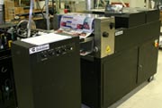
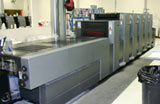
Commercial Offset Printing is the standard commercial printing method used around the world since the 20th century. Also called offset lithography, this form of printing produces the bulk of mass printing production used by businesses and organizations of all types.


PrintingForLess.com uses traditional offset commercial printing on genuine Heidelberg printing presses for most of the products we offer. While the concept isn’t new, the state-of-the-art technologies on our 21st century equipment enable fast, reliable and affordable printing.

offset press cylinders

What is Offset Printing?

Offset lithography operates on a simple principle: ink and water don’t mix. Image information (art and text) is put on thin metal plates which are dampened by water and ink by rollers on the press. The oil-based ink adheres to the image area, the water to the non-image area. The inked area is then transferred to a rubber cylinder or “blanket” and then onto the paper as it passes around the blanket. The process is called “offset” since the image doesn’t go directly from the plates to the paper, but is offset or transferred to another surface as an intermediary.


Why is it called 4-Color Printing?

Offset commercial printing presses and inkjet desktop printers both use four basic ink colors: CMYK. Where inkjet printing puts all the different ink colors on the paper in one pass through the printer, in offset printing each color of ink is applied separately – one plate per color. Small dots of the four inks – cyan (blue), magenta, yellow, and black (K) – are deposited in specific patterns that make our eyes believe we are seeing a wide range of colors. That’s why the standard offset printing process is often called 4-color process lithography or 4-color printing.

Offset printing can also use premixed inks in specific colors including metallic and fluorescent colors, called spot colors, to obtain hues outside the normal color range of process printing.


Why Use Offset Printing?

The advantages of traditional commercial offset printing are higher quality and the best cost-effectiveness for quantities over a few hundred, especially high volume quantities.

  • Low price per piece. The more you print, the less you pay per piece, since most of the cost is in the setup. With a commercial printer, any additional quantity costs only a few cents per sheet for the paper and ink.
  • Brilliant quality. Offset printing produces rich, accurate color and high-quality images and photographs, with sharp typefaces and fine details.

When you need 250 to 500 or more business cards, postcards, posters, glossy brochures, flyers or catalogs, offset printing is tough to beat for high-end quality at an affordable price. 4 color offset printing enables small businesses to compete with the “big guys” by providing professional-looking marketing materials.

Printing plate being mounted

What’s involved in setting up an offset printing run?

To start a press run, the imaged plates are clamped onto the plate cylinders and the ink settings are adjusted for the density of ink needed for the particular run. The press operator then runs a batch of initial sheets through the press at low speed and carefully checks registration (alignment) of the colors and the ink/water balance to ensure full and steady ink flow for accurate color reproduction. The operator can adjust the plate positions and ink density while the press is running at low speed. This set up process is called a “make ready,” where highly-skilled operators prepare the press for perfect offset printing.


Are there different types of offset printing presses?

Yes. “Sheet-fed” offset printing presses run individual sheets, ranging from “full size” sheet-fed presses running sheets that are about 28 x 40 inches, to “half size” and “quarter size” which use proportionately smaller sheets. “Web-offset” presses are fed from a large roll of paper, which goes through the press in a continuous length of paper, called a “web.” Sheet-fed presses are generally used for business marketing printing, while web presses are more cost-effective for high volume printing of catalogs, newspaper inserts and magazines (around 50,000 quantity or more depending on the size and type of piece).

This field is for validation purposes and should be left unchanged.

Get 20% Off

Subscribe to our weekly newsletter and get an instant 20% off your first print project.

Name(Required)
RELATED MARKETING & DESIGN TIPS

Offset Printing FAQs

Learn how offset printing or offset lithography works, the most common commercial printing method in use today

Read More >


Preparing Photos for Print Projects

You’ll learn how to use resolution and sharpening to improve digital photos so that they look crisp and sharp in your printed projects

Read More >


Letterhead Design and Printing

Read More >


About RGB and CMYK

Important Information About RGB and CMYK

Many graphics software programs give you the choice to work in either RGB or CMYK. These are called “color spaces”. Scanners, phones, and digital cameras create images using combinations of just three colors: Red, Green and Blue (called “RGB”). These are the primary colors of light, which computers use to display images on your screen. Printing presses print full color pictures using a different set of colors, the primary colors of pigment: Cyan (blue), Magenta (red), Yellow and Black (called “CMYK”). This is “4-color process” or “full-color” printing that comprises the majority of magazines and marketing materials you see every day.


It’s Best If You do the RGB-to-CMYK Conversion of Your Images

You will have more control over the appearance of your printed piece if you convert all of the images from RGB to CMYK before sending them to us. When we receive RGB images, we do a standard-value conversion to CMYK, which may not be perfectly to your liking. We want you to be happy, so please, take the time to prepare your file properly. We cannot be responsible for sub-par results if you furnish your images in RGB. Even though monitors always use RGB to display colors, the colors you see on your monitor will more closely match the final printed piece if you are viewing them in the CMYK color space.

Be aware that it is possible to see colors in RGB that you can’t make with CMYK.

They are said to be “out of the CMYK color gamut”. What happens is that the RGB-to-CMYK translator just gets as close as possible to the appearance of the original and that’s as good as it can be. It’s something that everyone in the industry puts up with. So it’s best to select any colors you use for fonts or other design elements in your layout using CMYK definitions instead of RGB. That way, you will have a better idea of how they will appear in your printed piece. Here’s a common example: many programs translate the 100% Blue in RGB into a somewhat purple-looking color in CMYK. We recommend a CMYK value of 100-65-0-0 to get a nice clean blue. Working in the CMYK color space allows you to select the CMYK recipe, or “screen build”, that gives you the results you want.


Here are some examples of how various RGB colors to CYMK:


rgb colors

rgb colors
(what you see on screen)

cmyk colors

cmyk colors
(printing inks will do this)

how rgb colors print

rgb colors
(what you see on screen)

how cmyk colors print

cmyk colors
(printing inks will do this)


You most likely won’t notice this kind of color shift in a color photograph.

It is more likely to happen if you pick a very rich, vibrant color for a background or some other element of your layout. It probably won’t look bad, it just won’t look exactly the same. But it may not be noticeable at all either.
To purchase a color guide with over 3,000 process colors and their CMYK screen percentages visit the CreativePro Pantone store.


Converting to the CMYK Color Space

Here is a list of several common programs with instructions on how to make sure you are working in the CMYK color space. If your program or version is not listed here, don’t worry. Most of these instructions will apply to all versions of a program. If at any time you need further help, please call us for assistance. We are happy to talk you through the steps needed to get your document into the CMYK color space.

Microsoft Publisher 2000

Microsoft Publisher defaults to RGB. It is easy to convert everything to a CMYK color space or to start a new document using the CMYK color space.

Use the following menu options: Tools/Commercial Printing Tools/ Color Printing and select Process colors (CMYK). Please note that all images incorporated into a layout need to be linked and not embedded in order to maintain the CMYK color space within the image. Using the following menu options does this: Tools/Commercial Printing Tools/Graphics Manager and highlight the embedded image. Click Link and click Browse to locate the original file and link to it. You will then need to send both the images and the layout file to us for printing.

Microsoft Publisher 2003-2007 or later

Select File Tab, then select Info. Select Commercial Print Settings. Select Choose Color Model, then Select Process Colors (CMYK)

Adobe Photoshop

If the file already exists select the following menu options: Image/Mode/CMYK When starting a new file select CMYK for the mode before clicking OK.

Corel Draw

Select each object you want to convert. Select the Fill tool and click Fill Color Dialog. Make sure the Color model is CMYK. For each object with an outline: Select the Outline tool and click the Outline Color Dialog. Make sure the Color model is CMYK.

Adobe Illustrator

Select File/Document color mode/CMYK color

Quark Xpress

Use the following menu options: Edit/Edit Colors/Show Colors in Use/Highlight Color and click Edit. Change model to CMYK and deselect Spot color. Remember to send us your layout and linked images!

Adobe InDesign

Use the following menu options: Window/Swatches and Window/Color. Double click color in Swatches Change color mode to CMYK and color type to Process. Any colors created in the document that are not in the Swatches palette, need to be changed to the CMYK color space. Select each object you want to convert and make sure the Color palette reflects the CMYK percentages. Click top right arrow in the palette to change to CMYK if necessary. Remember to send us your layout and linked images!

Adobe Pagemaker

Use the following menu options: Window/Show Colors. Double click “colors” in palette and select Model to be CMYK and Type to be Process. Please be advised that Pagemaker does not successfully represent CMYK color on the monitor.

The following programs do not have the capability to convert to CMYK. No worry, we will convert it for you free of charge!

Adobe Photoshop LE
Adobe PhotoDeluxe
Microsoft Word
Microsoft Excel
Microsoft Powerpoint
Microsoft Works
Microsoft PhotoDraw
Picture It Publishing


If you do not see your program listed here, or are having difficulty converting RGB to the CMYK color space, please call us at 800-930-2423 for further assistance.

For more info on color see: Guide to Using Color and Ink in Commercial Printing


This field is for validation purposes and should be left unchanged.

Get 20% Off

Subscribe to our weekly newsletter and get an instant 20% off your first print project.

Name(Required)
RELATED MARKETING & DESIGN TIPS

Printing Help

Printing Help Getting Started Product Descriptions Paper Descriptions Designing Your Layout Print Marketing Tips Preparing Your Files: Color        Layout Specs Images     Text The Ordering Process Ordering Checklist Production Speed Shipping & Delivery Mailing Services Proofing…

Read More >


2 Color Printing – Two Colors are Better than One

2 Color printing advantages and disadvantages for commercially printed marketing materials, with printed examples.

Read More >


Soft Touch Coating for Printing

Check out the advantages and benefits of UV coating.Soft Touch Coating creates a velvety texture that increases the tactile appeal of printed materials such as brochures, postcards and business cards

Read More >


  • Page 1
  • Page 2
  • Go to Next Page »

Footer

Printing for Less

info@printingforless.com
100 P F L Way, Livingston, MT 59047

800-930-2423

  • Home
  • Products
  • Services
  • Industries
  • Get Printing Samples
  • Direct Mail Marketing Resource Center
  • Printing Resource Center
  • Blogs
  • Templates
  • Terms & Conditions
  • Contact
  • About Printing for Less
  • Careers
  • Login

Copyright © 1998-2026 PrintingforLess.com. All Rights Reserved.

logo
  • 800-930-2423
  • Products
  • Direct Mail Marketing
  • Services
  • Industries
  • Direct Mail Marketing Resources
  • Printing & Mailing Resources
  • Get a Quote
  • Contact Us
  • My Login
Postcard Printing & Mailing
This field is for validation purposes and should be left unchanged.

Get 20% Off

Subscribe to our weekly newsletter and get an instant 20% off your first print project.

Name(Required)

*Some exclusions apply. See details