• Skip to primary navigation
  • Skip to main content
  • Skip to footer
Printing for Less

Printing for Less

At Printing for Less, we've offered high quality online printing services since 1996. Shop business cards, booklets, stickers, and more!

P F L.com
My LoginMy Login
800-930-2423
  • Printing
    • Postcards
    • Business Cards
    • Catalogs
    • Brochures
    • Folders
    • Letters
    • Newsletters
    • Envelopes
    • Greeting Cards
    • Print Templates
    • All Products
  • Direct Mail
    • Why Direct Mail Marketing?
    • Every Door Direct Mail® Postcards
    • Direct Mail Letters
    • Catalogs & Booklets
    • Marketing Gifts & Kits
    • Direct Mail Automation
  • Services
    • Mailing Services
    • Corporate Services
    • Design Services
    • Custom Printing Services
    • Reseller Program
  • Industries
    • Advertising & Design
    • Food & Beverage
    • Healthcare Payers
    • Healthcare Providers
    • Nonprofit
    • Real Estate
    • Retail
    • Technology
    • University
  • Resources
    • Direct Mail Marketing
      Resource Center
    • Printing Resource Center
    • Blogs
    • Templates
    • Video Library
    • Have a Question?
  • Get Samples
  • Holiday Shopping
  • Get a Quote

Blog

Guide to Using Color and Ink in Commercial Printing

Color in Printing

We want to give you a better understanding of how color works in a professional print environment so you’ll consistently achieve accurate, high quality work. There is a lot to learn about color space, color theory, and how different printing techniques can change how to use color in your print projects.

What Is RGB Color?

RGB (red, green, and blue) is a model based on light energy. It’s what’s called an “additive model,” meaning adding the highest strength of all the colors of light together will give you white. If your laptop or device were suddenly shut off, your screen would immediately become black because no light would be passing through it. Speaking of computers, RGB is the color space most commonly used to display colors on a computer monitor. That means it is the color space you likely used to build your designs.

How is CMYK different from RGB?

rgb cmyk comparison

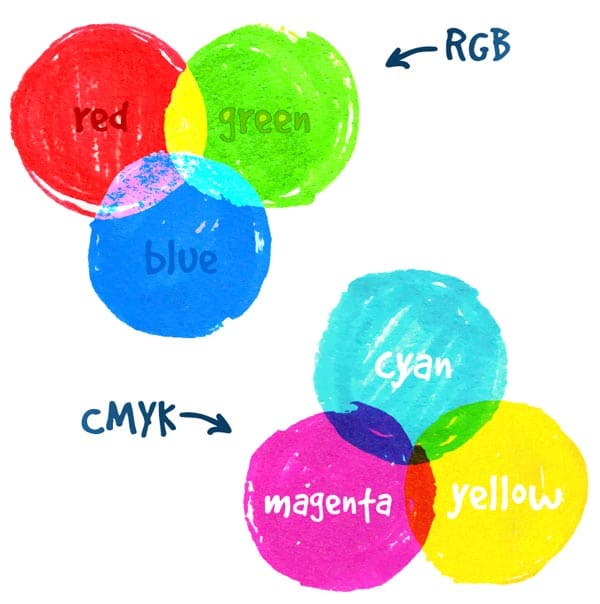
CMYK is a subtractive, pigment-based model. Instead of starting with black, we start with white (like white paper) and the color subtracts from the amount of white you start off seeing.  In CMYK printing, there are four color different plates, each printing a different color of ink: cyan, magenta, yellow, and black. These colors mix together to remove color from white light, producing the image you see.

While the first three letters, C, M, and Y refer to the first letter of the ink/plate they represent, the letter K refers to the black plate and represents the first letter of the word “key.”  Black establishes a frame of reference by “keying” all of the colors so that your eyes can interpret a color image.

So how do the cyan, magenta, yellow, and black inks produce such a wide range of colors using just four inks? The colors are printed in varying percentages using something called a halftone dot. If you look at any printed piece with a magnifying glass, you’ll be able to see the halftone dots that make up the artwork.

Further Reading: RGB vs. CMYK, and Converting Your Colors

The number of colors of light you can see far surpass the number of unique colors you can get by adding four different pigment inks together. That means that the “gamut,” or range, of colors in the RGB (light-based, additive) spectrum far exceeds the gamut of the CMYK color space. In fact, some colors in the RGB model will never be achieved with CMYK printing colors alone.

A gamut describes the number of colors and tonal range that a specific device or environment can show you. Then certain colors cannot be produced on/by a device, those colors are said to be “out of gamut.”

Further Reading: Designing for Commercial Printing
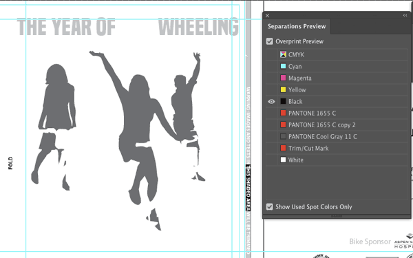
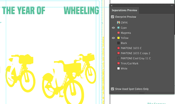
Spot colors

There are times when we really need to see a specific color in print, even when it can’t be achieved by combining cyan, magenta, yellow, and black inks. Some brand standards, for example, specify very exact colors for their business identities and collateral. Maybe you want to increase the perceived value of your printed piece. Maybe you’ve designed a high-profile brochure or annual report that needs a little something “extra” – like a spot metallic ink – to give it a luxurious feel.

If you try to print them in CMYK, a lot of vibrant colors like bright orange and neon green come out looking kind of funny (and definitely not what you intended). Navy blue comes out looking more purple and grey. Silver looks sort of grey, and gold really just looks brown.

These specific colors can be printed even if they’re out of gamut, but they must be printed with solid or “spot” colors instead of with process inks. With spot colors, the inks are usually printed in solid, single-color blocks instead of in layers using the traditional CMYK mosaic-like dot pattern. On occasion, they also get overlaid translucently on top of a CMYK base in order to extend the available range of CMYK pigment mixes.

Pantone vs CMYK image

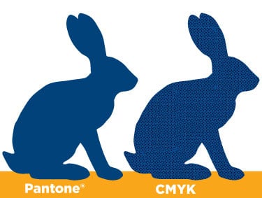
The Pantone color library is the industry standard library of spot colors. Their reputation grew based on the variety of multi-pigment specialty inks they offer and the legendary color-consistency of their inks. Before going crazy on adding spot colors to your pieces, though, keep in mind that these colors will significantly increase the cost of any print job since the press must be completely cleaned both before and after printing with these inks to avoid any color contamination and guarantee color accuracy. The prices of spot color inks can also vary based on which specific pigments and colorants go into a certain color (metallic inks tend to be on the higher end of the cost spectrum).

Further Reading: Pantone, RGB, and CMYK

Note: While spot colors can be fun to play with in your image editing and desktop publishing software, if you know that you’re never going to print actual spot colors, keep you color values as CMYK. You’ll have a more accurate visual preview on the monitor, and avoid additional delays with getting your project printed.

Color management

You want your printed piece to look as much as possible like the colors that you see on your computer monitor, right? That’s never really possible, to be honest. Why? Because digital screens can show you colors that you can’t actually print, and some colors that you can print can’t be displayed on a computer monitor.

We may not be able to achieve perfection, but we can make colors more consistent. That’s color management. Good color management gets you consistent and accurate results when you’re presenting, printing, or otherwise sharing your images.

Color workflow

The accurate reproduction of full color images and artwork requires following a careful and proven workflow. A color workflow maintains the best translation of colors from device to device or environment to environment throughout the production process, each with its own color processing standards and capabilities.

For example, you’d perhaps first have a digital camera. Then, you’d have a monitor (or multiple monitor) display. Then, you’d have the environment of your image editing software (such as Adobe Photoshop, Illustrator, InDesign, or Acrobat), including any specific adjustments you choose to make. You’d need to consider your paper, your printer, and the pigments available for your use. Each of these environments must be carefully managed for consistent and predictable artwork results.

Further Reading: Fix Color Issues with the Ink Manager

Why, for example, might the images on your screen differ from your final printed piece?

  • Your human eye can see more colors than any combination of inks can create in print.
  • Monitors typically use RGB color (additive model — adding to make white), but offset printing uses CMYK pigments (subtractive color — subtracting from the existing white).
  • Printed images have less visual range, saturation, and contrast than digital images, so in print, colors will usually appear darker and less vibrant. Paper texture and brightness will also have an effect on any image, and digital displays are unable to accurately mimic those effects.
  • The layering and overlapping of inks results in subtle color shifts and blends that can’t be exist in the discrete pixels of a digital image on screen.

Effective color management — including color calibration — ensures that you’ll be able to predict and work around any inconsistencies.

Color calibration

Color calibration guarantees adherence to a known set of color standards. Color standards provide a common base language or code for all devices to reference, such as the proper distribution of tones from black to white. Referring to the same code allows the translation of color representation between devices to occur seamlessly. If one of the devices in your own workflow is unable to reproduce certain colors, you’ll want to know when to make adjustments and when to accept the available output.

As the first step in your color workflow, you’ll want to calibrate your computer monitors. Your monitors are the windows through which you’ll make your biggest image editing decisions. Without an accurately color calibrated monitor, you can’t be sure that any decisions you make will produce a reliable outcome. Emitted light produces an image on a screen, whereas reflected light produces a visible image in print, so you’re going to need to bridge that gap without losing visual accuracy.

What happens if you don’t calibrate your monitor color? You lose accuracy. If your monitor isn’t showing you accurate images, then ay edits you make are just guesses. Do you really want to spend hours and hours editing your artwork, only to find out you made the wrong (or even just ineffective) tweaks? Or have your prints come out looking awful because you couldn’t really see what you were doing?

When you’re ready to calibrate, here are some basic steps that a monitor calibration tool might lead you through:

  1. Choose which monitor (if you have more than one) that you’re going to calibrate first.
  2. Adjust your white point to be slightly cool (6,500 degrees Kelvin – closer to blue), which produces a more natural-looking image on your screen compared to warmer tones. (Note: You don’t want your monitor to be overly blue, either, which is common error – your monitor shouldn’t be so blue that you feel the need to add yellow to your images to “correct” them.)
  3. Adjust your luminance value to 120 candelas per square meter. (Note: You don’t want your monitor to be too bright either, which is another common error.)
  4. Some calibration software may then begin generating and then measuring a variety of color and tonal values on the monitor. The software will then make adjustments to your monitor in order to produce the most accurate colors possible within the limitations of your hardware.
  5. You’ll then have the option to save this monitor “profile” and set it as your default.
  6. Check the “before” and “after” comparison to confirm you’re satisfied with your new settings.
  7. Proceed confidently with your images!
monitor color calibration

You can also buy an assortment of color calibration tools that help you calibrate display monitors. Be sure and get a calibration tool rated for print color management.

Choosing a color space for working with your images

When you’re opening a new document in your image editing or desktop publishing software, you’ll most often stick to the RGB color mode. That’s because you’ll usually be working with images in their most glorious and full color range, which only exists in the RGB color space (especially when the image was captured with a digital — meaning RGB — device in the first place).

You’d even use the RGB color mode if you wanted to work with an image in grayscale, adding adjustment layers to remove the appearance of color. You should definitely keep your image in RGB as long as you’re actively working on it, and your master file should always be RGB.

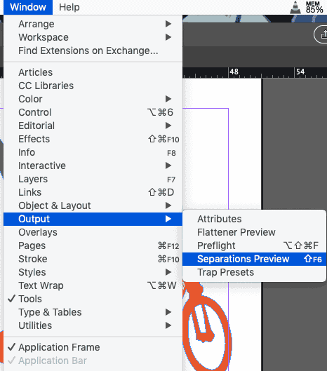
Some benefits of staying in RGB, even if you’re eventually going to print, are:

  • The flexibility of using the same artwork file for producing print pieces as well as vivid, web-based graphics
  • Keeping the image data for the larger RGB color gamut intact
  • Access to the benefits of all the filters and adjustment layers in Adobe Photoshop (many Photoshop operations, like Filters, work in RGB but not CMYK)
  • Avoiding the regrets of losing huge amounts of image data by converting to CMYK too soon
  • Saving space on your hard drive (RGB images are 25% smaller than CMYK because they only have three color channels instead of four)
  • Saving the time it would take to individually convert RGB images to CMYK

Within the RGB color space, there are three main options you’ll want to consider, each with a different available range of colors:

  • The sRGB color space
  • The Adobe RGB color space
  • The ProPhoto RGB color space

(Ultimately, though, the impact each of these color spaces will have on the available color range isn’t going to have a critical impact due to the capabilities of today’s printers and monitors.)

sRGB

sRGB has the smallest color range (gamut) and is the most appropriate for images that will be displayed on a screen. It’s less than ideal for anything that will be printed because it’ll prevent the use of some colors that your printer actually could make. Many people put down the sRGB space. However, it is, in fact, the color space of the digital world, the color space of most modern monitors, and it’s even the color space of most commercial photo lab printers.

Adobe RGB

Adobe RGB tends to be the safest and most flexible option. It’s got a large color gamut, and there aren’t too many additional things to worry about. Adobe RGB is the most commonly used RGB profile in print; in fact, it’s even recommended to export files for prepress in Adobe RGB instead of in CMYK, since Adobe RGB completely encompasses both the sRGB and CMYK color spaces. This means Adobe RGB can keep the integrity of all the color possibilities that both of these spaces can produce.

ProPhoto RGB

ProPhoto RGB has the largest available color range, which even includes colors that aren’t part of the visible spectrum. You should only consider this color space if you’re working in the 16 bit per channel mode. The main benefit of the ProPhoto color space is that it keeps the data that applies to the colors your monitor can display, the colors your printer can produce, as well as all the colors that printers and monitors in the future will recognize.

If you’re using ProPhoto RGB, we recommend you maintain that color space throughout the image editing process, and then convert your image to sRGB when you’re saving it for the web or sending it to another party. If you’re both editing and printing your own images, you’ll have the most flexibility if you leave your images in ProPhoto RGB.

Assign Profile versus Convert to Profile

A color profile defines a particular device’s range of color reproduction as well as how that device stores the color information to begin with. If an image that you open doesn’t have an “embedded” color profile, this means that even though specific RGB values exist in your image, your image editing software doesn’t know what those values mean. It’s trying to interpret the information in the image but can’t figure out the appropriate translation.

If an image doesn’t have an existing profile, you will need to assign one so that the color data gets interpreted accurately. Assigning a profile means consciously choosing the way an image’s color values will be interpreted and matched with specific RGB values and visual display. You can do this pretty easily in most design software, such as Photoshop, with the Assign Profile option. When you assign a color profile, you’re intending to change the image’s appearance.

You can also convert color to specific color profile. This method assumes that an image already has an assigned color profile. This function will take note of the image’s current appearance and then convert the color information while keeping things looking the same (or as closely as possible, anyway). With Convert to Profile, you’re intending to maintain the status quo, color-wise.

If you still need to convert from RGB to CMYK

These days, it’s recommended to keep your artwork in RGB, even when you’re going to be sending it to print.

The old “RGB versus CMYK” color wars don’t matter much anymore. RGB content can now be seamlessly processed by most modern print workflows and gets converted on the fly to CMYK for any offset printing applications. Digital output devices like professional digital printers may even give you better color if you don’t convert to CMYK.

Sometimes, though, you won’t be given a choice.

Your printer may be gun shy. He or she may have been doing things a more traditional (“old school”) way for so long that they don’t realize the flexibility and ease that modern technology can create. What were once commonplace mistakes (like leaving artwork in RGB) no longer cause problems – and sometimes even work to our advantage.

A lot of old school print shops still recommend converting images to CMYK. In Adobe Photoshop, you could go to Image >Mode > CMYK color, which will convert the image to CMYK. But not only will you immediately lose irrecoverable image data, Photoshop will make this conversion based on your current color settings for the CMYK color space and is rarely, if ever, correct.

If your printer still insists on CMYK deliverables, first ask for a custom CMYK output profile. Not necessarily a profile created for your print job alone, but a print profile that they’ve found works well based on their specific ink and press configurations.

Even with a custom profile, be extremely careful when navigating this territory. Making a color mode conversion is a one-way street. Besides using your “Undo” command immediately after making the switch, you won’t be able to retrieve any vividness or color data that gets lost.

You don’t want to throw away any color information away prematurely, so one option is to keep your working files in RGB but export to a CMYK PDF. You can use a preset or printer profile that makes the conversion for you, creating a new CMYK file but leaving your native RGB file alone.

Further Reading: Choose the Best PDF Preset for Printing

To continue designing and editing with all of the features and possibilities while keeping an eventual CMYK output in mind, you can choose View > Proof Colors in Adobe Photoshop, Illustrator, or InDesign. This way, you can see how your colors will look after conversion to CMYK, but all of your image data will remain intact in your original source files.

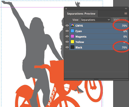
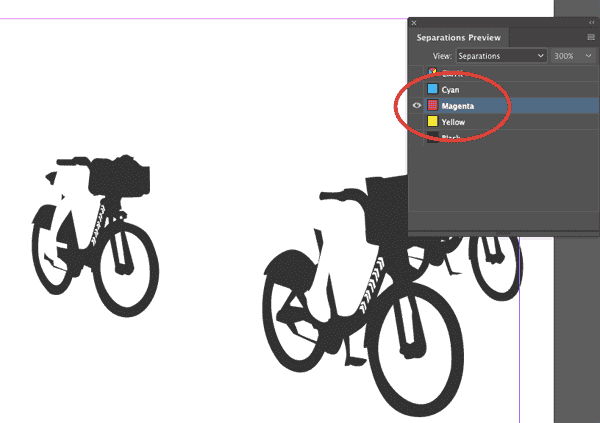
The main benefit of using “Proof Colors” is that you’ll avoid the point of no return. Your colors won’t get converted to CMYK until you actually export to a Print Ready PDF. Once you’ve exported to a Print Ready PDF and opened the file in Adobe Acrobat, you can confirm the CMYK conversion by going to Tools > Print Production > Output Preview. There, you’ll be able to see the CMYK separation plates, even though you began with an RGB image.

How are you going to print?

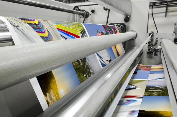
Today, traditional and modern printing methods coexist. You’ve got nearly unlimited options for producing your perfect printed piece. Here’s a summary of the most commonly used print processes.

  • Sheet-fed offset printing. Capable of printing very crisp, detailed, high-quality pieces. Can handle heavy paper stock. Allows for true spot colors. A perfect method for producing prints of fine art or brochures, or manuals. Uses process color and spot colors.
  • Web offset printing. The best for high volume print runs, especially those which may require inline finishing such as folding or gluing.
  • Letterpress. An elegant and historic method of printing most often used on heavy, textured paper stock to create memorable pieces with character.
  • Digital printing. An efficient method for high-quality print runs of less than 5,000 which also allows for variable data and personalized mailings. Today, digital presses are incredible advanced and are nearly indistinguishable from offset printing, but very few digital presses support true spot colors. Some inline finishing options may be available depending on the specific printer. Because they’re not just working from four plates, digital presses support the wider and more vibrant color gamut of RGB images – finally ending the RGB vs CMYK debate.
  • Silkscreen. The printing method most often used for apparel, products, and a variety of irregular surfaces. A screen gets burned for each ink color in place of traditional metal plates.

Of all the common printing techniques summarized above, your biggest decision will most likely come when evaluating offset versus digital. Each year, the quality of digital printing increases. In fact, the print quality of digital can often matches that of offset (often at a lower cost). Here’s a closer look at your choices:

Offset printing

Offset printing (lithography), as previously mentioned, is most commonly associated with high-volume commercial print jobs. (Visualize large rolls of newspaper running through a very large and loud press.) This traditional method of printing has been around for over one hundred years.

For offset printing, your artwork’s colors will be separated and the separations will get burned onto four plates – one each for cyan, magenta, yellow, and black. Pantone spot colors may be substituted for any four of the colors, and additional plates may be burned if special spot colors have been requested in addition to the traditional four.

The imprinted plates transfer the artwork onto rubber rolls, which get spread with the associated inks. The inked image then gets transferred (“offset”) from the plate onto a rubber blanket. Your chosen paper stock is then fed through the rubber rolls and gradually layered with the ink on each plate to complete the printing of your final artwork as designed.  

How Process Inks Are Made for Offset Printing

If you choose to go with offset printing, you might want more insight into just how these workhorse inks get made, right? The perfect printing ink would achieve high marks in number of areas (including set speed, gloss, running ability, and rub resistance), so the ink-making process is just as in-depth as you’d expect.

Printing inks are made of up two primary ingredients: pigment (the color) and a vehicle which carries the color. The pigment usually starts in powder form, and the vehicle tends to be a kind of varnish-like substance that’s sticky like honey. The vehicle components (whether thick or thin) are weighed into a pot and then added to a mixer.

mixing a Pantone color ink

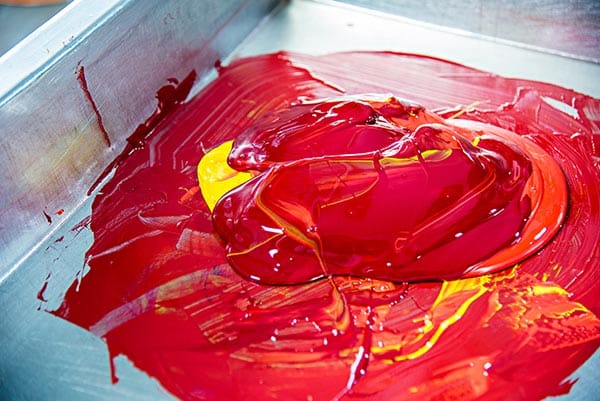
The mixing process heats them together and the heat makes for a thinner consistency, which allows for the pigment to be easily incorporated in the varnish until it’s no longer a powder, but a thin liquid that can easily run through a printing press.

Next, in case any pigment particles are still stuck together, the lumps of pigment get broken apart in two different machines: a bead mill filled with tiny steel balls which roughly break the pigment particles off of the clumps, and a three roller mill which has three steel rollers moving in opposite directions. The steel rollers smears the pigment particles apart instead of knocking them about like the bead mill, and results in a glossy, smooth ink with a high color intensity.

Once a batch of ink gets to this stage, several quality control tests occur. A grind test takes place to make sure that every particle of pigment has been reduced to its smallest possible size so that it’ll print smoothly and consistently. Then, the ink is run through a “bleach test” where it’s mixed with opaque white to see how far it’s been developed. If everything looks good, the ink is moved to another mixer where waxes and dryers are added to impart necessary qualities to the ink. A final quality check on ink tack ensures that the ink is just sticky enough to adhere, but not so sticky that it gums things up.

Once that ink meets quality standards, it gets packaged via another three roller mill to remove any air bubbles and add more gloss and polish.

Offset Press Setup

  • The first step before beginning any new process print job is cleaning the press. Everything used in the last job, from printing plates to cylinders to fountains and rollers, must be uninstalled and cleaned. Starting with a clean, fresh press isn’t just about preventing ink contamination; it’s also important to make sure that any dirt or leftover residue doesn’t disrupt the registration or alignment for the new job.
  • The second step is creating color separations. Your composite artwork needs to be separated into four different artwork files (one each for cyan, magenta, yellow, and black), which are called color separations. Each separated file will get laser-engraved onto its very own thin metal own printing plate.
  • The third step is laser-engraving the metal printing plates. Each coated thermal plate gets inserted into an imagesetter, where lasers output each plate’s image by heating areas of the plate to different degrees (the temperature varies depending on how much color ink each area should collect). The plate moves out of the laser compartment and through a cleaning solution to wash away the heated parts of the coating. The plate now contains a negative image of what will appear when  printed.
  • The fourth step is installing the four newly burned plates into the printing press. The plates are flexible enough to get clamped around plate cylinders inside the press, which will rotate while water and ink get added to the surface.
  • The fifth step is calibrating the press. The press operator will perfect the color output by using calibration software. Output color density can be changed using levels and curves, as well as other tools. The calibration software also calculates ink absorption by taking into account the thickness of the chosen paper and any coatings being used. The operator starts the press at a slow speed to check the first prints for alignment and color. Any final adjustments get made so the press can ramp up to full production speed.

Use offset printing if:

  • You need to print large quantities. Offset printing can be much more cost effective in bulk because you pay a lump sum for paper and press time (in addition to set up) instead of an unwavering, flat rate per piece. With offset, the more pieces you print, the less you’ve had to invest in each one.
  • You have very specific paper stock or ink color requirements. Digital printing tends to be more restricted in these areas.
  • You need consistent, reliable, perfect image quality. With offset printing, you won’t have to worry about streaks or spots or stains. Your details will be impeccably crisp and defined.
  • Your color really matters. Offset printing is known for the best color balance and accuracy, especially since custom color inks can be precisely mixed for your job.
  • You’re working with unique materials. Offset printing gives you more flexibility in terms of the weight and finish of your stock, as well as allowing custom-sized material.
  • You’re not in a rush. You’ll need to allow a bit of time for your plates to be created and the press to be set up for your very own print run.
  • You trust your editing and proofing teams completely. Once an offset print run begins, any errors (like typos) are a big deal to fix. You’ll have to start the plate and setup process all over again, and anything you’ve already printed (along with the initial setup) will be a loss.

Digital printing

Digital printers look a lot like giant versions of the printer you have in your house. They print sheets one at a time, dispensing ink on demand instead of needing to burn individual color plates. There’s a lot less mystery in the digital process, since most of us have already been using digital printers of some sort for years.

A digital press is high-end color output device, toner-based, and can print 100 pages per minute. Many digital presses can print up to 300 line screen, which is a high quality print. Some digital presses can support special-mix spot colors, but you won’t generally have access to as many Pantone colors as offset printing can accommodate. Even without exact matching, though, the colorants in digital presses can quite closely approximate special spot colors because they have access to a much wider color gamut.

Besides digital presses, inkjet devices are also powerful modern digital printing machines, and their capabilities continue to increase. We aren’t talking about the inkjet printers you have at home, these industrial presses come in large format and grand formats, both of which mean new possibilities in terms of printing surfaces and sizes. Flatbed inkjets can print on metal, glass, or plastic; product decals and window clings which used to require silkscreening can now be printed with inkjets. Inkjet UV inks even permit the printing of outdoor signage!

The wide color gamut of digital printing colorants becomes an even bigger advantage when using inkjet printers. The colorant range allows the mixes of colors beyond the offset standards of cyan, magenta, yellow, and black. Unique colorants can be added to inkjets to extend the range of printable colors past traditional CMYK blends.

Because of this wide color gamut, RGB files become printable. RGB images are capable of  producing a wider range of colors than CMYK images. And the wide gamut of digital toners and inks surpasses the available range that offset printing inks can render; even CMYK digital toners also have a wider gamut than the four process inks. Spot colors can be closely approximated via built-in recipe books which generate the best options for producing a near-match.

Use digital printing if:

  • You need something printed, fast. Since digital printing doesn’t bother with the extensive setup required by offset printing, rush jobs are no problem.
  • You need to see a final printed piece before committing to the job. It’s easy to crank out a single copy from a digital file, but it would be awfully expensive to set up an entire offset press for just a single printed sample.
  • You’re printing a relatively small run. With digital printing, each printed sheet costs you the same amount of cash, so you won’t have to invest in plate and press setup when you’re just making just a few copies.
  • You’re using standard materials and paper stock. Digital printing just doesn’t have the flexibility of offset printing.
  • You need something personalized. Because of the “digital” nature of digital printing, you can easily import spreadsheets of values that need to be printed uniquely. This is called variable data printing. Offset printing, on the other hand, doesn’t accommodate such customization; every piece must be the same.
  • You want to print multiple versions of the same piece. Because there’s no extensive setup process, you can print as many variations as you like for the same cost per piece.
  • You don’t need everything to be perfectly crisp. And by perfect we mean, beyond the powers of a regular human eyeball. When printed on the best digital presses, you likely can’t tell the difference from an offset press without a microscope.
  • You’re not too concerned about exact color. While offset printing gives you the control of perfect color matching, digital printing just does the best it can to match whatever colors you chose. Digital printing can blend inks, but those blends will never be as perfect nor as reliable as a custom Pantone mix.

Have you enjoyed this journey through color and print, but need some more guidance? Talk to a print expert today by calling 800-­930-7978.

Get A Printing Quote

Jump Start Your Direct Mail Marketing Response Rate with These Quick Tips

Have you ever designed what you thought was a stellar piece of direct mail marketing only to find the response rate to be less than optimal? Direct mail serves a lot of purposes, but ultimately, the goal is a simple one: to get a response. And if you’re not getting a big one, it’s time to rethink your strategy.

Compared to other types of marketing efforts, the direct mail response rate is already one of the best out there. On average, you can expect a reasonable 5.1% of your house list and 2.9% of your prospect list to respond – a significant jump from the 2% response rate you’d get from all your digital efforts (email marketing, paid search, social media, etc.) combined (DMA).

The good news is that if you didn’t get a great response rate, it has less to do with your marketing method itself than the way that you framed it. Direct mail provides businesses with a ton of opportunity to connect and grow, you may just have to tweak how you get there. Here are some tips for getting more out of your direct mail and increasing that all important response rate.  

Have a clear and distinct call to action

The call to action (CTA) is one of the most important features of your direct mail. A CTA is a directive of sorts that inspires immediate action on the part of the mail recipient. And it’s often promotional, i.e. “Schedule before January 1 and receive 10% off your next appointment!” or “First 100 people to sign up get a free gift.”

Your exact CTA will depend on what the product or service it is that you’re selling, as well as who your audience is. But regardless of the exact terms, it should have a few key distinct features:

  • It should stand out on the page. Whether you’ve sent a postcard or a multi-page brochure, your CTA needs to be clear and obvious to the recipient. Play around with placement, font size, color, and more to ensure that your CTA pops off the page.
  • It should be actionable. A good CTA encourages the recipient to act fast. Direct mail is highly effective, but it’s also time-sensitive – if your lead isn’t inspired to act now, they may not act at all.
  • It shouldn’t be too general. You’ve got to give something to get something. If your CTA is broad and doesn’t offer anything to the recipient – for example, “Call now to learn more!” – they’re not going to have any incentive to follow through. Making your CTA promotional is a way to offer the recipient value in return for their response.

A piece of direct mail can be informative and well-designed, but if it’s lacking a strong CTA you’re missing out on a major component of high response rates. More than anything else, you should be optimizing your CTA if you want to increase the amount of responses that you receive.

Make it personal

Your recipients are more apt to connect with a piece of mail that is personalized to them and their needs. Seventy-seven percent of individuals who responded to a USPS survey said that personalization in the direct mail they receive is very important to them (PRIMIR). In another survey, 29.2% of respondents said that they’re much more likely to open and read personalized direct mail, and 55% said they’re a little bit more likely (InfoTrends).

You’re not going to get a high direct mail response rate if you don’t get people to look at your mailer in the first place. Include the recipient’s name in the headline and tailor an offer to what you perceive as their specific needs. You can even personalize the images, choosing visuals that are most likely to appeal to the unique demographics your recipient falls under. By making a bigger impression you up your chances of engaging with the recipient and getting a response.

Incorporate digital components

Direct mail and digital mail aren’t completely antithetical. In fact, you can increase your direct mail response rate by including digital directives through a personalized URL (PURL) or a QR code – both of which drive the recipient directly to your website with minimal effort on their part.

We live in a digital world, and it’s not just millennials who are loathe to pick up the phone. Ninety percent of customers visit a company’s website before calling or emailing them (Huffington Post). A recipient visiting your site is both a response in itself and a precursor to further engagement. And using PURLs and QR codes to get them there – instead of just offering a broad direction such as “visit us at xyz.com” – allows you to track who follows through and monitor their behavior once they get there.

When including digital aspects in your direct mail, be sure to specifically note where they lead. Context matters, and a recipient might not want to follow through on a PURL or QR code if they don’t know where it’s going to take them. A good way to increase the efficacy of these digital components is to tie them in to your CTA. “Follow the link to claim your $10 off” is almost always going to more effective than simply “Follow the link.”

QR code for digital payment

Focus on existing customers

Obviously you want to use your direct mail campaign to drive new business to your company, but if you’re neglecting your existing customer base you’re doing yourself a major disservice. You have about a 60% to 70% chance of selling to an existing customer, and just a 5% to 20% chance of selling to a new prospect (Invesp). So if you’re dealing with a low response rate, it might be who you’re marketing to – not how – that is to blame.

One of the major benefits of focusing your direct mail on your current client base is that you already know what they’re interested in. Use that information to help further your personalization efforts, offering information and promotions that will appeal to them. Don’t neglect un-converted leads entirely (this isn’t an all or nothing approach), but do tap into your existing base of customers for insight on how you can better connect.

Your direct mail can – and should – do more for you. Talk to a print expert today to learn more about how to increase your direct mail response rate and start turning a bigger ROI on your mail campaigns. And if you’re just getting started, call us at 800-930-7978 to get started with direct mail printing.

Check Out Your Color Files with Separation Preview

Color is a big topic. And there’s a difference between on-screen color and in-print color, which is most important to remember (and troubleshoot) if you’re going to print.

As graphic designers working between multiple platforms and applications, we can sometimes forget which mode we’re working in, or which colors have been applied where. The outcome? We can get results we’re not expecting when we send our files to the printer.

We don’t want that to happen to you. And one way to prevent any unexpected color results is to preview the print output before we send our files out the door (or email box). It’s wise to check the settings for the actual inks and make sure they’re going to interact in a predictable and satisfying way, for both you and your client.

The Separations Preview tool provides you with a visual display of how the various color inks in your document will interact with each other on the printed page. You’ll only need this panel if you’re going to be doing any commercial printing; if you’re sticking to your home printer (laserjet, inkjet, and the like), you won’t need to bother with separations. The Color Separations Preview will help you prep your files when you’re sending your job to a professional print house.

Since both Adobe Illustrator CC and Adobe InDesign CC are popular print layout powerhouses, we’ll focus on the Separations Preview in these applications. This way, you’ll be prepared for how the various process colors will interact with each other when you commercially reproduce an Adobe document.

Launch Separations Preview in Illustrator

Here’s how to launch Separations Preview in Illustrator. Go to Window → Separations Preview to launch the Separations Preview Panel.

illustrator separations preview

If the panel seems to be empty, check to make sure your document is in CMYK color mode. While you don’t have to work in CMYK just because you’re printing a document commercially (especially when using spot colors, which exist independently of the CMYK plates), you won’t be able to use the Separations Preview unless you are.

You can check your color mode by going to File → Document Color Mode. Make sure there’s a check next to “CMYK Color.” If “RGB Color” is checked instead, then change it to CMYK.

document color mode

Be aware that the saturation of the colors on your screen will become more muted if you make the change to CMYK, since RGB is considered a more “lively” color space than the printed page allows. In fact, if you have a document that only uses spot colors and no process color plates, some designers believe they can see the spot colors better if they leave the document in RGB. It’s your choice; just be aware of the pros and cons of each!

What you should see, once your document is in CMYK color mode, is a list of the four process color inks (cyan, magenta, yellow, and black) along with any spot colors which exist in your swatches panel. Spot colors are premixed inks which don’t  separate into the process components.

illustrator separation colors

To activate the actual separations preview, you’ll need to check the box next to “Overprint Preview.” Overprinting relates to how the inks interact; because they’re translucent, when each ink is printed on top of the others, you’ll a deeper visual range.

After that, you can decide whether you still want to see all the spot colors that have been defined, or only the spot colors actively in use. If the latter, check the “Show Used Spot Colors Only” box at the bottom of the Separations Preview Panel.

overprint preview

Note that nothing that you change in the panel will affect the actual print job; turning any of these checkboxes on or off simply allows you to see what will visually happen as the various colors interact.

In order to preview any one ink by itself, use the keyboard shortcut Alt + click (PC) or Option + click (Mac) while clicking the eye on the left side of the color indicator. You’ll then see a preview of all of the places in your document where that ink will be printed (where that color plate will be used). Here, we’re previewing the black plate only:

separation preview black

To restore the visibility of all the inks, simply Alt-  or Option-click again next to any ink swatch.

You can also toggle inks one by one to see different combinations of interaction. In this image, for example, the interaction of just the cyan and yellow inks are being previewed.

separations preview cyan yellow

Using the Color Separations Preview in Adobe InDesign

Now that we’ve covered separation previews in Adobe Illustrator, do you want to know how to preview color separations in InDesign, too? We’re not covering how to actually print color separations in InDesign, but the Separations Preview panel will give you good information so that you can make sure your separations are set up correctly before actually going to print.  

Assuming you’ve already got an InDesign document open, you’re ready to make sure the right inks will end up in the right places when you print your InDesign file commercially. To launch the Color Separations Preview, go to Window → Output → Separations Preview.

output separations preview


When you first launch the Separations Preview panel, you won’t see much, but if you click the “View” panel menu, you’ll get to choose your display options.

separations preview off

When you choose “Separations” from the dropdown, InDesign will activate “High Quality” display for the entire document (which you could also manually activate by going to View → Display Performance → High Quality Display).

display performance high quality

It will also show you a list of all the inks (not color swatches, but the actual inks) used in your file.

Would you like to see how much of each ink is being used in various places throughout your document? Simply move your cursor around your document, and notice that the percentages change in real-time to the right of each ink/plate in the Separations Preview panel.

separations preview percentages

You get to see exactly how much ink is set to be applied at any and every point in the document.

With this level of feedback from InDesign, you’re really able to make sure your files are set up perfectly before sending them along to the printer. The visual nature of this kind of troubleshooting makes it easy to catch color assignment errors, and your printer will be grateful! Your clients will be grateful, too, when perfectly printed pieces arrive on their doorsteps.

Now, let’s actually look at color separations. We’ll be able to see exactly which colors are applied to exactly which objects on your page, and in which densities.

Click on any color (magenta, in this example) to see what exists on that particular color plate — literally, what that color plate will look like

separations preview magenta

By turning on and off the various colors (by clicking on the eyeballs on the left), we get what’s called a “color build” — we can see various plates combined, and add more plates gradually to build up the cumulative ink density.

At first glance, this may not seem particularly useful, but a cyan-magenta-yellow color build can help you identify text, for example, that should be black but isn’t. If you have cyan, magenta, and yellow all turned on (but black turned off) in the Separations Preview panel and then go through your document page by page, you’ll immediately see items that should be black but aren’t.

If you have the black plate turned off but still see “black” text, that’s your a red flag! To remedy any non-black text or objects that should be black (and not a combination of the other process colors), first, select them. Then, open the Swatches palette, and click the black process swatch to assign that text or those objects to that plate.

Learn More About RGB and CMYK Color Printing

12 Ways to Make College Brochures Stand Out From the Pack

Direct mail is a popular marketing channel for college recruitment. Starting in the spring, more than a million high school students will be sitting down to take the SATs and PSATs, and most of these tests have a small box that the student can check to receive information on different schools.

For most campuses, that information will come in the form of college recruitment brochures. Any college admissions rep will tell you that a good recruitment flier is worth its weight in gold, which is why Printing for Less prides itself on supplying hundreds of thousands of custom designed fliers and brochures every year. And with an unprecedented number of high school students eagerly awaiting their chance to shine, there is no time to waste in promoting your brand.

Enrollment is expected to continue to grow to 20.5 million between now and 2027. Yet, with the cost of education on the rise, more and more are looking very critically at their college choices. Even with an overall 7% increase in the number of first-time freshman, more than a third are applying to seven or more colleges. While some hail this as an economic coup, many more are lamenting the number of students applying to too many schools.

But how can more choices be a bad thing? With all these potential students applying to multiple schools, the odds of them picking your campus improves too, right? Not necessarily.

You have to stand out, get noticed, and deliver the value your school brings in a clear and concise way. Nothing squeezes all of that information into a mailbox-friendly format like a recruiting brochure. The trick is to make your brand out-shine the other six. For that, here are some ways to make your school stand out from the pack.

Imperial College: London

by Mark Vaile

The Natural Sciences have never looked more appealing. Vibrant, organic, and yet still grounded this brochure for the London campus of England’s Imperial College kicks off our list to a great start. Colorful imagery captures your attention but doesn’t detract from the catalogue of the department’s projects and sponsors.

college brochures example

LaSalle College of the Arts

by Capi VietAhn

Invoking origami, this design’s inspired concept makes the most of a larger space by layered folds of card stock. When it does bloom, you will find nuggets of information tucked into each segment.

origami college brochure example

North Carolina State University, Engineering

by Jacob Fremderman

The future is now. Or next academic term, to be exact. The retro style 3D font immediately invokes a sense of futurism, while the minimalist layout and blocks of colour keeps the look fresh and uncluttered.

College brochure example

Muhlenberg College

by Misty Bourdess Wilt

Knowledge may be the key, but in this case a great die cut is the gate keeper to a fantastic brochure. Vibrant red detailing on a classic dove gray background updates the look and lures the viewer inside.

College brochure example

Goa College of Art

by Jeanine Soares

A beautiful brochure that showcases the allure a simple die cut and fold can create. The art nouveau style and square shape mirrors the album art of folk records of the 1960’s for a funky, grassroots feel.

College brochure example

CCA Graduate Design

by Martin Venezky

The cover of this brochure appears to honour the Asian wood block printings of the early 20th century and their influence on the styles of Western artists. Add a piece of delicate, almost architectural line work and you can really see how the blend of landscape and urban development influenced this San Francisco artist.

College brochure example

Boston University College of Fine Arts

by Chandra Wroblewski

Another beautiful example of how die cuts can highlight an already great design. The dynamic exchange between the muted cover illustration and the colourful interior collage, only serves to highlight the finer points of the campus. Take a look inside, it says, and see at all the amazing and beautiful things we can accomplish together.

College brochure example

Virginia Tech College of Science

by Stephanie Strouse and Meaghan Dee

A simply gorgeous combination of Man’s attempts at permanence and the organic beauty of the natural world. The cover image brings to mind the Axe Historique in Paris, reminding the viewer of the precision and dedication required to create something lasting; a perfect maxim for Virginia Tech’s College of Science. And yet, by poking holes in that picturesque facade, they show hints at what is yet to come. A world of achievement lies inside their walls, if the student is dedicated.

College brochure example

Nebraska Independent College

by Tana Kosiyabong

This brochure is especially fun. It successfully imparts the idea that the future is a blank canvas and their students are the building blocks that will add colour and character to the world. The honeycomb design simply enhances the idea that each student is a crucial piece of the larger picture. With Nebraska Independent, you can continue to build upon the success of your predecessors.

College brochure example

Derwentside College

by Mark Coleman

This ode to higher education is sleek and well executed. It isn’t always easy to pull off monochrome, even harder for an ombre gradient. But Derwentside makes it look smart and not a bit overdone. This outer wall and underside of the roof may never grace the cover of an architecture magazine, but they have managed to turn the ordinary into the extraordinary. Just like their students, I imagine.

College brochure example

Klein College of Media and Communication

by Leonard Benfante

Just when we think that gray scale is done, Klein gives us another homerun. Even the fonts are larger than life. By sequentially spelling out ‘KLEIN’ one page at a time, the over-sized letters lure students further into the packet,. With the bright blue underscoring their message of success and individualized curriculum, their brochure hits it out of the park.

College brochure example

These are just a few ideas to spark your imagination. To find out how to make these looks work for you, give us a call at 800-930-7978. Speak to a live print expert to get started on brochure printing today!

Why Printers Prefer CMYK Versus RGB

Technology is in a constant state of flux. But although the hardware, software, and processes you use will be unique, the basic approach toward managing your color tends to remain the same year over year.

It’s a common misconception that before any type of printing, all images must be converted to print in CMYK (the four process color printing inks: cyan, magenta, yellow, and black — the key “color”). While it’s been the traditional practice for decades, many consumer inkjet printers now have more than just four process inks, meaning those printers are capable of printing a few hundred or even a few thousand times as many colors as you’d be able to create with just CMYK color printing.

But when you are sending a print design to a professional press, you will still need to convert your color space to CMYK. Otherwise, you risk getting strange, muddy or simply incorrect colors back from the printer.

The Skinny on RGB and CMYK

RGB stands for the independent color channels that make up the digital light display: red, green, and blue.

Think about it: every digital image you’ll encounter has been, at some point, an RGB image. This is true even if an image is currently in the CMYK color space, because the devices that likely captured that image — digital cameras and scanners — operate in RGB. They sense and store red, green, and blue light instead of physical pigments.

While progress in flexibility has been made, CMYK conversion is still required when sending out your artwork and images for commercial printing. And converting everything to CMYK before you send your files to print can also guarantee that the printed results match your expectations.

Why Manage Color?

Some designers completely ignore color management and still get acceptable colors in their printed pieces (with “acceptable” meaning good enough for a school fundraiser flyer or a bulletin about the next company picnic). But if you care about getting precise results consistently and want to make the best possible impression on your audience, then you’ll definitely want to pay attention to color management.

keeping consistent color across mediums

“Color management” is an official-sounding term for changing colors to control the visual consistency of your colors from one display (laptop, smartphone, glossy color brochure, color newspaper) to another. Maybe you need to alter your RGB colors so that your boss’s newly designed presentation looks the same on a large wall monitor as it does on your computer screen. Maybe you’re going to have to convert the RGB colors in your piece to CMYK so that they’ll exactly match your client’s brand standards once their newest printer gets the file.

Converting RGB to CMYK

The “shortcut” that many designers take when they have an RGB image that needs to be in CMYK is to toggle the Document Color Mode or Image Mode to CMYK Color.

But not so fast. If your artwork was originally in RGB color mode, you may notice that the new CMYK values aren’t whole numbers. This is because there’s a wider spectrum of options with RGB color, meaning when you convert to CMYK, there’s a chance your printed colors won’t exactly match your original intentions.

This is why some designers choose to design in CMYK: they can guarantee that the exact colors they’re using will be printable.

It’s a bit like translating from one spoken language to another; you can get the general meaning across, but the exact word-for-word translation often doesn’t correlate. Similarly, the translation of RGB colors on your screen into physical CMYK printing ink combinations that will print may be a “good enough” approximation but won’t be perfect.

Convert to Profile

The best way to convert an RGB image to the CMYK color gamut is with “Convert to Profile.”  A profile is a description of the output device that tells your software what the colors mean; it defines what cyan should look like, what magenta should look like, etc.  “Convert to Profile” means you’re trying to make things look the same from one profile to another.

To “Convert to Profile” in an Adobe product, go to your Edit menu, scroll down to Convert to Profile or Assign Profile, and then choose the profile for the printing device or display environment. You may notice there are many different RGB and CMYK profiles.

For example, RGB looks different from sRGB, and the appearance of CMYK depends on your exact output conditions. Once you’ve checked your original colors and then set the best destination target, your software can manage your colors correctly.

Any visual change you notice once you’ve converted RGB to CMYK using Convert to Profile might be very subtle, but be aware that sometimes the colors in your image may change significantly. Typically, CMYK makes colors look more dull or desaturated.

Why Would You Keep an Image in RGB?

Staying in RGB can allow you to keep your options open (options which disappear once the wide color range of RGB has been reduced to the much more limited CMYK space).

Because of today’s crossover between digital and print, the same artwork must often do double or even triple duty. Maybe one photo will be both printed on a magazine and posted on a website. Perhaps your image will be printed in a booklet, but the printer hasn’t yet been chosen and you’re still expected to meet the deadline for design. Maybe you’re still waiting on a few outstanding quotes for paper stock before the definite specs will be chosen.

digital press printing CMYK

The best way to efficiently manage all this uncertainty may be to keep your artwork in RGB. That way, you’ll be able to repurpose the same artwork with less effort. You’ll be able to target it to multiple outputs using the relevant output profiles.

Another reason to keep your images in RGB is because you’ll often need to go back and make edits (like additional retouching or color correction), and it’s much more preferable to make image edits in RGB, where much more of the original image data still exists.

If you really need to convert your artwork to CMYK, at least wait until you’re sure no more edits will be needed. The reason? Once you’ve converted your artwork to CMYK, you’ll never be able to convert it back to the original color range and intensity. So keep your options open, and let your software program (like Adobe InDesign, for example) do the any conversions to CMYK at the very last possible moment: when it’s time to go to print or export to a PDF.

Need help with your printing? Talk to a live print expert today: 800-930-7978.

Get Professional Print Design Help

20 Free and Effective Fonts to Use on Your Business Cards

What are the best business card fonts?

Sadly there is no single answer, but we can look at fonts that make a business card do its job: make you memorable.

There are hundreds of websites that are loaded with free business card fonts, so even though you have more choices than ever before, you can be overwhelmed. We see a lot of business cards at Printing for Less – and some certainly leave a bigger impact on us than others. We’ll dig into what makes the best fonts for business cards.

What’s Important About Fonts for Business Cards?

Business cards are small, so we tend to think of them as somewhat innocuous. But this couldn’t be further from the truth. Getting your foot in a customer’s door requires A LOT of leg-work and after all of that, no one wants to blow it with a run-of-the-mill business card. You want to make a statement. But all you have is a measly 14 square (front and back) inches to do so.

You should choose a bold font that fills the space of a business card. Of course, in the hands of a master designer, even a small typeface, script font can work for the rest of us, go big with your business card font or go home.

Here are some examples of fonts we love.

Eurocine

eurocine business card font

Brilliantly dramatic with just a hint of suspense, Eurocine was inspired by Italian movie posters of the 1970’s. Walking the line between glamorous and edgy, it grabs the viewer by the lapels and demands a second look. It’s bold lines can fill the space on a business card very well for a dramatic, in-your-face look that is still classy.

Milkshake

Milkshake font face

Thick, round, and wholesome, Milkshake’s classic feel invokes gleaming chrome and Sunday afternoons. Vanilla (but never boring), these lines can stand alone or blend well with others. This is a great font for resumes, CVs, and titles and headers in your designs.

Sofia Pro

Sofia Pro font face

Lovely, harmonious, and just a little bit spunky. A fantastic multi-use font, Sofia Pro brings a touch of playfulness while retaining its sense of poise. This business card font looks great scaled up to dominate a design or as a the small print. With so many options for line weight, you could do an entire project just using Sofia Pro.

Quicksand

Quicksand font face

Childhood cartoons were practically PSAs for these jungle hazards. Instead, this Quicksand sucks you in with tidy concise lines reminiscent of a raked desktop Zen garden. Find your business card bliss with this elegant font.

Geometria

Geometria font face

As elegant as a modern sky-rise in downtown Tokyo, Geometria embodies a gorgeous minimalism without sacrificing form. With this business card font, your business has no where to go but up!

Acherus Grotesque

Acherus Grotesque font

Sounds like a Bond villain, but looks like it belongs on Broadway? Don’t let the name fool you, this font is beautiful in its simplicity. Never harsh, Acherus Grotesque is nonetheless sharp and will nicely round out your look.

Neuton

Neuton font face

Reminiscent of periodic tables and grade-school alchemy (J+C = 4ever !) Neuton has a playfulness that other serif fonts can lack. And with TWO different italic forms, which is unusual for any business card font. We find this is a very popular font with younger professionals.

Alcubierre

Alcubierre font

Clean, sweeping lines make Alcubierre a breath of fresh air. And an open spread and smooth form elevates and gives it a distinctly Continental atmosphere.

Aileron

Aileron font face

Aileron is a comfortable font that sits well on the page. Round and softly curving, but with a self-possession that asserts an easy maturity. It comes in a wide selection of weights, so it can be used in almost any situation. We trust Aileron and so will your customers.

Ubuntu

Ubuntu system font face

Now you can take the look of your favorite operating system with you anywhere. Not surprisingly, we see this font used by technology companies, coders and developers. The font is surprisingly versatile but we recommend pairing it with other fonts for balance and symmetry.

Ambarella

Ambarella font face

Now your business cards can have the look of hand lettered calligraphy. Ambarella has an old world charm with a new world sensibility. And we think that it would look positively bewitching foiled on a matte card stock!

Shadows Into Light

Shadows into Light font face

Shadows Into Light is a delicate yet practical handwritten style font. Like a beloved kindergarten teacher, it is playful, up-beat, and if given the opportunity, would probably lead the sing-along with a ukulele. If you’re compelled to use Comic Sans (you madman), consider this business card font instead.

Futuracha

Futuracha font face

Futuracha is far too much fun not to include here! Looking like a print sample from a Martian edition of The Great Gatsby, the design was actually based upon the lengthy antennae of cockroaches. How can something so gross create something to beautiful? It’s a design mystery. Give Futuracha a try and turn any logo into a stunning visual with only the click of a button. This font looks fantastic when it is embossed with a metallic foil.

Cheque

Cheque font

This fun font started as a student project but quickly took off. Its antique vibe appeals to the Jules Verne fan and speakeasy moll alike.

Cute Punk

Cute Punk font face

A little bit naughty, a touch playful, and very very cute! This font is for the person that doesn’t take themselves too seriously. This font looks great when it is used in square designs. If you’re doing a square business card, consider this font.

Find some retro funk with these next two 80’s throwbacks

Lot

Lot font

It’s Game On with this Tetris-esque blocky font. What’s not to love? The ‘C’s even look like PacMan®!

Paralines

Paralines font

With this font, you don’t have to put on the red light. Like a neon sign for your business cards, these letters practically yell ‘Come and Get It!’

Tag Type

Tag Type font

Be outstanding in your field. Capture the rebellious spirit of plein air artistry with this free font.

Elixia

Elixia font face

Words almost fail the simple beauty of this font. Graceful like crystal field theory yet angled like an empress cut diamond, Elixia speaks for itself. And it can go for days.

Kust or Brux Font

Kust font
Brux font face

Technically, these are two separate business card fonts but they are way too cool to pass up, so today you’re getting a freebie.

Both Kust (from the Latvian word ‘to melt’. I mean, how rad is that?!) and Brux Font are brush style fonts, but have their own unique markers that just rock my world.

Kust, with its fat Japanese calligraphic notes and Eastern European feel, blurs the line between avant garde impressionism and the rustic aesthetic.

Brux Font on the other hand, is pure business card font. It is an Icelandic birch forest, it is Ansel Adams’ ‘Monolith’, it is Tom Sayer whitewashing a fence. It is poetry.

Either way, you’re good.

So, there you have it! Personally, I can’t pick just one. But I do need a refill. Perhaps a Toasted Marshmallow Sweet Potato Chai latte? (I hear it’s ‘Yam’my!) so here concludes your 20(ish) Free and Effective Fonts to Use on Your Business Cards.

Need help with your print? Talk to a live print expert today: 800-930-7978.

Learn More About Business Card Sizing
  • « Go to Previous Page
  • Page 1
  • Interim pages omitted …
  • Page 20
  • Page 21
  • Page 22
  • Page 23
  • Page 24
  • Interim pages omitted …
  • Page 47
  • Go to Next Page »

Footer

Printing for Less

info@printingforless.com
100 P F L Way, Livingston, MT 59047

800-930-2423

  • Home
  • Products
  • Services
  • Industries
  • Get Printing Samples
  • Direct Mail Marketing Resource Center
  • Printing Resource Center
  • Blogs
  • Templates
  • Terms & Conditions
  • Contact
  • About Printing for Less
  • About P F L
  • Careers
  • Login

Copyright © 1998-2025 PrintingforLess.com. All Rights Reserved.

logo
  • 800-930-2423
  • Products
  • Direct Mail Marketing
  • Services
  • Industries
  • Direct Mail Marketing Resources
  • Printing & Mailing Resources
  • Get a Quote
  • Contact Us
  • My Login
2026 Calendar
This field is for validation purposes and should be left unchanged.

Get 20% Off

Subscribe to our weekly newsletter and get an instant 20% off your first print project.

Name(Required)

*Some exclusions apply. See details