• Skip to primary navigation
  • Skip to main content
  • Skip to footer
Printing for Less

Printing for Less

At Printing for Less, we've offered high quality online printing services since 1996. Shop business cards, booklets, stickers, and more!

My LoginMy Login
800-930-2423
  • Printing
    • Postcards
    • Business Cards
    • Catalogs
    • Brochures
    • Folders
    • Letters
    • Newsletters
    • Envelopes
    • Greeting Cards
    • Print Templates
    • All Products
  • Direct Mail
    • Why Direct Mail Marketing?
    • Every Door Direct Mail® Postcards
    • Direct Mail Letters
    • Catalogs & Booklets
    • Marketing Gifts & Kits
    • Direct Mail Automation
  • Services
    • Mailing Services
    • Pro Services
    • Design Services
    • Custom Printing Services
    • Reseller Program
  • Industries
    • Advertising & Design
    • Food & Beverage
    • Healthcare Payers
    • Healthcare Providers
    • Nonprofit
    • Real Estate
    • Retail
    • Technology
    • University
  • Resources
    • Direct Mail Marketing
      Resource Center
    • Printing Resource Center
    • Blogs
    • Templates
    • Video Library
    • Have a Question?
  • Request Samples
  • Get a Quote

Blog

Design Inspirations for the Perfect Business Holiday Card

Design Inspirations for the Perfect Business Holiday Card

The holiday season is on its way, and with it, new and inspiring opportunities for brands to connect with their current and prospective clients through holiday marketing.

Seasonal marketing is an important subset of a business’s year-round strategy. Think of it as a chance to reach out to the people who matter not with an overt advertising message but with the intent to build rapport and goodwill. A holiday business card does serve a purpose, of course, but ultimately the goal is to check in and send best wishes for a happy and joyful season and the year ahead. So get creative with your holiday marketing and consider upping the whimsy in ways you might not do the rest of the year. Here’s some design inspiration to get you started.

Go Geometric

geometric holiday card

Add a contemporary touch to your corporate holiday cards with a modern, geometric design. The winter holidays are an ideal time to play around with different styles since the core elements of your message and imagery are so recognizable on their own. Use that to your advantage and embrace some less holiday-specific design elements. Geometric styles are particularly great to incorporate due to their inherent visual balance and versatility.

Incorporate Non-Traditional Colors

non traditional holiday card

Stand out from a sea of red and green by incorporating colors that aren’t often associated with the holidays into your seasonal cards. Play around with pops of neon or pastels, or go a more muted route with neutrals like beige and cream. The holidays shouldn’t limit your creativity when it comes to design—keep your message seasonally focused and go as bold as you want with your color choices.

Cut It Out

Joy to the world greeting card

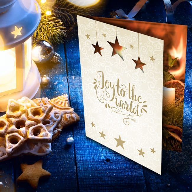
Incorporate cutouts onto your custom holiday business cards for a simple tactile element that packs a big punch. If you want to be more elaborate, you can tie in the background imagery to create a cohesive design between the cutouts and what’s behind them.

For example: have a tree on the front page of your holiday card with small cutouts where lights would go and have a white, gold, or glitter background behind them. Not only will cutouts inspire recipients to open your card up, they’ll also probably also draw them back for a second and third look.

Seal Your Card with a Personalized Touch

personalized holiday card

A custom envelope sticker, sealing wax stamp, or a simple personalized message are all simple ways to go the extra mile and add a touch of luxury to your holiday marketing cards. Think seasonal colors when you’re designing your seal and go with a metallic such as gold or silver or a standard holiday hue like red or green.

Include a Special Gift

While it’s probably not in your budget to send a gift to everyone on your contact list, there is certainly value in sending a gift alongside your seasonal business card to your most important and appreciated clients. Gifts are a welcome surprise to receive, and the bulk packaging they come in will inherently stand out from the other mail that a recipient receives.

It’s also an effective way for you to say “thank you” to those clients who matter most to you. A box of chocolates, artisanal snacks or ingredients, or a customized holiday mug with your brand’s logo on it will all go a long way toward continuing a good relationship when combined with a handwritten holiday card.

Festive Foil

Holiday Foil Cards

Foil designs are particularly well suited to seasonal cards since the holidays are already heavy on shiny metallics. There are several ways to incorporate foil printing into your corporate holiday cards, some more subtle than others. You can use foil for your wording, around the edge of your card, or as your entire background. No matter how little or how much you use, your card is sure to make a major impact.

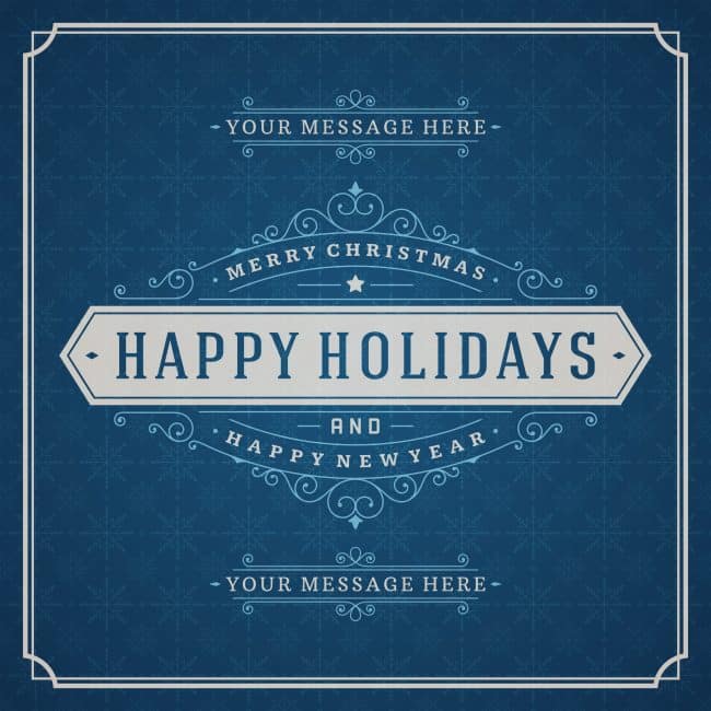
Add a Touch of Vintage

Holiday Greeting Cards

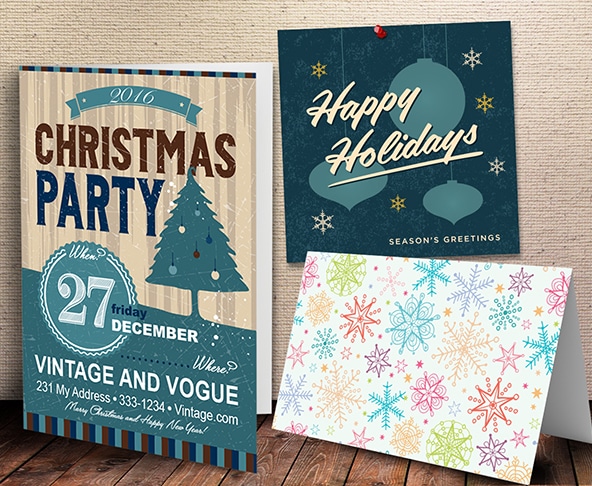
Go old school with your seasonal marketing with vintage-inspired fonts, imagery, and color schemes. The holidays are all about invoking nostalgia, and there’s a strong appeal to designs that bring people back to simpler times. Think muted colors, whimsical fonts, and images long-associated with the season, such as ornaments, snowflakes, or fir trees.

All That Glitters

glitter card with envelope

A sparkling confetti bomb is a unique way to brighten someone’s day, and will definitely make a lasting impression. To make it easy, you can order whatever cards you like and then add in a touch of confetti (sequins or glitter are good choices) on your own.

Do know your clientele, though – this element might not be a great fit for everyone. If your recipients are corporate, they probably won’t appreciate the mess that confetti makes. But if they’re millennials or you’re a kid-focused brand, a rainstorm of sparkles may be a fun and festive addition.

Go Bold with Your Envelope

creative holiday envelope

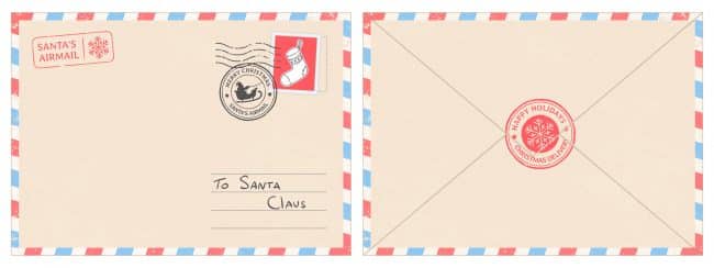
Send your card in a custom holiday envelope worthy of being shipped off to the North Pole. A festive envelope suggests that something equally great is inside, but it also stands on its own, so if you want to keep your card itself simple you’d be fine to do so.

Size It Right

vertical holiday card

Seasonal cards tend to be pretty similar in terms of size and shape. Make yours distinct by choosing a long, vertically-focused card that will naturally stick out from everyone else’s. The objective with your holiday card, aside from sending season’s greetings, is to look for ways to do something different than everyone else.

Take it a step further and ditch the rectangle entirely by making your card a circle, a star, or even a Christmas tree shape.

The Perfect Holiday Business Cards: Additional Tips

Stay true to your brand’s voice. While you can certainly get creative with your design, make sure you’re carrying through your brand’s voice and values with your holiday card, just as you would for any other piece of marketing material.

Consider your audience. Depending on who you’re sending your card to and/or your own company policies, you may want to go the broader “Happy Holidays” or “Happy New Year” route instead of focusing your marketing on a specific holiday like Christmas or Hanukkah. If you don’t, you run the risk of alienating recipients who don’t celebrate the holidays in the same way.

Include a holiday promotion. Give your seasonal card an additional purpose by including a timely promotion with it, such as 10% off a purchase made before January 1. Since the holidays are already a time when people are doing a lot of shopping, it makes sense to let your holiday card do double duty as a promotional tool.

Design your holiday business card today! Speak to a print consultant and get a custom holiday business card that perfectly combines your own style with festive seasonal inspiration.

Learn more and place your order with Printing for Less here.

Need help with your print? Talk to a live print expert today: 800-930-7978.

How to Design Print Materials for Foil Stamping Effects

how to design for foil stamping

Foil stamping is a custom print effect that gives printed materials a metallic effect, and it’s one of the simplest ways to add an elegant touch to everything from invitations and business cards to letterheads and reports.

But what is foil stamping, and how do you design for it?

How Foil Stamping Works

Here’s a basic description of how foil stamping works. First, there are four main items involved:

  • The paper, or stock, your final design will appear on.
  • The die (like a rubber stamp, but made of metal).
  • The dye (if your design includes color).
  • The foil.

Your design is first etched onto a piece of metal called a die. Then, a piece of foil goes between the die and the paper. This is all placed within a hot stamping press, which presses these layers together and creates a metallic stamp on your paper using heat and pressure.

There are many different types of machines that create this effect. Some are manual, while others are automatic or air-powered. Regardless of the machine, the result is a truly stunning effect that highlights a design’s details in a gold or silver metallic patina. You can add colors to your foil, too, if you want to go a step beyond basic metal effects. You can even combine foil stamping with embossing to make the design pop, often with a 3-D effect.

Why Designing for Foil or Metallic Effects Is Important

Designing for foil or metallic print effects requires a bit more preparation than designing for other print effects. Why? There are several reasons. First, certain graphics and font styles will look way better with metallic effects than others. Secondly, foiling requires the printer to create a static, metal stamp (the “die”), that can’t be changed once it’s created. If you have last-minute changes to your design, it can be costly and time-consuming to alter.

That’s why we’re here to share the top best practices for foil designing — to help you or your designer have a smooth experience from brainstorm to final product.

Watch: One of our experts at Printing for Less explains the foil stamping process

foil stamped business cards


A Touch of Class: Hot Foil Design Tips and Tricks

When you’re designing a piece for hot foil printing effects, keep the following items in mind and you’re sure to create an end product that’s both stunning and exactly what you wanted.

Consider the paper type.

To achieve the best finish, foil stamping requires crisp line art. This type of art is more likely to have a consistent, clear result on coated or smooth paper stocks. On the other hand, if you’re using heavy or textured paper stock, your foil design will need to be simpler and larger to produce a high-quality effect.

Adjust the typography.

“Foiling tends to makes type appear a little larger,” says Kristine Neil, owner and creative director of Markon Brands. To make sure your text is easy to read, loosen up the kerning between letters — and increase the leading between lines.

When choosing a typeface, keep the rules above in mind. Scripts are especially elegant when combined with foil effects, but serif and sans serif typography can also look incredible. Pick what suits your brand, and only render in foil the words that are largest and easiest to read.

metallic gold stamping

Go big.

When you’re selecting which part of your design will get the metallic effect, Neil advises you avoid applying it to small details. “Foiling is not a good option for small, intricate or detailed aspects of your designs. Instead, choose larger elements such as just the company name or icon on a business card.”

Some elements that look great in foil include logos, titles, headers, large patterned backgrounds, and contour line illustrations.

Foil stamping design ideas

Get a 3D rendering.

Use the technology available to you to visualize what the end result will look like. If you’re working with a professional designer, ask them to provide a metallic rendering of the final result to make sure you’re getting the effect you want.

Keep it simple!

“The most important thing to remember when designing for print that includes foil or metallic effects is to keep it simple,” says Neil. “These unique finishes not only look better when used judiciously, but the finished print quality is also often much more attractive.”

Keep simplicity in mind when choosing a color scheme and your design elements. Two or three main colors (including your metallic hue) is often enough to lend a professional look without overdoing it.

gold stamping accent effects

If you’re using color or unusual effects, request a proof.

Gold and silver are the most common colors used for foiling, since they give a premium feel to any project. However, there are a variety of alternative metallic colors available — along with pigment and gloss foils for bringing a static design to life.

To make sure your colors are consistent from design to final product, ask your printer to send a proof in advance. This will save both you and your printer time and money.

Get to know your printer.

All printers have different machinery, techniques, guidelines, and limitations for printing foil effects. “The best way to get a high-quality result is to build a relationship with one or two trusted resources so that you don’t end up designing something that your preferred printer can’t produce,” says Neil. Often, you’ll find that having set parameters will actually improve your creative design process rather than hindering it.

Want to learn more about foil stamping and foil effects? Read more about hot foil stamping.

Need help with your print? Talk to a live print expert today: 800-930-7978.

How to Tell if Your Small Business Marketing is Working

how to tell when your small business marketing is working Measuring the effectiveness of your marketing efforts is a crucial but often confusing part of business. This is perhaps even truer for small businesses, where you likely don’t have an entire team devoted to search engine optimization or business analytics.

But small businesses can and should track how well their marketing efforts are working. Here we’ll walk you through some of the first steps you should take, key metrics to look at, as well as how to track them so you can better attribute your successes to your marketing efforts.

Set a Baseline for Marketing Metrics

It is critical to have a clear picture of where you’ve come from.

If you haven’t already, get your website hooked up to Google Analytics (learn how to get started here) so you can start easily tracking growth and regression. Set up a baseline report for:

  • Organic SEO traffic. This measures how many people are finding your site and how they’re getting there.
  • Learn how to set up conversion events – these track important actions on your site such as online purchases, filling out forms, or sharing your content on social media.

If you’re a brick and mortar operation, start tracking foot traffic, looking at your point of sales data (vendors like Square make it easy to pull reports about what you’re selling).

The point is – take your current marketing temperature, that will be your baseline for improvement.

Formulate Regular Reports

Just like it’s crucial to set your business up to be able to visualize trends in your website statistics, it’s also important to regularly write up reports on the results of your marketing efforts. Start sending your team a monthly marketing recap, which details what you worked on, as well as the results of those efforts.

How many website visitors did you have this month compared to last? How many people found your website through organic search this month? How many pages did the average person click on before exiting your site? Were those blog posts you wrote to try to rank for certain keywords found in people’s Google searches? Include screenshots or links to the graphs from Google Analytics for each metric so you and your team can easily visualize the impact. Google Analytics is loaded with tools that make it fast and – somewhat – easy to create reports.

Having a written report where you dive into not only the statistics for your business, but also interpret what you think those trends mean and why you’re seeing them, will help you and your team have a clear picture of where you’re coming from and where you should be heading to reap the most benefit from your marketing.

Track your marketing performance with reporting
A typical Google Analytics dashboard.

Focus on Key Performance Indicators (KPIs)

There are several ways to analyze whether your small business marketing efforts are working, but a few key metrics will give you a good jumping off point. Some of the most indicative are:

Website Visits. This one is pretty straight-forward. How many people are coming to check out your product or service via your website? This metric gives you a good idea of the level of interest your product or service is gaining.

Sources. Just as important as the number of website visitors, is where those visitors are coming from. How did they find you? Was it through keywords they typed into Google? If so, great job! You’re rocking your SEO efforts. Did they find you through social media? Also a good indicator of marketing success.

Be sure to create tracking links for all digital ads and sponsorships you send out, so that you can also see how many people visited your site as a result of those individual pieces.

Bounce Rate. When people land on your website, are they truly interested in your content? Is your site compelling and easy to understand so that people want to click on to another page to learn more?

If not, you might see a high bounce rate, where visitors click out of the page they landed on, without visiting any other pages. If this is happening, consider adjusting your messaging on your website to ensure it’s crystal clear and contains plenty of CTAs and other links to grab visitors and begin pushing them through the funnel.

A high bounce rate can also be a sign that you need to adjust the messaging on your marketing materials. For instance, if your ads or social media content seem to promise one thing, but your website doesn’t mention that right away on your home page, visitors will quickly grow frustrated or lose interest and exit your site. Consistent messaging is key.

Tracking bounce rate.
Here’s what bounce rate looks like in Google Analytics.

Session Duration. You know that cute girl you went on a first date with last weekend? How long did you hang out for at dinner? Did she want to take a stroll with you after you ate, or was she anxious to get home?

Just like the amount of time a date wants to spend with you indicates his or her interest level, so does the amount of time prospects spend on your website. Is your content interesting and informative? Are people finding what they came for (and even better, are they finding more than they came for)? Do they click to the next blog post in the series, or are they just skimming for a few seconds and quickly exiting?

Coupling this metric with your sources metric, you can start to identify which of your marketing channels are resonating with the right people, and which could use some adjusting. You might find that your Facebook ads are getting great engagement and clicks to your website, but those people only stay on your site for a few seconds, whereas prospects that come from your tactile marketing piece are browsing for an average of six minutes, despite similar messaging on both campaigns. If that’s the case, you’ll want to adjust the amount of money you’re spending on social and consider pouring that into another, more successful source.

Assess and Adjust. Now that you have the tools set up to monitor and analyze the results of your marketing efforts, you can identify the areas where they might be falling flat. Once you do, try making small changes at first. Is your messaging just a little too long or confusing? Are your blog titles clickbait-esque and so prospects get frustrated when your content isn’t what they expected to get? Start with small changes and monitor your progress in those monthly reports.

Think Outside the Computer

As a small business, it can be tough to compete with bigger brands online that have more robust budgets and staffing. Combine that with the fact that consumers are over-loaded with digital content — yes, including your ads — and you might find that your marketing efforts aren’t delivering quite the punch you thought they would.

That’s why some of the smartest businesses are turning to direct mail, or tactile, marketing. Delivering a personal touch in the form of a physical mailer or piece of branded “swag” can leave a lasting impression your competition is missing out on.

And don’t fret. You can track the effectiveness of tactile marketing campaigns too with software like Printing for Less’s Tactile Marketing Automation (TMA) software. Even better, you can set up your tactile marketing campaign just like a digital one, where when prospects take a certain action, a send is automatically triggered for the next piece in the campaign. See how it works here.

Need help with your print? Talk to a live print expert today: 800-930-7978.

How to Save EPS Files in Photoshop: Understanding EPS Format

This is the third posting about formats for saving images. We started a couple weeks ago with the Photoshop PSD format. EPS stands for Encapsulated PostScript because it was designed as a way of saving graphics to be used with PostScript printers. However, today the format is showing its age because it doesn’t support a lot of the features which we can create in Adobe Photoshop –for example, layers, transparency, Smart Objects, etc.

Notice in the dialog box below that when I save a layered file with transparency, I see an alert icon in the Save As dialog box, and the notice that the “File must be saved as a copy with this selection” because data will be lost.

This is not a good format for non-PostScript printers (for example, inkjet printers) because these printers can only print the low-resolution preview.

eps format save as

Traditionally, EPS was the format used to save silhouetted images with a clipping path, and was used to save multitone images (duotone, tritone, or quadtone). However, the native Photoshop format can save all of those things so there are generally no advantages in saving as EPS to do those things.

Photoshop EPS format can also save vector data like type or vector shape layers. The vector data will be sent with sharp edges to a PostScript printer. However, if you try to reopen the EPS file in Photoshop to data will be re-rasterized so will become soft, not sharp.

When you save as Photoshop EPS, you have the options shown below. The Preview option chooses how you create a low-resolution preview that is used for viewing or printing on non-PostScript printers. Encoding determines the way the data is delivered to the PostScript printer. (If your commercial printer asks for this format, ask which option works best with their PostScript processor.) The defaults work in most cases.

Need help with your print? Talk to a live print expert today: 800-930-7978.

Get Professional Print Design Help

Why the Font Should I Care?

Why the Font Should I Care?

Sometimes an idea is great enough to rise above even the worst presentation.  For all other ideas no pictures, poor grammar, or a bad font can lose your audience before you even have a chance.

In the span of human history, few things have truly changed our culture more than the invention of the written word.  And ever since then we have struggled to bring to our writing the same meaning and emotion that we are able to breathe into words.  This is just as true when we are pouring our hearts into a personal blog, as it is when we are writing our brand promise on a company brochure.  Our business is our livelihood. Our business fuels the most important things that we need as humans: a meal to eat, a place to rest and a means to participate in the world around us.  

So when it comes to putting cursor to webpage, or printing press to paper, every choice that we make matters to our message.  There are so many of these decisions that we make while speaking that don’t even register to our conscious brain. The way we move our hands.  The way that we angle our head slightly to maintain eye contact. The gleam in our eye as we get into an exciting topic. How do we put that into a written piece?

Part of the secret is in the font choice.

The Power of Font

Research tells us that fonts can drastically change the way readers react to your writing.  A 2012 New York Times study by Errol Morris found that using Baskerville font lead to a 1.5% increase in readers believing a false scientific report over five other fonts.  Serif fonts, those with the ‘tails’ and ‘feet’ on the ends of letters, have been used in scientific and professional reporting since printing began. Baskerville has a classic, reliable look that breeds confidence.  

The Internet went into hysterics when CERN, the European Organization for Nuclear Research, announced the discovery of a new subatomic particle in a press release using Comic Sans.  If CERN had a marketing department they would have been nominated for awards based on the coverage from that release. There was even a Change.org petition to change the name of Comic Sans to Comic Cerns.  You can’t buy coverage like that.

So how do you choose what font will best represent your message?  While there are no clear rules to follow, a few guidelines can help add nuance to your writing.

To Sans, or not to Sans?

The Serif, also called Roman fonts, have small projections on the ends of most letters.  Serif fonts are some of the most recognized because of their early use in print. Serif fonts convey credibility, professionalism, and academic integrity. These fonts are easily recognizable, especially in print, because they created the standard.  

Sans-Serif fonts have none of the projections and are sometimes referred to as Grotesque or Gothic fonts.  These letters give a cleaner, more modern look and are usually easier to read in long paragraph formats.

Script fonts mimic cursive letters.  You can tell a story of class and elegance, quality and royalty using a script font.  They can be difficult to read in long sentences or paragraphs.

Display fonts are the strange ones.  Marquees, Old Western, Ransom Note. Used sparingly, these fonts can create an instant connection before the reader has even acknowledged what the words say.

Choose Colors Wisely

Contrast is an important element in print and on the web.  Bold color can draw attention to a line of text, but be aware of background images and color.  It is also worth remembering that 8-15% of people are colorblind and unable to differentiate certain hues next to each other.  

So Why the Font Should I Care?

All of your choices are important when creating your brand, and font choice allow you to bring the reader into your story without saying a word.  If you would like help crafting the perfect look for your story, Printing for Less’s design and print team have the experience and knowledge to make it happen.

Need help with your print? Talk to a live print expert today: 800-930-7978.


Be Seen: Signage Design Done Right

Need to get your small business out in the open? Signage — indoor and outdoor— is a great way to get your message out there. But where do you begin? The options and best practices may seem overwhelming. But we’ve been helping people get their ideas printed, so let us help you! Ready to turn some eyes your way? Let’s begin your signage journey.

Signage for Different Occasions

First things first: be clear on your needs. There are different signs for different purposes and occasions, not to mention marketing purposes, so let’s break them down:

Brand Awareness: Need to get your logo and tagline known? Banners, posters, yard signs, car magnets and flags are a surefire way to get your contact details, information, branding, or anything else you need, out in the open.

Outdoor Events: Festival goers and craft fair mavens need to know how to get to your goods! Arrows, signs, banners and flags can help attract the attention of potential customers.

farmers market

Trade Shows: Prepping for an indoor event? We can help you choose the best table tents, banners, foam boards and branding details with ease.

It’s a Sale! Estate, yard, liquidation sales and more. People won’t want to miss out on your mega deals when they can see them advertised!

Window Displays: Posters and decals help attract extra attention and spread your news.

Consider the Details

Now that you know what kind of signs you need, think about how and where they’ll be used. For instance, an outdoor sign in Florida needs to not bleach out in the sun, whereas a sign outside in Montana needs to stand strong against wind and snow. Where is the sign going to be physically placed? Size up and down, with respect to your messaging, appropriately.

outdoor signage

Do your signs need to tie to a pole or trees? Does it need to be free-standing? Does it need to be tied down some other way? Think the physical details through before you head over to design and get it all laid out.

Get That Sign Designed

You know what you want and you know what your signage needs to stay in plain sight. Now it’s time to get your idea into its visual shape. Here are some tips to get you started, straight from our design expert’s mouths:

  1. Wise Typography Wins: Use big, bold fonts to capture attention. Fonts with elegant, thin lines are hard for the eye to immediately recognize and understand.
  2. Keep it Simple: Big signs are not meant for complex messaging. Keep your ideas boiled down to the fewest possible words and symbols. The longer details belong on printed pieces that are closer to people’s eyes and that can home with them, like brochures, one-sheets and cross foldes.
  3. Be Eye-Catching: High color contrast is hard to miss. If your logo is a dark color, go for a light background. Keep the sign’s location in mind too– don’t use dark shades in a shady area, or for instance reds against a brick wall!
visitor and service parking entrance sign

  1. Learn Substrates: Will there be glare? If so, avoid glossy finishes. Matte finishes work best in brightly lit spaces.
  2. Vector logos only: You need your artwork to be scalable, and a fixed, flat image file won’t work. Go for as high-resolution as possible, always. A file can always be scaled down, but not up, and keep its clarity. We gladly accept virtually every Mac & PC file format, including any version of:
  • Adobe: Acrobat, FrameMaker, Illustrator, InDesign, PageMaker, Photoshop
  • Apple: Works
  • Broderbund: The Printshop, version 15
  • Claris: Works
  • Corel: Bryce, Draw, Lotus, PhotoPaint, Quattro Pro, Ventura, WordPerfect
  • Deneba: Canvas
  • Macromedia: Fireworks, Freehand
  • Microsoft: Excel, Home Publishing, PhotoDraw, Powerpoint, Publisher, Word, Works
  • Quark: Xpress
  • Serif: DrawPlus, PagePlus, PhotoPlus
  • Also: .EPS, .JPEG & .TIF files

Need help with your print? Talk to a live print expert today: 800-930-7978.

  • « Go to Previous Page
  • Page 1
  • Interim pages omitted …
  • Page 23
  • Page 24
  • Page 25
  • Page 26
  • Page 27
  • Interim pages omitted …
  • Page 48
  • Go to Next Page »

Footer

Printing for Less

info@printingforless.com
100 P F L Way, Livingston, MT 59047

800-930-2423

  • Home
  • Products
  • Services
  • Industries
  • Get Printing Samples
  • Direct Mail Marketing Resource Center
  • Printing Resource Center
  • Blogs
  • Templates
  • Terms & Conditions
  • Contact
  • About Printing for Less
  • Careers
  • Login

Copyright © 1998-2026 PrintingforLess.com. All Rights Reserved.

logo
  • 800-930-2423
  • Products
  • Direct Mail Marketing
  • Services
  • Industries
  • Direct Mail Marketing Resources
  • Printing & Mailing Resources
  • Get a Quote
  • Contact Us
  • My Login
Direct Mail Delivery
This field is for validation purposes and should be left unchanged.

Get 20% Off*

Your First Print Order

Name(Required)

*By subscribing, you agree to receive weekly emails from Printing for Less. Some exclusions apply. See details.