Custom Size Brochure Design Analysis
Power in a small package - Using few words, this 5 x 20 inch brochure says plenty
Beware of False Axioms
We've all heard the axiom, "less is more." Of course this advice wouldn't apply if we were to follow it when pouring a foundation for a house. But when it comes to this
Timothy Faust Photography brochure, the axiom most certainly holds true.
Faust was able to use his magnificent photos to convey a message of quality, class, brilliance, professionalism, emotion, excitement, and beauty. Only about 130 words were used in the whole brochure - that's it. Nevertheless, the impression conveyed is unmistakable.
Target
Timothy Faust Photography is a destination wedding photography company that focuses on brides getting married in outdoor settings with nature as a backdrop. They travel world-wide to serve their clients, and they've photographed weddings in Colorado, Washington DC, Las Vegas, Oregon, Nepal, Beijing, and the Grand Canyon in Arizona.
Appeal
Potential clients of Timothy Faust Photography want to picture themselves in surroundings similar to the one they'll be in at their wedding. In this brochure, the designer mixed dramatic outdoor images with traditional tuxedos and wedding gowns to give potential clients a feel for what they can expect. High quality is very important here. Remember, we are talking about weddings.
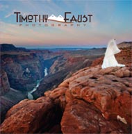
- Breathtaking image on cover - The contrast of a bride in her wedding gown standing on the edge of a precipice in the Grand Canyon overlooking the Colorado River is striking. While it grabs your attention, the image also speaks directly to the customer by combining a dramatic landscape with a bride in a traditional white gown.
- 80# dull matte cover stock - The thickness of this paper expresses quality when handled, and the dull matte finish offers little distraction to the images due to reflection.
- Font - The designer chose a century gothic typeface. Century gothic gives the brochure an up to date, clean look, and it goes well with the natural settings in the photos.
Attention Directors
The designer employed several techniques to help keep the reader's interest through the whole piece.
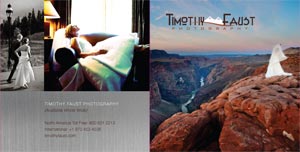
- Fold - The double parallel fold used in this brochure leads the reader through a set of images and helps the reader to follow a story. The reader here is taken through many different settings and poses that she may find herself in, and each flip of the brochure unfolds a different romantic tale.
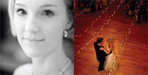
- Contrasting images - You may ask, "What place does a soft, warm close-up of a bride's face or a bride relaxing on a couch have in a destination wedding brochure?" These images give the reader a sense of peace - the bride is not worried about her wedding, she's enjoying it. She's certainly not worried about the photographer.
- Format - The smaller size of this printed brochure (5 inches high by 5 inches wide when folded) allows the piece to easily fit into a purse.
Motivators
The only contact information the designer placed on the inside of the brochure is the company's website. By encouraging the prospective customer to visit the site, she can continue the story started by the printed piece.
Summary
Many marketers believe that people today don't read, but this isn't true. They do read, but only when they need to or want to. When preparing your brochure copy, remember the cardinal rule of good writing; if you can say the same thing with fewer words, say it with fewer words.
Timothy Faust Photography shows that with little words you can still convey a powerful message.
So be judicious in your word usage, and when it comes to your next brochure printing project, think "images add power, words can sour."
The different panels showing the nice design layout.
Back and Front Covers
Inside spread on first unfold

Inside when fully unfolded
Need help or advice on a brochure design?
Give our helpful experts a call at 800-930-2423.
More helpful brochure printing, design and marketing resources:
