It's Right. It's On Time. Or It's FREE!
- Expert Help on all Your Projects
- High Quality and Fast Turnaround
- 100% Satisfaction Guarantee!
Custom Brochure Design Analysis
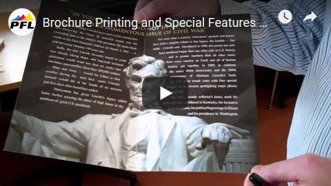
President Lincoln's Sesquicentennial Brochure
To celebrate the sesquicentennial anniversary of our 16th president's first inauguration, Louisiana numismatist and Lincoln enthusiast Paul Hollis mailed a custom designed and printed brochure along with 4 commemorative pennies to youth across the nation. His goal was to honor Lincoln's achievements and educate recipients about the meaning of the new designs on the back of four pennies struck by the U.S. Mint in 2009.
Target - Since the intent of the mailing was not sales oriented, but rather educational and dedicatory, Hollis' brochure doesn't have a traditional "hook" or "call to action." In fact, he knew that the people receiving his mailing were not rare-coin collectors and highly unlikely to ever become customers. With this in mind, the brochure needed to appeal to a very broad, almost universal American audience. He felt strongly that the brochure be family oriented as well.
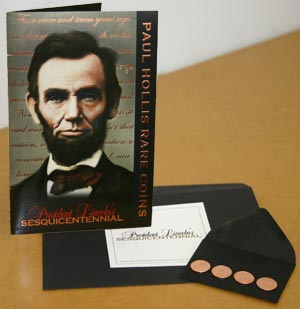
The brochure, mailing envelope, card, and special commemorative coins made up this awesome piece.
Appeal - With the beloved 16th president as the focus of the piece, it was important to present a kind, family friendly image of Lincoln. The designers also wanted to have a subtle patriotic appeal - not a direct, aggressive patriotism, but rather a hint towards the love of a unified America that Lincoln bore. The design elements incorporated in the brochure to stimulate these emotions were:
- A "softened" colorized image of Lincoln on the front. Due to the style of portrait photography during Lincoln's time, along with the pressing, weighty issues he was dealing with, many photos of Lincoln can give the president a harsh, almost unsettling quality. To soften the image and to add a "kind" family appealing effect, a famous 1863 image of Lincoln was colorized and a copper metallic Pantone ink was added for warmth and depth and to associate the image with the Lincoln cent. A dull matte varnish was also added over the image for emphasis or "draw."
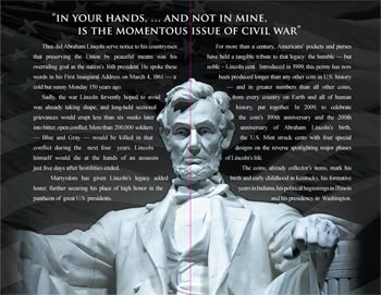
- Subtle flag in background on inside of brochure. To evoke patriotic feelings in a gentle, subtle way, a faint image of an American flag was placed behind the Lincoln memorial statue. The stars on the flag were covered with a clear foil to raise awareness of the flag.
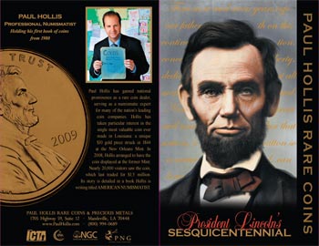
- Credibility factors were added. Credibility factors are important when printing any brochure with a message - even when it doesn't involve sales. To add trustworthiness and confidence to his content, Hollis used logos from authoritative independent numismatist organizations printed with a gold spot color. Additionally, he added detail about his own background to lend authority to the message.
Attention Directors - We previously mentioned a few printing and design techniques that were used to draw attention to objects or messages on the brochure, such as the foil stamped stars and Pantone highlights of Lincoln's image. Other techniques used in this brochure were:
- Use of copper foil on text. Copper foil stamping was used to help the reader tie the man and his message to the representative coins.
- Custom printing effects used on back cover penny. The penny itself was printed in CMYK colors, but to truly draw attention to the penny and leave the reader with this lasting image a special black ink chosen and mixed by the press manager was applied around the edge of the coin. A clear foil was then applied to the penny to help it further stand out and add a 3 dimensional effect.
- Clear foil vs varnish. Often people ask, "Why not use a less expensive clear varnish instead of a clear foil?" From experience we've learned that the foil stands out more than spot varnish, and customers almost always prefer clear foil. The differences are clear to see on this piece, since both a clear varnish and clear foil stamping are used on the same brochure and can be easily compared.
Both sides of the half fold brochure listing the custom printing options
Front and Back Panels
clear and gold foil stamping, blind embossing, Pantone 873
spot dull varnish, spot gloss varnish,
Inside Panels
silver foil stamping, clear foil stamping,
custom Pantone black ink
Motivators - Paul Hollis wanted to share his interest in coins with youth across America. A greater public awareness of Lincoln's life and the association of those events to the coin were the motivation behind this brochure. If you ask him, he'd probably tell you that if the readers of his brochure were motivated to consider the virtues of Lincoln more thoughtfully when looking at a penny, then his brochure would be considered a success.
Conclusion - Creative brochure printing as art. This brochure is moving and visually appealing, combining many advanced printing effects to accomplish its goal. Pieces designed this well are rare, and we love having the opportunity to review what is truly a special work of art.
Need help with a custom brochure design?
Give our helpful experts a call at 800-930-2423, or
Video of the custom brochure printing effects
More helpful brochure printing, design and marketing resources:
PFL is a marketing technology company that provides printing, mailing, fulfillment, and marketing automation services to over 200,000 businesses from startups to the Fortune 500. Our 100,000 sq. ft. state-of-the-art facility provides a one-stop shop for all your company's needs, from marketing advice, design services, sustainable print and mailing solutions since 1996. Our highly qualified team of 300+ employees deliver exceptional print quality with award-winning customer service backed by our A+ BBB rating and 100% satisfaction guarantee.