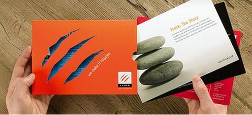
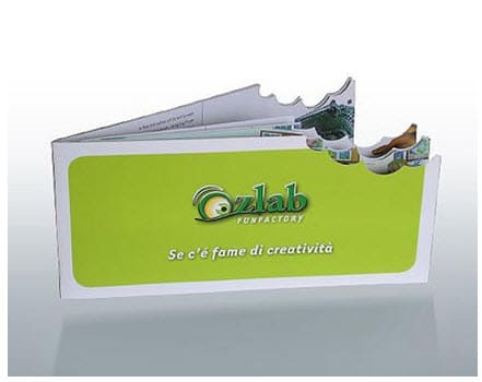
Check out the Accordion Fold Brochure Printing for Less printed for the Town Green of Maple Grove, Minnesota!
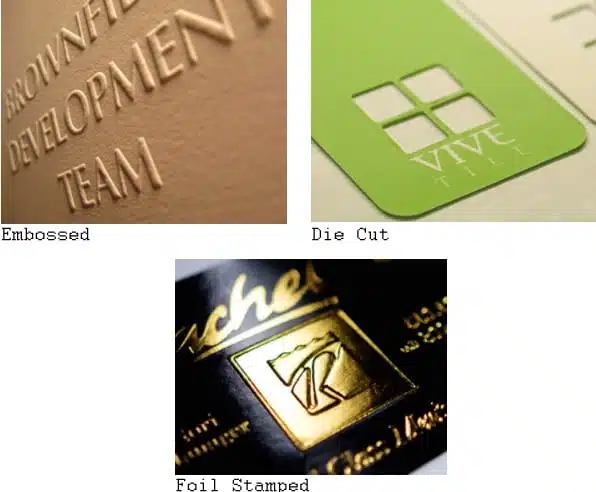
When you’re designing print marketing materials, it’s essential to stand out from the crowd. A popular and effective way to accomplish this is through custom design work; such as embossing, foil stamping, and die cutting.
While custom work will get you a dazzling and unique project result – it does tend cost a little more…
The cool thing about the Accordion Fold Brochure Printing for Less printed for Town Green, is the cutting or “trimming” used to enhance its shape.
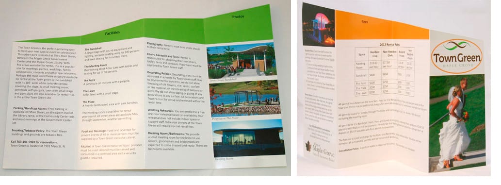
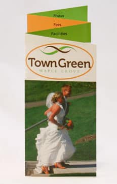
This diagonal cut across the top of the unfolded brochure, results in a layering effect when it is folded.
The layering has a similar effect of a more complex custom die cut; but because the cut is a straight line, and not a unique shape – it can be produced at a much lower cost!
Need help with your print? Talk to a live print expert today: 800-930-7978.