• Skip to primary navigation
  • Skip to main content
  • Skip to footer
Printing for Less

Printing for Less

At Printing for Less, we've offered high quality online printing services since 1996. Shop business cards, booklets, stickers, and more!

P F L.com
My LoginMy Login
800-930-2423
  • Printing
    • Postcards
    • Business Cards
    • Catalogs
    • Brochures
    • Folders
    • Letters
    • Newsletters
    • Envelopes
    • Greeting Cards
    • Print Templates
    • All Products
  • Direct Mail
    • Why Direct Mail Marketing?
    • Every Door Direct Mail® Postcards
    • Direct Mail Letters
    • Catalogs & Booklets
    • Marketing Gifts & Kits
    • Direct Mail Automation
  • Services
    • Mailing Services
    • Design Services
    • Custom Printing Services
    • Reseller Program
  • Industries
    • Advertising & Design
    • Enterprise
    • Food & Beverage
    • Healthcare Payers
    • Healthcare Providers
    • Nonprofit
    • Real Estate
    • Retail
    • Technology
    • University
  • Resources
    • Direct Mail Marketing
      Resource Center
    • Printing Resource Center
    • Blogs
    • Templates
    • Video Library
    • Have a Question?
  • Get Samples
  • Holiday Shopping
  • Get a Quote

Blog

Examine Your PDFs with Acrobat’s Output Preview

Output Preview is a convenient Adobe Acrobat tool which helps you visually troubleshoot your PDF files before they go to print.

Output Preview will display content selectively, based on whatever options you choose through the Output Preview dialog. Visual troubleshooting can be a quick and efficient way to identify the biggest potential problems in the way of a perfect print job. You could also generalize and call Output Preview the best way to “soft proof” a document — to see an approximation of what it will look like once actually printed.

What issues can Output Preview help you identify on the spot? Identifying RGB images, spot colors, and overprinting are just a few areas where this tool excels.

And what won’t Overprint Preview identify? Things that aren’t apparent at a glance, such as issues with document size, resolution of images, and file or font embedding problems. You can dig a little deeper in the dialog box, especially with the Object Inspector (which we’ll cover below), but it’s a way for you to do your own super-sleuthing as opposed to having error boxes pop up and highlight where you might want to start looking.

Look at it like a self-directed investigation, versus red flag chasing.

Exploring the Output Preview Dialog

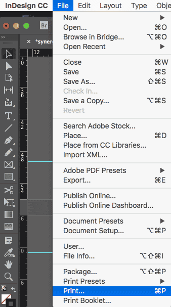
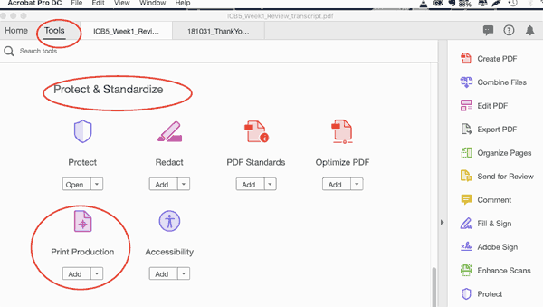
Open the Output Preview dialog in Adobe Acrobat Pro in order to view all available visual preview options. To get there, click on the “Tools” tab, then scroll down to “Protect & Standardize,” then finally click on “Print Production.”

protect and standardize dialog

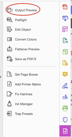
In the right-hand pane, click “Output Preview.” (Note: Because this is a visual preview, you’ll be responsible for noticing any oddities or errors, and digging deeper as necessary.)

output preview

By making various selections from the “Show” dropdown, you’ll be able to choose what (if it exists in the document) will display on your screen.

output preview show all

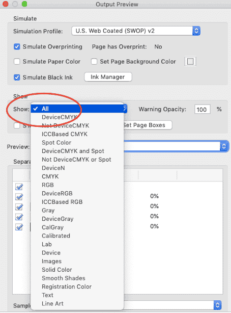
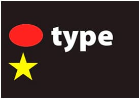
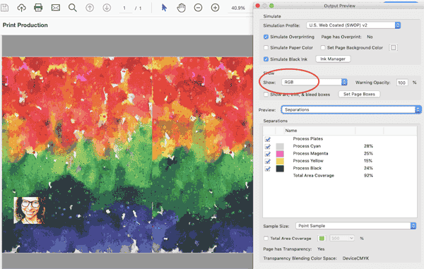
For example, by choosing “RGB” from the “Show” dropdown menu, we see that three images in the document are in RGB color space and will need to be converted to CMYK for printing.

output preview rgb

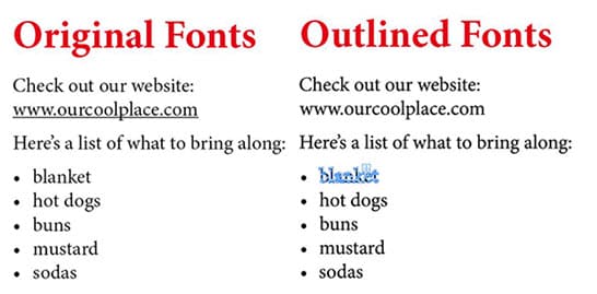
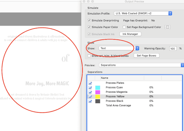
By selecting “Text” in the “Show” dropdown, you’ll see only the text throughout the document. (The text in this example only looks faded because it’s white text in the final piece.)

output preview show text

Color Separations with Overprint Preview

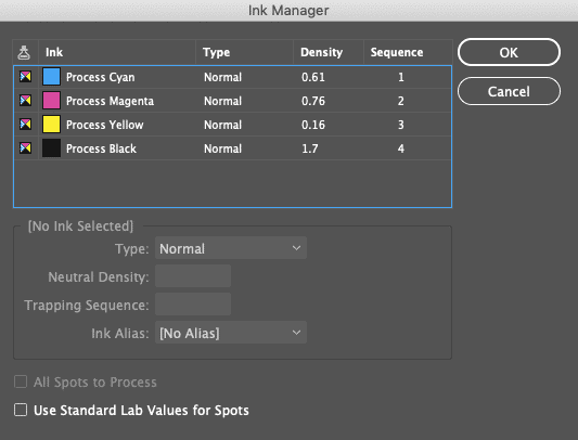
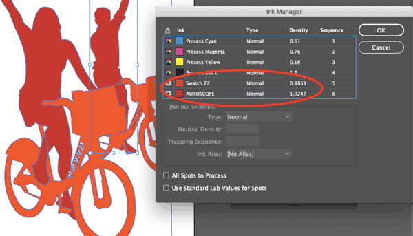
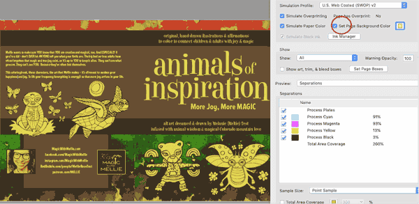
Acrobat can also help you preview color separations from within Overprint Preview.  To get there, choose “Separations” from the “Preview” dropdown menu in the center of the dialog box. (image: separations.png).

You will then see all of the inks required in order to print the currently open PDF. For most documents, you’ll usually see the four basic process plates (which are called “separations”): cyan, yellow, magenta, and black.

You can play around a bit in this dialog by checking and unchecking the boxes next to each color; each time you check or uncheck a box, you’ll be given a visual preview of what the document would look like if that color were either removed or included. You can keep the process color plates checked and click anywhere on your document to see what percentage of each process color will be printed in that spot.

You can also uncheck all the boxes for cyan, magenta, yellow, and black to show only imagery in your document which uses spot colors.

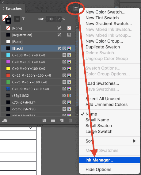
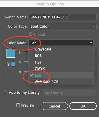
Correcting Spot Colors in Adobe Acrobat Pro

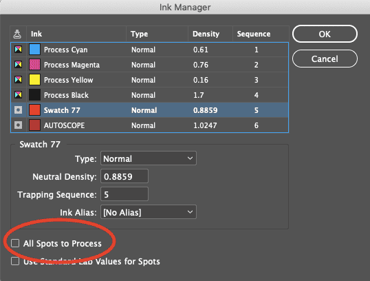
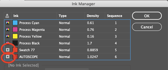
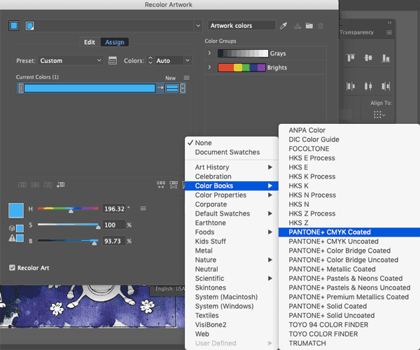
Speaking of spot colors, Adobe Acrobat Pro offers convenience in this area. You can actually correct spot colors right from inside Adobe Acrobat instead of having to go back, reopen, and edit within your original application! Print Production Tools Ink Manager to the rescue!

The Ink Manager can map one spot color to another. Here’s how: take a look at the list of incorrect spot colors (or correct spot colors if you’ve simply changed your mind and want to re-map). Select one, and then while it’s selected, choose the correct spot color from the Ink Alias list at the bottom of the dialog box. All of the objects which use the first spot color will then automatically be re-mapped to output in the right color (or new color, if you’re making an arbitrary change) on the right plate.

Soft Proofing with Simulation Profiles

The Simulation Profiles in Adobe Acrobat Pro’s Overprint Preview can help you ”soft proof” your document for a variety of scenarios. It give you an idea of what your document would look like when printed on different types of paper stock (including colored papers), or even on a different colored background.

As you change the Simulation Profiles in Output Preview, you’ll notice color shifts in your document on the screen. Adobe Acrobat is using the display on your screen to approximate what your printed document will look like.

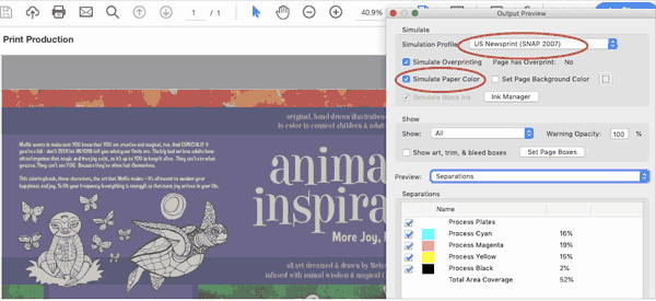
For example, you can see how muted this colorful print piece would be if printed on newsprint instead of white paper stock by choosing the “US Newsprint (SNAP)” Simulation Profile, then checking the box for “Simulate Paper Color.”

newsprint simulation profile

You could also see what would happen if you printed your piece on yellow paper or cardstock by clicking the colored box to the left of “Set Page Background Color”, then using the RGB sliders to choose your desired color.

background page color

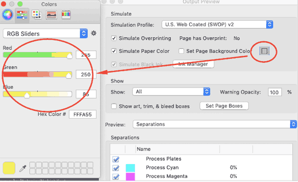
Then, when you’ve chosen your background color, you can check the box to the left of “Set Page Background Color” to see what the output result would be. Here’s what this piece would look like if printed on yellow stock:

set page background color

While it could be fun to play endlessly with different combinations of printers, papers, and background colors, the point is to choose the output device that matches what your printer will actually be using. Not sure? Just ask your printer what their specifications are, and what profiles they’ll be using.

Note that in order for the Simulation Profile to accurately display your monitor must have been calibrated, and you must have accurately calibrated ICC profiles. Without calibrating both your monitor and the ICC profiles, the simulation can’t accurately match the printed PDF.

Exploring Acrobat’s Output Preview Object Inspector

The Object Inspector, just like Separations Preview, is part of Overprint Preview. The Object Inspector will display everything that’s true about the content in the location you click on your PDF document. The Object Inspector provides details on everything from color space to image resolution to fonts, and more.

You can access the Object Inspector from Overprint Preview. Choose the “Preview” dropdown and then select “Object Inspector.”

object inspector dialog

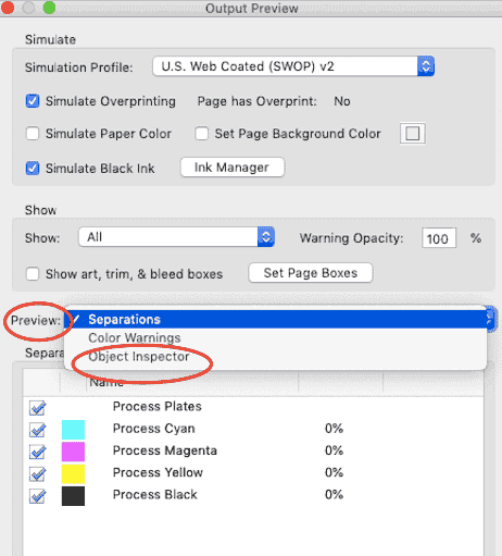
Don’t be frightened by the empty Object Inspector window. By default, Acrobat’s Object Inspector won’t have any details to display until you manually select something on the page. You’re given crosshairs, so you’ll hover over your document and click on the object you’d like to inspect. Once you do, you’ll see the window populate with a list of information.

object inspector settings

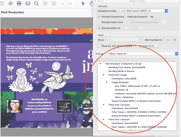
This list documents everything that’s happening underneath wherever you clicked; it’s like taking a spot sample of all the layers that exist (or slicing a layer cake. Yum). You may see information about the color space, blending mode and live transparency, size and resolution of an image, font details, and overprint information.

How is this helpful and how can you avoid overwhelm? Let’s say you print your document and an image comes out pixelated. By using the Object Inspector in Overprint Preview, you can visually select what printed incorrectly, and find out why. Perhaps it was a resolution issue, or had to do with live transparency? Using this tool is a great way to troubleshoot — and manage your own expectations (or those of a picky client) before your file gets in your printer’s hands.

Want help printing your next project? Printing for Less’s print consultants will help you get your ideas into stunning print. We’re here 8am-5pm MT Monday through Friday at (800) 930-7978.

Get Professional Print Design Help

Brochure Designs that Inspire

Capturing the attention of potential customers has become more challenging than ever. However, one traditional tool that still holds immense power is the humble brochure. Creating brochures with eye-catching designs, help captivate audiences and leave a lasting impression on behalf of your business or brand.  

From clever color combinations and typography choices to striking imagery and innovative layouts, we delve into the key elements that make a brochure appealing. Discover brochure designs that unlock the potential of this versatile marketing medium as a means to make your business stand out. 

Best Practices for Creating a Brochure 

While there are a number of ways to capture the attention of brochure recipients via design, it is first crucial to understand the basics of using a brochure for marketing. Our best practices include: 

1. Know Your Audience  

Understand your target audience’s preferences, interests, and demographics. Tailor the design, language, and imagery to resonate with their needs. This will help you create a brochure that connects with them on a personal level. 

2. Visual Storytelling  

Use compelling visuals to tell a story about your business or brand. Incorporate high-quality images, illustrations, or infographics that convey your message effectively. Visual storytelling can engage readers and leave a lasting impression. 

3. Consistent Branding  

Ensure your brochure aligns with your overall brand identity. Use consistent colors, fonts, and design elements to reinforce your brand image. This creates a cohesive and professional look, reinforcing brand recognition and trust among your audience. 

4. Simplicity and Clarity  

Keep the design clean and uncluttered to avoid overwhelming readers. Use white space strategically to give the content room to breathe. Breaking information into easily digestible sections with clear headings and subheadings will also enhance readability and make your brochure more user-friendly. 

5. Unique Formats and Finishes  

Experiment with different formats and finishes to make your brochure stand out. Consider using tactile elements that create a sensory experience. These unique touches can pique curiosity. 

These best practices can create a unique brochure that grabs attention, communicates effectively, and leaves a lasting impression on your audience.  

Remember to stay true to your brand while pushing the boundaries of design to create a remarkable print experience. 

Why Should My Business Create Brochures? 

Choosing a brochure over other types of printed media offers distinct benefits for clients seeking effective engagement. Here’s why a brochure can be a valuable choice: 

1. Comprehensive Information  

Brochures provide ample space to showcase detailed information about your business, products, or services. Unlike smaller print materials like flyers or business cards, brochures allow you to delve into the specifics, highlighting key features, benefits, and testimonials. This comprehensive approach helps clients present a complete picture of their offerings, answering potential customer questions, and boosting brand confidence. 

2. Tangible and Portable  

A brochure offers a tangible, physical form that clients can distribute directly to their target audience. Unlike digital advertisements that can be easily overlooked or forgotten, a well-designed brochure can be carried, shared, and referenced at any time.  

3. Visual Impact  

Brochures provide a canvas for captivating visuals. This allows clients to showcase their brand identity or services in a visually engaging and memorable way, while reinforcing their unique selling proposition. 

4. Credibility and Professionalism  

A professionally designed brochure exudes credibility and enhances the perception of a client’s business or brand. It demonstrates a commitment to quality and attention to detail. When compared to digital marketing alone, brochures can convey a sense of permanence and legitimacy, establishing trust in the eyes of potential customers. 

5. Targeted Marketing  

Brochures offer a focused approach to marketing by enabling clients to tailor their content to specific audiences. By strategically choosing the distribution channels and locations, clients can reach their desired target market directly. Brochures can be displayed at events, mailed to targeted prospects, or distributed in high-traffic areas, ensuring that the right message reaches the right people. 

Brochure Design and Formatting 

So just how exactly can brands push the boundaries of design? Here are a few examples.  

1. Die-Cut Shapes  

Instead of a standard rectangular brochure, you can opt for die-cut shapes that align with your brand or the theme of your content. For instance, if you’re promoting a surf school, you could have a brochure shaped like a wave or a surfboard. This adds visual interest and makes your brochure more memorable. 

2. Embossing and Debossing  

Embossing involves raising certain design elements or text on the paper, creating a three-dimensional effect. Debossing, on the other hand, involves pressing the design or text into the paper, creating an indented effect. Both techniques add texture and a tactile experience to your brochure, making it visually appealing and engaging to touch. 

3. Spot UV Coating  

Spot UV coating involves applying a glossy, raised coating to specific areas of the brochure, creating contrast and highlighting certain elements. This technique can be used to enhance logos, headlines, or other important details, giving them a luxurious and eye-catching appearance. 

4. Folded Panels and Inserts 

Instead of a standard bi-fold or tri-fold brochure, you can explore more intricate folding techniques to create unique panels or inserts. For example, a gate-fold brochure opens up like two doors, revealing a central content area. This adds an element of surprise and interactivity to your brochure. 

5. Specialty Paper and Finishes  

Consider using specialty papers, such as textured or metallic paper, to add visual interest and a premium feel to your brochure. You can also explore additional finishes like foil stamping, which involves applying metallic foil to specific areas. 

The key is to think creatively and align your choices with your brand and the message you want to convey.  

Businesses that Should Try Brochure Marketing 

A wide range of businesses can benefit from sending brochures to potential customers. Here are a few verticals where Printing for Less customers have seen success. 

  • Tourism and Hospitality: Hotels, resorts, travel agencies, and tourist destinations can showcase their amenities, services, and attractions through brochures while also highlighting scenic locations or impressive accommodations.  
  • Real Estate: Brochures are effective for real estate agencies looking to market residential or commercial properties. Brochures can provide detailed property descriptions and floor plans. 
  • Education and Training: Businesses in the educational space can use brochures to present their courses, faculty, facilities, and success stories. Brochures can help prospective students and parents understand the educational opportunities available and make informed choices. 
  • Healthcare and Wellness: Hospitals, clinics, wellness centers, and healthcare providers can utilize brochures to educate potential patients about their services, specialties, and treatment options. Brochures can help build trust in a vertical where trust is essential. 
  • Event Management: Brochures can highlight event details, schedules, speakers, and exhibitors, enticing potential attendees and sponsors to participate. 
  • Nonprofit Organizations: Nonprofits can leverage brochures to create awareness for their projects. Brochures can convey the impact of their work, share success stories, or provide information on how people can get involved and donate. 

These are just a few examples, but in general, the versatility and customization options of brochures make them suitable for a wide range of industries. 

die cut insert brochure
ozlab fun factory die cut
custom die cut brochure

Fix Spot Color Issues in InDesign with the Ink Manager

Printers continue to report an epidemic of spot colors being specified in documents when they really just need to use process inks. If you’d like to avoid this mistake (and save your printer some frustration), do your printer a favor and thoroughly check over your spot and process colors. Make use of the Ink Manager each and every time you’re prepping your files for print so that you can find any formatting mistakes before your printer does.

Getting to the Ink Manager in InDesign

The easiest way to access the Ink Manager in InDesign is through the swatches palette. (If you haven’t opened the Swatches palette yet, go to Window → Color → Swatches or just hit F5.

InDesign Color Swatches

Click on the hamburger menu in the top right of the palette, and go down to “Ink Manager.”

ink manager color swatches in InDesign

If you don’t want to open the Swatches palette, you can also access InDesign’s Ink Manager in four other places: in the Separations Preview panel, in the “Export PDF” and “Export EPS” dialogs, and in the Print dialog box.

  • From the Separations Preview panel (Window → Output → Separations Preview), click the hamburger icon and select “Ink Manager.” (image: ink_separationspreview.png)
  • From the Export PDF dialog (File → Export → File Format: PDF → Save), select the “Ink Manager” from the Output tab. (image: exportPDF_inkmanager.png)
  • From the Export EPS dialog (File → Export → File Format: EPS → Save), select the “Ink Manager” from the Advanced tab. (image:exporteps_ink.png)
  • From the Print dialog (File → Print → Printer: Postscript File), select the “Ink Manager” from the Output tab. (image: print_inkmanager.png)

Regardless of how you get there, here’s what you’ll see when you launch the Ink Manager. You’ll see the four process inks listed at the top, followed by any spot colors. In this example, there aren’t any.

InDesign ink manager dialog


Check Your Inks in InDesign

The Ink Manager shows you all of the inks in your document. Not just the swatches — specifically, the inks. Which means each color in this list has been set to use a completely unique ink, versus a blend of the four traditional process inks. Which means each “ink” is going to generate its own plate when you print the color separations. And extra inks/plates run up your costs when you’re printing commercially.

Now, if you’ve got the budget for extra plates and you have a need for extra and specific inks to get an exact color match, then go ahead and have fun! But printers have noticed that most designers don’t actually need all the unique inks they’ve specified (which appear as spot colors in the Ink Manager list).

So, what should you do if the Ink Manager has identified a number of spot colors that don’t actually need to be spot colors?

You can convert spot colors to CMYK, which are also called process colors!

How to Convert Spot Colors to CMYK in InDesign

In this image, you’ll notice two unneeded spot colors listed underneath the four process inks. We’re going to convert them to process colors so that we don’t need to print extra plates for colors that can be covered by the CMYK color range.

editing spot colors in InDesign

The easiest way to do this (assuming you don’t need any of the spot colors that are appearing in the Ink Manager) is to check the “All Spots to Process” box at the bottom of the Ink Manager.

all spot colors to process

You can also convert spot colors to process colors individually in the Ink Manager panel by clicking the box with a dot in it to the left of any color designated as a spot. This will convert that icon to the four color process box icon, thereby telling InDesign how the swatch will be printed.

(Note: this doesn’t change the actual color tone; it simply removes a color plate from the printing process and allows that color to be printed with a combination of cyan, magenta, yellow, and black instead).

convert spot colors individually


Spot Color Swatches in Illustrator

When you have defined swatches in the Swatches panel, you’ll notice that some swatches have a little white triangle in the lower right hand corner. These are “global swatches.”

global swatches in InDesign

With a global swatch, any future changes made to that swatch will automatically apply to any and all objects using (“linked to”) that swatch. These automatic and “global” changes occur even when no objects are selected on the artboard.

You can also add something called “book colors” to your available swatches. An example of a book color would be a Pantone color which is a specific formula of pre-mixed ink. Colors such as Pantone or PMS colors allow you flexibility that you can’t achieve within the confines of the possible cyan, magenta, yellow, and black (process) ink mixes. When you add these book colors to your Swatches palette, you’re using a “spot color.” They’re called “spot” colors because they’re usually used in select, or “spot” parts of a document.

Spot color swatches look just like global swatches in the Swatches palette, but with a dot in the white triangle (this is easy to recognize if you open one of the Pantone swatch libraries).

choose Pantone colors

You won’t see them at their full brilliance unless you go to View → Overprint Preview, in which case your computer will do its best to render a more accurate preview of the specially mixed color at its best.

setting overprint preview in InDesign


Converting a Process Color to a Spot Color in Adobe Illustrator

To find the closest Pantone match for an existing process color, select an object with your swatch applied, and click the “Recolor Artwork” icon in the toolbar.

recoloring artwork in InDesign

Then, click on the “Swatch Library” icon in the Recolor Artwork dialog.

choose Swatch Library

From the dropdown, choose Color Books → Pantone+ CMYK Coated.

choose Pantone colors

Click “Ok.”

You’ll notice that a new global swatch has been added to your Swatches palette. When you double-click on it, you’ll notice the spot color equivalent of your original swatch. Use the dropdown to change the swatch from “Process Color” to “Spot Color,” and change the Color Mode from CMYK color to LAB, and you’re good to go.

Lab Mode Adobe Illustrator

LAB is a device-independent color model. It’s not influenced by your printer or your screen; it’s supposed to emulate real world colors in your on-screen display. When you use specific Pantone spot colors in your files, the color dialog box shows them to be mixed in LAB mode.

Take note to keep the LAB Color Mode for Pantone swatches, and confirm that the swatch name is accurate (and in all caps) to save a lot of headaches when your file arrives at the printer.

How to Convert Spot Colors to Process in Illustrator

It’s even easier to go the other direction. When you have a spot color in use, simply double click on your Pantone swatch and notice a dialog open.

convert spot colors to process in Illustrator

From the “Color Mode” dropdown, select “CMYK.”

CMYK mode Adobe Illustrator

You’ll then see the CMYK values appear.

converting to CMYK in Illustrator

By clicking “Ok” you’re changing the Pantone mix to a process color blend.

Refreshing your memory on the difference between spot and process colors — and making sure to set them up appropriately in either InDesign or Adobe Illustrator — will give you quite an advantage when it comes to maximizing efficiency, investment… and your printer’s sanity!

Speaking of sanity, you can keep yours by using Printing for Less for your next print project. We’ve earned scores of awards for our top-quality printing services. Need help with your project? Talk to a live print expert today at 800-930-7978.

Get Professional Print Design Help

Outlining Fonts Isn’t Usually Necessary

Sometimes a person writes that they have been asked to outline fonts by a printer. Or they think that if the person they’re sending a file to doesn’t have the fonts used in a PDF document, that other fonts will be substituted.

If you create a PDF file from your document, all the Adobe Creative Suite applications (and most other applications) will embed all the fonts. Outlining in almost all cases is not necessary.

There are some good reasons not to outline fonts:

• The outlining of text will degrade the typographic quality of the text. The glyphs are turned into ordinary graphics that lack the intelligence fonts have (called hinting) to look good on different kinds of printers. Look at the word “blanket” below after it has been outlined. Outlined type will look thicker.

• Certain attributes will be lost because they are not part of the font itself. The underscore in the URL below below was lost, and the words in the bulleted list were outlined but the bullets were not.

original fonts vs outlined fonts

So the best advice is: Keep type in its native format. Resist outlining if possible.

Need help with your print? Talk to a live print expert today: 800-930-7978.

Get Professional Print Design Help

Use the Correct PDF Viewer Application

It’s important to use the correct settings to create a PDF file when it’s intended for commercial printing. It’s also critical to select the best PDF viewer application in which to look at your PDF. There are many choices of PDF readers, and not all of them are created equally. Many of them may work for everyday use but cannot display attributes that are important for printing.

Shown below is an example. When a customer creates a document for print, they turn on the overprinting attribute on some type. They switch the color of the type to white and when they create a PDF file, it looks like this:

pdf file example


But when the printer looks at the file in Adobe Acrobat or Adobe Reader, which are designed to accurately preview PDF files for print, they see the way the file will really print:

printed image example

When the VIGC, the Flemish Innovation Center for Graphic Communication, tested PDF readers like Apple Preview or Foxit Reader, they found that they couldn’t display critical features like transparency, overprinting, color accuracy or interactive PDF elements.

The most reliable PDF readers are Adobe Reader (free from the Adobe website) and Adobe Acrobat, and they are what you should use to preview your PDF files.

Need help with your print? Talk to a live print expert today: 800-930-7978.

The Latest InDesign Postscript Advice for Mac OS X

If you’re creating an Adobe Acrobat PDF to send to your printer from Adobe InDesign, it’s now best to avoid Acrobat Distiller. These days, there is no reason a printer should be asking you do use it. And frankly, if they’re making such a request, you may want to find an updated printer.

When you’re ready to send your InDesign document to print, there are three main ways you can deliver your file: delivering the file in its native InDesign format, delivering the file as a print-ready PDF, or delivering a Postscript file.

Regardless of the file you choose to deliver, always make sure that you’ve double checked everything in your document before saving the final version. Once the document goes to the printer, it’ll be much more difficult (and expensive) to make changes.

If you decide to send the InDesign file, be careful. It’s impossible to know what version of InDesign your printer is running (even though InDesign boasts backward compatibility, a perfect translation between versions isn’t guaranteed). Will your provider set up the registration marks correctly? Do they have the same versions of the fonts you’ve used? At the very least, your text may change if your file is opened in a version other than the version in which you created your document.

Instead of creating a Postscript file and then distilling it, you can simply export a PDF from InDesign (specifically “Export” — don’t use the PDF printer driver). Most printers these days actually prefer not to receive Postscript files, and request PDFs instead.

Many printers won’t accept Postscript files at all because there’s too much room for error. It’s too easy for clients to make errors when creating Postscript files. Plus, changes are more difficult to make once the document is written as Postscript, so PDF seems to be the way to go.

Creating Postscript in Mac OS X Using InDesign

There used to be a different process to use Adobe InDesign for creating a Postscript file (.ps file) on a Mac, but with recent updates in technology and software technology, it’s a much simpler process.  Also, PDF files are generally preferred these days. But if you have to create a Postscript file, the Print Dialog box will be your best friend.

InDesign Print Dialog Settings

It’s always better to set printer driver settings from within the Print Dialog box, as opposed to modifying the driver (oftentimes, the same settings are duplicated in both places, and it’s best to avoid possible override confusion and conflicts. InDesign is able to accurately print to other printers, but prefers Postscript 3 and the PDF print engine. They’re Adobe’s printing technologies, after all, so it makes sense!

When making your printer selection from the Print Dialog box, InDesign will look at the PPD for any printer you choose, which it will display in the PPD popup menu.  If you want to create/save a Postscript file instead of printing directly to a physical printer, you’ll choose “Postscript file” from the Printer popup menu. You’ll then need to choose a PPD file that describes your output device (assuming you know it), or choose “Device Independent.”

What Does “Device-Independent PostScript” Mean?

  • You’ll get a “100% DSC-compliant” file, which means that your file will be able to support any required functions (like trapping or imposition) post-processing
  • You’ll have a file that will print to just about any output device, because all dependencies on specific devices or drivers have been stripped. (That said, if you need to take advantage of any special printer features like different media sizes or screen frequencies, you won’t be able to choose Device Independent Postscript.)
  • The file will need color separations created in post-processing software (or at the RIP, with in-RIP separations), because the color output includes spot colors AND composite CMYK.
  • Any trapping you want will have to happen at the RIP or through post-processing software. InDesign won’t allow trapping in a Device-Independent Postscript file.
  • InDesign can only print a Device-Independent Postscript to a file. This file format can’t be used if you’re going directly to another device or application.
  • If trapping and separations will happen later in the production process (like during imposition, trapping, or at the RIP), Device-independent PostScript file is a solid choice.

Steps to Create Your Postscript File on a Mac with InDesign

  • If you don’t already have your file open in Adobe InDesign, now’s the time to open it.
  • If you’re ready to create your Postscript file, open the Print Dialog box (Cmd + P) or File → Print

print screenshot

  • In the “Printer” dropdown, choose “Postscript file”.

postscript file screenshot

  • A “PPD” dropdown will appear right under the “Printer” dropdown. Select “Device Independent” unless you have another PPD you’ve been told to use.

device independent screenshot

  • Navigate to the “”Graphics” tab in the left hand menu and choose either Level 2 or Level 3 (if you don’t need to use level 2, just keep it set to Level 3).

graphics screenshot

  • Click the “Save” button at the bottom right of the Print Dialog box, and you’ll then be prompted to choose where to save your Postscript file. Be sure to change the file extension to “.ps” even though it defaults to “.indd”.  

finder screenshot

  • If you forget to change the file extension, don’t worry; InDesign will prompt you with the following error popup:

indesign warning message screenshot


Using a PPD from Your Printer

If you‘re being required to create a Postscript printer file,  your chosen printer may have actually given you a specific PPD to use for file setup. If you’ve already installed a specific PPD on your Mac and don’t see it as an option in the PPD popup menu, you may need to first decompress it (using an application such as Stuffit Expander).

Okay, So What About Encapsulated Postscript?

Encapsulated Postscript (EPS) is still widely used, but it’s quite an outdated file format. EPS is no longer evolving, and because Adobe Creative Cloud and Creative Suite software has become the industry standard, it makes more sense to use Adobe’s native formats instead. Adobe has made it seamless and simple to place files from one of its applications into the next and the Adobe file size tends to be both smaller and editable.

Continuing to use EPS as an intermediate file format just doesn’t make practical sense. It may be easier to use EPS files with non-Adobe applications, but most up-to-date printers have Adobe on hand.

That said, if you have folders and folders of old EPS files on hand, you don’t have to trash them. Adobe’s Dov Isaacs promised (via the PrintPlanet website) that Adobe will support EPS as a legacy graphics format, even though using EPS format isn’t recommended.

Printing for Less (Printing for Less) has been an industry leader and provider of high-quality, unique printing services since 1996. Though we are a large company with customers across the globe, we treat our customers with the attention and care you’d expect from a luxury printing boutique. From business cards and banners to letterhead, flyers, and beyond — Printing for Less knows printing like no other. Let’s talk about your project! Our print consultants are available 8am-5pm MT Monday through Friday at (800) 930-7978.

  • « Go to Previous Page
  • Page 1
  • Interim pages omitted …
  • Page 34
  • Page 35
  • Page 36
  • Page 37
  • Page 38
  • Interim pages omitted …
  • Page 45
  • Go to Next Page »

Footer

Printing for Less

info@printingforless.com
100 P F L Way, Livingston, MT 59047

800-930-2423

  • Home
  • Products
  • Services
  • Industries
  • Get Printing Samples
  • Direct Mail Marketing Resource Center
  • Printing Resource Center
  • Blogs
  • Templates
  • Terms & Conditions
  • Contact
  • About Printing for Less
  • About P F L
  • Careers
  • Login

Copyright © 1998-2025 PrintingforLess.com. All Rights Reserved.

logo
  • 800-930-2423
  • Products
  • Direct Mail Marketing
  • Services
  • Industries
  • Direct Mail Marketing Resources
  • Printing & Mailing Resources
  • Get a Quote
  • Contact Us
  • My Login
2026 Calendar
This field is for validation purposes and should be left unchanged.

Get 20% Off

Subscribe to our weekly newsletter and get an instant 20% off your first print project.

Name(Required)

*Some exclusions apply. See details