Design Tips for Commercial Printing
Get Many More Print and Design Tips in our Help Center
What Types of Images Will Work Ok?
If you are scanning the iages yourself from photographs it is better to save them in either tif, or eps format. These image formats will preserve the color and sharpness of your pictures the best.
File formats like gif or jpg compress the pictures color and pixel resolution and this can cause color shifts and blurriness. Since jpg and gif are the most predominant image formats on the weit follows that it’s not a good idea to simply lift an image from someone’s website and use it in your layout.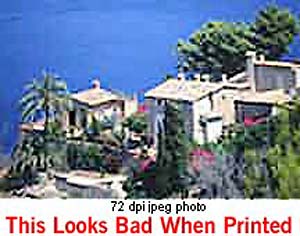
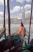
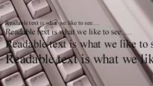
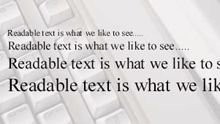
You should scan your images using a resolution of 300dpi at the final dimensions you intend to use them so that your colors will look smooth, and hard objects will look sharp. In other words don’t scan at 300dpi and then enlarge the picture by 200% in your layout program! This is another reason why you should not use images that are lifted from websites; they are probably only 72dpi in resolution and will look very blurry if printed on a printing press. See our Resolution page for more information on resolution.
If you are using pictures from your digital camera they will work just fine if they are jpgs; the quality of jpg images from digital cameras seems to be much better than jpgs that are used on the web. You must do the math to make sure that it is high enough in pixel resolution though. For instance, if your camera puts out a typical image of 1280 x 960 pixels at 72dpi you get about 17″ x 13″ of photograph (at 72dpi); this is the same amount of detail as an image which is 4″ x 3″ at 300dpi so it’s safe to reduce or enlarge that image in Publisher up to about 4″ x 3″ in dimension.
Do I need to send you my fonts?
If you use only the fonts that came with MS Publisher then no. We have them here too.
But if you use any other fonts from other sources then we most likely do need you to gather up copies of them and archive them together using a program like Winzip and send them to us with your layout file.
If you don’t know how to do this then just carefully go through your document and make a list of the fonts used. Send that list to us in an email along with your order reference number so that we can see if we have your typefaces.
Will my printed piece look exactly like it does on my computer monitor?
 RGB colors (what you see on screen) |
 CMYK colors (printing inks will do this) |
 RGB colors (what you see on screen) |
 CMYK colors (printing inks will do this) |
| You most likely won’t notice this kind of color shift in a color photograph. It is more likely to happen if you pick a very rich, vibrant color for a background or some other element of your layout. It probably won’t look bad, it just won’t look exactly the same. But it may not be noticeable at all either. In any event it will look spectacular compared to a piece printed on an inkjet printer. |
| Color photos don’t suffer much from CMYK translation | |
 RGB picture (what you see on screen) |
 CMYK picture (printing inks will do this) |
Can I use colored text?


It’s best not to colorize small text. What happens is that all printing presses have a little bit of variance in the consistency of the position of the different color plates. This is called misregistration. The cyan, magenta, yellow and black portions of the text characters don’t line up exactly. So the result is little colored halos around the characters. It’s ok to use colored text on large, headline type, or smaller sizes down to about 12 point size, but much smaller than that will be too noticeable and you won’t like it. The same thing holds true for white (knock-out) text on a dark or colored background. You can do it but don’t use point sizes smaller than about 12 point. Otherwise the words may be hard to read and it will look unprofessional.
Can I put text over an image?
Be careful about using photographs for backgrounds. If you put text (any color) on top it can be very hard to read. So the secret is to lighten the photograph a lot–more than you may think is necessary. Use a photo editing program like Photoshop, Paint Shop Pro or Adobe Elements.
What are bleeds, and do I need them?
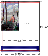 Bleed is the term for printing that goes right to the edge of the paper. The way to do this is to make your document .125″ too big in both dimensions. For instance, if the final size is 8.5″ x 11″ then make your document 8.75″ x 11.25″. Draw guides on the layout that are .125″ from the edge all the way around. Now create your design with the idea that the layout will be cut off where those guides are….because that is precisely what is going to happen. Make sure that any photographs or backgrounds that you want to bleed go clear out to the perimeter of the document, past the guidelines. Then after we have printed your piece we will trim off that extra .125″ all the way around and voila! You have color all the way to the edges of your piece. It looks professional….
Not Sure We Can Print From Your File?
If you are not sure that your file will work, you can send it to us and we will examine it
to see if there are any major flaws that would prevent us from printing your job.
Give our helpful experts a call at 800-930-6040 or Request a Quote.