Color Printing Design Tips
Getting Started with your Graphic Design
Designing your own printed piece can seem like a challenge. These handy hints will help you with the process. Here are the first steps.
- Decide the purpose of your piece. Ask yourself the following questions:
- Who will be reading it?
- What is the main point you want them to remember?
- What do you want them to do when they read the material (What is the “call-to-action”)?
- How will you be distributing the piece (does it need to have a mailing panel)?
- What is your budget?
- Decide on a format and size for your design.
- Sketch a mock-up of the piece before you start your digital design and layout.
- Understand your choices about color, type, resolution and layout.
- Get on the computer and have fun!
Design with Color
The best designs are simple. Clean lines, organized structure and minimal clutter will ensure that people read and remember your piece. Use a limited set of colors throughout your layout to keep the design consistent. Choose a color for each area of interest including:- Titles — Headlines, Subtitles
- Body Copy — Captions
- Graphics — Borders, Lines, Clip Art
Monitor-to-Print Comparison
Image Resolution
Resolution is the measurement of the number of pixels of color information in an inch.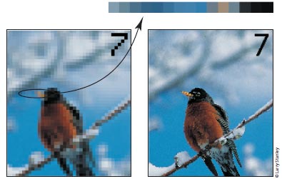
Low Resolution (72 dpi)
Good Resolution (300 dpi)
Low resolution images look choppy and lack detail. Super-high resolution (over 400 dpi) will produce large file sizes and longer upload times, with no improvement in visual quality.The Rules of Resolution
- Images should be 300 dpi (dots per inch) at the final size in the layout.
- The settings used during the original “capture” of an image (ie: scanning, digital camera, etc) determine its base resolution. Resolution can only be improved by decreasing the image size, or by recapturing the image at a higher quality setting.
- Images which include text should be 400 dpi at the final size in the layout.
- Resolution and image size are inversely proportional to each other. Enlarge an image, the resolution decreases; reduce an image, the resolution increases. Example: a 2″ x 2″ image at 300 dpi (acceptable) enlarged to 4″ x 4″ has a new resolution of 150 dpi (unacceptable).
- Low resolution images print fuzzy, jagged and blurry.
- Recommended minimum resolution for printing is 300 dpi; computer monitors generally have a display setting of 72 or 96 dpi. If we indicate that some of your images have low resolution, they may look fine on your computer monitor but will likely appear blurry or pixelated in print.
Things to Avoid
- Web images are predominately low resolution (72-96 dpi) GIF or JPEG files. This resolution is good for quick transmission over the internet, but is not acceptable for use in printing. Do not save images or graphics from a website to use in your print project!
- Upsampling is when a low resolution image is saved to a higher resolution with no changes in dimensions. Upsampling adds more pixels/dots per inch (dpi), but creates blurry images, ugly blocks of color, and high contrast in images. The only way resolution can be improved is by decreasing the image size, or by recapturing the image at a higher quality setting.
Spot Color or 4-Color?
Spot colors (also called PMS colors) use ink that is custom mixed. Generally, spot color is used with 1- or 2-color printing. Inks like fluorescent orange, metallic gold or Pantone colors are examples of spot color. For more color choices at a lower cost, use CMYK color in your design. Full-color photos are always printed in CMYK.Black and Rich Black
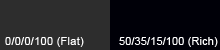 Black colors in print are not all the same. On computer monitors, all blacks will generally appear consistent. But on press, different ink combinations can create a wide range of blacks. When black is the text color, use flat black (CMYK 0-0-0-100) for the best results. If you have a solid black area larger than two square inches, we recommend using a “rich black” for a darker, more uniform color. The rich black color build we recommend is 50-35-15-100.
Background Color
Make sure your design has enough contrast between the type color and the background color. The examples below show how font and background colors can cause readability issues.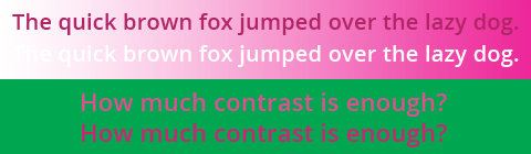
Number of Fonts
Minimize the number of font styles for your entire design (preferably 3 or less). Keep it simple! Read more about designing with text.Type Size and Color
Type smaller than 10 point can be difficult to read. Type smaller than 14 point should be made with 3 or fewer of the CMYK colors to avoid mis-registration.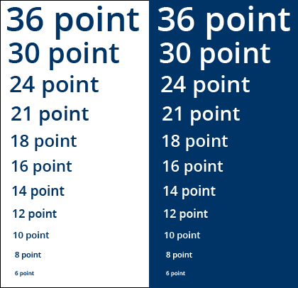
Line Width
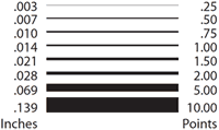
“Hairlines” or very thin lines will not print well. Set line thickness to at least .25 points or .003 inches in width. A one or two-point line looks great around photographs.Bleeds
“Bleed” refers to images or graphics that go to the edges of the paper on the final printed piece (also called “full bleed”).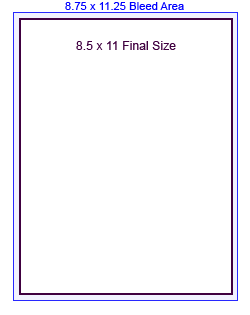 When designing for bleed, you should make your document .25″ larger on both your horizontal and vertical dimensions. For instance, if the final size of your piece is 8.5″ x 11″ then make your document 8.75″ x 11.25″. Add guides to your layout that are .125″ from the edge all the way around. Now create your design with the idea that the layout will be cut off where those guides are – because that is exactly what will happen. Make sure that any photographs or backgrounds that you want to bleed go clear out to the perimeter of the document, past the guidelines. After your piece is printed, we will trim off that extra .125″ all the way around, leaving you with color all the way to the edges!
CMYK: The Formula for Success
Full-color printing, also called “4-color process,” uses Cyan (C), Magenta (M), Yellow (Y), and Black (K) inks in different percentage combinations to create the colors we see in print. By specifying your design elements using a CMYK formula, you can be confident that you will get the colors you want. Create your design in CMYK color instead of RGB whenever possible.Request a Design Guide below.
Need help preparing your graphic arts printing file?
Call our helpful print experts now at 800-930-6040.
Get Free Print & Paper Samples