Best Quality Text for Printing
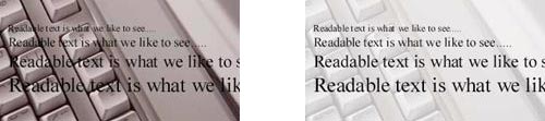
Raster vs. Vector Text
- Raster graphics are bitmap images made up of individual pixels/dots, laid out in a grid. Raster images have a fixed resolution (dots per inch) and lose quality when enlarged. Not recommended for text, as edges will likely appear jagged.
- Vector graphics are graphics created with mathematical lines and curves. Vector graphics are resolution independent and scalable. Recommended for text, as edges will be clear and crisp.

BAD GOOD
Raster type will print blurry & fuzzy Vector type will print clear & crisp
Raster type will print blurry & fuzzy Vector type will print clear & crisp
How to get vector text:
Colored Text
There are two things to be aware of when working with colored text:
- Due to their physical limitations, all printing presses may experience slight variations in the positioning of the cyan, magenta, yellow and black plates. Any deviance among the four plates is called misregisration.
- The printed result of misregistration is colored “halos” around your smaller, finer elements such as text or thin lines.
- We recommend that colored text is used only at sizes larger than 12 point. This also applies when you are using white knock-out text.
- Light colors built of only one or two colors may appear to have rough edges when printed. Adding a color or two to the color build, or using a darker mix of colors, will help to smooth the edges and improve text legibility and appearance.
- Colored text should be at least 12 point.

BAD BAD BAD
Colored type smaller than 12 Knock-out type smaller than 12 Light text built of only one or two
point is subject to misregistration point is subject to misregistration colors can appear jagged when printed
Black & Rich Black
Printed blacks are not all the same.
- Computers display color with RGB light, while presses print with CMYK ink.
On computer monitors, all blacks will generally appear consistent. But on press, different ink combinations can create a wide range of blacks: warm black, cold black, green black, etc. It is important to know the CMYK builds of any blacks used in your project so that you can achieve the results you want.
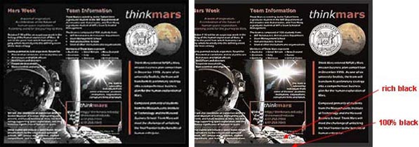
Black border looks consistent on screen
Some Guidelines:
- When black is the text color, we recommend using 100% black (0 C / 0 M / 0 Y / 100 K) for crispest results.
- If you have a solid black area larger than two square inches, we recommend using a “rich black” to achieve a thicker, darker and more uniform color. We recommend a rich black color build of 50 C / 35 M / 15 Y / 100 K.
- When you have two abutting backgrounds, adjoining color builds should match to avoid color inconsistencies.
- If your piece has a black or dark color background, we highly recommend that you add a coating to your piece. Dark backgrounds are more likely to show fingerprints, scuffing and smudges, which the applied coating can help minimize.
Laying Type Over Images
Be careful when using images and graphics for backgrounds. Text of any color can become very hard to read when placed over a busy image.

It can be difficult to read text over an image
Dramatically lighten the image for easy reading
- The secret is to lighten the image a lot – more than you may think is necessary.
It can be difficult to read text over an image
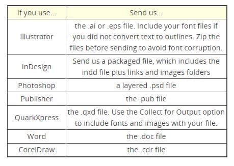
Sending Fonts
We need the same fonts that you use in your file to be able to successfully reproduce your order on press. It is not necessary to send us standard fonts, but we do need any special fonts that you have used or purchased. This usage is allowed by copyright law.
To upload your font:
- Go to the Start menu on your computer
- Go to Search/For Files or Folders
- Type in the name of your font and search your computer for the file
- Once the file pops up, copy the file by right clicking on the icon, scrolling down and clicking “copy”
- Type 1 fonts contain two parts with the extensions .PFM and .PFB. Both are needed in order for the font to be functional.
- True type fonts only require one file that uses the extension .TTF.
- Paste the font file(s) onto your desktop; do this by right clicking, scrolling down and clicking “paste”
- Go to our file upload page
- Click “Browse”, go to your desktop, click on the font file you pasted and then click “Upload”
- Mac users must compress font files prior to upload to avoid corruption.