• Skip to primary navigation
  • Skip to main content
  • Skip to footer
Printing for Less

Printing for Less

At Printing for Less, we've offered high quality online printing services since 1996. Shop business cards, booklets, stickers, and more!

P F L.com
My LoginMy Login
800-930-2423
  • Printing
    • Postcards
    • Catalogs
    • Brochures
    • Folders
    • Letters
    • Newsletters
    • Envelopes
    • Greeting Cards
    • Print Templates
    • All Products
  • Direct Mail
    • Why Direct Mail Marketing?
    • Every Door Direct Mail® Postcards
    • Direct Mail Letters
    • Catalogs & Booklets
    • Marketing Gifts & Kits
    • Direct Mail Automation
  • Services
    • Mailing Services
    • Design Services
    • Custom Printing Services
    • Reseller Program
  • Industries
    • Advertising & Design
    • Enterprise
    • Food & Beverage
    • Healthcare Payers
    • Healthcare Providers
    • Nonprofit
    • Real Estate
    • Retail
    • Technology
    • University
  • Resources
    • Direct Mail Marketing
      Resource Center
    • Printing Resource Center
    • Blogs
    • Templates
    • Video Library
    • Have a Question?
  • Get Samples
  • Get a Quote

Blog

10 Ways to Use Thank You Cards to Get More Business

People remember beginnings and endings—the brain guesses that the beginning of an interaction (hello and welcome) and the end (good day and farewell) are worth recalling. We’ve all heard about the importance of making a good first impression. But we often forget to create a clear and memorable ending to a customer interaction. And as it turns out, the end of a transaction can linger in your customers’ minds in the following days and months.

Ensure a positive, memorable end to a customer interaction. Show that you care, that the transaction mattered to you, and that you’d like the customer to come back and refer you to their friends.

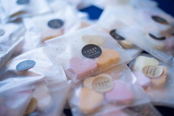
Why Send Thank You Notes?

thank you note card

First and foremost, because we’re all humans, and kindness is free. Everyone appreciates being thanked, and your heartfelt gratitude encourages positive relationships and reliable service delivery from that person in the future. After all, wouldn’t you prefer to do business with someone who took the time to thank you?

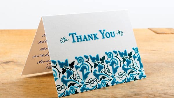
Be genuine and sincere. There’s hardly a better way to express gratitude and sincerity than a handwritten thank you card. Pro tip: Keep thank you cards for employees to send out as well—make it part of your company culture to write and send them regularly.

When Should a Business Send Thank You Cards?

thank you note card with gold lettering

There are many opportunities to use thank you cards in business, and we’ve listed just a few. Whether it’s an employee appreciation card or a “thanks for the service,” consider embracing as many opportunities as possible.

Here are ten ways to use thank you cards to get more business:

  1. Thank you for choosing me to work with you. After you’ve been selected to be the service provider, you can send a note to remind them you’re there—if they need anything or have any questions, you’re just a call, text, or visit away.
  2. Thank you for your business. For ad-hoc projects or product purchases, send a note. It doesn’t have to be long; you can simply recognize that the customer stopped in and made a purchase or worked with you on a single project. Adding some personalized details about the purchase helps your customer feel extra special.
  3. Thank you for the ongoing work. Let’s say you just signed a contract to provide services for a year. Send them a note to thank them for the great opportunity and remind them you’re looking forward to your partnership.
  4. Thank you for the referral. When someone liked your products or services enough to recommend you to others, that’s definitely worthy of gratitude. What better way to build your business than through word of mouth?
  5. Thank you for the meeting. This could also be lunch, catching up, or some other get-together. Networking is always good—even if it doesn’t lead to new business today, it could lead to new business in the future.
  6. Thank you for your testimonial. If you have a customer or client who loves you enough to tell the world, you absolutely want to thank them for their endorsement of your products and services.
  7. Thank you for the interview. If you are the person being interviewed, be sure to thank the interviewer for their time. You want to stay at the top of their mind, and an appreciation card will help do just that. If you’ve interviewed someone, consider thanking them for their time as well. Even if you don’t give them your business (or hire them), you’ll leave a good impression.
  8. Thank you for your consideration. If you don’t get the business or land the customer, you should still thank them for taking the time to analyze your proposal. You can say something like “We regret being unable to prove to you the benefits we have to offer at this time. We’d like to keep in touch with the hope that we can partner in some way at a future time.
  9. Thank you for your great work. An employee appreciation card says thank you to a team member who has done a great job. Whether or not it’s Employee Appreciation Day, cards can go a long way toward improving morale—who doesn’t like to feel appreciated?
  10. Thank you for partnering with us. The people who provide services at your business (coffee delivery, for example) deserve recognition for their efforts, as well. Let them know you appreciate what they do for you.

Tips for the Greatest Impact

hand-written thank you card

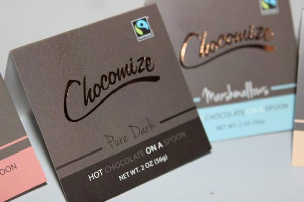
Hand-write at least some of the card. If you’re going to take the time to create cards, do it well. Hand-write as much of the inside as possible, but at least the recipient’s name and your signature. If the whole thing is pre-printed, it won’t look sincere. Remember that the whole point is to build relationships, and that needs a personal touch.

Save time with business thank you card scripts. Odds are, you’ll find yourself writing similarly worded thank you cards time and time again. Make note of the most common scripts you use and refer to them when it’s time to write out appreciation cards for employees and others.

You can do this by typing out your sentiments and saving them in a file or by photographing what you wrote in previous thank you cards. For employees, make these suggested scripts available to the whole team. It’ll save everyone time wondering what to write.

Use different envelopes than your regular business stationery. When you think about thank you notes, you might not immediately consider what kind of envelope to use. By choosing the right envelope, you can influence the recipient’s perception of the card before they even open it.

You don’t want to use the same kind of envelope you send invoices or statements in, because the recipient will immediately assume it’s a bill. That’s not the impact you want! Choosing a standout envelope gives the recipient a bit of anticipation before they even open it.

Consider including a little gift. Think about the last time you got a bulky envelope. You were probably excited for a moment, wondering what was inside. Your thank you cards for employees, clients, and customers will feel the same way. A bulky envelope with a small treat—a gift card or coupon, a bit of candy, a pen—will make it obvious that it contains something fun to open.

Just be sure whatever you enclose adds to your brand’s message and aligns with the quality of your products and services. Sure, it may cost a few dollars to send, but it’s a small amount of time and effort to deliver a big “wow” factor.

Send business thank you cards promptly and consistently. There are two final factors to consider: promptness and consistency. Send a thank you card as soon as you can after an event. That way, you’ll be perceived as being sincere; waiting too long will make the thanks look like an afterthought.

Establish a system that ensures you send cards consistently. If you aren’t consistent, your customers and partners may perceive you no longer value them, or that you’ve lowered your standards.

Don’t be salesy. Don’t taint your thank you note with overt promotion—this isn’t time for a sales pitch. A note of appreciation is best used as a passive sales tool; they’re good for customer relationship building, not for advertising. You can, however, mention an upcoming event you hope they’ll attend.

Giving sincere thanks is a simple way to show kindness and appreciation in your business. Crunch the numbers to find out how to make this marketing tactic viable for your business. You don’t have to spend a lot of money to make the people you work with a little happier with a nice note. And, since sending thank you cards can help with your customer retention rates and referral rates, you don’t have a lot to lose.

Need help with your note cards? Give us a call at 800-930-7978. Speak to a live print expert to get started on note card printing today!

10 Daring Designs for Dazzling Table Tents

At Printing for Less, we know table tents design like the backs of our hands. After all we see them all the time. As it happens, so do you! But maybe you haven’t noticed them. Table tents can be found everywhere, but are especially common in establishments such as restaurants or cafes. Like most people, you probably gave it a cursory glance before depositing it out of the way of your conversation or your in-coming drink order.

If you are into marketing (since you’re reading this, you must be) then you may have given that piece of cardstock a longer than average look. You might have assessed the table tent’s design, the color scheme, font choices, maybe even the stock images that were selected. But let’s face it: most table tents rarely inspire more than a quick look at the monthly specials. It doesn’t have to be that way! These little gems are a fantastic under-appreciated resource: inexpensive, designed to meet any need, and so easy to set up that even a rampaging horde of unsupervised temps could still get them right.

Here are 10 unique table tent designs that are elevating the lowly table tent from clutter to eye-catching.

1. Table Flyer

These are a fabulous way to generate interest in a restaurant, cafe, or fundraising event. Although they are technically table tents, these almost defy the term with their unusual design. A colorful array of tantalizing dishes draws your audience in to peruse the interior. Keep up their interest peaked with a few fantastic fonts in varying sizes to make the contents as dynamic as the exterior.

What exactly does fine wine have to do with finance? We have no idea. But pyramids have been elevating the concept of wealth to new heights for thousands of years. These table tents are positively decadent in luscious hues of cabernet and rose. Try adding gold foil highlights to compliment the rich undertones and add some lux to your royal design.

cool table flyer design

2. Pyramid

What exactly does fine wine have to do with finance? We have no idea. But pyramids have been elevating the concept of wealth to new heights for thousands of years. These table tents are positively decadent in luscious hues of cabernet and rose. Try adding gold foil highlights to compliment the rich undertones and add some lux to your royal design.

pyramid table tent design

3. Gatorade

Gatorade has built an empire upon athletic prowess and this table tent makes the most of that association. Relying upon the brand recognition of their classic shade of orange, this topper goes the extra mile by identifying with the viewer through an act as simple as running. Throw in a couple of one-liners and a quick pitch on the back and they are off to a great start.

triangular table tent design

4. Energy and Power

Table tents are so frequently about food but these ones really take the cake. Vibrant colors and great illustrations create a tactile experience that makes your audience hungry for more. Use a complimentary banner or artistic fonts to keep the interest peaked. Whether you’re selling baguettes, bathmats, or BitCoin, effective imagery grows your audience and builds anticipation.

3 standard table tent designs

5. Tiger

A yawning maw to make even the most daring marketing exec pause! But look! This one has been transformed into a catchy little game. Whether your clientele chooses to blow their sleeve intact from the straw or ball it up and launch it by hand, they are already engaged with your brand and having fun. Who knew that a table tent could do so much?

special function table tent

6. Myths and Legends

Mainstream doesn’t have to mean boring. Podcasts are everywhere and that means that it can be easy to get lost in the deluge of new ones popping up on the daily. Enter the Dragon! Messy, fat brush strokes and charred colors instill a sense of chaos and dynamism. You can almost smell the sulfur and smoke. This will certainly get people warmed up to this brand!

creative table tent design

7. Steele

As far as table tents go, this one pretty much speaks for itself. When making an impact, it pays to rely on simple ideas. Like an ad straight out of Vogue; from the glasses to the font everything about this piece is outspoken and larger than life. It refuses to settle for average. With it’s ‘Follow me’ attitude, it successfully creates a sense of mystique and gives the target audience something to talk about.

table tent ad

8. Geo-metric

A great play on an idea, this design kicks things up a notch and takes table tents to a whole new level. When a customer wanted to talk about the geothermal heat used in their kitchens, this designer gave it shape. Geometric shape, that is! We love the play-on-ideas of the several ways ‘geo’ features in this design. Playful and in primary colors, it begs to be handled, picked up, rolled, and of course, read. The fonts are wonderfully organic and make the information accessible all at once.

geometric table tent design

9. Everyday Magic

For office workers across the world, the restorative powers of caffeine can certainly seem like magic. But sharing the experience of your favorite hot beverage with friends (whether in the office or out) can make that everyday event something special. That was obviously the idea in mind for this promotional material. With the magic of a die-cut, you too can share that experience with your friends and clients. That kind of everyday magic isn’t a complicated idea and neither is this design. Au natural cardstock, a sweet but simple illustration, and a great idea. Throw in some kitschy fonts and light use of color and we have ourselves a winner! With a small modification, this design would even make a superb gift card holder for your next promotional event (hint hint!)

die cut table tent design

10. What is It?

Although this design was developed as a mock-up for an imaginary product, it is simply spectacular. The fact that it also doubles as a centerpiece or gift bag is just another reason to love this inspirational work. Anyone can try their hand at a black and white design, but it takes skill to make an intriguing product. Graceful fonts worked in gold make a beautiful accent in this presentation. Instead of distracting from the overall effect, they elevate the design and leave us wondering, what is this product and where can I get one?

gift bag table tent

With so many gorgeous options to choose from, you will be hard-pressed to pick just one table tent for your next promotion. But with your ideas and the know-how of our expert designers at Printing for Less, together we can build the marketing campaign of your dreams.

Want to find out more? To get started, call 800-930-6040 and take advantage of table tent printing today!

Get A Quote on Custom Table Tents

The Ultimate Guide: How To Choose the Right Packaging for Your Product

It’s what’s on the inside that counts, but it’s amazing what good packaging can do for your product.

The way your product is packaged plays a surprisingly key role in how consumers respond to it. Good packaging can elevate your brand, justify a high price point, and serve as a key distinction between yourself and your competitors — and that’s just the beginning.

To understand why packaging is so important, you have to understand what your packaging communicates. There are a few fundamental elements of your product packaging: shape, design, materials, colors, and text. Each element communicates something about your brand both on its own and in relation to the entire package. These are things like:

  • Your brand’s voice and values.
  • Who your product is marketed to.
  • What your product does.

Your packaging also inherently communicates other things, such as its market value and — strange as it may seem — who the consumer can become if they use the product.

Ultimately, product packaging is about marketing. The way you choose to design your packaging will help consumers differentiate between your products and other similar products and assist you in building brand recognition over time.

Well-designed packaging can also sway consumer behavior in your favor. For example, 72% of consumers say that the way a product is packaged affects their purchasing decision, with even more (81%) saying it influences their gift selections.

If you acknowledge packaging for what it is — an ad for your product that lives right with it on the shelf — it becomes clear that there’s no room for error. Good packaging can make a noticeable difference on your bottom line, and it’s up to you to ensure that you end up with packaging that sells.

Read on to learn everything you want to know about picking the perfect packaging for your product. We’ll cover the types of packages and boxes you should consider, custom print effects, how to communicate your ideas to your printer, and more. 

Determining the Basics of Your Package Design

product packaging example

Before you can select the best packaging for your product, you need to make some decisions up front. Start with these questions to help narrow down your options and clarify what direction you should go in:

1. What material do you want to use?

Your choice of material is one of the most important parts of your packaging design. Whether you go the paper or plastic route depends on your brand’s style and the product itself, though keep in mind that, overwhelmingly, consumers prefer paper packaging. 68% of consumers say they’re more likely to choose a product in a paper or cardboard package versus a plastic package, and 63% say paper packaging makes a product seem more high-quality.

2. How will your product be transported?

Durability is tantamount to successful packaging, and function and ease of transport should be considered when coming up with your package design. You don’t want to design original and eye-popping packaging only to have it lose its shape before it gets to its end location.

3. What is your budget?

As with most marketing strategies, budget is going to have a big impact on what you can and cannot do. When coming up with your spending limit, make sure to budget not just for the packaging itself but also for the creative work that goes into designing it.

4. What will appeal to your desired customers?

This is one of the biggest areas you need to define when coming up with your packaging plan. From the materials to the colors, each aspect of your packaging needs to be optimized to appeal to its intended audience. Spend time researching what will make the biggest impact with your key demographics and incorporate your findings into your final design.

12 Package Styles

candy packaging example

There is no shortage of styles when it comes to packaging. Choose one that aligns with your answers to the questions in the last section, and that works well with the size and shape of your product as well as the overall presentation that you are going for. Here are

1. Straight Tuck End

Versatile and easy to assemble, Straight Tuck End (STE) boxes are an excellent option for streamlined packaging. Fold/tuck closures on both sides make for a simple and effective seal. Closures are positioned toward the back and blend seamlessly along the edges to maintain a clear design across the entire box.

2. Reverse Tuck End

Reverse Tuck End (RTE) boxes are similar in style to STE boxes, but instead of both closures sealing in the back the top closure seals in the front. The alternating closures enhance the durability of the seal, making RTEs good choices for heavier items or those that may shift around in transit.

3. Display Box

Display boxes come in a range of sizes and shapes to help your products stand out on the shelves. Optimize your display box to best fit your product, your display area, or both, with plenty of options for ensuring that your products are both well protected and well positioned to sell.  

4. Gable Bags and Box

One of the leaders in luxury packaging, gable bags, and boxes feature a steady structure and a tuck-in front closure that helps them come together easily and stay closed. Use Gable Bags and Boxes for product packaging or display.

5. Four Corner Beer

Four corner beer packaging — which includes a tray and a box with a lid — features a classic four-corner design wherein each side folds inward to hold its shape. This structure is ideal for carrying and storage, and it also makes for stylish on-counter displays.

6. Six Corner Beer

The six corner beer is a riff on standard four corner beer packaging, consisting of a four-fold box and a two-fold lid that easily slips over the box when folded down. Boxes can be shipped flat for practical storage and put together on site.

7. Sleeve

A sleeve box uses a dual part structure to create a highly durable packaging solution. Double wall tray inserts slide effortlessly into a folding carton that envelops the insert on all sides. Trays can be opened at either end and are securely fitted to prevent them from slipping out when you don’t want them to.

8. Pillow Box

It’s easy to see how the pillow box got its name. These basic cartons are easy to assemble, with a one-piece design and foldover closures on each end. While not great for stacking, pillow boxes make for innovative product and gift packaging.

9. Foot Lock

Also known as the walker lock, foot lock trays feature a traditional male-female lock design that ensures stability once constructed. Features four fixed flaps that hold together separately from the main lock design. Good for storing and organizing large inventories and heavy items.

10. 1-2-3 Bottom (aka Snap Lock)

1-2-3 bottom boxes also called snap lockboxes, offer a similar look to tuck end boxes with additional bottom strength security provided by interlocking closures. Additional locks or friction can be applied to the boxes for increased durability.

11. Hexagon/Octagon

For those who want to get a bit more creative with the shape of their packaging, hexagon and octagon boxes offer similar security to square, rectangular, and pillow boxes, plus a stand-out silhouette. Despite their unique shape, hexagon and octagon boxes can be folded flat for storage and are a good fit for a wide variety of products.

13. Literature Shipper

Literature shipper boxes are lightweight but strong, making them sturdy options for shipping large quantities of books, product samples, brochures, and more. An outside front flap enclosure makes for easy opening and closing and lends structural support where it’s needed most.

Custom Packaging

custom box packaging

All of our packaging solutions and designs can be completely customized to fit both your product and your brand. Companies across a wide variety of industries are using custom packaging as an innovative way to add a distinct touch to their products, particularly products that look similar from manufacturer to manufacture.

Custom packaging can enhance the entire experience of your product for a consumer. In the cannabis industry, for example, recently formed companies who want to get ahead of their competitors on the market with custom packaging that plays around with structure, design, and even smell. Digitally produced packaging components help ensure that branding doesn’t interfere with regulatory labeling requirements, while modern design techniques and packaging shapes help redefine cannabis and what it means to purchase it.

Another industry taking custom packaging to the next level is mail subscription boxes. Companies that offer monthly or quarterly product selections for consumers are shipping focused — meaning their packaging has to be durable and can’t vary too much in shape. To stand out, many subscription boxes play around heavily with design, custom creating boxes for each shipment so that recipients are as intrigued by the package they receive as they are about what is inside of it.

And perhaps nowhere are we seeing more expressive custom packaging than among e-commerce companies. Online-only stores rely on their packaging for both efficient shipping and to enhance the value of their brand, which can be difficult to convey in a website. By getting creative with their packaging, e-commerce companies help build a brand identity off of the web — a major objective for products that you aren’t going to just come across in a store’s aisle.

foil stamped packaging

Custom Print Effects

The only limit to a company’s creativity with their packaging is their imagination. Today’s custom print effects can make pretty much any packaging idea come to life quickly and affordably. Learn a bit more about our custom print effects and how to turn your dream packaging design into a reality.

Ink Effects

Custom ink effects add a ton of personality to your brand packaging and are incredibly useful for maintaining a cohesive marketing message across various brand materials.

Think beyond the standard CMYK process when selecting colors for your product packaging. Custom ink and coating is a relatively simply printing effect that uses a variety of specialty inks to make your product pop. Custom inks include metallics, and scratch-and-sniff scented varieties.

Die Cutting

Die cutting adds depth and texture to your packaging with special effects that help you communicate key ideas about your brand and your products. Die cut shapes are created with custom made cutters (think of a steel cookie cutter) that result in finely detailed, sharp edge designs that can augment all of your packagings or call attention to one distinct part of it. Die cuts can also be made digitally.

Other Special Print Effects

Beyond the basics are those effects that don’t fit neatly into a specific category. These include:

  • Foil Stamping. Heat meets pressure for a dye-process that adds a luxurious touch to any package. Heated foil is pressed on to the surface and preserved in place with a unique pressure process. Can be used on its own or combined with embossing for a three-dimensional effect. Various types of foil can be used, including metallics, woodgrains, and holograms.
  • Embossing. The embossing process brings texture to your packaging with words and designs subtly popping off the package for a truly eye-catching look. The embossment can be the same color as the rest of the packaging, or dies — including lavish metallic foils — can be used to enhance the look even more.
  • Spot UV Printing. With Spot UV, ultra-violet light is used to cure a glossy ink or coating on your packaging. The result is a shiny print effect that is excellent for highlighting key text on your packagings, such as your logo or the name of your product.

The sky’s the limit when it comes to your custom print effect options. Work with our design team for creative solutions to any effects you may want to add.

Questions Your Printer Will Ask

printing quality check

Your printer is the one responsible for taking your packaging ideas and turning it in to a completed product. As such, packaging design is mostly a collaborative effort. Be prepared to answer key questions that will help your printer establish guidelines for your packaging and ensure that the package you picture in your mind is what you end up with.

Question 1: What are the exact dimensions of your product?

The most important thing about your package is that your product fits inside of it. While package sizes can certainly extend far beyond the dimensions of your product, this answer will establish the minimum size of your packaging and may suggest that your product would work better in some box structures better than others.

Question 2: Is this a one-time use box, or something you’re going to use repeatedly?

You’re going to want a different box for packaging that’s used often (such as a box of cards) versus packaging that’s used just once (such as a box for shipping). Your answer to this question helps to establish the structure and the substrates (materials) that make up the basis of your packaging design.

Question 3: How heavy is the item you will be putting inside the package?

Similar to your product’s dimensions and the use frequency of the package, the weight of your product is going to have an effect on the structure and materials your printer uses. For example, if your product is heavy you may need corrugated paper rather than a folding carton to ensure that everything stays in place.

Question 4: Is there some commonality between different products that need packages?

You can save a lot of money by ordering one box for various products and customizing them with labels, stickers, or print effects. Various color swatches can also be used to differentiate different products on the shelf while using only one box structure. If you and your printer can find a commonality, you can simplify the packaging process by ordering more boxes from the start and then working to distinguish between them later on.

Question 5: What do you want your box to do?

This question is a biggie. Considerations for your packaging will differ depending on if your package will sit on the shelf or display table or if it’s going to be going through the mail.

Question 6: What coatings/textures do you want?

Custom print effects are incredibly versatile, but not all effects work with all printing processes. You’ll want to know what sorts of custom inks, coatings, textures, etc. you want for your package before you finalize your box order.

Question 7: What shape of box do you want?

By this point, your printer will know more than enough about your package requirements to help you narrow down an ideal shape. If you don’t want a standard square or rectangle, consider custom box options such as pillow boxes, hexagons, or other unique shapes.

Question 8: Do you need your packaging to fold?

If you’re going to be putting together packaging on site it’s a good idea to order boxes that fold for easy shipping and storage. It’s also good for your bottom-line since flat boxes are considerably cheaper to ship. It’s important to note however that some folding boxes cannot support as much weight as their non-folding counterparts. You may need to change the base enclosure to accommodate a heavier item.

Be ready with answers to these questions before you first speak with your printer. The same goes for any other specific requirements you have that will be related to your ultimate package structure and design.

product holder packaging

Considerations for Designing the Perfect Package

Your packaging needs to serve a lot of purposes — both function-related and style-related. Designing the perfect package comes down to making smart decisions about not just what you want your product packaging to do but what you want it to say (and within your company’s budget, no less).

There is no such thing as one-size-fits-all packaging that works for every product and every brand. What there is, however, is perfect packaging for your product and your brand. Here’s how to figure out what that is:

Start with your product.

It’s the reason you’re designing packaging in the first place, after all. Your packaging needs to be optimized to fit and sell your product — not the other way around. In addition to customizing for fit and design, don’t forget to factor in how your packaging will travel and store.

Look at what your competitors are doing.

It’s a good idea to look at strong brand contenders in your industry to see what they’re doing with their packaging, not to steal their design but to identify some key features that make their packaging so effective. These will include companies that are selling similar products to your own as well as companies who are selling in similar environments. What are they doing that’s working, and how can you use those strengths to inspire your own design?

Consider your customer.

Well-developed customer personas can help you establish everything from what grabs your customers’ eyes on the shelves to the packaging materials they’re most likely to gravitate towards. The customers are the “end users” of your packaging, so you need to make sure to appeal to them with each detail.

Don’t forget about any packaging requirements.

If you have certain labeling that needs to be included on your packaging, incorporate it into your overall design so it doesn’t look like an afterthought. This helps you create one cohesive design instead of a package of competing parts.

Get results and feedback.

It’s okay if you don’t get it right on the first try. While it’s important to maintain your packaging over time for an established brand identity, you don’t want to hold on to a packaging style that’s not working for you. Try to create opportunities for clear feedback from your customer base on whether they like your packaging and what they like about it (or alternately, what they don’t).

Great packaging design is crucial for the success of your business. You should be putting as much thought into it as you did design your product itself, with an eye toward additional functional considerations like durability and transportability.

A big part of creating the right package is working with the right printer. Printing for Less is an industry leader and has been helping businesses create standout custom packaging since 1996.

Ready to take the next step? Email us at info@printingforless.com or give us a call at 800-930-6040 to get to work today on your perfect packaging.

how to choose the best packaging

8 Medical Design Brochures That Work

As we all know, the medical industry is heavily regulated. There are very good reasons for it but that doesn’t mean that effective marketing is out. Playing by the rules (or FDA regulations) shouldn’t mean that you can’t create amazing marketing campaigns with some spiffing new medical brochures. With a great medical brochure from Printing for Less and direct mailing, you can spread the word to a wider audience about the newest and best advancements in your field or facility.

Have a ton of information on a new procedure that you offer? Medical brochures are perfect for getting you message out there. But you should never sacrifice quality for quantity in your medical brochure design. Seize attention with something interesting, inspiring, or just eye-catching. Soothing blue borders and a stock image of a smiling doctor is done! There are tons of great medical brochure examples out there. Here are just a few.

1. Okuloplasti

Start out by picking the right image and you can push your brochure from average to awesome just like that! If a picture is worth a thousand words, then maximize the impact of your message. With this image staring you straight in the face, it is impossible to miss the focus of this brochure. The bright blue highlight and the rich dark eyes are mesmerizing. And unlike some generic pamphlet designs, this cover cuts straight to the point. For an image this powerful, choose a clean but matter-of-fact font that won’t detract. This layout is perfect for promoting your newest product or procedure. Go bold or go home and galvanize your customers.

2. Formula4Success

Making your brand approachable in the field of medical billing and healthcare is no easy task. Throw in anything related to healthcare or billing and you’ve got your work cut out for you. Attempting to decipher medical coverage raises most people’s blood pressure but this brochure makes it look fun. With a catchy hook of a title and a fun catchphrase, this brochure removes the stress and sets customers at ease. If your goal is to provide an accessible solution, then use visual cues, like cute and colorful icons, to lay the groundwork for your message. Taking a difficult problem and turning it into an approachable resolution will build brand awareness and create happy (and regular) customers.

3. The Pavilion

An adorable baby is always an easy front page to sell. But in the world of healthcare and medicine it is also a very common image. So if you want the ads for your prenatal exams, maternity ward, or post-natal support programs outshine the others, you will have to raise the bar.

A solid image can do the trick when you want your message to stick. Gender neutral colors and a happy but hazy parental figure increases the wider market appeal. But the real gem here is the tagline. Variants of ‘Never miss a…’ continues on to each page throughout the brochure and emphasizes not only the preciousness of these babies, but also their fleeting nature. Babies grow so quickly so missing any time with them is avoidable with the services offered.

4. Camscreen

DNA profiling seems fairly complex but this design makes advertising it deceptively simple. The dark, serious colors balance nicely against the bright and playful DNA strand, creating a sense of professionalism but approachability. This cover makes a hot topic into child’s play and is a perfect example of advertising cutting edge tech and medical advancements.

5. Vector 1

Forget medical therapy; what we really need is this ad on a band t-shirt. This cover is pretty cool, but despite the seemingly obvious clue, there is still the question of what type of medical service this brochure is advertising. Is it a radiology office, a physical therapy clinic, chiropractic, rheumatology, or osteopathy? Is it a single facility that offers all of those? Intriguing! This cover alone is enough of a lure to make us want to find out more but what we really want to know is, what is Vector 1? We must know! To build additional suspense, roll out a cover like this near Halloween. With winter sport season around the corner, you can capitalize on the spooky season while beating out the competition.

6. Pipi au Lit

Even if you are not fluent in French, it is easy to see that this brochure is geared towards kids. From the cheerful colors, the playful font, and the gold stars to the adorably illustrated children, it hits all the right notes. When looking for original ideas for children, check out popular or award-winning picture books for suggestions on color schemes, fonts, or illustration styles. You don’t have to be French to create a Caldecott Award-worthy pamphlet out of a stressful childhood event like bedwetting (but it certainly couldn’t hurt).7. Analiza

Crisp veggies, fresh flowers, and picturesque yoga backdrops; this cover has everything that you need. Direct but beautifully illustrated, this brochure doesn’t stagger the images and articles. It is all about getting the information out there and they don’t hold back. Most of the time, critics will suggest that too many images on a page can overwhelm the viewer. You want your audience to become invested in the material, not distracted by too much visual stimuli. But in this case, the critics would be wrong. There is no sense of clutter, instead this collage-like presentation succeeds beautifully. By choosing thematic images that share the same or similar colors, a series of images can act as one larger photo. This can be a tricky approach, but really pays off when you have more photos than can be reasonably arranged around the page. Just use this powerful technique sparingly. As a statement or showcase method it works best at the introduction of an article, by growing interest in the rest of the piece.

8. One Medical Group

This design by One Medical Group builds a whole new future before our very eyes. Gently contrasting colors blend to create a city of tomorrow, invoking concepts like ‘innovation’ and ‘cutting edge.’ Reminiscent of those hidden picture scenes, this cover implies that through One Medical Group, we can see the potential for new medical facilities where pioneers in the field of healthcare will make giant strides forward in the advancement of human-kind. Or maybe they’ll just have those really cool vending machines. Who knows? What is really amazing is that all of this was accomplished with dots! This technique is so versatile that it could be applied to any kind of branded campaign. The future is in your hands.

Have any questions? Talk to a print expert today and get started on your next order of brochures. Call us at 800-930-6040 for expert advice on your next project.

How to Design a Brochure That Actually Gets Used

woman opening package

We all know that direct mail is incredibly popular. Study after study proves that people love to receive relevant, attractive, and personalized mail. Brochures are a versatile solution to your direct mail needs. They are compact, can be stacked in offices or passed out by hand, act as self-mailers, and hold a ton of information. A beautiful brochure is the cornerstone of any marketing campaign but finding those perfect brochure colors can be difficult. Thankfully, by utilizing just 3 color combinations, you can pull together a snappy new brochure design in no time!

The 3 color combination is popular with major companies because of its simple application and visual appeal. Using only a 3 color palette keeps you brochure on point and easy to design. You can also apply this design principle to a 3 color logo or other 3 color design for other direct mail materials or swag.

Know Your Objective

Before we delve into design, let’s focus on your goals. What do you hope to accomplish with this brochure? What is your message? What impression do you want to create? What ultimate results do you want to achieve? By using these questions as your style guide, the design process will be effortless and your brochure will stay on message with your brand.

marketing plan image

Know Your Audience

As always, consider your target audience when picturing your design. Is this brochure for your usual clientele or is it for a specific sub-group? What are their wants? Do they have any pain points? Design your pitch with your audience in mind and your work is half done already.

Your Brochure Color Scheme

The colors that you choose can significantly alter the effectiveness of your brochure. Colors can sooth, irritate, energize, infuriate, bolster, or boost, so choose yours carefully.

What Is Your Brand Personality?

When picking colors to represent your brand, select ones that match the mood of your company.

What does that mean? Well, does your company have branded colors? What color is your logo? If your company doesn’t have branded colors, the you can use this exercise to get started. And if your company has a main branded color, then start with it and use our tutorial to update your look.

First write down an adjective that best describes your company. Is your company energetic? How about passionate? Rugged? Suave or strong? Intelligent or youthful?

Once you’ve written it down, compare your adjective to the chart shown here:

brand personality graph

Find the word that most closely matches your word and the color associated with it. That color is going to be your main color.

Now, for your paired colors, you will be choosing from two complimentary colors and then a neutral. What is a complimentary color, you ask?

The Basics (A Very Quick Tutorial)

color wheels

Basically, there are three types of color: primary, secondary, and tertiary. Primary colors are red, yellow, and blue; whereas secondary colors are the colors created when you blend the primary colors (in this case, orange, green, and purple). Tertiary colors are blends of primary and secondary colors and have two-word names (like red-orange, yellow-green, blue-purple)

Complimentary (sometimes called contrasting) colors are ones that are opposite of each other on the color wheel. An example would be red and green.

colors can also be categorized as warm or cool. Warm colors have red undertones, whereas cool colors have blue undertones. Warm colors can be welcoming and cool colors can be soothing. Matching colors that are warm or cool to the mood of your campaign can improve the appeal of your brochures.

Now, back to your choices. Let’s say for example that the word that you picked for your company was ‘enthusiastic’, and so you chose orange as your main color (a very popular choice by the way!)

To find your complimentary colors, take another look at the color wheel in The Basics (A Very Quick Tutorial) section. Remember, the complimentary colors are directly opposite the color that you choose. So, in this case, your contrasting colors will be blue-green, blue, or blue-violet.

Well, that was easy! So, are we all done here? …no? Oh, right.

Remember those warm and cool colors? As you can see on that color wheel, the primary (red, yellow, blue) colors are in a triangle, so all of the blue colors end up on one side and all of the red colors end up on the other, with yellow and purple as sort of a DMZ. Cool on one side, warm on the other. Do you want a friendly and warm color scheme? Try orange and blue-violet. Or go cool and upbeat with orange and blue-green.

Finally, your choose your neutral color. Orange and blue will really POP but you don’t want them to be too overwhelming and a neutral tone provides some visual relief. Neutrals are usually white, gray, or black, but you can pick a hue (a color that has white mixed in) that compliments your main color too.

Restrain Your Fonts

With so many choices available, it can be easy to get carried away. But you want to attract your audience, not overwhelm them. Pick something fun, funky, or even a more elaborate font, but save them for your banners or headlines. Balance them with more conservative fonts for the body of your material and remember to use a dark color over a light color or vice versa for your fonts.

What’s Your Point?

With so many balls in the air, it can be easy to lose sight of your message. To stay on topic during the design process use your headlines as guidelines. Base them off of your goals to keep your objective in mind. Stay focused and remember your audience. Don’t get bogged down in a slew of information. No matter how relevant the material, if it’s boring your audience may lose interest. With that in mind, avoid long words and sentences and keep the acronyms to a minimum. Keep it short and sweet. Short sentences keep the momentum going. Remember, brevity is the soul of wit.

Set The Tone

Keep your overall look on point by choosing visuals that share similar tones as your main or complimentary colors. Pick images that match your mood. Is your tone warm? Then think upbeat, smiling faces and sunshine. Did you go cool? Then go confident, professional, or edgy. And always remember, if it doesn’t enhance your brand, cut it loose.

Quality Materials

Even when you are on a budget, investing in quality materials is a must. Thin, flimsy, or cheap feeling paper and weak inks can negatively impact the appeal of your brochure and degrade the value of your message. Psychologically, if your customer thinks that you have put a lot of time and effort (and money) into your presentation, then the information must be that much more important. Appeal to their sense of worth and give your brochure some weight. Even a small increase to a heavier bonded weight of card stock will add gravitas to your brochure and your message.

With so many options available from Printing for Less, you don’t have to break the bank but you show your customers that you think that they are worth it. Talk to an expert today at 800-930-6040 to get started on brochure design.

Get A Brochure Printing Quote

15 Creative Newsletter Designs for Growing Businesses

Developing an original look for your advertising materials doesn’t have to be a Herculean task. With a seemingly endless array of possibilities, getting started by just picking a font can seem daunting. Thankfully, with our teams of experts here at Printing for Less, you don’t have to worry about knowing the ins and outs or even the How-To’s of print newsletter design. We can take care of the nitty-gritty (and can even help with those fonts), but if you are finding yourself stumped for newsletter design ideas or your next newsletter layout, then take a gander at these creative printed newsletter designs and pick up some inspiration for your next project.

1. Fashion

Fashion Newsletter design

Mailbox-friendly marketing materials are always in vogue. Model yours on haute couture fashion mags and your clients won’t want to wait to get their hands on your next newsletter. Start with a gorgeous stand-alone image on the cover, then go glossy and showcase your list of contents just below for a tasteful layout worthy of Harper’s Bazaar. While black and white is always fashionable, you can spice things up with some color. Instead, try rich, beautiful tones and a matte finish for a high end feel and a modern appeal that never goes out of style.

2. Greenpeace

Green Peace Newsletter example

It isn’t always easy being Green. This cover beautifully blends organic imagery and earth tones with a dynamically placed title that delivers a strong on-brand message. It may be tranquil, but it is not passive. Combine this look with environmentally responsible products, such as milled paper from Oji Paper Group and vegetable-based inks (both available at Printing for Less) and showing your true colors will be a walk in the park.

3. Xplore

Xplore Newsletter cover

For an energetic design like this one, you need a dynamic color scheme and some great shots. This cover makes fantastic use of a strong geometric scheme and trendy colors, reminiscent of the industrial sprawl and neon signage of Tokyo’s Shibuya shopping district. Saturated contrasting colors (like the teal, rust and pumpkin used here) glow against the grounding effect of the black and white. Combined with bold and funky fonts, this is a great style for growing brand interest.

4. African Studies Heritage Studies

AHSA Newsletter Cover example

This layout showcases a classic form that offers a relaxed presentation. A fantastic style for the more formal settings of conferences or meetings, the soft tones and flow of information effortlessly carries the reader from one page to the next. Perfect for accompanying materials, your audience can easily refer to displayed data without missing out on the presentation.

5. Art News

ARTS News newsletter cover

Here is another example of beautiful results that can come from the use of contrasting colors and geometric shapes. An abstract landscape graces the cover; done in arctic shades and highlighted by brilliant oranges and golds. This style has a more mature feel than the Xplore cover previously shown, but is no less visually stunning. With modern sensibilities and a playful appeal, this layout is perfect for established companies looking to cultivate their image.

6. La Memoire Vive

La Memoire Vive cover

Colorful and playful, this newsletter doesn’t hide from the facts, but lays them carefully out on the front page. Primary colors and cute icons are easy on the eyes and makes those pie charts fun to peruse. Meanwhile, generous spacing keeps the layout from looking crowded and the toned down shades lend maturity. We see this style used most commonly by companies looking to invigorate their look.

7. Magnolia

newsletter cover example

This newsletter successfully rocks an upscale East Coast vibe. Leaf green accents alongside its minimalist black and white architectural illustration give it a clean, fresh look. And a quick list of highlights neatly tucked along the bottom of the page keeps things top-notch. This layout is perfect for a first-of-the-year newsletter.

8. Vinoly

Vinoly Newsletter Cover Design

You can’t go wrong with a fantastic centerpiece. And this one, with its alternating curves and hard lines, the ribs of the structure either heavily kohled with shadow or iridescent with sunrise, is superlative.
Let your image speak for itself. Take advantage with a larger-than-life layout and a minimalist cover. Off-setting your font breaks up the straight lines of your borders and creates a point of interest, When your newsletter’s focus is information-laden articles, copy this style or take a page from popular magazines like Time or Smithsonian. Develop your written content around interest-building images. Keep them relevant and your viewers will stick with you until the end (of the article at least).

9. Power Through Peace

Power Through Peace Newsletter

There is something fundamentally transient about this cover. One can almost taste the bitterness of black coffee, feel the rhythm of slam poetry where newsletters like these might be strewn across battered tables. Youthful rebellion is dynamic branding. Bespoke résistance showcasing gorgeous street art is trendy and the message is clear: politics change, graffiti may be painted over, but this is cool.

10. Act News

Act News Cover

Vibrant, dynamic, and magnetic! This pop art inspired cover effectively uses saturated colors and simple motifs to drive their message. Try using an all lower-case serif to keep your title professional but low key. Direct and to the point, these semi-transparent text boxes list the newsletter’s highlights without detracting from the overall effect.

11. A News

newsletter design example

Putting the ‘M’ back in Modern, this daring spread is laden with great visuals. Framed by fantastic images, the article lies center-stage and gives you the opening you need. Grab audience attention with over-sized fonts as solid as the brick-and-mortar beauties showcased opposite. Just remember, yellow and black is daring but keep it in check with a saturated but less vibrant tone. You want to attract them, not give your viewers hives.

12. The Food Truck

newsletter design example

No business is too small or too new to benefit from a well executed direct-mail campaign. From food trucks to pop-up shops or even your kiosk at the next convention, you can generate interest in up-coming venues, popular trends, and developing products that are in the pipeline.

13. Grobund

full color newsletter design

A veritable pastel rainbow, this layout is friendly and approachable and balances nicely with the raw pine frame of the facing image. Fresh spring tones beautifully frame the inset flier, tying this brochure back to a larger campaign.

14. Lux

folded newsletter design


Saturated color is truly luxurious. The brushstrokes provide impeccable texture and incredibly vibrant. And yet, the picture facing it from within the article is fairly tame. This diametric opposition between the mundane and the feverish creates a sense of balance upon the page. The article provides content yet the images are the substance, acting as a foil for the spread. Meanwhile, the over-sized title carries the energy onto the next page.

15. The Cut

corporate newsletter example

Corporate newsletters were made for newsprint. From ‘breaking news’ to the gossip column, there isn’t a single other forum that matches the pure vivacity of copy. Does that mean that you have to be big business to send out your own limited edition? Absolutely not! Tuck in a flier or a coupon for your reader’s next visit and get twice the action out of your direct-mail campaign.

Want more? Talk to a print expert today at 800-930-6040 to get started with your newsletter.

  • « Go to Previous Page
  • Page 1
  • Interim pages omitted …
  • Page 15
  • Page 16
  • Page 17
  • Page 18
  • Page 19
  • Interim pages omitted …
  • Page 43
  • Go to Next Page »

Footer

Printing for Less

info@printingforless.com
100 P F L Way, Livingston, MT 59047

800-930-2423

  • Home
  • Products
  • Services
  • Industries
  • Get Samples
  • Direct Mail Marketing Resource Center
  • Printing Resource Center
  • Blogs
  • Templates
  • Terms & Conditions
  • Contact
  • About Printing for Less
  • About P F L
  • Our Team
  • Careers
  • Login

Copyright © 1998-2025 PrintingforLess.com. All Rights Reserved.

logo
  • 800-930-2423
  • Products
  • Direct Mail Marketing
  • Services
  • Industries
  • Direct Mail Marketing Resources
  • Printing & Mailing Resources
  • Get a Quote
  • Contact Us
  • My Login