• Skip to primary navigation
  • Skip to main content
  • Skip to primary sidebar
  • Skip to footer
Printing for Less

Printing for Less

At Printing for Less, we've offered high quality online printing services since 1996. Shop business cards, booklets, stickers, and more!

P F L.com
My LoginMy Login
800-930-2423
  • Printing
    • Postcards
    • Catalogs
    • Brochures
    • Folders
    • Letters
    • Newsletters
    • Envelopes
    • Greeting Cards
    • Print Templates
    • All Products
  • Direct Mail
    • Why Direct Mail Marketing?
    • Every Door Direct Mail® Postcards
    • Direct Mail Letters
    • Catalogs & Booklets
    • Marketing Gifts & Kits
    • Direct Mail Automation
  • Services
    • Mailing Services
    • Design Services
    • Custom Printing Services
    • Reseller Program
  • Industries
    • Advertising & Design
    • Enterprise
    • Food & Beverage
    • Healthcare Payers
    • Healthcare Providers
    • Nonprofit
    • Real Estate
    • Retail
    • Technology
    • University
  • Resources
    • Direct Mail Marketing
      Resource Center
    • Printing Resource Center
    • Blogs
    • Templates
    • Video Library
  • Get a Quote

Transparency Best Practices

When you use transparency in Adobe Creative Suite applications like Adobe InDesign and Adobe Illustrator, you must take care to follow best practices. This is especially important when transparency must be flattened. We discussed flattening transparency in this blog post.

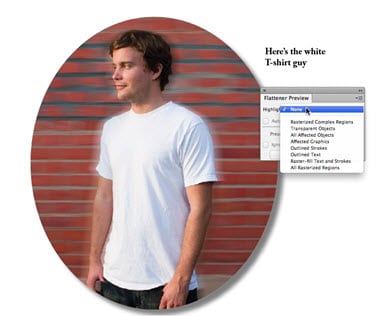
• If possible, place text and vector content higher in the stacking order than objects using transparency. If the transparency is higher, it may interact with the text or vector content, forcing it to be rasterized, making it spread (thicken in weight). In the example below, even though the type doesn’t touch the drop shadow around the image, it could still interact with it.

white t shirt guy

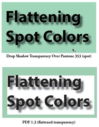
If you’re using spot colors to color objects, and you’re also using transparency, a PostScript raster image processor (the processor that produces the artwork for printing) must use overprinting to image both spot colors and transparency at the same time. If overprinting is not used, you may encounter an effect I call the “white box effect” behind the transparency as you see in the illustration below. When flattening occurs (as by choosing Acrobat 4 or earlier compatibility for a PDF file), the spot colored background doesn’t image properly.

flattening spot colors example

Keep transparency live as long as possible. Use native file formats like Photoshop PSD and Adobe Illustrator AI files instead of saving as EPS files which will flatten the artwork. When creating PDF files from document containing live transparency, use a PDF format with Acrobat 5 compatibility or higher, such as PDF/X-4 that support transparency, if your printer’s workflow supports such files.

Need help with your print? Talk to a live print expert today: 800-930-7978.

Primary Sidebar

Subscribe to our weekly newsletter and get an instant 20% off your first print project.

Name(Required)
This field is for validation purposes and should be left unchanged.

Footer

Printing for Less

info@printingforless.com
100 P F L Way, Livingston, MT 59047

800-930-2423

  • Home
  • Products
  • Services
  • Industries
  • Get Samples
  • Direct Mail Marketing Resource Center
  • Printing Resource Center
  • Blogs
  • Templates
  • Terms & Conditions
  • Contact
  • About Printing for Less
  • About P F L
  • Our Team
  • Careers
  • Login

Copyright © 1998-2025 PrintingforLess.com. All Rights Reserved.

logo
  • 800-930-2423
  • Products
  • Direct Mail Marketing
  • Services
  • Industries
  • Direct Mail Marketing Resources
  • Printing & Mailing Resources
  • Get a Quote
  • Contact Us
  • My Login
Catalog Printing

Subscribe to our weekly newsletter and get an instant 20% off your first print project.

Name(Required)
This field is for validation purposes and should be left unchanged.

*Some exclusions apply. See details