• Skip to primary navigation
  • Skip to main content
  • Skip to footer
Printing for Less

Printing for Less

At Printing for Less, we've offered high quality online printing services since 1996. Shop business cards, booklets, stickers, and more!

P F L.com
My LoginMy Login
800-930-2423
  • Printing
    • Postcards
    • Catalogs
    • Brochures
    • Folders
    • Letters
    • Newsletters
    • Envelopes
    • Greeting Cards
    • Print Templates
    • All Products
  • Direct Mail
    • Why Direct Mail Marketing?
    • Every Door Direct Mail® Postcards
    • Direct Mail Letters
    • Catalogs & Booklets
    • Marketing Gifts & Kits
    • Direct Mail Automation
  • Services
    • Mailing Services
    • Design Services
    • Custom Printing Services
    • Reseller Program
  • Industries
    • Advertising & Design
    • Enterprise
    • Food & Beverage
    • Healthcare Payers
    • Healthcare Providers
    • Nonprofit
    • Real Estate
    • Retail
    • Technology
    • University
  • Resources
    • Direct Mail Marketing
      Resource Center
    • Printing Resource Center
    • Blogs
    • Templates
    • Video Library
    • Have a Question?
  • Get Printing Samples
  • Get a Quote

Blog

Looking Beyond the Printed Piece

What is your goal?

It goes hand-in-hand with ‘motive’ and ‘purpose.’ It is an all-encompassing mindset that looks beyond a single printed piece and engages the outcome of an entire business as well. While the content of a printed piece is important, the impression it leaves with the consumer has a far greater impact.

Capture2

blog_modified-iron-cross If your piece is mostly informational, you may consider a brochure. A creative fold, such as the popular ‘cross fold,’ encourages exploration of the piece, such as in PrintingForLess.com’s HR recruitment piece. On the other hand saddle stitching or perfect binding can encourage a customer to walk through the piece in a more orderly manner.

Capture2

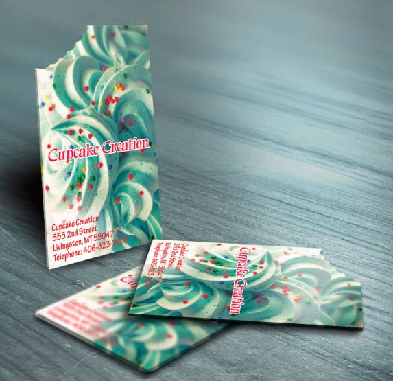
As much as we don’t like to admit it, we as humans develop impressions, values and sometimes stereotypes based on a first glance at almost any situation. That’s why the choice of the format for your printed piece is so meaningful: it directly affects how the customer sees the product in the long-term.

Capture2

diecut  This charging rhinoceros, die-cut and UV-coated, is the logo for Shirt Rhino, an online T-shirt company for custom screen-printing. The powerful design of this business card is sure to lead with a roar.

guitar_pick

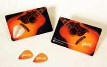
You also might try to leave something useful with the customer, such as in Gibsun’s plastic-coated business card with a die-cut guitar pick built into the card itself.

Capture2

When deciding on a format, consider your overall goals: Why do you operate your business the way you do, and how can you best communicate this to the customer? What specifics are you highlighting? Use your business essentials to drive your detail choices—not the other way around.

Capture2

Chair_Bcard3

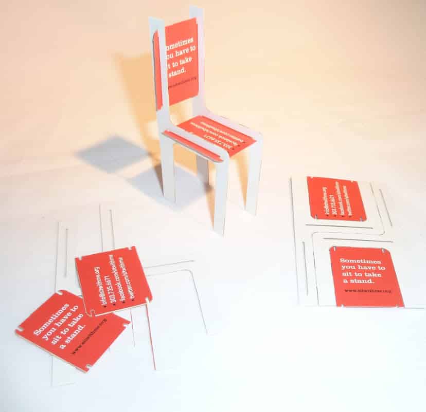
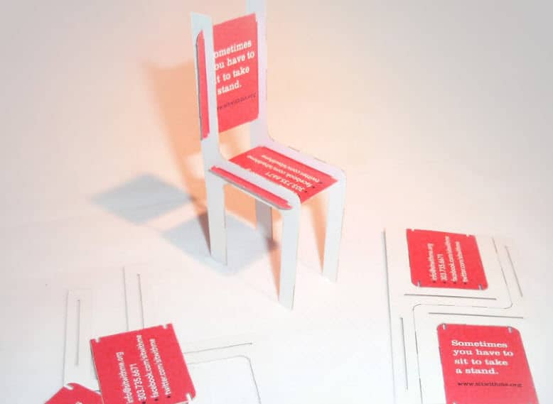
The not-for-profit coalition National Center for Women & Information Technology wanted to cement their idea of ‘The Red Chair’ in consumer’s minds: for NCWIT, this symbol promotes their slogan, ‘Sometimes you have to sit to take a stand.’ They created a business card with four die-cut pieces that could be punched out and assembled into the Red Chair itself: and still maintains its business-card purposes, with NCWIT information (and instructions for assembly) printed on all available faces.

Capture2

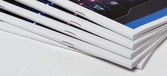
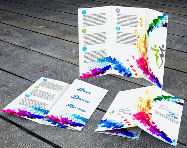
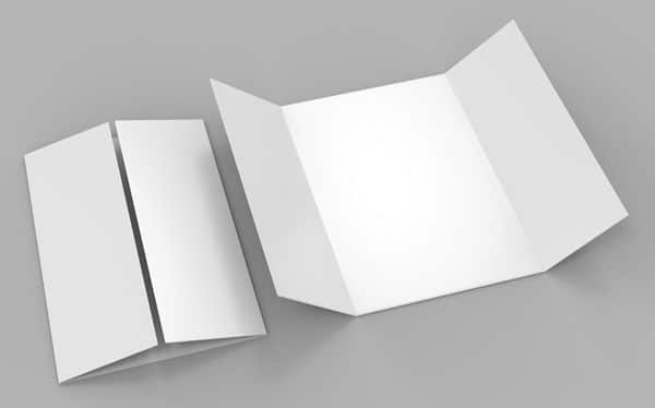
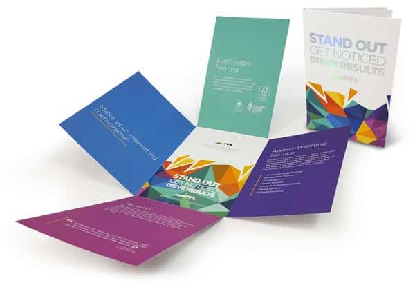
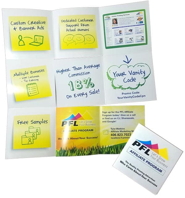
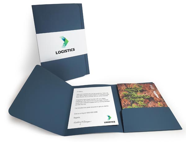
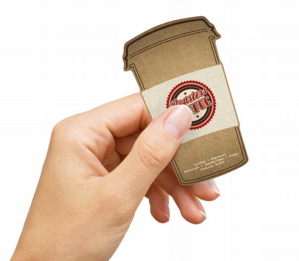
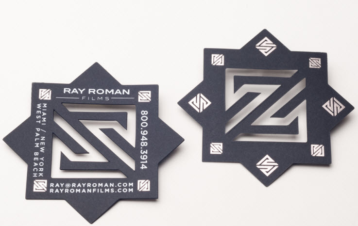
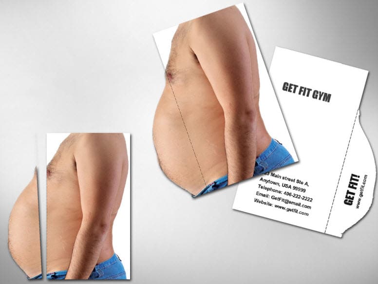
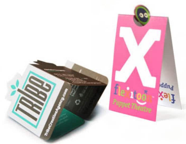
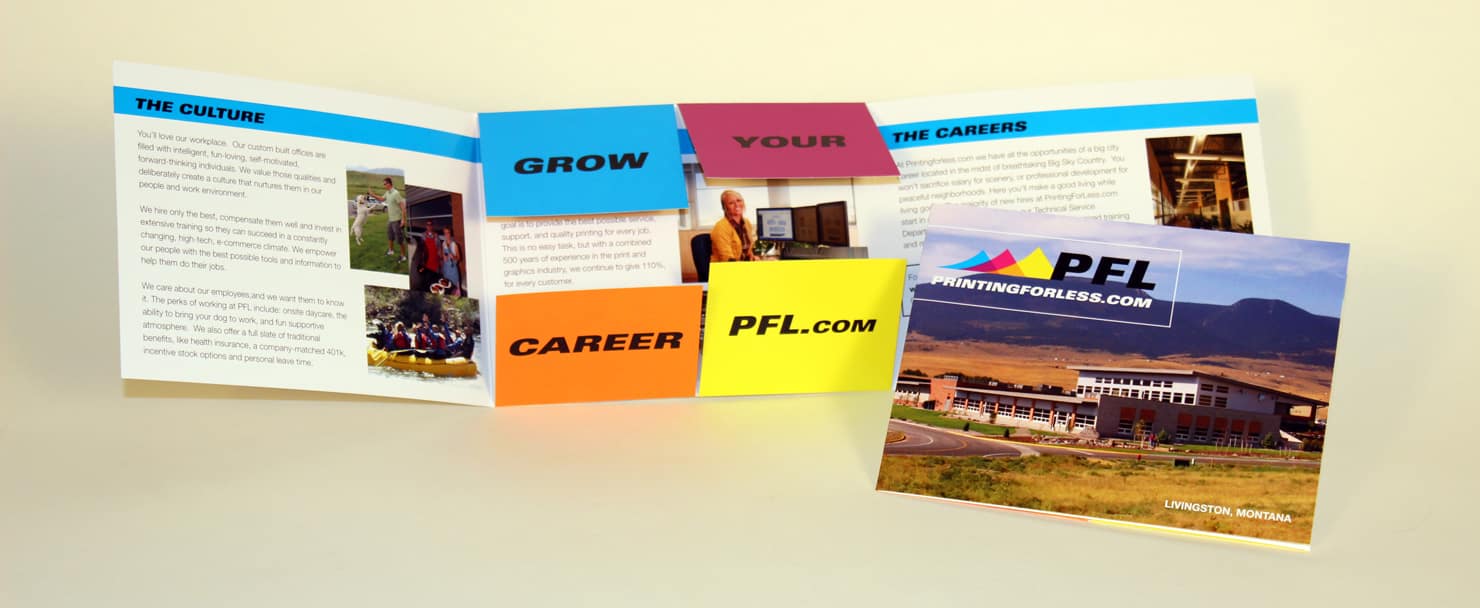
There are a variety of options for format when it comes to printed material: business card, folder, newsletter, etc. These are fairly standard choices. But you may need to unleash your creative when it comes to details such as size, design and special effects.

Capture2

WhiteIce The highly contrasting colors on this White Ice postcard draw the eye to the few white spaces left on the card—namely, the brightness of the woman’s teeth, for which the postcard is advertising. The offer and contact information for the tooth whitener are contained on the back of the card. The simple design of a postcard may be just the thing you need to quickly catch your customer’s eye.

Capture2

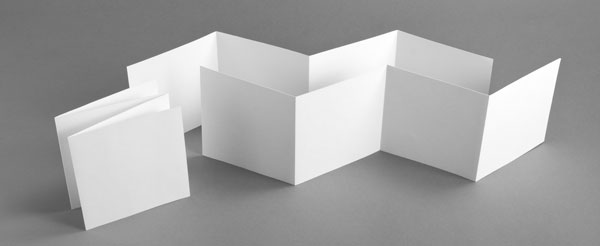
Greeting cards are an excellent way to relate to customers on a personal level while stil foil l maintaining somewhat of a business mindset. KLOVE radio station made these cards with foil-stamping on a plain black front to highlight on two words, which, when combined, form their main message. The visual contrast between the black and gold again underscores their key phrase.

stationery1

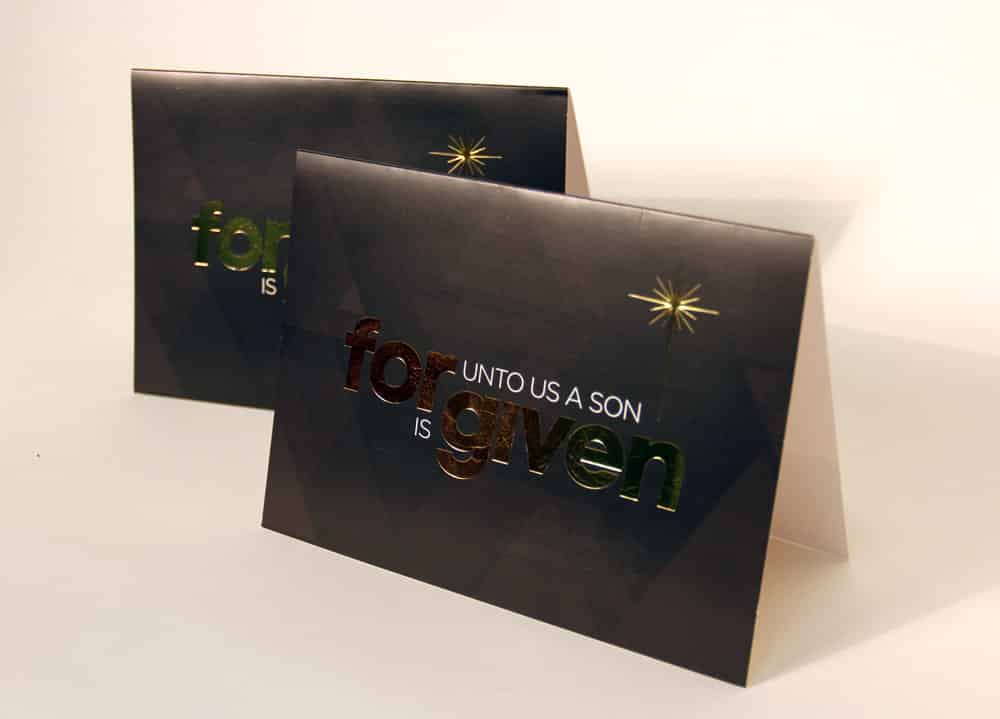
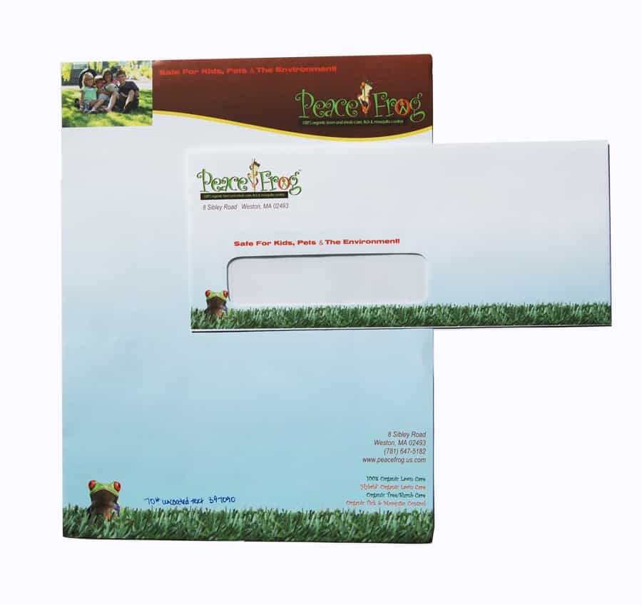
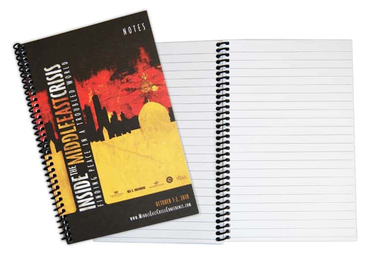
Like greeting cards, stationery can address formal issues while keeping your company’s name and logo in plain view. Matching envelopes are always an impressive touch.

Need help with your print? Talk to a live print expert today: 800-930-7978.

Consider Your Options when Binding Multiple Pages

Are you in a bind trying to decide how best to present multiple pages of information?

This is your guide to organizing your ideas in a presentable way; namely, through any one of the four main types of binding. These four categories range in cost-effectiveness and professionalism. Once you have a goal for your piece in the crosshairs, you will know where your piece falls on the grid.

Saddle stitching is the most cost-effective option when it comes to binding your piece. This is the type of binding that you often see in calendars and brochures: usually two or three staples along the spine, halfway through the sheets. The staples will show through on the opposite side, but for many pieces this does not pose an issue. Saddle stitching gives a casual feel while still presenting your information in a well-organized manner.

SquareBackBindingSamples


Square-back binding, shown above, is a cross between saddle stitching and perfect binding, which we will cover later. Square-back is similar to saddle stitching in the way it is produced, and only slightly more expensive: the pages are still stapled on a saddle, but then pressed until the piece resembles perfect binding, with the addition of a few staples showing along the outside of the spine. Square-back binding is slightly more professional than saddle stitching, but still maintains the value pricing. This type of binding works well for short children’s books and short-run magazines.

Plastic coil and wire spiral binding are similar in price, but have varying appeals. Both are durable, and can open 360 degrees. On the aesthetic scale these types of binding lean more toward the side of the casual brochure or booklet for a meeting or conference. Using wire binding gives your piece a slightly more finished look than plastic. However, plastic coil can be purchased in a variety of colors to further compliment your brand consistency. coilboundbooklets2

Perfect binding grants the best value, and is ideal for pieces with a larger page count. Although square-back binding might work for shorter volumes, perfect binding can be used for anything with 40 sheets or more, and provides the finest finished look for many pieces. Perfect binding uses a durable, strong adhesive inside the spine to hold your pages together, and is ideal for many larger magazines, books, manuals and catalogs.

When it comes to binding, price often dictates choice. Binding is an afterthought in most printed pieces, and its value is not considered at the forefront. You may have the perfect design for your pages, but binding is necessary to complete your multi-page project.

Keep an eye on the piece as a whole when first considering your target price during the design phase—don’t get to the last phase and leave yourself in a bind about the bind. Hold it together with a choice that supports the quality and goal of the rest of the piece.

Need help with your print? Talk to a live print expert today: 800-930-7978.

Welcome to the Fold – Standard and Unique Printing Folds

Most people don’t give folding enough credit. The physical design of a printed piece is often the first thing people notice, long before their eyes scan the words or images, and sometimes before they even pick it up.

Think about it. Have you ever read a brochure in a doctor’s office or opened a card that came in the mail, simply because the fold beckoned you? Blame human curiosity or FOMO (fear of missing out), but even when you’re uninterested in the content of a piece, it’s almost impossible not to unfold it and take a peek inside.

The Key Benefits of Custom Folding Effects

  1. Low-budget friendly. The fold has every other custom print effect beat when it comes to price. Compared to die cuts, metallic inks and embossing, a fold is insanely cost-effective. Let’s look at a few creative folds for print design and explore the impact they make on your brand, business, or message.
  2. Staying power. Folding encourages the customer to interact with the product longer, making it more engaging than a flat piece of paper. Your message is more likely to stick when you use a fold.
  3. It’s multi-sensory. In a digital world, tactile experiences are less frequent these days. For that reason, they stand out. Like embossing and other special printing techniques, interesting folds invite a tactile connection.
  4. Flexibility. Folds aren’t restricted to specific types of papers or inks. The weight, stiffness, and texture of your paper will create a unique effect depending on what you choose.

Here are several different options for folding, to help you imagine the possibilities for your next print project.

Standard Fold

Don’t confuse “standard” with “dull.” The standard fold is the standard because it works! Standard folds include the half-fold (like a booklet) and a tri-fold (like a standard brochure). There are variations on these, including the half-then-half.

standard tri fold brochure

Gate Fold

A gate fold, or barn door fold, is just what it sounds like: a fold that opens up in the center like a gate. An open gate fold starts as a rectangle, and its outer edges are folded inward once to meet in the middle.

standard gate fold brochure

A closed gate fold is folded one extra time over the center to create a shape that looks like a booklet.

Giant Folds

How do you get more content into your printed piece without cluttering it? Easy: use a bigger piece of paper, and fold it down. Change any of the standard folds into “giants” by adding more folds, like in the image below:

Accordion Fold

An accordion fold, when fully expanded and standing up, looks like a “Z” from the top. It can have any number of panels, but three is the minimum.

accordion fold example

Iron Cross

An cross fold fold is a sheet of paper that starts as a cross shape, and each panel folds into the center. Here’s what it looks like:

Iron Cross Fold Brochure

“Reveal” Folds

A reveal fold opens up, one panel at a time, until the piece is fully extended. These can be square or rectangular, and can have multiple panels or just a few. These are like cross fold folds that expand out to a square or rectangle, rather than a cross shape.

Hidden Panel Folds

The hidden panel fold has an additional panel that can’t be seen until the whole piece is unfolded. It may resemble a “T” or “L” shape when completely open, an cross fold, or a unique geometric form.

Similar to the “reveal” fold above, a hidden panel fold allows a reader to explore your content as they work their way through the material. This encourages them to hold onto it longer, making it a great tactic for marketing or advertising materials.

Snake Fold

A snake fold is ideal for storytelling, as it reveals one panel at a time until it’s fully extended. The paper for a snake fold is cut so that the folds “snake” around from one corner to the other. See below:

snake fold brochure

Pocket Fold

A pocket fold incorporates a physical pocket within your content where you can slip a business card, brochure, coupon, or additional information. You’ve seen these before in standard pocket folders — but there are plenty of ways to customize this fold to your needs.

Tri-Fold Presentation Folder

Twist Fold

In a twist fold, a small square expands into a larger square when you pull on opposing corners. There are many intricate folds within this piece to allow it to cleanly “twist” open and closed.

Exotic Folds

Unless you’re into origami, you may be starting to run out of ideas. But if we dig deeper, you’ll see there is more to the art of folding than first meets the eye.

“Folding Fanatic” Trish Witkowski has yet to run out of ideas. Witkowski is the founder of FoldFactory.com, a printing site that specializes in unique folds.

3D Folds

3D folds are complex, but truly artful and more memorable than typical folds. A great resource for learning more about 3D folds are Paul Jackson’s books Cut and Fold Techniques for Promotional Materials and Folding Techniques for Designers: from Sheet to Form. Though these folds tend to be difficult to learn, they may be well-worth it if you’re interested in the art of folding.

Although Jackson’s folds are mostly used to teach design students, he says that “practical concepts of folding can be adapted infinitely by any designer from any design discipline, using any sheet material.”

3D fold brochure example

Go on, give it a try! You don’t have to be an origami expert to discover a gorgeous fold that serves the perfect function. And when you’re ready to print your design, Printing for Less offers standard folds on most items for only one cent more than the base price, and complex folds which have to be folded by hand begin at six cents over the base price, depending on the intricacies of the fold and the weight of the paper. Get in touch with us today to learn more, we love phone calls. 

Get A Brochure Printing Quote

Complete Creativity in Inks and Coatings

In the ancient Greek language, the word ‘pan’ means ‘all’—limitless; vast; encompassing more than any other. The ‘pantheon’ is a temple dedicated to many gods instead of just one.

So when you’re choosing ink for your product, why stick to ‘process colors’ when you could have Pantone at your fingertips?

Pantone. All tones.

Pantone spot-color technique was developed in 1963 as a color-matching communication system for frustrated advertisers who could never match their ink after it was mixed by various printers at various locations. Since then, Pantone has morphed into a gigantic system, producing thousands of colors not previously available with standard CMYK process ink.

Although the wide range of options is certainly a plus, consistency is Pantone’s forte. Because of the Pantone Matching System (PMS), which uses a detailed combination of numbers and letters in its ink ‘recipes,’ any printer anywhere can perfectly match the color to any other printer, according to pantone.com. This is important for brand consistency. PMS can also ensure smooth coverage of large areas, keeping the colors identical from edge to edge.

The vibrant array of possibilities now available with Pantone ink has been catching the eyes of consumers for over 60 years, and has given rise to new experimentations with ink. Over the past several years Pantone has been promoting a Color of the Year; recent choices include Emerald, Tangerine Tango and Honeysuckle.

EmeraldStyles

These notable colors have been setting standards around the world, inspiring clothing lines and makeup trends. This year’s Radiant Orchid was chosen for its “magical” and “beguiling charm,” according to Pantone Color Institute Executive Director Leatrice Eiseman.

RadiantOrchid


“It enhances your feeling of being more creative,” Eiseman says. “We’re all looking for that touch of uniqueness.”

Now that you have a Pantone background, it’s time to spice up your text.

Metallic ink is a good place to start. The gold or silver flakes in the ink give the text a nice pop, especially on dark paper. Push yourself out of your printing comfort zone! On a business card or brochure, use metallic ink sparingly to draw the eye to one specific point, such as the offer—don’t overwhelm your customer with rock-star bling.

metallicink


Keep your metallic ink on coated paper so the tiny chunks of metal in the ink do not sink into the paper, and are able to retain their maximum shine and that extra zing that makes metallic ink stand out. A coating is advisable as well, so the flakes do not transfer to another sheet of paper stacked on top of it. Gloss coatings are standard, but aqueous coatings give the paper a ‘watery’ appearance, even when dry.

If zing isn’t your thing, maybe you’d like a bit of texture, such as with Spot UV coating. Spot UV is applied to a matte coating to cure certain areas of flat paper into items of subtle visual interest. The area of focus, either text or image, will be glossed over slightly. This prompts viewers to tilt the card or paper back and forth to experience the quiet marvel of Spot UV.

SpotUV3


Try applying Soft Touch coating to your piece. This rubbery coating dries quickly, and gives paper another texture. It can be recycled easily, because the coating is water-based. Soft Touch is similar to the coating on many phone and laptop cases, and tends to absorb light rather than reflect it, much like a matte coating.

It’s a softly striking way to combine tactile appeal to an already visually-intriguing piece.

Finally, combining Soft Touch with Spot UV will provide a higher contrast in both reflectivity and tactile stimulus than printing either alone, making your paper products irresistible to both eyes and hands.

Your choices impact the visual and tactile experience for your customer: choose thoughtfully from the nearly ‘pan-options’ of inks and coatings.

Need help with your print? Talk to a live print expert today: 800-930-7978.

Every Door Direct Mail® Success Kit

Use Every Door Direct Mail® to grow your business and increase revenue at a fraction of the cost!

The United States Postal Service’s EDDM® program allows you to have your postcards delivered to individual neighborhoods, using carrier routes. You identify the carrier routes and control the drop date and the USPS delivers directly to every door on the route. You save the cost of purchasing a mailing list, and there’s no permit required, which puts more money back into your campaign’s pocket.

This kit will give you all of the information needed to start, send, and succeed using Every Door Direct Mail®.

Download your Every Door Direct Mail® Success Kit Here

Need help with your print? Talk to a live print expert today: 800-930-7978.

10 Commandments for a Better Business Card

When it comes to creating effective business cards, it’s all about standing out against your competition. After all, a business card is usually something you give a customer when they’re just getting to know you. You haven’t had a chance to win them over yet, and they may never give you a call if you don’t make a strong impression.

A strong business card can be every bit as powerful as a strong business pitch. Yet, so many businesses still default to the standard rectangle, with standard information, on standard paper. What will your customers think of you when they see these? Simple: they’ll think you’re just like everybody else.

But here’s the secret. It’s not tremendously expensive or complicated to completely transform your business card design into something incredible. If you’re having trouble getting your creative juices flowing, here are ten business card commandments to live by.

Sure, no design “rule” is really written in stone (see what we did there?). However, we’ve seen businesses get powerful results when they employ some of these unique business card designs, so we think these ten commandments are at least worth considering!

1. Thou Shalt Not Always Conform to the Paper Standard

Who said business cards have to be made of paper? Though this is the golden standard, and the best budget option, paper cards can often come across as rote and boring.

In the example here, see how a plastic business card fits this brand’s message perfectly. The unique, see-through element gives clear plastic business cards a modern touch. Plus, clear cards can incorporate a number of design elements, from frosting (a foggy look) to partial or full color printing.

They are perfect for businesses and individuals looking for that competitive edge, and may be especially fitting for specific industries — think window manufacturers or cleaners, opthamologists, or a beverage company, for example.

clear business card

2. Thou Shalt Encourage Interaction

Take a look at this example. This business card uses a die cut print effect to convert a standard piece into a 3D chair! It doesn’t just look cool, it also invites a tactile experience for the person using it. Go on: imagine trying to look at this thing and not turn it around in your hand.

Another way to encourage interactivity is to use a partial die cut (called a “kiss cut”) to make a section of an image pop up from your business card.

bc chair

3. Thou Shalt Embrace All Shapes

The more personal you can make your business card, the more your customers will connect with you — and recall your brand. This die cut to-go coffee cup is a perfect fit for a coffee shop or café. It can also double as a frequent drink card that your customers are sure to hang on to.Inventive die cuts are an excellent way to grab the attention of the person receiving your business card. Like a cookie cutter, a die cut can create any shape you can imagine.

bc cup


4. Thou Shalt Not Worship the Rectangle

Rectangular business cards are designed to fit rectangular wallet slots, but why not design your business card into a shape that won’t be instantly lost and forgotten in a wallet? Square, vertical, and custom-shaped business cards are growing in popularity. In the example below, a die cut created these see-through geometric shapes. Still, there’s plenty of room for essential information: name, address, phone, email, and website. Also, the black matte card stock is an excellent base for the silver foil stamping at each of the edges, giving it an ultra-sleek look.

bc foil

5. Thou Shall Be Multi-Purpose

One of the surest ways to avoid your card being forgotten is to give it another purpose. The design below functions as a guitar pick and a business card, doubling the brand’s staying power. Every time a user picks up this pick, they’re reminded of the Gibson brand.

You, too, could make your business card multi-purpose by making it a rewards card, including a sticker to peel off, designing it in the shape of a bookmark — the possibilities are endless!

6. Thou Shalt Perforate Thine Edges

Perforation is another common trick that has a world of creative uses. This card stands out in more ways than one. Its creative use of a die cut with a perforated tear off belly not only grabs your attention, but lets you know exactly what this gym can do for you. It also invites a tactile experience, and every additional second your prospect spends with your business card engrains your brand further in their mind.

bc gym

7.Thou Shalt Not Think Bigger Is Better

There’s a time and a place for big print projects, but a business card is a first impression, and it’s unwise to assume your card recipient wants to empty their purse or briefcase to make room for your brand.

This example is small (1.75 X 3.5”) but elegant. It’s a true testament to simple, classic design, with diagonal rounded corners giving it a natural effect that perfectly mirrors the cardholder’s industry. Altering the size of your business card or adding rounded corners is an inexpensive way to make a business card memorable.

bc leaf

8. Thou Shalt Not Be Centered

Center-aligned content may be classic, but that also means everybody’s doing it. One easy way to stand out is to move your design elements off-center and leave plenty of white space. Here, an off-center fold and a creative die cut give this card great dramatic flair.

The best part? Adding a fold is a simple tactic, but one of the least expensive custom print effects. Think of all of the content you could design around a fold: a flipbook-style image that changes when you open it, hidden content behind the panel, or even a coupon with a perforated edge.

bc off center

9. Thou Shalt Excite With Custom Images

If only paper tasted as good as frosting! We haven’t mastered the art of edible business cards yet, but this one comes pretty close. This creative use of a die cut works in perfect harmony with the custom image below. It’s clever, a great conversation starter, and depicts a perfectly-executed example of meaningful design.

bc bite

10. Thou Shalt Not Reveal Everything Upfront

When you withhold the right information, you arouse a sense of wonder and curiosity in your customers. These folded business cards do exactly that, using die-cut elements and multiple folds. Instead of thinking of your business card as a static, 2D shape, imagine some of the folds you’ve seen on brochures (the tri-fold, gate fold, or cross fold, for example) and think of how you might shrink them down to business-card size.

bc folded pop up tribe

Need help with your print? Talk to a live print expert today: 800-930-7978.

  • « Go to Previous Page
  • Page 1
  • Interim pages omitted …
  • Page 26
  • Page 27
  • Page 28
  • Page 29
  • Page 30
  • Interim pages omitted …
  • Page 44
  • Go to Next Page »

Footer

Printing for Less

info@printingforless.com
100 P F L Way, Livingston, MT 59047

800-930-2423

  • Home
  • Products
  • Services
  • Industries
  • Get Printing Samples
  • Direct Mail Marketing Resource Center
  • Printing Resource Center
  • Blogs
  • Templates
  • Terms & Conditions
  • Contact
  • About Printing for Less
  • About P F L
  • Our Team
  • Careers
  • Login

Copyright © 1998-2025 PrintingforLess.com. All Rights Reserved.

logo
  • 800-930-2423
  • Products
  • Direct Mail Marketing
  • Services
  • Industries
  • Direct Mail Marketing Resources
  • Printing & Mailing Resources
  • Get a Quote
  • Contact Us
  • My Login