The power of your printed piece is usually conveyed most strongly through your type. If your type is sharp, it best communicates whatever message you want to send to your audience. Here are a few tips to make sure that your type remains crisp and sharp.
First, make sure you’re using the Type tool in whatever program you’re working in. If you are sending your applications files to your printer, use the Package feature (InDesign) or Collect for Output feature (QuarkXPress) if it’s available, to send your original fonts.
Don’t inadvertently rasterize (turn into pixels) the type. This softens the type, and it loses its crispness. The stair-stepping on the left letter indicates it has been rasterized.

If want to place type you’ve created in Photoshop into a program like InDesign, save it as a Photoshop PDF file. Unlike Photoshop PSD format, this keeps the sharp edges.
If you’re creating a PDF file, be sure to embed your fonts. If you’re using an Adobe application, or using a Macintosh, this usually happens automatically. If you’re using an older version of Microsoft products, you may need to look for the option to embed fonts.
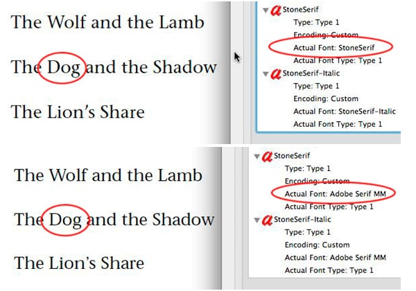
If the fonts are not embedded, they may be substituted. The original font, Stone Sans, is shown above, and the substituted font, Adobe Serif MM, is shown below.
Need help with your print? Talk to a live print expert today: 800-930-7978.